
What is a Pie Chart?
A pie chart is a circular graphical representation used to illustrate data proportions or percentages. It is a popular tool in data visualization that showcases the relationship between different components of a whole. The chart is divided into slices, with each slice representing a specific category or data point. The size of each slice corresponds to the proportion or percentage it represents within the data set.
Pie charts are effective in conveying information in a visually appealing and easily understandable format. They are commonly used to compare the distribution or composition of different categories within a dataset. For example, a pie chart can show the percentage of sales contributed by each product category in a company’s overall revenue.
One of the significant advantages of a pie chart is its ability to immediately convey the relative proportions between different categories at a glance. It allows viewers to quickly understand which categories are more or less significant compared to others. The circular shape of the pie chart resembles a whole, reinforcing the idea of the data representing a complete set of information.
When creating a pie chart, it is crucial to choose the right data for representation. Pie charts work best when showcasing data with distinct categories that do not overlap or have complex relationships. Additionally, it is recommended to limit the number of categories in the chart to maintain clarity and avoid clutter.
Overall, pie charts are a useful tool for visually representing data proportions and highlighting the distribution of categories within a dataset. They offer a quick and easy way to grasp the relative importance of different components, making them a valuable resource for data analysis and presentation.
Creating a Pie Chart in Excel
If you want to create a pie chart to showcase your data in Excel, you’ll be pleased to know that it’s a simple and straightforward process. Here’s how you can create a pie chart in Excel:
- Select the data for your pie chart: First, open your Excel spreadsheet and ensure that the data you want to represent in the chart is organized in columns or rows. The data should include the categories or labels and the corresponding values or percentages.
- Insert the pie chart: Once your data is ready, select the range of cells that includes both the categories and values. Next, go to the “Insert” tab on the Excel ribbon, locate the “Charts” group, and click on the “Pie” button. From the dropdown menu, choose the desired pie chart style.
- Format the pie chart title: By default, Excel generates a generic title for your pie chart. However, you can customize it to better describe your data. To change the title, click on the chart title, edit the text, and press Enter.
- Format the pie chart labels: Excel automatically adds data labels to the pie chart, displaying the values or percentages for each slice. To format the labels, right-click on any data label and choose “Format Data Labels.” From there, you can adjust the label position, font style, color, and more.
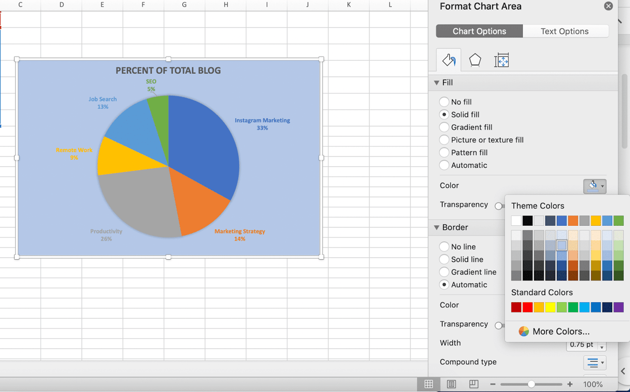
- Change the pie chart colors: By default, Excel assigns colors to each slice of the pie chart. However, you can change these colors to better suit your preference or to create a more visually appealing chart. To do this, right-click on any slice and select “Format Data Series.” Navigate to the “Fill & Line” tab to modify the colors.
- Explode a slice in the pie chart: To draw attention to a specific category or highlight its significance, you can explode a slice in the pie chart. Simply click on the slice you want to explode, and then drag it away from the center of the chart using the mouse.
Creating a pie chart in Excel is a simple and effective way to visualize your data. It allows you to present information in a visually appealing and easy-to-understand format, making it ideal for both professional and personal use.
Selecting the Data for Your Pie Chart
Before you can create a pie chart in Excel, you need to select the appropriate data to represent. The data you choose will determine the categories or slices of the pie chart. Here are some guidelines for selecting the data for your pie chart:
- Ensure the data is organized: Before selecting the data, make sure it is organized in columns or rows. Each category or label should be in a separate column or row, and the corresponding values or percentages should be in the adjacent columns or rows.
- Select both the categories and values: The data selection for a pie chart should include both the categories (labels) and their corresponding values or percentages. This means you will need to highlight the cells that contain the category names as well as the cells that contain the data values.
- Include the total or overall value: In some cases, you may want to include a “total” or “overall” category in your pie chart. This category represents the sum or aggregate value of all the other categories. To include the total, make sure to include a row or column that adds up all the other values.
- Avoid selecting unnecessary data: It’s important to select only the data that is relevant to your pie chart. If you have additional columns or rows that are not part of the categories or values, avoid including them in your selection. This will help keep your chart concise and focused.
- Consider the data distribution: When selecting the data, consider the distribution of values among the categories. Ideally, you want the values to have distinct differences to ensure that the pie chart effectively represents the proportions or percentages. If the values are too similar, it may be challenging to interpret the chart accurately.
By following these guidelines, you can select the appropriate data for your pie chart in Excel. Remember to organize your data, include both the categories and values, and consider the distribution of the values to ensure a clear and accurate representation in your pie chart.
Inserting the Pie Chart in Excel
Once you have selected the data for your pie chart in Excel, the next step is to insert the chart into your spreadsheet. Here’s how you can do it:
- Select the range of cells: Start by selecting the range of cells that contains the data you want to represent in your pie chart. Make sure to include both the category labels and their corresponding values or percentages.
- Go to the “Insert” tab: Move to the “Insert” tab on the Excel ribbon, which is located at the top of the Excel window. This tab contains various options and tools for inserting different elements into your spreadsheet.
- Choose the Pie Chart option: Locate the “Charts” section within the “Insert” tab. In this section, you will find different types of charts that you can create. Click on the “Pie” button to view the available pie chart options.
- Select the desired pie chart style: From the dropdown menu, choose the specific style of pie chart that you want to use. Excel offers different variations, such as 2D or 3D pie charts. Select the one that best suits your data and visual preferences.
- Click on the “OK” button: After selecting the desired pie chart style, click on the “OK” button to insert the pie chart into your spreadsheet. Excel will automatically generate the chart based on the data you selected.
Once you have inserted the pie chart, it will be visible within your spreadsheet. You can now start customizing and formatting the chart to enhance its appearance and showcase your data more effectively. You can modify the chart’s title, labels, colors, and more using the various formatting options available in Excel.
Inserting a pie chart in Excel is a simple process that allows you to present your data visually. By following these steps, you can create a pie chart that accurately represents your data and adds visual impact to your spreadsheets.
Formatting the Pie Chart Title
After inserting a pie chart in Excel, it’s essential to format the chart’s title to provide clear and concise information about the data being represented. Formatting the title helps to enhance the overall appearance and readability of your chart. Here’s how you can format the pie chart title:
- Click on the pie chart: Begin by clicking on the pie chart to select it. You will notice that Excel automatically includes a generic title for your chart.
- Edit the title text: Double-click on the existing chart title, and an editing cursor will appear. Now, you can edit the text and enter a more descriptive and meaningful title that accurately represents the data being illustrated.
- Apply formatting options: With the title selected, you can apply various formatting options to make it visually appealing. Use the options available on the Excel ribbon to modify the font style, size, color, alignment, and effects to achieve the desired look.
- Resize and reposition the title: If needed, you can adjust the size and position of the title to better fit your chart. Click and drag the title to move it to a new location, or click and drag the corner handles to resize it.
By formatting the pie chart title, you can ensure it stands out and effectively communicates the subject of the chart. A clear and well-formatted title helps viewers understand the main focus of the data and adds professionalism to your presentation. Consider using a concise and descriptive title that summarizes the key insight or message you want to convey.
Remember that formatting options may vary depending on the version of Excel you are using. However, most versions offer a range of formatting tools to customize the appearance of the pie chart title and make it visually appealing and informative.
Formatting the Pie Chart Labels
When creating a pie chart in Excel, the labels display the category names or values associated with each slice of the chart. Formatting the pie chart labels can greatly enhance the readability and visual aesthetics of your chart. Here’s how you can format the pie chart labels:
- Click on the pie chart: Start by clicking on the pie chart to select it. This will activate various formatting options specific to the chart.
- Format the data labels: Right-click on any data label within the pie chart and select the “Format Data Labels” option. Alternatively, you can go to the “Design” or “Format” tab on the Excel ribbon and find the data label formatting options there.
- Adjust label position: In the format options, you can choose the position of the data labels within the pie chart slices. You can place them inside or outside the slices, or even choose to display them as callouts with lines linking them to their respective slices.
- Modify label font and style: Customize the font, font size, font color, and font style of the data labels to ensure they are easy to read and aesthetically pleasing. Use bold or italic fonts, colors that contrast with the chart background, and appropriate font sizes to enhance visibility.
- Display additional information: Excel offers options to display more than just the category names or values as data labels in the pie chart. You can include percentage values, totals, or any other relevant data point that provides additional information and context to the chart.
Formatting the pie chart labels is crucial to effectively deliver information and enhance the visual appeal of your chart. A well-formatted label can improve understanding and make it easier for viewers to interpret the data represented in the chart.
Remember to strike a balance between clarity and aesthetics when formatting the pie chart labels. They should be visually appealing while still providing the necessary information without overwhelming the chart.
Keep in mind that specific formatting options may vary depending on the version of Excel you are using. However, most versions provide a wide range of options to customize and format the pie chart labels according to your preferences and requirements.
Changing the Pie Chart Colors
Changing the colors of a pie chart in Excel allows you to customize its appearance and make it visually engaging. By selecting appropriate colors, you can highlight specific categories or create a cohesive color scheme that aligns with your data. Here’s how you can change the colors of a pie chart:
- Select the pie chart: Begin by clicking on the pie chart to select it. Ensure that the entire chart is highlighted.
- Format the data series: Right-click on any slice within the pie chart and select the “Format Data Series” option. Alternatively, you can go to the “Design” or “Format” tab on the Excel ribbon and find the data series formatting options there.
- Choose a color scheme: In the format options, you will find various color options for the chart. Excel offers predefined color schemes that you can select from. These color schemes are designed to ensure a visually pleasing and harmonious combination of colors.
- Customize colors: If you prefer, you can also manually customize the colors of the pie chart slices. In the format options, navigate to the “Fill & Line” tab and modify the fill color or pattern of each slice individually. You can choose solid colors, gradients, patterns, or even use picture fills for a truly unique look.
- Apply a preset style: Excel provides preset styles that automatically format the pie chart with a combination of colors, effects, and outlines. You can choose from these styles to quickly change the chart’s appearance without individually customizing each slice.
- Experiment and preview: Feel free to experiment with different color combinations and schemes to find the one that best represents your data and matches your desired visual aesthetic. As you make changes, use the preview option to see the results in real-time before finalizing your color choices.
Changing the colors of a pie chart can significantly impact its visual appeal and make it more engaging for viewers. By selecting appealing color combinations and ensuring contrast between slices, you can effectively highlight data points and improve the readability of the chart.
Remember, choosing appropriate colors is essential to maintain the integrity of the data representation. Avoid using misleading or conflicting colors that may affect the interpretation of the chart.
Keep in mind that the specific steps and options for changing pie chart colors may vary slightly depending on the version of Excel you are using. However, the basic principles of selecting color schemes, customizing colors, and using preset styles apply across different versions.
Exploding a Slice in the Pie Chart
Exploding a slice in a pie chart can draw attention to a specific category or highlight its significance. When a slice is exploded, it is pushed away from the center of the chart, creating a visual effect that separates it from the other slices. Here’s how you can explode a slice in a pie chart in Excel:
- Select the pie chart: Begin by clicking on the pie chart to select it. Make sure the entire chart is highlighted.
- Identify the slice to explode: Determine which slice you want to explode in the pie chart. Each slice represents a category, and you can choose to explode any one of them.
- Click and drag the desired slice: With the pie chart selected and the specific slice in mind, click on the slice and drag it away from the center of the chart using the mouse. You will see the slice move outward, creating a distance between it and the other slices.
- Release the mouse button: Once you have positioned the exploded slice to your liking, release the mouse button to fix its placement. The other slices will remain in their original positions.
Exploding a slice in a pie chart can be an effective tactic to emphasize a particular category or highlight its significance within the data set. By visually separating the slice from the rest, you bring attention to its importance or distinctiveness.
Keep in mind that exploding a slice is a stylistic choice and should be used selectively. If multiple slices are exploded, it may clutter the visual presentation and make it harder to interpret the chart accurately. Consider using this feature judiciously to maintain the clarity and readability of the pie chart.
Please note that the process of exploding a slice in a pie chart may vary slightly depending on the version of Excel you are using. However, the general steps of selecting the chart, identifying the slice, and dragging it away from the center should be applicable across different versions.
Adding Data Labels to the Pie Chart
Data labels in a pie chart provide a way to display the actual values or percentages associated with each slice. By adding data labels, you can enhance the clarity and understanding of the information being presented. Here’s how you can add data labels to a pie chart in Excel:
- Select the pie chart: Begin by clicking on the pie chart to select it. Ensure that the entire chart is highlighted.
- Enable data labels: Right-click on any slice within the pie chart and select the “Add Data Labels” option. This action will add data labels to each slice of the chart, displaying the values or percentages.
- Customize the data labels: With the data labels enabled, you can now customize their appearance and position. Right-click on any data label and select the “Format Data Labels” option. From there, you can make changes such as adjusting the font size, font color, label position, or even choosing to display percentage values instead of the actual values.
- Show or hide specific labels: If you only want to show data labels for certain slices or hide them for specific slices, you have the flexibility to do so. Right-click on the individual slice that you want to modify and choose the “Format Data Point” option. From there, you can select or deselect the “Data Labels” checkbox for that particular slice.
By adding data labels to your pie chart, you provide viewers with a clear understanding of the values or percentages associated with each slice. The labels help to support the visualization and make it easier to comprehend the proportions represented by the chart.
Keep in mind that data labels should be used judiciously to prevent overcrowding the chart. If you have a large number of slices or limited space, consider displaying the data labels only for significant or prominent slices.
Please note that the specific steps to add and customize data labels may vary slightly depending on the version of Excel you are using. However, the general process of selecting the chart, enabling the data labels, and customizing their appearance applies to most versions.
Adjusting the Size and Position of the Pie Chart
Excel allows you to adjust the size and position of a pie chart to fit your presentation needs and ensure optimal visibility. By making these adjustments, you can create a visually balanced and aesthetically pleasing chart. Here’s how you can adjust the size and position of a pie chart in Excel:
- Select the pie chart: Begin by clicking on the pie chart to select it. Make sure the entire chart is highlighted.
- Resize the chart: Hover your cursor over any of the corner handles of the chart until you see a two-headed arrow. Click and drag the handle inward or outward to decrease or increase the size of the chart, respectively. Alternatively, you can manually enter specific dimensions in the “Size” options within the “Format Chart Area” menu.
- Move the chart: To reposition the chart within the worksheet, click on the chart and drag it to the desired location. Excel allows you to place the chart anywhere within the worksheet, granting flexibility for effective data presentation and alignment with other elements.
- Align the chart: To ensure the proper alignment of the chart within the worksheet, you can use Excel’s alignment tools. The alignment options can be found in the “Format Chart Area” menu, where you can adjust the horizontal and vertical alignment of the chart.
- Aspect ratio preservation: If you want to maintain the aspect ratio of the chart while resizing it, hold the Shift key while dragging one of the corner handles. This will keep the chart’s proportions intact.
Adjusting the size and position of your pie chart can greatly impact its overall appearance and visibility. By resizing the chart, you can ensure it fits well within your worksheet and avoids unnecessary clutter. Moving and aligning the chart provides flexibility to position it strategically, whether it’s in relation to other data or for better visual impact.
Remember to consider the overall layout and design of your worksheet when adjusting the size and position of the pie chart. Aim for a visually balanced composition that enhances the readability and impact of your data presentation.
Note that the specific options and menus for adjusting the size and position of the pie chart may vary slightly based on the version of Excel you are using. However, the basic principles of resizing and moving the chart remain consistent across different versions.
Editing the Pie Chart Legends
The legend in a pie chart provides valuable information about the categories represented by each slice. It helps viewers understand the data more easily and provides context for the chart. Excel allows you to edit and customize the pie chart legends to enhance their appearance and clarity. Here’s how you can edit the pie chart legends:
- Select the pie chart: Begin by clicking on the pie chart to select it. Ensure that the entire chart is highlighted.
- Show or hide the legend: Right-click on the chart and select the “Add Legend” or “Legend Options” (depending on the Excel version) to enable the legend. If the legend is already displayed, you can adjust its visibility by selecting the “None” option.
- Edit the legend text: Double-click on the legend text to activate the editing mode. You can then modify the text to provide more descriptive labels or to better represent the categories being presented by the chart.
- Format the legend: With the legend selected, use the formatting options available in Excel to customize its appearance. You can change the font style, font size, font color, alignment, and even add effects such as bold or italic formatting.
- Adjust the position and orientation: If needed, you can reposition the legend within the chart or change its orientation. Click on the legend to select it, and then click and drag to move it. Additionally, right-click on the legend and choose the “Format Legend” option to access settings for adjusting its position and orientation.
Editing the pie chart legends allows you to provide clearer and more meaningful information about the slices in your chart. By modifying the text, formatting, and position of the legend, you can enhance the overall appearance and readability of your chart.
Remember to keep the legends concise, avoiding lengthy descriptions that may clutter the chart. Focus on providing clear and relevant information that helps viewers understand the data represented by each slice.
Keep in mind that the process of editing and formatting the pie chart legends may vary slightly depending on the version of Excel you are using. However, the general steps of selecting the chart, accessing the legend options, and making the necessary edits apply across different versions.
Adding a Chart Title and Axis Labels
When creating a pie chart in Excel, adding a chart title and axis labels can provide important context and make the information more understandable. These components help viewers grasp the purpose and significance of the chart. Here’s how you can add a chart title and axis labels to a pie chart in Excel:
- Select the pie chart: Begin by clicking on the pie chart to select it. Make sure the entire chart is highlighted.
- Add a chart title: In Excel, you can add a title that clearly describes the purpose or main message of the pie chart. To do this, go to the “Layout” or “Design” tab on the Excel ribbon, locate the “Chart Title” button, and choose the placement option that suits your preference (such as “Above Chart” or “Centered Overlay Title”).
- Edit the chart title text: Double-click on the chart title to activate editing mode. You can then modify the text to reflect the specific information you want to convey.
- Add axis labels (optional): By default, pie charts do not have traditional X or Y axes. However, you may choose to add labels to provide additional information. For instance, you can add a label for the units of measurement or any other relevant information that helps viewers interpret the chart better.
- Format the chart title and axis labels: With the chart title and axis labels selected, use the formatting options available in Excel to customize their appearance. You can adjust the font style, font size, font color, alignment, and more to ensure consistency with your overall data presentation.
Adding a chart title and axis labels to your pie chart helps viewers understand the purpose and context of the information being presented. The title provides a quick summary of the chart’s content, while axis labels offer additional insights or clarifications.
When creating the chart title and axis labels, remember to be concise and precise. Use clear and straightforward language to effectively communicate the main message and supporting information.
Note that while pie charts do not have traditional axes, you can still make use of axis labels to enhance the chart’s clarity and understanding.
The precise steps and options for adding a chart title and axis labels may vary slightly depending on the version of Excel you are using. However, the general process of selecting the chart, accessing the title and axis label options, and making the necessary edits apply across different versions.
Adjusting the Formatting Options in the Format Data Series Window
When working with a pie chart in Excel, you have the option to fine-tune its appearance and customize various formatting options through the Format Data Series window. This window allows you to make specific adjustments to each data series within the chart. Here’s how you can adjust the formatting options in the Format Data Series window:
- Select the pie chart: Begin by clicking on the pie chart to select it. Ensure that the entire chart is highlighted.
- Access the Format Data Series window: Right-click on any slice within the pie chart and select the “Format Data Series” option. Alternatively, you can go to the “Design” or “Format” tab on the Excel ribbon and find the data series formatting options there.
- Modify the fill color and pattern: In the Format Data Series window, navigate to the “Fill & Line” tab. Here, you can choose a different fill color for each slice or even apply a pattern fill. Done correctly, adjusting the fill color and pattern can enhance visual appeal and emphasize specific data points.
- Adjust the border color and style: Within the Format Data Series window, locate the “Border” tab. Here, you can modify the border color and style of each slice. Enhancing or maintaining contrast between slices can improve the chart’s readability and ensure each data point stands out distinctly.
- Explore additional formatting options: The Format Data Series window offers various other formatting options. For instance, you can adjust the shadow effects, 3D format, transparency, and more. Experiment with these options to enhance the chart’s appearance, but ensure that the changes do not detract from the chart’s clarity.
- Apply changes to other data series: If your pie chart contains multiple data series, you can apply the same formatting options to all data series or make specific changes for each series individually. Use the options available in the Format Data Series window to customize each series according to your requirements.
The Format Data Series window in Excel allows you to have precise control over each data series within your pie chart. By adjusting options such as fill color, border style, and additional effects, you can enhance the chart’s visual impact and clarity.
It’s important to strike a balance between a visually appealing chart and one that remains clear and easy to understand. While exploring formatting options, always keep the focus on presenting the data accurately and effectively.
Please note that the precise formatting options and their availability may vary based on the version of Excel you are using. However, most versions offer similar options in the Format Data Series window to customize the appearance of pie chart slices.