
Selecting and Formatting Data
Before creating an exploding pie chart in Excel, you need to ensure that your data is properly selected and formatted. This step is crucial for producing an accurate and visually appealing chart.
To begin, open your Excel worksheet and locate the data you want to use for your pie chart. The data should be organized in columns or rows, with the first column or row containing the labels for each data point.
Next, select the data range by clicking and dragging the cursor over the cells. You can also use the Ctrl key to select multiple non-contiguous ranges. Make sure to include both the labels and the corresponding values.
Once the data is selected, navigate to the “Insert” tab in the Excel menu, and choose the “Pie” chart option from the “Charts” section. A basic pie chart will be inserted into your worksheet.
Now, let’s focus on formatting the data within the pie chart. By default, Excel assigns random colors to each data point in the chart. However, you may want to customize the colors to match your preferences or represent specific categories.
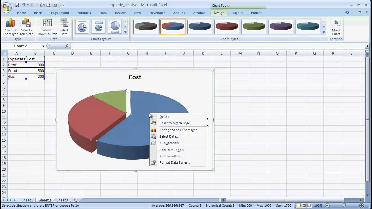
To do this, right-click on any of the slices in the chart and select “Format Data Series” from the context menu. In the “Format Data Series” panel on the right-hand side of the screen, navigate to the “Fill & Line” tab.
Here, you can choose a new color or gradient for each data point. You can also adjust the transparency level, add borders, or apply different fill effects. Play around with the available options until you’re satisfied with the appearance of your chart.
In addition to adjusting the colors, you can also fine-tune the data labels, title, and legend of the pie chart. These elements provide essential context and make the chart more informative.
By following these steps and taking the time to properly format your data, you will lay the foundation for creating an exploding pie chart that effectively communicates your information. Let’s move on to the next section to learn how to add the explosion effect to the chart slices.
Creating a Basic Pie Chart
To create a basic pie chart in Excel, follow these simple steps.
Once you have selected and formatted your data, as explained in the previous section, go to the “Insert” tab in the Excel menu. From the “Charts” section, select the “Pie” chart option.
A basic pie chart will be inserted into your worksheet, displaying the data in a circular graph. Each data point will be represented as a slice in the pie chart, with the size of each slice corresponding to its value.
By default, Excel will use the first column or row of your selected data as the labels for each slice. The labels are displayed outside the pie chart, next to their respective slices.
If you want to customize the labels, click on one of them and start typing the desired text. You can also adjust the font size, color, and style of the labels to improve the readability and visual aesthetics of the chart.
To further enhance the clarity of your pie chart, consider adding a data table. This table will display the values and corresponding labels in a neat format, allowing viewers to easily reference the exact data behind each slice.
To add a data table, right-click anywhere on the chart and select “Add Data Labels” from the context menu. The values will be displayed within each slice, as well as in a separate table.
In addition to displaying the data labels, Excel provides other customization options for the basic pie chart. You can resize and reposition the chart by clicking and dragging its edges or corners.
To move the chart to a different worksheet or workbook, right-click on the chart and select “Move Chart” from the context menu. Choose the desired location and click “OK.”
Remember that a basic pie chart is just the starting point. In the following sections, we will explore how to add explosion effects, adjust colors, add a title and legend, and make other refinements to create a visually stunning and informative exploding pie chart.
Now that you have a basic understanding of how to create a pie chart in Excel, let’s move on to the next section, where we will learn how to explode the pie chart slices for added visual impact.
Exploding the Pie Chart Slices
One way to make your pie chart more visually appealing and dynamic is by exploding or separating its slices. This effect adds emphasis to specific data points and helps to highlight their significance.
To explode the pie chart slices in Excel, follow these steps:
1. Select the pie chart by clicking on it.
2. On the right side of the Excel window, you will see a green button with a “+” symbol on it, called the Chart Elements button. Click on this button.
3. A drop-down menu will appear. From the list of chart elements, check the box next to “Data Labels” if it’s not already selected.
4. Now, click on any slice of the pie chart that you want to explode. This slice will be separated from the rest of the chart.
5. To adjust the extent of the explosion effect, click and drag the exploded slice away from the center of the chart. You can also use the “Format Data Point” option from the context menu to specify the explosion radius numerically.
6. Repeat these steps for any other slices you want to explode or adjust the explosion effect for.
By exploding specific slices, you can draw attention to important data or make comparisons between segments more apparent. It is recommended to use this effect sparingly and strategically, as over-exploding can clutter the chart and make it harder to interpret.
Remember to double-check that the exploded slices do not overlap or hide any other slices or labels. Adjust the explosion radius accordingly to maintain clarity and readability.
Exploding the pie chart slices can be a powerful technique to enhance the visual impact of your data presentation. It adds depth and engagement to the chart, making it more visually appealing and informative.
In the next section, we will explore how to further customize and refine the explosion effect, as well as adjust the colors of the pie chart. These steps will help you create a chart that effectively conveys your message and captures the attention of your audience. Let’s continue our journey to create an impressive exploding pie chart in Excel.
Customizing the Explosion Effect
Once you have exploded the slices of your pie chart in Excel, you can further customize the explosion effect to create a visually stunning and impactful chart. Customizing the explosion effect allows you to refine the positioning and appearance of the exploded slices.
To customize the explosion effect in Excel, you can follow these steps:
1. Select the pie chart by clicking on it.
2. On the right side of the Excel window, click the green Chart Elements button (with the “+” symbol) to reveal the chart elements.
3. Ensure that the “Data Labels” option is selected.
4. Click on the slice you want to adjust the explosion effect for. The selected slice will be highlighted.
5. Right-click on the selected slice and choose the “Format Data Point” option in the context menu.
6. In the Format Data Point pane that appears on the right-hand side of the screen, navigate to the “Series Options” section.
7. Adjust the explosion radius by either moving the slider or entering a specific value in the “Explosion” input box. Positive values move the slice away from the center of the chart, while negative values move it toward the center.
8. Repeat these steps for other slices you want to customize the explosion effect for.
By customizing the explosion effect, you can create a more dynamic and visually appealing pie chart. You have the flexibility to control the extent to which each slice is separated and the positioning of the exploded slices. This customization allows you to emphasize certain data points and highlight their significance.
Remember to strike a balance and maintain the overall coherence of the chart. Avoid over-exploding slices or creating uneven spacing, as this can make the chart cluttered and difficult to interpret.
In the next section, we will explore how to adjust the colors of the pie chart, allowing you to create a chart that matches your branding or conveys specific information through color coding. Let’s continue our journey towards creating a visually captivating and impactful exploding pie chart in Excel.
Adjusting Pie Chart Colors
To enhance the visual impact and customization of your exploding pie chart in Excel, you can adjust the colors of the chart slices. By selecting specific colors or gradients, you can effectively convey information, match your branding, or create a visually appealing chart.
To adjust the colors of the pie chart slices in Excel, follow these steps:
1. Select the pie chart by clicking on it.
2. On the right side of the Excel window, click the green Chart Elements button (with the “+” symbol) to reveal the chart elements.
3. Ensure that the “Data Labels” option is selected.
4. Right-click on any of the slices in the chart and choose the “Format Data Series” option in the context menu. A Format Data Series pane will appear on the right-hand side of the screen.
5. In the Format Data Series pane, navigate to the “Fill & Line” tab.
6. Here, you will find various options to customize the color of the chart slices. You can select a solid color, apply a gradient, or choose from predefined color schemes.
7. To select a solid color, click on the “Solid fill” option and choose the desired color from the color picker.
8. If you prefer a gradient, select the “Gradient fill” option and choose the gradient style and colors that best suit your needs.
9. You can also utilize predefined color schemes by selecting the “Preset Gradients” or “Preset Colors” options. Excel provides a range of built-in color combinations to choose from.
10. To customize the color of individual slices, click on the slice you want to modify, then navigate to the “Fill & Line” tab in the Format Data Series pane and adjust the color settings.
11. Repeat these steps for other slices you want to adjust the colors for.
By adjusting the colors of the pie chart slices, you can create a visually appealing and informative chart. Use colors strategically to represent different categories or highlight specific data points of interest. Ensure that the color choices are visually pleasing and easily distinguishable.
However, exercise caution when selecting colors, as colors with low contrast may make it difficult for viewers to differentiate between slices. Always consider accessibility guidelines and choose colors that are easy to read for all audiences.
In the next section, we will explore how to add data labels to the pie chart, providing additional context and enhancing the readability of the chart. Let’s dive in and continue our journey towards creating an impressive and informative exploding pie chart in Excel.
Adding Data Labels to the Pie Chart
Data labels in a pie chart provide valuable information about the values of each slice. They make it easier for viewers to understand and interpret the data represented in the chart. Adding data labels to your exploding pie chart in Excel is simple and can greatly enhance its clarity and effectiveness.
To add data labels to the pie chart in Excel, follow these steps:
1. Select the pie chart by clicking on it.
2. On the right side of the Excel window, click the green Chart Elements button (with the “+” symbol) to reveal the chart elements.
3. In the list of chart elements, ensure that the “Data Labels” option is checked. If it is not checked, click on it to enable the data labels.
4. Once the data labels are enabled, individual values will be displayed within each slice of the pie chart.
5. By default, the labels are positioned outside the pie chart, adjacent to their respective slices. You can click and drag these labels to move them to a more suitable position if needed.
6. If you prefer the labels to be displayed inside the slices, right-click on any data label and choose the “Format Data Labels” option from the context menu.
7. In the Format Data Labels pane that appears on the right-hand side of the screen, you can customize the position, font, and appearance of the data labels.
8. To adjust the position of the data labels, go to the “Label Options” section and choose the desired position (such as Inside End, Inside Base, Outside End) from the drop-down menu.
9. If you want to display additional information with the data labels, such as category names or percentages, check the boxes corresponding to those options in the Label Options section.
10. Format the font, size, color, and other aspects of the data labels to ensure they are visually appealing and easy to read.
Adding data labels to your pie chart makes it easier for viewers to understand the values associated with each slice. Whether you choose to display just the values or additional information, data labels provide context and enhance the readability of the chart.
In the next section, we will delve into formatting the data labels, allowing you to further refine their appearance and ensure they align with the overall visual style of your exploding pie chart. Let’s continue our journey toward creating an impressive and informative chart in Excel.
Formatting Data Labels
Formatting the data labels in your exploding pie chart can significantly enhance their visibility and overall aesthetics. Excel provides several options to customize the appearance of the data labels, allowing you to align them with your desired visual style and make them more visually engaging.
To format the data labels in Excel, follow these steps:
1. Start by selecting the pie chart by clicking on it.
2. On the right side of the Excel window, click the green Chart Elements button (with the “+” symbol) to reveal the chart elements.
3. Ensure that the “Data Labels” option is checked. If not, click on it to enable the data labels.
4. With the data labels visible, you can now format their appearance to your liking.
5. Right-click on any data label and choose the “Format Data Labels” option from the context menu.
6. In the Format Data Labels pane on the right-hand side of the screen, you will find various options to customize the appearance of the data labels.
7. Use the options under the “Label Options” section to adjust the font, font size, font color, and text orientation of the labels.
8. In the “Number” category, you can choose the desired number format, decimal places, and other numeric settings for the data labels.
9. If you want to display leader lines connecting the data labels to the corresponding slices, check the box next to “Show Leader Lines” in the Labels Options section.
10. Experiment with different formatting options and preview the changes in real-time to achieve the desired look for your data labels.
By formatting the data labels in your pie chart, you can ensure that they are easily readable and visually appealing. Proper formatting can also help in emphasizing specific data points or aligning the labels with your branding or presentation style.
Remember to strike a balance between formatting and legibility. Avoid using overly complex fonts or color combinations that may make the labels difficult to read. It’s important to prioritize clarity and readability while still maintaining an aesthetically pleasing chart.
In the next section, we will explore how to add a title and legend to your pie chart, providing additional context and improving the overall understanding of the chart. Let’s continue our journey toward creating an impressive exploding pie chart in Excel.
Adding a Title and Legend to the Pie Chart
To provide additional context and improve the overall understanding of your exploding pie chart in Excel, it is important to add a descriptive title and a clear legend. These elements help viewers quickly grasp the purpose of the chart and understand the meaning behind each slice.
To add a title and legend to your pie chart, follow these steps:
1. Select the pie chart by clicking on it.
2. On the right side of the Excel window, click the green Chart Elements button (with the “+” symbol) to reveal the chart elements.
3. Check the box next to “Chart Title” to add a title to your pie chart.
4. By default, the title will be placed above the chart. To reposition it, click on the title and drag it to the desired location.
5. Double-click on the chart title and enter the text you want to display as the chart title. Make sure the title is clear, concise, and accurately represents the purpose of the chart.
6. To add a legend to the chart, ensure that the “Legend” option is also checked in the chart elements.
7. The legend will be placed at the default position, which is typically at the right side of the chart. To reposition it, click on the legend and drag it to the desired location.
8. If you want to customize the legend, right-click on it and choose the “Format Legend” option from the context menu. You can customize the font, size, color, and other appearance settings of the legend.
9. If you don’t want to display the legend, simply uncheck the box next to “Legend” in the chart elements.
Adding a title and legend to your pie chart provides essential information and enhances the overall understanding of the data being presented. The title clearly defines the purpose of the chart, while the legend explains the meaning of each slice.
Ensure that the title and legend are easily readable and visually distinct from the other elements of the chart. Use a font size and color that contrasts well with the background and is consistent with your overall design.
In the next section, we will explore how to fine-tune the appearance of your pie chart, including adjusting the colors, labels, and other visual elements, to make it visually appealing and informative. Let’s continue our journey towards creating an impressive and impactful exploding pie chart in Excel.
Fine-Tuning the Pie Chart Appearance
To create a visually appealing and professional-looking exploding pie chart in Excel, it is important to fine-tune its appearance. Fine-tuning allows you to customize various visual elements, such as colors, labels, and chart styles, to make your chart more engaging and informative.
Here are some ways to fine-tune the appearance of your pie chart:
1. Adjusting Slice Colors: To create a cohesive and visually pleasing chart, consider using a consistent color scheme for the slices. Choose colors that are visually distinct and easily distinguishable from one another. You can modify the slice colors by right-clicking on a slice, selecting “Format Data Series,” and navigating to the “Fill & Line” tab.
2. Exploding Slices: Experiment with different explosion effects to find the right balance between emphasizing important data points and maintaining a clear and readable chart. Adjust the explosion radius for individual slices by right-clicking on a slice, selecting “Format Data Point,” and modifying the explosion value.
3. Formatting Labels: Ensure that the data labels are easily readable and visually appealing. Adjust the font, size, color, and orientation of the labels to improve their readability and alignment with the chart’s overall style. Use the “Format Data Labels” option to customize the appearance of data labels.
4. Chart Title and Legend: Make the chart title descriptive and concise, clearly representing the purpose of the chart. Customize the font, size, and color of the title to ensure readability. Use a legend to provide an explanation of each slice, positioning it in a clear and easily accessible location.
5. Chart Styles: Excel offers a range of chart styles that you can apply to your pie chart. Experiment with different styles to find one that suits your data and enhances its visual appeal. To apply a chart style, right-click on the chart and select “Change Chart Type” or use the Chart Styles options in the Chart Elements button.
6. Chart Background: Consider changing the background color or applying a gradient to the chart area to create a visually striking effect. Right-click on the chart area, select “Format Chart Area,” and explore the available options.
By fine-tuning the appearance of your pie chart, you can create a visually engaging and informative chart. Remember to strike the right balance between aesthetics and readability to ensure that your chart effectively communicates the information you want to present.
In the next section, we will explore how to save and share your exploding pie chart, allowing you to distribute and present your chart in various formats. Let’s move forward and conclude our journey towards creating an impressive and impactful exploding pie chart in Excel.
Saving and Sharing the Exploding Pie Chart
Once you have created an impressive and informative exploding pie chart in Excel, it’s important to save and share it with others. By saving your chart, you can easily access and edit it in the future, while sharing it allows you to distribute and present the chart to a wider audience.
To save your exploding pie chart in Excel, follow these steps:
1. Click on the “File” tab in the Excel menu.
2. Select “Save As” to open the “Save As” dialog box.
3. Choose the desired location on your computer to save the file.
4. Enter a suitable name for your file in the “File Name” field.
5. Select the desired file format from the drop-down menu. For example, you can save it as an Excel workbook (.xlsx) or a PDF (.pdf) file format.
6. Click “Save” to save the file in the selected format.
Now that your exploding pie chart is saved, you can easily share it with others. Here are a few ways to share your chart:
1. Email: Attach the saved file or, if it’s a PDF, directly insert it into an email to send it to recipients.
2. Printing: Print the chart as a handout or presentation material for meetings or workshops.
3. Presentation Software: Insert the chart into presentation software, such as PowerPoint or Google Slides, to incorporate it into a wider presentation.
4. Online Platforms: Upload the chart to online platforms, such as websites or social media, to share it with a broader audience.
When sharing your chart, consider the intended audience and the best format for their needs. For example, if the audience prefers a printed document, you may want to save the chart as a PDF or print it directly. If the chart needs to be embedded in a presentation, you can save it as an image file and insert it into the presentation software.
Remember to respect any confidentiality or privacy requirements when sharing your chart. Ensure that you have permission to share any sensitive or confidential data that might be included in the chart.
By saving and sharing your exploding pie chart, you can effectively communicate your data and insights, collaborate with others, and present your findings in a visually engaging and impactful manner.
With that, you have successfully completed your journey in creating an impressive and informative exploding pie chart in Excel. Congratulations!