
Types of Charts in Excel
Excel is a powerful tool that offers a wide range of charting options to help you visualize and analyze your data effectively. With various chart types available, you can choose the one that best represents your data and conveys your message. Here are some commonly used chart types in Excel:
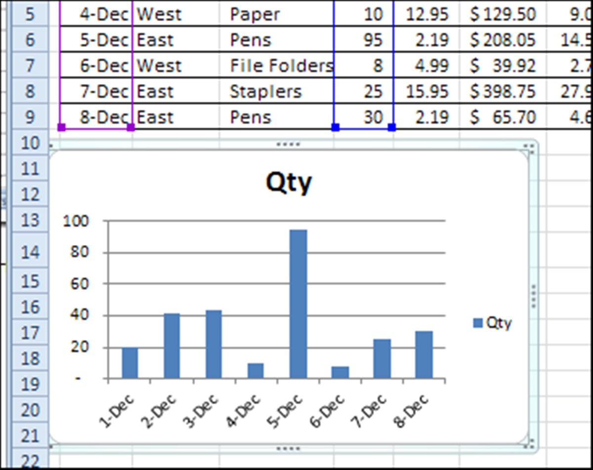
- Column Chart: This type of chart is ideal for comparing data across different categories. It displays vertical bars that represent the values, making it easy to identify trends and variations.
- Bar Chart: Similar to the column chart, the bar chart displays data horizontally. It is often used to compare values across different items or to show rankings.
- Line Chart: The line chart is perfect for showing trends and changes over time. It connects data points with a line, allowing you to observe patterns and fluctuations.
- Pie Chart: If you want to represent parts of a whole, the pie chart is a great choice. It displays data as slices of a pie, with each slice representing a percentage or proportion of the whole.
- Area Chart: The area chart is similar to the line chart, but the area beneath the line is filled with color. It is useful for showing cumulative variations or highlighting the extent of data values.
- Scatter Plot: This type of chart represents individual data points as dots. It is useful for identifying relationships and correlations between two variables.
- Bubble Chart: The bubble chart is a variation of the scatter plot, but with an additional dimension. It uses different-sized bubbles to represent data values, making it easier to visualize multiple variables.
- Radar Chart: The radar chart is ideal for comparing multiple data points across different categories. It displays data as a series of spokes from a central point, allowing you to identify strengths and weaknesses.
- Box and Whisker Plot: This chart type is used to display the distribution of a dataset. It shows the minimum, maximum, median, and quartiles, providing a visual summary of the data’s variability.
These are just a few examples of the chart types available in Excel. Each chart offers unique advantages, so choose the one that best suits your data and presentation goals. With Excel’s charting capabilities, you can transform raw data into meaningful visualizations that enhance your analysis and decision-making process.
Shortcut Keys for Creating Charts
Excel provides several shortcut keys to expedite the process of creating charts. These time-saving shortcuts allow you to quickly select data, insert charts, and perform various chart-related tasks. Here are some essential shortcut keys for creating charts in Excel:
- Alt + F1: Pressing Alt + F1 instantly creates a default chart based on the selected data range. This shortcut is a quick way to generate a basic chart without going through the chart creation wizard.
- F11: Pressing F11 creates a chart on a separate sheet using default settings. This shortcut is useful when you want to create a chart quickly without customizing it immediately.
- Alt + Shift + F1: This shortcut creates a new chart sheet with the chart type that you used previously. It saves you time by automatically duplicating the chart format.
- Alt + Shift + F11: Pressing these keys inserts a new chart sheet based on the default chart type. It is useful when you want to create a new chart quickly without referring to the previous settings.
- Alt + Arrow Keys: After selecting a chart, you can use the arrow keys to move the chart in small increments. This allows you to precisely position the chart within your worksheet.
- Alt + Shift + Arrow Keys: This shortcut resizes the selected chart by moving the top, bottom, left, or right edges. It enables you to adjust the chart’s size proportionally without distorting its appearance.
- F3: Pressing F3 displays the paste name dialog box. You can use this shortcut to assign a name to a chart or edit the existing chart name.
- F4: This shortcut repeats the last action performed in Excel, making it useful when you want to duplicate a chart or apply the same formatting to multiple charts.
These are just a few examples of the shortcut keys available in Excel for creating and working with charts. By mastering these shortcuts, you can significantly speed up your charting tasks and improve your productivity. Experiment with different combinations and explore other shortcuts to find the ones that work best for you.
Selecting Data for the Chart
Accurately selecting the data is a crucial step when creating a chart in Excel. The data you choose will determine the insights and visual representation of your chart. Here are some tips on selecting data for your chart:
- Range Selection: To select a range of data, simply click and drag the mouse over the cells that contain the information you want to include in the chart. Excel will automatically detect the range and highlight it.
- Non-Adjacent Data: If your data is not contiguous, hold the Ctrl key while selecting each range separately. This allows you to include multiple non-adjacent data ranges in a single chart.
- Entire Column or Row: You can also select an entire column or row by clicking on the column header or row number. This is useful when you have data organized in a column or row format.
- Named Ranges: Another way to select data is by using named ranges. By assigning a name to a specific data range, you can easily reference it when creating a chart.
- Dynamic Ranges: If your data range is expected to change or expand in the future, consider using dynamic ranges. Dynamic ranges automatically adjust based on the data entered, ensuring your chart is always up to date.
- Data with Headers: Including headers in your data selection provides context and improves the readability of your chart. Ensure that you select both the headers and the data when creating a chart.
- Filtered Data: If your data is filtered, be mindful of the selection. You can choose to include only the visible cells or the entire range, depending on your chart’s purpose.
Remember, selecting the right data is crucial for accurate and meaningful charting. Review your data carefully to ensure that it aligns with your charting objectives and accurately represents the story you want to convey.
Creating the Chart
Once you have selected the data for your chart, it’s time to create the chart itself. Excel offers various methods to create a chart, each catering to different preferences and requirements. Here are the steps to create a chart in Excel:
- Select Data: Start by selecting the range of data that you want to include in the chart. Make sure to include both the data and any relevant headers.
- Insert Chart: With the data selected, navigate to the “Insert” tab in the Excel ribbon. Click on the chart type you want to create, such as Column, Line, Pie, or Scatter. Alternatively, you can click the “Recommended Charts” button to explore chart suggestions based on your selected data.
- Choose Chart Layout: After selecting a chart type, Excel will insert the chart onto your worksheet. You can now choose a chart layout from the “Chart Design” tab, which allows you to modify chart elements, such as titles, legends, and axis labels.
- Format the Chart: Customize the appearance of your chart by formatting its various elements. You can change colors, fonts, borders, and other visual settings to match your preferences or the overall theme of your document.
- Chart Tools: Excel provides dedicated tabs, called “Chart Tools,” that offer additional options to refine and enhance your chart. The “Design,” “Layout,” and “Format” tabs provide access to various chart-related commands and settings.
- Update Chart Data: If your data changes or you want to include additional data in the chart, you can easily update the chart by modifying its data source. Right-click on the chart, select “Edit Data,” and make the necessary changes in the “Chart Data” window that appears.
- Move and Resize the Chart: To reposition the chart within your worksheet, click and drag it to the desired location. You can also resize the chart by clicking and dragging its edges or corners.
- Save and Share: Once you are satisfied with the chart, save your Excel workbook to preserve your chart and its data. You can share the workbook with others or export the chart as an image to use in other documents or presentations.
Creating a chart in Excel is a straightforward process that allows you to present and analyze your data visually. Experiment with different chart types, layouts, and formatting options to find the best representation for your data and effectively communicate your insights.
Modifying and Formatting the Chart
After creating a chart in Excel, you may need to modify and format it to enhance its visual appeal and effectively convey your data. Excel provides a wide range of tools and options to help you customize your chart to meet your specific needs. Here are some ways to modify and format your chart:
- Chart Elements: The chart elements, such as titles, legends, axes, and data labels, can all be modified to provide clarity and context to your chart. You can add, remove, or format these elements to make them more informative and visually appealing.
- Chart Styles: Excel offers a variety of pre-defined chart styles that allow you to quickly change the appearance of your chart. These styles apply different color schemes, fonts, and effects to make your chart stand out.
- Data Labels: Data labels can provide additional information about the data points in your chart. You can choose to display data labels for individual data points, as a series, or as a percentage of the whole, making it easier for viewers to interpret the chart.
- Chart Layout: The layout of your chart can be adjusted to optimize its visual impact. You can add or remove chart elements, change the axis scales, switch between different chart types, or modify the arrangement of the chart’s elements.
- Formatting Axes: The axis on your chart can be customized to improve readability. You can change the axis labels, format the tick marks, adjust the axis scales, and add gridlines to guide the viewer’s interpretation of the data.
- Chart Colors: Excel allows you to change the colors used in your chart to better suit your preferences or match the color scheme of your document. You can modify individual data series colors or apply a consistent color scheme to the entire chart.
- Chart Borders: Adding borders to your chart can help differentiate it from the surrounding content and provide a polished appearance. You can customize the border color, thickness, and style to suit your design needs.
- Chart Effects: Excel offers various graphic effects to enhance the visual impact of your chart. You can apply 3D effects, shadow effects, and transparency settings to make your chart visually compelling and engaging.
- Chart Title and Descriptions: Adding a descriptive title and axis labels to your chart can make it easier for viewers to understand the information being presented. You can customize the font, size, and alignment of the chart title and descriptions to improve readability.
By modifying and formatting your chart in Excel, you can transform it into a powerful data visualization tool. Experiment with different options, styles, and layouts to create a chart that effectively communicates your message and captivates your audience.
Moving and Resizing the Chart
After creating a chart in Excel, you may find the need to move or resize it to better fit your worksheet or presentation. Excel provides flexible options to adjust the position and size of your chart to ensure optimal placement and visual balance. Here’s how you can move and resize your chart:
- Moving the Chart: To move your chart, simply click and drag it to the desired location. Excel allows you to drag the chart within the same worksheet, or you can even move it to a different sheet by dragging it to the sheet tab.
- Resizing the Chart: Excel makes it easy to adjust the size of your chart according to your preferences. To resize the chart, click and drag one of the corners or edges. You can enlarge or shrink the chart proportionally by dragging the corners, or adjust the height or width individually by dragging the edges.
- Aligning and Snapping: As you move or resize the chart, Excel provides alignment guides and snapping features to help you align the chart with other worksheet elements. The chart will align with the column boundaries or other nearby objects, making it easier to create a visually balanced layout.
- Align to Cells: To align the chart to specific cells, you can utilize Excel’s alignment options. Right-click on the chart, go to “Format Chart Area,” and navigate to the “Size & Properties” tab. Here, you can enter the exact positions of the chart based on the cell measurements.
- Locking the Chart: If you want to ensure that your chart remains fixed in place, you can lock it. Right-click on the chart, select “Format Chart Area,” and go to the “Properties” tab. Enable the “Don’t move or size with cells” option to prevent accidental movement or resizing when you edit the worksheet.
- Chart Sheets: If you prefer to have your chart on a separate sheet, Excel allows you to move it to a dedicated chart sheet. Right-click on the chart, choose “Move Chart,” and select the option to move it to a new or existing chart sheet. This keeps your chart isolated from the rest of the worksheet contents.
By moving and resizing your chart in Excel, you can optimize its placement, enhance its visibility, and create a more polished and professional presentation of your data. Experiment with different positions and sizes to find the best arrangement for your chart within the worksheet or presentation.
Adding Titles and Labels to the Chart
Titles and labels provide important context and clarity to your chart, helping viewers understand the data being presented. Excel offers various options to add titles and labels to your chart, allowing you to enhance its readability and information value. Here’s how you can add titles and labels to your chart:
- Chart Title: A chart title provides an overall description or main idea of the chart. To add a chart title, click on the chart and go to the “Chart Design” tab. Choose the “Chart Title” option and select either “Above Chart” or “Centered Overlay Title.” You can then type in the title text and format it according to your preferences.
- Axis Titles: Axis titles specify the data represented by the chart’s X (horizontal) and Y (vertical) axes. To add an axis title, click on the respective axis and go to the “Chart Design” tab. Click on the “Axis Titles” option and select either “Primary Horizontal Axis Title” or “Primary Vertical Axis Title.” You can then enter the title text and customize its appearance.
- Data Labels: Data labels provide specific values or information for each data point in a chart. To enable data labels, click on the chart and go to the “Chart Design” tab. Click on the “Data Labels” option and choose the desired labeling format, such as showing values, percentages, or category names. You can further customize the data labels by adjusting their position, font, and other formatting options.
- Legend: A legend displays the labels or colors used to represent different data series or categories in the chart. To add or modify the legend, click on the chart and go to the “Chart Design” tab. Click on the “Legend” option and choose the desired position or format. You can also customize the font, size, and style of the legend text.
- Data Table: A data table presents the raw data behind the chart in tabular format. To include a data table, click on the chart and go to the “Chart Design” tab. Click on the “Data Table” option and select the desired display format. Excel will automatically generate a table within the chart, showing the corresponding data values.
- Data Label Format: Excel allows you to format the data labels individually based on criteria such as minimum, maximum, above average, or below average values. To format data labels, click on a data label and go to the “Format Data Labels” option. Choose the desired formatting options, such as font color, size, background color, or data value display format.
By adding titles and labels to your chart, you can significantly enhance its informative value and make it more accessible to viewers. Consider the specific information you want to convey and choose the appropriate titles and labels to ensure clarity and understanding.
Changing Chart Type
Excel provides the flexibility to change the chart type of your data to better represent and analyze it. By altering the chart type, you can explore different visualizations and perspectives that may provide deeper insights. Here’s how you can change the chart type in Excel:
- Select the Chart: Click on the chart that you want to modify to activate it. The “Chart Tools” tabs will appear in the Excel ribbon.
- Navigate to the “Design” Tab: Click on the “Design” tab under the “Chart Tools” section. This tab offers various options for modifying the chart’s appearance and structure.
- Click on the “Change Chart Type” Button: In the “Type” group on the “Design” tab, click on the “Change Chart Type” button. A dialog box will appear with a wide range of chart types to choose from.
- Explore Chart Types: In the “Change Chart Type” dialog box, you can see different chart categories on the left side, such as Bar, Column, Line, and Pie. Select a new chart type from the list in the center of the dialog box to see a preview on the right side.
- Preview the Changes: As you select different chart types, the preview on the right side of the dialog box will update to reflect the chosen chart type. Evaluate the visual representation of your data in each chart type and choose the one that best communicates your message and insights.
- Customize the Chart Type: Once you have selected a new chart type, you can customize it further by adjusting its settings. Use the options and tabs available in the dialog box to modify the chart’s elements, such as titles, legends, axes, and data labels.
- Apply the Changes: After customizing the new chart type to your satisfaction, click the “OK” button in the dialog box. Excel will update the chart with the new type and any associated settings or modifications.
- Review the Results: Take a moment to review the updated chart. Check if the new chart type is effectively representing your data and conveying the intended message. Make any necessary adjustments or repeat the process if you need to further modify the chart type.
By changing the chart type in Excel, you can explore different visualizations and perspectives to unlock deeper insights from your data. Experimenting with various chart types can help you find the most effective way to present and analyze your information.
Adding and Removing Data Series
Excel allows you to add and remove data series from your chart, giving you the flexibility to focus on specific data points or compare different sets of data. Adding or removing data series can help you highlight trends, identify relationships, or simplify your chart. Here’s how you can add and remove data series in Excel:
- Select the Chart: Click on the chart that you want to modify to activate it. The “Chart Tools” tabs will appear in the Excel ribbon.
- Navigate to the “Design” Tab: Click on the “Design” tab under the “Chart Tools” section. This tab provides various chart-related options and settings.
- Select Data: In the “Data” group on the “Design” tab, click on the “Select Data” button. A dialog box will open, displaying the current data series included in the chart.
- Add Data Series: To add a new data series, click on the “Add” button in the “Select Data Source” dialog box. In the “Edit Series” window, specify the series name and series values by selecting the range of cells containing the data. You can also edit the series values directly in the “Values” field.
- Remove Data Series: To remove an existing data series, select the series name in the “Select Data Source” dialog box. Click on the “Remove” button. The selected series will be deleted from the chart.
- Reorder Data Series: If you want to change the order of the data series, select the series in the “Select Data Source” dialog box and click on the “Move Up” or “Move Down” buttons. This allows you to adjust the sequence in which the data series are displayed in the chart.
- Edit Data Series: To modify the data range or series name of an existing series, select the series in the “Select Data Source” dialog box. Click on the “Edit” button. In the “Edit Series” window, you can update the series name or modify the range of cells for the series values.
- Apply the Changes: After making the desired additions or removals, click the “OK” button in the “Select Data Source” dialog box. Excel will update the chart accordingly, reflecting the changes in the data series.
- Review and Adjust: Take a moment to review the chart and ensure that the data series changes accurately represent your desired focus or comparison. Make any necessary adjustments or repeat the process if you need to further modify the data series.
By adding and removing data series in Excel, you have the ability to customize your chart based on specific data sets or analytical requirements. This flexibility enables you to highlight the most relevant information and create a visual representation that effectively communicates your intended message.
Changing Chart Layout and Style
Excel provides a variety of options to change the layout and style of your chart. By modifying the layout and applying different styles, you can enhance the visual appeal and clarity of your chart. Here’s how you can change the chart layout and style in Excel:
- Select the Chart: Click on the chart that you want to modify to activate it. The “Chart Tools” tabs will appear in the Excel ribbon.
- Navigate to the “Design” and “Format” Tabs: Depending on the specific changes you want to make, you’ll utilize the “Design” and “Format” tabs under the “Chart Tools” section. These tabs offer various options and settings for modifying the chart’s layout and style.
- Change Chart Layout: In the “Design” tab, you can choose from a variety of predefined chart layouts. Click on the “Quick Layout” button and select a layout that rearranges and organizes the chart elements, such as titles, legends, and labels, in a different configuration. This can help improve the readability and information flow of your chart.
- Apply Chart Styles: Excel provides a range of chart styles that you can apply to your chart to change its appearance. In the “Design” tab, click on the “Change Colors” or “Chart Styles” buttons to access a gallery of different color schemes and visual styles. Experiment with various styles to find the one that best suits your preferences or matches the overall color scheme of your document.
- Modify Individual Chart Elements: Excel allows you to customize specific chart elements to further enhance the layout and style. In the “Format” tab, you can select individual chart elements, such as titles, legends, axes, or data labels, and modify their formatting attributes. Use options like font, size, color, and alignment to achieve the desired effect.
- Apply Shape Styles and Effects: If you want to add additional visual impact to your chart, Excel provides shape styles and effects that you can apply. Access these options through the “Format” tab by selecting the chart elements and then clicking on the appropriate styles and effects buttons. This allows you to add 3D effects, shadows, glows, bevels, and other formatting options to make your chart visually engaging.
- Align and Position Chart Elements: In addition to changing the layout and style, you can also fine-tune the alignment and positioning of individual chart elements. Use options in the “Format” tab, such as aligning text, adjusting margins, and managing object properties, to achieve precise control over the placement of titles, legends, and labels.
- Save Chart Layout as a Template: If you have customized the layout and style to your liking, you can save it as a chart template. In the “Design” tab, click on the “Save as Template” button, choose a location to save the template, and give it a descriptive name. This allows you to apply the same layout and style to other charts in the future.
By changing the chart layout and style in Excel, you can transform your chart into a visually appealing and professional representation of your data. Experiment with different options, layouts, and styles to find the best combination that effectively communicates your message and captivates your audience.
Customizing Chart Axis
Excel allows you to customize the chart axis to better represent and interpret your data effectively. By customizing the chart axis, you can refine the scale, labels, and appearance of the axis to enhance the readability and understanding of your chart. Here’s how you can customize the chart axis in Excel:
- Select the Chart Axis: Click on the chart to activate it. Then, click on the specific axis (X-axis or Y-axis) that you want to customize. The “Chart Tools” tabs will appear in the Excel ribbon.
- Navigate to the “Format” Tab: Click on the “Format” tab under the “Chart Tools” section. This tab offers various options and settings for modifying the chart axis.
- Adjust Axis Scale: In the “Format” tab, you can modify the scale of the chart axis to better suit your data. Click on the “Axis Options” button to access settings such as minimum and maximum values, intervals, and logarithmic scale. Adjust these options as needed to ensure that the axis scale effectively represents the data range.
- Edit Axis Labels: You can customize the labels on the chart axis to provide more meaningful and descriptive information. In the “Format” tab, click on the “Axis Titles” button to access options for editing the axis labels. Modify the axis label text, font, size, alignment, and orientation to improve clarity and readability.
- Rotate Axis Text: Excel allows you to rotate the text on the chart axis to accommodate long labels or improve alignment. In the “Format” tab, click on the “Text Options” button under “Axis Options” to adjust the rotation angle of the axis text. Experiment with different angles to find the most visually appealing and informative orientation.
- Format Tick Marks and Gridlines: Tick marks and gridlines help the viewer interpret the data on the chart axis. In the “Format” tab, you can modify the appearance of tick marks, including their length, thickness, color, and style. You can also add or remove gridlines to guide the viewer’s interpretation of the data points.
- Display Axis Titles: Axis titles provide additional context and information about the data represented on the chart axis. In the “Format” tab, enable the display of axis titles by clicking on the “Axis Titles” button. Customize the axis title text, font, size, and alignment to clearly convey the axis’s purpose.
- Hide or Show Axis: In certain cases, you may want to hide an axis if it is unnecessary or if you want to focus on a specific aspect of the chart. In the “Format” tab, enable or disable the display of a particular axis by clicking on the “Axis Options” button and selecting the appropriate checkbox for hiding or showing the axis.
- Apply Other Axis Formatting: Excel offers additional formatting options for the chart axis, such as line thickness, colors, and effects. In the “Format” tab, explore the available options to customize the appearance of the axis line, including its color, thickness, and style. Applying formatting can help differentiate the axis from the other elements in the chart and give it a cohesive design.
Customizing the chart axis in Excel allows you to tailor the display and presentation of your data to align with your objectives and audience. Take advantage of the numerous customization options to create a chart that effectively communicates your data and insights.
Adding Trendlines and Error Bars
Excel allows you to enhance your charts by adding trendlines and error bars. These features provide valuable insights and help visualize trends and variances in your data. By adding trendlines and error bars, you can strengthen the analysis and presentation of your chart. Here’s how you can incorporate them in Excel:
- Select the Data Series: Click on the chart to activate it. Then, click on the specific data series to which you want to add a trendline or error bars. The “Chart Tools” tabs will appear in the Excel ribbon.
- Navigate to the “Design” or “Layout” Tab: Depending on the version of Excel, you will find the options for adding trendlines and error bars either in the “Design” or “Layout” tab under the “Chart Tools” section.
- Adding Trendlines: To add a trendline, click on the “Design” or “Layout” tab, and locate the “Add Chart Element” group. Click on the “Trendline” button and choose the desired trendline type, such as linear, exponential, or moving average. Excel will add the trendline to the selected data series in the chart.
- Customizing Trendlines: You can further customize the appearance and behavior of the trendline. Click on the trendline in the chart to activate it, and then right-click to access the formatting options. You can modify the trendline type, line style, color, thickness, and more to suit your preferences and requirements.
- Adding Error Bars: To add error bars, click on the “Design” or “Layout” tab, and locate the “More Chart Elements” group. Click on the “Error Bars” button and choose the desired error bar type, such as standard deviation, percentage, or custom. Excel will add error bars to the selected data series, representing the variability or uncertainty in the data.
- Customizing Error Bars: You can adjust the appearance and behavior of the error bars. Click on the error bars in the chart to activate them, and then right-click to access the formatting options. You can modify the error bar type, direction, line style, color, thickness, cap style, and other aspects to enhance their visibility and meaning.
- Changing Error Bar Values: Depending on the error bar type chosen, you may need to specify the error bar values. After adding the error bars, right-click on the error bars and select “Format Error Bars.” In the dialog box that appears, you can enter the values or formulas for the error bar range or select the range directly from your worksheet.
- Updating Trendlines and Error Bars: If your data changes or you want to adjust the trendlines or error bars, you can easily update them. Right-click on the trendline or error bars and choose “Format Trendline” or “Format Error Bars,” respectively. Make the necessary changes or modifications in the formatting options window that appears.
- Removing Trendlines or Error Bars: If you no longer want to display trendlines or error bars, you can remove them from the chart. Click on the trendline or error bars to select them and press the delete button or right-click and choose “Delete” or “Remove.” This will remove the trendline or error bars from the chart.
By adding trendlines and error bars to your charts in Excel, you can provide additional insights into your data and enhance the understanding of trends and uncertainties. Experiment with different trendline types and error bar configurations to effectively analyze and communicate your data.
Adding Data Labels to the Chart
Data labels play a crucial role in conveying specific information about data points in a chart. They provide clarity and make it easier for viewers to interpret the values represented. Excel allows you to add data labels to your chart in a variety of formats, allowing for a more comprehensive understanding of your data. Here’s how you can add data labels to your chart:
- Select the Chart: Click on the chart to activate it. The “Chart Tools” tabs will appear in the Excel ribbon.
- Navigate to the “Design” or “Layout” Tab: Depending on the version of Excel, you will find the options for adding data labels either in the “Design” or “Layout” tab under the “Chart Tools” section.
- Adding Data Labels: To add data labels to your chart, click on the “Design” or “Layout” tab and locate the “Chart Elements” or “Labels” group. Find the “Data Labels” button and click on it. Excel will add default data labels to the chart, usually displaying the values of the data points.
- Customizing Data Labels: You can customize the appearance and format of data labels to suit your needs. Right-click on any data label in the chart and select “Format Data Labels” or “Edit Data Labels.” A formatting options window will appear, allowing you to modify the label text, font, size, number format, position, and more.
- Selecting Specific Data Labels: If you want to add or customize data labels selectively, you can choose individual data series or data points. Activate the chart, then select a specific data series or data point by clicking directly on it. Right-click on the selection, choose “Add Data Labels,” and the labels will appear only for the selected data.
- Displaying Additional Information: In addition to the default values, you can choose other information to display in the data labels. The formatting options window allows you to customize the label content, such as displaying category names, series names, percentages, or a combination of these options.
- Data Label Positioning: Excel offers various positioning options for data labels, ensuring they don’t overlap or clutter the chart. You can choose to position the labels above, below, inside, or outside the data points. Experiment with different label positions to find the most visually appealing and informative arrangement.
- Updating Data Labels: If your data changes or you want to modify the data labels, you can easily update them. Right-click on any data label and choose “Format Data Labels” or “Edit Data Labels” to access the formatting options window. Make the necessary changes or modifications to the labels’ appearance or content.
- Removing Data Labels: If you no longer want to display data labels in your chart, you can remove them. Right-click on any data label, select “Format Data Labels” or “Edit Data Labels,” and uncheck the checkbox next to “Data Labels” in the formatting options window. This will remove all data labels from the chart.
By adding data labels to your chart in Excel, you can provide valuable insights and make your data more accessible. Experiment with different formatting options and label settings to effectively communicate the information in your chart.
Adding and Editing Chart Legends
A chart legend helps viewers understand the different elements or data series in a chart. It provides key information about the colors, patterns, or labels used in the chart, making it easier to interpret the data. Excel allows you to add and edit chart legends, providing you with control over the content and appearance of the legend. Here’s how you can add and edit chart legends in Excel:
- Select the Chart: Click on the chart to activate it. The “Chart Tools” tabs will appear in the Excel ribbon.
- Navigate to the “Design” or “Layout” Tab: Depending on the version of Excel, you will find the options for adding and editing legends either in the “Design” or “Layout” tab under the “Chart Tools” section.
- Adding a Chart Legend: To add a legend to your chart, click on the “Design” or “Layout” tab. Locate the “Legend” button and click on it. Excel will insert a default legend into the chart, usually positioned to the right or below the chart area.
- Customizing the Chart Legend: You can customize the content and appearance of the legend to suit your needs. Right-click on the legend and select “Format Legend” or “Edit Legend.” A formatting options window will appear, allowing you to modify the legend’s text, font, size, position, orientation, and other formatting properties.
- Formatting Legend Entries: If your chart has multiple data series, you can format individual legend entries to make them stand out or provide additional information. Right-click on a legend entry and choose “Format Legend Entry” or “Edit Legend Entry.” You can customize the formatting options for the selected entry, such as changing the label text, font, size, color, or marker style.
- Reordering Legend Entries: To change the order of the legend entries, click and drag an entry to a new position. This can be useful when you want to emphasize a specific data series or change the presentation order of the legend to align with the chart’s visual flow.
- Removing a Chart Legend: If you don’t want to display a legend in your chart, you can remove it. Right-click on the legend and select “Delete Legend” or “Remove Legend.” This will remove the legend from the chart, so viewers will need to rely on other chart elements (such as data labels or annotations) to interpret the chart.
- Updating the Chart Legend: If your chart data changes or you want to modify the legend, you can easily update it. Right-click on the legend and select “Format Legend” or “Edit Legend.” Make the necessary changes or modifications to the legend’s content, appearance, or formatting options in the formatting options window.
- Legend Position and Layout: Excel offers various options to position the legend within the chart area. You can choose to position the legend at the top, bottom, left, or right of the chart. Additionally, you can set the layout to overlay the chart or float above it, depending on your preference and the available space in your worksheet.
By adding and editing chart legends in Excel, you can enhance the clarity of your chart and make it easier for viewers to understand the data. Customize the content, appearance, and positioning of the legend to effectively convey the information and insights in your chart.
Using Chart Filters
Excel offers chart filters, which allow you to selectively display or hide specific data series or categories in your chart. Using chart filters provides a powerful way to focus on specific data points or to highlight relevant information. By applying filters, you can easily analyze and visualize different subsets of data within your chart. Here’s how you can use chart filters in Excel:
- Select the Chart: Click on the chart to activate it. The “Chart Tools” tabs will appear in the Excel ribbon.
- Navigate to the “Design” or “Layout” Tab: Locate the “Design” or “Layout” tab under the “Chart Tools” section. The specific location may vary depending on the Excel version you are using.
- Applying Chart Filters: In the “Design” or “Layout” tab, locate the “Select Data” or “Filter” button. Click on it to access the chart filtering options. Excel will open the “Select Data Source” or “Filter” dialog box.
- Hiding Data Series: In the “Select Data Source” or “Filter” dialog box, you can hide specific data series by unchecking their checkboxes. This allows you to remove the visibility of particular series in the chart without deleting the data.
- Showing Data Series: If you previously hid certain data series and want to show them again, go to the “Select Data Source” or “Filter” dialog box. Simply check the checkboxes next to the series you want to display, and Excel will include them in the chart.
- Filtering Categories: Excel also allows you to filter categories or data points by choosing specific categories to display in the chart. In the “Select Data Source” or “Filter” dialog box, click on the “Edit” button next to the category axis labels. Specify the range or individual categories you want to display, and Excel will update the chart accordingly.
- Customizing Chart Filters: Excel provides additional customization options for chart filters. In the “Select Data Source” or “Filter” dialog box, you can rearrange the order of data series or categories by clicking on the “Move Up” or “Move Down” buttons. This allows you to control the presentation and hierarchy of the data in your chart.
- Updating Chart Filters: If your data changes or you want to modify the filter settings, you can easily update them. Open the “Select Data Source” or “Filter” dialog box by clicking on the “Select Data” or “Filter” button. Make the necessary changes to the filter checkboxes or category range, and Excel will adjust the chart accordingly.
- Removing Chart Filters: If you no longer want to apply any filters to your chart, you can remove them. Open the “Select Data Source” or “Filter” dialog box and click on the “Clear” or “Remove All” button. This will reset the chart to display all data series and categories.
By using chart filters in Excel, you can focus on specific data series or categories, effectively analyze subsets of data, and emphasize important information within your chart. Experiment with different filtering options to highlight the desired data and generate valuable insights.
Using Quick Analysis Tools
Excel provides quick analysis tools that offer a range of automated analysis and visualization features. These tools are designed to help you explore, summarize, and visualize your data quickly and effortlessly. By utilizing the quick analysis tools, you can save time and gain valuable insights from your data. Here’s how you can use the quick analysis tools in Excel:
- Select Your Data: Highlight the data range that you want to analyze or visualize. This can be a table, a column, a row, or a combination of data in your worksheet.
- Activate Quick Analysis Tools: Once you have selected your data, you will notice a small icon appearing in the bottom right corner of the selected range. Click on this icon to activate the quick analysis tools.
- Access Analysis Options: The quick analysis tools menu will open, providing various options for analyzing and visualizing your data. This menu is divided into several sections, including formatting, charts, tables, totals, and sparklines.
- Apply Formatting: In the formatting section of the quick analysis tools menu, you can instantly apply formatting options, such as conditional formatting, color scales, data bars, and icon sets. This allows you to highlight trends, patterns, and outliers in your data.
- Create Charts: The charts section of the quick analysis tools menu enables you to create charts based on your selected data. It presents various chart types, such as column, line, pie, and scatterplot, allowing you to select the most suitable visualization for your data.
- Generate Tables: Within the tables section of the quick analysis tools menu, you can quickly create pivot tables and data tables. Pivot tables help you summarize and analyze large datasets, while data tables provide a tabular representation of your data for easy reference and analysis.
- Add Totals: The totals section allows you to calculate totals for rows or columns in your selected data. This option is useful when you want to quickly obtain sum, average, count, minimum, or maximum values without having to manually apply formulas.
- Create Sparklines: Sparklines, found within the sparklines section, are miniaturized charts that fit within individual cells. With a single click, you can create sparklines to represent trends in your data, such as line sparklines for trend analysis or column sparklines for comparing values.
- Explore More Options: In addition to the aforementioned sections, the quick analysis tools menu also provides other options, including conditional formatting recommendations, smart art, and calculations. These features can help you explore alternative ways to analyze and visualize your data quickly.
- Customize and Fine-Tune: Once you have applied a quick analysis tool, you can further customize and fine-tune the analysis or visualization to suit your specific needs. Excel offers a range of formatting and customization options for each tool, providing flexibility and control over the final result.
By utilizing the quick analysis tools in Excel, you can quickly analyze and visualize your data, saving time and gaining valuable insights. Experiment with the different tools and options to effectively present and interpret your data in a variety of formats.
Creating and Formatting Sparklines
Sparklines are miniaturized charts that can be created within individual cells in Excel. They provide a condensed visualization of data trends within a small space, making it easier to quickly identify patterns and changes. Excel offers various types of sparklines, such as line sparklines, column sparklines, and win/loss sparklines. Here’s how you can create and format sparklines in Excel:
- Select the Cell: Click on the cell where you want to create the sparkline. This cell will be the location of the sparkline you are about to create.
- Navigate to the “Insert” or “Design” Tab: Depending on your version of Excel, you will find the sparkline options either in the “Insert” or “Design” tab under the “Sparklines” section.
- Create a Sparkline: In the “Insert” or “Design” tab, locate the sparkline buttons. Click on the appropriate button based on the type of sparkline you want to create – line, column, or win/loss. Excel will prompt you to select the data range for the sparkline by highlighting the range on your worksheet.
- Format the Sparkline: Once you have created the sparkline, you can format it to suit your preferences and enhance its visual appeal. Right-click on the sparkline and select “Format Sparkline” or “Edit Sparkline.” This opens the formatting options window, where you can customize the sparkline’s appearance, including line color, style, width, marker shape, and color.
- Customize Sparkline Axis: Excel also allows you to customize the axis and scale of the sparkline. Right-click on the sparkline and choose “Edit Data” or “Data Range.” In the “Edit Sparkline” dialog box, adjust the axis range and maximum/minimum axis values to best fit your data and provide optimal visualization.
- Create Group Sparklines: Excel lets you create group sparklines to display multiple sparklines in a compact format. Select a range of cells where you want to create the group sparklines. In the “Insert” or “Design” tab, choose the desired sparkline type, and Excel will create individual sparklines for each row or column of the data range.
- Modify Group Sparkline Options: You can further modify the group sparkline by right-clicking on any sparkline within the group and selecting “Sparkline Group.” This allows you to adjust the group sparkline options, such as axis ranges, display settings, and formatting.
- Update Sparklines: If your data changes or you want to adjust the sparklines, you can update them easily. Activatethe sparkline(s) and open the sparkline options. Make the necessary changes or choose the new data range, and Excel will update the sparklines accordingly.
- Delete Sparklines: If you no longer need the sparklines, you can easily delete them. Right-click on a sparkline or select a group of sparklines, and choose “Clear” or “Delete.” This will remove the sparklines from the worksheet.
By creating and formatting sparklines in Excel, you can effectively visualize trends and changes in your data within small cells. Experiment with different sparkline types and formatting options to make your data more visually appealing and easily understandable.
Updating and Refreshing the Chart
As your data changes or updates, it is important to update and refresh the chart in Excel to ensure that it accurately reflects the latest information. Excel provides various methods to update and refresh the chart, allowing you to stay up-to-date with the latest data changes. Here’s how you can update and refresh the chart in Excel:
- Change the Data Range: If your data range has expanded or shifted, you can update the chart by modifying the data range. Right-click on the chart and select “Select Data” or “Edit Data Source.” In the “Select Data Source” or “Edit Series” dialog box, adjust the range references or select the new range that includes the updated data.
- Edit Data Values: If individual data values have changed, you can directly edit the data points in the worksheet. Click on the chart, locate the data series, and modify the values in the worksheet cells. The chart will automatically update to reflect the changes you made to the data.
- Use Excel Tables: If your data is in an Excel table, any changes or additions made to the table will automatically update the chart. Excel tables are dynamic, and the chart will refresh whenever there’s a change in the table’s data range.
- Refresh External Data Connections: If your chart is linked to an external data source, such as a database or web query, you need to refresh the data connection to update the chart. Right-click on the chart and select “Refresh” or “Update Data” to pull the latest information.
- Use Formulas: If your chart uses formulas to derive values, such as in a calculated column, you need to update the formulas when the underlying data changes. Ensure that the formulas are correctly referencing the updated data range or cells.
- Press F9: If you made changes to the data or the formulas and want to manually update the chart, you can press the F9 key on your keyboard. This will recalculate and refresh the chart based on the updated data and formulas.
- Auto-Refresh: Excel offers an auto-refresh functionality for certain types of data connections, such as PivotTables or Power Query. You can set the refresh interval to automatically update the chart at regular intervals, ensuring that the chart always displays the latest information.
- Save and Reopen the Workbook: As a last resort, if the chart is not updating or reflecting the changes, save the workbook and close it. Then reopen the workbook, and the refreshed version of the chart should accurately reflect the updated data.
Updating and refreshing the chart in Excel is crucial to reflect the latest changes in your data. Utilize the appropriate methods to update the chart, whether by modifying the data range, editing data values, refreshing connections, or recalculating formulas, ensuring your chart remains accurate and reflects the most up-to-date information.