
Choosing the Right Type of Graph
When it comes to creating a graph in Microsoft Word, selecting the right type of graph is crucial. The type of graph you choose will depend on the data you want to represent and the message you want to convey. Here are a few popular types of graphs and when to use them:
- Line Graph: A line graph is useful for showing trends and changes over time. It is especially effective for displaying continuous data, such as stock market prices or temperature fluctuations.
- Bar Graph: Bar graphs are ideal for comparing data across different categories. Use this type of graph when you want to compare sales figures for different products or the population of different cities.
- Pie Chart: A pie chart is perfect for illustrating proportions or percentages. It is commonly used to show market shares or the distribution of different types of expenses in a budget.
- Scatter Plot: Scatter plots are best suited for showing the relationship between two variables. Use this type of graph when you want to highlight patterns or correlations in data.
- Area Graph: Area graphs are similar to line graphs but are filled with color to represent different categories. They are particularly useful for showing cumulative data, such as total sales over time for different products.
Consider the nature of your data and the story you want to tell. Choosing the appropriate graph type can make your data more accessible and visually appealing to your audience.
Remember, in addition to these main graph types, Microsoft Word offers various other graph options, such as histograms, bubble charts, and radar charts. Explore these options and select the one that best fits your data and message.
Now that you have a clear understanding of the different graph types, let’s move on to the next step.
Selecting and Preparing the Data
Before creating a graph in Microsoft Word, it is essential to carefully select and prepare the data you want to depict. This ensures accuracy in your graph and meaningful representation of the information. Follow these steps to select and prepare your data:
- Identify the Key Variables: Determine the variables you want to showcase in your graph. These could be sales figures, survey responses, or any other relevant data points.
- Collect and Organize the Data: Gather the data for each variable and organize it in a spreadsheet or table format. This will help in easy data entry and manipulation in Microsoft Word.
- Clean and Format the Data: Remove any unnecessary rows or columns and ensure that the data is in the correct format. For example, if you have dates, make sure they are formatted as dates in the document.
- Check for Errors and Outliers: Review the data for any errors, missing values, or outliers. Correct any mistakes and ensure that your data is accurate.
- Calculate Summary Statistics: Compute summary statistics, such as means, medians, or standard deviations, if applicable. These can provide additional insights and context to your graph.
Once you have prepared your data, you are ready to insert a graph into Microsoft Word. Remember, a well-prepared dataset leads to a clear and visually appealing graph that effectively communicates your message to your audience. Take the time to ensure the accuracy and integrity of your data before proceeding to the next step.
In the next section, we will learn how to insert a graph into Microsoft Word and customize its design.
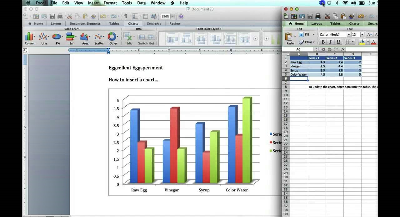
Inserting a Graph into Microsoft Word
Now that you have your data prepared, it’s time to insert a graph into Microsoft Word to visualize your information effectively. Follow these steps to insert a graph:
- Open the Document: Open a new or existing Word document where you want to insert the graph.
- Place the Cursor: Position the cursor at the location in the document where you want the graph to appear.
- Go to the Insert Tab: Click on the “Insert” tab in the Word ribbon, located at the top of the window.
- Select Chart: Within the “Charts” group, click on the “Chart” button. A gallery of chart types will appear.
- Choose a Chart Type: Browse through the various chart options and choose the type that best suits your data, such as a line graph, bar graph, or pie chart.
- Insert Chart: After selecting the chart type, click on the “OK” button. A blank chart will be inserted into the document.
Once the chart is inserted, you can customize it further, such as adding and editing data, modifying the design, and labeling the graph elements. Clicking on the chart will display the “Chart Tools” tab in the Word ribbon, allowing you to perform various operations on the graph.
Remember to refer back to your carefully prepared data to enter the correct values into the chart. Microsoft Word provides options to manually input the data or link the graph to an existing spreadsheet or table for automatic updates.
By following these steps, you can easily insert a graph into your Word document and begin visualizing your data. In the next section, we will explore how to customize the design of the graph.
Customizing the Graph Design
Once you have inserted a graph into Microsoft Word, you have the flexibility to customize its design according to your preferences and the requirements of your document. Here are some ways you can customize the design of your graph:
- Changing the Chart Type: If you decide that a different chart type would better represent your data, you can easily change it. Select the chart and go to the “Chart Design” tab in the Word ribbon. Click on the “Change Chart Type” button to explore different chart options for your data.
- Modifying Colors and Styles: Customize the colors and styles of the chart elements to make them visually appealing and cohesive with your document’s theme. Use the “Chart Styles” and “Chart Color” options available in the “Chart Design” tab to make these modifications.
- Adding Chart Elements: Enhance the clarity and readability of your graph by adding chart elements such as a title, axis labels, legends, or data labels. These options can be found under the “Chart Layout” and “Chart Format” tabs in the Word ribbon.
- Adjusting the Chart Layout: Fine-tune the layout of your graph by resizing or repositioning the chart area, axis, or legend. Resize and align the elements to ensure a balanced look and optimize the space within your document.
- Applying Special Effects: Microsoft Word allows you to apply various special effects to your graph, such as shadow, glow, or reflection, to make it visually more appealing. Experiment with these effects in the “Chart Styles” and “Chart Format” tabs to find the desired visual enhancement.
Remember, the goal of customizing the design is to make your graph visually engaging and easy to interpret. Avoid cluttering the graph with excessive elements or unnecessarily complex design choices, as it may distract from the main message of your data.
Once you are satisfied with the design of your graph, you can move on to the next step of editing the data within the graph, which we will explore in the following section.
Editing the Data in the Graph
After inserting a graph into Microsoft Word, you may need to make changes to the data represented in the graph. Whether you want to update the values, add or remove data points, or adjust the range, Microsoft Word offers easy-to-use editing capabilities. Follow these steps to edit the data in your graph:
- Select the Graph: Click on the graph to select it. The “Chart Tools” tab will appear in the Word ribbon.
- Edit the Data: In the “Chart Tools” tab, go to the “Design” or “Format” tab, depending on the version of Microsoft Word you are using. Look for the “Source Data” or “Edit Data” option and click on it. A dialog box will open, displaying the data used to create the graph.
- Make Changes: In the data dialog box, you can make various changes to the graph data. You can modify the values, add or delete rows or columns, change labels, and update the data range to include new or exclude existing data points.
- Apply Changes: Once you have made the necessary edits, click on the “OK” button to close the data dialog box. The graph will automatically update with the new data.
Editing the data in your graph allows you to ensure that your visual representation accurately reflects the information you want to convey. It is particularly useful when working with dynamic datasets or when you need to make real-time updates to the graph.
Remember to double-check your changes and verify that the graph accurately reflects the updated data before finalizing your document. By editing the data within the graph, you can maintain the integrity and relevance of your visual representation.
Next, we will explore how to add titles and labels to your graph to provide context and make it more informative.
Adding Titles and Labels to the Graph
Titles and labels play a crucial role in adding context and clarity to your graph in Microsoft Word. By providing informative titles and properly labeling the graph elements, you can help your audience understand the data being presented. Follow these steps to add titles and labels to your graph:
- Select the Graph: Click on the graph to select it. The “Chart Tools” tab will appear in the Word ribbon.
- Add a Chart Title: In the “Chart Tools” tab, go to the “Layout” or “Format” tab, depending on the version of Microsoft Word you are using. Look for the “Chart Title” option and click on it. You can then add a title to your graph by typing it in the provided space.
- Label the Axes: In the same “Layout” or “Format” tab, locate the “Axis Titles” option. Click on it to reveal sub-options for labeling the horizontal and vertical axes of the graph. Enter the appropriate labels to define the axes.
- Add Data Labels: To display the values of individual data points directly on the graph, select the graph and go to the “Layout” or “Format” tab. Find the “Data Labels” option and enable it to show the values for each data point.
- Include a Legend: If your graph contains multiple datasets or series, consider adding a legend to clarify which colors or patterns correspond to which data. Look for the “Legend” option in the “Layout” or “Format” tab and choose the desired positioning and formatting.
By adding titles and labels to your graph, you provide valuable context and ensure that your audience understands the information being presented. Clear and concise titles, axis labels, data labels, and legends make it easier for viewers to interpret your graph accurately.
After adding titles and labels, you can customize other aspects of your graph, such as adjusting the axes and gridlines, changing colors and styles, or adding trendlines and error bars.
In the next section, we will explore how to make these adjustments to further enhance the visual representation of your graph.
Adjusting the Axes and Gridlines
One important aspect of graph customization in Microsoft Word is adjusting the axes and gridlines. By making changes to these elements, you can enhance the clarity and readability of your graph. Follow these steps to adjust the axes and gridlines:
- Select the Graph: Click on the graph to select it. The “Chart Tools” tab will appear in the Word ribbon.
- Modify the Axes: In the “Chart Tools” tab, go to the “Layout” or “Format” tab, depending on the version of Microsoft Word you are using. Look for the “Axes” option and click on it. From here, you can make various adjustments, such as determining the range and scale of the axes, changing the labeling format, or choosing logarithmic or linear scales.
- Show or Hide Gridlines: Gridlines help to guide the eye and make it easier to interpret the data points. To toggle the visibility of gridlines, select the graph and go to the “Layout” or “Format” tab. Locate the “Gridlines” option and choose whether to show or hide major and minor gridlines for each axis.
- Format the Gridlines: If you decide to keep the gridlines visible, you can further customize their appearance. Select the graph and go to the “Layout” or “Format” tab. Look for the “Gridlines” option and choose to format the color, style, or thickness of the gridlines as desired.
Adjusting the axes allows you to accurately represent the data range and highlight the important details on your graph. Gridlines, when used effectively, improve readability and aid in data interpretation. By customizing these elements, you can create a graph that effectively communicates your message to your audience.
Once you have adjusted the axes and gridlines, you can further refine the appearance of your graph by changing the color and style or adding data labels and legends.
In the next section, we will explore these additional customization options to create a visually appealing and informative graph.
Changing the Color and Style of the Graph
Customizing the color and style of your graph in Microsoft Word can significantly enhance its visual appeal and make it more engaging to your audience. By using appropriate colors and styles, you can highlight important data points and create a cohesive aesthetic. Follow these steps to change the color and style of your graph:
- Select the Graph: Click on the graph to select it. The “Chart Tools” tab will appear in the Word ribbon.
- Modify the Chart Styles: In the “Chart Tools” tab, go to the “Design” or “Format” tab (depending on your Word version). Look for the “Chart Styles” option and click on it. Here, you can choose from a variety of pre-designed styles to instantly update the appearance of your graph.
- Change the Chart Colors: To further customize the color scheme, select the graph and go to the “Design” or “Format” tab. Look for the “Chart Styles” option and click on “Change Colors.” From the color palette, choose a new color scheme that complements your document or conveys the desired mood.
- Apply Chart Effects: For more advanced customization, select the graph and go to the “Design” or “Format” tab. Look for the “Chart Styles” option and click on “Chart Effects.” Here, you can apply various effects like shadows, reflections, glows, or bevels to add depth and dimension to your graph.
- Manually Adjust Colors and Styles: If you prefer a more tailor-made approach, you can manually adjust the colors and styles of individual elements in your graph. Select the graph, and then select the specific element you want to modify, such as data series, data points, or graph backgrounds. Use the formatting options in the “Chart Design” or “Chart Format” tabs to change the colors, borders, fills, and other style attributes.
By changing the color and style of your graph, you can create a visually compelling representation of your data. Choose a color scheme that matches your document theme or branding, and use styles that enhance the overall look and feel. Consistency and coherence in the color and style choices will make the graph more appealing and easier to interpret.
Once you have customized the colors and styles, consider adding data labels, legends, trendlines, and error bars to provide additional insights to your audience.
In the next section, we will explore how to incorporate these elements into your graph to enhance its informational value.
Adding Data Labels and Legends
Adding data labels and legends to your graph in Microsoft Word can provide valuable context and make it easier for viewers to interpret the information being presented. Data labels allow you to display the exact values of individual data points, while legends clarify the meaning of different elements within your graph. Follow these steps to add data labels and legends:
- Select the Graph: Click on the graph to select it. The “Chart Tools” tab will appear in the Word ribbon.
- Add Data Labels: In the “Chart Tools” tab, go to the “Layout” or “Format” tab, depending on the version of Microsoft Word you are using. Locate the “Data Labels” option and click on it. Choose the desired position for the data labels, such as above, below, inside, or outside the data points.
- Customize Data Labels: To further customize the appearance of the data labels, select the graph and go to the “Layout” or “Format” tab. Locate the “Data Labels” option and click on “More Options” or “Label Options.” From there, you can modify the font, size, color, and other formatting settings of the data labels.
- Add a Legend: To add a legend to your graph, go to the “Layout” or “Format” tab and locate the “Legend” option. Click on it and choose the desired position, such as top, bottom, left, or right of the graph. The legend will automatically appear, representing the different datasets or series in your graph.
- Customize the Legend: If needed, you can further customize the legend’s appearance. Select the graph, go to the “Layout” or “Format” tab, and find the “Legend” option. Click on “More Options” or “Legend Options” to modify the font, size, color, alignment, and other formatting properties of the legend.
By adding data labels and legends, you provide critical information to your audience, allowing them to understand and interpret the data more accurately. Data labels can help identify specific values, while legends clarify the meaning and differentiate between different elements within the graph.
Remember to ensure that your data labels and legends are clear and legible. Choose appropriate font sizes and colors to make them easily readable, and position them in a way that does not obstruct or clutter the graph.
In the next section, we will explore how to add trendlines and error bars to your graph to provide additional analytical insights.
Adding Trendlines and Error Bars
When creating a graph in Microsoft Word, the addition of trendlines and error bars can provide valuable analytical insights to your data. Trendlines help identify patterns or trends in your data, while error bars indicate the variability or uncertainty associated with the values. Follow these steps to add trendlines and error bars to your graph:
- Select the Graph: Click on the graph to select it. The “Chart Tools” tab will appear in the Word ribbon.
- Add a Trendline: In the “Chart Tools” tab, go to the “Layout” or “Format” tab, depending on the version of Word you are using. Locate the “Trendline” option and click on it. Choose the type of trendline you want to add, such as linear, exponential, logarithmic, or polynomial.
- Customize the Trendline: Once the trendline is added, you can further customize its appearance. Select the trendline and go to the “Layout” or “Format” tab. Use the various formatting options available to modify the color, line style, thickness, and other properties of the trendline.
- Add Error Bars: To add error bars to your graph, select the graph and go to the “Layout” or “Format” tab. Locate the “Error Bars” option and click on it. Choose the type of error bars you want to display, such as standard deviation, standard error, or custom.
- Customize Error Bars: Once the error bars are added, you can customize their appearance. Select the error bars and go to the “Layout” or “Format” tab. Use the available formatting options to modify the style, color, width, and other properties of the error bars.
The addition of trendlines and error bars can offer valuable insights into the patterns, correlations, and uncertainties within your data. Trendlines make it easier to identify trends or forecast future values, while error bars help visualize the variability or margin of error associated with each data point.
Remember to use trendlines and error bars judiciously, ensuring they are relevant and applicable to your specific dataset. They should support the interpretation of your data and provide useful information to your audience without causing confusion or cluttering the graph.
In the next sections, we will cover how to format the value and category axis, insert multiple graphs on the same page, and save and export your graph.
Formatting the Value and Category Axis
Formatting the value and category axis in your graph is essential to ensure clear and accurate representation of your data in Microsoft Word. The value axis represents the numerical values, while the category axis represents the different categories or groups. Follow these steps to format the value and category axis:
- Select the Graph: Click on the graph to select it. The “Chart Tools” tab will appear in the Word ribbon.
- Format the Value Axis: In the “Chart Tools” tab, go to the “Layout” or “Format” tab, depending on the version of Word you are using. Locate the “Axis” option and click on it. From the available options, you can modify the scale, tick marks, number formats, and other properties of the value axis.
- Format the Category Axis: To format the category axis, select the graph and go to the “Layout” or “Format” tab. Locate the “Axis” option and click on it. Choose the desired formatting options, such as showing or hiding tick marks, modifying the label positions, or adjusting the number formats.
- Modify Axis Titles: In the same “Axis” options panel, you can also customize the titles for the value and category axes. Add descriptive titles that accurately represent the data being depicted in the graph.
Formatting the value and category axis allows you to fine-tune the representation of your data and maximize its clarity. Proper scaling, labeling, and formatting of the axes are important for accurate interpretation and understanding of the data.
Remember to consider the nature of your data and adjust the axes accordingly. For example, if your data ranges from negative to positive values, ensure the value axis includes both sides of the scale. If you are working with categorical data, make sure the category axis is well labeled and visually organized.
In the next section, we will explore how to insert multiple graphs on the same page to compare and analyze different sets of data.
Inserting Multiple Graphs on the Same Page
When working with multiple sets of data or comparing different aspects, inserting multiple graphs on the same page can be a powerful way to visually analyze and present your information in Microsoft Word. Follow these steps to insert multiple graphs on the same page:
- Open the Document: Open a new or existing Word document where you want to insert the graphs.
- Place the Cursor: Position the cursor at the location in the document where you want the graphs to appear.
- Insert the First Graph: Follow the steps mentioned earlier to insert the first graph into your document.
- Insert Subsequent Graphs: Repeat the process of inserting graphs for each additional set of data. Position them next to or below the previous graphs, depending on your desired layout.
- Resize and Align: To ensure a visually pleasing layout, you may need to resize and align the graphs. Click on each graph and drag the corner handles to resize them. Select all the graphs you want to align, go to the “Home” tab, and use the alignment options to align them horizontally or vertically.
Inserting multiple graphs on the same page allows for easy comparison and analysis of different datasets or data points. It helps to visually demonstrate relationships, patterns, or variations among the various sets of data.
Remember to maintain consistency in graph styles, labels, and colors across all the graphs if they represent related data. This ensures a cohesive and visually appealing presentation.
In the next section, we will explore how to save and export your graph in different formats for sharing or further editing purposes.
Saving and Exporting the Graph
Once you have created and customized your graph in Microsoft Word, it is important to save and export it in a suitable format for sharing or further editing. Follow these steps to save and export your graph:
- Click on the Graph: Make sure the graph is selected by clicking on it.
- Go to the File Tab: Click on the “File” tab in the Word ribbon, located at the top left corner of the window.
- Choose Save or Save As: If the graph is part of an existing Word document, choose “Save” to save the document along with the graph. If you want to save only the graph as a standalone file, choose “Save As” and select your desired file location.
- Select the File Format: In the Save or Save As dialog box, choose the desired file format for your graph. Commonly used formats for graphs include JPEG, PNG, PDF, or SVG. Select the appropriate format based on your needs.
- Specify the File Name: Provide a suitable name for your graph file and click on the “Save” button.
Saving and exporting your graph ensures that it can be easily shared and accessed by others who may not have Microsoft Word or may want to view the graph without editing the document. Different file formats offer varying levels of compatibility, quality, and editability.
Consider the intended use of the graph when choosing the file format. If you need a high-quality image for presentations or printing, formats like PNG or PDF are often suitable. If the graph will be embedded in a website or digital document, JPEG or SVG formats may be more appropriate.
Now that you have saved and exported your graph, you can confidently share it with others or use it in other applications as needed.
In this article, we have explored various aspects of creating and customizing graphs in Microsoft Word. From selecting the right graph type to formatting axes, adding titles, labels, trendlines, and error bars, you now have the knowledge to create visually appealing and informative graphs that effectively convey your data.