
What is a Pictograph / Pictogram?
A pictograph, also known as a pictogram, is a visual representation of data using pictures or symbols. It is a graphical illustration that conveys information through the use of icons or images instead of traditional numerical or textual data. Pictographs have been used for centuries across various cultures to communicate complex information in a more intuitive and accessible way.
The main purpose of a pictograph is to simplify data visualization and enhance understanding. By replacing numbers or words with visual representations, it allows individuals, even those with limited literacy or language skills, to interpret information easily. Pictographs are particularly suitable for presenting quantitative data, categorical data, or any information that can be represented visually.
Pictographs can take many forms, ranging from simple drawings or symbols to more elaborate graphical designs. Each image or icon in a pictograph represents a specific quantity or category, depending on the data being presented. The size, shape, color, or orientation of the image can be used to convey additional information or highlight specific trends or patterns within the data.
One key advantage of pictographs is their universal appeal. They can overcome language barriers and cultural differences, making them a powerful tool for communicating information to diverse audiences. Pictographs are commonly used in various fields, including education, statistics, marketing, and even public signage.
When creating a pictograph, it is essential to carefully select and design the images or symbols to ensure they accurately represent the data being presented. The use of proper scaling, clear labels, and appropriate legends is crucial to maintain the accuracy and integrity of the information conveyed.
Now that we understand what a pictograph is, let’s explore why they are widely used to visualize data effectively.
Why Use Pictographs / Pictograms in Data Visualization?
Pictographs or pictograms are popular choices for data visualization due to their ability to convey information quickly and efficiently in a visually appealing way. Here are some key reasons why you should consider using pictographs in your data presentations:
- Enhanced Visual Communication: Pictographs utilize images and symbols, which can be easily understood and interpreted by a wide range of people. They remove the barrier of language, making it easier for viewers to grasp the message without reading or interpreting complex numbers or text.
- Increased Engagement: Humans are naturally drawn to visual content. By incorporating pictographs into your data visualization, you can capture the attention of your audience and keep them engaged throughout the presentation. This is especially important when dealing with large datasets or complex information.
- Improved Memorability: Pictographs are memorable due to their visual nature. The use of visually distinctive icons or symbols can help viewers retain the information more effectively. Compared to traditional numerical or textual data, pictograms leave a stronger and lasting impression on the viewer’s mind.
- Simplified Data Exploration: Pictographs simplify the process of exploring and understanding data. Complex information can be summarized and presented in a concise and straightforward manner through the use of images or symbols. This enables viewers to identify trends, patterns, and relationships within the data more easily.
- Enhanced Accessibility: Pictographs provide a more inclusive and accessible way of sharing information. They cater to diverse audiences, including individuals with limited literacy, language barriers, or visual impairments. The use of visually intuitive representations ensures that everyone can access and comprehend the information being presented.
Overall, pictographs or pictograms offer numerous advantages when it comes to data visualization. They enable effective communication, increase engagement, and simplify the understanding of complex information. By incorporating these visual elements into your data presentations, you can create more impactful and memorable content for your audience.
Now that we understand the benefits of using pictographs in data visualization, let’s delve into a step-by-step guide on how to create them in Excel.
Step-by-Step Guide to Creating a Pictograph / Pictogram in Excel
Excel is a versatile tool that can be used for creating various types of charts and visualizations, including pictographs or pictograms. Follow these step-by-step instructions to create a pictograph in Excel:
- Selecting the Data: Start by selecting the data that you want to represent in your pictograph. Make sure the data is organized and includes a numerical value corresponding to each category or data point you want to visualize.
- Inserting a Bar Chart: Go to the “Insert” tab in Excel and select the “Bar Chart” option. Choose a basic bar chart layout initially, as we will customize it to look like a pictograph later on.
- Formatting the Bar Chart: Right-click on the chart, select “Format Chart Area,” and customize the chart to match the size and dimensions you desire. Remove any unnecessary chart elements like the gridlines or axis labels for a cleaner look.
- Replacing Bars with Images: Right-click on a bar in the chart and choose “Change Chart Type.” In the “Change Chart Type” dialog box, select the “X Y (Scatter)” chart type. This will convert the bars into data points that we will replace with images.
- Adding Images: In the X Y (Scatter) chart, right-click on one of the data points, then go to “Format Data Point” and select the “Marker Options” tab. Choose the “Image” option and browse for the image file you want to use as a representation of the data point.
- Scaling the Images: Adjust the size and scaling of the images by modifying the “Symbol Size” and “Symbol Width” values in the “Marker Options” menu. Ensure that the images are proportionally scaled and properly aligned with the data points.
- Adding Data Labels: To show the numeric values associated with each data point, right-click on a data point, select “Add Data Labels,” and choose the appropriate label format to display the values clearly.
- Customizing the Legend and Axes: Customize the legend and axis labels to provide clear context for the pictograph. Add a title to the chart, and include any necessary units or scales to aid interpretation.
- Adding a Data Table: Consider including a data table beneath the pictograph to provide a detailed breakdown of the values and categories represented in the chart. This can improve the clarity and accessibility of the information.
- Reviewing and Formatting: Review your pictograph to ensure the images, labels, and data accurately represent the original data set. Make any necessary adjustments to font styles, colors, or other formatting choices to enhance the visual appeal and readability of the pictograph.
By following these steps, you can create a pictograph in Excel that effectively displays your data using images or symbols. Experiment with different customization options to find the visual style that best suits your needs and enhances the understanding of your data.
Now that you have created the pictograph, let’s explore how to format and customize it to make it visually appealing.
Selecting the Data for the Pictograph / Pictogram
Before creating a pictograph or pictogram in Excel, it is crucial to select the appropriate data that you want to represent visually. The data you choose will determine the categories or values that will be depicted using images or symbols. Here are some considerations when selecting the data for your pictograph:
- Identify the Key Data: Determine the specific data that you want to showcase in your pictograph. It could be quantitative data, such as sales figures, population statistics, or survey responses, or qualitative data, such as different types of products, customer feedback sentiments, or project milestones.
- Categorize the Data: If your data is qualitative or categorical, group related information into distinct categories. For example, if you are visualizing survey results about favorite colors, the categories may include red, blue, green, etc. Categorization helps in organizing the data and simplifying its representation.
- Assign Numeric Values: If you have data that is associated with specific numerical values, make sure to assign those values to each category. These values will determine the size or quantity of the images or symbols used in the pictograph. Ensure that the assigned values accurately represent the underlying data.
- Consider Data Relationships: If your data includes relationships or comparisons between categories, select the appropriate data points that reflect these connections. For example, if you want to compare the sales figures of different products, choose the relevant data points that illustrate the relative performance of each product.
- Ensure Data Accuracy: It is essential to verify the accuracy and integrity of the selected data. Check for any gaps or inconsistencies in the data set and rectify them before proceeding with creating the pictograph. Accuracy in data selection will result in a more reliable and meaningful visualization.
Remember that the success of your pictograph heavily relies on the quality and relevance of the selected data. Make sure to gather and organize your data effectively to ensure that the pictograph accurately represents the information you want to convey.
Now that you have selected the data, let’s move on to the next step, which involves creating the pictograph using conditional formatting in Excel.
Creating the Pictograph / Pictogram Using Conditional Formatting
In Excel, you can create a pictograph or pictogram using conditional formatting to visually represent the selected data. Conditional formatting allows you to apply formatting rules based on specific conditions, which can be used to replace numerical values with images or symbols. Here’s how you can create a pictograph using conditional formatting:
- Select the Data Range: Highlight the data range that you want to convert into a pictograph. This range should include the categories or data points and their corresponding numerical values.
- Open the Conditional Formatting Menu: Go to the “Home” tab in Excel and click on the “Conditional Formatting” button. From the dropdown menu, select “New Rule” to open the Conditional Formatting dialog box.
- Select the Rule Type: Within the Conditional Formatting dialog box, choose the rule type that will determine how the images or symbols will appear based on the numerical values. For example, you can select the “Icon Sets” rule type to apply different icons or symbols based on the value range.
- Customize the Icon Set: After selecting the rule type, you can customize the icon set that will represent the data points. Excel provides a range of built-in icon sets to choose from, or you can create a custom icon set based on your requirements.
- Assign Data Values to Icons: Along with selecting the icon set, you need to assign the numerical values from your data range to the respective icons. This will ensure that the icons represent the data accurately. Adjust the thresholds and value ranges to match your data set.
- Apply the Formatting Rule: Once you have customized the icon set and assigned the data values, apply the formatting rule to the selected data range. Excel will automatically replace the numerical values with the corresponding icons or symbols based on the conditional formatting rules you have set.
- Review and Modify: Take a moment to review the pictograph created using conditional formatting. Ensure that the icons or symbols accurately represent the data points and that the formatting is visually appealing. Make any necessary modifications to the icon set, value assignments, or formatting to achieve the desired result.
By utilizing conditional formatting in Excel, you can convert numerical data into a pictograph or pictogram that effectively represents the selected data. This visual representation enhances understanding and makes the data more engaging and accessible to viewers.
Now that you have created the basic pictograph, let’s move on to the next section, which covers formatting techniques to enhance the visual appeal of the pictograph.
Formatting the Pictograph / Pictogram for Visual Appeal
Formatting plays a crucial role in creating visually appealing pictographs or pictograms in Excel. By applying various formatting techniques, you can enhance the visual appeal and clarity of the data representation. Here are some ways to format the pictograph for visual appeal:
- Choose a Suitable Color Scheme: Select a color scheme that complements the theme or purpose of your pictograph. Use colors strategically to highlight important data points or categories, and ensure that the colors are visually pleasing and accessible to all viewers.
- Resize and Align Images: Adjust the size and alignment of the images or symbols used in the pictograph to ensure consistency and visual balance. Resize and align the images proportionally with the data points, making them easily distinguishable and visually appealing.
- Add Transitions or Animations: Consider adding subtle transitions or animations to the pictograph to draw attention and make the visualization more engaging. However, ensure that the transitions are not distracting and do not compromise the clarity of the data representation.
- Create a Clear and Engaging Title: Include a descriptive and attention-grabbing title for the pictograph. The title should provide a concise summary of the information being presented and encourage viewers to explore the visualization further.
- Utilize Fonts and Typography: Choose fonts and typography styles that are easy to read and align with the overall design of your pictograph. Use font sizes and styles to emphasize important labels or data points, while maintaining consistency throughout the visualization.
- Add Background or Borders: Enhance the visual appeal of the pictograph by adding a background color or border to the chart area. This can help create a visually cohesive and aesthetically pleasing overall presentation.
- Remove Clutter: Eliminate unnecessary chart elements, gridlines, or axis labels that can clutter the pictograph and distract from the main message. Maintain a clean and uncluttered design that focuses on the data representation and its visual impact.
- Consider Accessibility: Ensure that the pictograph is accessible to all viewers, including those with visual impairments or color blindness. Use high contrast colors and provide alternative text for images to ensure inclusivity and accessibility.
By applying these formatting techniques, you can transform a basic pictograph into a visually appealing and engaging representation of your data. Experiment with different styles, colors, and design elements to find the best combination that effectively communicates your message and captivates your audience.
Now that the pictograph is properly formatted, let’s move on to the next section, where we will cover how to add labels and legends to provide contextual information.
Adding Labels and Legends to the Pictograph / Pictogram
Labels and legends are essential components of a pictograph or pictogram as they provide contextual information and aid in the interpretation of the data being represented. Adding clear and informative labels and legends ensures that viewers can easily understand and analyze the pictograph. Here’s how you can add labels and legends to your pictograph in Excel:
- Axis Labels: Assign descriptive labels to the x-axis and y-axis of your pictograph to provide clarity about the categories or values being represented. These labels help viewers understand the context and scale of the data being visualized.
- Data Labels: Include data labels to display the numerical values associated with each data point in the pictograph. Data labels improve accuracy and aid in precise interpretation of the information. You can choose to display the values directly on the data points or in a data table adjacent to the pictograph.
- Category Labels: If your pictograph includes categorical data, consider adding category labels. These labels provide a clear identification of each category and help viewers understand the meaning behind the images or symbols used in the pictograph.
- Legends: Legends play a vital role in explaining the visual representations used in the pictograph. Create a legend that maps the images or symbols used in the pictograph to the corresponding categories or values they represent. Place the legend in a prominent position within the chart to ensure easy identification and comprehension.
- Title: Include a title that concisely summarizes the purpose or topic of the pictograph. The title helps viewers understand the overall theme of the visualization and provides context for the data being depicted.
- Additional Notes or Annotations: Depending on the complexity of the data or specific insights you want to highlight, consider adding additional notes or annotations to the pictograph. These notes can provide explanations, call attention to interesting observations, or provide further context for the data visualization.
- Formatting: Ensure that the labels and legends are legible and easily visible. Use appropriate font sizes, styles, and colors to differentiate the labels from other elements in the pictograph. Consider using bold or italic formatting for emphasis, and align the labels or legends neatly for a tidy presentation.
By incorporating clear and informative labels and legends, you can enhance the understanding and interpretation of your pictograph. These visual aids provide crucial context and assist viewers in deriving insights from the data being represented.
Now that we have added labels and legends to the pictograph, let’s explore how to further customize the pictograph to meet specific needs or preferences.
Customizing the Pictograph / Pictogram for Specific Needs
While creating a pictograph or pictogram in Excel, it’s important to consider your specific needs and preferences. Excel provides various customization options that allow you to tailor the pictograph to effectively communicate your data. Here are some ways to customize the pictograph for specific needs:
- Selecting Image or Symbol Style: Choose images or symbols that align with the theme or subject of your data. Consider using cohesive and visually appealing icons or symbols that accurately represent the data points and make the pictograph visually engaging.
- Applying Conditional Formatting Rules: Customize the conditional formatting rules to match your data and desired visual representation. Adjust the thresholds, value ranges, or icon sets to effectively convey the intended message and highlight important data points.
- Exploring Data Visualization Techniques: Experiment with different data visualization techniques to customize the pictograph. You can use variations such as stacked bar charts, pie charts, or combination charts to present the data in a more comprehensive or comparative manner.
- Changing Chart Layout: Modify the chart layout and design elements to fit your specific needs. Excel offers a range of options for chart elements, such as axes, titles, gridlines, and backgrounds. Customize these elements to enhance the visual appeal and emphasize the important aspects of the pictograph.
- Adding Supplementary Data: Incorporate additional data into the pictograph, such as trendlines, averages, or benchmarks, to provide further insights or context. These supplementary data points can enhance the interpretation of the pictograph and add valuable information for analysis.
- Adapting for Different Audiences: Consider customizing the pictograph for specific target audiences. Adjust the level of detail, language, or design elements to suit the preferences and understanding of the intended viewers. Tailoring the pictograph to different audiences ensures maximum clarity and impact.
- Using Interactive Features: Leverage Excel’s interactive features to enable users to interact with the pictograph. This can include adding drop-down menus or slicers that allow viewers to dynamically filter or explore different subsets of the data, enhancing their understanding and engagement.
- Maintaining Consistency: As you customize the pictograph, ensure consistency in design, formatting, and labeling. Consistency makes the pictograph visually cohesive, professional, and aligned with your branding or overall presentation style.
By customizing the pictograph to meet your specific needs, you can create a visualization that effectively communicates your data and resonates with your audience. Take advantage of the customization options available in Excel to create a unique and impactful pictograph.
Now that you have customized the pictograph, let’s explore some tips and best practices for creating pictographs in Excel to ensure the highest quality and accuracy.
Tips and Best Practices for Creating Pictographs / Pictograms in Excel
Creating pictographs or pictograms in Excel requires attention to detail and careful consideration of design principles. By following these tips and best practices, you can create visually appealing and effective visualizations of your data:
- Plan and Organize: Before starting, plan out your pictograph by identifying the data, categories, and specific message you want to convey. Organize your data in a clear and structured manner to facilitate easy visualization.
- Choose the Right Chart Type: Select the appropriate chart type for your data. While pictographs typically use bar charts, consider other options, such as pie charts or scatter plots, depending on the nature and context of your data.
- Keep it Simple: Strive for simplicity in your pictograph design. Avoid cluttering the chart with unnecessary elements and opt for a minimalist approach. Emphasize clarity and ease of understanding by using clean and uncluttered visuals.
- Use Consistent Scaling: Maintain consistent scaling throughout the pictograph to ensure accurate representation of data. This ensures that the images or symbols used to represent the data points are proportionate and provide an accurate visual comparison.
- Design for Accessibility: Ensure that your pictograph is accessible to all viewers. Use high contrasting colors, consider color blindness, and provide alternative text for images. Also, pay attention to font sizes and styles to ensure legibility.
- Label Clearly and Accurately: Use clear and concise labels for axes, categories, data points, and legends. Labels aid in understanding and interpretation of the pictograph, so ensure they are easily readable and accurately reflect the associated data.
- Proofread and Verify: Double-check your data, labels, and legends for accuracy and consistency. Any inaccuracies or errors can significantly impact the integrity and interpretation of your pictograph.
- Test and Iterate: Test your pictograph with a sample audience or colleagues to gather feedback. Iterate on the design and layout based on their input, ensuring that the pictograph effectively communicates your message and is easily understood by others.
- Emphasize Data Integrity: Maintain the integrity of the data being presented in the pictograph. Avoid distorting or misrepresenting the data through creative visual manipulations. The accuracy and reliability of your pictograph are key to its credibility.
- Show Context and Limitations: Provide context and limitations for the data presented in the pictograph. Include a caption or note detailing the data source, time period, and any limitations or assumptions made during the visualization process.
By following these tips and best practices, you can create high-quality pictographs in Excel that effectively communicate your data and insights. Keep in mind that practice and experimentation will help you refine your skills and produce even better visualizations.
Now, let’s explore some examples of pictographs or pictograms for different types of data sets to inspire your next data visualization project.
Examples of Pictographs / Pictograms for Different Data Sets
Pictographs or pictograms can be used to visualize various types of data sets effectively. Here are a few examples of how pictographs can be applied to different scenarios:
- Sales by Product Category: Suppose you have sales data for different product categories. You can create a pictograph where each product category is represented by a unique image or symbol, and the size of the image corresponds to the total sales amount for that category. This pictograph allows you to quickly identify the highest and lowest selling categories and visually compare their performance.
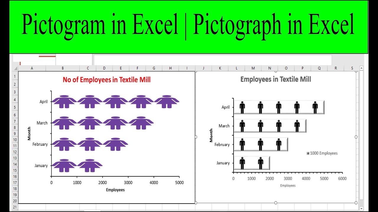
- Population by Age Group: Visualizing population demographics can be done using a pictograph, where each age group is represented by a person icon. The number of icons in each age group corresponds to the population count. This pictograph helps in understanding the distribution of population across different age ranges and identifying any significant trends.
- Survey Responses: Pictographs can be used to display survey results or feedback. For example, if you conducted a customer satisfaction survey, you can represent the responses using smiley face icons. Each smiley face can be assigned a value that corresponds to a specific satisfaction rating. This pictograph allows you to easily gauge the overall satisfaction level based on the distribution of smiley faces.
- Weather Conditions: Pictographs are a great way to visualize weather conditions for a specific location over a period of time. For instance, you can use different icons or symbols to represent sunny, cloudy, rainy, or snowy weather conditions. The frequency of each type of weather can be depicted by the number of icons used for each category. This pictograph allows you to see the overall weather patterns over time.
- Project Milestones: Pictographs can be used to present the progress or milestones of a project. Each milestone can be represented by a unique icon or symbol, and the size or color of the icon can reflect the completion status. This pictograph helps stakeholders understand the project’s progress visually and identify any potential delays or bottlenecks.
These are just a few examples of how pictographs or pictograms can be used to represent different types of data sets. Remember to adapt the design, formatting, and icons based on the specific requirements of your data to create accurate and visually appealing visualizations.
Now that you have gained insights into using pictographs for various data sets, you can apply this knowledge to your own data visualization projects in Excel.