
What is a Data Series?
A data series is a collection of related data points in a chart or graph. It represents a set of data that will be plotted on the chart. In simpler terms, it is a group of values that are visually represented using the same formatting and connected by a line or a bar in the chart.
Data series are a fundamental component of data visualization as they allow us to see patterns, trends, and relationships between different sets of data. They provide a way to organize and present data in a meaningful and coherent manner, making it easier for viewers to understand and interpret the information.
For example, let’s say you have a sales report for a particular product over a period of time. The data series would consist of the sales figures for each month, with each month representing a data point. By creating a line or bar chart using this data series, you can visualize the sales trend and identify any fluctuations or patterns over time.
Data series can also include multiple sets of data that are compared against each other. For instance, you might have two data series representing the sales figures of two different products. By plotting them on the same chart, you can analyze the sales performance and determine which product is performing better.
Understanding Data Points
Data points are individual values within a data series that are plotted on a chart or graph. They represent specific data or observations and are typically displayed as markers, such as dots or bars, on the chart.
Data points play a crucial role in visualizing data as they provide the actual numerical information that forms the basis of the chart. They help to convey the magnitude and position of each value within the overall data series. For example, in a bar chart showing the sales of different products, each bar represents a data point indicating the sales figure for a specific product.
Understanding data points involves analyzing and interpreting their characteristics, such as their position, value, and significance within the context of the chart. Here are a few key points to consider:
- Position: The position of a data point along the horizontal (x-axis) or vertical (y-axis) axis of the chart provides information about its relationship to other data points. It helps in determining the relative values and comparisons between different data points.
- Value: The value of a data point represents the specific measurement or observation. It is the actual numerical data that is being plotted on the chart. For example, in a line chart representing temperature over time, each data point would display the exact temperature reading at a particular time.
- Significance: Data points can have varying degrees of importance or relevance depending on the purpose of the chart. Some data points may highlight key trends or outliers, while others may represent average values or provide context to the overall data series.
By examining and analyzing data points, we can gain valuable insights into the underlying trends, patterns, and relationships within the data series. They enable us to make informed decisions, identify areas of improvement, and communicate the information effectively to others.
Different Types of Data Series
Data series can come in various forms, providing different ways to represent and analyze data. The type of data series used depends on the nature of the data being presented and the purpose of the chart. Here are some common types of data series:
- Line Data Series: This type of data series is commonly used to show trends or changes over time. It consists of data points connected by straight lines, forming a continuous line on the chart. Line data series are suitable for visualizing data with a continuous range of values, such as stock prices, temperature fluctuations, or population growth.
- Column/Bar Data Series: Column or bar data series are used to compare different categories or groups. Each data point represents a separate category, and the height or length of the columns or bars indicates the value. They are effective for showing comparisons between discrete categories, such as sales by region, monthly expenses, or product performance.
- Pie Data Series: Pie data series are circular charts divided into slices, with each slice representing a proportion or percentage of the whole. They are useful for illustrating the composition or distribution of data, such as market share, demographic breakdown, or budget allocation.
- Area Data Series: Area data series are similar to line data series but with the area below the line filled with color. This type of data series emphasizes the magnitude of values and is often used to represent cumulative totals or stacked data. Area charts are effective for visualizing data with changing proportions, such as revenue by product category or population growth by age group.
- Scatter Data Series: Scatter data series are used to represent relationships between two variables. Each data point is plotted on a grid, with the x-axis and y-axis representing the variables being compared. Scatter charts are useful for identifying patterns or correlations, such as the relationship between temperature and ice cream sales or the correlation between study hours and test scores.
These are just a few examples of the different types of data series available. The choice of data series depends on the specific data being presented and the insights you wish to convey. Understanding the characteristics and applications of each data series will help you select the most appropriate one for your chart, ensuring effective communication and analysis of the data.
How to Create a Data Series
Creating a data series is a fundamental step in creating charts or graphs. The process may vary depending on the software or tool you are using, but here are general steps to create a data series:
- Identify the data: Determine the data that you want to represent in your chart. This could be numerical data, such as sales figures, temperature readings, or survey responses, or categorical data, such as product categories, regions, or age groups.
- Organize the data: Arrange your data in a logical and structured manner. If you have numerical data, make sure it is organized in rows and columns, with each row representing a data point and each column representing a different variable. If you have categorical data, ensure it is grouped or categorized appropriately.
- Open the charting tool: Open the software or tool that you will be using to create your chart. This could be Excel, Google Sheets, Tableau, or any other charting application or website.
- Select the chart type: Choose the appropriate chart type based on the nature of your data and the insights you want to convey. Refer to the earlier section on different types of data series for guidance on selecting the suitable chart type.
- Specify the data series: In the charting tool, look for the option to input or import data. Depending on the tool, this may involve selecting cells in a spreadsheet, uploading a file, or manually entering the data.
- Assign data to axes: Once you have specified the data series, you may need to assign the data to the appropriate axes. For example, if you have a line chart representing temperature over time, you would assign the time data to the x-axis and the temperature data to the y-axis.
- Format and customize the chart: After creating the data series and selecting a chart type, you can further customize the chart by adding titles, legends, axis labels, and formatting options to enhance its visual appeal and clarity.
By following these steps, you can easily create a data series and generate a chart that effectively represents your data. Experiment with different chart types and formatting options to find the best visualization that suits your data and the message you want to communicate.
Editing and Formatting Data Series
Once you have created a data series in your chart, you may need to edit and format it to enhance its visual representation and effectively convey your data. Here are some key editing and formatting options for data series:
- Change chart type: If you feel that the current chart type is not visually appealing or not suitable for your data, you can change the chart type. Most charting tools allow you to switch between different chart types, such as line charts, bar/column charts, pie charts, and scatter plots.
- Adjust data range: If you want to add or remove data points from a data series, you can adjust the data range. This allows you to modify the data displayed in the chart without changing the overall structure of the chart.
- Modify colors and styles: Changing the colors and styles of the data series can make the chart more visually appealing and easier to understand. You can customize the color of the data points, lines, bars, or slices to highlight specific data or create a consistent color scheme that aligns with your brand or presentation.
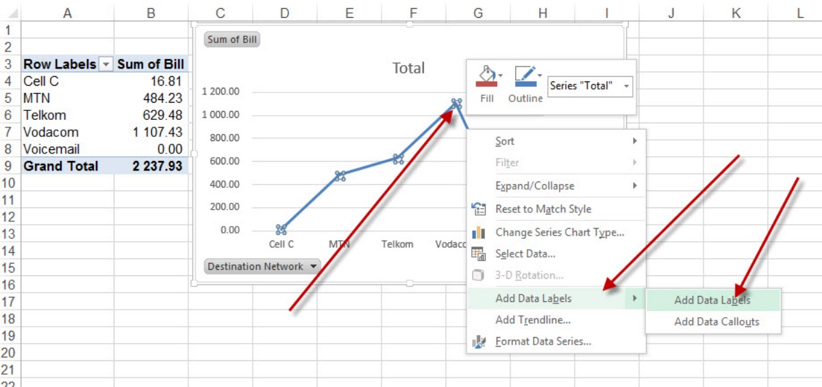
- Add data labels: Data labels provide additional information about the data points. You can add labels that display the exact value of each data point or include a category name. This helps viewers easily interpret the data without referring to the axis or legend.
- Apply data markers: Data markers are symbols or icons that represent each data point. They can enhance the visibility and distinction between data points, especially in charts with multiple series. Common data marker styles include circles, squares, triangles, or custom shapes.
- Adjust axis labels and scales: The axis labels and scales provide context and help viewers understand the magnitude of the data. You can customize the labels to provide more descriptive information or adjust the axis scales to emphasize specific data ranges or intervals.
- Add trendlines or regression curves: Trendlines or regression curves can be added to data series to identify and visualize trends or patterns. They provide a best-fit line or curve based on the data points, allowing viewers to easily identify the direction or relationship within the data.
By utilizing these editing and formatting options, you can make your data series more visually appealing, informative, and impactful. Experiment with different settings and styles to find the best representation that effectively communicates your data and supports your key messages.
Adding and Removing Data Points
Adding or removing data points from a data series allows you to modify and refine your chart to reflect updated or relevant information. Whether you want to include new data or eliminate outliers, here’s how you can add and remove data points:
Adding Data Points:
- Identify the new data: Determine the additional data you want to include in your chart. This could be new observations, measurements, or values that are relevant to the existing data series.
- Organize the new data: Add the new data to your existing data series. Make sure the new data is consistent with the format and structure of the current data series. If you’re using a spreadsheet or data entry form, input the new data in the appropriate cells or fields.
- Update the chart: Once you’ve added the new data to the data series, update the chart to reflect the changes. Depending on the software or tool you’re using, this may involve refreshing the chart or adjusting the data range. The chart will automatically incorporate the new data points and display them accordingly.
Removing Data Points:
- Identify the data points to remove: Analyze your data series and identify any data points that you want to remove. These could be outliers, errors, or outdated data that are skewing the overall representation of your chart.
- Remove the data points: Delete or exclude the identified data points from your data series. This can be done by deleting the corresponding cells or rows in your spreadsheet or data source. Alternatively, some charting tools allow you to remove specific data points directly from the chart interface.
- Update the chart: Once you have removed the data points, update the chart to reflect the changes. This may involve refreshing the chart or adjusting the data range to exclude the deleted data points. The chart will automatically adjust and display the updated data series.
Adding or removing data points provides flexibility and control in presenting your data accurately and effectively. It allows you to incorporate new information or refine your chart by eliminating irrelevant or misleading data. By keeping your data series up to date, your chart remains relevant and reliable for analysis and decision-making purposes.
How to Label Data Points
Labeling data points in a chart can provide valuable context and make the information more understandable for viewers. Whether you want to display the exact values or include category names, here’s how you can label data points:
- Add data labels: Most charting tools offer the option to add data labels to data points. Select the data series you want to label and enable the data label feature in the chart settings or formatting options. This will display labels directly on or near the data points.
- Choose label format: Determine how you want to format the data labels. You can choose to display the exact values of the data points, category names, or a combination of both. Formatting options may include displaying values as numbers, percentages, or currency symbols, depending on the type of data.
- Position the labels: Decide where to position the data labels to ensure they are easily readable and do not overlap with other elements of the chart. Options may include above, below, inside, or outside the data points. Some charting tools also allow you to manually adjust the position of individual data labels if needed.
- Customize the label appearance: Customize the appearance of the data labels to improve visual clarity and consistency. Options may include changing the font type, font size, color, or adding background fill or borders to make the labels stand out. Consider aligning the labels consistently across the chart for a more professional and organized look.
- Show or hide specific labels: In cases where the chart becomes crowded with data points, you can choose to selectively show or hide certain labels. This can be done by selecting individual data points or categories and enabling or disabling the data label display for those specific elements.
- Format label text: Make sure the label text is clear, concise, and easy to read. Avoid lengthy or convoluted labels that may confuse viewers. Consider using abbreviations or symbols when appropriate to convey information in a concise manner.
- Utilize tooltips: If data labels are not feasible due to space constraints or graphical limitations, you can utilize tooltips. Tooltips provide additional information when users hover over the data points. They can display the values or other relevant details associated with each data point, providing an alternative way to label the data.
Labeling data points in your chart improves comprehension and facilitates data interpretation for viewers. By following these steps and customizing the data labels to suit your needs, you can effectively convey the significance and meaning of each data point in your chart.
Formatting Data Labels
Formatting data labels in a chart allows you to enhance their appearance and improve their readability. With various customization options available, you can make the data labels more visually appealing and aligned with the overall design of your chart. Here are some formatting techniques for data labels:
- Text formatting: Modify the font type, font size, and font color of the data labels to ensure they are easily readable. Use a clear and legible font that complements the chart style and theme.
- Background and border: Add background fill or borders to the data labels to make them stand out from the chart background. Consider using a contrasting color for the background to improve visibility, and adjust the border thickness to achieve the desired effect.
- Label position: Experiment with different label positions to find the most optimal placement for readability. Options might include above, below, inside, or outside the data points. Ensure that the labels do not overlap with other chart elements or cause confusion.
- Label orientation: Adjust the orientation of the data labels to improve their alignment and readability. Some charting tools offer the option to rotate the labels horizontally or vertically, depending on the orientation of the chart or the available space.
- Data label connectors: If you choose to position data labels outside the data points, you can add connectors to visually link the labels to their corresponding data points. Use connectors sparingly and ensure they do not create clutter or confusion in the chart.
- Decimal places and number formatting: Control the number of decimal places displayed in numeric data labels to maintain precision and avoid unnecessary detail. Additionally, consider using number formatting options, such as percentages or currency symbols, to provide additional context for the data.
- Conditional formatting: Apply conditional formatting to the data labels to highlight specific data points or ranges. For example, you can use different font colors or font styles to distinguish positive and negative values or emphasize significant data points.
- Data label visibility: Show or hide specific data labels based on the relevance or significance of the data points. This is particularly useful when dealing with crowded charts where displaying all labels might lead to visual clutter.
- Font effects: Consider using font effects, such as bold, italic, or underline, to draw attention to specific data labels or highlight important information. However, use these effects sparingly and meaningfully, avoiding excessive formatting that could distract from the data.
By formatting data labels effectively, you can make your chart more visually appealing and improve the audience’s comprehension of the displayed data. Experiment with different formatting options to achieve a cohesive and professional look that enhances the overall impact of your chart.
Displaying Data Labels
Data labels serve as a crucial visual aid in charts, providing valuable information about individual data points. Displaying data labels enables viewers to quickly understand the exact values or categories associated with each data point. Here are various options for displaying data labels:
- Display all labels: The simplest approach is to display data labels for all data points in the chart. This ensures that viewers have access to the precise information associated with each data point without any omissions.
- Display selected labels: In some cases, displaying all data labels might clutter the chart and make it difficult to read. To alleviate this issue, you can selectively display labels for specific data points or categories that are of particular interest or have significant values.
- Display only critical labels: Focusing on the most critical or significant data points, you can choose to display labels for specific markers that help convey the essential information effectively. This approach helps avoid overwhelming the chart with excessive labels while still providing relevant insights.
- Display on hover: To save space and maintain a clean visual presentation, you can opt to display data labels on hover. When hovering over a data point, the label appears, providing additional details and context without cluttering the chart.
- Display as data callouts: Data callouts are labels that are placed adjacent to or connected with the corresponding data points through lines or connectors. This method allows for a clear association between the data labels and the data points, effectively communicating information while maintaining a visually clean chart.
- Rotate or reposition labels: Adjusting the positioning or orientation of data labels can enhance readability. Rotating labels can help accommodate longer text or optimize space utilization, while repositioning the labels can prevent overlapping and improve visual clarity.
- Display within data markers: Depending on the chart type, you may have the option to display data labels directly within or on top of the data markers themselves. This placement conserves space and ensures a clear association between the label and its corresponding data point.
- Customize label visibility: Some charting tools offer advanced features that allow for customized label visibility based on predefined rules or thresholds. For instance, you can set a condition to display labels only for data points above or below a certain value or show labels when a specific criteria is met.
- Use leader lines: In situations where labels need to be displayed outside the data markers, leader lines or connectors can be added to guide the viewer’s eye from the label to the corresponding data point. This ensures clear association and avoids any confusion.
When displaying data labels, it is essential to strike a balance between providing sufficient information and maintaining a clear and uncluttered visualization. Consider the nature of your data and the objectives of the chart to determine the most suitable approach for displaying data labels that effectively communicates the desired insights.
Customizing Data Labels
Customizing data labels in a chart allows you to tailor their appearance and style to align with your specific requirements and design preferences. By applying various customization options, you can make data labels more visually appealing, informative, and aligned with the overall chart aesthetics. Here are some ways to customize data labels:
- Change font style and size: Adjust the font style and size of the data labels to make them easily readable and consistent with the chart’s visual theme. Experiment with different font options to find the best combination that enhances clarity and complements the overall design.
- Modify font color: Choose an appropriate font color for the data labels that ensures optimal contrast and visibility against the chart background. Consider using contrasting colors or color schemes that harmonize with the chart’s color palette.
- Add formatting to label text: Implement formatting options such as bold, italic, or underline to emphasize specific data labels or highlight key information. Use these formatting options judiciously, ensuring that they contribute to the clarity and visual hierarchy of the labels.
- Apply data label backgrounds: Adding backgrounds to data labels can improve their visibility and distinction from the chart background. Choose a contrasting or complementary color for the background to make the labels stand out, and adjust the opacity or transparency if necessary.
- Use custom labels: Instead of displaying the actual values, you can use custom labels that provide more context or concise descriptions. This approach is particularly useful when the precise numerical values may not be as important as the meaning behind the data points.
- Include additional information: Consider expanding your data labels to include more information, such as units of measurement, percentages, or annotations, to provide valuable context to the viewers. Ensure that the extra information does not overcrowd the labels or create clutter.
- Adjust label positioning: Fine-tune the position and alignment of data labels to create a clean and organized appearance in the chart. You can choose to position labels above, below, inside, or outside the data points, based on the specific requirements and chart layout.
- Format label connectors: If using leader lines or connectors to link data labels with their corresponding data points, customize their appearance. Adjust the line style, color, and thickness to ensure they are visually appealing and do not distract from the data labels.
- Apply conditional formatting: Utilize conditional formatting to dynamically format data labels based on specific criteria or rules. For example, you can highlight labels with above-average values in a different color or use arrows to indicate positive or negative trends.
- Enable data label interactions: Depending on the charting tool or software, you may have the option to enable data label interactions. This can include actions like displaying tooltips when hovering over labels, allowing users to click labels for additional information, or enabling label animations.
By customizing data labels, you can enhance the visual impact of your chart and improve the readability and understanding of the presented data. Experiment with different customization techniques to create a customized visualization that effectively communicates your message and insights.
Using Data Labels for Data Analysis
Data labels serve as a valuable tool for data analysis, providing key information and insights within a chart or graph. They help users understand the data points and enable meaningful analysis of trends, comparisons, and patterns. Here’s how data labels can be used for data analysis:
- Identifying specific values: Data labels allow viewers to quickly identify the exact values associated with each data point on the chart. This is particularly useful when precise numerical information is crucial for analysis, comparison, or decision-making.
- Comparing data points: Data labels enable users to compare values among different data points. By analyzing the numerical values, viewers can easily identify which data points are larger or smaller, determine the magnitude of differences, and assess the relative significance of each data point.
- Spotting trends and patterns: Data labels placed on trend lines or within time-series charts help viewers observe trends and patterns over time. By analyzing the changing values and their labels, users can identify upward or downward trends, seasonal variations, or recurring patterns that might help in forecasting or decision-making.
- Highlighting outliers: Outliers are data points that significantly deviate from the overall pattern or distribution. Data labels make it easier to identify and analyze these outliers, providing insights into potential anomalies, errors, or exceptional data points that may require further investigation or consideration.
- Understanding data distribution: When data labels are used in charts such as pie charts or stacked bar/column charts, they provide insights into the distribution of the data. Analyzing the percentages or category labels helps users understand the proportion of each data category and their contribution to the whole, supporting effective data comparison and decision-making.
- Performing data calculations: Data labels can serve as a basis for performing calculations or statistical analysis directly from the chart. For instance, users can calculate averages, sums, or percentages based on the data labels, leveraging the information for further analysis and reporting.
- Conducting qualitative analysis: In addition to numerical information, data labels can include qualitative information or descriptions. This facilitates qualitative analysis by allowing viewers to analyze text-based labels for insights, such as category names, descriptions, or observations associated with the data points.
- Supporting data storytelling: Data labels play a crucial role in data storytelling, as they provide context and enhance the narrative. By aligning the labels with the story being told, they can guide viewers’ attention, reinforce key points, and emphasize the significance of certain data points within the broader analysis.
By leveraging data labels for analysis, viewers can gain meaningful insights, patterns, and trends from the displayed data. When used effectively, data labels enhance the interpretability and analytical value of a chart, supporting decision-making, problem-solving, and effective communication of insights derived from the data.
Best Practices for Using Data Series, Data Points, and Data Labels
When working with data series, data points, and data labels in charts or graphs, it is important to follow best practices to ensure effective communication and accurate representation of the data. Here are some key best practices to consider:
- Keep it simple: Avoid overcrowding the chart with excessive data series, data points, or labels. Simplify the chart by focusing on the most relevant data and displaying only necessary information to avoid overwhelming the viewer.
- Choose an appropriate chart type: Select the chart type that most effectively represents your data and supports your communication goals. Consider the nature of the data, the relationships you want to highlight, and the insights you want to convey. Use the appropriate chart type to ensure clarity and understanding.
- Use meaningful data labels: Ensure that data labels are clear, concise, and informative. Use labels that accurately represent the data points or convey relevant information. Consider using units of measurement or additional details to provide context without overwhelming the visualization.
- Consider visual hierarchy: Design your chart with a clear visual hierarchy, where the most important data series or data points are visually emphasized. Use formatting techniques like color, size, or font weight to differentiate important elements from less significant ones.
- Evaluate the need for data labels: Assess whether data labels are necessary for your chart or whether the data can be easily understood without them. In some cases, the data may be self-explanatory or other chart elements, such as a legend or tooltip, may provide sufficient context.
- Avoid clutter: Ensure that data labels, data points, and data series do not clutter the chart or create visual confusion. Leave sufficient whitespace and use appropriate spacing to allow for clear interpretation of the data.
- Provide clear legends or keys: If using multiple data series in a chart, provide a clear legend or key to help viewers understand the meaning and representation of each data series. This ensures that viewers can interpret the chart accurately and easily differentiate between different sets of data.
- Apply appropriate color schemes: Use color schemes that are visually pleasing and accessible. Consider the use of color to group related data points or highlight specific categories within a data series. Ensure that color choices do not hinder readability, particularly for viewers with color vision deficiencies.
- Label axes clearly: Ensure that the axes in your chart are properly labeled, providing clear descriptions and units of measurement. This helps viewers understand the scale and interpretation of the data points along each axis.
- Regularly update and review data: Ensure that your data series, data points, and data labels are up-to-date and accurate. Review the data regularly to ensure that the chart represents the latest information and supports accurate analysis and decision-making.
By following these best practices, you can create charts that effectively communicate data, facilitate analysis, and aid in decision-making. Remember to consider the specific context, audience, and purpose of your chart to ensure that you present your data in the most impactful and meaningful way.