
What is a Legend?
A legend is a component commonly found in Excel spreadsheets that provides valuable information about the data represented in the chart or graph. It acts as a guide, explaining the colors, patterns, or symbols used to differentiate various data series or categories within the visualization. The legend helps users understand the meaning or significance of the different elements in the chart, making it easier to interpret and analyze the data.
In simple terms, the legend serves as a key that unlocks the codes used in the chart. It acts as a reference point for viewers to understand the relationship between the data points and their corresponding labels.
The legend is particularly useful when dealing with complex charts that involve multiple data series or categories. It allows the audience to discern between different data sets and comprehend the information being presented more effectively.
For instance, imagine you have a bar chart that compares the monthly sales of three different products over a year. Without the legend, it would be challenging to distinguish which color represents each product. However, by incorporating a legend, you can easily associate each color with its respective product, enabling viewers to identify and analyze the data accurately.
Legends are not limited to bar charts; they are also commonly used in line graphs, pie charts, scatter plots, and other types of visualizations. Regardless of the chart type, the legend remains crucial in providing context and understanding for the data being displayed.
Purpose of the Legend
The primary purpose of a legend in an Excel spreadsheet is to clarify the meaning and significance of the different elements in a chart or graph. It serves as a visual aid that helps viewers understand the information being presented by providing key details and explanations. Let’s explore the specific purposes of a legend:
- Identification: The legend acts as a reference point, allowing viewers to identify and differentiate between different data series or categories in the chart. It provides a clear association between specific colors, patterns, or symbols and their corresponding elements in the visualization.
- Understanding: By providing a comprehensive explanation of the various elements in the chart, the legend enhances the viewer’s understanding of the data. It eliminates any confusion or ambiguity and ensures that the information is interpreted correctly.
- Context: The legend adds context to the chart by offering additional information about the data series or categories. It can include descriptions, labels, or units of measurement, providing a deeper understanding of the displayed information.
- Comparisons: In charts with multiple data series, the legend helps viewers make accurate comparisons between different elements. It allows them to analyze the relationships, trends, or patterns across the data and draw meaningful insights.
- Accessibility: The legend improves the accessibility of the chart by providing a text-based interpretation of the visual elements. This is especially valuable for individuals with visual impairments who rely on screen readers or other assistive technologies.
Overall, the purpose of the legend is to enhance the clarity and interpretation of the data presented in an Excel chart. It enables viewers to grasp the information more effectively, make informed decisions, and communicate insights with others.
How to Add a Legend in Excel
In Microsoft Excel, adding a legend to your chart is a simple and straightforward process. Just follow these steps:
- Select the chart or graph that you want to add a legend to.
- Click on the “Chart Elements” button (the plus icon) that appears in the top-right corner of the chart when you hover over it.
- In the dropdown menu that appears, check the box next to “Legend” to add the legend to your chart.
- The legend will be inserted into your chart, typically positioned either on the right-hand side or at the bottom, depending on the chart type.
- Optionally, you can customize the appearance and formatting of the legend by right-clicking on it and selecting “Format Legend” from the context menu. This allows you to modify the font, size, colors, and other visual properties to align with your overall chart design.
- To remove the legend from your chart, simply uncheck the “Legend” box in the “Chart Elements” menu or right-click on the legend and select “Delete”.
Adding a legend to your Excel chart is essential, especially when dealing with visualizations that involve multiple data series or categories. It provides clarity and context to the chart, facilitating a better understanding of the information presented. By correctly labeling and differentiating the elements in your chart, the legend ensures that your audience can interpret and analyze the data accurately.
How to Format the Legend in Excel
Formatting the legend in your Excel chart is a great way to customize its appearance and make it more visually appealing. Here’s how you can format the legend:
- Select the legend in your chart by clicking on it.
- Right-click on the legend to open the context menu. From here, select “Format Legend” to access the formatting options.
- In the “Format Legend” pane that appears, you can modify various aspects of the legend’s appearance, including:
- Fill: Choose a solid color or gradient fill for the legend background.
- Border: Apply a border with a specific color, style, and thickness to the legend.
- Font: Select a font type, size, style, and color for the legend text.
- Position: Adjust the placement of the legend within the chart by changing its orientation, alignment, and location.
- Number Format: Customize the format of any numeric values displayed in the legend, such as currency, percentage, or scientific notation.
- Effects: Apply various visual effects, such as shadows or 3-D formatting, to the legend.
- Make your desired formatting changes by selecting the appropriate options in the “Format Legend” pane.
- Preview the changes in your chart to see how the legend’s formatting is updated in real-time.
- Once you are satisfied with the formatting, close the “Format Legend” pane.
By formatting the legend, you can match its style to the overall look and feel of your chart. This helps create a cohesive and visually appealing presentation. Experiment with different colors, font styles, and positioning options to find the formatting that best suits your chart’s design and effectively communicates the information.
Legend Positioning Options in Excel
Excel provides various positioning options for the legend in your chart, allowing you to place it in the most suitable location based on your design and data. Here are the common legend positioning options available in Excel:
- Right: By default, Excel places the legend on the right-hand side of the chart. This option is useful when you want to maximize the chart’s width and have enough space for the legend without it overlapping with the data.
- Bottom: Another common positioning option is placing the legend at the bottom of the chart. This works well when you want to save vertical space or when the legend labels are long and would be better displayed horizontally.
- Left: If your chart has ample space on the left side, you can choose to position the legend there. This layout is particularly helpful when you have a longer legend or want to balance the visual weight of the elements in your chart.
- Top: The top positioning option puts the legend above the chart. This can be useful when you want to save space or if your legend labels are short, as it presents a neat and compact layout.
- Custom: In addition to the standard positioning options, Excel allows you to manually adjust the legend’s position by dragging it to the desired location within the chart. This gives you full control over its placement, allowing for more customized and creative chart designs.
To change the position of the legend in Excel, simply select the legend in your chart and then select the desired positioning option from the “Layout” or “Format” tab in the Excel ribbon. Alternatively, you can right-click on the legend, choose “Format Legend,” and then select the “Legend Options” tab to access more advanced positioning settings.
Consider the design and layout of your chart, as well as the amount of available space, when choosing the positioning option that best suits your needs. Remember that the goal is to ensure the legend is easily visible and does not obstruct or confuse the data being presented.
Legend Key Explanation
In an Excel chart, a legend key provides a visual representation and explanation of the data series or categories displayed in the chart. It helps viewers understand the meaning behind the colors, patterns, or symbols used to differentiate the various elements within the chart. The legend key acts as a bridge between the chart and its corresponding data, allowing for clear interpretation and analysis. Let’s delve into the details of the legend key:
The legend key consists of the following components:
- Symbol: The legend key includes a symbol that represents each data series or category in the chart. It can be a color-coded square, a line pattern, or any distinct symbol that differentiates one element from another. The symbol is closely associated with the actual data points in the chart.
- Label: Each legend key is accompanied by a label that provides a textual description of the associated data series or category. The label serves as a concise identifier, allowing viewers to connect the symbol with its corresponding meaning. It may include the name of a product, the time period, or any other relevant information that characterizes the data.
The legend key helps viewers interpret the chart by providing a visual reference for the data sets portrayed. It ensures that there is no confusion or ambiguity regarding the meaning of each element. By associating the symbol with a specific label, the legend key provides clarity and enhances the understanding of the chart.
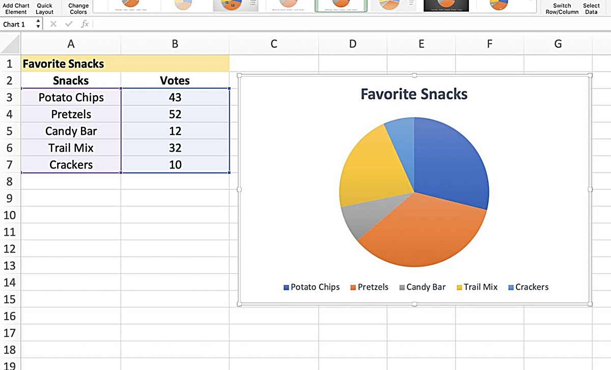
For example, if you have a line graph that displays the sales performance of different regions over time, the legend key might include symbols like a blue line, a red line, and a green line, along with labels such as “East,” “West,” and “South.” This representation allows viewers to easily distinguish and comprehend the sales performance for each region.
Customizing the legend key is also possible in Excel. You can modify the appearance and formatting of the symbols and labels by accessing the “Format Legend” options. This enables you to align the legend key with your chart’s overall design and make it more visually engaging.
The legend key is a vital component of an Excel chart as it simplifies the interpretation of complex data and provides invaluable context. By clearly defining the symbols and labels, the legend key allows viewers to make informed comparisons and draw meaningful insights from the chart’s visualization.
How to Add a Legend Key in Excel
In Excel, adding a legend key to your chart is a straightforward process that helps viewers understand the meaning behind the colors, patterns, or symbols used to differentiate the data series or categories. Here’s how you can add a legend key in Excel:
- Create a chart or graph in Excel that includes multiple data series or categories.
- Select the chart or graph that you want to add a legend key to.
- Click on the “Chart Elements” button (the plus icon) that appears in the top-right corner of the chart when you hover over it.
- In the dropdown menu, check the box next to “Legend Keys” or “Data Labels” to add the legend keys to your chart. This option may vary depending on the version of Excel you are using.
- The legend keys will be inserted into your chart, typically appearing next to each data series or category.
- To customize the appearance of the legend keys, right-click on any of the keys and select “Format Legend Keys” or “Format Data Labels” from the context menu. This will open the formatting options, allowing you to modify the symbols, labels, sizes, colors, and other visual properties of the legend keys.
- Make the desired changes to the legend keys’ formatting and close the formatting options when you are satisfied.
- If needed, you can also move or resize the legend keys by clicking and dragging them within the chart.
By adding legend keys to your Excel chart, you provide a clear visual representation of the different data series or categories, making it easier for viewers to interpret and analyze the data. The legend keys help establish a connection between the symbols used in the chart and their corresponding meaning, enabling better comprehension and understanding.
Remember that the availability and customization options for legend keys may vary depending on the chart type and the version of Excel you are using. Make sure to explore the options and experiment with different formatting settings to achieve the desired appearance of the legend keys for your specific chart.
Customizing the Legend Key in Excel
Excel provides various customization options to enhance the appearance and visibility of legend keys in your chart. By customizing the legend key, you can make it stand out and align it with your chart’s overall design. Here are some key ways to customize the legend key in Excel:
- Symbol Format: You can modify the symbols used in the legend keys to represent the different data series or categories in your chart. Excel allows you to change the shape, size, color, fill pattern, line style, and other visual properties of the symbols.
- Label Formatting: Customize the appearance of the labels associated with the legend keys. This includes options to change the font style, size, color, alignment, and formatting such as bold or italic.
- Size and Position: Adjust the size and position of the legend keys within the chart area. This can be particularly helpful if you have a larger chart and want to ensure that the legend keys are clearly visible and well-positioned.
- Legend Key Order: Rearrange the order in which the legend keys appear in the legend. This can be useful if you want to prioritize or emphasize specific data series or categories.
- Effects: Apply various visual effects to the legend keys, such as shadows or 3-D formatting. These effects can add depth and dimension to the legend keys, making them more visually appealing.
To customize the legend key in Excel:
- Select the legend key that you want to customize by clicking on it in the chart.
- Right-click on the legend key to open the context menu.
- From the context menu, select “Format Legend Key” or “Format Data Labels” to access the formatting options specific to legend keys.
- In the formatting pane, you will find several tabs containing options to customize the symbol format, label formatting, size and position, order, and effects of the legend keys.
- Make the desired changes using the available formatting options.
- Preview the changes in real-time to see how the customized legend key appears in your chart.
- Once you are satisfied with the customization, close the formatting pane.
By customizing the legend key in Excel, you can create a visually appealing and informative chart that effectively communicates the meaning and significance of the data series or categories. Experiment with different formatting options to find the style that best suits your chart and enhances its overall visual impact.
Tips and Tricks for Working with Legends and Legend Keys in Excel
Working with legends and legend keys in Excel charts can greatly enhance the clarity and understanding of your data visualization. Here are some useful tips and tricks to make the most out of legends and legend keys in Excel:
- Keep it concise: When adding labels to legend keys, aim for brevity and clarity. Short and succinct labels make it easier for viewers to quickly associate the legend keys with their corresponding data series or categories.
- Use consistent colors: For charts with multiple data series, use a consistent color scheme throughout to maintain visual coherence. This helps viewers easily identify and remember which colors represent specific data series or categories.
- Order wisely: Arrange the legend keys in a logical order that aligns with the data. This can be alphabetical, chronological, or based on a priority or significance of the data series or categories. A well-organized legend makes it easier for viewers to interpret and analyze the chart.
- Avoid overcrowding: If you have many data series or categories, consider utilizing multi-column or multi-row legends to prevent overcrowding and ensure legibility. This allows for more efficient use of space and avoids confusion caused by cramped legend keys.
- Maximize visibility: Position the legend in a strategic location within the chart to maximize its visibility and avoid overlapping with the data. Experiment with different positions, such as right, bottom, left, or top, to find the optimal placement based on the chart design and available space.
- Consistent font styles: Maintain consistency in font styles between the legend labels, data labels, and axis labels in your chart. This creates a cohesive visual presentation and enhances the overall readability of the chart.
- Highlight key information: Emphasize important legend keys or data series by using bold or italic font styles, different color shades, or thicker symbol borders. This draws attention to specific data and helps convey the key message or insights of your chart.
- Test readability: Before finalizing your chart, step back and evaluate the legibility of the legends and legend keys. Ensure that the font size, symbol sizes, and label placement are easily readable, even when the chart is viewed at different sizes or on different devices.
- Save and reuse: If you frequently create charts with similar data series or categories, save a template chart with customized legends and legend keys. This allows you to reuse the template and saves time in formatting the legends for future charts.
By implementing these tips and tricks, you can effectively utilize legends and legend keys in Excel to improve the clarity, readability, and impact of your charts. Paying attention to the details of the legends and legend keys enhances the overall understanding and interpretation of the data, ultimately leading to more effective data communication.