
Choosing the Right Data
When creating a column chart in Excel, it’s crucial to choose the right data to visualize your information effectively. A column chart is ideal for comparing data values across different categories or time periods. Here are some important considerations to keep in mind:
1. Identify the Purpose: Determine the objective of your chart. Are you looking to showcase sales data, compare trends, or present survey results? Clearly defining the purpose will help you select the most relevant data.
2. Select Key Variables: Identify the variables that you want to highlight in your chart. These could be product sales, revenue figures by region, or any other data points that are relevant to your analysis.
3. Ensure Data Accuracy: Verify that your data is accurate and up-to-date before creating the chart. Inaccurate or outdated information can lead to misleading visual representations.
4. Consider Data Range: Decide on the timeframe or category range you want to include in your chart. This could be a specific month, quarter, or year, or a particular set of categories such as products, regions, or departments.
5. Limit the Data: Avoid overwhelming your chart with too much data. Select a focused subset of data that is relevant to your purpose and conveys the message you want to communicate.
6. Sort and Filter: Depending on your analysis, you may need to sort or filter the data to highlight specific patterns or outliers. Excel provides easy tools for sorting and filtering data directly within the chart.
By carefully selecting the right data, you set the foundation for a meaningful and impactful column chart. It’s important to spend time analyzing and organizing your data before proceeding with chart creation to ensure accurate and informative visualizations.
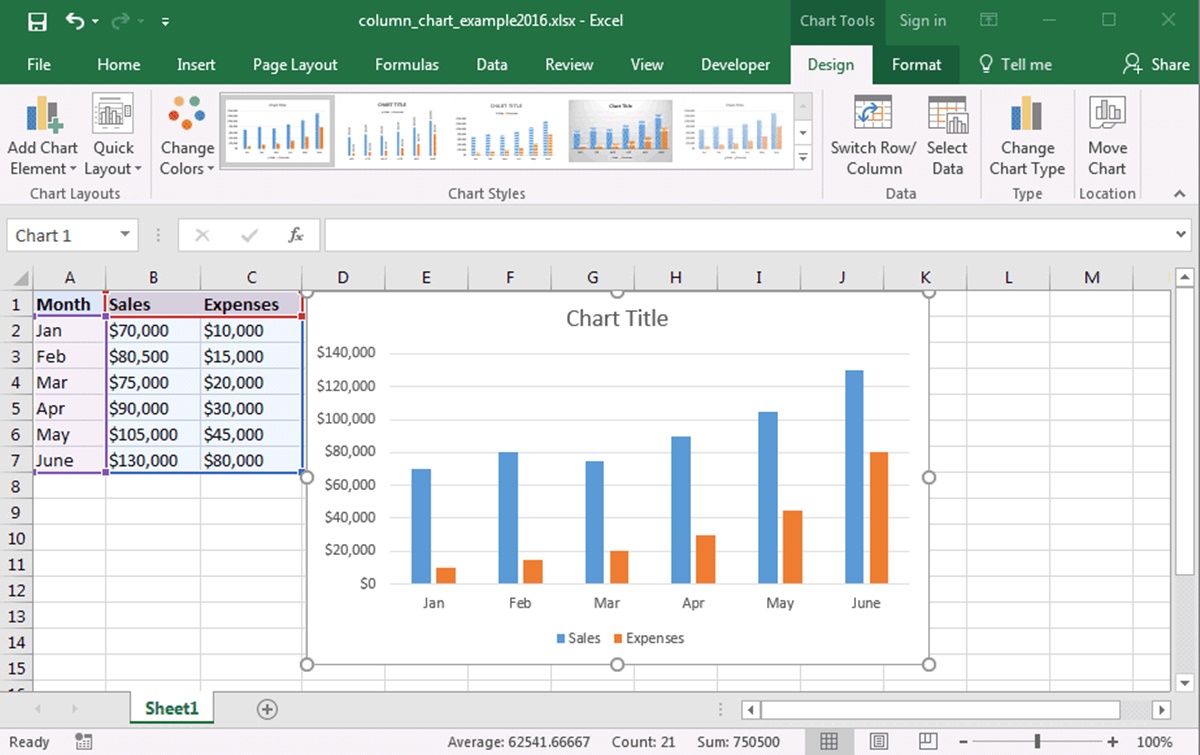
Inserting a Column Chart
Creating a column chart in Excel is a straightforward process that allows you to present your data visually. Follow these steps to insert a column chart:
1. Select the Data: Highlight the data range that you want to include in your chart. This should include both the category labels and the corresponding values.
2. Open the Insert Tab: Go to the “Insert” tab on the Excel ribbon. This tab contains various chart types that you can choose from.
3. Choose the Column Chart: Click on the “Column” chart icon. Excel offers different column chart styles to suit your preference. Select the specific style that best represents your data.
4. Insert the Chart: Once you’ve selected the desired column chart style, click on it to insert the chart into your worksheet. The chart will appear in the location of your cursor.
5. Customize the Chart: After inserting the chart, you can customize its appearance and layout. You can modify colors, fonts, gridlines, and many other elements to make the chart visually appealing and easy to understand.
6. Resize and Move the Chart: If needed, you can resize and move the chart within the worksheet. Simply click and drag the edges of the chart to adjust its size. To move the chart, click and drag it to the desired location.
7. Chart Tools: When the chart is selected, the “Chart Tools” tab will appear on the Excel ribbon. This tab allows you to further customize the chart using features like “Chart Layouts” and “Chart Styles”. Experiment with different options to find the best visual representation of your data.
By following these simple steps, you can easily insert a column chart in Excel to present your data in a visually compelling way. Remember to explore the various customization options available to make your chart stand out and effectively communicate your information.
Customizing the Chart Design
When creating a column chart in Excel, you have the flexibility to customize its design to match your preferences and enhance its visual impact. Here are some key ways to customize the design of your chart:
1. Chart Styles: Excel offers a variety of built-in chart styles that allow you to change the overall appearance of your chart with just a few clicks. Explore the different styles available in the “Chart Styles” section of the “Chart Tools” tab.
2. Colors and Fonts: Personalize the chart by choosing custom colors and fonts. You can modify the color scheme of the series, axes, gridlines, and other chart elements to create a cohesive and visually pleasing design. Experiment with different font styles to find the one that best complements your chart.
3. Chart Layouts: Excel provides pre-designed chart layouts that offer different arrangements of chart elements. Selecting a layout can change the positions of the chart title, legend, axis labels, and data labels. Use the “Chart Layouts” section in the “Chart Tools” tab to explore various options.
4. Axis Formatting: Customize the appearance and scale of the axes in your chart. Adjust the axis labels, units, and number formats to better present your data. You can also change the axis title to provide additional context to your chart.
5. Gridlines and Data Labels: Gridlines help to guide the reader’s eye across the chart. You can turn on or off gridlines and format them to match the overall design. Data labels provide specific values for each data point and can be customized to show various information such as values, percentages, or category names.
6. Chart Title: The chart title serves as a visual summary of what the chart represents. Customize the chart title to accurately describe the data being displayed and make it more engaging for your audience.
Remember that while customizing the chart design can enhance its visual appeal, it is critical to maintain clarity and ensure that the customization choices do not hinder the understanding of the data. Aim for a design that is both visually engaging and easy to interpret.
Adjusting the Chart Layout
After creating a column chart in Excel, you may need to make adjustments to the chart layout to best present your data. Here are some key ways to fine-tune the chart layout:
1. Chart Title: Add or modify the chart title to provide a clear and concise description of the data being presented. Click on the chart title and edit the text directly in the chart or in the formula bar.
2. Legend: The legend is used to identify the different categories or series in the chart. You can reposition the legend, change its orientation, or even hide it if it is not necessary for understanding your chart. To make adjustments, select the legend and right-click to access the formatting options.
3. Axis Labels: Excel automatically generates axis labels based on the data range. However, you can customize the axis labels to better reflect the information being presented. Right-click on the axis and choose “Format Axis” to make changes such as modifying the label text or changing the number format.
4. Gridlines: Gridlines provide visual guidance and aid in interpreting the values on the chart. You can turn gridlines on or off for both the horizontal (x) and vertical (y) axes. To change the appearance of the gridlines, right-click on them and select the desired formatting options.
5. Plot Area: The plot area is the space within the chart that displays the data points and columns. You can adjust the size of the plot area by resizing the chart. Click on the chart, and handles will appear on the corners and sides. Use these handles to resize the plot area to your desired dimensions.
6. Data Labels: Data labels provide additional information about the data points in the chart. You can choose to display labels that show the actual values, percentages, or other relevant information. To add, remove, or modify data labels, right-click on the column chart and select “Add Data Labels” or “Edit Data Labels” from the menu.
By adjusting the chart layout, you can optimize the visual presentation of your column chart and provide a clear and engaging representation of your data. Experiment with different layout options to find the best arrangement that effectively communicates your message and insights.
Adding Data Labels
Data labels in a column chart can be a useful way to display specific values or additional information for each column. They provide clarity and assist in understanding the data points being represented. Here’s how you can add data labels to your column chart in Excel:
1. Select the Chart: Click on the chart to select it. The chart elements will be highlighted, indicating that it is selected.
2. Chart Tools: On the Excel ribbon, the “Chart Tools” tab will now be visible. Click on it to access the additional chart customization options.
3. Add Data Labels: Within the “Chart Tools” tab, click on “Data Labels” in the “Labels” group. A dropdown menu will appear with various options for data label placement.
4. Choose Data Label Option: Select the desired data label option, such as displaying the actual values or percentages. You can also choose to show both the category name and value.
5. Format Data Labels: Once the data labels are added, you can further format them to suit your needs. Right-click on any data label and choose “Format Data Labels” from the menu. This will open a formatting pane where you can customize the appearance, including font size, color, and label position.
6. Customize Specific Data Labels: If you want to modify specific data labels, you can do so individually. Click on the data label you want to customize and right-click to access the formatting options. This allows you to highlight specific values or make them stand out for emphasis.
7. Remove Data Labels: If you decide that you no longer want data labels in your column chart, you can easily remove them. Simply go back to the “Data Labels” option in the “Chart Tools” tab and click on “None.”
By adding data labels, you can provide clear and concise information about the values presented in your column chart. Ensure that the data labels are easily readable and placed appropriately to avoid clutter and confusion. Customize the labels to enhance their visibility and make your chart more informative and visually appealing.
Changing the Axis Labels
The axis labels in a column chart in Excel provide important context and understanding of the data being displayed. By customizing the axis labels, you can make your chart more informative and tailored to your specific needs. Here’s how you can change the axis labels:
1. Select the Chart: Start by clicking on the column chart to select it. The chart elements will be highlighted, indicating that it is selected.
2. Chart Tools: The “Chart Tools” tab will appear on the Excel ribbon. This tab contains multiple options for customizing the chart. Click on it to access the additional chart formatting options.
3. Edit Axis Titles: Within the “Chart Tools” tab, locate the “Axis Titles” group, which contains options to modify the axis titles. Click on either the primary horizontal axis or the primary vertical axis title, depending on which axis label you want to change.
4. Edit Axis Labels: A text box will appear next to the selected axis title. Click inside the text box and type your desired axis label. You can enter a concise label that clearly describes the data shown on the axis.
5. Formatting the Axis Labels: To further customize the appearance of the axis labels, right-click on the axis and select “Format Axis” from the dropdown menu. This will open a formatting pane where you can modify the font size, color, rotation, and other formatting options.
6. Category Axis Labels: The column chart typically has a category axis (x-axis) that displays the category labels, such as the names of products or months. To change these labels, you need to modify the underlying data range. Click on the data range in the worksheet and edit the category labels directly.
7. Value Axis Labels: The value axis (y-axis) displays the numerical values of the data. You can adjust the scale, number format, and other properties of the value axis labels by right-clicking on the axis and selecting “Format Axis”.
By changing the axis labels, you can provide a more meaningful representation of your data in the column chart. Use clear and concise labels that accurately describe the information being presented. Experiment with the formatting options to ensure that the axis labels are visually appealing and support the overall understanding of the chart.
Formatting the Chart Elements
Formatting the elements of your column chart in Excel helps to enhance its visual appeal and make it more engaging for your audience. By customizing the chart elements, you can create a professional and polished presentation of your data. Here’s how you can format various aspects of your column chart:
1. Chart Area: The chart area refers to the entire space occupied by the chart. You can customize its fill color, border, and transparency to create a visually appealing background. Right-click on the chart area and select “Format Chart Area” to access the formatting options.
2. Plot Area: The plot area is the space within the chart that displays the actual columns representing your data. You can format the plot area’s fill color, border, and transparency to enhance its appearance. Right-click on the plot area and select “Format Plot Area” to customize its formatting.
3. Column Formatting: Customize the appearance of the columns in your chart. Right-click on a column and select “Format Data Series” to access various formatting options, such as changing the fill color, border color, column width, and gap width between columns.
4. Axis Formatting: Modify the appearance of the horizontal and vertical axes to better suit your design preferences. Right-click on an axis and select “Format Axis” to access options for changing the axis title, labels, scale, tick marks, and other formatting properties.
5. Legend: The legend provides a key to identify the different categories or series in the chart. You can format the legend’s font, size, position, and other properties to ensure it aligns with the overall chart design. Right-click on the legend and choose “Format Legend” to access the formatting options.
6. Data Labels: Customize the appearance of the data labels that provide specific values for each data point in the chart. Right-click on a data label and select “Format Data Labels” to modify the font, size, color, position, and other formatting properties.
7. Chart Title: The chart title provides a clear description of the overall chart’s purpose or topic. Format the chart title by selecting it and using the options in the “Format Chart Title” section. Choose a font style, size, color, alignment, and other formatting properties that align with your design preferences.
By formatting the various elements of your column chart, you can create a visually appealing and highly customized representation of your data. Experiment with different formatting options to achieve a cohesive and professional look that effectively communicates your information.
Adding a Trendline to the Chart
An effective way to visualize and analyze trends in your column chart is by adding a trendline. A trendline is a line that shows the general direction of the data series, helping to identify patterns and make predictions. Follow these steps to add a trendline to your chart in Excel:
1. Select the Chart: Click on the column chart to select it. The chart elements will be highlighted, indicating that it is selected.
2. Chart Tools: The “Chart Tools” tab will appear on the Excel ribbon. Click on it to access the additional chart formatting options.
3. Add a Trendline: Within the “Chart Tools” tab, locate the “Trendline” group, which contains options to add trendlines to the chart. Click on the “Trendline” button to reveal a dropdown menu of trendline options.
4. Choose a Trendline Type: Select the desired trendline type from the dropdown menu. Excel provides different options such as linear, exponential, logarithmic, moving average, and more. Choose the trendline type that best fits your data and analysis objectives.
5. Display Equation and R-squared Value: You can choose to display the equation and R-squared value on your trendline. The equation represents the mathematical formula that determines the trendline, while the R-squared value measures the goodness of fit of the trendline to the data. Right-click on the trendline and select “Add Trendline Equation” and/or “Add R-squared Value” to display them on the chart.
6. Format the Trendline: To further customize the appearance of the trendline, right-click on it and select “Format Trendline” from the menu. Here, you can modify properties such as line color, line style, and line thickness.
7. Updating the Trendline: If your data changes or you want to experiment with different trendline types, you can easily update the trendline. Right-click on the existing trendline to access the formatting options, and make the desired changes.
Adding a trendline to your column chart in Excel provides valuable insight into the direction and nature of your data series. It helps you identify trends, make predictions, and gain a deeper understanding of your data. Experiment with different trendline types and formatting options to create a chart that effectively visualizes the trends in your data.
Modifying the Chart’s Legend
The legend in a column chart serves as a key that identifies the different categories or series represented in the chart. Modifying the chart’s legend can help improve the clarity and understanding of the data being presented. Here’s how you can modify the legend in Excel:
1. Select the Chart: Begin by clicking on the column chart to select it. The chart elements will be highlighted, indicating that it is selected.
2. Chart Tools: The “Chart Tools” tab will appear on the Excel ribbon. Click on it to access the additional chart customization options.
3. Edit the Legend: Within the “Chart Tools” tab, locate the “Legend” group, which contains options to modify the legend. Click on the “Legend” button to reveal a dropdown menu with various options.
4. Position the Legend: You can choose to position the legend in different locations within the chart, such as at the top, bottom, left, or right. Select the desired position from the options provided in the “Legend” dropdown menu. Excel will automatically update the chart to reflect the new legend position.
5. Customize the Legend Format: You can further customize the format of the legend to suit your preferences. Right-click on the legend and select “Format Legend” to access formatting options such as font style, font size, font color, and border formatting.
6. Toggle Legend Visibility: If you want to temporarily hide the legend from view, you have the option to toggle its visibility. Simply click on the legend to select it and press the “Delete” or “Backspace” key on your keyboard. This will remove the legend from the chart while still maintaining the data and series representation.
7. Update the Legend: If your chart data changes or you need to update the series labels, you can easily modify the legend. Select the desired legend entry, right-click, and choose “Edit Legend Entry” to make changes to the text that appears in the legend.
By modifying the chart’s legend, you can effectively label and identify the different categories or series in your column chart. Ensure that the legend is clearly visible and organized, providing a useful guide to interpreting the data represented in the chart.
Filtering and Sorting Data in the Chart
Excel provides powerful tools to filter and sort data in your column chart, allowing you to focus on specific information and highlight patterns or trends. Filtering data allows you to selectively display certain categories or series, while sorting data rearranges the order of the data points. Here’s how you can filter and sort data in your chart:
1. Filter Data: To filter data in your column chart, you can use Excel’s built-in filtering feature. Click on one of the data points in the chart to activate the “Chart Tools” tab on the Excel ribbon. Within the “Chart Tools” tab, click on the “Filter” icon to display a dropdown menu with filtering options. Select the desired filter, such as “Filter by Category” or “Filter by Series,” to narrow down the data shown in the chart.
2. Sort Data: Excel allows you to sort the data in your column chart in ascending or descending order. To sort the data, click on a data point in the chart to activate the “Chart Tools” tab. Within the “Chart Tools” tab, click on the “Sort” icon to access sorting options. Choose the desired sort order, such as “Sort by Category” or “Sort by Value,” to rearrange the order of the data points in the chart.
3. Multiple Data Points: If you want to filter or sort multiple data points in the chart, hold down the Ctrl key on your keyboard while selecting the desired data points. This allows you to perform filtering or sorting operations on specific data series or categories.
4. Interactive Chart Elements: Excel also provides interactive elements in the chart itself to filter or sort the data. For example, you can click on a legend entry to display or hide a specific series. You can also click on an axis label to filter out or highlight specific categories in the chart.
5. Clear Filters: To remove any applied filters or sorting from the chart, click on the “Clear” button in the “Chart Tools” tab. This will restore the chart to its original state, displaying all the data points without any filtering or sorting applied.
Filtering and sorting data in your column chart allows you to focus on specific information and analyze the data from different angles. It helps highlight relevant trends and patterns, making it easier to draw meaningful insights from your chart. Apply filters and sorting techniques that best suit your analysis needs and effectively communicate the story behind your data.
Updating the Chart with New Data
As your data changes and evolves, it is important to keep your column chart in Excel up to date to ensure accurate representation and analysis. Here are the steps to update your chart with new data:
1. Add New Data: If you have new data points to include in your chart, input the values in the appropriate cells in your Excel worksheet. Make sure the new data points are located in the same columns or rows as the existing data.
2. Extend Data Range: To incorporate the new data into your chart, you need to extend the data range. Click and drag the selection handles to include the new data points. Alternatively, you can manually enter the new data range in the “Select Data” dialog box by clicking on “Select Data” in the “Chart Tools” tab.
3. Update the Chart: Once you’ve extended the data range, right-click on the chart and select “Refresh” or “Update Data” from the context menu. This will update the chart to reflect the new data points you’ve added.
4. Adjust Chart Properties: After updating the chart with new data, review whether any changes need to be made to the chart properties. You may want to adjust the axis scales, data labels, chart title, or any other elements of the chart to accommodate the new data.
5. Customize Visual Appearance: If desired, you can also apply formatting or customization options to the updated chart. This includes modifying colors, fonts, and styles to ensure the chart aligns with your design preferences and visual guidelines.
6. Verify Chart Accuracy: Before using the updated chart for analysis or presentation, double-check that the new data has been correctly incorporated. Verify that the chart accurately reflects the updated values and relationships among the data points.
By regularly updating your column chart with new data, you can ensure that your analysis remains relevant and accurate. Keeping your chart up to date allows you to track changing trends, observe patterns, and make informed decisions based on the most current information available.
Saving and Sharing the Chart
Once you have created and updated your column chart in Excel, it is important to save and share it effectively to ensure it can be accessed and understood by others. Here is how you can save and share your column chart:
1. Save the Excel File: To save your entire Excel workbook, click on the “File” tab and choose “Save” or use the shortcut Ctrl + S. Give the file a descriptive name and select the desired location on your computer or cloud storage. Saving the file ensures that all the associated charts, data, and calculations are retained.
2. Save As an Image: If you want to share the chart in a format that can be easily viewed by others who might not have Excel or need to embed the chart in other documents, you can save it as an image file. Right-click on the chart and choose “Save as Picture” from the context menu. Select a suitable image format (e.g., JPEG or PNG) and save it to your desired location.
3. Print the Chart: If you need a physical copy of the chart or prefer to share it in printed form, you can print the chart directly from Excel. Go to the “File” tab, select “Print”, and choose the desired print settings, such as page orientation, paper size, and number of copies. Preview the printout and click “Print” to generate a hard copy of the chart.
4. Copy and Paste: Excel allows you to copy and paste the chart into other applications such as Word, PowerPoint, or email. Select the chart, press Ctrl + C to copy it, and then use Ctrl + V to paste it into the desired document or email. This allows you to include the chart in reports, presentations, or communications with others.
5. Share Online: If you want to share the chart online, consider using cloud storage platforms or online document-sharing services. Upload the Excel file or image file to a suitable platform that allows others to access, view, and download the chart as needed.
6. Protect the Chart: If your column chart contains sensitive or confidential information, consider applying security measures to protect it. Password-protect the Excel file or implement security settings to restrict access to certain individuals or groups.
By following these steps, you can ensure that your column chart is saved and shared in a way that is convenient for others to access and understand. Select the appropriate methods based on the intended audience and the platform or medium through which you want to share your chart.