
Choosing the Data for the Pie Chart
Creating a pie chart in PowerPoint allows you to visually represent data in a clear and engaging way. Before diving into the process of inserting the chart on a slide, it is essential to first choose the data that will be used to generate the pie chart.
The data you select for your pie chart should be relevant, concise, and easily understandable for your audience. Here are some steps to help you choose the data for your pie chart:
1. Identify the purpose: Determine the main message or story you want to convey through your pie chart. Are you comparing sales figures, showing market share, or highlighting different categories? Having a clear understanding of your purpose will guide your data selection process.
2. Gather accurate data: Ensure that you have accurate and reliable data to represent in your pie chart. Collect information from credible sources, such as surveys, reports, or internal data, to ensure the integrity of your chart.
3. Simplify the data: If you have a large dataset, consider simplifying the information by selecting the most significant or relevant categories. Too many data points can make the pie chart crowded and confusing for viewers, so focus on the key information that supports your message.
4. Categorize the data: Group your data into categories or segments that are distinct and mutually exclusive. This will allow you to create separate sections in your pie chart, making it easier for your audience to interpret and understand the data.
5. Calculate percentages: Determine the proportion of each category in relation to the total data set. Convert these proportions into percentages, which will be used to represent each segment in the pie chart. Ensure that the percentages add up to 100% to create an accurate representation.
By carefully selecting and organizing your data, you can create a pie chart that effectively conveys your message and helps your audience grasp the information easily. Once you have identified the data for your pie chart, it’s time to proceed to the next step: inserting the chart onto a PowerPoint slide.
Inserting a Pie Chart on the PowerPoint Slide
Now that you have chosen the data for your pie chart, it’s time to learn how to insert it onto a PowerPoint slide. PowerPoint offers a straightforward process for adding and customizing charts. Follow these steps to insert a pie chart:
1. Open PowerPoint: Launch the PowerPoint application on your computer and open the presentation where you want to insert the pie chart.
2. Go to the Insert tab: Click on the “Insert” tab located in the top menu bar of PowerPoint to access the chart options.
3. Choose the pie chart: Click on the “Chart” button in the Insert tab. A drop-down menu will appear with various chart options. Select the “Pie” chart from the list.
4. Insert the chart: Once you’ve clicked on the Pie chart option, PowerPoint will automatically insert a basic pie chart onto your slide.
5. Enter the chart data: A spreadsheet-like window called the “Excel” sheet will appear alongside the chart. This is where you can input or paste your chart’s data. Simply replace the existing sample data with your own data.
6. Customize the chart: PowerPoint offers a range of customization options in the “Design,” “Format,” and “Layout” tabs, located in the Chart Tools section. Here, you can modify the chart’s appearance, colors, labels, and more to suit your preferences and needs.
7. Position and resize the chart: Click and drag the corners or sides of the pie chart to adjust its size within the slide. You can also move the chart to a different position by clicking and dragging it to the desired location.
8. Save the presentation: Once you have inserted and customized the pie chart, remember to save your PowerPoint presentation to ensure that your progress is retained.
By following these simple steps, you can effortlessly insert a pie chart onto a PowerPoint slide. The next section will delve into how to modify the chart data to accurately represent your information.
Modifying the Chart Data
After inserting a pie chart onto your PowerPoint slide, you may find the need to modify the chart data to reflect updated information or make adjustments. PowerPoint allows you to easily modify the chart data without the need to recreate the entire chart. Here are the steps to follow:
1. Select the chart: Click on the pie chart to select it. Handles will appear around the edges of the chart, indicating that it is selected.
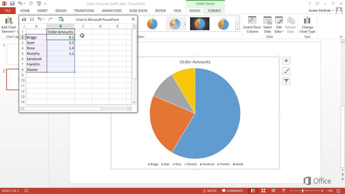
2. Access the Excel sheet: Double-click on the pie chart. This action will open the Excel sheet where you originally entered or pasted the chart data.
3. Edit the data: In the Excel sheet, make the necessary modifications to the values, labels, or categories. You can add or delete data points, change values, rename labels, or reorder the data as needed.
4. Close the Excel sheet: Once you have finished editing the chart data, close the Excel sheet by clicking outside of the sheet or pressing the Enter key. The changes you made will automatically reflect on the pie chart in your PowerPoint slide.
5. Verify the changes: Take a moment to review the pie chart and ensure that the modifications you made accurately represent the updated information or adjustments you wanted to make.
6. Customize the chart: If desired, customize the appearance and formatting of the chart using the various options available in the Chart Tools section, such as colors, labels, legends, or data labels.
7. Save the presentation: Remember to save your PowerPoint presentation to preserve the changes and modifications you’ve made to the chart data.
Whether you need to update the data or make adjustments to the labels or values, modifying the chart data in PowerPoint is a straightforward process. By following these steps, you can ensure that your pie chart reflects the most accurate and up-to-date information for your presentation.
Customizing the Chart Design
PowerPoint provides a range of customization options that allow you to personalize the design and appearance of your pie chart. By customizing the chart design, you can make it visually appealing and align it with your presentation’s theme. Here’s how you can customize the design of your pie chart:
1. Select the chart: Click on the pie chart to select it. This will enable the Chart Tools section in the PowerPoint ribbon.
2. Navigate to the Design tab: Within the Chart Tools section, locate and click on the “Design” tab. This tab provides several pre-designed chart styles and layout options.
3. Choose a chart style: In the “Chart Styles” group, browse through the different styles available and click on one to apply it to your chart. Experiment with various styles until you find one that suits your presentation’s visual aesthetics.
4. Modify chart colors: Click on the “Chart Styles” drop-down menu to access additional color options for your pie chart. You can choose different color schemes or create a custom color palette that matches your presentation’s theme. Experiment with different color combinations to find the one that enhances clarity and visual impact.
5. Adjust chart layout: Explore the “Layouts” group in the Design tab to change the layout of your pie chart. You can add or remove elements like titles, legends, data labels, or the chart’s axis. Select the layout option that best suits your presentation and data visualization needs.
6. Customize chart elements: PowerPoint allows you to customize individual chart elements as well. Right-click on any element, such as the chart background, labels, or data points, and choose “Format [element]”. This will open a formatting pane on the right side of the screen, enabling you to modify specific styling and formatting options for that element.
7. Apply animations and transitions: Add visual interest and create impact by incorporating animations and transitions to your pie chart. Access the “Animations” tab in the PowerPoint ribbon and select an animation or transition effect that enhances the chart’s visual storytelling.
8. Fine-tune the design: Spend some time adjusting the chart’s size, position, and alignment within the slide. You can also experiment with other visual features, such as shadows, 3D effects, or transparency, to give your chart a unique and polished look.
By customizing the design of your pie chart, you can create a visually stunning and engaging visual aid for your presentation. Remember to consider your audience and the overall theme of your presentation to ensure that the design choices align with your intended message.
Adjusting the Chart Layout
A well-organized and visually appealing chart layout can significantly enhance the clarity and understanding of your pie chart. PowerPoint gives you the flexibility to adjust the layout of your chart to optimize its presentation. Follow these steps to adjust the chart layout:
1. Select the chart: Click on the pie chart to select it. This will activate the Chart Tools section in the PowerPoint ribbon.
2. Navigate to the Layout tab: Within the Chart Tools section, locate and click on the “Layout” tab. This tab provides various options to modify the layout of your chart.
3. Add chart elements: Click on the “Axes” or “Axis Titles” buttons in the Labels group to add horizontal and vertical axes, as well as labels to your chart. This can provide additional context and make it easier for viewers to interpret the data.
4. Customize chart titles: Use the “Chart Title” button in the Labels group to add a title to your chart. Click on the button and choose the suitable location for the title, such as above or below the chart.
5. Resize and reposition chart elements: Click and drag elements, such as the legend or chart title, to adjust their size or position. This allows you to optimize the layout for better visibility and readability.
6. Adjust data labels: Data labels provide specific information about each segment of the pie chart. To adjust their appearance or position, right-click on a data label and select “Format Data Labels”. This opens a formatting pane where you can customize aspects like font, size, position, and whether to display percentages or values.
7. Change the chart type: In some cases, you may find that a different chart type better suits your data. PowerPoint allows you to change the chart type while retaining the data and layout. Simply go to the “Design” tab, click on the “Change Chart Type” button, and select the desired chart type that effectively represents your data.
8. Align and distribute chart elements: To ensure a clean and organized layout, use PowerPoint’s alignment and distribution tools. Select multiple chart elements, right-click, and choose “Align” or “Distribute” to align them vertically, horizontally, or evenly distribute them.
By adjusting the chart layout, you can optimize the presentation and readability of your pie chart. Tailor the layout to suit your data and the overall aesthetics of your presentation. Experiment with different options to find the best arrangement that enhances the visual impact of your chart.
Adding Labels and Data Labels
Labels play a crucial role in conveying information and aiding in the interpretation of a pie chart. PowerPoint offers several options for adding labels and data labels to make your chart more informative and visually appealing. Here’s how you can add labels to your pie chart:
1. Select the chart: Click on the pie chart to select it. This will activate the Chart Tools section in the PowerPoint ribbon.
2. Navigate to the Design tab: Within the Chart Tools section, locate and click on the “Design” tab. This tab provides various options to modify the chart’s design and layout.
3. Add a chart title: Click on the “Chart Title” button in the Labels group and choose the desired location for the title, such as above or below the chart. Enter the text for the title that accurately represents the information conveyed by the pie chart.
4. Insert a data label: Data labels provide specific information about each segment of the pie chart. To add data labels, click on the “Data Labels” button in the Labels group. You can choose to display the labels inside or outside the pie slices, or customize their position within the chart.
5. Customize data labels: Right-click on a data label and select “Format Data Labels”. This opens a formatting pane where you can customize various aspects of the data labels, such as font, size, color, and whether to display percentages or values. Experiment with different formatting options to ensure readability and alignment with your presentation’s style.
6. Use leader lines: If you choose to display the data labels outside the pie slices, PowerPoint allows you to add leader lines to connect the labels to the corresponding slices. To enable leader lines, right-click on a data label, select “Format Data Labels”, and check the “Show Leader Lines” option. Adjust the leader lines’ appearance and position, if necessary, for improved clarity.
7. Add a legend: A legend helps viewers understand the different categories or segments represented in the pie chart. To add a legend to your chart, go to the “Layout” tab in the Chart Tools section and click on the “Legend” button in the Labels group. Choose the desired location for the legend, such as at the bottom or side of the chart.
By adding labels and data labels to your pie chart, you can provide essential information and improve its clarity for your audience. Utilize PowerPoint’s formatting options to customize the appearance of labels, data labels, and the legend to enhance the overall visual impact of your chart.
Exploding Segments in the Chart
Exploding segments in a pie chart can help draw attention to specific data points or highlight important information. PowerPoint allows you to explode one or more segments to make them stand out from the rest of the chart. Here’s how you can explode segments in your pie chart:
1. Select the chart: Click on the pie chart to select it. This will activate the Chart Tools section in the PowerPoint ribbon.
2. Navigate to the Design tab: Within the Chart Tools section, locate and click on the “Design” tab. This tab provides access to various chart design options.
3. Identify the segment to explode: Analyze your chart data and determine which segment or segments you want to explode. These are the data points you want to highlight by visually separating them from the rest of the chart.
4. Explode a segment: Right-click on the desired segment and select “Format Data Point” or “Format Data Series” from the context menu. A formatting pane will appear on the right side of the screen.
5. Adjust the explosion: In the formatting pane, look for the “Explosion” option or a similar setting. Increase the value to explode the segment outwards from the center of the chart. Experiment with different explosion values to achieve the desired effect.
6. Preview the explosion: As you adjust the explosion value, you can preview the changes in real-time on your chart. Make sure to find a balance that highlights the segment without compromising the overall aesthetics and readability of the chart.
7. Modify other formatting options: While adjusting the explosion, you may want to explore other formatting options available in the formatting pane. This includes changing colors, borders, or effects to further enhance the visual impact of the exploded segment.
8. Repeat for multiple segments: If you want to explode multiple segments in the chart, repeat the above steps for each segment individually. This allows you to customize the explosion level and appearance of each highlighted data point.
By exploding segments in your pie chart, you can effectively draw attention to specific data points, emphasize their significance, or create a visually engaging representation of your information. Remember to use this feature judiciously and consider the overall balance and readability of the chart for optimal communication with your audience.
Formatting and Styling the Chart
A well-formatted and stylishly designed chart can greatly enhance its visual impact and make it more engaging for viewers. PowerPoint offers a variety of formatting and styling options to customize the appearance of your pie chart. Here’s how you can format and style your chart:
1. Select the chart: Click on the pie chart to select it. This will activate the Chart Tools section in the PowerPoint ribbon.
2. Access the formatting options: Navigate to the Design or Format tab within the Chart Tools section to access the chart formatting options. These tabs provide various tools and settings to modify the appearance of your chart.
3. Change the chart’s color scheme: Select the chart and use the “Chart Styles” or “Change Colors” options to apply a different color scheme to your chart. Experiment with different color combinations that match the overall theme and aesthetics of your presentation.
4. Adjust the chart’s borders: Modify the border settings of your chart to make it more visually appealing. Select the chart, right-click, and choose “Format Chart Area”. In the formatting pane, you can adjust the border color, thickness, and style to suit your preferences.
5. Customize data labels: Make your data labels more visually appealing and legible by formatting their appearance. Right-click on a data label and select “Format Data Labels” to access the formatting options. Here, you can change the font, size, color, position, and other attributes of the data labels.
6. Apply visual effects: PowerPoint offers several visual effects, such as shadows, 3D effects, or transparency, that can be applied to your chart. Experiment with these effects to add depth and dimension, making your chart visually captivating.
7. Add a chart title and axis labels: A chart title provides a clear indication of what the chart represents. Use the “Chart Title” button in the Labels group to add a title to your chart. Similarly, apply axis labels to provide context and improve clarity.
8. Maintain consistency: Ensure that the formatting and styling elements of your chart align with the overall design of your presentation. Consistency in font styles, colors, and other visual elements will create a cohesive and professional look.
By taking the time to format and style your pie chart, you can create a visually appealing representation of your data that captivates your audience. Experiment with different options and find the formatting choices that best complement your presentation’s theme and convey your message effectively.
Animating the Pie Chart
Animating your pie chart in PowerPoint can bring it to life, capturing the attention of your audience and emphasizing key information. By adding animations to your chart, you can present data in a dynamic and engaging way. Here’s how you can animate your pie chart:
1. Select the chart: Click on the pie chart to select it. This will activate the Chart Tools section in the PowerPoint ribbon.
2. Access the Animations tab: Within the Chart Tools section, locate and click on the “Animations” tab. This tab provides various animation options to apply to your chart.
3. Choose an animation: Explore the different animation options available in the Animation group. Click on an animation to preview how it affects your chart. Depending on your preference, you can choose options like “Fade In”, “Zoom In”, or “Slide In” to introduce your chart.
4. Set the animation trigger: Decide how you want the animation to be triggered. By default, the animation may occur all at once or when the slide loads. However, you can customize the trigger by selecting the chart and going to the “Start” dropdown in the Timing group. Options such as “On Click” allow you to control when the animation appears.
5. Customize the animation timing: Adjust the timing and duration of the animation to create the desired effect. In the Timing group, you can specify the duration of the animation, delay its start, or choose options like “With Previous” for simultaneous animation.
6. Add animation to data labels: If you want to draw attention specifically to the data labels in your pie chart, you can add animation to them individually. Select the data labels, go to the “Animations” tab, and choose an animation from the gallery. This will animate the data labels when triggered.
7. Preview and refine: Play the slide to preview the animation and make any necessary adjustments. Fine-tune the animation timing, duration, or order if needed to ensure the chart animates smoothly and aligns with your presentation flow.
8. Coordinate with slide transitions: Consider coordinating the animation of your pie chart with slide transitions to create a cohesive and seamless visual experience. Utilize slide transitions to smoothly transition between slides while your pie chart animates.
By animating your pie chart, you can enhance its impact and engage your audience. However, it’s important to use animation sparingly and purposefully, so it supports the content and message rather than becoming a distraction. With strategic use of animation, your pie chart can become a dynamic element in your presentation that captures and holds the attention of your audience.
Inserting Additional Elements to Enhance the Chart
While a pie chart can effectively convey data, you can further enhance its visual impact and clarify its message by inserting additional elements. PowerPoint provides a range of options to supplement your pie chart and enrich its presentation. Here are some elements you can insert to enhance your chart:
1. Text boxes: Inserting text boxes allows you to provide additional context or explanations for the data displayed in the pie chart. You can use text boxes to give a brief description of the chart’s purpose, define terms, or highlight key insights. Place the text boxes near or below the pie chart for easy visibility.
2. Callouts: Callouts are great for drawing attention to specific data points or providing additional information. You can use callouts to explain a particular segment in more detail or emphasize notable figures or statistics. Position the callouts strategically beside or near the corresponding segments in the pie chart.
3. Icons and images: Icons and images can add visual interest and improve the overall presentation of your chart. You can use relevant icons or images to represent the different data categories or to provide visual cues. Ensure that the icons or images are appropriately sized and placed around or alongside the pie chart.
4. Arrows and lines: Arrows or lines are useful for visually connecting elements within the chart or highlighting specific data relationships. You can use arrows or lines to indicate the flow or progression between different segments, categories, or data points in the pie chart. Arrange the arrows or lines in a way that guides the viewer’s attention and understanding.
5. Annotations: Annotations are annotations are a great way to provide supporting information or explanations about specific data points. You can use annotations for additional insights, references, or sources related to the data represented in the pie chart. Place the annotations as footnotes or side notes near the relevant parts of the chart.
6. Visual effects: PowerPoint offers various visual effects, such as shadows, glows, or 3D effects, to enhance the chart’s appearance. Apply these effects sparingly to add depth and dimension to the pie chart. Ensure that the visual effects do not overpower the chart but rather create a visually appealing and polished look.
7. Background images or shapes: To provide a visually appealing backdrop for your chart, consider adding relevant background images or shapes. These can help set the context and reinforce the theme of your presentation. Select images or shapes that complement the chart’s content and maintain clarity.
By including additional elements to your pie chart, you can enhance its visual appeal, provide more information, and guide your audience’s understanding. However, exercise discretion and ensure that these elements are introduced strategically and do not overwhelm the primary focus of the chart.
Updating the Chart Data
As your data changes or gets updated, it is essential to keep your pie chart accurate and reflective of the latest information. PowerPoint allows you to easily update the chart data without having to recreate the entire chart. Here’s how you can update the chart data:
1. Select the chart: Click on the pie chart to select it. This will activate the Chart Tools section in the PowerPoint ribbon.
2. Access the Excel sheet: Double-click on the pie chart. This will open the Excel sheet where you initially entered or pasted the chart data. The Excel sheet will appear alongside the chart.
3. Update the data: In the Excel sheet, make the necessary modifications to the values, labels, or categories. You can add or delete data points, change values, rename labels, or reorder the data as needed. Ensure that you enter or paste the updated data accurately.
4. Close the Excel sheet: Once you have finished updating the chart data, close the Excel sheet by clicking outside of the sheet or pressing the Enter key.
5. Verify the changes: Take a moment to review the pie chart and ensure that the modifications you made accurately represent the updated information. Confirm that the chart now displays the latest data accurately.
6. Customize the chart design: PowerPoint provides various customization options to modify the appearance of your pie chart. If necessary, you can further customize the design, colors, labels, or other formatting elements to ensure that the updated data is presented in the most meaningful and visually appealing way.
7. Save the presentation: Once you have updated the chart data, remember to save your PowerPoint presentation to preserve the changes. This ensures that your pie chart reflects the latest data when you present or share the presentation with others.
By regularly updating your pie chart data, you ensure that it remains current and relevant. This allows you to present accurate information to your audience and maintain the integrity of your presentation.
Saving and Sharing the PowerPoint Slide with the Pie Chart
Once you have created and finalized your presentation with the pie chart, it is important to save it properly and share it with others if needed. Here are some steps to save and share your PowerPoint slide with the pie chart:
1. Save the presentation: Click on the “File” tab in the top-left corner of the PowerPoint window, then choose “Save As”. Give your presentation a descriptive and recognizable name, select the desired location on your computer, and click “Save”. This ensures that any changes made to the slide, including the pie chart, are saved.
2. Check the file format: Before sharing the presentation, consider the file format you want to use. PowerPoint allows you to save your presentation as a PPTX, which is the default format, or choose other formats such as PDF or PPT to ensure compatibility with different devices and software.
3. Test the presentation: Open the saved presentation file to ensure that all elements, including the pie chart, appear as desired. Review the slide with the pie chart and verify that the data, formatting, and other visual aspects are intact.
4. Compress media (optional): If your presentation contains large media files, such as images or videos, you may want to compress them to reduce the file size. Compressing media helps when sharing the presentation via email or other online platforms where file size may be a concern.
5. Share the presentation: There are several ways to share your presentation with others. You can email the file directly, upload it to a file-sharing platform, or use cloud storage services like Google Drive or Microsoft OneDrive. Choose a method that is convenient for both you and the recipients.
6. Consider slide notes: If your pie chart requires additional explanations or context, you may want to include slide notes. Slide notes provide a separate area where you can add detailed information related to the pie chart. When sharing the presentation, ensure that the recipient also has access to the slide notes to fully understand the content.
7. Protect sensitive information (if applicable): If the pie chart contains sensitive or confidential data, it might be necessary to password-protect the presentation. PowerPoint allows you to add a password to prevent unauthorized access to the file. This ensures that only authorized individuals can view and make changes to the presentation.
By properly saving and sharing your PowerPoint slide with the pie chart, you can effectively communicate your data and insights with others. Ensure that the file is accessible, compatible, and secure, allowing your audience to view and understand the pie chart effortlessly.