
Overview of PowerPoint Charts
PowerPoint is a popular software tool used for creating presentations, and one of its key features is the ability to create dynamic and visually appealing charts. Charts are a powerful way to present data, statistics, and trends in a clear and concise manner.
PowerPoint offers a variety of chart types, including bar charts, line charts, pie charts, and more. These charts enable users to represent complex data sets in a visually engaging format, making it easier for the audience to understand and interpret the information.
Each chart type has its own unique features and uses. Bar charts, for example, are commonly used to compare multiple categories or items. Line charts, on the other hand, are ideal for showing trends over time. Pie charts are useful for representing proportions or percentages. PowerPoint also offers more specialized charts like scatter plots, bubble charts, and radar charts.
With PowerPoint charts, you have the ability to customize and format them to suit your specific needs. You can change colors, fonts, add labels, legends, and even adjust the size and shape of the chart. This level of customization allows you to create professional-looking visuals that align with your branding or presentation theme.
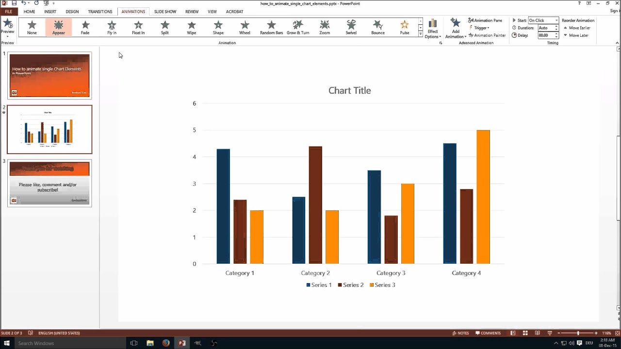
Another great feature of PowerPoint charts is the ability to animate specific elements. Animation brings charts to life by allowing you to control how and when different parts of the chart are revealed. This can be particularly effective when presenting data or telling a story with your presentation.
Animating chart elements not only adds visual interest, but it also helps to highlight key points or data points, making them more memorable to your audience. By strategically animating parts of your chart, you can guide your audience’s attention and ensure that they focus on the most important information.
Whether you are presenting sales data, survey results, or market trends, PowerPoint charts offer a powerful tool for communicating and visualizing your information. With a range of chart types and the ability to customize and animate them, you can create impactful and engaging presentations that effectively convey your message.
Types of PowerPoint Charts
PowerPoint provides a wide range of charts that can be used to effectively represent data and convey information in a visually appealing manner. Understanding the different types of PowerPoint charts available can help you select the most appropriate chart type for your specific needs:
- Bar Charts: Bar charts are widely used to compare and contrast different categories or items. They consist of horizontal or vertical bars that represent the values of each category, allowing viewers to quickly understand the relative differences.
- Line Charts: Line charts are ideal for displaying trends over time. They can show the progression of data and highlight patterns or changes in values. Using lines to connect data points, line charts provide a visual representation of how data fluctuates over a specific period.
- Pie Charts: Pie charts are commonly used to represent proportions or percentages. The chart is divided into sectors, with each sector representing a different category or component. The size of each sector corresponds to the proportion of that category relative to the total.
- Area Charts: Area charts are similar to line charts, but the area beneath the line is filled with color, creating a more solid visual representation. This chart type is helpful for illustrating cumulative data, such as tracking changes in total value over time.
- Column Charts: Column charts are similar to bar charts, but with vertical bars instead of horizontal ones. They are useful for comparing quantities or values for different categories or items, similar to bar charts.
- Scatter Plots: Scatter plots are used to display the relationship between two variables. Data points are plotted on a grid, and the position of each point represents the values for the two variables. Scatter plots are helpful for identifying correlations or trends between variables.
- Bubble Charts: Bubble charts combine the features of scatter plots and pie charts. They represent data points as bubbles, with the size of each bubble indicating a third variable. This chart type is useful for visualizing and comparing data that has three dimensions.
- Radar Charts: Radar charts, also known as spider charts, are used to compare multiple categories or variables in a two-dimensional graph. Each category is represented by a spoke, and data points are connected to create a polygon shape. Radar charts are effective for highlighting strengths and weaknesses across different variables.
These are just a few examples of the many chart types available in PowerPoint. Each chart type offers unique benefits and can be tailored to suit your specific data and presentation needs. Experimenting with different chart types can help you find the most effective way to present your information and engage your audience.
Animating the Chart Title
One effective way to engage your audience and draw attention to key information in your PowerPoint chart is by animating the chart title. Animating the chart title can create visual interest and help emphasize the main message or topic of your presentation.
To animate the chart title in PowerPoint, follow these simple steps:
- Select the chart title by clicking on it. The title is usually located above or next to the chart.
- Go to the “Animations” tab in the PowerPoint toolbar.
- Choose an animation effect from the available options. These options may include fading in, zooming in, or sliding in.
- Preview the animation by clicking the “Preview” button in the Animations tab.
- Adjust the timing and duration of the animation to control when the chart title appears. This can be done by selecting the chart title, going to the “Animations” tab, and clicking on “Duration” or “Delay” options.
When animating the chart title, it’s important to keep a few best practices in mind:
- Keep the animation subtle and not overly distracting. The purpose of animating the chart title is to draw attention to it, not to overwhelm the audience.
- Choose an animation effect that complements the content of your chart and the overall theme of your presentation. Consider the tone and message you want to convey.
- Ensure that the animation is synchronized with the rest of your presentation. Consistency in timing and transitions can enhance the flow and professionalism of your presentation.
- Consider the order of animations within your presentation. You may want to animate the chart title along with other elements in a specific order to create a cohesive story or emphasize certain points.
By animating the chart title, you can effectively capture your audience’s attention and make your PowerPoint presentation more engaging. The animation can help highlight the main message or topic of your chart and guide the audience’s focus.
Remember to use animation sparingly and purposefully, only selecting effects that enhance the overall content and flow of your presentation. With a well-animated chart title, you can create a professional and captivating presentation that leaves a lasting impression on your audience.
Animating the Axis Labels
In PowerPoint charts, the axis labels are essential for providing context and understanding to the data being presented. Adding animation to the axis labels can further enhance the visual appeal of your presentation and draw attention to important information.
To animate the axis labels in your PowerPoint chart, follow these steps:
- Select the chart that contains the axis labels.
- Go to the “Animations” tab in the PowerPoint toolbar.
- Choose an animation effect from the available options. Options can include fading in, sliding in, or even animating individually.
- Preview the animation by clicking the “Preview” button in the Animations tab.
- Adjust the timing and duration of the animation to control when the axis labels appear. This can be done by selecting the axis labels, going to the “Animations” tab, and adjusting the “Duration” or “Delay” options.
When animating axis labels, it is crucial to consider the following best practices:
- Keep the animation simple and subtle to avoid distracting the audience from the main content of the chart. The purpose of animating the axis labels is to enhance understanding, not to overwhelm or confuse.
- Choose an animation effect that complements the overall style and theme of your presentation. Maintain consistency throughout your slides for a cohesive design.
- Ensure that the animation timing aligns with the flow of your presentation. Smooth transitions and synchronized animations can help create a seamless visual experience.
- Consider animating axis labels along with other chart elements to maintain a balanced and harmonious effect.
By animating the axis labels, you can effectively guide your audience’s attention and create a more engaging and dynamic PowerPoint presentation. The animation can draw focus to specific data points or trends, consequently improving the audience’s understanding and retention of information.
Remember, moderation is key. Use animation strategically, focusing on the key points you want to highlight and making sure it aligns with the overall purpose and message of your presentation. With animated axis labels, you can captivate your audience and bring your data to life in a visually appealing and impactful way.
Animating Data Points
In a PowerPoint chart, data points represent the actual values or data that are being presented. Animating data points can be an effective way to emphasize specific data or highlight important trends or comparisons within your chart.
To animate data points in your PowerPoint chart, follow these steps:
- Select the data points you want to animate. You can do this by clicking on the chart and then clicking on the individual data points you wish to animate.
- Go to the “Animations” tab in the PowerPoint toolbar.
- Choose an animation effect from the available options. Effects can include fading in, flying in, or even bouncing.
- Preview the animation by clicking the “Preview” button in the Animations tab.
- Adjust the timing and duration of the animation to control when the data points appear. This can be done by selecting the data points, going to the “Animations” tab, and adjusting the “Duration” or “Delay” options.
When animating data points, consider the following best practices:
- Selectively animate only the most relevant or significant data points to avoid overwhelming the audience with excessive animation.
- Choose an animation effect that suits your data and reinforces the message you want to convey. For example, if you want to highlight a specific data point, use an effect that attracts attention, like zooming in or pulsating.
- Align the animation with the flow and timing of your presentation. Consider the order in which the data points are animated to ensure a logical and coherent narrative.
- Avoid using animations that are too flashy or distracting. The goal is to enhance the data’s understanding and impact, not to divert focus away from the content.
By animating data points, you can effectively draw attention to specific values or trends within your chart. This animation technique allows your audience to better absorb and comprehend the information being presented. It can also help in creating a more engaging and visually compelling presentation.
Remember, moderation is key. Use animation strategically and purposefully to enhance the clarity and impact of your data points. With well-animated data points, you can effectively communicate your message and make your PowerPoint chart more dynamic and memorable to your audience.
Animating Data Series
In PowerPoint charts, data series consist of a group of related data points that are plotted together. Animate the data series in your PowerPoint chart to bring attention to different groups of data or to demonstrate changes over time.
To animate the data series in your PowerPoint chart, follow these steps:
- Select the data series you want to animate. This can be done by clicking on one data point within the series, and the entire series will be selected.
- Go to the “Animations” tab in the PowerPoint toolbar.
- Choose an animation effect from the available options. Effects can include fading in, sliding in, or even animating individually.
- Preview the animation by clicking the “Preview” button in the Animations tab.
- Adjust the timing and duration of the animation to control when the data series appears. This can be done by selecting the data series, going to the “Animations” tab, and adjusting the “Duration” or “Delay” options.
When animating data series in your PowerPoint chart, consider the following best practices:
- Selective animation: Choose to animate specific data series that are important for your message or analysis. Avoid animating all the data series within the chart, as it may cause confusion or overload the audience with information.
- Consistent animation: Maintain consistency in animation styles across all data series in your chart. Using the same animation effect or timing for similar data series will create a cohesive and professional look.
- Clear storytelling: Use the animation of data series to tell a story or highlight trends and comparisons. Consider the order in which the data series are animated to ensure a logical flow in your presentation.
- Subtle animation: Keep the animation effect subtle and not overly flashy. The goal is to draw attention to the data series without distracting from the information being presented.
Animating data series in your PowerPoint chart can make your presentation more visually appealing and engaging. It allows you to guide your audience’s focus to the specific data you want to highlight, enabling them to better understand the information you are presenting.
Remember to use animation selectively and purposefully, aligning it with your overall presentation objectives. With well-animated data series, you can effectively communicate your message and captivate your audience with a dynamic and visually compelling PowerPoint chart.
Working with Grouped Objects
Grouped objects in PowerPoint charts refer to multiple elements that have been combined and treated as a single entity. Working with grouped objects allows you to manipulate and animate multiple chart components simultaneously, creating a cohesive and visually impactful presentation.
To work with grouped objects in your PowerPoint chart, follow these steps:
- Select the objects you want to group by holding the Shift key and clicking on each individual object.
- Right-click on any of the selected objects and choose the “Group” option from the context menu.
- You can now move, resize, or apply animations to the grouped objects as a single entity.
- To ungroup the objects, select the grouped object, right-click, and choose the “Ungroup” option.
When working with grouped objects in your PowerPoint chart, consider these best practices:
- Organizing elements: Grouping objects can help you organize and manage the different components in your chart more efficiently. It makes it easier to position, resize, and format the elements cohesively.
- Animating grouped objects: Animating grouped objects allows for synchronized animations, where multiple chart elements appear or move together. This can create a more polished and professional presentation.
- Consistency in grouping: Maintain consistency by grouping similar chart elements together. For example, group the data labels or legends for each series to ensure a clear and organized presentation.
- Test and preview: Before finalizing your presentation, test the animations and movements of your grouped objects to ensure they enhance the visual flow and clarity of your chart.
Working with grouped objects in your PowerPoint chart enables you to have greater control over the visual elements and animations within your presentation. By combining related objects, you can create a more cohesive and seamless flow, ensuring that your chart effectively communicates your message.
Remember to use grouping strategically and purposefully, keeping in mind the overall design and goals of your presentation. With well-organized and animated grouped objects, you can create a visually impactful PowerPoint chart that engages and captivates your audience.
Advanced Animation Techniques for Charts
In PowerPoint, charts are not just static elements on a slide. With advanced animation techniques, you can bring your charts to life and create dynamic and engaging presentations. These techniques allow you to go beyond basic animations and add depth and interactivity to your chart.
Here are some advanced animation techniques you can use to enhance your PowerPoint charts:
- Data Revealing Animation: Instead of showing the entire chart at once, consider revealing data points or series one by one. This gradual animation builds anticipation and helps guide your audience’s focus.
- Data Highlighting Animation: Use animation to highlight specific data points, series, or trends within your chart. This technique draws attention to important information and allows you to emphasize key insights.
- Chart Transformation Animation: Transformations can add a visually stunning effect to your charts. For example, you can animate a bar chart turning into a donut chart or a line chart smoothly transitioning into an area chart. These transformations can help tell a story or show a transition between different data sets.
- Interactive Chart Features: Create interactive elements in your chart by using triggers and animations. For instance, you can set up animations to activate when a specific data point or button is clicked, allowing your audience to explore the chart at their own pace.
- Dynamic Chart Updates: Use animation to simulate real-time updates in your chart. For example, animate a line chart to dynamically plot data as it changes over time, giving your audience a sense of live data visualization.
- Path and Motion Animation: Apply motion paths to your chart elements, allowing them to move along a specified path. This technique can be particularly effective for showing relationships between different chart components or illustrating a sequence of events.
- Combining Multiple Animations: Experiment with combining different animation effects to create more complex and visually appealing presentations. For instance, you can combine a zoom-in animation with a fade-in animation to create a more dramatic and immersive effect.
When using advanced animation techniques in your PowerPoint charts, it’s important to strike a balance. Aim for animations that enhance the content and storytelling of your presentation, without becoming overwhelming or distracting.
Remember to test and fine-tune your animations to ensure they align with the overall message and flow of your presentation. With well-executed advanced animation techniques, you can take your PowerPoint charts to the next level and deliver impactful and memorable presentations to your audience.
Tips and Best Practices for Animating Charts
Animating charts in PowerPoint can greatly enhance the visual impact and effectiveness of your presentations. However, it is important to approach chart animations with care and consideration to ensure they enhance the overall clarity and understanding of your message. Here are some tips and best practices for animating charts:
- Keep it Simple: Use animations sparingly and avoid overloading your charts with excessive or flashy effects. The goal is to enhance the content, not distract from it.
- Focus on Key Points: Determine the most important information or data points in your chart and animate those elements to draw attention to them. Highlighting key points can help your audience grasp the main message or takeaways.
- Timing is Key: Pay attention to the timing of your animation. Ensure that the animation is in sync with your narration and the flow of your presentation. Avoid animations that feel rushed or too slow.
- Create a Narrative: Consider the story you want to tell with your chart and use animations to guide the audience through the sequence. Arrange the animations in a logical order to build a cohesive narrative.
- Be Consistent: Use consistent animation styles and timings across your charts to maintain a professional and cohesive look throughout your presentation. Consistency helps create a harmonious visual experience for your audience.
- Test and Preview: Before presenting, thoroughly test and preview your animations to ensure they function as intended. Pay attention to the smoothness of transitions and any potential glitches or delays.
- Avoid Clutter: Keep your chart animations clean and uncluttered. Do not animate every single element in your chart, as it can create visual confusion. Selectively animate the elements that serve the purpose of your message.
- Consider Your Audience: Think about the preferences and expectations of your audience when choosing animation styles. Tailor your animations to resonate with your specific audience and the tone of your presentation.
Remember, the main purpose of animating charts is to improve communication and engage your audience. Keep your animations purposeful, clear, and impactful. By following these tips and best practices, you can effectively use animations to create compelling and visually engaging PowerPoint charts that leave a lasting impression on your audience.