Choosing the Right Template
When it comes to creating a visually appealing and eye-catching poster in PowerPoint, the first step is to choose the right template. A template serves as the foundation of your poster design, providing a structure and layout that can be customized to suit your specific needs and preferences.
PowerPoint offers a wide range of pre-designed templates that are both professional and visually appealing. These templates come in various themes and designs, making it easier for you to find one that aligns with the message and purpose of your poster. Whether you’re creating a poster for an event, promoting a product, or presenting research findings, there’s sure to be a template that suits your needs.
When selecting a template, consider the overall look and feel you want to achieve. Think about the color scheme, font styles, and graphical elements that will best convey your message. Whether you prefer a minimalist design or a bold and vibrant layout, take the time to browse through the available templates and choose one that resonates with your vision.
Keep in mind that while templates provide a great starting point, they can also be customized to suit your needs. PowerPoint offers a range of editing tools that allow you to adjust the layout, color scheme, and font styles. You can also add your own images, graphics, and text to further personalize the template and make it uniquely yours.
Remember, choosing the right template is crucial to creating a visually appealing and impactful poster. It sets the tone for your design and helps capture the attention of your audience. So take the time to explore the available options and select a template that best represents your message.
Customizing the Layout
Once you’ve chosen the perfect template for your poster in PowerPoint, it’s time to customize the layout to make it unique and visually appealing. Customizing the layout allows you to arrange the different elements of your poster in a way that effectively communicates your message and captures the attention of your audience.
Start by considering the overall structure of your poster. Determine how you want to divide the space and allocate different sections for text, images, and other graphical elements. You can use columns or grids to create a well-organized and balanced layout that flows smoothly from one section to another.
Next, begin adding your content to the poster. Rather than overwhelming the layout with too much text, aim for concise and impactful messaging. Use headings, subheadings, and bullet points to break up the text and make it easily digestible for readers.
Don’t be afraid to play around with the placement and size of your content. PowerPoint provides a range of tools for aligning, grouping, and resizing elements, allowing you to create a visually pleasing arrangement. Experiment with different layouts to find the most effective way to present your information.
Consider the use of white space or negative space in your layout. Leaving some areas of the poster free from content can help draw attention to important elements and prevent it from appearing cluttered. Utilize space strategically to create a clean and balanced design.
To enhance the visual appeal of your layout, you can also apply color schemes, gradients, or background patterns. These elements can add depth and interest to your poster, making it more visually appealing.
Remember to regularly preview and test your layout as you make adjustments. Step back and evaluate how the overall design looks from a distance. This will help you ensure that your poster is visually appealing and easy to comprehend, even from a distance.
By customizing the layout of your poster in PowerPoint, you can create a visually stunning and engaging design that effectively conveys your message. Take the time to experiment with different arrangements and elements to find the perfect layout that brings your poster to life.
Adding Text
Text plays a crucial role in conveying information and capturing the attention of your audience on a poster in PowerPoint. Whether you’re including a headline, body text, or call-to-action, it’s important to carefully consider the placement, formatting, and style of your text to ensure it effectively communicates your message.
Start by deciding what key information you want to include on your poster. This could be a catchy headline, a clear and concise summary, or important details about your topic. Keep in mind that posters are typically viewed from a distance, so use larger font sizes and bold text to ensure your message is easily readable.
When adding text to your poster, consider the hierarchy of information. Use headings, subheadings, and body text to guide the reader’s eyes and help them navigate through the content. Make sure to use a font that is legible even from a distance, and avoid using too many different font styles as it can make your poster look cluttered.
PowerPoint provides a variety of styling options for text, such as bold, italic, underline, and color. Use these formatting tools selectively to emphasize important information or create visual interest. However, be cautious not to overuse them, as it can make your text appear chaotic and difficult to read.
Consider using bullet points or numbered lists to break up large chunks of text and make it more easily digestible. This can simplify complex information and help your audience grasp the main points of your poster at a glance.
When it comes to text alignment, it’s generally best to stick with left-aligned or centered text. Left-aligned text is easy to read and follow, while centered text can create a more symmetrical and visually appealing design. Avoid using right-aligned text unless it is necessary for a specific design purpose.
Lastly, consider the color contrast between your text and background. Ensure that your text is easily readable by using contrasting colors. For example, use dark text on a light background or vice versa to maximize legibility.
Adding relevant and well-formatted text to your poster in PowerPoint is key to effectively conveying your message. Take the time to carefully consider the placement, formatting, and style of your text to ensure it captures attention and communicates your information in a clear and visually appealing way.
Formatting Text
Formatting text is essential for creating a visually appealing and readable poster in PowerPoint. By applying various formatting techniques, you can enhance the design and ensure that your message stands out. Here are some tips for effectively formatting text on your poster:
Font Selection: Choose a font that is clear, legible, and appropriate for your poster’s theme. Avoid using too many different fonts, as it can create a cluttered and unprofessional look. Stick to two or three fonts at most, including one for headings and another for body text.
Font Size: Ensure that the text on your poster is easily readable from a distance. Use larger font sizes for headings and subheadings, and slightly smaller sizes for body text. However, be mindful not to make the font too large as it may take up too much space and overwhelm the design.
Font Weight: Use bold text to emphasize important points or headings. This can help guide the reader’s attention and create visual hierarchy. However, use bold sparingly and avoid using it for large blocks of text, as it can become visually overwhelming.
Font Color: Choose a font color that contrasts well with the background of your poster. High contrast ensures readability. For dark backgrounds, use light-colored fonts, and for light backgrounds, use dark-colored fonts. Avoid using neon or overly bright colors as they can strain the eyes.
Text Alignment: Decide on a consistent text alignment for your poster, such as left-aligned or centered. Consistency creates a sense of cohesion and makes your poster easier to read. Avoid using right-aligned text, as it can make the text harder to follow.
Letter Spacing and Line Height: Adjust the letter spacing and line height to improve readability and overall appearance. Increasing the spacing between letters (tracking) and lines (leading) can help prevent the text from appearing cramped and improve legibility.
Text Effects: Use text effects such as shadow, outline, or gradient fills to add depth and visual interest to your text. However, use these effects sparingly and ensure that they don’t distract from the overall message of your poster.
Consistency: Maintain consistency in font styles, sizes, and formatting throughout your poster. This creates a cohesive design and helps the reader navigate through the content more easily.
By applying effective text formatting techniques, you can enhance the readability and visual appeal of your poster in PowerPoint. Experiment with different font styles, sizes, and colors to find a combination that best represents your message and captures the attention of your audience.
Adding Images and Graphics
Adding images and graphics to your poster in PowerPoint can greatly enhance its visual appeal and engage your audience. Images and graphics can effectively convey your message, add interest, and make your poster more memorable. Here are some tips for incorporating images and graphics into your poster:
Choose High-Quality Images: Use high-resolution images that are clear and crisp. Blurry or pixelated images can detract from the overall quality of your poster. If possible, opt for original or royalty-free images to avoid copyright issues.
Relevance: Select images and graphics that are relevant to the content and purpose of your poster. They should support and enhance the message you are trying to convey. Avoid using images just for decoration; they should serve a purpose.
Placement: Strategically place images and graphics on your poster to create balance and visual interest. Consider the flow and hierarchy of information and ensure that the placement of images does not distract from the main message.
Size and Scale: Resize and scale images proportionally so that they fit appropriately within the layout of your poster. Avoid stretching or distorting images, as this can make them appear unnatural or unprofessional.
Image Editing: Use image editing tools within PowerPoint to make adjustments as needed. You can crop, rotate, or apply filters to enhance the visual impact of your images. However, be cautious not to make excessive edits that can make the images look unrealistic.
Charts and Graphs: If your poster includes data or statistics, consider using charts and graphs to present the information visually. PowerPoint offers a variety of chart templates and customization options to create visually appealing and informative visuals.
Captions and Labels: Provide captions or labels for images and graphics, especially if they are complex or require additional explanation. This helps the audience understand the significance of the visuals and reinforces your message.
Consistency: Maintain a consistent style throughout your poster when adding images and graphics. This includes the color scheme, font styles, and overall aesthetic. Consistency creates a cohesive design and enhances the professional look and feel of your poster.
Copyright Considerations: Ensure that you have the necessary rights and permissions to use any copyrighted images or graphics. If in doubt, opt for royalty-free images or create your own visuals.
By incorporating relevant and visually appealing images and graphics into your poster, you can effectively convey your message and capture the attention of your audience. Experiment with different placements and sizes to find the perfect balance that enhances the overall design and impact of your poster.
Adjusting Image Properties
Adjusting image properties is an important step in creating a visually appealing and polished poster in PowerPoint. By making various adjustments, you can fine-tune the appearance of your images and ensure they complement the overall design. Here are some key image properties to consider:
Resize and Scale: PowerPoint provides easy-to-use controls to resize and scale your images. Adjust the size of your images to fit them appropriately within your poster layout. Be mindful of maintaining the aspect ratio while resizing to avoid distorting the image proportions.
Cropping: Use the cropping tool to remove any unnecessary parts of an image. Crop out distracting background elements or focus on specific details within the image that best support your message. Cropping can help improve the composition and impact of your visuals.
Rotate and Flip: If needed, rotate or flip your images to achieve the desired orientation. This can be useful for aligning images with other elements on your poster or for creative purposes. However, be cautious not to rotate or flip your images excessively, as it can make them appear unnatural.
Transparency: Adjust the transparency of your images to create subtle or blended effects. This can be especially useful when overlaying images or combining them with other graphical elements. Experiment with different transparency levels to achieve the desired visual effect.
Brightness and Contrast: Enhance or adjust the brightness and contrast levels of your images to optimize their visibility and impact. Use these adjustments sparingly to maintain a natural and visually pleasing appearance.
Color Corrections: Fine-tune the colors in your images to match the overall color scheme or to create a specific mood. You can adjust the saturation, temperature, or even apply color filters to create an impactful visual presentation.
Image Effects: Explore the various image effects available in PowerPoint, such as shadows, reflections, or borders. These effects can add depth and visual interest to your images, making them more visually appealing and captivating for your audience.
Resolution and Compression: Ensure that your images have an adequate resolution for printing or displaying purposes. High-quality images with higher resolutions are recommended for crisp and clear visuals. However, keep in mind that larger images can increase the file size, so consider compressing them if necessary.
Consistency: Maintain consistency in adjusting image properties throughout your poster. Using a consistent approach to cropping, resizing, and adjusting other image properties creates a cohesive visual presentation and enhances the overall professional look of your poster.
By adjusting image properties effectively, you can optimize the visual impact and integration of your images within your poster design. Take the time to experiment with different adjustments to achieve the desired appearance and ensure that your images enhance the overall message and aesthetics of your poster.
Using Shapes and Icons
Shapes and icons are powerful design elements that can add visual interest and enhance the overall aesthetics of your poster in PowerPoint. They can be used to highlight important information, create visual hierarchy, or convey concepts in a concise and appealing manner. Here’s how you can effectively use shapes and icons on your poster:
Highlighting Key Points: Use shapes and icons to draw attention to important information or key points on your poster. By placing a shape or icon next to a specific section of text, you can make it stand out and easily catch the reader’s eye.
Visual Hierarchy: Create a visual hierarchy by using shapes and icons in different sizes and shapes. Larger shapes and icons can signify more important or prominent information, while smaller ones can represent minor details. This helps guide the reader’s attention and makes your poster visually engaging.
Symbolizing Concepts: Utilize icons to convey concepts or ideas in a simple and concise way. For instance, use a magnifying glass icon to represent “research” or a light bulb icon to represent “ideas.” Icons can effectively communicate complex ideas or themes at a glance.
Grouping and Organizing Content: Use shapes to group related text or visuals together. By placing text or images inside a shape, you can create a visual grouping effect, making it easier for the audience to understand the relationship between different elements on your poster.
Customizing Shapes and Icons: PowerPoint provides a wide range of built-in shapes and icons that can be customized to suit your needs. You can change their size, color, fill, and outline to match your poster’s design and aesthetic. Additionally, you can combine shapes to create unique visuals or use icons from external sources for more specific representations.
Consistency: Maintain consistency in the style, color scheme, and shape usage throughout your poster. Consistency helps create a cohesive visual presentation and makes your poster look polished and professional.
White Space: Consider the use of white space or negative space around shapes and icons. Leaving some areas empty can give them breathing room and prevent your poster from looking cluttered. It also allows the shapes and icons to stand out and grab attention.
Alignment and Placement: Pay attention to the alignment and placement of shapes and icons on your poster. Make sure they are aligned with other elements, such as text or images, to create a visually harmonious design. Be mindful of their proximity to other elements to maintain a balanced and organized layout.
By effectively using shapes and icons, you can create a visually captivating and organized poster that effectively communicates your message. Experiment with different shapes, sizes, and arrangements to find the best combination that enhances the overall design and captures the attention of your audience.
Adding Charts and Graphs
Charts and graphs are valuable tools for presenting data and statistics on your poster in a visually engaging and organized way. They can help your audience understand complex information quickly and easily. Here are some tips for effectively adding charts and graphs to your poster in PowerPoint:
Choose the Right Chart Type: Consider the type of data you want to present and choose the appropriate chart type. Common chart types include bar graphs, line graphs, pie charts, and scatter plots. Select a chart that can effectively showcase your data and convey the intended message.
Organize Data Before Creating the Chart: Ensure that your data is organized and properly formatted before creating the chart. This includes categorizing data into relevant groups or series and arranging it in a logical order. Well-organized data makes it easier to create accurate and meaningful charts.
Use Clear Labels and Titles: Include clear labels for each data point and axis to ensure the audience understands what the chart represents. Use concise titles that accurately describe the content of the chart and its purpose. Clear labeling helps avoid confusion and enhances the understanding of your data.
Simplify and Minimize Clutter: Avoid overcrowding the chart with excessive data points or unnecessary elements. Simplify the chart by focusing on the most relevant and important information. Minimize clutter by removing gridlines or unnecessary labels, keeping the chart clean and easy to read.
Select Appropriate Colors and Fonts: Use colors and fonts consistently throughout the chart to maintain a cohesive design. Choose colors that are visually appealing and easily distinguishable from each other. Ensure that the font size is legible, even for smaller data labels or annotations.
Add Captions or Annotations: Provide captions or annotations to further explain the data or highlight significant findings. These captions can help the audience interpret the chart and understand key takeaways from the data presented.
Animate Elements for Presentation: If you plan to present your poster in a slideshow format, consider adding animation effects to your charts and graphs. Animating elements can help draw attention to specific data points or reveal information gradually, enhancing the visual impact and engagement during the presentation.
Test and Review: Regularly review and test your charts to ensure they effectively communicate your message. Step back and assess the readability, accuracy, and overall visual appeal of the charts. Make any necessary adjustments or revisions to improve their effectiveness.
By incorporating well-designed charts and graphs into your poster, you can present complex data in a visually compelling and easily understandable format. Use these tools to highlight key information, support your message, and engage your audience, making your poster more impactful and memorable.
Inserting Tables
Tables are an effective way to organize and present structured data on your poster in PowerPoint. They provide a clear and concise format for comparing and analyzing information. Here are some tips for effectively inserting tables into your poster:
Determine the Structure: Decide on the structure and layout of your table before inserting it into your poster. Consider the number of columns, rows, and headers you will need to accurately represent your data.
Use Clear and Descriptive Headers: Include clear and descriptive headers for each column in your table. The headers should accurately capture the data being presented and make it easier for the audience to understand the information within each column.
Format Cells: Apply formatting to cells within your table to enhance readability and highlight important details. You can adjust cell sizes, change text alignment, add background colors, or even apply borders to set off specific sections or data points.
Avoid Overcrowding: Avoid overcrowding the table with excessive data or text in each cell. Keep the information concise and ensure that the table is easily scannable and readable. If the data is extensive, consider using abbreviations or symbols to condense the information.
Use Consistent Formatting: Ensure that the formatting of your table is consistent throughout. Use the same font style, font size, and color scheme for all elements of the table. Consistency will make it visually cohesive and enhance the overall look of your poster.
Add Captions or Titles: Include a brief title or caption above the table to provide context and summarize the information it presents. This helps the audience understand the purpose of the table and its relationship to the overall content of your poster.
Consider Alternatives: Depending on the complexity and size of the data, you may consider alternative ways to present the information. For instance, if your table is too large, you could divide it into multiple smaller tables or use visual aids like charts or graphs to better represent the data.
Review and Proofread: Before finalizing your table, review and proofread the content to ensure accuracy and consistency. Double-check calculations, verify data sources, and ensure that all text is error-free. A well-presented and accurate table enhances the credibility and professionalism of your poster.
By effectively inserting tables into your poster and organizing your data in a structured manner, you can present information clearly and facilitate better understanding for your audience. Utilize these tips to create visually appealing, well-formatted tables that enhance the overall message and impact of your poster.
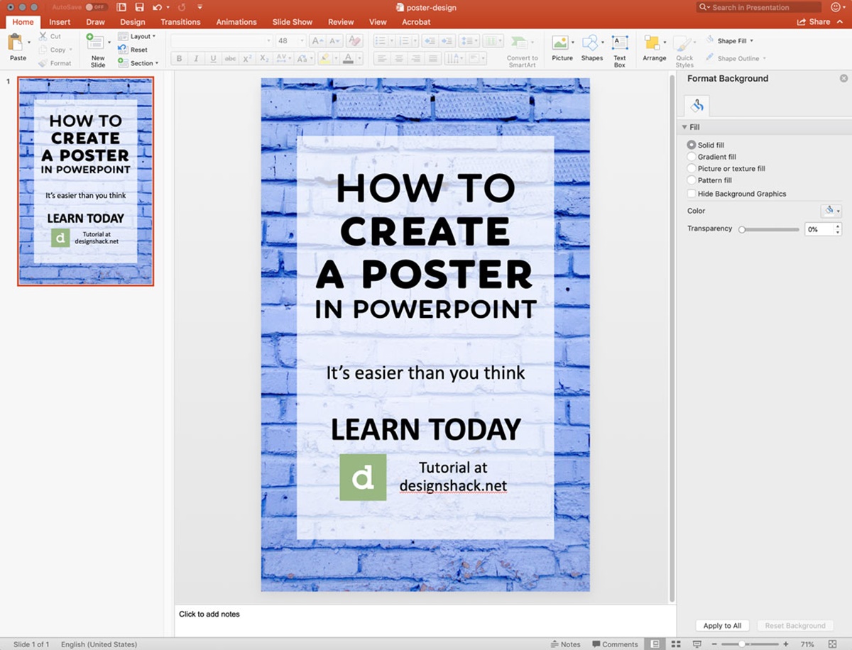
Applying Background Styles
The background of your poster in PowerPoint is an important element that sets the tone and enhances the overall visual appeal of your design. Applying background styles can help create a cohesive and professional look. Here are some tips for effectively applying background styles to your poster:
Selecting a Background: Choose a background style that complements the content and purpose of your poster. Consider the theme, color scheme, and overall aesthetic you want to achieve. PowerPoint offers a variety of built-in backgrounds, or you can import your own custom background image.
Color and Gradient: Experiment with different color combinations or gradients to create an attractive and visually appealing background. Use colors that are harmonious and work well together. Ensure there is enough contrast between the background color(s) and the content to maintain readability.
Texture and Pattern: Consider adding texture or pattern to your background to add depth and visual interest. Textures or patterns can be subtle or bold, depending on the look you want to achieve. Be mindful of not making the texture or pattern overpowering, as it can distract from the main message.
Transparency: Adjust the transparency of your background to allow other elements on the poster, such as text or images, to show through subtly. This can create a layered effect and add a sense of depth to your design.
Consistency: Maintain consistency in background styles throughout your poster. Use the same or similar background styles on each slide to create visual cohesion. Consistency enhances the professional look and feel of your poster.
White Space: Take advantage of white space or negative space in your background. Leaving some areas empty can help focus attention on the content and prevent your poster from looking cluttered. Strategic use of white space creates a clean and balanced design.
Review and Test: Regularly review and test your background style to ensure it enhances the readability and overall aesthetic of your poster. Review the background in different viewing environments and at various distances to ensure it appears as desired.
Printer-friendly Backgrounds: If you plan to print your poster, consider the printer-friendliness of your background style. Avoid using dark or heavily textured backgrounds that may result in poor visibility or high ink consumption. Opt for backgrounds that are readable in both digital and print formats.
By applying background styles effectively, you can create a visually appealing and cohesive backdrop for your poster. Take the time to experiment with different colors, gradients, textures, and patterns to find a background style that enhances the overall impact and reinforces the message of your poster.
Adding Transitions and Animations
Transitions and animations can add an extra layer of visual interest and engagement to your PowerPoint poster. They can help captivate your audience’s attention and enhance the overall flow and professionalism of your presentation. Here are some tips for effectively adding transitions and animations:
Consider the Purpose: Before adding transitions and animations, consider the purpose and tone of your presentation. Are you aiming for a more formal and professional style, or a dynamic and creative approach? Choose transitions and animations that align with the overall message and atmosphere you want to create.
Use Transitions Strategically: Apply transitions between slides to create a smooth and seamless flow. Avoid using excessive or distracting transitions that can take away from the content. Choose transitions that are subtle and visually appealing, such as fades or slides.
Transition Timing: Adjust the timing of transitions to control the pace of your presentation. Ensure that the timing is not too fast or too slow, allowing sufficient time for your audience to process the information on each slide. Use consistent timing throughout for a cohesive and well-timed flow.
Animate Key Points: Use animations to draw attention to important elements within your slides. Animate text blocks, images, or charts to appear as you discuss them or to emphasize specific points. Select animations that enhance your content rather than distracting from it.
Subtle Animations: Choose animations that are subtle and professional. Avoid overly flashy or gimmicky animations that may detract from the message. Use animations sparingly and ensure they serve a purpose in enhancing the understanding or impact of your content.
Transitions within Animations: Utilize transitions within animations to add an additional level of engagement. For example, you can fade in or zoom in an image, creating a smooth and visually pleasing effect. These transitions can make your animations appear more polished and seamless.
Rehearse and Review: Practice and review your presentation, paying attention to the transitions and animations. Ensure that they work as intended and enhance the overall delivery of your content. Rehearsing helps you become familiar with the timing and flow, allowing for a more confident and effective presentation.
Consider your Audience: Adapt your use of transitions and animations based on the preferences and expectations of your audience. If presenting to a professional or academic audience, opt for more subdued transitions and animations. For creative or informal settings, you may have more flexibility to use dynamic or innovative effects.
Adding well-chosen transitions and animations to your PowerPoint poster can elevate its visual impact and make your presentation more engaging. Use these features judiciously to enhance your content and maintain a professional and polished presentation.
Saving and Exporting the Poster
Once you have completed your poster in PowerPoint, it is crucial to save and export it properly to ensure its accessibility and professional quality. Here are some key steps to follow when saving and exporting your poster:
Save your Work: Before proceeding with any exporting or formatting, make sure to save your poster regularly. Use the “Save” or “Save As” option to ensure that your progress is saved in a PowerPoint file format (.pptx).
Check for Compatibility: If you will be sharing your poster with others or presenting it on different devices, verify the compatibility of your file. Check that the version of PowerPoint you used to create the poster is compatible with the versions of PowerPoint that will be used to view it.
Consider Printing Requirements: If you plan to print your poster, determine the required dimensions and resolution for the final print. Set up your PowerPoint file accordingly and ensure that all text and images are clear and legible at the intended size.
Export to PDF: To ensure that your poster looks consistent and professional across different platforms, consider exporting it to a PDF format. PDF files preserve the formatting and layout, making it easier to share and print your poster without any unexpected changes.
Review the PDF Version: After exporting to PDF, review the resulting file to ensure that all elements of your poster, including graphics, colors, and fonts, appear as intended. Check that all text is readable and that there are no formatting inconsistencies or errors.
Consider File Size: If your poster contains high-resolution images or graphics, the file size may be large. For efficient sharing or online publication, optimize the file size by compressing images, removing unnecessary elements, or converting complex elements to simplified images or shapes.
Save Backup Copies: It is always a good practice to save backup copies of your poster in different formats or on different storage devices. This safeguard ensures that you have access to your work in case of unexpected file corruption, loss, or compatibility issues.
Scan for Viruses: Before sharing your poster with others, scan the file with antivirus software to ensure that it does not contain any malicious content that could harm the recipient’s computer.
Label and Organize Files: It is essential to properly label and organize all related files for your poster, such as images, data files, and supplemental materials. This practice ensures that you can easily locate and update these files if needed.
By following these guidelines for saving and exporting your poster in PowerPoint, you can ensure that it remains accessible, visually appealing, and professional. Taking the time to properly save and export your poster will help you share it seamlessly with others, whether in digital or print form.