
Choosing the Right Background Color
When designing a PowerPoint presentation, one important aspect to consider is the background color. The background color sets the tone and visual appeal of your slides, so it’s crucial to choose the right color that complements your content and enhances its readability. Here are some factors to consider when selecting the perfect background color for your presentation.
1. Purpose and Audience: The first step in choosing the right background color is to identify the purpose of your presentation and understand your target audience. Different colors evoke different emotions and have different connotations. For instance, warm colors like red, orange, and yellow can create a sense of excitement and energy, while cool colors like blue, green, and purple can create a calming and professional atmosphere. Consider the message you want to convey and choose a color that aligns with the mood you want to set.
2. Contrast and Visibility: The background color should complement the text and graphics on your slides and ensure optimal visibility. Choose a background color that provides enough contrast to make the text stand out. For example, if you have dark text, opt for a light background color, and vice versa. This ensures that your audience can easily read and understand the content.
3. Branding and Consistency: If you’re creating a presentation for your company or organization, consider incorporating your brand colors into the background. This helps reinforce your brand identity and creates consistency in your visual communication. Ensure that the background color complements your logo and other brand elements and doesn’t overpower the content on your slides.
4. Accessibility: It’s important to consider accessibility when selecting a background color. Some individuals may have vision impairments or color blindness, so choose colors that are accessible and provide enough contrast for everyone to easily read and understand your presentation.
5. Test and Evaluate: Before finalizing the background color, test it on different devices and projectors to ensure that it appears as expected. Sometimes, colors may look different on different screens, so it’s important to evaluate the appearance of your presentation in various environments.
By considering these factors and giving careful thought to your background color, you can create visually appealing and impactful PowerPoint presentations that effectively convey your message to your audience.
Customizing the Background Color
Once you have chosen a suitable background color for your PowerPoint presentation, you may want to customize it further to add your personal touch or align it with your branding. Customizing the background color can help make your presentation more visually appealing and engaging. Here are some ways to customize the background color in PowerPoint.
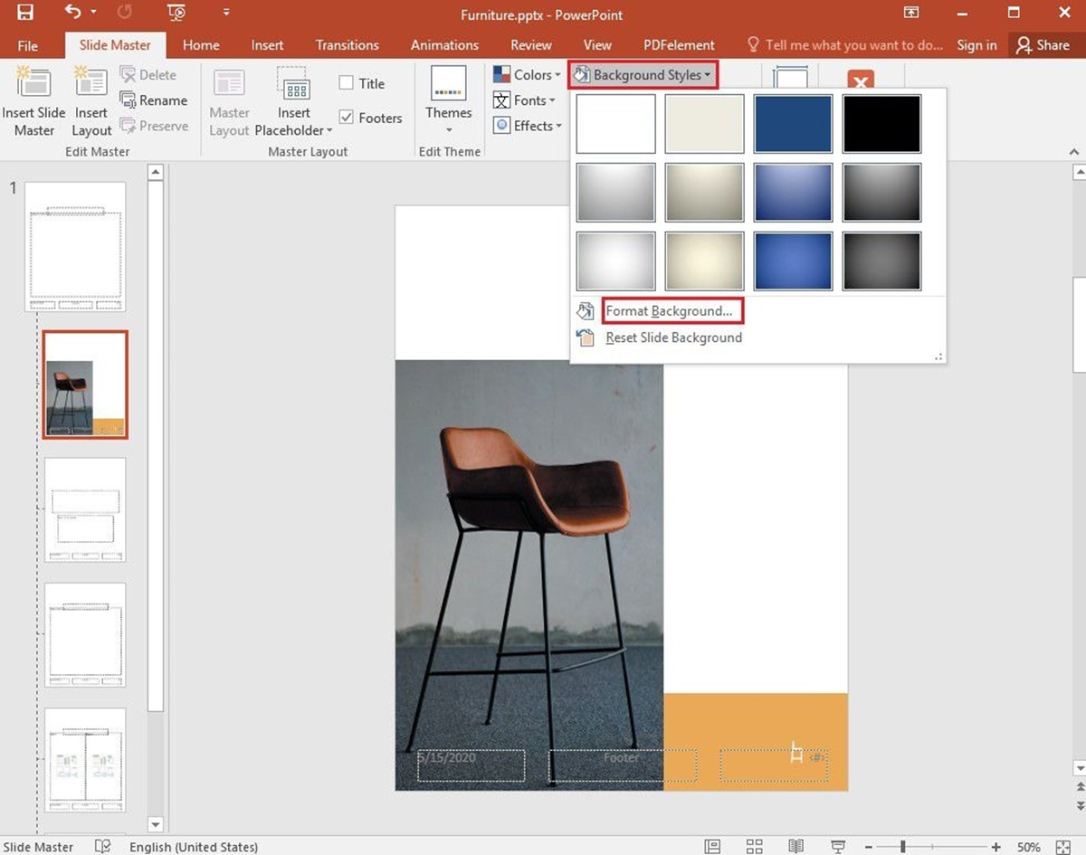
1. Gradient Fills: Instead of a solid color, you can use gradient fills to add depth and visual interest to your background. PowerPoint offers various gradient options, allowing you to blend two or more colors seamlessly. Experiment with different gradient types, such as linear, radial, or rectangular, and adjust the angle and intensity to achieve the desired effect.
2. Texture and Patterns: Another way to customize the background color is by adding texture or patterns. PowerPoint provides a range of preset textures and patterns to choose from. These can add a dynamic element to the background and make it visually appealing. Consider using subtle patterns or textures that do not distract from the content on your slides.
3. Transparency: Adjusting the transparency of the background color can create an interesting visual effect. You can make the background slightly transparent to allow other elements, such as images or text, to partially show through. This can add depth and dimension to your presentation, making it more visually captivating.
4. Color Theme: PowerPoint provides predefined color themes that consist of complementary colors. These themes can be applied to the entire presentation, including the background. Using a color theme ensures consistency and harmony in your design and makes it easier to create a professional-looking presentation.
5. Animation and Transition Effects: To make your background color more dynamic, you can apply animation and transition effects. For example, you can fade in or fade out the background color, or use slide transitions that reveal different colors as you move from slide to slide. However, use these effects sparingly and ensure they enhance rather than distract from your content.
Remember to consider the overall design and purpose of your presentation when customizing the background color. The customization options in PowerPoint provide you with the flexibility to create a unique and visually engaging backdrop that complements your content and captivates your audience.
Using Gradient Backgrounds
A gradient background can add depth and visual interest to your PowerPoint presentation. Instead of a solid color, a gradient background blends two or more colors seamlessly, creating a smooth transition. This effect can enhance the overall design and make your presentation more visually appealing. Here are some tips for using gradient backgrounds effectively.
1. Choose compatible colors: When using a gradient background, it’s important to select colors that work well together. Consider using colors that are complementary or from the same color family. Avoid using colors that clash or create a harsh transition. Experiment with different combinations to find the perfect gradient for your presentation.
2. Blend the colors smoothly: The key to a successful gradient background is to ensure a smooth transition between colors. PowerPoint offers various gradient options, such as linear, radial, and rectangular. Adjust the angle and intensity of the gradient to achieve the desired effect. Pay attention to how the colors blend together and ensure a seamless transition from one color to another.
3. Consider the content: When using a gradient background, consider the content that will be placed on top of it. Ensure that the gradient does not interfere with the readability of text or the visibility of other elements. Adjust the intensity or brightness of the gradient colors if needed to provide enough contrast for optimal visibility.
4. Create a visual hierarchy: Gradient backgrounds can be used to create a visual hierarchy within your slides. For example, you can use a darker gradient at the top and gradually transition to a lighter color at the bottom. This draws the viewer’s attention towards the top of the slide and creates a sense of depth. Experiment with different gradient variations to enhance the visual hierarchy and guide the audience’s focus.
5. Use gradients as accents: In addition to using gradients as backgrounds, you can also use them as accents or overlays on specific elements. For example, you can create a gradient shape or apply a gradient fill to a specific object or text box. This adds visual interest and depth to your slides without overpowering the overall design.
Using gradient backgrounds in your PowerPoint presentation can elevate its visual appeal and make it more engaging. Remember to choose compatible colors, blend them smoothly, consider the content, create a visual hierarchy, and use gradients as accents. With these tips in mind, you can effectively utilize gradient backgrounds to enhance the overall aesthetic of your presentation.
Using Patterned Backgrounds
In addition to solid colors and gradients, patterned backgrounds offer a creative and visually appealing option for your PowerPoint presentations. Patterned backgrounds can add texture, interest, and personality to your slides. By incorporating patterns into your design, you can create a unique and engaging visual experience for your audience. Here are some tips for effectively using patterned backgrounds in your presentations.
1. Choose appropriate patterns: When selecting patterned backgrounds, consider the theme and tone of your presentation. Different patterns evoke different emotions and associations. For example, floral patterns may create a more feminine and soft ambiance, while geometric patterns can convey a sense of structure and professionalism. Choose patterns that align with your content and overall message.
2. Balance the pattern: While patterns can add visual interest, it’s crucial to find the right balance. Patterns should enhance your content without overpowering it. If the pattern is too busy or distracting, it can hinder readability and comprehension. Experiment with different scales and opacities to find a balance that complements your content and maintains a professional look.
3. Consider contrast and visibility: Ensure that the patterned background provides enough contrast for your text and visuals to stand out. It’s essential to have a sufficient contrast between the pattern and the elements on top to maintain readability. Opt for patterns with contrasting colors or adjust the opacity to improve visibility.
4. Use patterns as separators or highlights: Patterns can also be used strategically to separate sections or highlight specific elements in your presentation. For example, you can use a patterned background as a divider between different topics or as a frame around important information. This can help organize your content visually and guide the audience’s attention.
5. Be consistent: To create a cohesive design, maintain consistency in your pattern choices throughout your presentation. Using a consistent pattern or a related set of patterns can enhance the overall visual appeal and professionalism of your slides. Avoid using too many different patterns that may create a chaotic or disjointed appearance.
By using patterned backgrounds, you can add an extra layer of visual interest and creativity to your PowerPoint presentations. Choose appropriate patterns, balance the pattern with your content, consider contrast and visibility, use patterns strategically, and maintain consistency. With these tips, you can effectively utilize patterned backgrounds to engage and captivate your audience.
Adding Solid Colors
Solid colors are a classic choice for PowerPoint backgrounds. They provide a clean and simple backdrop that allows your content to shine. Whether you prefer a bold and vibrant color or a subtle and muted tone, solid colors can effectively convey your message and create a cohesive visual experience. Here are some tips for adding solid colors to your PowerPoint presentation.
1. Choose colors that align with your content: When selecting a solid color background, consider the message and theme of your presentation. Different colors evoke different emotions and associations. For example, blue can convey professionalism and trust, while green can represent growth and harmony. Select colors that align with your content and help reinforce your message.
2. Consider readability and contrast: A crucial factor when using solid colors is ensuring readability and contrast. Choose a background color that provides enough contrast with the text and visuals on your slides. For example, if you have dark text, opt for a light background color, and if you have light text, choose a darker background color. This ensures that your content is easily legible and visually appealing.
3. Create visual hierarchy: Solid colors can also be used to create a visual hierarchy within your presentation. For example, you can use a darker color for the background of your title slide and gradually lighten the color for subsequent slides. This helps guide the audience’s attention and creates a sense of progression. Experiment with different color variations to achieve an effective visual hierarchy.
4. Use color psychology: Colors have the power to evoke certain emotions and reactions in people. Utilize color psychology to enhance the impact of your presentation. For instance, red can convey energy and urgency, while yellow can evoke a feeling of optimism and happiness. Understand the psychological associations of colors and choose accordingly to enhance the emotional impact of your content.
5. Maintain consistency: To create a polished and professional look, maintain consistency in your color choices throughout your presentation. Stick to a consistent color scheme for backgrounds, titles, and other elements. This helps create visual harmony and ensures a cohesive design.
Adding solid colors to your PowerPoint presentation can provide a clean and impactful backdrop for your content. Choose colors that align with your message, consider readability and contrast, create a visual hierarchy, utilize color psychology, and maintain consistency. By following these tips, you can effectively use solid colors to enhance the visual appeal and effectiveness of your presentation.
Using Transparency for Backgrounds
Transparency is a powerful design element that can add depth, creativity, and visual interest to your PowerPoint backgrounds. By adjusting the transparency of your background color, you can create unique and captivating visual effects that enhance the overall design of your presentation. Here are some tips for effectively using transparency for your background in PowerPoint.
1. Partial transparency: Instead of using a completely opaque background, consider adding partial transparency to create a subtle and layered effect. This allows other elements, such as images or text, to partially show through the background, adding depth and dimension to your slides.
2. Overlaying effects: By overlaying transparent elements onto your background, you can create interesting effects and visual storytelling. For example, you can overlay a transparent shape or gradient to create a dynamic and eye-catching background. Experiment with different overlaying techniques to achieve the desired visual effect.
3. Contrast and visibility: When using transparency, make sure to maintain enough contrast between the background and the content on your slides to ensure readability. Test the visibility of your content on different devices and screens to ensure that it remains clear and legible.
4. Highlighting focal points: Transparent backgrounds can be particularly useful for highlighting specific elements or focal points in your presentation. By making the surrounding area transparent and leaving the focus area solid, you can draw attention to important information or visuals, guiding the audience’s eye to the key elements of your slide.
5. Layering and depth: Transparency allows you to create a sense of visual depth by layering different elements. You can place transparent shapes or images in front of solid backgrounds or other transparent elements to achieve a three-dimensional effect. This technique adds complexity and visual interest to your presentation.
6. Consistency: When using transparency, it’s important to maintain consistency throughout your presentation. Stick to a unified design approach and ensure that the level of transparency remains consistent across your slides. This helps create a cohesive and visually pleasing experience for your audience.
Using transparency for your PowerPoint backgrounds offers endless possibilities for creativity and visual storytelling. Experiment with different levels of transparency, overlaying effects, and layering techniques to achieve captivating and unique backgrounds. Remember to maintain contrast and visibility, highlight focal points strategically, and ensure consistency. By utilizing transparency effectively, you can elevate the visual impact of your presentation and engage your audience in a visually stimulating experience.
Understanding the Effects of Backgrounds on Text
The choice of background color in your PowerPoint presentation can have a significant impact on the readability and visual appeal of your text. It’s essential to consider how the background interacts with the text and ensure that the contrast and overall design enhance the legibility of your content. Here are some important factors to understand regarding the effects of backgrounds on text in PowerPoint presentations.
1. Contrast: One of the most critical factors when it comes to background and text is the contrast between them. Make sure there is enough contrast between the background color and the text color to ensure readability. If the contrast is inadequate, the text may become difficult to read, resulting in a less effective presentation. For example, avoid using light-colored text on a light background or dark-colored text on a dark background.
2. Legibility: The legibility of your text also depends on the font size and typeface you choose. Consider the size of the venue and the distance between the audience and the screen. Opt for a font size that is easily readable from a distance. Additionally, select a font that is clear and uncluttered, ensuring that every letter is distinct and easily recognizable.
3. Font colors: In addition to the contrast between the background and text, the color of the font plays a role in legibility. While black is a standard choice, other dark colors such as dark gray or navy blue can work well too. Avoid using light or neon colors for your text as they can be challenging to read against certain backgrounds.
4. Text effects: The use of text effects, such as shadows or outlines, can enhance the legibility of text on certain backgrounds. Adding a subtle shadow or a contrasting outline around the text can make it stand out and improve readability. However, be cautious not to overdo these effects, as they can become distracting or make the text appear cluttered.
5. Background density: The density and pattern of the background can affect how the text appears. If the background is too busy or dense, it may interfere with the legibility of the text. Consider using a solid background color or a subtle pattern that does not overpower the text. Ensure that the background allows the text to be the focal point of the slide.
6. Accessibility concerns: It’s crucial to consider the accessibility needs of your audience when designing the background and text of your PowerPoint presentation. Some individuals may have color blindness or vision impairments, so choose colors and fonts that are accessible and provide sufficient contrast for everyone to read and understand your content.
By understanding the effects of backgrounds on text, you can make informed choices for your PowerPoint presentation design. Pay attention to contrast, legibility, font colors, text effects, background density, and accessibility concerns. By optimizing the design to enhance readability, you can effectively communicate your message and engage your audience.
Using Graphics as Backgrounds
Graphics can add a dynamic and visually captivating element to your PowerPoint presentations. By using graphics as backgrounds, you can create unique and engaging designs that enhance the overall impact of your slides. Incorporating relevant and high-quality graphics can help convey your message effectively and leave a lasting impression on your audience. Here are some tips for utilizing graphics as backgrounds in your PowerPoint presentations.
1. Choose appropriate graphics: When selecting graphics for your background, ensure they align with the theme and content of your presentation. Consider using graphics that are relevant to your topic, such as icons, illustrations, or images that represent your message. Avoid using busy or distracting graphics that can overwhelm the text and other elements on your slides.
2. Maintain readability: While graphics can make your presentation visually appealing, remember to prioritize readability. Ensure that the color and contrast of the graphics allow the text to be easily readable. Adjust the opacity or use a color overlay to create a balanced visual hierarchy that allows the text to stand out against the background.
3. Enhance storytelling: Graphics can be used strategically to enhance the storytelling aspect of your presentation. Use relevant visuals that support and reinforce your message. Instead of using generic stock photos, consider custom-made illustrations or graphics that reflect your unique narrative. This can make your presentation more engaging and memorable.
4. Create visual impact: Graphics as backgrounds can create a powerful visual impact. Consider using large-scale graphics or patterns that cover the entire slide to evoke a sense of drama or emphasize a particular point. Use high-resolution images to ensure a crisp and professional look. Experiment with different placements and sizes of the graphics to achieve the desired effect.
5. Maintain consistency: To ensure a cohesive and professional look, maintain consistency with your graphics throughout the presentation. Use similar styles, color schemes, or motifs to tie the graphics together. This creates a unified visual experience that enhances the overall aesthetic of your slides and reinforces your branding.
6. Consider the technical requirements: When using graphics as backgrounds, keep in mind the file size and compatibility with different devices and projectors. Optimize your graphics to maintain a reasonable file size without compromising quality. Test your presentation on different devices and ensure that the graphics appear as expected.
By leveraging graphics as backgrounds, you can elevate the visual impact and engagement of your PowerPoint presentations. Choose appropriate graphics, prioritize readability, enhance storytelling, create visual impact, maintain consistency, and consider technical requirements. With these strategies in mind, you can effectively utilize graphics to create visually compelling backgrounds that support and elevate your content.
Importing and Customizing Images as Backgrounds
Using images as backgrounds in your PowerPoint presentation can add a touch of creativity and personalization. Importing and customizing images allows you to create unique and visually captivating backgrounds that align with your content and enhance the overall visual appeal of your slides. Here are some guidelines for effectively importing and customizing images as backgrounds in PowerPoint.
1. Choose high-quality images: When selecting images for your background, ensure they are high-resolution and of good quality. Low-resolution images may appear pixelated or blurry when stretched to fit the slide. Look for images that are clear, crisp, and visually appealing to create a professional look.
2. Import images: To import images into PowerPoint, use the Insert Image function. You can insert images from your computer, an online source, or a stock image library. Choose images that are relevant to your content or can help illustrate your message effectively.
3. Resize and position: Once the image is imported, resize and position it to fit your slide. Use the crop or resize functions to adjust the size and aspect ratio of the image. Depending on your design, you may want the image to cover the entire slide or be positioned as a focal point in a specific area.
4. Use transparency: If the image is too dominant and distracts from the content on your slides, consider adjusting the transparency. Reducing the opacity of the image allows the text and other elements to be more visible. Experiment with different transparency levels to achieve the desired balance between the image and the content.
5. Apply filters or overlays: To customize the image further, you can apply filters or overlays. Filters can alter the colors, saturation, or contrast of the image to suit your design aesthetic. Overlays, such as gradients or patterns, can be applied atop the image to add depth or visual interest to the background. Be mindful of not making the image too busy or overpowering the text.
6. Maintain contrast and readability: As you customize the image, ensure that the text and other elements on your slides remain readable. Adjust the contrast and opacity of the image to create sufficient contrast with the text. Consider adding a solid color overlay or applying a drop shadow to create a clear separation between the image and the foreground elements.
Importing and customizing images as backgrounds in PowerPoint enables you to create visually compelling and unique slides. Choose high-quality images, import them into PowerPoint, resize and position them appropriately, adjust transparency, apply filters or overlays, and maintain contrast and readability. By following these guidelines, you can effectively utilize images as backgrounds to enhance the visual impact and engagement of your presentation.
Using PowerPoint Templates for Backgrounds
PowerPoint templates offer a convenient and time-saving option for creating visually appealing backgrounds for your presentation. With a wide range of pre-designed templates available, you can easily find one that aligns with your content, style, and overall theme. Here are some benefits and considerations when using PowerPoint templates for backgrounds.
1. Professionally designed: PowerPoint templates are typically created by professional designers, ensuring a high level of visual appeal and aesthetic. These templates often incorporate sophisticated color schemes, layout designs, and typography choices that can elevate the overall look of your presentation. By using a well-designed template, you can present your content in a polished and professional manner.
2. Consistent visual style: Templates provide a consistent visual style throughout your presentation. By utilizing the same template for all slides, you can maintain a cohesive look and feel, creating a seamless flow from one slide to another. This consistency helps in reinforcing your branding and delivering a visually balanced presentation.
3. Time-saving: With templates, you can save valuable time in designing and formatting your presentation. Instead of starting from scratch, templates provide pre-built frameworks that you can easily customize to fit your content. This frees up time for focusing on creating and refining your key message rather than spending extensive hours on design aspects.
4. Customization options: While templates offer a ready-made design, they also allow for customization to suit your specific needs. You can modify the background colors, typography, and layouts to match your branding or personal preferences. Additionally, templates often include placeholders for adding images, charts, and other visual elements, making it easy to insert and arrange your content.
5. Considerations for uniqueness: While templates provide a convenient starting point, it’s important to consider the uniqueness of your presentation. Templates are widely used and easily recognizable, so personalizing the template and adding your own content is essential to make your presentation stand out. Add your own touch, incorporate relevant images or graphics, and tailor the template to suit your specific message.
6. Compatibility and consistency: When using templates, ensure compatibility with the version of PowerPoint you are using. Also, be mindful of maintaining consistency in your designs if you use multiple templates or elements from different templates within the same presentation. Consistency in design and style is crucial for a professional and cohesive presentation.
Using PowerPoint templates for backgrounds provides a range of benefits including professional design, consistent visual style, time-saving convenience, customization options, and compatibility. While templates offer a starting point, make sure to personalize and tailor the template to reflect your unique content and message. By leveraging the advantages of PowerPoint templates, you can create visually impressive and engaging backgrounds for your presentation.
Using Animation and Transition Effects with Backgrounds
Animation and transition effects can add a dynamic and engaging element to your PowerPoint presentation. When utilized effectively with backgrounds, these effects can enhance the visual impact, create seamless transitions between slides, and captivate your audience’s attention. Here are some considerations and tips for using animation and transition effects with backgrounds in your presentation.
1. Enhancing the story: Animation and transition effects can be used to reinforce the narrative of your presentation. By aligning the effects with the content and message, you can create a more immersive and memorable experience for your audience. Consider using fade-ins, slide-ins, or zoom animations that complement the background imagery, adding depth and visual interest to your storytelling.
2. Smooth transitions: Transition effects allow for seamless transitions between slides, creating a more polished and professional presentation. Use slide transitions that are consistent with the mood and tone of your content. For example, a subtle fade or dissolve transition can provide a smooth flow between slides, while a more dynamic transition such as a slide or cube effect can add a touch of excitement.
3. Timing and pacing: Pay attention to the timing and pacing of your animations and transitions. Avoid overcrowding your slides with too many effects or making them too slow-paced. Aim for a balance that complements and enhances the overall presentation flow. Ensure that the timing allows your audience to process the information without feeling overwhelmed or disoriented.
4. Subtle background animations: Consider applying subtle animations specifically to the background elements. For example, you can add gentle movements, such as a slight parallax effect or a soft flickering light, to create a sense of depth and realism. These subtle animations can enhance the overall visual experience without distracting from the main content of your slides.
5. Use animations sparingly: While animation and transition effects can be impactful, it’s important to exercise restraint and use them sparingly. Too many flashy or excessive animations can distract from the content and even impair comprehension. Reserve the use of animations for key points, visual highlights, or to emphasize critical information.
6. Test and rehearse: Before delivering your presentation, ensure that you test and rehearse the animations and transitions to ensure they work seamlessly. Confirm that the timing is accurate, and that the animations are displayed correctly on different screens and devices. Rehearsing your presentation will help you become familiar with the flow and ensure that the effects enhance your delivery rather than hinder it.
By using animation and transition effects with backgrounds, you can elevate the visual experience of your PowerPoint presentation. Align the effects with your narrative, aim for smooth transitions, pay attention to timing and pacing, employ subtle background animations, use animations sparingly, and test and rehearse your presentation. By applying these considerations and tips, you can create a more immersive, engaging, and visually enhanced presentation for your audience.