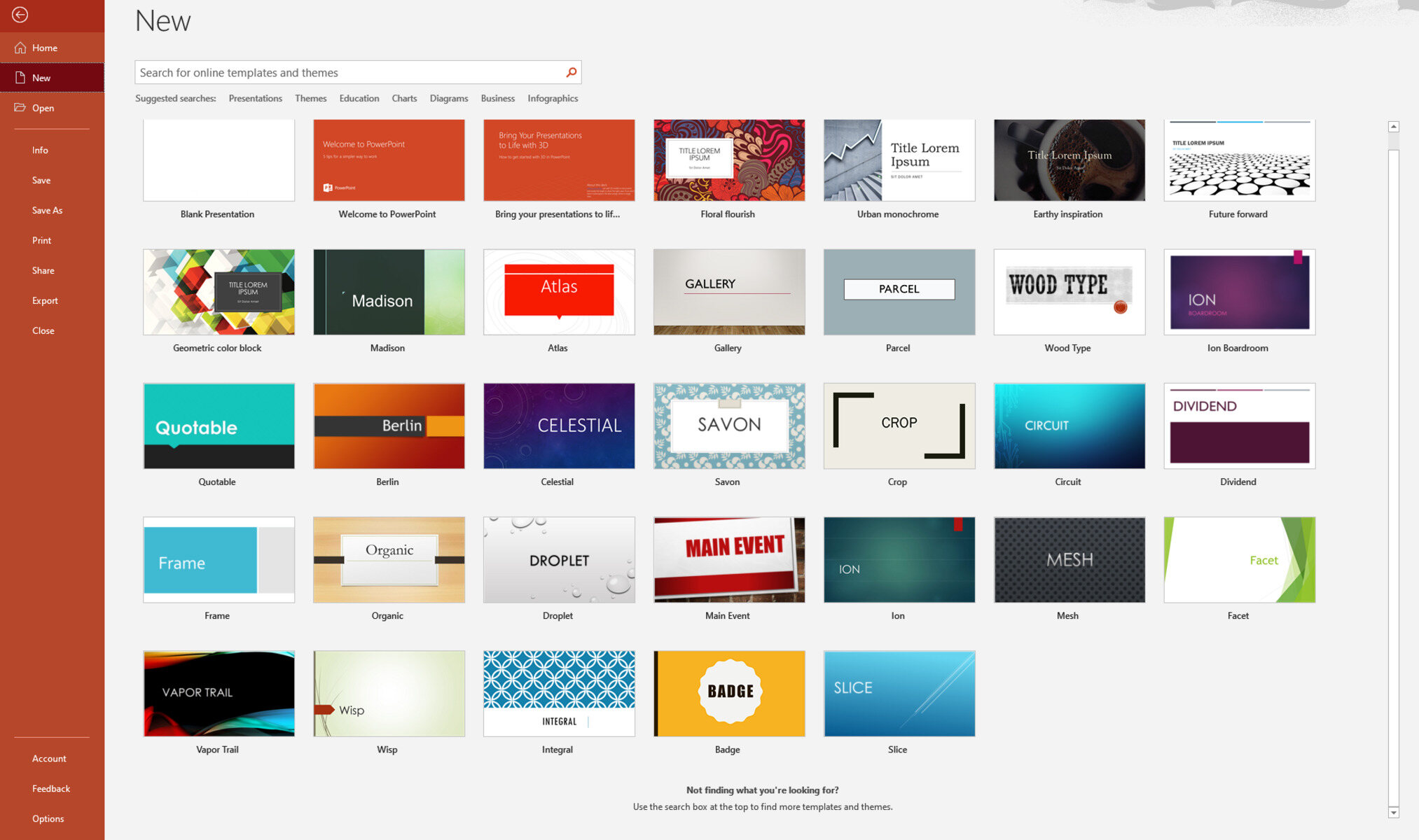
What is a PowerPoint presentation template?
A PowerPoint presentation template is a pre-designed framework that serves as a starting point for creating professional and visually appealing slideshows. It provides a consistent layout, design elements, and formatting options, making it easier for users to create cohesive and visually engaging presentations.
Templates typically include placeholders for text, images, graphs, and multimedia elements, allowing presenters to focus on content rather than spending time on design. Whether you are a student, business professional, or public speaker, using a default template can save you time and effort in creating a visually appealing presentation.
Templates come in various styles and themes, catering to different purposes and audiences. From corporate presentations to educational lectures, there are templates available for every occasion. These templates often have pre-set slide layouts, color schemes, font choices, and even predefined animations and transitions.
PowerPoint templates provide a consistent look and feel throughout your presentation, ensuring that all slides follow the same design guidelines. This consistency not only enhances the visual appeal but also helps the audience focus on the content and message being delivered.
Additionally, templates offer flexibility and customization options. You can modify and personalize the default template to reflect your branding, style, and preferences. Customizing the template allows you to add your logo, adjust colors, choose specific fonts, and incorporate your own graphics, making your presentation unique and aligned with your brand identity.
PowerPoint presentation templates can be created from scratch or downloaded from various online sources. Many websites and software applications offer a wide range of templates to choose from, catering to different industries, purposes, and design preferences.
Overall, using a PowerPoint presentation template is an effective way to streamline the design process, maintain visual consistency, and create professional-looking presentations with ease. By leveraging the predefined design elements of a default template, you can focus on crafting compelling content and delivering a powerful message to your audience.
Why use a default template?
When creating a PowerPoint presentation, using a default template offers several advantages that can greatly enhance the effectiveness and efficiency of your presentation. Here are some compelling reasons to consider using a default template:
1. Time-saving: A default template provides a ready-made structure and design elements, eliminating the need to start from scratch. This saves you valuable time and allows you to focus more on creating engaging content and refining your delivery.
2. Professional appearance: Default templates are designed by professionals, ensuring that your presentation has a polished and cohesive look. The consistent style and layout of a template give your slides a professional appearance, making a positive impression on your audience.
3. Visual consistency: Using a default template ensures that all the slides in your presentation have a consistent design, fonts, and color scheme. This visual consistency helps your audience stay focused on your message and avoids distractions caused by inconsistent slide layouts and styles.
4. Brand alignment: If you are presenting on behalf of a company or organization, using a default template offers an opportunity to incorporate brand elements. You can customize the template by adding your company logo, using brand colors, and aligning the overall design with your brand guidelines.
5. User-friendly: Default templates are designed to be user-friendly, with clearly labeled placeholders for text, images, and multimedia content. This makes it easier for you to insert your own content without worrying about resizing or formatting issues.
6. Design guidance: Templates often come with pre-set slide layouts and design elements, offering guidance on how to structure your presentation. This can be especially helpful for novice presenters who may need assistance in organizing their content and creating visually appealing slides.
7. Customization options: While default templates provide a consistent starting point, they can still be customized to suit your specific needs. You can adjust the color scheme, font choices, and even rearrange the layout to better align with your content and desired visual aesthetic.
8. Increased productivity: By using a default template, you can streamline the presentation creation process, allowing you to focus on crafting compelling content and rehearsing your delivery. This increased productivity can lead to a more polished and impactful presentation.
Overall, using a default template in PowerPoint offers numerous benefits, from saving time to enhancing the visual appeal and professionalism of your presentation. Whether you are a seasoned presenter or a beginner, leveraging the features and design elements of a default template can help you create engaging, well-structured, and visually cohesive presentations that effectively convey your message to your audience.
Design elements of a default PowerPoint template
A default PowerPoint template encompasses various design elements that contribute to the overall visual presentation. These elements are carefully chosen to create an appealing and cohesive design while providing flexibility for customization. Here are some key design elements typically found in a default PowerPoint template:
1. Slide layouts: A default template offers multiple pre-designed slide layouts that determine the arrangement of content on each slide. These layouts may include title slides, content slides, media-focused slides, and more. The variety of slide layouts allows you to choose the most suitable layout for different types of content.
2. Color scheme: The color scheme of a default template consists of a set of colors that form the basis for the entire presentation. It includes primary colors for text and background, as well as accent colors for headings, graphs, and other visual elements. The color scheme provides consistency and enhances the overall aesthetic appeal of the presentation.
3. Fonts: Default templates come with predefined font choices for titles, headings, and body text. These fonts are carefully selected to ensure readability and visual harmony. Fonts may differ for different sections of the presentation, with larger, bolder fonts used for titles and headings to make them stand out.
4. Graphics and icons: Default templates often incorporate a library of graphics and icons that can be used to enhance the visual impact of your slides. These graphics and icons can be added to express concepts, illustrate data, or convey specific messages. They are usually designed to match the overall aesthetic of the template.
5. Background styles: Default templates provide different background styles that can be applied to individual slides or the entire presentation. Background styles can range from solid colors to gradients, patterns, or even images. These styles add depth and visual interest to the slides, complementing the content and enhancing the overall design.
6. Transitions and animations: Default templates often include predefined transitions and animations that can be applied to slide elements. These transitions and animations add movement and visual effects to the presentation, making it more dynamic and engaging. They can be customized to match the tone and style of your presentation.
7. Placeholder elements: Default templates typically include placeholders for text, images, charts, and other media. These placeholders provide a visual guide for where to insert your content while maintaining the overall design and layout. They ensure consistency across slides and make it easier to replace placeholder content with your own.
8. Footer and branding: Default templates often include a footer section where you can add information such as your name, date, and additional branding elements like a company logo or website address. The footer helps maintain consistency and reinforces your branding throughout the presentation.
Incorporating these design elements into your presentation using a default template can significantly enhance the visual appeal, readability, and professionalism of your slides. Remember, while default templates provide a solid foundation, you can always customize and adjust these elements to align with your specific needs and presentation style.
Choosing the right color scheme
When creating a PowerPoint presentation, one crucial aspect of design is choosing the right color scheme. The color scheme not only affects the visual appeal of your slides but also influences the audience’s perception of your content. Selecting the appropriate color scheme can enhance readability, evoke specific emotions, and convey your message effectively. Here are some considerations for choosing the right color scheme:
1. Understanding color psychology: Colors have the power to evoke emotions and create certain associations. It is essential to understand the psychology behind colors and select hues that align with the mood and message of your presentation. For example, warm colors like red and orange can evoke energy and passion, while cool colors like blue and green can create a sense of calm or trust.
2. Reflecting your brand or topic: If you are presenting on behalf of a company, it is important to use colors that reflect your brand identity. Incorporating brand colors into your slides can reinforce brand recognition and create a consistent visual experience. Alternatively, if your presentation is topic-specific, consider using colors that are commonly associated with that subject matter to create visual coherence.
3. Considering readability: While it’s essential to choose colors that are visually appealing, it is equally important to ensure that the text on your slides is readable. Dark text on a light background or light text on a dark background generally provides good contrast and legibility. Avoid using color combinations that result in low contrast and make it difficult for the audience to read your content.
4. Maintaining consistency: Consistency in color usage throughout the presentation enhances visual harmony and aids in audience comprehension. Select a limited palette of two to four colors that work well together and use them consistently across your slides. Consistency ensures a cohesive and professional look, creating a visually appealing experience for your audience.
5. Using color as a visual hierarchy tool: Color can also be utilized to establish a visual hierarchy in your slides. By assigning different colors to headings, subheadings, and body text, you can guide the audience’s attention and emphasize important information. This visual hierarchy helps in organizing the content and highlighting key points effectively.
6. Considering culture and context: It is crucial to be mindful of cultural interpretations of color when creating presentations intended for a global audience. Different cultures may have unique associations and meanings associated with colors. Research and ensure that the color scheme you choose resonates positively across different cultural backgrounds, ensuring inclusivity and avoiding unintended negative connotations.
7. Getting inspiration: If you need inspiration or assistance with color selection, there are various online resources and tools available. Websites like Adobe Color or Color Hunt offer pre-designed color palettes that you can use as a starting point. You can also explore design websites, branding materials, or even nature for inspiration on color combinations that evoke the emotions and aesthetics you intend to convey.
By carefully selecting a color scheme that aligns with your message, audience, and content, you can create a visually engaging and impactful PowerPoint presentation. Remember to balance aesthetics with readability and maintain consistency throughout your slides to create a cohesive and professional look.
Selecting appropriate fonts
Choosing the right fonts for your PowerPoint presentation is crucial as it significantly impacts readability, visual appeal, and overall communication. The fonts you select should complement your content, reflect the tone of your message, and ensure legibility. Here are some guidelines to help you in selecting appropriate fonts:
1. Prioritize readability: The primary consideration when choosing fonts is readability. Opt for fonts that are clear, legible, and easy on the eyes. Avoid overly ornate, decorative, or script fonts that may be difficult to read, especially in smaller font sizes or on projector screens. Sans-serif fonts, such as Arial or Calibri, are often preferred for on-screen presentations due to their clean and straightforward design.
2. Consider font hierarchy: Establishing a clear hierarchy in your text is essential to guide the audience’s attention and emphasize key points. Select fonts that offer different weights or styles, such as bold, italic, or semi-bold, to differentiate headings, subheadings, and body text. This hierarchy helps convey the structure and importance of information in your presentation.
3. Match the tone and message: Fonts convey a certain tone and personality, making it important to choose fonts that align with the overall message you want to convey. For formal and professional presentations, opt for conservative and classic fonts. For creative or informal presentations, you may be more adventurous with your font choices, incorporating unique or playful fonts to reflect the theme or topic.
4. Consider brand guidelines: If you are presenting on behalf of a company or organization, it is important to adhere to brand guidelines. Use fonts that are specified in the brand guidelines to maintain consistency and reinforce the organization’s visual identity. This consistency helps build brand recognition and professionalism in your presentation.
5. Limit font choices: To maintain a clean and cohesive look, limit the number of fonts used in your presentation. Using too many different fonts can create visual clutter and confusion. Stick to a maximum of two to three fonts, one for headings and another for body text. Consistency in font usage throughout the presentation creates a harmonious and visually appealing experience.
6. Test legibility on different screens: Ensure that the fonts you choose remain clear and legible on different screens and projectors. What looks good on your computer screen may not be as easily readable on a larger display. Test your presentation on different devices and projectors to ensure that the fonts maintain their readability and visual impact.
7. Don’t be afraid to experiment: While it’s important to follow best practices for font selection, don’t be afraid to experiment and find a font combination that suits your presentation. You can explore different font pairing options to create visual interest and enhance the overall design. Online resources and typography tools can provide inspiration and suggestions for font pairings.
Remember, selecting appropriate fonts is crucial for effective communication in your PowerPoint presentation. Prioritize readability, consider the tone and message, maintain consistency, and test legibility on different screens. By carefully choosing fonts that align with your content and presentation goals, you can enhance visual appeal and ensure that your message is effectively conveyed to your audience.
Creating a title slide
The title slide of your PowerPoint presentation plays a crucial role in capturing the attention of your audience and setting the tone for the rest of the presentation. It serves as the introduction to your topic and should be visually appealing and informative. Here are some key elements to consider when creating a compelling title slide:
1. Concise and impactful title: The title of your presentation should be concise and clearly convey the main message or topic. Use a succinct headline that grabs the audience’s attention and piques their interest. Avoid using long, complex sentences or technical jargon that may confuse or overwhelm the audience.
2. Strong visual element: Incorporate a visually striking element that complements your topic and engages the audience. This can be an eye-catching image, a relevant graphic, or an impactful background that creates visual interest. Ensure that the visual element aligns with the overall aesthetic and theme of your presentation.
3. Balanced layout: Arrange the elements on your title slide in a balanced and visually pleasing way. Consider the placement and size of your title, subtitle (if applicable), and any additional information or branding elements. A well-structured and organized layout creates a professional and polished look.
4. Consistent design: Maintain consistency with the design elements used in your title slide. Use the same color scheme, font styles, and graphics that will be used throughout your presentation. Consistency creates a cohesive visual experience and reinforces your branding.
5. Clear and readable text: Ensure that the text on your title slide is clear, legible, and readable from a distance. Use a font size that is easily visible for your audience. Select fonts that are clean and easily recognizable, keeping in mind that decorative or script fonts may be more challenging to read on a title slide.
6. Optional subtitle: Including a subtitle below your main title can provide additional context or a summary of your presentation. It can help set expectations and give the audience a clear idea of what to expect in the upcoming content. The subtitle should be brief and complement the main title without overwhelming the slide.
7. Branding elements: If you are presenting on behalf of a company or organization, consider incorporating branding elements such as the company logo or colors on your title slide. This not only reinforces your brand identity but also adds a professional touch to your presentation.
8. Empty space: Don’t overcrowd your title slide with too many elements. Leave some empty space to create visual breathing room and avoid a cluttered look. Clean and well-organized slides help the audience focus on the main message and key information.
9. Engaging transitions: Use subtle and professional transitions to introduce your title slide. Avoid overly flashy or distracting transitions that may take away from the content. Smooth and seamless transitions can make your title slide visually appealing and set the stage for the rest of your presentation.
Remember, the title slide is the first impression your audience will have of your presentation. By incorporating these elements into your title slide and ensuring a visually appealing and balanced design, you can create a captivating introduction that grabs the attention of your audience and sets the tone for a compelling presentation.
Designing content slides
When creating content slides for your PowerPoint presentation, it’s important to ensure they are visually appealing and facilitate effective communication. Well-designed content slides enhance engagement, comprehension, and retention of information. Here are key considerations when designing content slides:
1. Clear and concise content: Content slides should deliver information in a clear and concise manner. Use bullet points, short sentences, or phrases to convey key points. Avoid cluttering the slide with excessive text, as it can overwhelm your audience and distract from your message.
2. Visual hierarchy: Establish a visual hierarchy to guide the audience’s attention. Use headings, subheadings, and bullet points in different font sizes or styles to differentiate levels of importance. This hierarchy aids comprehension and emphasizes key information.
3. Consistent design: Maintain a consistent design throughout your content slides. Use the same color scheme, fonts, and formatting as your title slide to maintain visual coherence. Consistency creates a professional and polished look, reinforcing your branding and aiding audience familiarity.
4. Appropriate use of visuals: Incorporate visuals such as icons, images, charts, or graphs to enhance understanding and engagement. Use visuals that are relevant, high-quality, and complement the content. Avoid using excessive or irrelevant visuals that can create confusion or visual clutter.
5. Legible fonts and font sizes: Ensure that your chosen fonts are legible, even from a distance. Use a font size that is easily readable by your audience. Sans-serif fonts, like Arial or Calibri, are generally preferred for on-screen presentations due to their readability.
6. Color coordination: Select colors that align with your color scheme and create harmony on the slide. Use color to highlight or emphasize important information. Ensure there is a sufficient contrast between text and background colors, maintaining readability for all audience members.
7. Effective use of white space: Utilize white space strategically to create balance and focus on the content. Provide enough empty space around text and visuals to prevent overcrowding. White space creates visual clarity and allows the audience to absorb information without feeling overwhelmed.
8. Consistent alignment and spacing: Maintain consistent alignment and spacing across your content slides. Use grids or guides to align elements properly. Consistent alignment and spacing give your slides a polished and organized appearance, enhancing readability and aesthetics.
9. Minimal use of animations and transitions: Be mindful of the use of animations and transitions. They can add visual interest but should not overshadow the content. Use subtle and relevant animations and transitions to reinforce key points or highlight important elements.
10. Proofread and edit: Before finalizing your content slides, proofread and edit for clarity, grammar, and spelling errors. Ensuring error-free slides enhances credibility and professionalism.
By incorporating these design strategies into your content slides, you can create visually appealing and effective presentations. Remember, the design should support and enhance your content, facilitating understanding and engagement for your audience.
Incorporating multimedia elements
Incorporating multimedia elements into your PowerPoint presentation can enhance engagement, clarity, and overall impact. Multimedia elements such as images, videos, audio clips, and animations help to create a dynamic and visually rich experience for your audience. Here are key considerations when incorporating multimedia elements:
1. Relevant and high-quality visuals: Choose visuals that are relevant to your topic and help illustrate or emphasize your points. High-quality images and graphics enhance the professionalism of your presentation. Use stock photos, illustrations, diagrams, or custom-made visuals to visually support your content.
2. Effective use of videos: Videos can be an excellent way to showcase demonstrations, interviews, testimonials, or complex concepts. Embed videos directly into your presentation to provide additional context or deliver information in a more engaging format. Ensure that the video quality is suitable for the presentation environment and consider compressing large video files to optimize performance.
3. Audio clips for emphasis: Audio clips can be useful to add emphasis or to present sound bites, music, or voiceovers. Use audio clips sparingly and ensure that they directly support your content. Consider the volume levels and timing of audio clips to ensure they are audible and synchronized appropriately with your slides.
4. Animations for visual interest: Animations can add visual interest and help illustrate processes or concepts. Use animations sparingly and purposefully to avoid distracting your audience. Select animations that are appropriate for your content and consider the timing and duration to ensure a smooth and seamless transition between slides.
5. Interactive elements: Incorporate interactive elements such as hyperlinks, buttons, or navigation menus to provide an interactive experience for your audience. Interactive elements can facilitate engagement and allow your audience to explore specific areas of interest within the presentation.
6. Slide transitions and effects: Utilize slide transitions and effects to add a professional touch and create smooth transitions between slides. However, keep in mind that these transitions should not overshadow or distract from your content. Use subtle and seamless transitions that enhance the flow of your presentation.
7. Testing and compatibility: Test your multimedia elements to ensure they work properly and are compatible with the presentation environment. Check the compatibility of videos or audio clips with the software or hardware you will be using for your presentation. Consider having backup options in case any multimedia element does not function as intended.
8. File size optimization: Be mindful of the file sizes of multimedia elements, especially when it comes to videos or audio clips. Compressing large files can help optimize performance and ensure smooth playback. Consider the available storage or memory capacity of the device you will be presenting on to avoid any technical issues.
9. Proper attribution and copyright: Ensure that you have the necessary permissions or licenses to use any multimedia elements that are not your original creations. Give proper attribution to the source of your multimedia elements when required.
Incorporating multimedia elements can add depth, engagement, and visual appeal to your PowerPoint presentation. When used appropriately and thoughtfully, multimedia elements help to reinforce your message, clarify complex concepts, and leave a lasting impression on your audience.
Adding consistent branding
Adding consistent branding to your PowerPoint presentation is essential to create a cohesive and professional visual identity. Incorporating your branding elements throughout the presentation not only reinforces your brand identity but also helps to establish credibility and brand recognition. Here are important considerations when adding consistent branding:
1. Company logo: Include your company or organization’s logo on each slide of the presentation. Place it in a consistent location, such as the top right or bottom corner, to create a visual anchor. Ensure that the logo is appropriately sized and does not overpower other content on the slide.
2. Brand colors and fonts: Use your brand’s color palette and fonts consistently throughout the presentation. Consistent use of colors and fonts aligns with your established brand guidelines and helps to reinforce your brand’s visual identity. Ensure that the colors and fonts you choose are readable and visually pleasing.
3. Design elements: Consistency in design elements, such as shapes, patterns, or graphic styles, further establishes a cohesive brand identity. If your brand has specific design elements or textures associated with it, incorporate them into your presentation design to maintain brand recognition and visual consistency.
4. Typography: If your brand has specific font choices or typographic styles, incorporate them into your presentation. Use the same fonts for headings, subheadings, and body text to maintain consistency. Consistent typography contributes to a polished and professional look and reinforces your brand’s personality.
5. Visual style: If your brand has a specific visual style, such as a minimalist or playful aesthetic, incorporate it into your presentation design. Consistency in visual style creates a sense of familiarity and reinforces your brand’s overall tone and message.
6. Brand imagery: Use imagery that aligns with your brand’s visuals and messaging. If your brand has specific image styles or photography guidelines, incorporate them into your presentation. This consistency in imagery helps to create a cohesive visual experience and reinforces brand recognition.
7. Templates and layouts: Create custom templates or layouts that align with your brand’s visual identity. Establish a consistent layout structure for your slides that incorporates your brand elements and guidelines. Having custom templates ensures that your branding is consistently applied across all presentations.
8. Consistent voice and messaging: In addition to visual branding, maintain a consistent tone of voice and messaging throughout your presentation. Use language that aligns with your brand’s personality and represents your company’s values and mission. Consistency in messaging helps to reinforce your brand identity and establish rapport with your audience.
By incorporating consistent branding elements, such as your logo, colors, fonts, design style, and messaging, you create a visually cohesive and professional PowerPoint presentation. Consistent branding reinforces your brand identity, builds credibility, and helps to establish a strong connection with your audience.
Arranging slide layouts
The arrangement of slide layouts in your PowerPoint presentation is crucial for organizing content effectively and ensuring a cohesive flow. By considering the purpose of each slide and strategically arranging the layouts, you can improve the overall presentation structure and enhance the audience’s understanding. Here are important considerations when arranging slide layouts:
1. Balance and hierarchy: Create a visual balance by arranging the different slide layouts in a way that provides a sense of symmetry and organization. Consider the hierarchy of information and use appropriate layouts to emphasize key points and guide the audience’s attention. Place the most important information or main ideas in prominent positions to ensure they stand out.
2. Content grouping: Group related content together using appropriate slide layouts. For example, use a content slide layout to display bulleted lists or paragraphs of text, a title and content layout for introducing new concepts, or a comparison layout to highlight similarities and differences. Grouping content ensures a logical flow and makes it easier for the audience to follow and understand the information.
3. Transition and storytelling: Arrange slide layouts to create a smooth transition between concepts or sections. Consider the logical progression of your presentation and arrange layouts to tell a cohesive story. Use transition layouts to bridge different topics or sections, guiding the audience from one idea to the next in a seamless manner.
4. Visual impact: Incorporate visually impactful slide layouts to engage and captivate your audience. Use layouts that include larger images, eye-catching graphics, or visually dynamic elements to create a memorable impression. However, ensure that the visual elements do not overshadow the content and serve a purpose in supporting your message.
5. Consistency: Maintain consistency in the arrangement of slide layouts throughout your presentation. Establish a consistent structure, such as having a title slide followed by content slides or using a specific layout for each section. Consistency helps the audience to navigate the presentation more easily and creates a sense of familiarity.
6. Flexibility and adaptability: Be flexible in arranging slide layouts based on the specific content and flow of your presentation. Adjust and customize layouts as needed to accommodate different types of information, such as text-heavy slides, visual-focused slides, or slides that require more white space. Adaptability ensures that each slide effectively communicates its purpose and supports the overall presentation goals.
7. Relevance to the audience: Consider the needs and preferences of your audience when arranging slide layouts. Tailor the layout choices to best match the expectations and comprehension level of your audience. For example, use simpler layouts for a general audience or more detailed layouts for an expert audience.
By thoughtfully arranging slide layouts, you can create a well-structured and visually appealing PowerPoint presentation. Consider the balance, hierarchy, content grouping, transition, visual impact, consistency, flexibility, and relevance to the audience when deciding on the arrangement of slide layouts. A well-arranged presentation enhances the audience’s understanding, engagement, and overall experience.
Creating a master slide
Creating a master slide in PowerPoint is a key step in maintaining consistency and efficiency throughout your presentation. A master slide serves as a template for all your slides, ensuring that design elements, formatting, and placeholders remain consistent across the entire presentation. Here are important considerations when creating a master slide:
1. Setting the layout: Choose a layout that best suits the overall design and content structure of your presentation. The layout will determine the placement and formatting of placeholders for titles, content, images, and other elements. Consider the hierarchy and importance of different elements when selecting a layout for your master slide.
2. Customizing placeholders: Determine the placement and formatting of placeholders on the master slide. Customize the placeholders for titles, subtitles, content, images, and any other elements you plan to include. Consistent placement and formatting make it easier to add content to individual slides while maintaining a cohesive design.
3. Applying design elements: Incorporate design elements from your chosen template or theme onto the master slide. This includes background colors or images, fonts, shapes, and graphic elements. Consistency in design elements throughout the presentation enhances the professional appearance and reinforces your branding.
4. Adding headers, footers, and logos: Include headers and footers on the master slide to display consistent information, such as slide numbers, presenter names, or presentation titles. If relevant, incorporate your company or organization’s logo into the master slide for branding continuity. These elements reinforce your identity and provide important context for your audience.
5. Setting font styles: Define font styles for different text elements on the master slide, such as titles, subtitles, and body text. Choose fonts that are easy to read and align with the overall design and theme of your presentation. Consistent font choices create a harmonious and professional look.
6. Selecting colors: Set the color scheme for your master slide, ensuring that it matches your branding or desired visual aesthetic. Choose colors that are visually pleasing and provide good contrast between background and text. Consistent use of colors throughout the presentation creates a cohesive and polished look.
7. Incorporating transitions: Set slide transitions and animations on the master slide, allowing for consistent visual effects across all slides. Use subtle and appropriate transitions that enhance the overall flow and engagement of your presentation. Consistent use of transitions maintains a seamless and professional experience for your audience.
8. Saving the master slide: Save your customized master slide as a template or theme to be applied to future presentations. This allows you to maintain consistency across multiple presentations and streamline the creation process. Saving the master slide template ensures the preservation of your design choices and avoids the need to recreate the same elements from scratch.
By creating a master slide in PowerPoint, you establish a consistent visual framework and expedite the creation of individual slides. The master slide provides a foundation for maintaining design elements, formatting, and placeholders across your entire presentation. Utilize the features and customization options available in PowerPoint to create a master slide that represents your desired design aesthetic and enhances the overall effectiveness of your presentation.
Customizing slide backgrounds
Customizing slide backgrounds in your PowerPoint presentation allows you to add visual interest, reinforce your message, and create a cohesive design. By customizing slide backgrounds, you can enhance the overall aesthetics and improve the impact of your content. Here are important considerations when customizing slide backgrounds:
1. Selecting background styles: PowerPoint provides various background styles and options to choose from. Explore solid colors, gradients, patterns, or even images as background options. Consider the mood, theme, and content of your presentation to select a background style that aligns with your message.
2. Aligning with branding: Incorporate your company or organization’s branding elements into the background design. Use colors, patterns, or images that reflect your brand’s visual identity. Consistent branding across slide backgrounds reinforces your brand recognition and creates a professional look.
3. Maintaining readability: Ensure that your background choice does not hinder the readability of your text or other elements on the slide. If your background is vibrant or has complex patterns, adjust the font color and size to create sufficient contrast. Prioritize clarity and legibility to effectively convey your message to the audience.
4. Using imagery: Incorporate images or visuals into the slide background to enhance visual impact and align with your content. Choose high-quality images that are relevant to your topic and reinforce your message. Adjust the transparency or brightness of the image to create a visually pleasing and balanced background.
5. Applying gradients: Gradients can be a visually appealing background choice that adds depth and dimension to your slides. Experiment with various color combinations and gradient directions to create the desired effect. Gradient backgrounds can be particularly effective for highlighting important content or creating a sense of progression.
6. Using slide master: Customize the slide master to apply consistent background styles across your entire presentation. Modifying the slide master allows you to save time by not having to change the background on each individual slide. It ensures a consistent design and simplifies the process of creating a visually cohesive presentation.
7. Incorporating textures or patterns: Use textures or patterns to add visual interest and uniqueness to your slide backgrounds. Choose textures or patterns that complement your content and align with the overall theme. Use subtle and understated textures or patterns to avoid overwhelming the slide design.
8. Incorporating animations: Consider adding animations to your slide backgrounds to create dynamic visual effects. Use animations sparingly and purposefully to avoid distracting the audience from the content. Subtle, seamless animations can enhance the overall engagement and captivate the attention of your audience.
When customizing slide backgrounds, strike a balance between visual aesthetics and readability. Keep your audience in mind and choose background styles, colors, and imagery that resonate with your content and effectively convey your message. Customized slide backgrounds enhance the visual appeal and overall impact of your PowerPoint presentation.
Applying transitions and animations
Applying transitions and animations to your PowerPoint presentation can breathe life into your slides and make your content more engaging and visually appealing. Transitions create a smooth flow between slides, while animations add movement and interactivity to individual slide elements. Here are important considerations when applying transitions and animations:
1. Enhancing visual continuity: Transitions help to create a seamless visual flow between slides. Select transitions that complement the overall design and content of your presentation. Use the same transition style or a limited set of transitions throughout the presentation to maintain visual continuity and avoid distracting transitions that detract from your message.
2. Supporting content organization: Transitions can aid in organizing content and guiding the audience’s attention. Use transitions strategically to draw focus to important information or to transition smoothly between different sections or ideas. Consider the logical progression of your presentation and select transitions that enhance the overall structure and organization of your content.
3. Balancing animations: Animations can add visual interest and create a dynamic experience for your audience. However, it’s important to use animations judiciously and purposefully. Avoid overusing or excessively flashy animations that can distract from your content. Select animations that enhance understanding, emphasize key points, or add visual appeal without overwhelming the audience.
4. Highlighting key elements: Utilize animations to draw attention to specific slide elements or to highlight important information or data points. For example, you can use entrance animations to gradually reveal bullet points, use emphasis animations to make certain text or graphics stand out, or use motion paths to guide the audience’s eye through complex diagrams or charts.
5. Timing and pacing: Pay attention to the timing and pacing of transitions and animations. Avoid long or overly quick transitions that may disrupt the flow or comprehension. Ensure that animations are coordinated with your presentation delivery, allowing for the proper timing of information and smooth transitions between elements.
6. Audience impact: Consider your audience’s preferences and the purpose of your presentation when applying transitions and animations. While animations can add interest and engagement, some audiences may prefer a more straightforward approach. Adapt the use of transitions and animations based on the context and the likely response of your audience.
7. Testing and rehearsing: To ensure a seamless and professional presentation, thoroughly test the transitions and animations before delivering your presentation. Make sure that they work as intended and appear as desired on the devices or projectors you will use. Rehearse your presentation with the animations to ensure proper timing and synchronization with your content delivery.
8. Moderation and simplicity: Exercise moderation and simplicity when applying transitions and animations. Avoid excessive or distracting effects that take away from the main focus of your presentation. Maintain a balance between visual appeal and keeping the focus on your content and message.
By applying transitions and animations thoughtfully, you can make your PowerPoint presentation more engaging, visually appealing, and memorable. Consider the purpose of transitions and animations, ensure their relevance to your content, and balance their usage to enhance the overall impact of your presentation.
Adding placeholders for text and media
When creating a PowerPoint presentation, incorporating placeholders for text and media is essential for organizing and formatting content effectively. Placeholders serve as predefined areas on a slide where you can easily insert and manipulate text or media elements. They help maintain consistency, streamline the content creation process, and ensure a cohesive design. Here are important considerations when adding placeholders:
1. Text placeholders: Include text placeholders to guide the placement and formatting of textual content on your slides. These placeholders can be used for titles, subtitles, bullet points, paragraphs, captions, or any other textual information. By utilizing text placeholders, you ensure a consistent visual hierarchy and spacing for your text.
2. Media placeholders: Incorporate media placeholders for images, videos, audio files, and other multimedia elements. These placeholders provide designated areas to insert and display the media within your slides. Using media placeholders ensures proper sizing, alignment, and positioning of media, enhancing the visual appeal and professionalism of your presentation.
3. Resizing and adjusting content: Placeholders allow you to easily resize and adjust content within designated areas. For text, you can change font styles, sizes, and alignments while preserving the overall layout. For media, placeholders allow you to adjust image sizing, crop visuals, and control the placement of videos or audio files.
4. Consistency and formatting: Placeholders maintain consistency in formatting and styling across slides. Apply consistent font styles, colors, and sizes to text placeholders to ensure a professional and cohesive look. Similarly, utilize uniform sizing, positioning, and formatting options for media placeholders for a visually coherent presentation.
5. Providing content guidance: Placeholders offer content guidance by providing clear sections for different types of information. They help structure your presentation by indicating where specific content should be placed, such as main points, supporting details, or visual illustrations. This guidance ensures that your content is logically organized and easy to understand for your audience.
6. Flexibility and customization: While placeholders provide structure, they also offer flexibility and customization options. You can modify the format, layout, and styling of placeholders to align with your presentation’s visual aesthetic or branding. Customize the placeholders to suit your specific content and design preferences while maintaining consistency throughout.
7. Content adaptability: Placeholders allow for easy content adaptability. As your presentation evolves, you can quickly update or replace the content within the placeholders without disrupting the overall design. This adaptability makes it efficient to make revisions or tailor your presentation to different audiences or contexts.
8. Simplicity and clarity: Placeholders contribute to the simplicity and clarity of your slides. By providing designated areas for text and media, they help avoid clutter and maintain a clean, organized look. The simplicity and clarity achieved through placeholders allow your content to stand out and resonate with your audience effectively.
By incorporating placeholders for text and media, you establish consistency, structure, and visual organization within your PowerPoint presentation. Utilize placeholders to guide content placement, ensure formatting consistency, and customize the design to align with your overall vision. By doing so, you create a visually appealing and well-structured presentation that effectively communicates your message to your audience.
Using slide layouts effectively
Slide layouts are a crucial component of a well-organized and visually appealing PowerPoint presentation. Using slide layouts effectively ensures clarity, consistency, and readability throughout your slides. Each slide layout serves a specific purpose, helping you structure your content in a way that enhances comprehension and engagement. Here are important considerations when using slide layouts effectively:
1. Choosing appropriate layouts: Select slide layouts that best suit the type of content you want to present. Consider the nature of the information, such as titles, bullet points, images, graphs, or multimedia elements. Match the content to the most suitable layout to convey your message effectively.
2. Title slide layout: Use the title slide layout as an attention-grabbing introduction to your presentation. It typically includes the presentation title, your name, and any other essential information. The title slide layout sets the tone for your presentation and engages your audience from the start.
3. Content slide layouts: Content slide layouts offer designated areas for text and visual elements. Utilize these layouts to present information in a well-structured and organized manner. Bullet point lists, paragraphs, and sections within content slides allow for clarity, helping your audience understand complex concepts or follow a logical flow of information.
4. Image-focused layouts: Image-focused layouts are ideal for showcasing visuals or photographs that convey your message effectively. Use these layouts when images are central to your content, such as in photo presentations, portfolios, or when highlighting products or services. Select image-focused layouts that provide adequate space and ensure the images are of high quality.
5. Graphs and chart layouts: If your presentation includes data or statistics, choose slide layouts specifically designed for graphs or charts. These layouts help you present numerical information in a visually appealing and easily understandable format. Utilize the various chart and graph options available to effectively visualize and communicate your data.
6. Multimedia layouts: Multimedia layouts are suitable for incorporating videos, audio clips, or other interactive elements into your presentation. These layouts provide designated areas to seamlessly integrate multimedia files, ensuring they are integrated harmoniously with the rest of your content. Make sure to optimize the visibility and quality of multimedia elements within their respective layouts.
7. Customizing layouts: Customize slide layouts to match your branding or specific design preferences. Adjust fonts, sizes, colors, and positioning to align with your presentation’s visual identity. Customization enables you to create a cohesive and visually unified experience for your audience, reinforcing your branding and delivering a polished look.
8. Consistency in layout usage: Maintain consistency by using the same or similar slide layouts throughout your presentation. Consistent use of layouts establishes a visual flow and familiarity for your audience, allowing them to follow along easily. It also helps reinforce the structure and organization of your content.
By using slide layouts effectively, you can maximize the impact of your PowerPoint presentation. Choose appropriate layouts, customize them as needed, and maintain consistency to ensure clarity, readability, and engagement. Utilize the various layout options available to structure your content effectively and deliver a visually cohesive and compelling presentation.
Saving and sharing your default template
After customizing your PowerPoint presentation to create a cohesive and personalized design, saving and sharing your default template allows you to easily reuse your customizations for future presentations or share them with colleagues. Saving a default template streamlines the creation process and ensures consistency in design and formatting. Here are important considerations when saving and sharing your default template:
1. Saving the template: To save your customized template, navigate to the “Save As” option in PowerPoint and select “PowerPoint Template” or “PowerPoint Theme” as the file type. Give the template a descriptive name to easily identify it in the future. Saving the template file ensures that all your customizations are preserved, including slide layouts, design elements, and placeholders.
2. Locating the template: Save the template file in a location that is easily accessible, such as a designated templates folder on your computer or a shared network drive. Storing the template in a central location makes it convenient to find and use for future presentations.
3. Sharing with colleagues: If you want to share your default template with colleagues or team members, consider creating a designated folder or shared drive where they can access the template file. This allows everyone to use the template, ensuring consistency in design and branding across presentations created by the team.
4. Communicating customization guidelines: When sharing your default template, provide clear guidelines and instructions on how to use it effectively. Communicate any specific design elements, preferred fonts, color schemes, or branding considerations that should be followed when creating presentations based on the template. This ensures that others can maintain the intended design and branding consistency.
5. Updating and version control: As you make improvements or updates to your default template, be mindful of version control. Clearly label updated versions and communicate the changes made to colleagues or team members using the template. Ensuring that everyone has access to the most recent version enhances consistency and eliminates confusion.
6. Customizing for different audiences: While your default template serves as a starting point, remember to customize it based on the specific needs and preferences of different audiences or presentation contexts. Adapt fonts, colors, and design elements as necessary to align with the content and desired impact for each presentation.
7. Maintaining backups: Regularly back up your default template to prevent loss of customizations in case of computer or file corruption. Make a copy of the template file and store it in a separate location or cloud storage to ensure you can easily recover it if needed.
8. Updating and refining the template: As you gain more experience and receive feedback on your presentations, periodically review and refine your default template. Evaluate its effectiveness, make adjustments as necessary, and incorporate new design trends or branding considerations to keep your presentations fresh and visually appealing.
Saving and sharing your default template allows you to leverage your customizations for future presentations, saving time and ensuring consistency. By following these considerations, you can establish a streamlined process for creating presentations and empower colleagues to create visually cohesive and professional slides. Regularly updating and refining your default template helps maintain an evolving and effective design foundation for your PowerPoint presentations.