
What is Typing on a Path in Illustrator?
Typing on a path is a useful feature in Adobe Illustrator that allows you to add text along a drawn path. This feature offers endless possibilities for creating visually appealing designs, logos, and typography. Instead of having your text limited to straight lines, typing on a path allows you to follow any shape or curve, giving your designs a unique and creative touch.
With typing on a path, you can explore various design options such as creating circular text, bending text around shapes, or even following complex paths. This feature not only enables you to add text to your designs but also provides flexibility in how you position and manipulate the text.
By using typography on a path, you can create eye-catching headlines, logos, or decorative elements that stand out from the crowd. It allows you to express your creativity and enhance the overall visual impact of your designs. Whether you’re working on a professional project or a personal artwork, typing on a path in Illustrator provides you with the tools you need to make your text truly shine.
With the ability to control the placement and alignment of your text, along with the option to apply various effects and modifications, typing on a path opens up a whole new world of design possibilities. It allows you to seamlessly integrate text into your artwork, creating a harmonious composition that captures the attention of your audience.
Whether you’re working on a logo, a poster, or any other design project, the typing on a path feature in Illustrator empowers you to infuse creativity into your typography. It offers a versatile and dynamic way to arrange your text, making your designs visually engaging and captivating.
In the following sections, we will explore how to create paths for typing, choose fonts and font sizes, position and align text, apply effects, and even create curved text. By mastering these techniques, you’ll be able to take your designs to the next level and make your text truly stand out.
Creating a Path for Typing
Before you can start typing on a path in Illustrator, you need to create a path for the text to follow. Here’s how you can do it:
- Select the Pen tool from the toolbar or press “P” on your keyboard.
- Decide on the shape or curve you want your text to follow, then click on the artboard to create anchor points.
- Continue clicking to create additional anchor points and shape the path as desired.
- Once you’ve completed the path, switch to the Selection tool by pressing “V” on your keyboard.
- Click and drag the path to reposition it if needed.
- To edit the path further, select the Direct Selection tool (A) and click on the anchor points to adjust their position.
Remember, the shape and curvature of the path will determine how the text flows. So take your time to create a path that complements your design and enhances the readability of the text.
Alternatively, you can also use existing shapes or objects as paths. To do this, select the desired shape or object and choose “Type on a Path” from the Type menu. This will automatically generate a text box on top of the selected shape, allowing you to start typing.
Once you have created or selected a path, you’re ready to move on to the next steps of typing on a path in Illustrator. In the following sections, we will explore font selection, text positioning, applying effects, and other techniques to help you create stunning text designs.
Choosing a Font and Font Size
When it comes to typing on a path in Illustrator, selecting the right font and font size is crucial. The typeface you choose can significantly impact the overall look and feel of your design. Here are some tips to help you make the best font choices:
- Consider the style and tone: Think about the message you want to convey and the overall aesthetic of your design. Is it formal or playful? Modern or vintage? Choose a font that aligns with the style you’re aiming for.
- Avoid overly decorative fonts: While decorative fonts can be visually appealing, they can also make the text harder to read, especially when placed on a curved path. Opt for fonts with clean and legible letterforms to ensure readability.
- Experiment with different typefaces: Illustrator offers a vast selection of fonts to choose from. Take advantage of this variety and try out different typefaces to see which one complements your design the best.
- Consider contrast: If your path has a complex shape or curve, it’s important to choose a font that stands out against the background and remains easily readable. Ensure there’s enough contrast for the text to be legible.
- Adjust font size: Depending on the length and curvature of your path, you may need to adjust the font size for optimal readability. Smaller paths may require a smaller font size, while larger paths can accommodate larger text.
Remember, the font you choose should enhance the overall design and make the text easy to read, even when following a curved path. Take the time to experiment and find the perfect font that fits your design vision.
In addition to choosing a font, you can also further customize your text by adjusting the tracking (the spacing between characters) and leading (the vertical spacing between lines of text). These adjustments can help ensure that the text flows smoothly along the path and maintains visual consistency.
Now that you’ve chosen your font and adjusted the font size, let’s move on to positioning and aligning the text on your path in the next section.
Positioning and Aligning Your Text
Once you’ve created a path and selected the font for your text in Illustrator, the next step is to position and align the text along the path. Here are some techniques to help you achieve the desired placement:
- Click on the Type tool (T) and move the cursor near the path until you see a small squiggly line next to the cursor. This indicates that you can start typing on the path.
- Click anywhere on the path to begin typing your text. Alternatively, you can also paste or import existing text onto the path.
- To adjust the position of the text along the path, select the Selection tool (V) and click on the text to activate the text editing handles. Drag the text along the path to the desired position.
- To align the text horizontally, vertically, or along the path, go to the Align panel (Window > Align) and choose the desired alignment options. This will ensure that your text is positioned consistently.
- If you want to rotate the text along the path, select the Direct Selection tool (A) and click on the anchor points of the path to adjust the angle. This allows you to create dynamic text effects.
- You can also distribute the text evenly along the path by selecting the text objects and using the “Distribute Spacing” options in the Align panel. This is useful when you have multiple lines of text on the path.
- Experiment with different text placement options to see what works best for your design. You can place the text at the top or bottom of the path, or even along the inside or outside edges.
By carefully positioning and aligning your text, you can ensure that it harmoniously flows along the path while maintaining readability and visual consistency. Remember to review your design from different angles to ensure the text looks balanced and visually appealing.
In the next section, we’ll explore how you can apply effects to your text on a path, allowing you to further enhance its appearance and make it stand out.
Applying Effects to Your Text
One of the advantages of typing on a path in Illustrator is the ability to apply various effects to your text, further enhancing its visual impact. Here are some effects you can experiment with:
- Fill and stroke: You can customize the fill and stroke of your text to give it a solid color, gradient, or even a pattern. Use the Appearance panel (Window > Appearance) to access these options and create unique text effects.
- Drop shadow: Add depth and dimension to your text by applying a drop shadow effect. Experiment with different shadow settings, such as opacity, distance, and size, to achieve the desired result.
- Outline: Create an outline around your text by applying a stroke to the text object. Adjust the stroke weight and color to give your text a distinct and eye-catching look.
- Opacity: Modify the opacity of your text to create a subtle or transparent effect. This can be useful when you want the path or background to show through the text.
- 3D effect: Give your text a three-dimensional appearance by applying a 3D effect to it. Play with different lighting and shading options to achieve a realistic or stylized look.
- Gradient: Apply a gradient effect to your text to create a smooth transition between colors. Use the Gradient panel (Window > Gradient) to customize the gradient stops and angle for a unique result.
- Distortion effects: Illustrator offers a range of distortion effects, such as warp and twist, that can be applied to your text. These effects can add a dynamic and playful element to your design.
Experimentation is key when it comes to applying effects to your text. Don’t be afraid to try different combinations and adjust the settings to achieve the desired result. Remember to consider the overall design and ensure that the effects you apply complement the rest of your composition.
Now that you’ve learned how to apply effects to your text, let’s move on to the next section where we’ll explore editing and modifying text on a path in Illustrator.
Editing and Modifying Text on a Path
After typing on a path in Illustrator, you may find the need to edit and modify the text to fine-tune its appearance. Here are some techniques you can use to make adjustments:
- To edit the actual text content, select the Type tool (T), click on the text, and make the desired changes in the Character panel (Window > Type > Character). You can modify the font, size, tracking, and other text attributes to refine the typography.
- If you need to make adjustments to the position or shape of the path, select the Direct Selection tool (A). Click on the anchor points of the path and drag them to reposition or reshape the path as needed. This will automatically update the text flow along the modified path.
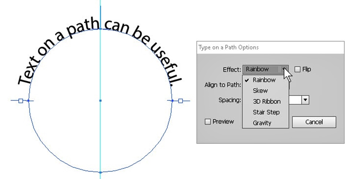
- To modify the curve or shape of the text on the path, select the text object and go to the Type menu. Choose “Type on a Path” and then select “Type on a Path Options.” Adjust the “Effect” and “Alignment” settings to control how the text wraps and follows the path.
- If you want to break the text into separate lines or paragraphs, use the Enter or Return key to add line breaks. You can also use the Paragraph panel (Window > Type > Paragraph) to customize the text formatting and alignment.
- When it comes to selected characters or words within the text, you can apply different formatting options specifically to them. Use the Type tool (T) to select the desired characters or words, and then apply formatting changes in the Character panel or Control panel.
- If you’re working with text that spans multiple lines along a path, you can adjust the spacing between the lines by using the Leading option in the Character panel. This will ensure that the text remains legible and visually pleasing.
It’s important to experiment and regularly review your text on the path to ensure it still aligns with your design vision. By making small adjustments as needed, you can fine-tune the text placement and appearance, ultimately enhancing the overall impact of your design.
With these techniques in mind, you’re well-equipped to edit and modify text on a path in Illustrator. In the next section, we’ll explore how you can create curved text on a path, adding another layer of creativity to your designs.
Creating Curved Text on a Path
One of the most popular applications of typing on a path in Illustrator is creating curved text. This technique allows you to bend text along the curvature of a path, giving your designs a unique and eye-catching aesthetic. Here’s how you can create curved text on a path:
- Select the Type tool (T) and move the cursor near the path until it changes to a squiggly line.
- Click anywhere on the path to activate the text cursor, and then start typing your text.
- To curve the text, click on the Selection tool (V) and then click and drag the blue circle handle that appears on the path. This handle controls the curve of the text along the path. Experiment with different handle positions to achieve the desired curvature.
- If you need to adjust the position of the text along the path, use the Selection tool (V) and drag the text object along the path. This allows you to fine-tune the placement and ensure the text flows smoothly.
- You can add more text to the path or remove text as needed by using the Type tool (T) and clicking on the path. This allows you to edit and modify the content without affecting the shape of the path.
- If you want to reverse the direction of the curved text, go to the Type menu, choose “Type on a Path” and select “Reverse Path” from the options. This will flip the text upside-down or change its orientation along the path.
- To further customize the appearance of curved text, you can apply various effects, such as fills, strokes, and gradients, to the text object. Use the Appearance panel (Window > Appearance) to access these options and experiment with different styles.
Curved text can add a sense of movement and dynamism to your designs. It’s often used for creating circular logos, curved headings, or decorative elements that follow a specific shape. By mastering the art of creating curved text, you can add a unique and visually pleasing touch to your designs.
Keep in mind that achieving the perfect curve may require some trial and error. Experiment with different handle positions and text adjustments to find the best configuration for your design. Regularly preview and review your curved text to ensure that it complements the overall composition and delivers the desired visual impact.
In the next section, we’ll explore how you can add images or shapes to text on a path, allowing you to create even more interesting and visually engaging designs.
Adding Images or Shapes to Text on a Path
In addition to typing on a path, Illustrator allows you to incorporate images or shapes into your text, creating unique and visually appealing designs. Here’s how you can add images or shapes to text on a path:
- Start by creating the text on a path using the techniques mentioned earlier. Make sure the text is positioned and aligned along the path as desired.
- Place the image or shape that you want to add to the text on a separate layer above the text layer. This ensures that the image or shape doesn’t interfere with the text while allowing you to manipulate its placement.
- Select the image or shape and copy it (Ctrl+C or Command+C).
- Activate the text layer, and place your cursor at the desired location within the text where you want to insert the image or shape.
- Paste the copied image or shape (Ctrl+V or Command+V) into the text. Illustrator will automatically create a new layer for the pasted object within the text layer.
- Use the Selection tool (V) to position and resize the image or shape within the text, adjusting it until it fits seamlessly into the desired area. You can also apply any necessary effects or transformations to enhance its appearance.
- If needed, you can further refine the placement of the image or shape by adjusting the text’s anchor points or path.
- Experiment with different images, shapes, and placements to find the most visually appealing composition. You can use this technique to add logos, icons, or decorative elements to your text.
By adding images or shapes to text on a path, you can create visually engaging designs that blend typography and graphical elements seamlessly. This technique allows you to enhance the meaning, convey a message, or simply add visual interest to your artwork.
Keep in mind the balance between the image or shape and the text, ensuring that both elements work together harmoniously. Regularly preview and review your design to assess the overall composition and make any necessary adjustments.
Now that you know how to add images or shapes to text on a path, you have another powerful tool at your disposal to create dynamic and captivating designs. In the next section, we’ll share some tips and tricks to help you master the art of typing on a path in Illustrator.
Tips and Tricks for Typing on a Path in Illustrator
Mastering the art of typing on a path in Illustrator takes practice and experimentation. To help you along the way, here are some tips and tricks to keep in mind:
- Use guides and grids: Utilize the guide and grid systems in Illustrator to ensure precise placement and alignment of your text on the path. This helps maintain consistency and balance in your design.
- Use the Direct Selection tool (A): The Direct Selection tool allows you to select and manipulate individual anchor points on the path. Use this tool to fine-tune the shape and curve of the path for more control over the text flow.
- Experiment with different fonts: Don’t limit yourself to just one font. Try out various fonts to find the one that best fits your design. Different font styles evoke different emotions and can greatly impact the overall look and feel of your text on the path.
- Consider the readability: While creativity and visual appeal are important, ensure that your text remains readable. If the path is too complex or the font size is too small, the text may become illegible. Adjust the path and font size accordingly to maintain readability.
- Use the Appearance panel: The Appearance panel allows you to apply multiple effects, fills, and strokes to your text on the path. Experiment with different combinations to create unique and eye-catching designs.
- Group and arrange layers: As you work on your design, make use of layers to organize text, images, and shapes. Grouping and arranging layers can make it easier to manage and edit your elements as you continue refining your design.
- Regularly save and backup: Illustrator projects can be complex and time-consuming. Make it a habit to regularly save your work and create backups to avoid losing progress in case of unexpected technical issues.
- Seek inspiration: Look for inspiration from other designers, illustrators, and typographers. Examine their work and techniques to get new ideas and insights for your own text on a path creations.
Remember, practice is key to mastering typing on a path in Illustrator. Don’t be afraid to experiment, explore different options, and learn from your successes and failures. With dedication and creativity, you can create stunning and professional-looking designs using the typing on a path feature.
Now that you have a variety of tips and tricks under your belt, it’s time to put them into action and continue honing your skills. Have fun and enjoy the process of creating visually captivating text on a path designs in Illustrator!