
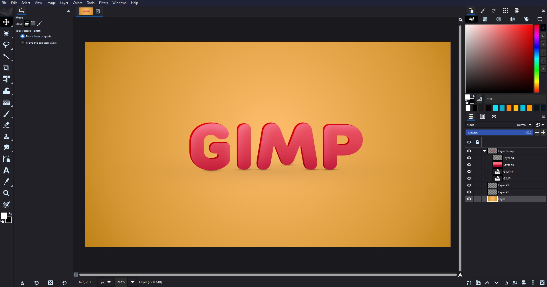
Selecting and Opening an Image in GIMP
Before you can start extracting colors from an image in GIMP, you need to select and open the image file within the software. Here’s a step-by-step guide to help you get started:
- Launch GIMP on your computer. If you don’t have GIMP installed, you can download it for free from the official GIMP website.
- Click on “File” in the menu bar and select “Open” to browse for the image you want to work with. Alternatively, you can use the shortcut key Ctrl+O (Command+O on a Mac) to open the file selection dialog.
- Navigate to the location of the image file on your computer, select it, and click on the “Open” button.
- The selected image will now open in the GIMP workspace, ready for further edits and color extraction.
It’s important to note that GIMP supports a wide range of image file formats, including JPEG, PNG, GIF, and TIFF, among others. So whether you’re working with a photograph or a digital artwork, you can easily open and manipulate the image to extract the desired color scheme.
Once you have successfully opened the image in GIMP, you’re now ready to start selecting colors using the Color Picker Tool, which allows you to sample colors from any part of the image. This tool is essential in the process of extracting a color scheme from the image, as it enables you to precisely choose the colors you want to incorporate into your design.
Using the Color Picker Tool to Select Colors
The Color Picker Tool in GIMP is a powerful feature that allows you to select colors directly from an image. This tool helps you pinpoint specific colors that catch your eye and extract them for use in your design project. Follow these steps to use the Color Picker Tool effectively:
- Select the Color Picker Tool from the Toolbox on the left side of the GIMP workspace. It is represented by an eyedropper icon.
- Click on the desired color in the image that you want to select. The selected color will be automatically set as the foreground color.
- If you’re not satisfied with the chosen color, you can manually adjust it using the Color Picker dialog. To access the dialog, go to “Tools” in the menu bar, choose “Color Picker,” and click on “Color Picker Options.” Here, you can fine-tune the hue, saturation, and value of the selected color.
- Continue using the Color Picker Tool to select additional colors from different areas of the image. Experiment with different color combinations until you have a collection that forms the desired color scheme.
- As you select colors, GIMP automatically adds them to the color swatches panel, allowing you to easily reference and manage your chosen colors.
Keep in mind that the Color Picker Tool allows you to select both foreground and background colors. By default, the selected color becomes the foreground color, but you can easily switch it to the background by right-clicking on the color swatch and selecting “Set Background Color.”
The Color Picker Tool in GIMP provides a convenient and efficient way to select colors from images. Take advantage of this feature to capture the exact colors you want and build a well-coordinated color scheme for your design project. Once you have your color palette established, you can proceed to create a color scheme and apply it to your design.
Creating a Color Palette with the Colors Selected
After using the Color Picker Tool to select colors from your image in GIMP, the next step is to create a color palette that contains all the chosen colors. This color palette will serve as a reference for your design and will help maintain consistency throughout your project. Follow these steps to create a color palette in GIMP:
- Ensure that the Color Palette dock is visible in your GIMP workspace. If it’s not displayed, go to “Windows” in the menu bar and select “Recently Used Colors.”
- As you select colors with the Color Picker Tool, GIMP automatically adds them to the Recently Used Colors section of the Color Palette dock. You can view and manage your selected colors in this section.
- To create a more organized and custom color palette, click on the small menu icon within the Color Palette dock and select “Palette Editor.” This will open the Palette Editor dialog.
- In the Palette Editor dialog, click on the “+ New Palette” button to create a new palette for your color scheme.
- Provide a name for the palette in the dialog box and click “OK” to proceed.
- The new palette will now appear in the Palette Editor. To add colors to the palette, simply drag and drop the colors from the Recently Used Colors section or use the “+ Add Color” button within the Palette Editor.
- You can rearrange the colors within the palette by dragging them into the desired order. This allows you to fine-tune the arrangement and create a visually pleasing color sequence.
- Once you have added and organized all the colors in your color scheme, click “OK” to save the palette.
By creating a color palette, you have a centralized location within GIMP that houses all the colors you selected from the image. This makes it easier to reference and utilize the color scheme throughout your design.
Now that you have your color palette set up, you can proceed to extract color swatches from the palette, which will enable you to apply the color scheme to your design more efficiently.
Extracting Color Swatches from the Color Palette
Once you have created a color palette in GIMP with all the selected colors from your image, the next step is to extract individual color swatches from the palette. This allows you to easily access and apply the specific colors from your color scheme in your design. Here’s how you can extract color swatches from the color palette:
- In the GIMP workspace, navigate to the Color Palette dock where your created color palette is displayed.
- Click on the small menu icon within the Color Palette dock and select “Palette Editor.”
- In the Palette Editor dialog, you will see a list of colors in your color palette. Each color entry will have an accompanying checkbox.
- To extract a color swatch, check the box next to the desired color. This selects and activates the color for use.
- Once you have selected the desired colors, you can start applying them to your design by using the Brush Tool, Fill Tool, or by manually selecting them as your foreground or background color.
- Repeat the process of checking the boxes next to the colors you want to extract, and deselect any colors that you no longer need. This allows you to switch between different color swatches as per your design requirements.
- If at any point you wish to add or remove colors from your color palette or make adjustments, you can do so by using the Palette Editor dialog.
By extracting color swatches from your color palette, you have easy access to the individual colors that make up your color scheme. This simplifies the process of applying your chosen colors to different elements of your design, ensuring consistency and visual harmony throughout.
Now that you have extracted color swatches, you can use them to apply the color scheme to your design project. Whether it’s designing a website, creating graphics, or editing images, having a set of extracted color swatches makes it convenient to maintain a cohesive and professional look.
Applying the Color Scheme to your Design
Once you have extracted color swatches from your color palette in GIMP, it’s time to apply the color scheme to your design. By using the chosen colors strategically, you can give your design a cohesive and visually appealing look. Here are some ways to apply the color scheme to your design:
- Background Color: Use one of the primary colors from your color palette as the background color of your design. This sets the overall tone and mood.
- Text and Headings: Select another color from the palette to use for text, headings, and other key elements. This color should provide a good contrast with the background color while maintaining readability.
- Accent Colors: Use additional colors from your palette as accent colors. These can be used for buttons, links, icons, borders, or other elements that you want to highlight. Using consistent accent colors throughout your design creates a sense of cohesion and balance.
- Gradients: Experiment with creating gradients using colors from your palette. Gradients can be used for backgrounds, banners, or other areas where you want to add depth and visual interest.
- Color Combinations: Consider how different colors from your color palette can work together harmoniously. Try different combinations to create a vibrant and visually pleasing design.
- Color Balance: Pay attention to the overall balance of colors in your design. Make sure that no single color overwhelms the others and that there is a good distribution of colors throughout the design.
Remember, the color scheme you have extracted from your image reflects the desired aesthetic and mood you want to convey. By thoughtfully applying the colors to your design, you can evoke specific emotions or convey a specific message to your audience.
As you work on your design, be open to adjustments and iterations. You may find that certain colors need to be tweaked or replaced to achieve the desired look and feel. Don’t be afraid to experiment and explore different possibilities until you achieve a design that truly represents your vision.
Now that you have successfully applied your color scheme to your design, take a moment to step back and assess the visual impact. Ensure that the colors work harmoniously and enhance the overall aesthetics of your design.
Customizing the Color Scheme for your Needs
While the color scheme you extracted from your image in GIMP is a great starting point for your design, you may find the need to customize it further to better suit your specific needs. Customization allows you to add a personal touch and align the colors with your branding, style, or desired aesthetic. Here are some ways to customize the color scheme:
- Adjusting Hue, Saturation, and Brightness: Use the color manipulation tools in GIMP to modify the colors from your palette. You can increase or decrease the hue, saturation, or brightness of a color to create different variations and shades.
- Adding or Removing Colors: If you feel that the extracted color scheme lacks a certain depth or is too overwhelming, consider adding or removing colors. You can introduce new colors that complement the existing ones or eliminate colors that don’t align with your vision.
- Creating Color Variations: Experiment with creating variations of the existing colors by adding slight variations in tone or saturation. This can help you create different shades and tints that give your design more versatility.
- Using Color Harmonies: Explore different color harmonies such as complementary, analogous, or triadic colors. These harmonies can help you identify additional colors that work well together and provide a harmonious and balanced feel to your design.
- Testing Compatibility: While customizing your color scheme, make sure to test the colors on different devices and backgrounds to ensure they remain legible and visually appealing. Consider factors such as contrast, accessibility, and readability.
Remember, the goal of customizing the color scheme is to make it uniquely yours while still maintaining a cohesive and visually pleasing design. Customization allows you to tailor the colors to your specific needs and create a design that truly represents your brand or vision.
Throughout the customization process, take the time to step back and assess the visual impact of the changes you make. Continuously evaluate how the colors work together and whether they achieve the desired look and feel for your design.
By customizing the color scheme, you can create a unique and memorable design that resonates with your target audience and effectively communicates your message.
Saving and Exporting the Color Scheme
Once you have finalized your color scheme in GIMP, it’s important to save and export it for future use. This ensures that you have easy access to the colors whenever you need them, whether it’s for a new design project or to maintain consistency across multiple designs. Here’s how you can save and export your color scheme:
- Save the Color Palette: In GIMP, navigate to the Color Palette dock where your color palette is displayed. Click on the small menu icon within the dock and select “Palette Editor.” In the Palette Editor dialog, click on the “Save Palette” button. Choose a location on your computer and provide a name for the color palette file. Click “Save” to store the color palette file.
- Export as a GIF or PNG Image: If you want to use your color scheme in other design software or share it with others, you can export it as an image file. In GIMP, go to “File” in the menu bar and select “Export As.” Choose either GIF or PNG as the file format, depending on your preference. Select the desired location and file name, then click “Export” to save the color scheme as an image file.
- Share the Color Palette: If you want to share your color scheme with others who use GIMP, you can provide them with the color palette file you saved. They can then load the palette into their GIMP workspace to access and use the same colors. This is especially useful for collaborative projects or when working with a team.
- Use External Color Palette Tools: Another option is to use external color palette tools, such as Adobe Color or Coolors, to recreate your color scheme based on the colors you selected in GIMP. These tools allow you to create and save color palettes in various formats, making it easier to use and share your color scheme across different design software.
By saving and exporting your color scheme, you ensure that you have a readily accessible reference for your chosen colors. Whether you’re working on a single project or multiple ongoing design tasks, having your color scheme readily available saves time and helps maintain consistency.
Remember to store your color scheme files in a safe and organized location, so you can easily locate and retrieve them when needed. By keeping your color scheme files organized, you can streamline your design process and create a cohesive visual identity.
In the next section, we will explore how you can effectively utilize your color scheme in other design projects, allowing you to bring your vision to life with a consistent and appealing color palette.
Using the Color Scheme in Other Design Projects
Once you have created and saved your color scheme in GIMP, you can utilize it in various other design projects to maintain consistency and strengthen your visual branding. Here are some ways you can effectively use your color scheme:
- Website Design: Apply the colors from your color scheme to various elements of your website, such as the background, headers, text, buttons, and links. Consistently using the same colors throughout your website creates a cohesive and visually appealing user experience.
- Graphic Design: Incorporate your color scheme into graphic designs such as posters, banners, social media posts, or infographics. By using the colors consistently, you create a recognizable visual identity that helps establish brand recognition.
- Logo and Branding: Ensure that your logo and overall branding materials incorporate the colors from your color scheme. Consistency in branding is crucial for building a strong and cohesive brand image.
- Print Materials: Apply your color scheme to printed materials such as business cards, brochures, flyers, or packaging. By using the same colors across various marketing collateral, you create a unified and professional brand image.
- User Interface Design: If you are working on designing a mobile app or software interface, use your color scheme to define the visual elements such as buttons, icons, menus, and backgrounds. Consistency in color helps users navigate the interface more easily.
- Presentations: Apply your color scheme to presentation templates, ensuring that slide backgrounds, fonts, and graphs align with your selected colors. This creates a visually cohesive and professional presentation.
- Social Media and Marketing: Use the colors from your color scheme to create visually appealing and consistent social media posts, advertisements, and other marketing materials. This helps create a recognizable and memorable brand presence.
- Customize Design Templates: If you are using pre-designed templates for your designs, customize them by replacing the default colors with the colors from your color scheme. This allows you to maintain consistency and align the templates with your brand identity.
By incorporating your color scheme into various design projects, you create a unified and visually appealing brand experience. Consistency in color helps establish brand recognition, evoke emotions, and communicate the desired message effectively to your target audience.
Remember to regularly revisit and evaluate your color scheme to ensure it remains relevant and aligned with your evolving brand identity. Although your color scheme provides consistency, it’s also important to allow for flexibility and adaptability as your design needs evolve.
In the next section, we will wrap up the article with a summary of the key points discussed and leave you with some final thoughts on utilizing color schemes effectively in your designs.