
What is a Line Graph?
A line graph is a type of chart that displays data points connected by lines to show trends or changes over a period of time. It is effective in conveying information about continuous data, such as revenue growth, temperature fluctuations, or population trends. By plotting data points on a grid with an x-axis representing time and a y-axis representing the magnitude of the data, a line graph enables viewers to quickly understand patterns, identify relationships, and make predictions.
The visual representation of the line graph is both clear and intuitive, making it a popular choice for presenting data in various fields such as economics, science, finance, and social studies. Unlike other chart types, the line graph emphasizes the sequential nature of the data and allows for easy comparison between different variables.
Line graphs are particularly useful for displaying trends over time, including upward or downward movements, cyclical patterns, seasonal variations, or sudden spikes. By visually connecting the data points with lines, line graphs highlight the overall trend or direction of the data, enabling viewers to identify patterns and make informed decisions.
For example, a line graph can be used to track the sales performance of a product over several months, displaying the fluctuations in revenue and identifying peak selling periods. It can also be used to present the rise and fall of stock prices over a specific time frame, helping investors analyze market trends and make investment decisions accordingly.
Additionally, line graphs can be used to compare multiple data series on the same graph, allowing for easy visualization of relationships and patterns. This enables viewers to identify correlations or disparities between different variables and draw meaningful insights from the data.
Step 1: Prepare the Data
The first step in creating a line graph is to gather and organize the data you want to present. Ensure that your data is in a format that can be easily plotted on a graph.
Here are a few guidelines to help you prepare your data:
- Collect the data: Determine what data you want to represent on your line graph. This could be numerical data related to a specific variable, such as sales figures, temperature readings, or population data. Ensure that you have sufficient data points to create a meaningful and accurate graph.
- Organize the data: Group your data into categories or time intervals. If you are tracking sales data over different months, organize the data by month. If you are comparing data from multiple sources, organize the data by source. This will allow you to create a clear and comprehensive line graph.
- Eliminate outliers and inconsistencies: Review your data for any outliers or inconsistencies that could skew the interpretation of the graph. If you find any erroneous or irrelevant data points, remove them to maintain the accuracy and integrity of your line graph.
- Calculate averages or totals: Depending on your data, you may need to calculate averages, totals, or percentages to provide a comprehensive view of the information. These calculations can help identify trends and patterns more effectively.
Once you have prepared your data, you are ready to move on to the next step of creating a line graph in Excel.
Remember, accurate and well-organized data is crucial for creating an informative line graph that effectively conveys your message. Take the time to review and validate your data before proceeding with creating the graph.
Step 2: Insert a Line Graph
After preparing your data, the next step is to insert a line graph into your Excel worksheet. Follow these steps to insert a line graph:
- Select your data: Highlight the data that you want to include in your line graph. Be sure to include both the x-axis (time or categories) and the y-axis (data values).
- Open the Insert Chart menu: Navigate to the “Insert” tab in Excel’s toolbar and click on the “Line” icon in the “Charts” section. This will open a dropdown menu with various line graph options.
- Choose a line graph style: Select the type of line graph that best suits your data visualization needs. You can choose from options such as line graph, stacked line graph, or 100% stacked line graph. Experiment with the different styles to find the one that presents your data most effectively.
- Click “OK”: Once you have chosen a line graph style, click the “OK” button. This will insert the line graph into your worksheet.
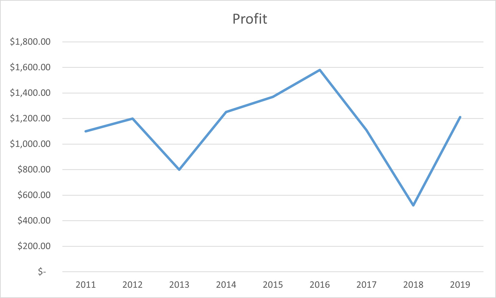
Excel will automatically generate a line graph based on the data you have selected. The x-axis will represent the categories or time intervals, and the y-axis will represent the data values. The data points will be connected by lines to visualize the trends or changes over the designated time or categories.
It’s important to note that the initial line graph may not be perfect and may require further customization to achieve your desired outcome. The next step will focus on customizing and formatting the line graph to improve its clarity and visual appeal.
By following these steps, you can easily insert a line graph in Excel and begin visualizing your data in a meaningful way. The line graph will provide a clear representation of trends and patterns, allowing you to interpret and communicate your data effectively.
Step 3: Customize the Line Graph
After inserting a line graph in Excel, you can customize various aspects of the graph to enhance its appearance and improve the clarity of the information being presented. Customizing the line graph allows you to tailor it to your specific data and visualization requirements. Here are some key customization options:
- Change the graph layout: Right-click anywhere on the graph and select “Select Data.” This will open the “Select Data Source” dialog box, where you can add or remove data series, edit the axis labels, or reorder the series to modify the graph’s layout.
- Modify the line color and style: Double-click on any of the lines in the graph to open the “Format Data Series” task pane. From there, you can change the line color, thickness, and style options (e.g., solid, dashed, dotted) to make individual lines more distinguishable or align with your desired visual style.
- Adjust line markers: Line markers are data points represented by symbols on the graph. You can customize their appearance by selecting a different marker style, changing the size, or adding fill colors. This can help emphasize important data points or make the graph more visually appealing.
- Add data labels: Data labels provide additional information about each data point on the graph. You can choose to display data labels directly on the data points, on the x-axis, or on the y-axis. This makes it easier for viewers to interpret the graph without needing to refer to the data source.
- Modify axes and gridlines: Right-click on the graph and select “Format Axis” to customize the appearance of both the x-axis and y-axis. You can adjust the axis scales, add gridlines to aid in interpreting the data, or modify the appearance of the axis labels and tick marks to align with your preferences.
Experiment with different customization options until you achieve the desired appearance for your line graph. However, keep in mind that excessive customization or busy visuals can detract from the main purpose of the graph: highlighting trends and patterns in the data.
Customizing the line graph allows you to present your data in a visually appealing and impactful way, making it easier for viewers to grasp the information being conveyed. By taking the time to customize the line graph, you can ensure that it effectively communicates your data and enhances the overall presentation of your work.
Step 4: Format the Title and Axis Labels
Formatting the title and axis labels of your line graph is crucial for providing context and guiding viewers in interpreting the data. By customizing these elements, you can create a graph that is not only visually appealing but also communicates the key information effectively. Follow these steps to format the title and axis labels:
- Edit the graph title: Double-click on the current title of the graph to select it. This will allow you to modify the text and style of the title. Consider using a concise and descriptive title that highlights the main message of the graph.
- Customize the axis labels: Right-click on either the x-axis or y-axis labels and select “Format Axis.” This will open a task pane where you can adjust the appearance of the axis labels. You can modify the font, color, size, and orientation to make them more legible and visually appealing.
- Add a label or units: If your data values have specific units or need further clarification, you can include a label or units in the axis labels. For example, if you are displaying temperature data, you can add “°C” or “°F” to indicate the temperature scale.
- Consider using a legend: If you have multiple lines representing different data series, using a legend can help viewers understand the color or symbol associated with each line. You can customize the legend’s appearance and placement to suit your preferences.
When formatting the title and axis labels, it’s important to maintain clarity and simplicity. Avoid using excessive text or complex formatting that may distract or confuse viewers. Clear and concise titles and labels will facilitate understanding and interpretation of the data.
By taking the time to format the title and axis labels, you can provide a clear and informative context for your line graph. This ensures that viewers can easily grasp the main message and accurately interpret the data being presented.
Step 5: Add Data Labels and Gridlines
Data labels and gridlines can provide additional clarity and context to your line graph. Data labels help viewers identify specific data points, while gridlines provide a visual reference for interpreting the data. Follow these steps to add data labels and gridlines to your line graph:
- Add data labels: Right-click on any data point in your line graph and select “Add Data Labels.” This will display the data values directly on the data points. You can further customize the appearance of the data labels by adjusting the font, size, color, and position.
- Show category labels: If your line graph represents data over specific categories, such as months or years, you can choose to display the category labels along the x-axis. Right-click on the x-axis and select “Add Category Axis Labels” to enable this option.
- Enable gridlines: Gridlines provide a visual aid for interpreting data points on the graph. To enable gridlines, right-click on the graph and select “Add Major Gridlines” or “Add Minor Gridlines,” depending on your preference. You can further customize the appearance of the gridlines, such as line style and color, by accessing the “Format Gridlines” options.
- Adjust gridline spacing: Depending on the data density, you may want to adjust the spacing between the gridlines. Right-click on the axis and select “Format Axis.” In the task pane, you can modify the interval or unit of the gridlines to ensure optimal readability.
By adding data labels and gridlines, you provide viewers with additional visual cues to interpret the data and understand its significance. Data labels help identify specific data points of interest, while gridlines provide a reference point for comparing values and identifying trends.
When adding data labels and gridlines, it’s important to strike a balance. Avoid cluttering the graph with too many labels or gridlines, as it may make the graph appear busy or difficult to read. Use them strategically to enhance comprehension without overwhelming the visual presentation.
With data labels and gridlines incorporated into your line graph, viewers can easily identify key data points and make meaningful interpretations. These additions contribute to a more comprehensive and informative representation of your data.
Step 6: Change the Line Style and Marker Options
Changing the line style and marker options in your line graph can help differentiate data series, emphasize specific data points, and enhance the visual impact of the graph. By customizing these elements, you can create a graph that is not only visually appealing but also effectively communicates your data. Follow these steps to change the line style and marker options:
- Select a data series: Click on any line in the graph to select the entire data series.
- Open the “Format Data Series” task pane: Right-click on the selected data series and choose “Format Data Series” from the context menu. This will open the task pane where you can modify the line style and marker options.
- Change the line style: In the task pane, navigate to the “Line” section. Here, you can select a different line style, such as solid, dashed, dotted, or any other predefined style. Adjusting the line style can help differentiate multiple data series or highlight specific trends in your data.
- Customize the marker options: In the same task pane, go to the “Marker” section. Here, you can choose a different marker symbol, such as a circle, square, or triangle, or customize the size, color, and fill options of the markers. Adding markers to data points can make them more visually prominent and aid in interpretation.
- Apply changes to other data series: If you want to apply the same line style and marker options to other data series in the graph, click the “Apply to All” button in the “Format Data Series” task pane. This will ensure consistency across multiple data series.
Experiment with different line styles and marker options to find the combination that best represents your data and aligns with your desired visual style. However, ensure that the changes you make are meaningful and do not distract from the main purpose of the graph, which is to present and interpret data accurately.
By changing the line style and marker options in your line graph, you can add visual interest, highlight important data points, and improve the overall presentation of your graph. Customizing these elements enhances the readability and impact of your data visualization.
Step 7: Adjust Data Range and Axis Scale
The data range and axis scale in your line graph determine the range of values displayed and how they are presented. Adjusting these elements enables you to focus on specific data points, highlight trends, or provide a broader view of the data. Follow these steps to adjust the data range and axis scale:
- Select the data range: Click on the horizontal axis (x-axis) or vertical axis (y-axis) to select it. This will allow you to modify the axis options.
- Modify the data range: Right-click on the axis and select “Format Axis” from the context menu. In the task pane, navigate to the “Axis Options” section. Here, you can manually adjust the minimum and maximum values for the axis to define the data range that will be displayed on the graph.
- Scale the axis: By default, Excel automatically scales the axis based on the data range. However, you can customize the scale to better highlight specific trends or patterns. In the “Axis Options” section of the task pane, you can choose to use a logarithmic scale or reverse the direction of the axis.
- Display data points beyond the range: If you want to show data points that fall outside the axis range, you can enable the “Overflow” or “Underflow” options in the “Axis Options” section. This allows for a more comprehensive view of the data, especially when dealing with outliers or significant data values.
- Preview and adjust: As you make modifications to the data range and axis scale, preview the changes in the graph to ensure they effectively communicate the desired information. Make necessary adjustments until you achieve the desired balance between focus and data inclusivity.
Adjusting the data range and axis scale in your line graph allows you to present the data in a way that aligns with your specific goals and objectives. Whether you want to emphasize specific trends or provide a broader perspective, customizing these elements helps fine-tune the visual representation of your data.
Remember to consider the appropriate scaling of the axis and the impact it has on accurately representing the data. Make sure the chosen range and scale effectively communicate the intended message and avoid misleading interpretations.
By adjusting the data range and axis scale, you can create a line graph that effectively highlights trends and patterns in your data while providing a comprehensive view for interpretation.
Step 8: Add Trendline and Error Bars
Adding a trendline and error bars to your line graph can provide additional insights and enhance the visual representation of your data. A trendline helps to depict the overall trend or pattern in the data, while error bars indicate the level of uncertainty or variability. Here’s how you can add trendlines and error bars to your line graph:
- Select a data series: Click on a data series in the line graph to select it.
- Add a trendline: Right-click on the selected data series, choose “Add Trendline” from the context menu. This will open the “Format Trendline” task pane.
- Select a trendline type: In the “Format Trendline” task pane, select the desired trendline type from various options such as linear, exponential, logarithmic, or moving average. Each type of trendline calculates and displays the overall trend of the data in a different manner.
- Customize trendline options: Explore the additional trendline options in the task pane. You can display the equation and R-squared value on the graph, change the line style, or modify the forecast period to extend the trendline into the future.
- Add error bars: To add error bars to your line graph, select the data series for which you want to display error bars. Right-click on the selected data series and choose “Add Error Bars” from the context menu. This will open the “Format Error Bars” task pane.
- Choose error bar type: In the “Format Error Bars” task pane, select the error bar type you want to use. Options may include standard deviation, standard error, percentage, or custom values.
- Customize error bar options: Adjust the range and direction of the error bars, display specific values, or customize the appearance of the error bars, such as line style and color, to make them easily distinguishable.
Adding a trendline to your line graph helps to visualize and communicate the overall trend in your data, making it easier to identify patterns or predict future values. Error bars, on the other hand, allow you to represent variability or uncertainty associated with individual data points. These additions enhance the comprehensiveness and accuracy of your line graph.
Remember to use trendlines and error bars judiciously and ensure they are relevant and meaningful to your data. Excessive or unnecessary use may hinder clarity and impact the interpretation of your line graph.
By adding trendlines and error bars to your line graph, you can better understand and communicate the underlying trends, patterns, and uncertainties in your data, providing valuable insights to your audience.
Step 9: Save and Share the Line Graph
Once you have created and customized your line graph, it’s important to save and share it appropriately to ensure its accessibility and visibility. Follow these steps to save and share your line graph:
- Save your Excel file: Click on the “File” tab in the Excel toolbar and select “Save” or use the shortcut Ctrl+S (Command+S on a Mac). Choose the desired location and provide a descriptive file name to easily identify your graph.
- Select the preferred image format: If you plan to share the graph as an image file, such as a PNG or JPEG, you can save the graph by taking a screenshot or using the “Save As Picture” option in the right-click menu. This allows for easy embedding in reports, presentations, or online platforms.
- Export as PDF: If you want to preserve the integrity of the graph’s formatting and ensure compatibility across different devices, you can export your Excel file as a PDF. Click on the “File” tab, select “Save As,” and choose PDF as the file format.
- Copy and paste the graph: You can also copy the graph from Excel and paste it directly into other applications such as Word, PowerPoint, or design software. This allows for seamless integration into your documents or presentations.
- Share the Excel file: If you want to share the entire Excel file with someone, use file-sharing platforms like email attachments or cloud storage services. Ensure that the recipient has the necessary software to view and edit the Excel file.
- Provide context and explanation: When sharing your line graph, consider including a brief explanation or summary of the data, highlighting the key trends or insights. This helps recipients understand the significance of the graph and interpret the data accurately.
Saving and sharing your line graph effectively ensures that your hard work is accessible to others and can be easily understood. Selecting the appropriate file format and sharing method based on your specific requirements helps maintain the quality and integrity of the graph.
Remember to respect any data privacy or confidentiality guidelines when sharing graphs involving sensitive or confidential information. It’s important to comply with any applicable regulations or policies to ensure the appropriate handling of data.
By following these steps, you can save and share your line graph in a way that promotes collaboration, understanding, and effective communication of data.