
Choosing the Right Type of Graph
When it comes to visualizing your data in Google Sheets, selecting the right type of graph is crucial. Different types of graphs are suited for different purposes and data types. By choosing the appropriate graph, you can effectively communicate your data and convey key insights to your audience. Here are some factors to consider when choosing the right type of graph:
- Data Type: The type of data you have will influence your graph choice. If you have categorical data, such as survey responses or product categories, a bar graph or pie chart can be suitable. On the other hand, if you have numerical data, such as sales figures or temperature readings, a line graph or scatter plot may be more appropriate.
- Relationship: Consider the relationship between your variables. Are you looking to compare different categories or show how variables change over time? For comparing categories, bar graphs and column charts work well. If you want to display trends or relationships over time, line graphs and area charts are ideal. For showcasing correlation or distribution, scatter plots and histograms can effectively portray the data.
- Message: Determine the main message you want to convey with your graph. Are you trying to show a comparison, a trend, a distribution, or a composition? Understanding the key message will help you select the graph type that best communicates that information.
- Audience: Consider who will be viewing your graph. Are they experts in the field or general audience members? If you are presenting data to experts, you may opt for more complex graphs that provide detailed insights. For general audience members, it’s best to use simpler and more easily understandable graphs.
By taking these factors into account, you can select the most appropriate graph type to effectively convey your data and insights. Remember, choosing the right graph type will enhance the understanding and interpretation of your data by your audience.
Entering Your Data into Google Sheets
Before you can create a graph in Google Sheets, you’ll need to enter your data into the spreadsheet. Follow these steps to enter your data:
- Open a new or existing Google Sheets document.
- In the first row of your spreadsheet, enter the column headers or labels for your data. These should describe the type of data you will be entering in each column.
- Starting from the second row, enter your data into the respective columns. Make sure to enter each value in the correct row and column to maintain the accuracy and integrity of your data.
- If you have multiple sets of data, consider organizing them in separate sheets or using different columns for each set.
- As you enter your data, Google Sheets automatically saves your progress. You can access your saved data anytime and make necessary modifications.
Ensure that your data is accurate and complete before proceeding to create a graph. Any errors or missing data can affect the integrity and validity of your graph.
Google Sheets also offers several helpful features to assist with entering and managing your data. You can use formulas, functions, and formatting options to perform calculations, analyze your data, and present it in a visually appealing manner. Explore these features to make the most out of your data entry process.
Once you have entered your data into Google Sheets, you are ready to create a graph to visualize your data and gain valuable insights.
Selecting the Data Range for Your Graph
After entering your data into Google Sheets, the next step is to select the specific range of data that you want to include in your graph. Here’s how you can do it:
- Navigate to the sheet containing your data and click and drag to select the range of cells that you want to include in your graph. This can be a single column, multiple columns, or a combination of columns and rows.
- If your data includes headers or labels in the first row or column, make sure to include them in your selection. Including headers will help create more meaningful and informative graph legends and axis labels.
- You can also select non-adjacent ranges by holding down the Ctrl key (or Command key on Mac) and then clicking on the individual cells or ranges you want to include.
- Consider selecting additional data points or columns that might provide context or enhance your graph’s visual representation. Including relevant data can provide a deeper understanding of the trends or patterns you are trying to illustrate.
- Review your selection to ensure that it accurately captures the data you want to visualize. If needed, you can adjust the range by clicking and dragging the selection handles or by manually entering the cell range in the formula bar.
By carefully selecting the data range for your graph, you can ensure that your visualization focuses on the most relevant information and effectively conveys your intended message. It’s important to choose a range that accurately represents your data and supports the insights you want to highlight.
Once you have selected your data range, you are ready to insert a graph into your Google Sheets document and start customizing its appearance to create a visually appealing and informative representation of your data.
Inserting a Graph into Your Worksheet
Once you have selected the appropriate data range in Google Sheets, the next step is to insert a graph to visualize your data. Follow these steps to insert a graph:
- Select the range of data you want to include in your graph by clicking and dragging over the cells.
- In the menu at the top, click on “Insert” and then select “Chart” from the drop-down menu. Alternatively, you can also right-click on the selected data and choose the “Insert chart” option.
- A sidebar will appear on the right side of the screen, displaying various graph types that are available in Google Sheets. Select the graph type that best suits your data and visualization needs.
- Once you have selected your desired graph type, click on the “Insert” button in the sidebar. Your graph will be inserted into your worksheet and will automatically be linked to the selected data range.
- You can now further customize your graph by adding titles, labels, legends, and other elements to enhance its clarity and visual appeal. Simply click on the chart and use the formatting options available in the toolbar at the top to make the desired changes.
- If you wish to change the type of graph or modify any other aspect, you can do so by selecting the chart and using the “Chart editor” option in the toolbar or by right-clicking on the chart and choosing the “Advanced edit” option.
Inserting a graph into your Google Sheets document allows you to visually explore and analyze your data more effectively. It provides a clear and concise representation of the information, making it easier to identify patterns, trends, and relationships within the data.
With your graph now inserted, you can move on to customizing its appearance to ensure that it effectively communicates the insights derived from your data.
Customizing the Appearance of Your Graph
After inserting a graph into your Google Sheets document, you have the ability to customize its appearance to create a visually appealing and engaging representation of your data. Here are some ways you can customize the appearance of your graph:
- Chart Styles: Select a predefined chart style from the “Chart styles” option in the toolbar. Experiment with different styles to find the one that best suits your data and visualization needs.
- Colors: Change the colors of your graph’s elements, such as bars, lines, or data points. You can choose from predefined color palettes or customize the colors according to your preferences or branding.
- Fonts: Adjust the font type, size, and style of your graph’s text elements, including titles, labels, and legends. Use legible fonts that enhance the readability of your graph.
- Background: Modify the background of your graph by choosing a solid color, applying a gradient, or using an image. The background can help create a cohesive visual theme or highlight important data points.
- Gridlines: Show or hide gridlines to guide your audience’s interpretation of the data. Gridlines can aid in understanding the scale and positioning of the data points.
- Chart Elements: Add or remove chart elements such as a title, axis titles, data labels, and a legend. Customize their placement, orientation, and formatting to provide clarity and context to your graph.
- Animations and Transitions: Apply animations or transitions to your graph to add visual interest and engage your audience. Use them sparingly and purposefully to avoid distracting from the data.
Remember, while customizing the appearance of your graph is important, it is equally essential to maintain clarity and accuracy. Avoid using excessive embellishments or overwhelming visual elements that may overshadow the data that you are trying to convey.
By carefully customizing the appearance of your graph, you can create a visually stunning representation of your data that effectively communicates the insights you want to share.
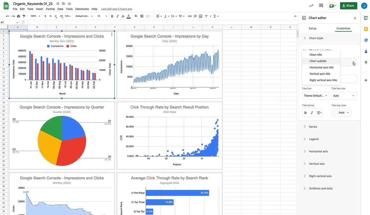
Adding Titles and Labels to Your Graph
Titles and labels play a crucial role in clarifying and providing context to your graph in Google Sheets. They help your audience understand the purpose of the graph, identify the data being represented, and interpret the information accurately. Here’s how you can add titles and labels to your graph:
- Main Title: Start by adding a main title to your graph. This title should summarize the main message or purpose of your graph. To add a title, click on the chart and use the toolbar to insert and customize the text box for your main title. Position it appropriately, such as above or below the graph.
- Axis Titles: Each axis in your graph should have a clear and descriptive label. Axis titles help your audience understand what the values on each axis represent. To add an axis title, click on the respective axis and use the toolbar to insert and customize the text box for the title.
- Data Labels: Data labels provide specific values for individual data points in your graph, making it easier for your audience to interpret and compare the data. You can choose to display data labels directly on the data points, bars, or columns. To add data labels, select the series or individual data points in the graph and use the toolbar to enable data labels with the desired format.
- Legend: If your graph includes multiple data series or categories, it is important to add a legend. The legend helps identify and differentiate between the different elements in your graph. To add a legend, click on the chart and use the toolbar to enable and customize the legend placement and format.
When adding titles and labels to your graph, ensure they are clear, concise, and easy to read. Use appropriate font sizes, styles, and colors to make them visually distinct. Additionally, make sure the titles and labels accurately represent the data being displayed in your graph.
By incorporating titles and labels in your graph, you enhance its clarity and usability, enabling your audience to understand the information more effectively and derive meaningful insights from your data.
Changing the Axis Settings
The axis settings in your graph determine the scale, range, and appearance of the axes, which are essential components for accurately interpreting and analyzing your data in Google Sheets. By modifying the axis settings, you can provide a clearer representation of your data and emphasize specific aspects. Here are the steps to change the axis settings in your graph:
- Axis Range: Adjusting the axis range allows you to control which values are displayed on the axes. To change the axis range, click on the axis you want to modify and access the “Axis” section in the toolbar. From there, you can set the minimum and maximum values or choose automatic scaling based on your data.
- Axis Labels: Axis labels are crucial for providing context and understanding the data displayed on each axis. To change the axis labels, click on the axis you want to modify and access the “Axis” section in the toolbar. You can customize the labels by editing the text and adjusting font styles and sizes.
- Axis Scale: Changing the axis scale allows you to control the intervals and divisions on the axis. To modify the axis scale, click on the axis you want to adjust and access the “Axis” section in the toolbar. You can specify the interval between tick marks or choose automatic scaling based on your data.
- Axis Type: Depending on the nature of your data, you may need to change the axis type. Google Sheets offers options for numerical, categorical, or date/time axes. To change the axis type, click on the axis and access the “Axis” section in the toolbar. Select the appropriate axis format based on your data.
- Axis Title: The axis title provides a clear description of the data represented on each axis. To modify the axis title, click on the axis and access the “Axis” section in the toolbar. You can customize the title by editing the text and adjusting the font styles and sizes.
By changing the axis settings, you can tailor your graph to highlight specific data points or trends. It allows you to adjust the scale and labeling to ensure accurate interpretation of the data by your audience. Experiment with different axis settings to create a graph that effectively communicates your intended message and insights.
Adding a Trendline to Your Graph
In Google Sheets, adding a trendline to your graph can help you identify and analyze patterns or trends in your data. A trendline is a line that represents the general direction or tendency of your data points. Here’s how you can add a trendline to your graph:
- Select the series or data points in your graph to which you want to add a trendline. You can do this by clicking on a data point or series.
- With the data selected, click on the “Chart elements” option in the toolbar and check the box next to “Trendline”.
- You can now customize the trendline by clicking on it and using the toolbar options. You can change the line type, thickness, color, and other formatting options to your preferences.
- Google Sheets offers various types of trendlines, including linear, exponential, logarithmic, polynomial, and more. To modify the type of trendline, click on the trendline and access the “Trendline” section in the toolbar. Select the desired trendline type from the available options.
- As you add or modify the trendline, Google Sheets will display the equation and R-squared value, providing insights into the relationship and accuracy of the trendline with your data.
Adding a trendline to your graph can help you observe patterns, forecast future trends, and better understand the behavior of your data. It can be especially useful when analyzing time-series data or when you suspect a specific relationship between variables in your dataset.
Keep in mind that trendlines should be used with caution and critical analysis. They provide a general representation of your data, but it’s important to consider the context, potential outliers, and other factors that may affect the accuracy and validity of the trendline.
By adding a trendline to your graph, you can visually depict trends and gain valuable insights into the underlying patterns within your data.
Using Filters to Display Specific Data in Your Graph
In Google Sheets, filters are a powerful tool that allow you to customize and focus your graph on specific data subsets. By applying filters, you can easily analyze and visualize specific portions of your dataset. Here’s how you can use filters to display specific data in your graph:
- Select the range of data that you want to filter in your graph. This can be a single column or multiple columns that contain the data you wish to include.
- In the toolbar, click on the “Data” menu and then select “Create a filter” from the drop-down menu. This will activate the filter options for your selected data range.
- Once the filter is applied, you will notice a small drop-down arrow next to each column header in your data range. Click on the arrow to open the filter menu for that column.
- In the filter menu, you can specify the criteria that determine which data points to include in your graph. For example, you can choose to display only specific categories or values that meet certain conditions.
- After applying the desired filters, your graph will automatically update to display only the filtered data points. This allows you to focus on specific subsets of your data and gain insights into those particular segments.
Using filters in your graph provides flexibility and relieves you from creating separate graphs for different subsets of your data. It enables you to explore and visualize specific data scenarios more efficiently.
By utilizing filters, you can easily analyze trends or patterns in your data based on specific criteria or conditions. This is particularly useful when you want to compare or highlight specific aspects of your dataset.
Remember to review and adjust the filters as needed to ensure that your graph accurately reflects the subset of data you want to analyze. Filters can be a powerful tool in helping you delve deeper into your dataset and uncover meaningful insights.
Adding Data Labels to Your Graph
Data labels are an important element in your graph that provide specific information for each data point, making it easier for your audience to interpret and analyze the data. Google Sheets allows you to add data labels to your graph in a few simple steps:
- Click on the chart to select it and access the “Chart editor” option in the toolbar.
- In the “Chart editor” sidebar, navigate to the “Customize” tab.
- Scroll down to the “Data Labels” section and enable the data labels for your graph.
- Customize the formatting and positioning of the data labels according to your preferences. Google Sheets offers options to display the data labels inside the data points, above them, or outside the graph area.
- If you want to display specific data labels, such as values, percentages, or additional information, you can choose the appropriate label type from the available options.
- You can also format the font, size, color, and other visual aspects of the data labels to ensure they are clear and easy to read.
Data labels serve as a visual aid to convey precise information about each data point and enhance the understanding of your graph. They can provide insights into the exact values or proportions represented by the data points, making it easier to compare and analyze the data.
However, keep in mind that data labels should be used judiciously to avoid overloading the graph with excessive information. Consider the size of your data points, the complexity of the graph, and the readability when deciding on the placement and formatting of the labels.
By adding data labels to your graph, you enhance its clarity and enable your audience to gain valuable insights at a glance. Use them to provide additional context and support the interpretation of the data presented in your graph.
Moving and Resizing Your Graph
In Google Sheets, moving and resizing your graph allows you to position it within your worksheet and adjust its dimensions to fit your desired layout. Here’s how you can move and resize your graph:
- Click on the graph to select it.
- Once selected, you will see small squares, known as sizing handles, around the edges of the graph.
- To move the graph, click and drag it to the desired location within your worksheet.
- To resize the graph, click and drag any of the sizing handles. You can modify the height, width, or aspect ratio of the graph depending on your needs.
- As you move and resize the graph, Google Sheets will automatically adjust the layout of your worksheet, shifting other elements accordingly.
- While resizing, you can also maintain the proportions of your graph by holding down the Shift key while dragging the sizing handles.
Moving and resizing your graph gives you the flexibility to arrange your data and visualizations in a way that best supports your analysis and presentation. It allows you to optimize the placement of your graph within your worksheet and ensure it fits harmoniously with other content.
Consider the overall aesthetics and readability when deciding on the position and size of your graph. Ensure that it is clear and visible, with enough space to accommodate all necessary labels, titles, and other components.
By effectively moving and resizing your graph, you can enhance the visual flow of your worksheet and make it easier for your audience to digest and interpret the data and insights presented.
Copying and Pasting Your Graph into Another Document or Presentation
In Google Sheets, you have the ability to easily copy and paste your graph into another document or presentation. This allows you to incorporate your graph seamlessly into reports, presentations, or other projects. Here’s how you can copy and paste your graph:
- Select the graph that you want to copy by clicking on it.
- Right-click on the selected graph and choose the “Copy” option from the menu. Alternatively, you can use the keyboard shortcut Ctrl+C (or Command+C on Mac) to copy the graph.
- Open the document or presentation where you want to paste the graph.
- Right-click on the desired location in the document or presentation and choose the “Paste” option from the menu. Alternatively, you can use the keyboard shortcut Ctrl+V (or Command+V on Mac) to paste the graph.
- The graph will be pasted as an image or as an embedded object, depending on the software you are using. You can then resize and reposition the graph within the document or presentation as needed.
Copying and pasting your graph allows you to easily transfer your visualizations across different files and applications without the need for manual recreations or adjustments. It saves time and ensures consistency in the representation of your data.
When pasting your graph, consider the size and layout of the destination document or presentation. Ensure that there is enough space to accommodate the graph appropriately and that it remains readable and visually appealing.
By copying and pasting your graph, you can effectively integrate it into your documents or presentations, enhancing the overall professionalism and impact of your work.
Updating Your Graph with New Data
In Google Sheets, it’s important to keep your graphs updated with new data to ensure accuracy and relevance. As your dataset evolves, you may need to update your graph to reflect the latest information. Here’s how you can update your graph with new data:
- Open your Google Sheets document containing the graph you want to update.
- Enter the new data into the appropriate cells within the existing data range or expand the range to include the new data.
- If your graph is linked to a specific data range, it will automatically update to incorporate the new data. However, if your graph is not linked to a specific range, you may need to manually adjust the selection to include the new data.
- Check the graph to ensure that it accurately reflects the updated dataset. Verify that the data points, axis labels, and any other elements in the graph align with the new data.
- If necessary, make any additional modifications to the graph, such as adjusting axis ranges, updating titles, or changing the style or formatting to maintain consistency.
By updating your graph with new data, you can present the most up-to-date information to your audience and allow them to make informed interpretations and decisions.
Regularly updating your graph is particularly crucial when dealing with dynamic or frequently changing data. It ensures that your visualizations remain relevant and accurately represent the current state of the data.
Remember to review and verify the integrity and accuracy of the updated graph before sharing or presenting it to others. Stay attentive to any changes in the dataset and take the necessary steps to keep your graph synchronized with the latest information.