
Setting up your data
Before you start creating a report in Excel, it is crucial to properly set up your data. By organizing and structuring your data effectively, you can create a comprehensive and insightful report that is easy to read and understand. Here are a few steps to help you get started:
- Identify your data: Determine the specific data that you want to include in your report. This could be sales figures, survey results, financial data, or any other relevant information.
- Clean and organize your data: Ensure that your data is accurate, free from errors, and properly formatted. Remove any unnecessary spaces, duplicates, or inconsistencies.
- Choose a logical structure: Determine how to organize your data to make it easier to analyze. Use columns for different categories or variables and rows for individual data points.
- Label your data: Assign clear and meaningful labels to your columns and rows. Descriptive labels will make it easier for others to understand the content of your report.
Once you have set up your data, you are ready to move on to the next step in creating your report. Remember, the quality of your data and how well it is organized will directly impact the effectiveness and accuracy of the final report.
Choosing the right type of report
Before diving into creating a report in Excel, it’s important to consider the purpose and audience of your report. Choosing the right type of report will ensure that the information is presented in a clear and meaningful way. Here are some factors to consider when selecting the appropriate report type:
- Objective: Determine the goal of your report. Are you tracking progress, analyzing trends, or presenting financial data? Understanding the objective will help you choose the most suitable report format.
- Data complexity: Evaluate the complexity of your data. If you have a large dataset with multiple variables, a pivot table or data table may be more appropriate. For simple data, a basic table or chart might suffice.
- Visual representation: Think about how you want to visually represent your data. Do you need to showcase comparisons, trends, or patterns? Bar charts, line graphs, or scatter plots can effectively display this information.
- Level of detail: Consider the level of detail you want to include in your report. If you need to provide a high-level overview, a summary report or dashboard can be useful. For more in-depth analysis, a detailed report with tables and charts may be required.
By carefully considering these factors, you can select the most appropriate report type that aligns with your goals and effectively communicates the information to your audience. Remember, the right choice of report format can significantly enhance the impact and usability of your data.
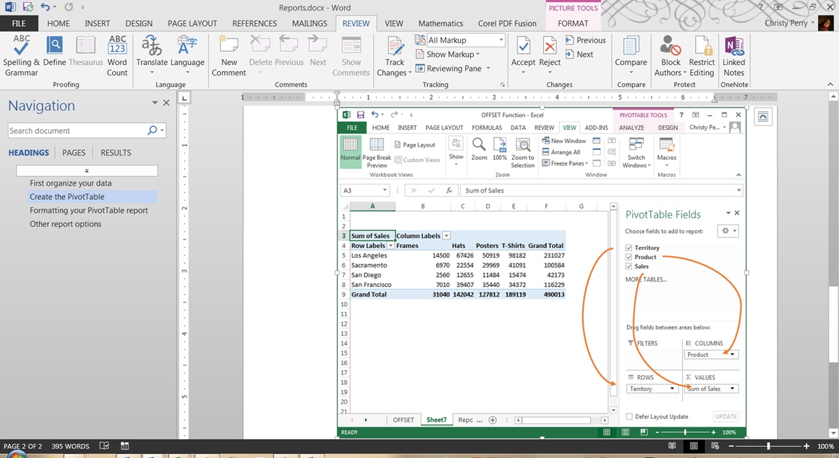
Creating a table
In Excel, creating a table is an essential step in organizing and presenting your data effectively. Tables provide a structured format that allows for easy sorting, filtering, and analysis. Here’s how you can create a table in Excel:
- Select your data: Highlight the range of cells that you want to include in your table.
- Go to the “Insert” tab: Click on the “Insert” tab in the Excel ribbon.
- Click on “Table”: In the “Tables” group, click on the “Table” button.
- Verify the range: Make sure that the correct range is selected for your table in the “Create Table” dialog box.
- Check the box for headers: If your table has headers, ensure that the box for “My table has headers” is checked.
- Click “OK”: Once you have verified the range and headers, click “OK” to create the table.
Once you have created the table, Excel will apply formatting and style options to differentiate the table from the rest of the worksheet. The table will have filter controls in the header row, allowing you to sort and filter the data easily.
You can further customize the table by adding additional columns, formatting the table style, or applying conditional formatting. Tables in Excel provide a dynamic and flexible way to manage your data, making it easier to analyze and present your information in a structured format.
Formatting your report
Once you have organized your data and created a table or chart, the next step in creating a report in Excel is formatting. Formatting your report is essential to enhance visual appeal, highlight key information, and improve readability. Here are some tips to effectively format your report:
- Apply consistent styles: Use consistent font styles, sizes, and colors throughout your report. This helps create a cohesive and professional look.
- Use borders and shading: Use borders to separate sections and add visual clarity. You can also apply shading to the background or cells to emphasize important information.
- Add headers and footers: Include headers and footers to provide additional context to your report. This may include titles, page numbers, or company logos.
- Use headings and subheadings: Organize your content with clear headings and subheadings. This helps guide readers and makes it easier to navigate through the report.
- Highlight key data: Use formatting techniques such as bold, italics, or color to highlight important data points or trends. This draws attention to critical information.
- Align and format numbers: Align numeric data consistently, such as aligning currency values to the right and decimal places to align vertically.
- Ensure readability: Use appropriate font sizes and line spacing to ensure that your report is easy to read. Avoid using overly small fonts that can strain the reader’s eyes.
- Consider accessibility: Make sure your report is accessible to all readers by using high contrast colors and providing alternative text for images.
By formatting your report effectively, you can create a visually appealing and professional-looking document that effectively communicates your data and insights. Take the time to experiment with different formatting options to find the best combination that suits your report’s purpose and audience.
Adding headers and footers
Headers and footers are useful tools in creating a well-formatted and professional-looking report in Excel. They allow you to add important information, such as titles, page numbers, dates, and company logos, to the top or bottom of each page. Here’s how you can add headers and footers to your report:
- Go to the “Insert” tab: Click on the “Insert” tab in the Excel ribbon.
- Select “Header & Footer”: In the “Text” group, click on the “Header & Footer” button.
- Choose a predefined header or footer: Excel provides several predefined options for headers and footers. Simply click on the desired option to insert it into your report.
- Customize your header or footer: If you want to create a customized header or footer, click on the “Custom Header” or “Custom Footer” button. This opens the “Header/Footer” dialog box where you can add text, images, page numbers, and other elements.
- Format your header or footer: Use formatting options such as font style, size, alignment, and color to format your header or footer content. You can also insert variables, such as the date, time, or the file name, using the predefined options.
- Preview and adjust: Use the “Close Header and Footer” button to exit the editing mode and preview your report. Adjust the positioning and content of the header or footer as needed.
Headers and footers are especially useful when creating multi-page reports or when you need to provide additional context or branding to your document. They help maintain consistency and professionalism throughout your report.
Remember to ensure that the text and images in the header and footer do not obstruct the main content of the report. Strike a balance between providing necessary information and keeping the focus on the data and insights you are presenting.
Inserting images and shapes
Adding images and shapes to your report can enhance its visual appeal and help convey information effectively. In Excel, you can easily insert images and shapes into your report using the following steps:
- Go to the “Insert” tab: Click on the “Insert” tab in the Excel ribbon.
- Select “Pictures” or “Shapes”: In the “Illustrations” group, click on either the “Pictures” or “Shapes” button, depending on what you wish to insert.
- Choose an image or shape: If you selected “Pictures,” navigate to the location of your image file and click “Insert” to add it to your worksheet. If you selected “Shapes,” choose the desired shape from the dropdown menu and click on the worksheet to insert it.
- Resize and reposition: After inserting an image or shape, you can resize it by clicking and dragging the corners. To reposition it, click and drag it to the desired location.
- Format images and shapes: To format an image or shape, right-click on it and select the “Format Picture” or “Format Shape” option. This allows you to adjust properties such as size, border, fill color, and transparency.
- Group and align objects: If you have multiple images or shapes, you can select them together and use the “Group” option under the “Arrange” menu to treat them as a single object. You can also align objects to ensure a neat and organized layout.
Images can be helpful in presenting visual data, such as charts, graphs, or product images. Shapes, on the other hand, can be used to create callouts, arrows, or other annotations to highlight specific information in your report.
When inserting images and shapes, it’s crucial to ensure that they complement the content and don’t overwhelm the report. Use them sparingly and purposefully to maintain a clean and professional appearance. Keep in mind that excessively large images or cluttered shapes can distract from the main message of your report.
Adding formulas and calculations
Excel’s powerful formula and calculation capabilities allow you to perform various calculations and analyze data effectively in your reports. By incorporating formulas, you can automate calculations and derive valuable insights. Here’s how you can add formulas and calculations to your report:
- Select a cell: Choose the cell where you want the result of your calculation to appear.
- Start with an equals sign: To begin a formula, always start with an equals sign (=). This tells Excel that you are entering a calculation.
- Enter the formula: Input the desired formula, using cell references or values. For example, “=A1+B1” will sum the values in cells A1 and B1.
- Use functions: Excel has a wide range of built-in functions that perform specific calculations. These functions can be used within formulas to simplify complex calculations. For instance, the SUM function adds up a range of cells, and the AVERAGE function calculates the average of a set of values.
- Drag and copy formulas: After entering a formula, you can drag its fill handle (a small square at the bottom right corner of the cell) to copy the formula to adjacent cells.
- Format the results: Apply appropriate formatting to the cells that contain the results of your calculations. This helps improve visibility and makes it easier to interpret the data.
Formulas and calculations in Excel allow you to perform various tasks, such as aggregating data, calculating percentages, performing statistical analyses, and much more. They provide valuable insights and automate repetitive tasks, saving you time and effort.
Ensure that you double-check your formulas for accuracy and consider using parentheses to control the order of operations if needed. Excel provides a wide range of mathematical, statistical, and logical functions that you can explore to customize your calculations based on your specific reporting needs.
Applying conditional formatting
Conditional formatting in Excel allows you to visually highlight and analyze specific data based on certain conditions. By applying conditional formatting, you can quickly identify patterns, trends, and outliers in your report. Here’s how you can apply conditional formatting to enhance your data analysis:
- Select the range: Highlight the range of cells that you want to apply conditional formatting to.
- Go to the “Home” tab: Click on the “Home” tab in the Excel ribbon.
- Select “Conditional Formatting”: In the “Styles” group, click on the “Conditional Formatting” button.
- Choose a rule: Select the desired rule from the dropdown menu. Excel provides several predefined rules such as highlighting cells that are greater than, less than, or equal to a certain value.
- Set the formatting: Configure the formatting options for the selected rule, such as font color, fill color, or data bars. You can also create custom rules based on specific criteria.
- Preview and adjust: Preview the applied conditional formatting and make any necessary adjustments to ensure that it effectively highlights the desired data based on your conditions.
- Combine multiple rules: You can apply multiple conditional formatting rules to the same range of cells. This allows for deeper data analysis and the identification of complex patterns.
Conditional formatting can be used to draw attention to important data points, identify outliers, visualize trends, or apply color scales based on values. It provides a dynamic and visual way to analyze your data without the need for manual sorting or filtering of your report.
Remember to use conditional formatting judiciously, as excessive formatting styles can make your report look cluttered or confusing. Aim for simplicity and consistency to ensure that the formatted data is easily understandable and meaningful to your audience.
Sorting and filtering data
Sorting and filtering data in Excel allows you to quickly organize, analyze, and extract specific information from your report. Whether you need to sort data in ascending or descending order or apply filters to narrow down your data, Excel provides powerful tools to efficiently manage your data. Here’s how you can sort and filter data:
- Select the range: Highlight the range of cells that you want to sort or filter.
- Sorting data: To sort data, go to the “Data” tab in the Excel ribbon and click on the “Sort” button. Choose the column or columns you want to sort by and specify whether you want to sort in ascending or descending order.
- Filtering data: To filter data, go to the “Data” tab and click on the “Filter” button. This will add filter dropdowns to the header row, allowing you to filter data based on specific criteria. You can apply simple filters, such as text filters or number filters, or use advanced filters to create more complex conditions.
- Applying multiple criteria: You can apply multiple criteria to your filters to refine and narrow down your data further. This is particularly useful when dealing with large datasets.
- Clearing filters: To remove filters and display the entire dataset, click on the “Filter” button again or use the “Clear” option in the filter dropdown.
Sorting data helps you arrange information in a logical order, making it easier to analyze and interpret. Filtering data allows you to focus on specific subsets of data, enabling you to answer specific questions and extract meaningful insights from your report.
It’s important to be mindful of the impact of sorting and filtering on other formulas and calculations in your report. Ensure that any formulas or calculations involving the sorted or filtered data are updated accordingly for accurate results.
Creating charts and graphs
Charts and graphs are invaluable tools in visualizing and presenting data in a meaningful way. Excel offers a wide range of chart types and customization options to help you create professional-looking visuals that effectively communicate your data. Here’s how you can create charts and graphs in Excel:
- Select the data: Highlight the data that you want to represent in your chart. Include column or row headings if applicable.
- Go to the “Insert” tab: Click on the “Insert” tab in the Excel ribbon.
- Select a chart type: Excel provides various chart types, such as column, bar, line, pie, and scatter. Choose the chart type that best suits your data and analysis needs.
- Customize the chart: Once the chart is inserted, you can customize its appearance and formatting. This includes modifying the chart title, axes labels, legends, colors, and styles. Right-clicking on different chart elements allows you to access additional customization options.
- Add data labels and annotations: You can enhance the clarity of your chart by adding data labels, annotations, or trendlines. This provides additional insights and helps communicate key information to your audience.
- Resize and reposition: Adjust the size and position of the chart within your worksheet to optimize its placement and visibility alongside your data.
- Update the chart: If your data changes or you need to update the chart with additional data, right-click on the chart and select “Edit Data” or use the “Select Data” option in the “Design” tab to make the necessary adjustments.
Charts and graphs enable you to identify trends, compare data, showcase relationships, and illustrate patterns effectively. They provide a visual representation of your data, making it easier for your audience to grasp the meaning and significance of the information.
When creating charts, be mindful of selecting the appropriate chart type for your data and the message you want to convey. Avoid cluttering your chart with unnecessary elements and ensure that the chart is properly labeled and interpretable without requiring additional explanations.
Printing and sharing your report
Once you have created your report in Excel, you may need to print it or share it with others. Excell provides various options and settings to optimize the printing process and ensure that your report is easily shared and accessible. Here’s what you need to consider when printing and sharing your report:
- Page setup: Before printing, adjust the page setup options to ensure that your report fits within the desired paper size and orientation. Access the “Page Layout” tab in Excel and navigate to the “Page Setup” group to modify settings such as margins, page size, and scaling.
- Print preview: Utilize the “Print Preview” feature to preview your report before printing. This allows you to check the layout, make any necessary adjustments, and ensure that everything appears as expected.
- Print options: Excel offers various options to customize the printing process. Consider selecting specific pages or a range of cells to print, adjusting the orientation, setting print titles to repeat on each page, and choosing the number of copies to print.
- Share as PDF: If you prefer to share your report digitally, Excel allows you to save it as a PDF file. This ensures that the formatting remains consistent when viewed on different devices or platforms. To save as PDF, go to the “File” tab, select “Save As,” choose the PDF format, and specify the location to save the file.
- File sharing: For collaborative purposes, you can share your Excel report with others by utilizing file sharing services or platforms. Ensure that appropriate access permissions are set to maintain data security and privacy.
- Emailing the report: If sending the report via email, you can attach the Excel file directly or include it as a link to a cloud storage platform. Consider compressing the file if it’s large to avoid any issues with email size limitations.
When printing and sharing your report, it’s essential to check for any formatting or layout issues that may arise when the report is viewed or printed on different devices or software. Take the time to review and adjust formatting if necessary to ensure optimal readability and visibility.
By considering these printing and sharing options in Excel, you can ensure that your report is presented accurately, professionally, and is easily accessible to your intended audience.