
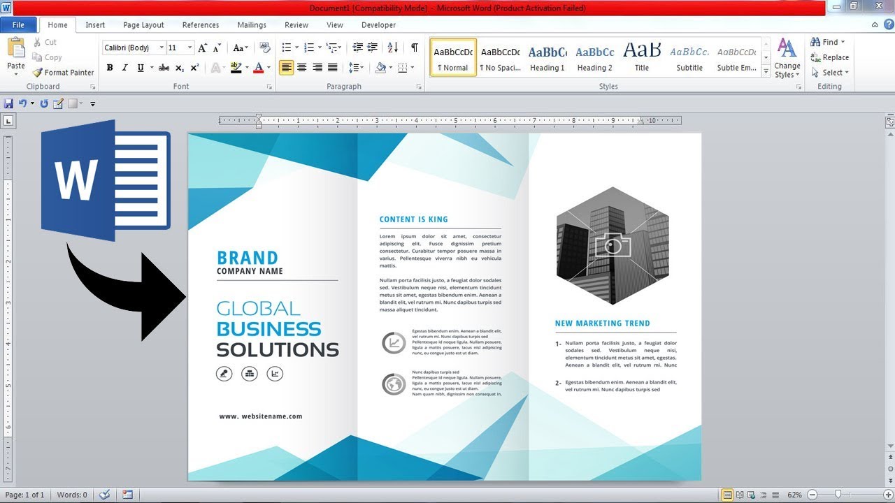
Choosing a Template
When it comes to creating a professional and eye-catching brochure in Microsoft Word, the first step is to choose the right template. A well-designed template can help you save time and effort by providing pre-existing layouts and designs that you can customize to suit your needs. Here are some tips to help you select the perfect template:
1. Consider your audience: Think about who will be reading your brochure and what message you want to convey. Is it for a business presentation, a sales pitch, or a creative project? Understanding your target audience will help you narrow down the template options.
2. Look for a clean and visually appealing design: A clutter-free design with ample white space can make your content stand out. Choose a template that has a modern and professional appearance, with a clear hierarchy of headings and subheadings.
3. Check the layout options: Templates usually offer different layout styles such as bi-fold, tri-fold, or multi-page. Consider the amount of content you have and the format that best suits your information. For shorter content, a bi-fold template may be sufficient, while a tri-fold or multi-page layout is better for longer content.
4. Think about color schemes: Select a template that aligns with your branding or the overall theme of your content. Look for templates that offer customizable color schemes, allowing you to adapt the design to your specific needs.
5. Download templates from reputable sources: Ensure that you download templates from reliable websites or directly from the Microsoft Office template library. This helps to avoid compatibility issues and ensures that the templates are safe to use.
Remember to choose a template that resonates with your goals, showcases your content effectively, and grabs the reader’s attention. While it’s essential to have a visually appealing design, make sure that the template doesn’t overpower the content itself. The right template can serve as a strong foundation for creating a professional brochure using Microsoft Word.
Customizing the Layout
Once you have selected a template for your brochure in Microsoft Word, it’s time to customize the layout to make it your own. This step allows you to arrange your content in a way that best suits your message and enhances the overall design. Here are some key points to consider when customizing the layout:
1. Adjusting the sections: Templates often come with predefined sections such as headings, subheadings, and body text. Modify these sections according to the content you want to include. You can add or remove sections, change the order, or combine multiple sections to create a cohesive flow.
2. Rearranging elements: Microsoft Word provides the flexibility to move images, text boxes, and other elements within the brochure. Experiment with different arrangements to find a visually pleasing layout. You can simply click and drag the elements to the desired location.
3. Using columns: If your brochure contains a significant amount of text, dividing it into columns can make it easier to read and give the layout a more professional look. To create columns, go to the Page Layout tab, click on Columns, and select the appropriate number of columns.
4. Adding and adjusting margins: Margins play a crucial role in defining the space between the content and the edge of the page. Customize the margins to ensure your text and images are adequately aligned. To adjust margins, go to the Page Layout tab and click on Margins. Choose a preset margin size or set custom margins.
5. Utilizing header and footer: Headers and footers provide additional space to include important information such as page numbers, contact details, or a company logo. Customize the header and footer sections to match the overall design of your brochure. You can do this by double-clicking on the header or footer area and inserting text or images.
6. Balancing symmetry and asymmetry: Achieving a balance between symmetry and asymmetry in your layout can create visual interest. Experiment with different alignments of text and images, and consider using shapes or lines to create visual flow and guide the reader’s attention.
Remember to save your changes regularly as you customize the layout. This ensures that you don’t lose any work in case of unexpected disruptions. By customizing the layout of your brochure, you can personalize it to suit your specific needs and create a visually appealing design that effectively delivers your message.
Adding and Formatting Text
After customizing the layout of your brochure in Microsoft Word, the next step is to add and format the text. Effective text formatting enhances readability, highlights key points, and ensures consistency throughout the document. Here’s how you can add and format text in your brochure:
1. Adding text boxes: To add text to your brochure, insert text boxes within the designated sections. Go to the Insert tab, click on Text Box, and select the desired style. Click and drag to create a text box, and then type or paste your text inside.
2. Formatting font styles: Use appropriate font styles to make your text stand out. Select headings and subheadings and apply bold, italic, or underline formats to distinguish them from the body text. Experiment with different font combinations to achieve a visually appealing look.
3. Adjusting font sizes: Ensure that the font sizes are consistent and appropriate for each section. Headings should be larger and more prominent, while body text should be legible but not overpowering. Use the font size dropdown in the Home tab to adjust the size of your text.
4. Aligning text: Position your text in a way that best suits your brochure’s design and message. You can align text to the left, right, center, or justify it. Consistency in text alignment throughout the brochure enhances readability and maintains a professional appearance.
5. Styling with colors: Use colors to emphasize important information or create visual hierarchy. Assign different colors to headings, subheadings, and body text, keeping in mind the overall design and branding of your brochure. Ensure that the color scheme you choose complements the rest of the layout.
6. Formatting paragraphs: Break your text into paragraphs to enhance readability. Use the paragraph formatting options to adjust spacing, indentation, and alignment. Utilize bullet points or numbered lists to organize information and make it easier to digest.
7. Proofreading and editing: Before finalizing your text, thoroughly proofread and edit it for grammar, spelling, and clarity. Ensure that the text is concise, free of errors, and effectively conveys your message. Consider asking a colleague or friend to review it as well for valuable feedback.
Remember to maintain consistency in font styles, sizes, and formatting throughout your brochure. A harmonious and well-formatted text enhances the overall design and readability of your brochure, making it more engaging and professional.
Inserting Images and Graphics
Adding visually appealing images and graphics to your brochure in Microsoft Word can greatly enhance its overall impact and engage your audience. Here are some tips on how to effectively insert and customize images and graphics in your brochure:
1. Inserting images: To insert an image, go to the Insert tab, click on Pictures, and select the image file from your computer. Position the image within a designated section by clicking and dragging it to the desired location. You can also resize the image by clicking and dragging its corners.
2. Choosing high-quality images: Select high-resolution images that are relevant to your content and convey your message effectively. Low-resolution or pixelated images can diminish the overall quality of your brochure. If needed, consider using royalty-free stock photos or hiring a professional photographer to capture custom images.
3. Wrapping text around images: To make your brochure visually appealing, you can wrap text around images. Right-click on the image, select Wrap Text, and choose an option such as Square, Tight, or Through. Experiment with different wrapping styles to find the most visually pleasing layout.
4. Customizing image styles: Microsoft Word provides various image editing tools to customize the appearance of your images. You can adjust the brightness, contrast, saturation, and sharpness of the image to achieve the desired visual effect. Explore the Picture Tools Format tab to access these editing options.
5. Adding captions: Captions can provide valuable context and information about the images in your brochure. To add captions, select the image, go to the References tab, click on Insert Caption, and enter the desired text. Customize the font style and size of the caption to ensure consistency with the rest of the text.
6. Incorporating icons and symbols: Icons and symbols can effectively convey information in a concise and visually appealing way. Microsoft Word provides a library of icons and symbols that you can insert into your brochure. Go to the Insert tab, click on Icons or Symbols, and choose the desired item to enhance your design.
7. Using charts and graphs: If your brochure includes data or statistics, consider presenting them in the form of charts or graphs. Go to the Insert tab, click on Charts, and select the appropriate chart type. Customize the chart with your data and style it to match the overall design of your brochure.
Remember to maintain a balance between the text and images in your brochure. Utilize visuals strategically to support your content, and ensure that they align with your overall message and brand identity. With properly inserted and customized images and graphics, your brochure will be visually compelling and effectively communicate your message to your audience.
Using Shapes and Text Boxes
Incorporating shapes and text boxes into your brochure design can add a creative touch and help convey information in a visually engaging manner. Microsoft Word offers a variety of shapes and text box options that you can utilize effectively. Here’s how you can enhance your brochure using shapes and text boxes:
1. Adding shapes: To insert shapes, go to the Insert tab, click on Shapes, and choose from a wide range of options such as rectangles, circles, arrows, and more. Click and drag to draw the shape on your brochure. You can resize, rotate, and customize the color and style of the shape using the options available in the Format tab.
2. Creating visual hierarchy: Utilize shapes to create visual hierarchy in your brochure design. Use larger shapes or differently styled shapes to emphasize important sections or key points. Consider surrounding text with shapes to make it stand out or using arrows or lines to guide the reader’s attention.
3. Grouping shapes: If you want to move or format multiple shapes together, you can group them. Select the shapes you want to group by holding the Shift key and clicking on each shape, then right-click and choose Group. This allows you to treat the grouped shapes as a single object that can be easily manipulated.
4. Inserting text boxes: To add text in a more creative and flexible way, utilize text boxes. Go to the Insert tab, click on Text Box, and choose a text box style. Click and drag to create the text box in your desired location, and then type or paste your text inside. Customize the font, color, and formatting of the text as needed.
5. Overlaying shapes with text boxes: Combine shapes with text boxes to create visually appealing layouts. Place text boxes over shapes to add captions, quotes, or additional information. Play with different text box styles and shapes to find combinations that complement your brochure’s design and enhance the overall visual impact.
6. Using callout shapes: Callout shapes are a great way to highlight specific information or draw attention to important details within your brochure. They can be used to insert speech bubbles, thought bubbles, or pointers. Select the desired callout shape, click and drag to create it, and then customize the text and appearance as needed.
Remember to use shapes and text boxes sparingly and strategically. They should enhance the overall design and help communicate your message effectively. Avoid overcrowding the brochure with too many shapes and text boxes, as it can make the layout appear cluttered. With creative placement and thoughtful customization, shapes and text boxes can bring your brochure to life.
Applying a Theme or Color Scheme
Applying a theme or color scheme to your brochure in Microsoft Word can greatly enhance its visual appeal and create a cohesive and professional look. A well-chosen theme or color scheme can also reinforce your branding and make your brochure more memorable. Here’s how you can efficiently apply a theme or color scheme to your brochure:
1. Accessing themes: Microsoft Word offers a range of built-in themes that you can apply to your brochure. To access the available themes, go to the Design tab. Browse through the different options and select a theme that aligns with your content and objectives.
2. Customizing themes: Once you’ve applied a theme, you can further customize it to suit your preferences. Click on the Theme Colors or Theme Fonts dropdown in the Design tab to explore different color and font options. Adjusting these elements can help create a personalized look while maintaining the overall theme.
3. Creating a custom color scheme: If you have specific colors associated with your brand or want to create a unique color scheme, you can do so in Microsoft Word. Go to the Design tab, click on the Colors dropdown, and select Customize Colors. Use the color picker or enter specific color values to create a personalized color scheme for your brochure.
4. Consistency in color usage: When applying a color scheme, ensure that you maintain consistency throughout your brochure. Use the chosen colors for headings, subheadings, text, shapes, and other graphical elements. Consistent color usage helps create a sense of visual harmony and reinforces your branding.
5. Contrast and legibility: When selecting colors for your brochure, consider the contrast between the background and the text. Ensure that text is easily readable against the background color. A high contrast ratio improves accessibility and enhances the overall readability of your brochure.
6. Incorporating images and graphics: When applying a theme or color scheme, consider how your chosen colors will work with the images and graphics in your brochure. Ensure that the colors you select complement the visuals and create a harmonious overall look.
Remember to choose a theme or color scheme that aligns with your brand identity and the message of your brochure. A visually cohesive and well-designed color scheme enhances the overall professionalism and impact of your brochure.
Choosing the Right Fonts
Choosing the right fonts for your brochure in Microsoft Word is essential for creating a visually appealing and readable design. Fonts play a significant role in conveying your brand identity and setting the tone for your content. Here are some tips to help you select the perfect fonts for your brochure:
1. Consider your branding and target audience: Start by considering your brand identity and the message you want to convey. Are you aiming for a modern, professional look, or do you want to evoke a more creative and artistic feel? Understand your target audience and choose fonts that resonate with their expectations and preferences.
2. Use complementary fonts: Select fonts that work well together and create visual harmony. Choose one font for headings and another for body text to establish a clear hierarchy. Ensure that the fonts you choose are legible and easy to read at different sizes.
3. Balance between simplicity and uniqueness: While it’s important to choose fonts that stand out and capture attention, avoid overly elaborate or intricate designs that may sacrifice readability. Find fonts that strike a balance between simplicity and uniqueness, effectively reflecting your brand personality.
4. Consider font families: Font families are groups of fonts that share similar design traits. Take advantage of font families to create consistency throughout your brochure. For example, you can choose a serif font for headings and a complementary sans-serif font for body text.
5. Pay attention to font weights and styles: Fonts often come in different weights and styles (bold, italic, light, etc.). Utilize these variations to add visual emphasis and create contrast. For instance, use a bold font for headings to make them stand out, and a regular weight font for body text to enhance readability.
6. Test for readability: Before finalizing your font choices, ensure that they are easily readable at various sizes. Consider the size of your brochure and the amount of text you have. Avoid using fonts that are too small or too condensed, as they can make reading difficult.
7. Limit the number of fonts: It’s generally recommended to not use too many different fonts in a single brochure, as it can create a disjointed and cluttered appearance. Stick to two or three fonts maximum to maintain consistency and visual cohesiveness.
Remember to save a copy of the brochure with the fonts embedded or provide font instructions if you plan to share the file with others. This ensures that the intended fonts are preserved and the design remains intact.
By carefully selecting fonts that align with your brand identity and message, you can create a visually appealing and engaging brochure that effectively communicates with your audience.
Adding Borders and Backgrounds
Enhancing the visual appeal of your brochure in Microsoft Word can be achieved by adding borders and backgrounds. Borders can help frame your content and create a polished look, while backgrounds can set the tone and add depth to your design. Here are some tips on how to effectively add borders and backgrounds to your brochure:
1. Adding borders to text boxes and images: To add a border to a text box or an image, click on the item to select it, go to the Format tab, and choose a border style from the options provided. You can customize the color, thickness, and line style of the border to match your design aesthetic.
2. Using page borders: Microsoft Word allows you to add borders to the entire page or specific sections of your brochure. To add a page border, go to the Page Layout tab, click on Page Borders, and select the desired border style. Choose from various border options such as solid lines, dotted lines, or custom patterns.
3. Customizing border elements: Experiment with different border elements, such as corners or individual sides, to add visual interest. Go to the Borders and Shading dialog box to access advanced customization options. You can also combine different border styles within the same brochure to create a unique and dynamic look.
4. Applying background colors or images: Give your brochure a distinctive look by adding background colors or images. To apply a background color, go to the Design tab, click on Page Color, and choose a color from the palette. For background images, select the Format tab, click on Background, and choose an image from your computer.
5. Choosing appropriate colors and patterns: When selecting border colors or background elements, consider the overall design and purpose of your brochure. Use colors and patterns that align with your brand identity or evoke the desired emotions in your audience. Ensure that the colors and patterns you choose do not overwhelm or distract from the main content.
6. Balancing simplicity and creativity: Strive for a balance between simplicity and creativity when adding borders and backgrounds. Avoid excessively ornate or busy designs that can overshadow your content. Instead, aim for a design that enhances readability and complements your brochure’s overall message.
7. Previewing and adjusting: Before finalizing your borders and backgrounds, preview your brochure in different viewing modes to ensure that they appear as intended. Make any necessary adjustments to the colors, patterns, or sizes to achieve the desired visual impact.
Remember to maintain consistency in border styles and background elements throughout your brochure to create a cohesive design. Adding borders and backgrounds can elevate the visual appeal of your brochure, making it more engaging and professional.
Incorporating Icons and Symbols
Including icons and symbols in your brochure can visually enhance your content and help convey information in a concise and effective manner. Icons and symbols can add visual interest, provide context, and make your brochure more engaging. Here are some tips on how to incorporate icons and symbols into your Microsoft Word brochure:
1. Accessing built-in icon libraries: Microsoft Word provides a range of built-in icon libraries that you can use in your brochure. To access these icons, go to the Insert tab, click on Icons, and choose from various categories such as business, technology, travel, or education. Browse through the icons and select the ones that best represent your content.
2. Using symbol fonts: In addition to icons, Microsoft Word also offers symbol fonts that contain a variety of symbols and glyphs. To access symbol fonts, go to the Insert tab, click on Symbol, and choose the desired font. Select the symbol you want to insert and click Insert. Experiment with different symbol fonts to find the ones that align with your brochure’s theme.
3. Customizing icons and symbols: Once you’ve inserted an icon or symbol, you can customize it to match your brochure’s design. Select the icon or symbol and use the formatting options in the Design tab to adjust its size, color, and style. You can also combine symbols and icons to create visual patterns or thematic representations.
4. Using icons for bullet points: Instead of traditional bullet points, consider using icons to list key points or highlight important information. This can make your content visually appealing and break up large chunks of text. Choose icons that are relevant to your content and easily recognizable.
5. Signifying actions or instructions: Icons can be used to represent actions or provide visual cues to guide readers. For example, you can use icons to indicate a button to click or an arrow to indicate direction. This helps users understand how to interact with your brochure and enhances user experience.
6. Organizing information with symbols: Symbols can be used to organize information or indicate specific categories. For instance, you can use smiley faces to represent different levels of satisfaction or use checkmarks and X marks to indicate completed tasks or items to avoid. Symbols can make information more visually comprehensible and easy to navigate.
7. Ensuring symbol clarity and readability: When using icons and symbols, ensure that they are clear and easily recognizable at the size you are using them. Avoid using overly complex or abstract symbols that may be confusing to the reader. Opt for simple, universally understood symbols that effectively convey your intended meaning.
Remember to use icons and symbols sparingly and purposefully. Thoughtfully incorporating them into your brochure can enhance its visual appeal, reinforce your message, and make the content more engaging for your audience.
Adjusting Margins and Page Size
Adjusting margins and page size in your brochure is crucial for creating a well-balanced layout and ensuring that your content fits appropriately. Microsoft Word allows you to customize the margins and page size to suit your design preferences. Here’s how you can effectively adjust margins and page size in your brochure:
1. Accessing margin settings: To adjust margins, go to the Page Layout tab and click on Margins. Here, you can choose predefined margin sizes or set custom margins by selecting Custom Margins. This opens a dialog box where you can enter specific measurements for the top, bottom, left, and right margins.
2. Considering content and readability: When adjusting margins, consider the amount of content you have and the overall readability of your brochure. Wider margins can provide more white space and improve the visual balance, while narrower margins allow for larger content areas. Striking the right balance ensures that your content is prominent and easy to read.
3. Creating consistent margins: Maintaining consistent margins throughout your brochure creates a more polished and professional look. Ensure that the margins on every page are set consistently to maintain visual consistency. You can do this by using the “Apply to:” dropdown in the Margins dialog box.
4. Accommodating bleed and print guidelines: If you plan to print your brochure professionally, you may need to account for bleed and print guidelines. Bleed is the area outside the final trim size that ensures that no white edges appear when the brochure is trimmed. Check with your printer for specific bleed and trim size requirements and adjust your margins accordingly.
5. Changing page size: If you need to modify the page size of your brochure, go to the Page Layout tab, click on Size, and select the desired page size. You can choose from various standard sizes, such as letter, legal, A4, or customize the size by selecting More Paper Sizes and entering specific dimensions.
6. Optimizing for different formats: Keep in mind that your brochure may need to be displayed or printed in different formats, such as PDF, digital screens, or physical prints. Adjusting margins and page size accordingly ensures that your brochure looks consistent and visually appealing across various formats.
7. Testing and adjusting: After making changes to margins and page size, preview your brochure in different view modes, such as Print Layout or Read Mode, to assess the overall look and ensure that your content is appropriately placed. Make any necessary adjustments and fine-tune the layout until you achieve the desired outcome.
Remember that adjusting the margins and page size can affect the overall layout and readability of your brochure. Take the time to experiment, test, and ensure that the changes you make align with your design vision and effectively present your content.
Setting up Headers and Footers
Setting up headers and footers in your brochure using Microsoft Word allows you to add important information, such as page numbers, titles, or branding elements, to every page consistently. Headers and footers can enhance the professionalism and organization of your brochure. Here’s how to effectively set up headers and footers:
1. Accessing header and footer sections: To access the header and footer sections, go to the Insert tab and click on Header or Footer. Choose from the available options, such as a blank header or footer space or pre-designed header/footer templates. By default, headers and footers are linked, meaning any changes made in one will apply to all pages.
2. Adding content to headers and footers: Double-click the header or footer area to enable edit mode and start adding content. Common elements to include in headers are the document title, chapter or section titles, or company logo. Footers often contain page numbers, copyright information, or website URLs. Use the options in the Design tab to format and customize the content as needed.
3. Formatting and styling: Apply consistent formatting to the content in your headers and footers to maintain a cohesive design. Ensure that font styles, sizes, and colors match the overall design of your brochure. Consider using different header or footer styles for the first page, if needed, to separate it from subsequent pages.
4. Inserting automatic elements: Microsoft Word offers automatic elements that you can insert into headers and footers. For example, to add page numbers, go to the Design tab, click on Page Number, and choose the desired position and format. You can also insert the date and time, file path, or other document properties using the options available under Quick Parts in the Insert tab.
5. Differentiating odd and even pages: If your brochure uses different layouts for odd and even pages, you may want to differentiate the headers and footers accordingly. Go to the Design tab, click on Different Odd & Even Pages to enable this feature. Then, customize the content in the headers and footers for the odd and even pages separately.
6. Adding section-specific headers and footers: If your brochure contains multiple sections, you may want to include section-specific headers and footers. Head to the Page Layout tab, click on Breaks, and choose the appropriate section break option. Once the sections are differentiated, you can modify the headers and footers for each section individually.
7. Previewing and adjusting: Preview your brochure in different view modes or print preview to ensure that the headers and footers are correctly positioned and appear as intended. Make any necessary adjustments to the content or formatting if needed.
Remember to strike a balance between informative content and visual design in your headers and footers. Use headers and footers to provide useful information while maintaining the overall aesthetic appeal of your brochure. Properly set up headers and footers will contribute to a more professional and organized brochure presentation.
Printing and Saving the Brochure
Once you have finalized your brochure in Microsoft Word, it’s important to properly print and save the document to ensure its quality and accessibility. Here are some guidelines for printing and saving your brochure:
1. Checking print settings: Before printing, review the print settings to ensure they are appropriate for your brochure. Access the print settings by clicking on File, then Print. Ensure that the correct printer is selected and check options such as paper size, orientation, and color settings.
2. Selecting the right paper: Choose a high-quality paper stock that best suits your brochure’s purpose and design. Consider factors such as thickness, finish, and durability. Glossy paper is often used for brochures to enhance image sharpness and color vibrancy, while matte paper provides an elegant and professional appearance.
3. Printing a test copy: To check the final outcome before printing multiple copies, it’s recommended to print a test copy. This allows you to detect any formatting or alignment issues, evaluate color accuracy, and ensure that the content appears as intended.
4. Double-checking alignment: Make sure that the content is properly aligned on each page. Check for any cutoff text, images, or graphics that may occur due to incorrect margins or printing settings. Adjust the margins if necessary to avoid any important content being trimmed.
5. Saving the brochure: Save your brochure in a format that preserves its design and allows for easy sharing. To save your brochure in Microsoft Word, click on File, then Save As. Choose a location on your computer and select the desired file format, such as .docx or .pdf. Saving in PDF format ensures that your brochure is accessible on different devices and retains its formatting.
6. Naming the file: Give your brochure a descriptive and meaningful filename, making it easier to identify and locate later. Consider including the version number or date to keep track of revisions.
7. Keeping backups: It’s important to create backups of your brochure files to avoid losing your work in case of computer crashes or accidental deletion. Save copies of your brochure on different storage devices or cloud storage services to ensure that you always have access to the latest version.
8. Proofreading printed copies: Before distributing your brochure, carefully proofread the printed copies to check for any errors or inconsistencies. Look for typos, formatting issues, or misaligned content. It’s always a good idea to have a second pair of eyes review the brochure as well to catch any overlooked mistakes.
Remember to follow any printing guidelines provided by your printer, such as resolution requirements or color profiles, to achieve the best print quality. By paying attention to the printing and saving process, you can ensure that your brochure looks professional and functions effectively as a communication tool.
Tips and Tricks for a Professional Finish
When creating a brochure in Microsoft Word, there are several tips and tricks you can apply to achieve a professional and polished finish. These techniques will help enhance the overall design and maximize the impact of your brochure. Here are some valuable tips to consider:
1. Use high-quality visuals: Incorporate high-resolution images and graphics that are relevant to your content. Clear and visually appealing visuals will help make a strong impression and elevate the overall professionalism of your brochure.
2. Proofread meticulously: Take the time to proofread your content thoroughly. Correct any grammar, spelling, or punctuation errors to ensure a flawless final product. A professionally crafted brochure is free from any typos or mistakes that can detract from its credibility.
3. Use consistent branding: Apply your branding consistently throughout the brochure. This includes using your logo, brand colors, and fonts in a cohesive manner. Consistent branding helps create a recognizable and professional identity.
4. Optimize your layout: Ensure that your layout is clean, organized, and visually pleasing. Use grids and guides to align elements properly. Pay attention to spacing, margins, and white space to create a balanced and professional design.
5. Keep it concise: A concise and focused message is key to maintaining the reader’s attention. Avoid lengthy paragraphs and instead use bullet points, headings, and subheadings to break up the content and make it more scannable.
6. Test readability: Before finalizing your brochure, test its readability. Print a sample copy and read it to ensure that the font size, choice of font, and overall layout make it easy for your audience to read and understand the information.
7. Use call-to-action statements: Incorporate clear and compelling calls-to-action to encourage your audience to take the desired next step. Whether it’s visiting a website, calling for more information, or making a purchase, effective calls-to-action add a professional touch and help drive desired outcomes.
8. Seek feedback: Don’t hesitate to seek feedback from others to gain valuable insights and different perspectives. Ask colleagues, friends, or industry experts to review your brochure and provide constructive criticism. This feedback can help refine your design and improve its overall professionalism.
9. Consider professional printing: When producing a large quantity of brochures, consider professional printing services. Professional printing ensures high-quality results, accurate color reproduction, and a range of finishes such as matte or glossy coatings for added visual appeal.
10. Stay updated: Keep up with design trends and industry standards to ensure that your brochure remains modern and relevant. Regularly review and update your brochure with fresh content, visuals, and design elements to stay ahead of the competition.
By following these tips and tricks, you will create a brochure that is visually appealing, engaging, and professionally executed. Paying attention to details and continuously improving the design will help you achieve the best possible outcome.
Troubleshooting Common Issues
While creating a brochure in Microsoft Word, you may encounter various issues that can affect the overall quality and appearance of your document. Understanding and troubleshooting these issues promptly can save you time and frustration. Here are some common issues you might encounter when designing a brochure and how to address them:
1. Formatting inconsistencies: If you notice inconsistent formatting throughout your brochure, such as varying font sizes or inconsistent spacing, it may be due to accidental changes while editing. To resolve this, select the problematic text or object and use the formatting tools in the Home tab to reset them to the desired style and size.
2. Distorted or pixelated images: If your images appear distorted or pixelated in your brochure, it may be due to low-resolution or improperly sized images. Replace them with higher-resolution versions or adjust their size using the Picture Tools Format tab to ensure clear and crisp visuals.
3. Printing errors: When printing your brochure, issues can arise such as cut-off text or misalignment. To fix this, double-check your print settings, ensure that the paper size matches your brochure layout, and adjust margins if necessary. If it persists, try printing a test page or consult your printer’s troubleshooting guide.
4. Text overflow: If your text extends beyond the boundaries of your text boxes or page, it may result in overlapping or incomplete text. To alleviate this, adjust the size of your text boxes, increase font size, or consider rephrasing to fit within the available space. Utilize hyphenation or add columns to manage large amounts of text.
5. Inconsistent colors: If the colors of your brochure elements appear different when printed or viewed on different screens, it may be due to color profiles or calibration differences. To ensure consistent color reproduction, use a color management system and choose print settings that match your desired color output. Test print a sample to verify color accuracy.
6. Corrupted file or missing content: If you experience a corrupted file or missing content within your brochure, it can be frustrating. To mitigate these issues, save your work regularly and create backups. Consider using cloud storage services or version control software to protect your files from loss or damage.
7. Lengthy loading times or performance issues: Large or complex brochures may experience slow loading times or performance issues in Microsoft Word. Simplify the design by reducing the number of images or objects, compress your images, or consider dividing the brochure into multiple sections to optimize performance.
8. Compatibility issues: When sharing your brochure with others, compatibility issues between different versions of Microsoft Word can arise. To ensure compatibility, save your file in a compatible format, such as .docx or .pdf. Communicate any specific font requirements or ask recipients to install any necessary fonts.
Remember to stay patient and persistent when troubleshooting these issues. Experimentation, testing, and seeking assistance when needed will help you overcome these common challenges and create a polished and professional brochure.