Using Design Themes in PowerPoint
Design themes play a crucial role in creating visually appealing and professional PowerPoint presentations. They provide a consistent and cohesive look to your slides, enhancing the overall impact of your message. With a wide range of design themes to choose from, you can easily customize the look and feel of your presentation to match the content and context. In this section, we will explore the importance of design themes in PowerPoint and how to effectively utilize them.
Design themes in PowerPoint consist of a set of predefined colors, fonts, and effects that are applied to a presentation. By using design themes, you can ensure that all the slides in your presentation have a consistent appearance and maintain a professional look throughout. This saves you time and effort, allowing you to focus on creating engaging content rather than worrying about the visual aesthetics of your slides.
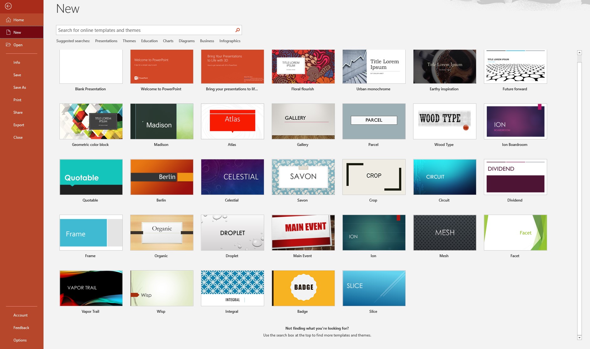
Applying design themes to your PowerPoint presentation is simple. Start by selecting the Design tab from the ribbon at the top of the screen. Here, you will find a variety of design themes to choose from. Simply click on a design to apply it to your slides. As you hover over each design, you will get a live preview, allowing you to see how it will look in your presentation.
Once you have applied a design theme, you can further customize it to your liking. PowerPoint offers various options to modify the colors, fonts, and effects of the selected theme. Under the Design tab, you will find options like Colors, Fonts, and Effects. Experiment with different combinations to create a unique and visually appealing look for your presentation.
When choosing a design theme for your presentation, it is important to consider the tone, style, and purpose of your content. If you are presenting a formal business proposal, a clean and professional design theme would be more appropriate. On the other hand, if you are delivering a creative pitch, a bold and vibrant design theme can help convey your ideas effectively. Remember that the design should complement and reinforce your message, not distract from it.
Using design themes effectively requires some best practices. Firstly, avoid overcrowding your slides with too much text or graphics. Keep it simple and focus on key points. Secondly, ensure that the text is easily readable by using appropriate font sizes and colors. Use contrasting colors to create a visually appealing and accessible presentation. Lastly, maintain consistency throughout the slides by using the same design elements and applying transitions and animations sparingly.
By utilizing design themes in PowerPoint, you can create impactful presentations that engage your audience and effectively convey your message. Experiment with different design themes, customize them to suit your needs, and follow the best practices to make your presentations visually stunning and memorable.
Understanding the Importance of Design Themes
Design themes are an essential component of creating compelling and professional PowerPoint presentations. They not only enhance the visual appeal of your slides but also help convey your message more effectively. Understanding the importance of design themes can empower you to create presentations that leave a lasting impression on your audience.
One of the primary reasons design themes are important is consistency. When you use a design theme, it ensures that all the slides in your presentation have a unified look and feel. This consistency creates a sense of coherence and professionalism, allowing your audience to easily navigate and understand the content. By maintaining a consistent design throughout your presentation, you establish credibility and professionalism, enhancing the overall impact of your message.
Design themes also help in creating a visual hierarchy in your slides. They guide the viewer’s attention to the most important elements and make your content more digestible. For instance, using different font sizes or colors for headings and text can make the information stand out and emphasize key points. By strategically using design themes, you can make your presentation more visually pleasing and engaging.
Another significant advantage of design themes is their ability to evoke emotions and set the tone of your presentation. The choice of colors, fonts, and visual elements in a design theme can influence how your audience perceives and connects with your content. For example, a design theme with warm colors and elegant fonts can create a sense of trust and professionalism, ideal for business presentations. On the other hand, a vibrant and playful design theme can captivate the attention of a younger audience or spark creativity during a brainstorming session.
Furthermore, design themes save you time and effort. Instead of manually formatting each slide individually, design themes allow you to apply consistent styling to all slides in a few simple steps. This time-saving feature enables you to focus on crafting compelling content and delivering an engaging presentation.
In a nutshell, design themes are vital for creating visually appealing, well-organized, and impactful PowerPoint presentations. They establish consistency, guide the viewer’s attention, evoke emotions, and save time. By understanding and utilizing design themes effectively, you can enhance the visual impact of your presentation, capture your audience’s attention, and ensure that your message is communicated with clarity and professionalism.
How to Apply Design Themes in PowerPoint
Applying design themes in PowerPoint is a straightforward process that allows you to quickly enhance the visual appeal and professionalism of your presentations. By following a few simple steps, you can apply design themes and transform your slides with ease.
To begin, open your PowerPoint presentation and navigate to the Design tab located in the ribbon at the top of the screen. Here, you will find a variety of design themes to choose from. Take your time to explore the available options and select a design that aligns with the tone and purpose of your presentation.
As you hover over each design, PowerPoint provides a live preview of how it will look on your slides. This allows you to visualize and compare different design themes before making your final selection. Once you have identified the design theme you wish to use, simply click on it to apply it to your entire presentation.
Once the design theme is applied, you will notice an instant transformation in the appearance of your slides. The colors, fonts, and effects defined by the design theme will be automatically applied to each slide, creating a cohesive and visually appealing look.
Customization is another aspect of applying design themes in PowerPoint. While the design theme provides a consistent base, you can modify specific elements to suit your preferences or match your branding. To customize a design theme, navigate to the Design tab and explore the options available for Colors, Fonts, and Effects.
Under the Colors option, you can select different color schemes or create a custom color palette. This allows you to adjust the colors used in your slides to better reflect your branding or personal style. Similarly, under the Fonts option, you can choose from a variety of font combinations to ensure that the text in your presentation is visually appealing and easy to read.
The Effects option allows you to add or modify the visual effects applied to objects on your slides. This includes options such as shadows, reflections, and glows. Experiment with different effects to add depth and visual interest to your presentation.
Remember, applying design themes is not a one-size-fits-all solution. Consider the nature of your content and the audience you are presenting to when making your design theme choices. A design theme that works well for a professional business presentation may not be suitable for a creative or informal setting.
Customizing Design Themes
While design themes provide a convenient and consistent starting point for your PowerPoint presentations, customizing them can add a personal touch and make your slides stand out. PowerPoint offers several options for customizing design themes, allowing you to tailor the appearance of your presentation to your specific needs and preferences.
To begin customizing a design theme, select the Design tab in PowerPoint. Under the Design tab, you will find various options such as Colors, Fonts, and Effects. These options allow you to modify different aspects of the design theme to create a unique look for your presentation.
The Colors option allows you to choose from a range of preset color schemes or create a custom color palette. Selecting a color scheme that aligns with your branding or desired visual aesthetic can significantly impact the overall look of your slides. You can also customize individual colors within the color scheme to match your specific requirements.
The Fonts option offers a selection of font combinations that can be applied to your presentation. Fonts play a crucial role in determining the readability and visual appeal of your slides. Experiment with different font combinations to find the perfect balance between professionalism and style. Consider using a consistent font combination throughout your presentation to maintain visual coherence.
In addition to colors and fonts, you can also customize the effects applied to objects in your presentation using the Effects option. PowerPoint provides various options such as shadows, reflections, and glows that can be applied to text boxes, images, shapes, and other elements. These effects can add depth and visual interest to your slides, making them more engaging and visually appealing.
Aside from the built-in options, you have the freedom to create your own custom design theme. Under the Design tab, select the “More” button in the Design Themes group, and then choose “Customize”. This will open the Slide Master where you can modify the layout, background, and other design elements of your presentation. Customizing the Slide Master allows you to apply consistent customizations to all slides in your presentation, saving you time and effort.
When customizing design themes, it’s important to strike a balance between creativity and professionalism. Be mindful of the purpose and context of your presentation and ensure that your customizations enhance, rather than distract from, the content. Avoid going overboard with decorations or heavy modifications that may overshadow your message.
By customizing design themes in PowerPoint, you can create visually stunning and unique presentations that effectively capture your audience’s attention. Experiment with colors, fonts, and effects to create a cohesive and personalized look that aligns with your brand or message.
Choosing the Right Design Theme for your Presentation
Choosing the right design theme is a crucial step in creating a visually appealing and impactful PowerPoint presentation. The design theme you select sets the tone, style, and overall aesthetic of your slides, making it essential to carefully consider the choices available. Here are some factors to consider when choosing the right design theme for your presentation.
The first factor to consider is the nature of your content. Think about the message you want to convey and the overall purpose of your presentation. Are you delivering a formal business proposal? Or is it a creative pitch or a motivational speech? Matching the design theme to the content ensures that your slides align with the overall tone and style of your presentation.
Next, consider your audience. Who will be viewing your presentation? Understanding your audience’s preferences, expectations, and demographics can guide you in selecting the most appropriate design theme. For instance, if your audience consists of professionals, a clean and minimalistic design may be more suitable. On the other hand, if your audience is more creative or informal, you can opt for a bold and vibrant design.
Additionally, consider your branding. If you are representing a company or organization, you may want to incorporate your brand’s colors and fonts into the design theme. This ensures consistency and strengthens brand recognition. If you don’t have specific branding guidelines, choose a design theme that resonates with the image you want to project or the emotions you want to evoke.
Another aspect to consider is the content itself. If you have a lot of visuals, such as charts, graphs, or images, choose a design theme that complements and enhances these elements. Consider the layout, color scheme, and font choices that will best showcase your content. A design theme that is cluttered or distracts from your visuals can hinder the comprehension of your message.
Lastly, trust your instincts and personal preferences. You are the best judge of what visually appeals to you and aligns with your style. Finding a design theme that resonates with you can boost your confidence and enthusiasm while presenting, leading to a more engaging and persuasive delivery.
Remember that the design theme you choose should not overpower your content but rather enhance and support it. It should be visually appealing, coherent, and relevant. By considering the nature of your content, audience, branding, and personal preferences, you can select the right design theme that will make your presentation visually captivating and impactful.
Best Practices for Using Design Themes Effectively
Using design themes effectively can significantly enhance the visual impact and professionalism of your PowerPoint presentations. However, it’s important to follow some best practices to ensure that your design themes are utilized in the most effective way. Here are some key tips to keep in mind:
1. Keep it Simple: Avoid overcrowding your slides with excessive text or graphics. Focus on the key points and use visuals to enhance the understanding of your content. A clutter-free design allows your audience to grasp the information more easily and keeps the focus on your message.
2. Ensure Readability: Select fonts and colors that are easy to read, even from a distance. Use a font size that is large enough to be legible, especially in a presentation setting. Choose contrasting colors between the text and background to ensure optimal readability.
3. Maintain Consistency: Stick to a consistent design throughout your presentation. Use the same design theme, colors, fonts, and styles for all slides to create a sense of unity. Consistency reinforces your professionalism and makes it easier for your audience to follow along.
4. Use Transitions and Animations Sparingly: While transitions and animations can add visual interest to your presentation, excessive use can become distracting. Use them strategically to highlight important points or to bring attention to specific elements. Keep transitions and animations simple and smooth to avoid overwhelming your audience.
5. Align Design with Message: Ensure that your design theme aligns with the tone and purpose of your presentation. For formal business presentations, choose a design theme that exudes professionalism and elegance. For creative or informal presentations, opt for a design that reflects playfulness and creativity. The design should complement and reinforce your message, rather than contradict it.
6. Limit the Use of Fancy Fonts and Effects: While it can be tempting to use unique or decorative fonts, they can often be difficult to read and can distract from your content. Stick to standard, easily readable fonts for the body text, and reserve fancier fonts for titles or headings. Similarly, avoid overusing visually heavy effects such as shadows or reflections, as they can detract from the clarity of your message.
7. Pay Attention to Image Quality: If you include images in your presentation, ensure that they are high-quality and relevant to your content. Blurry or pixelated images can undermine the professionalism of your presentation. Use images that enhance your message and evoke the desired emotions or responses from your audience.
8. Practice Consistency Across Presentations: If you frequently create PowerPoint presentations, aim for consistency in design across different presentations. This includes using the same font styles, color schemes, and layout structures. Consistency not only saves time in formatting, but also strengthens your brand identity and adds a professional touch to all your presentations.
By following these best practices, you can leverage design themes effectively to create visually stunning and engaging PowerPoint presentations. Keep your design elements simple, readable, and consistent, and ensure that they align with your message and audience. With a well-executed design theme, you can enhance the impact of your presentation and leave a lasting impression on your audience.
Tips and Tricks for Creating an Impactful Presentation with Design Themes
Creating an impactful presentation goes beyond just selecting a design theme in PowerPoint. It requires careful planning and thoughtful execution. Here are some tips and tricks to help you create a captivating and memorable presentation with design themes:
1. Start with a Clear Storyline: Before applying a design theme, establish a clear storyline or narrative for your presentation. Determine the key message or takeaway you want to convey and structure your content accordingly. A well-structured storyline will guide your design choices and keep your presentation focused and engaging.
2. Use Visuals Effectively: Design themes work hand in hand with visuals to communicate your message. Incorporate relevant and high-quality visuals such as images, charts, graphs, or diagrams that support and enhance your content. Ensure that the visuals are aligned with your design theme and use them strategically to emphasize key points.
3. Leverage White Space: White space, or negative space, is the empty space around your content. It helps to reduce clutter and improve readability. Embrace white space in your design by avoiding overcrowding slides with too much text or graphics. This will allow your audience’s attention to focus on the most important elements.
4. Consistency in Slide Layout: Maintain consistency in the layout of your slides. Use a uniform structure for headings, bullet points, and images throughout your presentation. Consistent slide layouts contribute to the flow and readability of your content, ensuring that your audience can easily follow along.
5. Balance Text and Visuals: Achieve a balance between text and visuals on your slides. Avoid extensive paragraphs and instead use concise bullet points or short sentences. Let the visuals play a role in conveying information and evoke emotions. Aim for a harmonious interplay of text and visuals that enhances understanding and engagement.
6. Practice Visual Hierarchy: Utilize design elements to guide your audience’s attention. Create visual hierarchy by using font sizes, colors, and formatting to indicate the importance of different elements on your slides. Headings and key points should stand out, while supporting content can be presented in a more subtle manner.
7. Incorporate Slide Transitions: Slide transitions can add visual interest and aid in the flow of your presentation. However, use them judiciously and avoid excessive or distracting transitions. Select smooth and subtle transitions that complement your design theme and enhance the overall experience for your audience.
8. Rehearse and Seek Feedback: Practice your presentation before the actual event. Rehearsing allows you to refine your delivery and ensure that your content is effectively aligned with the design theme. Additionally, seek feedback from trusted colleagues or friends to gain a fresh perspective and make any necessary adjustments to improve the impact of your presentation.
9. Consider Accessibility: Keep accessibility in mind when designing your presentation. Ensure that the contrast between text and background is sufficient for readability. Use alt text for images and provide captions or transcripts for audio and video elements. Design themes can be modified to meet accessibility standards and ensure that your presentation can be accessed and understood by a diverse audience.
By applying these tips and tricks, you can create an impactful presentation that effectively conveys your message and captivates your audience. Use design themes strategically, balance text and visuals, maintain consistency, and practice your delivery to make your presentation truly memorable.
Design Themes for Different Presentation Purposes
Design themes in PowerPoint offer a wide range of options to suit various types of presentations and their specific purposes. By choosing the right design theme for your presentation, you can enhance the visual impact and effectively convey your message. Here are some common presentation purposes and the suitable design themes for each:
1. Business or Professional Presentations: For formal business presentations, opt for clean and professional design themes. Choose neutral or muted colors, simple fonts, and minimalistic layouts. These design themes exude professionalism and help establish credibility. Examples include “Executive,” “Corporate,” or “Professional” design themes.
2. Creative or Artistic Presentations: For presentations in creative fields, such as art, design, or advertising, opt for bolder and more vibrant design themes. Use eye-catching colors, unique fonts, and creative layouts. These design themes can bring a sense of energy and creativity to your presentation. Examples include “Creative,” “Artistic,” or “Modern” design themes.
3. Educational or Instructional Presentations: When delivering educational or instructional presentations, choose design themes that support clarity and ease of understanding. Utilize legible fonts, clear diagrams or illustrations, and a structured layout. Consider using design themes specifically tailored for educational purposes, such as “Academic” or “Scholarly.”
4. Sales or Marketing Presentations: For sales or marketing presentations, select design themes that are visually engaging and attention-grabbing. Choose design themes that incorporate bold colors, striking imagery, and dynamic layouts to captivate your audience and convey the excitement of your product or service. Examples include “Sales,” “Marketing,” or “Product Launch” design themes.
5. Technical or Data-driven Presentations: Presentations that involve technical or data-driven content benefit from design themes that emphasize clarity and organization. Choose design themes with clean lines, simple fonts, and clear data visualization elements. These design themes help ensure that the data or technical information is presented in a structured and visually appealing manner. Examples include “Technical,” “Data Analysis,” or “Scientific” design themes.
6. Informal or Casual Presentations: For more informal or casual presentations, such as team meetings or brainstorming sessions, opt for design themes that reflect a relaxed and approachable atmosphere. Choose design themes with playful colors, friendly fonts, and unconventional layouts. These design themes create a more relaxed and engaging environment. Examples include “Casual,” “Fun,” or “Playful” design themes.
7. Event or Celebration Presentations: When creating presentations for events or celebrations, select design themes that align with the mood and theme of the occasion. Use design themes that incorporate festive colors, decorative elements, and celebratory imagery. These design themes help create a sense of excitement and set the tone for the event. Examples include “Celebration,” “Party,” or “Holiday” design themes.
Keep in mind that the appropriateness of a design theme for a specific presentation purpose may vary based on the context and audience. Consider the nature of your content, the audience’s expectations, and the desired atmosphere when selecting a design theme. With the right design theme, you can effectively enhance the visual appeal and impact of your presentation, making it more engaging and memorable.