What Are Adjacent Colors?
Adjacent colors, also known as analogous colors, are a set of colors that are positioned next to each other on the color wheel. These colors share a similar hue and are often used together to create harmonious and visually pleasing color schemes. By understanding how adjacent colors work, designers and artists can effectively create balance and depth in their compositions.
Adjacent colors are commonly used in various design fields, such as graphic design, interior design, and fashion. They play an important role in adding visual interest and creating a sense of unity in a design.
One of the key advantages of working with adjacent colors is the ease of blending them together. Since adjacent colors have a close relationship on the color wheel, they naturally complement each other and create a smooth transition between shades. This makes it easier to create gradients and subtle variations in color.
Furthermore, adjacent colors are often found in nature and are associated with a sense of harmony and balance. For example, the colors of a sunset – the oranges, pinks, and purples – are adjacent colors that create a serene and calming effect.
When using adjacent colors, it’s important to consider color temperature. Colors can be warm or cool, and pairing adjacent colors of the same temperature can create a cohesive look. For example, pairing adjacent warm colors like red and orange can evoke feelings of warmth and energy.
On the other hand, combining adjacent colors of different temperatures can create contrast and visual interest. For instance, pairing a cool blue with a warm yellow can create a vibrant and eye-catching combination.
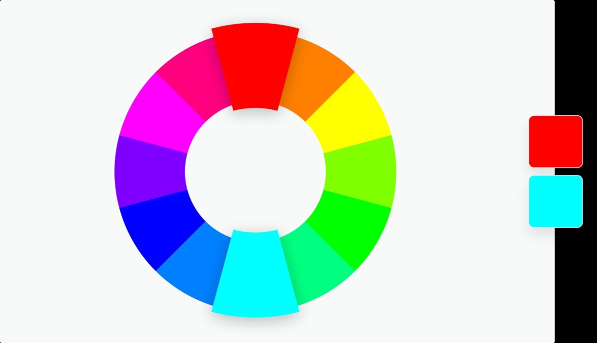
The Color Wheel
The color wheel is a visual representation of the relationships between different colors. It is a valuable tool for understanding color theory and provides a framework for working with colors in design and art.
The traditional color wheel is divided into primary, secondary, and tertiary colors. The primary colors are red, blue, and yellow, and they are the building blocks of all other colors. Secondary colors are created by mixing two primary colors together, resulting in orange, green, and purple. Tertiary colors, also known as intermediate colors, are formed by mixing a primary color with a neighboring secondary color.
The color wheel is further organized into color harmonies or color schemes. These schemes provide guidelines for combining colors in a visually pleasing way. One of the most common color schemes is the complementary scheme, which pairs colors that are opposite each other on the color wheel. This creates a high-contrast and dynamic effect.
Adjacent colors, as mentioned earlier, are another type of color scheme that uses colors that are next to each other on the color wheel. This scheme creates a harmonious and cohesive look.
Other color schemes include the triadic scheme, which uses three colors that are evenly spaced on the color wheel, and the analogous scheme, which uses colors that are adjacent to each other, but not necessarily next to each other.
The color wheel is not only a tool for selecting colors, but it also helps to understand color relationships and how colors interact with each other. It allows designers and artists to create balance, contrast, and unity in their work.
Ultimately, understanding the color wheel is crucial for working with adjacent colors. By knowing the relationships between colors on the color wheel, designers can make informed decisions about which adjacent colors to use to achieve their desired effect.
How to Identify Adjacent Colors
Identifying adjacent colors on the color wheel is a straightforward process that can be done by following a few simple steps. Here’s how you can identify adjacent colors:
- Start with a base color: Select a color that will serve as the foundation for your color scheme. This can be any color that you want to work with.
- Refer to the color wheel: Look at the color wheel and find the position of your base color. Take note of the colors that are directly adjacent to it.
- Observe the hues: Examine the adjacent colors and notice the subtle variations in hue. These colors will be close in hue to your base color but may have slightly different undertones.
- Consider the temperature: Determine whether the adjacent colors are warm or cool in temperature. This can influence the overall mood and feel of your color scheme.
- Experiment with combinations: Once you have identified the adjacent colors, experiment with different combinations using these colors. Try pairing your base color with one or more adjacent colors to see how they harmonize.
- Refine and adjust: Refine your color scheme as needed by tweaking the saturation or brightness of the colors. This can help create depth and dimension in your design.
By following these steps, you can easily identify and work with adjacent colors to create visually appealing color schemes. Keep in mind that the color wheel is a valuable tool, but it’s also important to trust your instincts and have a sense of what works best for your specific design or project.
Using Adjacent Colors for Design
Adjacent colors are a versatile and powerful tool in design, offering a range of possibilities for creating visually engaging and harmonious compositions. Here are some ways you can use adjacent colors in your design:
Color Blocking: Adjacent colors can be used to create striking color blocks or sections in a design. By pairing colors that are next to each other on the color wheel, you can create a cohesive and balanced look while still maintaining a sense of contrast and visual interest.
Gradient Effects: Adjacent colors can also be used to create gradient effects, where colors blend seamlessly into each other. This can be accomplished by gradually transitioning between adjacent colors, creating a smooth and visually pleasing transition from one shade to another.
Highlighting Elements: Use adjacent colors to highlight specific elements or focal points in your design. By selecting a neighboring color that contrasts with the main color palette, you can draw attention to certain elements and make them stand out.
Creating Depth: Adjacent colors can be employed to add depth and dimension to your design. By using lighter and darker shades of adjacent colors, you can create a sense of depth and make objects or elements appear more three-dimensional.
Establishing Mood: The choice of adjacent colors can greatly impact the mood and atmosphere of your design. Warmer adjacent colors, such as shades of red and orange, can evoke feelings of energy and excitement, while cooler adjacent colors like blues and greens can create a sense of calmness and serenity.
Consistency and Unity: Utilizing adjacent colors can help maintain consistency and unity within your design. By selecting colors that are closely related on the color wheel, you ensure that your design has a harmonious and well-coordinated color palette, creating a sense of cohesion.
Whether you’re designing a website, creating a piece of artwork, or planning an interior space, understanding how to effectively use adjacent colors can elevate your design and evoke the desired emotional response. Experiment, play with different shades and combinations, and let the power of adjacent colors enhance your design.
Creating Harmonious Color Schemes with Adjacent Colors
Adjacent colors offer a fantastic opportunity to create harmonious and visually pleasing color schemes. By understanding the principles of color harmony and applying them to your design, you can create stunning compositions. Here are some tips for creating harmonious color schemes with adjacent colors:
Choose a dominant color: Start by selecting a dominant color from the adjacent color group. This will be the primary color that anchors your design and sets the tone for the overall scheme.
Use variations in saturation and brightness: To add depth and interest to your color scheme, experiment with variations in saturation and brightness within the adjacent colors. This can create a visually engaging composition with a range of tones and intensities.
Use neutrals as a balancing element: Incorporate neutral colors, such as black, white, and gray, to balance the vibrancy of the adjacent colors. Neutrals can help prevent the color scheme from becoming overwhelming and provide a visually pleasing contrast.
Consider color psychology: Keep in mind the psychological effects of colors when creating your adjacent color scheme. Different colors can evoke different emotions and moods, so choose colors that align with the message or atmosphere you want to convey.
Create contrast: While adjacent colors naturally harmonize with each other, introducing subtle contrast can add visual interest. Contrast can be achieved by incorporating small accents of complementary colors or by varying the intensity or value of the adjacent colors.
Experiment with color proportions: Play with the distribution of the adjacent colors in your design. You can choose to use one color as the dominant hue and the others as accents, or you can distribute the colors evenly for a more balanced look. Adjust the proportions until you achieve the desired effect.
Consider the context: Be mindful of the context in which your design will be displayed. Consider how the adjacent color scheme will interact with the surrounding environment, whether it’s a website, a room, or a piece of printed material. Ensure that the colors harmonize with the overall aesthetic and purpose of the design.
By carefully selecting, balancing, and proportioning adjacent colors, you can create harmonious color schemes that evoke the desired mood and resonate with your audience. Don’t be afraid to experiment and trust your instincts as you explore the countless possibilities that adjacent colors offer.
Tips and Tricks for Working with Adjacent Colors
Working with adjacent colors can be both exciting and challenging. To help you make the most of this color scheme, here are some practical tips and tricks for working with adjacent colors:
Start with a base color: Begin by selecting a base color that you want to work with. Consider the mood and message you want to convey and choose a color that aligns with that intention.
Utilize color tools: Take advantage of color tools such as color wheels and color palette generators. These tools can help you identify and explore different adjacent color combinations, saving you time and effort.
Consider the color value: Pay attention to the value or brightness of the adjacent colors. Incorporating variations in value can add depth and contrast to your design. Mix light and dark shades of adjacent colors for visual interest.
Pair warm and cool adjacent colors: Experiment with combining warm and cool adjacent colors to create dynamic and engaging color schemes. The contrast between warm and cool tones can add visual intrigue and balance to your design.
Use complementary accents: Introduce small accents of complementary colors to your adjacent color scheme to create contrast and make certain elements stand out. This can be achieved by adding small pops of color in the form of typography, icons, or borders.
Experiment with textures and patterns: Incorporate different textures and patterns within your design, utilizing adjacent colors. This can add visual interest and create a multi-dimensional look.
Consider color proportions: Play around with the proportions of adjacent colors in your design. You can choose one color to dominate, while using the other adjacent colors as accents. Adjusting the proportions can significantly impact the overall balance and visual impact of your design.
Remember the power of neutrals: Neutrals are a great way to balance adjacent colors and provide a sense of grounding in your design. Consider incorporating neutral shades such as gray, beige, or cream to create a cohesive and harmonious color palette.
Test and iterate: Don’t be afraid to try different combinations and variations of adjacent colors. Test your design at different scales and in different contexts to see how the colors interact and whether they achieve the desired effect.
Take inspiration from nature and art: Look to nature, artwork, and other design sources for inspiration and guidance. Study how colors are used harmoniously in these contexts and apply those principles to your own designs.
By following these tips and tricks, you can navigate the world of adjacent colors with confidence and create visually compelling designs that resonate with your audience. Remember that experimentation and practice are key to finding the perfect balance and achieving the desired effect.
Examples of Adjacent Color Schemes
Adjacent color schemes offer a wide range of possibilities for creating visually appealing designs. Here are some examples of adjacent color schemes to inspire your next project:
Example 1: Red, Orange, and Yellow: This warm and energetic color scheme uses adjacent colors on the warmer side of the color wheel. It evokes feelings of warmth, excitement, and enthusiasm. This scheme can be perfect for designs related to food, sports, or anything that requires a burst of energy.
Example 2: Blue, Blue-Green, and Green: This cool and calming color scheme utilizes adjacent colors in the blue and green family. It brings a sense of tranquility and serenity to a design, making it suitable for spa-related businesses, nature-themed projects, or anything that requires a soothing and refreshing feel.
Example 3: Purple, Red-Purple, and Red: This scheme utilizes adjacent colors on the cooler side of the color wheel, with a mix of purple and red shades. It creates a rich, luxurious, and passionate look. It can be used to convey elegance, sophistication, and romance in designs such as high-end fashion, jewelry, or event invitations.
Example 4: Yellow-Green, Green, and Blue-Green: This nature-inspired color scheme incorporates adjacent colors from the green and green-blue spectrum. It creates a fresh and vibrant look, reminiscent of lush landscapes and thriving vegetation. It can be ideal for environmental or health-related designs, as well as for projects that aim to promote growth and sustainability.
Example 5: Orange, Red, and Red-Orange: This energetic color scheme combines adjacent colors in the red and orange range. It exudes warmth, vibrancy, and excitement. This scheme can be utilized for designs related to celebrations, entertainment, or any project that aims to grab attention and create a lively atmosphere.
Example 6: Yellow, Yellow-Green, and Green: This vibrant and harmonious color scheme blends adjacent colors from the yellow and green spectrum. It creates a lively and fresh feel, reminiscent of sunny days and flourishing gardens. This scheme works well for designs related to nature, health, or anything that needs a cheerful and uplifting aesthetic.
These examples are just a starting point to inspire your own use of adjacent color schemes. Remember to consider the context, purpose, and target audience of your design when choosing an adjacent color scheme. Experiment with different combinations and variations, and have fun exploring the endless possibilities that adjacent colors offer!