
What Is the HSV (Hue, Saturation, Value) Color Model?
The HSV color model, also known as the HSB (Hue, Saturation, Brightness) color model, is a method of representing colors in the digital design world. Unlike other color models, such as RGB (Red, Green, Blue) or CMYK (Cyan, Magenta, Yellow, Black), the HSV model focuses on the perceptual attributes of color: hue, saturation, and value.
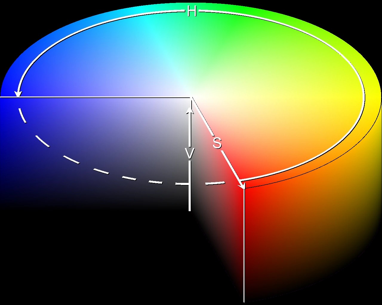
Hue represents the dominant wavelength of a color and is often described in terms of the color wheel. It can range from 0 to 360 degrees, with red at 0 degrees, green at 120 degrees, and blue at 240 degrees. Saturation refers to the intensity or purity of a color, with 0% saturation being grayscale and 100% saturation being the most vibrant and pure version of a hue. Value, also known as brightness or lightness, determines how light or dark a color appears.
The HSV color model provides designers with a more intuitive way to manipulate and select colors. It allows for easy adjustments of hue, saturation, and value individually, making it ideal for tasks like color correction, color grading, and creating color schemes. By separating the attributes of color, designers can create more harmonious and visually pleasing compositions.
Compared to other color models, the HSV model offers several benefits. First, it provides a more natural representation of how humans perceive color by separating out the perceptual attributes. This makes it easier for designers to communicate their color choices and achieve the desired visual impact. Second, the HSV model allows for easier color blending and gradients, as manipulating hue, saturation, and value independently provides greater control over transitions. Finally, the HSV color model is widely supported by graphic design software, making it accessible and practical for designers.
The Basics of Color in Digital Design
Color is a fundamental element in digital design that greatly impacts the overall aesthetics and user experience of a website, application, or graphic. Understanding the basics of color theory and how it applies to digital design is essential for creating visually appealing and effective designs.
Color can evoke emotions, convey meaning, and attract attention. Different colors have various psychological effects on viewers, and designers can strategically use this to their advantage. For example, warm tones like red and orange are often associated with energy and excitement, while cool tones like blue and green convey calmness and tranquility.
Color schemes, or combinations of colors, play a crucial role in digital design. Harmonious color schemes create a sense of unity and balance, while contrasting color schemes can create visual interest and highlight important elements. Designers can choose from various color schemes like complementary, analogous, and monochromatic to achieve the desired effect.
In digital design, color is commonly represented using different color models. The RGB color model is widely used for digital screens and combines red, green, and blue to create millions of colors. The CMYK color model, on the other hand, is used for print design and combines cyan, magenta, yellow, and black inks.
The HSV color model provides designers with a more intuitive way to work with colors by separating hue, saturation, and value. This model allows for more precise adjustments and control over the perceptual aspects of color. Designers can easily modify the hue to change the color’s wavelength, adjust the saturation to control the color intensity, and manipulate the value to create lighter or darker shades.
When working with color in digital design, accessibility is another crucial consideration. It is essential to ensure that the chosen color palette meets accessibility guidelines, ensuring that people with visual impairments or color blindness can easily perceive and distinguish elements on the screen.
Understanding the Hue Component
In the context of the HSV color model, hue refers to the dominant wavelength of a color. It is often described in terms of the color wheel, which is a circular representation of the spectrum of colors.
The color wheel is divided into 360 degrees, with each degree representing a specific hue. The primary colors, red, green, and blue, are located at 0°, 120°, and 240°, respectively. The intermediate colors, such as yellow, cyan, and magenta, are located between the primary colors.
One of the advantages of the hue component in the HSV model is that it allows for easy color manipulation and selection. Designers can adjust the hue value to create different variations of a color. For example, by modifying the hue of a base color, one can create a range of hues within the same color family.
The hue component of the HSV model is particularly useful for creating color schemes and conveying specific moods or emotions in a design. For instance, using warm hues like red and orange can create a sense of energy and excitement, while cool hues like blue and green can evoke feelings of calmness and tranquility.
Understanding the relationship between hues is also essential for creating visually appealing compositions. Color harmony is achieved by selecting hues that are complementary, analogous, or part of a specific color scheme. Complementary hues are located opposite each other on the color wheel and create a high-contrast effect when used together. Analogous hues are adjacent to each other and create a harmonious and cohesive feel. Various color schemes, such as monochromatic and triadic, utilize different combinations of hues to create visually pleasing designs.
Designers should also consider cultural and psychological associations when working with hues. Different cultures may have different interpretations of color meanings, so it’s important to research and understand the cultural context in which the design will be perceived. Additionally, colors can elicit specific emotions or convey certain messages. For example, red is often associated with passion and intensity, while green symbolizes nature and freshness.
By understanding and leveraging the hue component in the HSV color model, designers can create visually stunning designs that effectively communicate their desired message and resonate with their target audience.
Exploring the Saturation Component
In the HSV color model, saturation refers to the intensity or purity of a color. It determines how vibrant or subdued a color appears. Saturation values range from 0% (totally desaturated or grayscale) to 100% (fully saturated).
When a color is fully saturated, it appears vivid and intense. On the other hand, desaturated colors have less vibrancy and appear more muted or faded. Manipulating the saturation component allows designers to control the intensity level of a color, thereby impacting the overall visual impact of a design.
Saturation plays a critical role in creating visual interest and drawing attention to specific elements within a design. A highly saturated color can act as a focal point and help differentiate important elements from the rest. On the other hand, using desaturated colors can create a more subdued and calming effect, making it suitable for backgrounds or less important elements.
By adjusting the saturation level, designers can achieve various visual effects and convey different emotions. High saturation levels are often associated with energy, excitement, and boldness. These colors can be attention-grabbing and evoke strong emotions. On the contrary, desaturated colors are commonly associated with serenity, elegance, and sophistication. They provide a more subtle and understated tone to designs.
When working with color schemes, designers can use saturation to create contrast and balance. Combining highly saturated colors with desaturated or grayscale elements can help create visual hierarchy and ensure important elements stand out. Additionally, using different levels of saturation within a color scheme can add depth and dimension to a design.
It’s important to note that excessive saturation can lead to visual fatigue or overwhelm the viewer. Finding the right balance for saturation is crucial to ensure the design remains visually pleasing and easy to comprehend. It’s recommended to experiment and iterate with different saturation levels to achieve the desired effect.
The saturation component in the HSV color model provides designers with a powerful tool for manipulating color intensity and creating a visual impact. By judiciously adjusting saturation levels, designers can evoke specific emotions, enhance visual interest, and ensure the overall harmony and balance of their designs.
The Importance of Value in Colors
Value, also known as brightness or lightness, is a crucial component in the HSV color model that determines how light or dark a color appears. It is represented as a percentage, ranging from 0% (black or no light) to 100% (white or maximum light).
The value component has a significant impact on the overall visual perception of colors. It influences the contrast, depth, and readability of a design. By modifying the value, designers can create variations within a color scheme, add dimension to elements, or establish a hierarchy within the composition.
The value of a color can greatly affect its legibility, especially when it comes to text or graphic elements. For example, using a high contrast value between the text color and the background ensures readability and accessibility. Light-colored text against a dark background or vice versa improves readability and reduces eye strain.
The value component in the HSV model is particularly useful for creating depth and establishing visual hierarchy. Designers can use lighter values for foreground elements to make them visually prominent and draw the viewer’s attention. Conversely, darker values can be used for background elements to create contrast and enhance the focal point.
Understanding the importance of value is crucial for effective color combinations and creating visually appealing designs. A well-designed composition considers the contrast and balance between light and dark values. For example, using a combination of light, medium, and dark tones within a color scheme can create a pleasing visual rhythm and ensure harmony throughout the design.
Value can also evoke specific moods and emotions. Lighter values are often associated with feelings of positivity, purity, and openness, while darker values convey a sense of mystery, elegance, and sophistication. Choosing the right value can help designers convey the desired message or create a particular atmosphere within their design.
Furthermore, value is closely related to color contrast and the overall aesthetic quality of a design. By using a variety of values, designers can create compelling compositions that engage the viewer and provide visual interest. A design with a range of values tends to appear more dynamic and visually appealing.
Ultimately, understanding the importance of value in colors allows designers to create visually pleasing and well-balanced compositions. By deliberately manipulating the value component in the HSV color model, designers can maximize the impact of their designs and effectively convey their intended messages.
Comparing HSV with Other Color Models
While the HSV (Hue, Saturation, Value) color model offers a unique and intuitive way to work with colors, it is important to consider its differences and advantages compared to other popular color models like RGB (Red, Green, Blue) and CMYK (Cyan, Magenta, Yellow, Black).
The HSV model separates color into perceptual attributes: hue, saturation, and value. This allows designers to have more control and flexibility when adjusting individual components of a color. In contrast, the RGB model combines red, green, and blue to create colors. It is widely used in digital design, especially for screens and web applications. By adjusting the intensity of each primary color, designers can create a wide range of colors. However, the RGB model does not offer the same level of control over perceptual attributes as the HSV model.
On the other hand, the CMYK model is used primarily for print design. It combines cyan, magenta, yellow, and black inks to represent colors. The CMYK model is based on subtractive color mixing, where colors are created by subtracting light wavelengths. While CMYK is suitable for print applications, it is not as intuitive for digital design as the HSV model.
Compared to both the RGB and CMYK models, the HSV model provides a more natural and perceptual representation of colors. It aligns closely with how humans perceive and describe colors, making it easier for designers to communicate their color choices and achieve the desired visual impact.
Another advantage of the HSV model is its ability to create color blends and transitions seamlessly. By varying the hue while keeping the saturation and value constant, designers can create smooth gradients and harmonious color transitions. This level of control is not as straightforward in RGB or CMYK models.
However, it is important to note that the choice of color model depends on the specific design context. RGB and CMYK models are commonly used for certain applications, such as web design and print design, respectively. Understanding the strengths and weaknesses of each color model allows designers to make informed decisions and select the most appropriate model for their specific needs.
Practical Applications of HSV in Design
The HSV (Hue, Saturation, Value) color model has many practical applications in the field of design. Its intuitive and flexible nature makes it a popular choice among designers, allowing for a wide range of creative possibilities. Here are some practical applications of the HSV color model in design:
Color Selection: The HSV model simplifies the process of selecting colors by breaking them down into their perceptual attributes. Designers can easily adjust the hue, saturation, and value to find the perfect color for their project. By fine-tuning these components, designers can achieve the desired mood, create visual interest, and ensure color harmony.
Color Correction and Grading: HSV is widely used in photography and video editing to correct and enhance colors. By adjusting the hue, saturation, and value, designers can correct color cast, enhance colors, and achieve a consistent and appealing color palette. The HSV model makes it easier to fine-tune specific areas of an image or video to create the desired visual impact.
Color Combinations and Schemes: The HSV model is useful for creating harmonious color combinations and schemes. Designers can choose complementary hues for high contrast, analogous hues for a cohesive look, or triadic hues for dynamic compositions. The separate control of hue, saturation, and value allows for precise adjustments to achieve the desired color palette.
Creating Depth and Focus: The HSV model enables designers to create depth and focus within a composition. By adjusting the value component, designers can create a sense of depth, with lighter values appearing closer and darker values receding. Additionally, designers can use saturation to draw attention to specific elements within a design, creating a focal point that stands out.
Color Symbolism and Branding: Colors evoke emotions and convey meaning, and the HSV model allows designers to create specific associations. By choosing the right hue, saturation, and value, designers can align the color palette with the intended message or brand identity. Each color attribute can be carefully selected to optimize visual impact and effectively communicate the desired brand image.
These practical applications showcase the versatility and importance of the HSV color model in the realm of design. From color selection to enhancing visual impact, the HSV model empowers designers to create visually appealing and engaging designs across various mediums.
Pros and Cons of Using the HSV Color Model
The HSV (Hue, Saturation, Value) color model offers several advantages that make it a popular choice among designers. However, it also has some limitations and drawbacks that need to be considered. Let’s explore the pros and cons of using the HSV color model:
Pros:
- Intuitive Color Manipulation: The HSV model allows for intuitive manipulation of colors. Designers can easily adjust the hue, saturation, and value independently, providing greater control and flexibility when selecting and modifying colors.
- Perceptual Representation: The HSV model aligns closely with how humans perceive and describe colors. It separates color into its perceptual attributes, making it easier for designers to communicate and achieve the desired visual impact.
- Color Blending and Transitions: Manipulating the hue component in the HSV model allows for smooth color blending and transitions. Designers can create seamless gradients and harmonious color variations by adjusting the hue while keeping the saturation and value constant.
- Impact on Mood and Emotion: With the HSV model, designers can easily adjust color attributes to evoke specific moods and emotions. By choosing the right hue, saturation, and value, designs can elicit the desired emotional response from viewers.
- Widespread Software Support: The HSV color model is widely supported by graphic design software and tools, making it easily accessible and practical for designers. It can be seamlessly integrated into various design workflows.
Cons:
- Less Precise Color Reproduction: While the HSV model offers flexibility, it may not provide the same level of precision as other color models, such as RGB or CMYK. This can be a limitation when color accuracy is crucial, particularly in print design.
- Limited Color Gamut: The HSV model is not capable of representing the entire range of colors visible to the human eye. It has limitations in representing extremely saturated or desaturated colors, as well as certain complex color relationships.
- Complex Color Combinations: Designers may find it challenging to create complex color combinations using the HSV model alone. While hue, saturation, and value provide control over general color variations, more intricate relationships such as complementary or triadic colors may need additional tools or techniques.
- Subjectivity of Color Perception: perceptions of color can vary among individuals, and what one person considers a specific hue or saturation level might differ from another’s perception. This subjectivity can make it challenging to achieve precise color consistency across different devices and viewing conditions.
Understanding the pros and cons of the HSV color model allows designers to make informed decisions when selecting a color model for their specific needs. While the HSV model offers flexibility and an intuitive approach to color manipulation, designers should consider its limitations and use it in conjunction with other color models for more accurate color reproduction when necessary.
Tips for Working with HSV in Graphic Design
Working with the HSV (Hue, Saturation, Value) color model in graphic design provides designers with creative control and flexibility. To make the most out of this color model, consider the following tips:
1. Understand Color Psychology: Familiarize yourself with the emotional, symbolic, and cultural associations of different hues. This knowledge will help you choose the appropriate hues for your design and effectively communicate your message.
2. Experiment with Color Harmonies: Explore different color harmonies, such as complementary, analogous, and triadic, to create visually pleasing designs. Use the hue component to find harmonious color combinations, and adjust the saturation and value to create a balanced and unified look.
3. Create Visual Hierarchy: Use value variations to establish a visual hierarchy within your design. Lighter values can draw attention to important elements, while darker values can create depth and background elements.
4. Optimize for Accessibility: Ensure that your color choices meet accessibility guidelines. Consider the contrast between text and background colors, especially when designing for people with visual impairments. Adjust the value component to achieve better legibility.
5. Emphasize Key Elements with Saturation: Use saturation strategically to draw attention to key elements in your design. Higher saturation can create visual focus, while lower saturation can create a more muted or subtle effect.
6. Balance Vibrancy with Restraint: While saturated colors can be attention-grabbing, be mindful of using them sparingly to avoid overwhelming your design. Strike a balance between vibrant and desaturated colors for a harmonious and visually pleasing composition.
7. Test Color Variations: Experiment with different combinations of hue, saturation, and value to explore various possibilities. Iterate and test your design on different devices and under various lighting conditions to ensure color consistency across platforms.
8. Consider Color Context: Take into account the surrounding colors and context of your design. Colors can be influenced by adjacent hues, so consider how they interact with one another to create the desired effect.
9. Document Your Color Choices: Keep a record of the specific HSV values used in your design. This documentation will be valuable for future reference, adjustments, and maintaining consistency in future projects.
10. Stay Updated: Keep up with current design trends and color palettes to ensure that your designs remain fresh and relevant. Explore different sources of inspiration, such as color websites, design blogs, and social media platforms.
By following these tips, designers can effectively harness the power of the HSV color model and create visually stunning and impactful designs that resonate with their target audience.