
Colors have a strong impact on design efficiency; they can evoke emotions, set moods, and make projects captivating. When making appealing designs that target a specific audience, you should know how to combine colors to ensure that your overall composition aligns with the intended message and resonates with the viewer. This involves understanding color theory, cultural associations, and the psychology of color.
This article explains what colors work well together, what you should look out for when matching the hues, and what top aesthetic color palettes can help you grab attention and create a cohesive visual experience. Read on!
The basics of color
One of the standard tools for color selection and combination is a color wheel. It is a diagram that shows the relationship between colors: which ones are contrasting, which ones complement each other, which ones are analogous, etc. A color relationship is how colors interact when placed together, affecting design perception and the emotions they evoke.
The most common types of color relationships are:
- Monochromatic. A monochromatic scheme uses variations in the lightness and saturation of a single color.
- Analogous. Analogous colors are adjacent on the color wheel, like blue, blue-green, and green.
- Complementary. Colors that are set opposite to each other on the color wheel, e.g., red and green or blue and orange.
- Triadic. A color scheme involves using three colors evenly spaced around the color wheel, e.g., red, yellow, and blue.
What colors work well together
- Harmonious color combinations. These are colors that work well together and create a sense of unity and balance. For instance, you can pick a color combination of blue and green or purple and red, as they share similar undertones.
- Complementary color pairings for visual contrast. These combinations create strong visual contrast, which instantly catches the eye. For instance, you could pick yellow and purple or green and red combinations.
- Nature-inspired color combinations. Colors derived from nature often evoke a sense of calm and harmony. For instance, earthy tones like browns, greens, and yellows can mimic landscapes and natural environments.
What colors don’t work well together
- Low-contrast color combinations. Pairing colors with similar values or intensities can result in a lack of contrast. This makes it difficult for elements to stand out from each other and for viewers to distinguish them. For instance, combining light gray and light green is not the best option if you need to create high contrast.
- Colors with similar tones. Although this depends on shade and brightness, you must still be careful when combining colors with similar undertones. They might blend together and lack differentiation. For instance, combining yellow and green might not provide enough contrast if their tones are too close on the color wheel.
- Bright color combinations that aren’t balanced by neutral colors. Using bright and vibrant colors without balancing them out with neutral or muted tones can overwhelm viewers, strain their eyes, and make it difficult to focus on a visual.
Best three-color combinations
Three-color combinations usually create a strong visual impact and convey a distinct aesthetic that can define a brand, capture attention, or set the tone of a project. As a result, they are often used in design, art, and fashion to create eye-catching compositions.
Here are some examples of popular and visually appealing triadic color combinations:
- Red, white, and black. This combination is bold and classic. The contrast between the hues creates a strong visual impact.
- Blue, green, and yellow. This color combination is harmonious and refreshing, reminding viewers of nature. The colors work together to evoke calmness and positivity.
- Turquoise, coral, and white. This combination is bright and energetic. Turquoise and coral provide a beautiful contrast, while white balances them.
What to consider when choosing a three-color combination
- Contrast. Choose colors with sufficient contrast to help elements stand out from each other and maintain their unique look within the composition.
- Proportions. Determine how much of each color will be used in a design. One color can dominate, while the other two are used in smaller proportions to accentuate and complement the dominant color.
- Mood. Different combinations can evoke different moods. For instance, warm colors create an energetic and passionate atmosphere, while cooler tones elicit a sense of calmness.
- Context. Think about the context and purpose of your design. For instance, a red and green color combination might feel holiday-themed, even if this wasn’t your goal. Consider how lighting, context, and other design elements might affect the perception of a color combination.
Best color combinations with black
Black is a versatile color commonly used in design, fashion, and interior decor. Its timeless appeal and ability to deliver sophistication and depth make it a staple in various creative fields. Nonetheless, depending on the other colors combined, it can create diverse associations.
For example, complementary black, gold, and gray colors are often used for luxurious designs. Some of the most widespread associations with black are elegance, mystery, classics, minimalism, formality, and rebellion.
- Elegance. Black is often associated with elegance and sophistication. The best color combination to enhance elegance is black and gold, where the richness of gold accents complements black’s depth and creates a luxurious feel. You can learn more about the color gold meaning, its symbolism, and variations to create exciting and bold designs that convey opulence and style.
- Mystery. Black is also perceived as a mysterious color. It conceals and reveals, inviting curiosity and capturing attention. To enhance this meaning, pair black with purple, which typically carries a sense of mystique and drama.
- Classics. Black pairs well with almost any color. The best classic color combination is black and white, representing the ultimate contrast and timelessness.
- Minimalism. Minimalism embraces simplicity and clean lines. Black fits perfectly with this aesthetic, adding depth and contrast, especially when combined with shades of gray.
- Formality. Black is often the choice for formal attire and occasions. To enhance formality, consider combining black with silver. Just like the meaning of the color gold is often luxury and wealth, silver also conveys a sense of prestige, but often seems more approachable.
- Rebellion. Black has also been associated with rebellion. It represents breaking away from norms and conventions. To emphasize the rebellious spirit, pair black with electric blue, a vibrant color that adds energy and attitude to the mix.
Top 5 aesthetic color palettes to consider
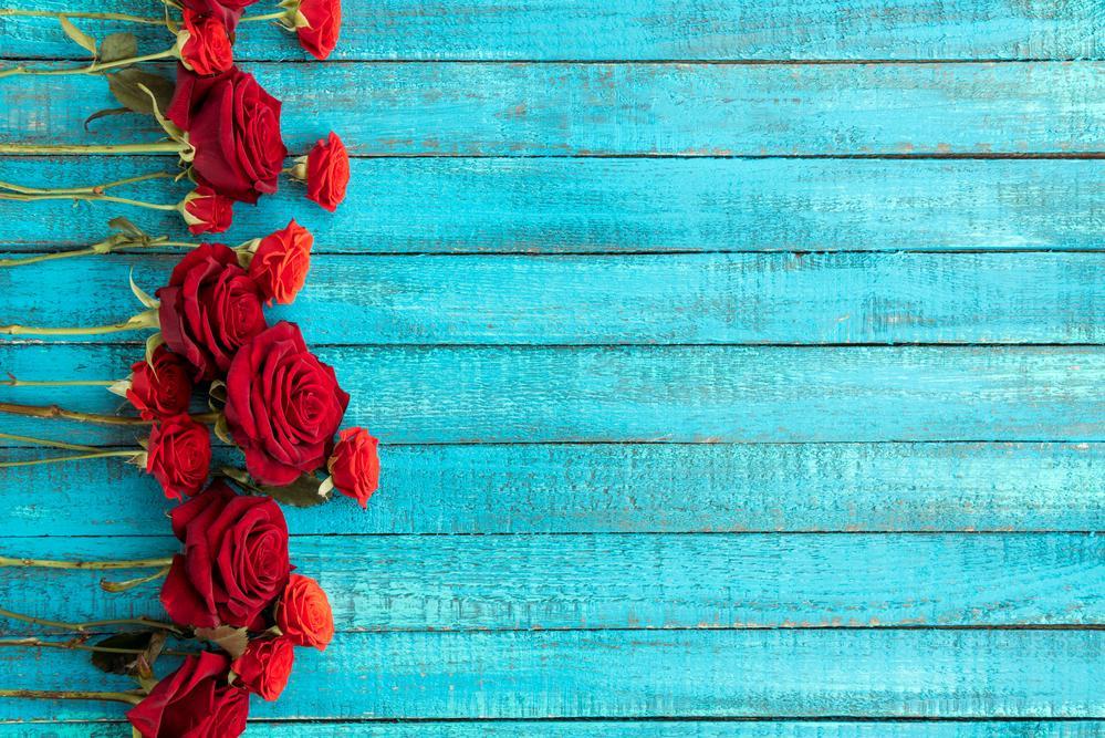
Nature-inspired color palette
Nature provides an endless source of inspiration. A palette drawn from the natural world often features earthy tones like warm browns and botanical greens, creating a calming and harmonious vibe. It resonates with organic beauty, perfect for eco-friendly brands, wellness-oriented designs, or projects emphasizing sustainability and tranquility.
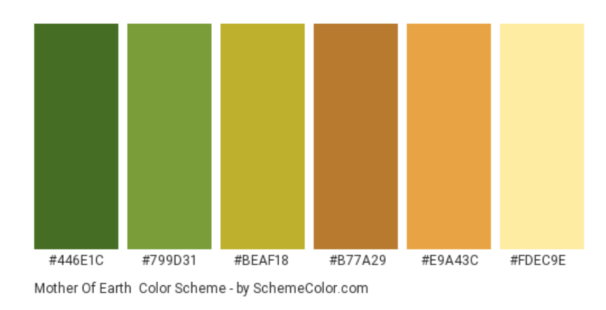
The best palette example is “Mother Of Earth” which features:
- Dark Moss Green
HEX: #446E1C
RGB: 68, 110, 28
CMYK: 0.381, 0, 0.745, 0.568
- Palm Leaf
HEX: #799D31
RGB: 121, 157, 49
CMYK: 0.229, 0, 0.687, 0.384
- Gold Foil
HEX: #BEAF18
RGB: 190, 175, 24
CMYK: 0, 0.078, 0.873, 0.254
- Copper
HEX: #B77A29
RGB: 183, 122, 41
CMYK: 0, 0.333, 0.775, 0.282
- Meat Brown
HEX: #E9A43C
RGB: 233, 164, 60
CMYK: 0, 0.296, 0.742, 0.086
- Flavescent
HEX: #FDEC9E
RGB: 253, 236, 158
CMYK: 0, 0.067, 0.375, 0.007
Pastel and soft color palette
Soft pastels, including gentle shades of blush, mint, blue, and pale yellow evoke a sense of innocence and serenity. This palette is often associated with sweetness, springtime, romance, and a youthful charm. It’s ideal for designs targeting a female audience or projects that seek to convey a delicate and comforting message.
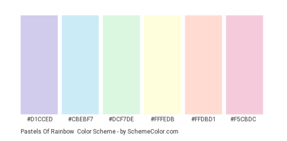
The best palette example is “Pastels Of Rainbow” which features:
- Soap
HEX: #D1CCED
RGB: 209, 204, 237
CMYK: 0.118, 0.139, 0, 0.070
- Water
HEX: #CBEBF7
RGB: 203, 235, 247
CMYK: 0.178, 0.048, 0, 0.031
- Nyanza
HEX: #DCF7DE
RGB: 220, 247, 222
CMYK: 0.109, 0, 0.101, 0.031
- Light Yellow
HEX: #FFFEDB
RGB: 255, 254, 219
CMYK: 0, 0.003, 0.141, 0
- Unbleached Silk
HEX: #FFDBD1
RGB: 255, 219, 209
CMYK: 0, 0.141, 0.180, 0
- Classic Rose
HEX: #F5CBDC
RGB: 245, 203, 220
CMYK: 0, 0.171, 0.102, 0.039
Vibrant and energetic color palette
When you want your designs to burst with energy and excitement, opt for bold and vibrant colors. Combining primary colors like red, blue, and yellow with attention-grabbing secondary colors like orange and green creates a lively and dynamic effect. This palette works wonders for grabbing attention and conveying enthusiasm, making it great for event promotions, youthful brands, and creative projects.
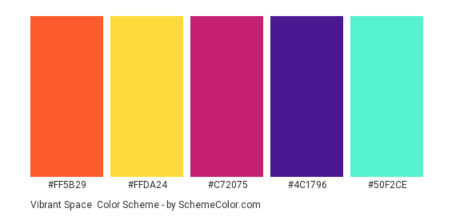
The best palette example is “Vibrant Space” which features:
- Giants Orange
HEX: #FF5B29
RGB: 255, 91, 41
CMYK: 0, 0.643, 0.839, 0
- Banana Yellow
HEX: #FFDA24
RGB: 255, 218, 36
CMYK: 0, 0.145, 0.858, 0
- Magenta Dye
HEX: #C72075
RGB: 199, 32, 117
CMYK: 0, 0.839, 0.412, 0.219
- American Violet
HEX: #4C1796
RGB: 76, 23, 150
CMYK: 0.493, 0.846, 0, 0.411
- Turquoise
HEX: #50F2CE
RGB: 80, 242, 206
CMYK: 0.669, 0, 0.148, 0.050
Subtle and minimalist color palette
Simplicity and elegance come to the forefront with a minimalist palette. Neutral shades like whites and grays and muted tones like pale pink or beige create a clean and sophisticated look. This palette emphasizes clarity and allows other design elements to shine. It’s perfect for modern, minimalistic design, conveying professionalism and a sense of refinement.
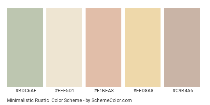
The best palette example is “Minimalistic Rustic” which features:
- Ash Gray
HEX: #BDC6AF
RGB: 189, 198, 175
CMYK: 0.045, 0, 0.116, 0.223
- White Chocolate
HEX: #EEE5D1
RGB: 238, 229, 209
CMYK: 0, 0.037, 0.121, 0.066
- Dark Vanilla
HEX: #E1BEA8
RGB: 225, 190, 168
CMYK: 0, 0.155, 0.253, 0.117
- Cookies And Cream
HEX: #EED8A8
RGB: 238, 216, 168
CMYK: 0, 0.092, 0.294, 0.066
- Silver Pink
HEX: #C9B4A6
RGB: 201, 180, 166
CMYK: 0, 0.104, 0.174, 0.211
Moody and dramatic color palette
For designs aiming to evoke emotion and depth, a moody color palette is an excellent choice. Deep hues like rich blues, intense purples, dark grays, and burgundy or emerald accents create mystery and drama. This palette is excellent for creating impact in artistic projects, gothic or upscale themes, and designs that want to make a bold statement.
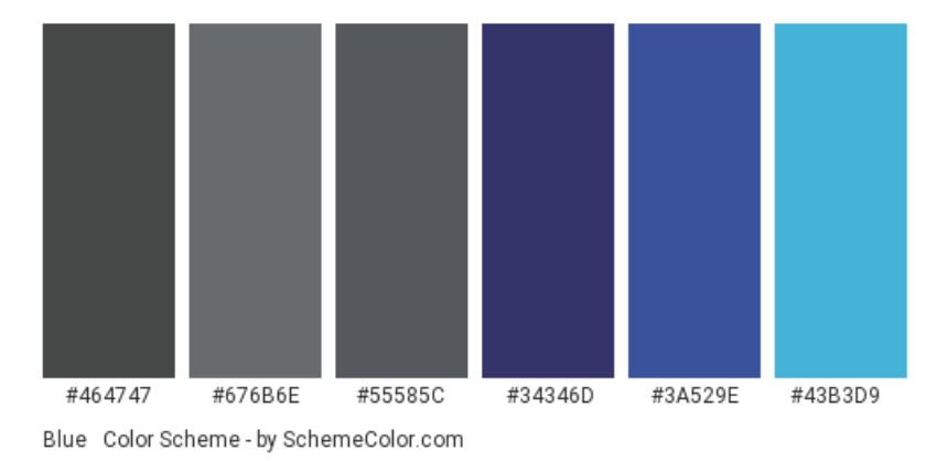
The best palette example is “Blue & Dark Grey” which features:
- Outer Space
HEX: #464747
RGB: 70, 71, 71
CMYK: 0.014, 0, 0, 0.721
- Dim Gray
HEX: #676B6E
RGB: 103, 107, 110
CMYK: 0.063, 0.027, 0, 0.568
- Davy’s Grey
HEX: #55585C
RGB: 85, 88, 92
CMYK: 0.076, 0.043, 0, 0.639
- Deep Koamaru
HEX: #34346D
RGB: 52, 52, 109
CMYK: 0.522, 0.522, 0, 0.572
- Chinese Blue
HEX: #3A529E
RGB: 58, 82, 158
CMYK: 0.632, 0.481, 0, 0.380
- Picton Blue
HEX: #43B3D9
RGB: 67, 179, 217
CMYK: 0.691, 0.175, 0, 0.149
To sum up
Color plays a vital role in how people see your designs. Color combinations can help you tell a story, create a certain mood, and help your work stand out—but only if you combine them well. So, pay attention to how colors work together and be mindful of the emotions and associations they evoke. Learn what colors and hues make gold, green, violet, or other shade of your choice. Try different combinations with black, and experiment with color palettes to help your designs gain powerful visual impact.