
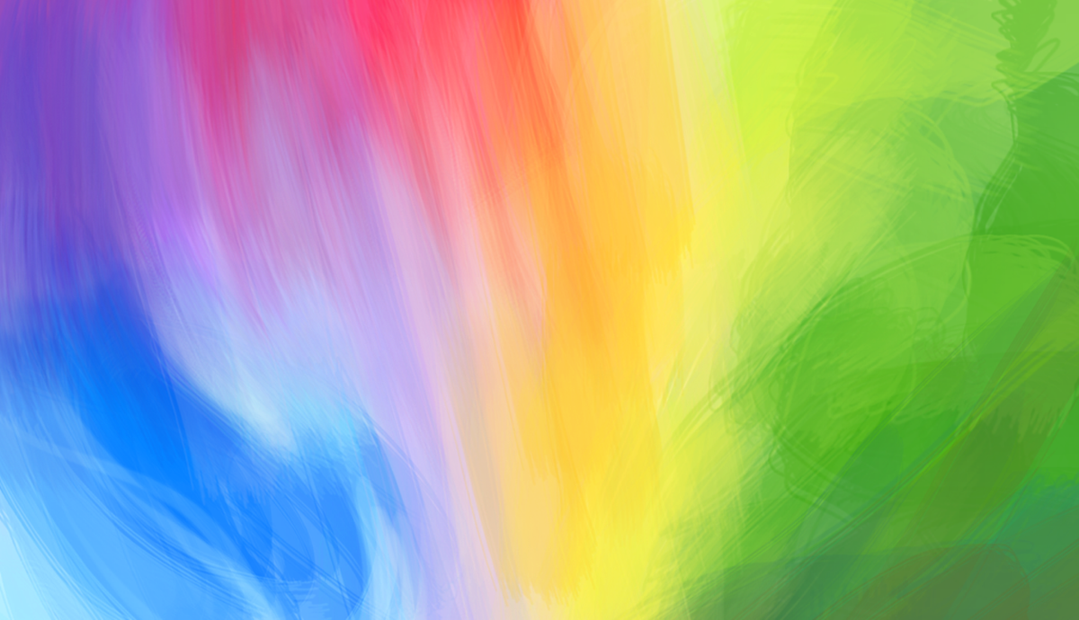
The Basics of Color Theory
Color theory is the backbone of effective print design. By understanding how colors work together and the emotions they evoke, you can create visually appealing and impactful designs. Here are the key concepts you need to know:
1. Color Wheel: The color wheel is a circular representation of colors. It consists of primary colors (red, blue, and yellow) and secondary colors (orange, green, and purple), which are created by mixing primary colors.
2. Complementary Colors: Complementary colors lie opposite each other on the color wheel. When used together, they create a strong contrast and make each other stand out.
3. Analogous Colors: Analogous colors are located next to each other on the color wheel. They create a harmonious color scheme and work well together.
4. Triadic Colors: Triadic colors consist of three colors evenly spaced on the color wheel. They create a vibrant and balanced look when used together.
5. Split Complementary Colors: Split complementary colors are a variation of complementary colors. Instead of using the color directly opposite, you choose the two neighboring colors. This creates a visually balanced yet contrasting color scheme.
6. Tetradic Colors: Tetradic colors are four colors that form a rectangle on the color wheel. They offer a high level of color contrast and can be used to create visually striking designs.
7. Monochromatic Colors: Monochromatic colors are different shades, tints, and tones of a single color. This creates a harmonious and elegant color scheme.
8. Warm and Cool Colors: Warm colors (reds, oranges, and yellows) evoke feelings of energy and excitement, while cool colors (blues, greens, and purples) evoke calmness and relaxation.
Understanding these basic color theory principles will help you create visually stunning print designs that effectively convey your message and evoke the desired emotions. By carefully selecting and combining colors, you can create a visually appealing and harmonious composition that captivates your audience.
Understanding Color Psychology
Color is not just visually appealing; it also has a psychological impact on our emotions and behaviors. Understanding color psychology can help you make informed decisions when choosing colors for your print design. Here are some key insights:
1. Red: Red is associated with passion, energy, and excitement. It grabs attention and can stimulate appetite, making it a popular choice for food-related designs.
2. Blue: Blue is often associated with calmness, trust, and reliability. It is commonly used in corporate designs and healthcare-related materials.
3. Yellow: Yellow is associated with happiness, optimism, and creativity. It can grab attention and add a cheerful vibe to your print designs.
4. Green: Green represents nature, growth, and harmony. It is often associated with eco-friendly and organic products, as well as financial institutions.
5. Purple: Purple is associated with luxury, creativity, and spirituality. It can add a sense of elegance and sophistication to your print designs.
6. Orange: Orange combines the energy of red and the cheerfulness of yellow. It represents enthusiasm, warmth, and creativity. It is often used to create a sense of urgency or draw attention.
7. Pink: Pink is often associated with femininity, romance, and sweetness. It can be used to create a soft and delicate feel in your print designs.
8. Black: Black represents power, sophistication, and elegance. It is commonly used in luxury and high-end designs.
9. White: White symbolizes purity, simplicity, and cleanliness. It is often used in minimalist or modern designs.
10. Gray: Gray represents neutrality, balance, and professionalism. It can be used as a background color to highlight other elements in your print designs.
By understanding the psychological associations of different colors, you can strategically select colors that align with your brand message and evoke the desired emotions in your audience. By leveraging color psychology in your print designs, you can create powerful and engaging visual experiences.
Primary and Secondary Colors
Primary colors are the building blocks of all other colors. They cannot be created by mixing other colors together. The primary colors are:
- Red: a warm and energetic color that grabs attention.
- Blue: a cool and calming color often associated with trust and reliability.
- Yellow: a bright and cheerful color that brings a sense of positivity and optimism.
Secondary colors are created by mixing two primary colors together. The secondary colors are:
- Orange: a vibrant and energetic color that combines red and yellow.
- Purple: a rich and luxurious color that is created by mixing blue and red.
- Green: a refreshing and harmonious color that results from combining blue and yellow.
Primary and secondary colors are essential in print design as they provide a foundation for color schemes and combinations. By understanding the relationships between these colors, you can create harmonious and visually appealing designs.
Additionally, primary and secondary colors can be used strategically to evoke specific emotions or communicate specific messages. For example, red can be used to create a sense of urgency or excitement, while blue can convey a sense of calmness or professionalism.
When using primary and secondary colors in print design, it is important to consider the context and purpose of your design. Different industries and target audiences may have varying preferences and associations with certain colors. By understanding the psychology of colors, you can make informed decisions and create designs that resonate with your audience.
Experiment with different combinations of primary and secondary colors to find the perfect balance that suits your design goals. Whether you want to create a bold and vibrant design or a soothing and serene aesthetic, primary and secondary colors are versatile tools that can help you achieve your desired visual impact.
Complementary Colors
Complementary colors are pairs of colors that are positioned directly opposite each other on the color wheel. When used together, they create a strong visual contrast and make each other stand out. The primary complementary color pairs are:
- Red and Green: This pairing creates a vibrant and attention-grabbing contrast. It can be used effectively to create dynamic and energetic designs.
- Blue and Orange: The contrast between blue and orange is striking and creates a sense of excitement and balance. It can be used to create visually compelling designs.
- Yellow and Purple: This combination creates a harmonious and rich contrast. It can be used to evoke a sense of creativity and luxury.
Complementary colors are commonly used in print design to create visually pleasing and dynamic compositions. They can be used to draw attention to certain elements or to create a sense of balance in a design. For example, using complementary colors for text and background can enhance readability and make important information stand out.
When using complementary colors, it’s important to consider the intensity and balance of the colors. Using equal amounts of both complementary colors can create visual tension, while using one color more dominantly can create a focal point. Finding the right balance is key to creating a visually pleasing and balanced design.
While complementary colors create a strong contrast, they can also be overwhelming if not used properly. It is important to consider the context, purpose, and target audience of your design. Certain industries and demographics may respond differently to specific color combinations, so it’s important to test and gather feedback to ensure your design resonates with your intended audience.
Overall, complementary colors offer a powerful tool in print design to create visually striking and engaging compositions. By understanding how to use and balance complementary colors, you can add depth, contrast, and impact to your designs.
Analogous Colors
Analogous colors are colors that are positioned next to each other on the color wheel. These colors share a similar hue and create a harmonious and cohesive color scheme. The use of analogous colors in print design can result in visually pleasing and balanced compositions. Here’s how to effectively incorporate analogous colors into your designs:
Analogous color schemes often consist of three colors, with one dominant color and two supporting colors. For example, using shades of blue, blue-green, and green creates a calming and natural color scheme. Similarly, a combination of yellow, yellow-orange, and orange creates a warm and energetic palette.
When using analogous colors, it’s important to consider the intensity and saturation of the colors. You can vary the shades, tints, or tones within the analogous color scheme to create contrast and depth in your design. This can be done by adjusting the brightness or adding a touch of complementary color to one of the colors.
Analogous colors are often used in print design to create a sense of coherence and flow. They are particularly effective in conveying themes related to nature, as they mimic the colors found in the natural world. Analogous color schemes can also be used to evoke specific emotions or set the tone for a particular message.
One important consideration when using analogous colors is to ensure there is enough contrast between the different elements of your design. Contrast can be achieved through variations in value (lightness and darkness), saturation (intensity), or by incorporating neutral colors as a backdrop to create separation and readability.
Like any color scheme, analogous colors should be chosen based on the context, purpose, and target audience of your design. Different industries and demographics may respond differently to specific color combinations. It’s always a good idea to test and gather feedback to ensure your design is effective and resonates with your intended audience.
Incorporating analogous colors into your print designs can create a sense of unity, balance, and visual appeal. By understanding how to effectively use and combine analogous colors, you can elevate your designs and create a cohesive and engaging visual experience for your audience.
Triadic Colors
Triadic colors are a color scheme that involves three colors equally spaced on the color wheel. This creates a vibrant and balanced look that can add visual interest to your print designs. Here’s how you can effectively incorporate triadic colors into your designs:
Triadic color schemes are versatile and offer a wide range of possibilities. They provide a high level of contrast while maintaining a sense of harmony. The primary triadic color combinations are:
- Red, Yellow, and Blue: This combination creates a dynamic and vibrant color scheme that can be used to evoke energy and creativity.
- Orange, Green, and Purple: This combination offers a bold and visually striking color scheme that can add excitement and impact to your designs.
When using triadic colors, it’s important to consider the balance and proportion of the colors. You can choose one color as the dominant hue and use the other two colors as accents or supporting elements. The choice of which color to emphasize will depend on the message or mood you wish to convey.
It’s also important to consider the intensity and saturation of the triadic colors. You can create variations within the color scheme by adjusting the brightness or adding shades, tints, or tones. This will enhance the overall visual appeal and add depth to your design.
Triadic color schemes are commonly used in print design to create visually engaging compositions. They provide a good balance between contrast and harmony, allowing you to create eye-catching designs that captivate your audience.
Incorporating triadic colors into your print designs can help you highlight important elements or create a sense of balance. By strategically using these colors, you can guide the viewer’s attention and create a visually cohesive and dynamic composition.
When choosing triadic colors, consider the context, purpose, and target audience of your design. Different industries and demographics may respond differently to specific color combinations. Testing and gathering feedback will help ensure your triadic color scheme effectively communicates your message and resonates with your intended audience.
By understanding how to effectively use and combine triadic colors, you can take your print designs to the next level and create captivating and visually striking compositions.
Split Complementary Colors
Split complementary colors are a variation of complementary colors that offer a visually balanced yet contrasting color scheme. This color combination involves choosing a base color and then selecting the two colors adjacent to its complementary color on the color wheel. This creates a visually striking composition that offers more variety and harmony compared to a direct complementary color combination.
Split complementary color schemes provide a good balance between contrast and harmony, making them a popular choice in print design. Here’s how you can effectively incorporate split complementary colors into your designs:
1. Choose a base color: Start by selecting a primary color as your base color. This will be the dominant color in your design.
2. Select adjacent colors: Identify the two colors adjacent to the complementary color of your base color. These colors will serve as the supporting colors in your split complementary color scheme.
3. Balance the colors: Consider the intensity and saturation of the colors to create a visually balanced composition. You can adjust the brightness, contrast, or tone of the colors to achieve the desired effect.
Split complementary color schemes offer more variety and depth compared to complementary colors alone. They can add visual interest and create a harmonious color palette that stands out in print designs. By using split complementary colors, you can achieve a balanced and visually compelling composition.
When using split complementary colors, it’s important to consider the context, purpose, and target audience of your design. Different industries and demographics may respond differently to specific color combinations. Testing and gathering feedback will help ensure your split complementary color scheme effectively communicates your message and resonates with your intended audience.
By understanding how to effectively use and combine split complementary colors, you can add depth, contrast, and visual appeal to your print designs. This versatile color scheme offers endless possibilities for creating captivating compositions that leave a lasting impression.
Tetradic Colors
Tetradic colors, also known as rectangular colors, involve the use of four colors that form a rectangle on the color wheel. This color scheme offers a high level of contrast and can create visually striking and harmonious designs. Here’s how you can effectively incorporate tetradic colors into your print designs:
1. Select a base color: Start by choosing one color as your base. This will serve as the dominant color in your design.
2. Identify the complementary colors: Find the two colors that are directly opposite your base color on the color wheel. These will be your complementary colors and will create a strong contrast in your design.
3. Choose the supporting color: Select a fourth color that is adjacent to one of your complementary colors. This supporting color will help balance the overall composition and add depth to your design.
4. Balance the colors: Consider the intensity, saturation, and brightness of the colors to achieve a visually pleasing balance. You can experiment with different variations and combinations within the tetradic color scheme.
Tetradic colors offer a wide range of possibilities and can create vibrant and visually dynamic designs. The high level of color contrast allows you to create emphasis, focal points, or visual hierarchy in your print designs.
When using tetradic colors, keep in mind the context, purpose, and target audience of your design. Different industries and demographics may respond differently to specific color combinations. Testing and gathering feedback will help ensure your tetradic color scheme effectively communicates your message and resonates with your intended audience.
By understanding how to effectively use and combine tetradic colors, you can create visually captivating and harmonious print designs. This color scheme offers versatility, allowing you to experiment with different combinations and variations to achieve the desired visual impact.
Monochromatic Colors
Monochromatic colors are a color scheme that involves using different shades, tints, and tones of a single color. This creates a harmonious and elegant look in your print designs. Here’s how you can effectively incorporate monochromatic colors into your designs:
To create a monochromatic color scheme, choose a base color and then use variations of that color by adding white to create tints, black to create shades, or gray to create tones. This allows you to explore the different values of a single color, resulting in a visually cohesive design.
Monochromatic color schemes offer simplicity and sophistication. They create a sense of unity and can be used to evoke a specific mood or create a calming visual experience. Monochromatic designs are often associated with minimalism and modern aesthetics.
When using a monochromatic color scheme, it’s important to consider the value and saturation of the colors. By varying the brightness or intensity of the color, you can add depth and visual interest to your design. Contrasting textures, patterns, or typography can also be used to create visual hierarchy within a monochromatic color scheme.
Monochromatic colors are versatile and can be used in a variety of design contexts. They work well for creating branding materials, brochures, posters, and more. They also provide a solid foundation if you want to introduce pops of contrasting colors or emphasize specific design elements.
Keep in mind the context, purpose, and target audience of your design when using monochromatic colors. Different industries and demographics may respond differently to specific shades and values. Testing and gathering feedback will help ensure your monochromatic color scheme effectively communicates your message and resonates with your intended audience.
By understanding how to effectively use and experiment with monochromatic colors, you can create visually pleasing and sophisticated print designs. This color scheme offers versatility and allows you to explore the nuances of a single color, resulting in a cohesive and visually appealing composition.
Warm and Cool Colors
Warm and cool colors are two distinct color groups that evoke different emotions and create different visual effects in print design. Understanding the characteristics and associations of warm and cool colors can help you effectively communicate your message and set the desired tone in your designs. Here’s what you need to know:
Warm Colors:
Warm colors consist of shades such as reds, oranges, and yellows. These colors are often associated with energy, passion, and warmth. Warm colors can create a sense of excitement and grab attention. They are commonly used to convey a feeling of intensity, urgency, or happiness. In print design, warm colors can be used to highlight important elements or create a visually stimulating composition.
Cool Colors:
Cool colors include shades of blues, greens, and purples. These colors are often associated with calmness, tranquility, and relaxation. Cool colors can create a sense of serenity and coolness. They are commonly used to convey a feeling of professionalism, trust, or sophistication. In print design, cool colors can be used to create a soothing and harmonious visual experience or evoke a sense of tranquility.
Combining Warm and Cool Colors:
Combining warm and cool colors in your print designs can create visual contrast and add depth to your composition. This can be achieved by incorporating complementary colors, such as combining cool blue tones with warm orange hues. The contrasting nature of warm and cool colors can create visually striking designs and help direct the viewer’s attention to specific elements.
Choosing Warm or Cool Colors:
When choosing between warm and cool colors for your print designs, consider the message and mood you want to evoke. Think about the target audience and the associations they may have with certain colors. For example, if you want to create a sense of excitement and energy, warm colors may be more appropriate. If you aim to convey a sense of calmness and professionalism, cool colors may better suit your design.
Ultimately, it’s important to experiment and find a balance that effectively communicates your message while resonating with your target audience. Be mindful of cultural or industry-specific color associations, and test different color combinations to determine the most impactful choices for your print designs.
By understanding the characteristics and effects of warm and cool colors, you can harness their power to create engaging and visually appealing print designs that effectively communicate your intended message.
Using Contrast in Color Design
Contrast is a fundamental principle in color design that helps create visual interest and enhance the legibility and impact of your print designs. By using contrast effectively, you can make certain elements stand out, guide the viewer’s attention, and create a visually engaging composition. Here’s how to leverage contrast in color design:
1. Color Value Contrast: Value refers to the lightness or darkness of a color. Utilizing contrast in value can create a clear distinction between elements. Pairing light and dark colors can enhance readability and make important information pop. For example, using a dark color for text on a light background provides strong value contrast.
2. Color Hue Contrast: Hue refers to the specific color on the color wheel. Contrasting hues can create a strong visual impact and draw attention. Colors that are opposite each other on the color wheel, such as red and green or blue and orange, provide a high level of hue contrast.
3. Color Saturation Contrast: Saturation refers to the intensity or purity of a color. Contrasting levels of saturation can add depth and dimension to your designs. Pairing highly saturated colors with desaturated colors can create a striking contrast and make certain elements stand out.
4. Color Temperature Contrast: Warm and cool colors have inherent contrasting properties. Combining warm and cool colors can create visual interest and highlight important elements in your design. This contrast is particularly effective when used strategically to create focal points or to convey specific moods or emotions.
5. Color Complementary Contrast: Utilizing complementary colors, those that are opposite each other on the color wheel, creates a strong contrast and makes elements stand out. Complementary color contrast can be applied to text and background, images and backgrounds, or elements within an illustration or composition.
By incorporating contrast into your color design, you can create a visually dynamic and engaging experience for your audience. Contrast not only adds visual interest but also aids in establishing visual hierarchy, emphasizing important information, and guiding the viewer’s eye through your design.
When using contrast, it’s important to strike a balance. Too much contrast can make a design overwhelming, while too little contrast can make it bland and unremarkable. Consider the context, purpose, and target audience of your design to determine the appropriate level of contrast needed to convey your message effectively.
Experiment and play with different contrast techniques to find what works best for your print designs. By understanding and utilizing contrast in color design, you can create visually stunning and attention-grabbing compositions that leave a lasting impression.
Color Harmony Techniques
Color harmony refers to the arrangement or combination of colors in a design that is visually pleasing and creates a sense of balance. By utilizing color harmony techniques, you can create cohesive and aesthetically pleasing print designs. Here are some popular color harmony techniques:
1. Complementary Harmony: This color scheme involves using colors that are opposite each other on the color wheel. It creates a strong contrast and adds visual interest to your design. Complementary harmony can be useful when you want to highlight specific elements or create a dynamic composition.
2. Analogous Harmony: Analogous color harmony uses colors that are adjacent to each other on the color wheel. This technique creates a sense of harmony and can be used to evoke specific moods or themes. Analogous color schemes are often found in nature-inspired designs as they mimic the colors found in the natural world.
3. Monochromatic Harmony: Monochromatic color harmony involves using different shades, tints, and tones of a single color. This technique creates a harmonious and elegant look. By exploring the variations within a single color, you can add depth and interest to your design while maintaining a cohesive visual aesthetic.
4. Triadic Harmony: Triadic color harmony uses three colors that are evenly spaced on the color wheel. This technique provides a vibrant and balanced color scheme. Triadic color schemes often offer a good balance between contrast and harmony, creating visually appealing and dynamic compositions.
5. Tetradic Harmony: Tetradic color harmony involves using four colors that form a rectangle on the color wheel. This technique offers a high level of contrast while maintaining a sense of balance. Tetradic color schemes provide versatility and possibilities for creating visually striking and harmonious designs.
6. Split Complementary Harmony: Split complementary color harmony is a variation of complementary colors. It involves choosing a base color and using the two colors adjacent to its complementary color. This technique provides a visually balanced yet contrasting color scheme, offering more variety and harmony compared to a direct complementary color combination.
When applying color harmony techniques to your print designs, consider the context, purpose, and intended emotional response. Different color schemes may evoke different emotions and convey different messages. By understanding the psychology of color and experimenting with different harmonious combinations, you can create visually appealing and impactful designs that resonate with your audience.
Remember that color harmony is not limited to a single technique; you can also combine multiple harmony techniques or introduce subtle variations within a specific technique to add complexity to your designs.
By incorporating these color harmony techniques into your print designs, you can create visually harmonious compositions that captivate your audience and effectively communicate your intended message.
Common Color Mistakes to Avoid
When it comes to color design, even the smallest mistakes can have a significant impact on the effectiveness and appeal of your print designs. To ensure your colors work harmoniously and convey your desired message, here are some common color mistakes to avoid:
1. Using Too Many Colors: Overloading your design with too many colors can lead to visual chaos and make it difficult for your audience to focus on the key elements. Limit the number of colors you use to create a cohesive and balanced composition.
2. Neglecting Contrast: Lack of contrast between elements can result in a design that appears flat or dull. Make sure there is sufficient contrast in color value, hue, or saturation to create visual interest and ensure readability.
3. Clashing Colors: Using colors that clash or create jarring combinations can make your design visually unpleasant or confusing. Avoid combining colors that create a harsh contrast or clash in terms of temperature or intensity unless you have a specific creative intent.
4. Poor Color Accessibility: Failing to consider color accessibility can lead to exclusion and poor readability for individuals with visual impairments. Ensure there is sufficient contrast between foreground and background colors to ensure that text and important information are easily readable.
5. Ignoring Brand Identity: Misusing or disregarding your brand’s established color palette can dilute your brand identity and confuse your audience. Always adhere to your brand’s color guidelines to maintain consistency and reinforce brand recognition.
6. Ignoring Cultural Context: Colors can carry different meanings and associations across cultures. Be mindful of the cultural context in which your design will be viewed to avoid unintentional misinterpretations or offensiveness.
7. Mismatching Color Messages: The emotions and messages associated with colors should align with your intended message. Using colors with conflicting meanings can convey mixed or confusing messages to your audience.
8. Forgetting Color Psychology: Colors have the power to evoke specific emotions and psychological responses. Ignoring color psychology and the impact of colors on human perception can result in a design that fails to effectively communicate your intended message.
9. Ignoring Print Production Factors: Different printing processes, substrates, and materials can affect the appearance of colors. Ignoring these factors can lead to unexpected color variations between your design and the final printed result. Always consult with your print production team to ensure accurate color reproduction.
Avoiding these common color mistakes will help you create print designs that are visually appealing, communicate effectively, and resonate with your audience. Take the time to plan and experiment with colors, and always consider the context, purpose, and target audience of your design.
The Impact of Color on Print Design
Color plays a crucial role in print design, as it has the power to evoke emotions, convey messages, and guide the viewer’s attention. Understanding the impact of color and effectively utilizing it in your print designs can significantly enhance the overall effectiveness and visual appeal of your work. Here are some key aspects to consider:
Emotional Response: Different colors have the ability to evoke specific emotions and moods. Warm colors like red and orange can create a sense of energy and excitement, while cool colors like blue and green can evoke feelings of calmness and tranquility. By strategically using colors that align with the desired emotional response, you can better communicate your message and connect with your audience on a deeper level.
Brand Identity: Colors play a vital role in brand recognition and identity. Consistently using the same colors across all print materials helps establish a strong visual identity for your brand. It fosters recognition and association, and enables your audience to connect certain colors with your brand values and offerings. Staying true to your brand’s color palette creates a consistent and cohesive visual experience.
Visual Hierarchy: Colors can be used to create visual hierarchy in your print designs by guiding the viewer’s attention. Bright colors or high-contrast combinations naturally attract attention and can be used to highlight key information or call-to-actions. By strategically selecting colors and their placement, you can create a clear flow and direct the viewer’s eye towards important elements.
Accessibility and Readability: Ensuring color accessibility is critical in print design. Color combinations with insufficient contrast can make it difficult for certain individuals, such as those with visual impairments, to read or comprehend the content. Consider using high-contrast combinations and alternative methods, such as using text and graphic elements, to convey information effectively and inclusively.
Cultural and Symbolic Associations: Colors can carry cultural and symbolic meanings that vary across different societies and contexts. What may be considered positive or meaningful in one culture can have a different interpretation in another. Understanding the cultural associations and symbolism of colors is essential to avoiding unintended misinterpretations or negative connotations in your designs.
Visual Appeal and Aesthetics: Colors have a significant impact on the overall visual appeal of your print designs. Harmonious color schemes and well-balanced combinations can create a visually pleasing and engaging experience. Consider the principles of color theory, such as complementary or analogous color schemes, to create compositions that captivate your audience and leave a lasting impression.
By understanding the impact of color on print design and utilizing it effectively, you can create visually compelling, emotionally resonant, and impactful designs. Carefully selecting and combining colors, while considering the context, purpose, and target audience of your design, allows you to maximize the potential of color in conveying your messages and achieving your design objectives.
Examples of Effective Color Combinations
Choosing the right color combinations is essential in creating visually appealing and impactful print designs. Here are some examples of effective color combinations that can inspire your own designs:
1. Blue and Orange: This complementary color combination creates a striking contrast while maintaining a sense of vibrancy. It is commonly used in sports-related designs or to create a sense of energy and excitement.
2. Black and White: The classic black and white combination offers a timeless and elegant look. It is versatile and works well in minimalist designs or when you want to create a clean and sophisticated aesthetic.
3. Pastel Palette: Soft and muted pastel colors, such as pale pink, mint green, and baby blue, create a calming and gentle aesthetic. This palette is often associated with delicate and feminine designs, but it can also be used to evoke a sense of nostalgia or simplicity.
4. Earth Tones: Colors inspired by nature, such as shades of brown, green, and warm earthy tones, create a sense of grounding and authenticity. This color combination is commonly used in eco-friendly or organic designs, as it evokes a connection to the natural world.
5. High-Contrast Black and Yellow: The combination of bold black and vibrant yellow creates a high level of contrast and grabs attention. This combination is often used in cautionary messages, safety signs, or designs that aim to create a sense of urgency.
6. Triadic Harmony: Utilizing triadic color harmony, such as combining red, yellow, and blue, creates a visually dynamic and balanced composition. This combination offers a wide range of color possibilities and can be used to create energetic or playful designs.
7. Monochromatic with Pop of Color: Using different shades, tints, and tones of a single color as a base, and adding a pop of contrasting color, creates a visually appealing composition. This combination allows for a cohesive and harmonious design while highlighting specific elements.
8. Warm Neutrals: Combining warm neutral tones, such as beige, tan, and cream, creates a sense of warmth and coziness. This color combination is often associated with rustic or vintage designs, evoking a sense of comfort and nostalgia.
Remember, these examples are just starting points. The effectiveness of color combinations depends on various factors, including context, purpose, and target audience. Experiment and explore different color combinations to find the ones that best suit your design objectives and resonate with your intended audience.
By leveraging the power of effective color combinations, you can create visually stunning and impactful print designs that leave a lasting impression.
Tips for Choosing Clashing Colors in Print Design
Choosing clashing colors in print design can be a bold and attention-grabbing choice that adds a unique and dynamic flair to your designs. When done correctly, these clashing color combinations can create visual interest and make your designs memorable. Here are some tips to help you effectively choose and utilize clashing colors in your print designs:
1. Understand Color Theory: Familiarize yourself with the basic principles of color theory, including complementary colors, analogous colors, and color harmonies. This knowledge will help you identify which colors clash in terms of contrast, hue, or saturation.
2. Start with a Base Color: Begin your design process by selecting a base color that you want to work with. This color will act as a foundation and guide your selection of clashing colors.
3. Explore Contrasting Combinations: Look for colors that are opposite on the color wheel or those that create strong contrast. For example, pairing blue with orange or green with purple can create visually striking clashes.
4. Consider Intensity: Experiment with mixing colors of different intensities, such as pairing a highly saturated color with a muted or desaturated color. This contrast in intensity can create an interesting clash without overwhelming the viewer.
5. Use Neutrals as Balancing Elements: Incorporate neutral colors, such as black, white, or gray, to balance the clashing colors. Neutrals can help tone down the intensity and create a more cohesive composition.
6. Test and Iterate: Create mock-ups or prototypes to see how the clashing colors work together in your design. Iterate and refine as needed to achieve the desired balance and impact.
7. Consider Context and Audience: Keep in mind the context in which your design will be seen and the preferences of your target audience. Certain color combinations may work better for specific industries, demographics, or cultural contexts.
8. Break Design Elements: Use clashing colors to intentionally disrupt the expected patterns or to draw attention to specific elements. This can create a visually exciting and dynamic composition.
9. Balance with Layout and Typography: Experiment with the arrangement and placement of elements to create a balanced visual hierarchy. Incorporate contrasting fonts or typography styles to further enhance the clash.
10. Trust Your Creativity: Get out of your comfort zone and trust your creative instincts. Sometimes, the most unconventional color combinations can lead to extraordinary results. Embrace experimentation and take risks.
When done purposefully and with an understanding of color theory, clashing colors can bring a unique and attention-grabbing element to your print designs. By following these tips and allowing yourself to explore the possibilities, you can create visually stunning and memorable designs that leave a lasting impression on your audience.