
What is the Grid System?
The grid system is a fundamental concept in graphic design that provides a framework for organizing content within a layout. It involves the use of a series of horizontal and vertical lines that intersect to create a system of columns and rows. These grids act as a guide to help designers align elements, distribute content, and establish a harmonious visual hierarchy.
The grid system has its roots in print design, where it was used to structure newspapers, magazines, and other printed materials. However, with the rise of digital design, the grid system has become equally important in web design and other forms of visual communication.
One of the key benefits of using a grid system is its ability to bring order and consistency to a design. By adhering to a predefined structure, designers can achieve balance, unity, and a sense of visual harmony. This is particularly crucial when working with complex layouts or multiple elements.
Moreover, the grid system serves as a tool for efficient content organization. It enables designers to plan and allocate space for different sections, such as headlines, text blocks, images, and navigation menus. This ensures that there is a logical flow and coherence to the overall design.
Another advantage of the grid system is its flexibility. Designers can adapt, modify, and customize the grid to suit different design needs. Whether it’s a symmetrical or asymmetrical layout, a single-column or multi-column design, the grid system provides a versatile framework that can be tailored to fit various design aesthetics.
Furthermore, the use of a grid system promotes better readability and comprehension. By aligning elements consistently, designers create a visual rhythm that makes it easier for users to navigate through the content. This increases the user experience and enhances engagement.
Why is the Grid System Important in Graphic Design?
The grid system plays a crucial role in graphic design for several reasons. Firstly, it brings structure and organization to the design process. Without a grid, designers may struggle with aligning elements, creating a consistent layout, and achieving a unified design. The grid system provides a solid foundation for designers to work from, giving them a clear framework to organize content and establish visual hierarchy.
Secondly, the grid system helps maintain balance and harmony within a design. By using the grid as a guide, designers can ensure that elements are proportionally and spatially arranged in a pleasing and visually appealing manner. This balance makes a design more aesthetically pleasing and enhances the overall user experience.
Additionally, the use of a grid system promotes consistency across different design elements. By establishing a set of rules and guidelines, designers can ensure that typography, images, and other visual elements align consistently throughout the design. This consistency creates a cohesive and professional-looking end result.
Another important aspect of the grid system is its impact on usability. A well-structured grid improves the readability and comprehension of a design, making it easier for users to navigate and understand the content. By aligning elements consistently and organizing information in a logical manner, designers can enhance the user experience and ensure that the intended message is effectively communicated.
The grid system also facilitates collaboration and communication between designers, developers, and clients. When working with a grid-based design, it becomes easier to discuss and iterate on different design elements. The grid acts as a common language that all parties can understand and refer to during the design process, streamlining the workflow and reducing misunderstandings.
Lastly, the grid system provides flexibility and scalability. It allows designers to easily adapt and adjust the layout to accommodate different screen sizes and devices. This responsiveness is crucial in today’s digital age as designs need to be optimized for various platforms and resolutions.
In essence, the grid system is an essential tool in graphic design as it brings structure, organization, and visual harmony to the design process. It enhances usability, consistency, and collaboration, ensuring that the end result is both functional and visually appealing.
How to Establish a Grid System
Establishing a grid system is a crucial step in the graphic design process. It provides a framework for organizing content and ensures consistency and structure within a layout. Here are the steps to follow to establish a grid system:
1. Define your design goals: Before diving into the grid system, it’s important to first establish your design goals and objectives. Consider factors such as the type of content, target audience, and desired visual aesthetic. This will help guide your grid system decisions.
2. Determine the number of columns: Decide how many columns your grid system will have. This can vary depending on the complexity of your design and the type of content you are working with. Common choices include 12-column, 16-column, or even custom column grids.
3. Establish the gutter width: The gutter is the space between columns. Determine a consistent gutter width that provides enough separation between columns while maintaining a visually coherent layout. Consider factors such as the font size, line height, and overall spacing of your design.
4. Set the column width: Once you’ve determined the number of columns and the gutter width, calculate the column width by dividing the available space by the number of columns. This will ensure that each column is evenly distributed and aligned within the layout.
5. Determine the overall layout width: Decide on the width of your overall layout. This will depend on the medium you are designing for, such as print or web. Consider factors such as screen size or paper dimensions to ensure your design fits within the designated space.
6. Establish margins: Set the margins on the left and right sides of your layout. These margins create a buffer space around the content and help maintain visual balance. Ensure that the margins are proportional to the column width and gutter width.
7. Create guides and templates: Use design software or tools to create guides and templates based on your grid system specifications. These guides will help you align elements accurately and consistently throughout the design process.
8. Test and iterate: Once you’ve established your grid system, test it with sample content and evaluate its effectiveness. Make adjustments as needed to ensure that the grid system aligns with your design goals and enhances the overall visual appeal and usability of your design.
By following these steps, you can establish a well-structured and organized grid system that will serve as a solid foundation for your graphic design projects.
Choosing the Right Grid System for Your Design
When it comes to choosing a grid system for your design, it’s important to consider the specific requirements and objectives of your project. Here are some factors to consider when selecting the right grid system:
1. Design goals and content: Consider the type of content you will be working with and the desired visual outcome. Different grid systems lend themselves better to specific types of designs. For example, a complex layout with multiple content sections may benefit from a more flexible grid system, while a minimalist design may work well with a simpler grid structure.
2. Grid complexity: Grid systems can range from simple to complex. A simple grid system may consist of a few columns and rows, while a complex grid system could have multiple levels of sub-grids. Determine the level of complexity that matches the needs of your design and ensures an efficient content organization.
3. Medium and format: Consider the medium and format of your design. Grid systems for print designs may differ from those for web or mobile designs. Take into account factors such as screen size, resolution, and user experience requirements when choosing a grid system that best suits your design medium.
4. Flexibility and responsiveness: If you anticipate the need for your design to be responsive across different devices and screen sizes, choose a grid system that allows for flexibility and adaptability. Responsive grid systems, such as those based on CSS frameworks like Bootstrap, can make it easier to create designs that adjust seamlessly to different screen sizes.
5. Alignment and visual hierarchy: Pay attention to how the grid system aligns and organizes elements within a design. Ensure that the grid system you choose is capable of creating a strong visual hierarchy and aligning elements consistently. This will contribute to a visually pleasing and well-structured layout.
6. Testing and scalability: Before settling on a grid system, test its scalability by applying it to different types of content and layouts. Ensure that it adapts well to various scenarios and can accommodate future design iterations. A grid system that can evolve with your design needs will save you time and effort in the long run.
7. User experience: Consider how a particular grid system may impact the user experience of your design. Ensure that it enhances readability, guides user interaction, and provides a seamless navigation experience. A well-chosen grid system will contribute to a positive user experience and improve engagement with your design.
By considering these factors and evaluating the specific requirements of your design project, you can choose a grid system that aligns with your goals and helps you create a visually appealing and well-structured layout.
Using Grids for Layout and Alignment
Grids are powerful tools for achieving effective layout and alignment in graphic design. They provide structure and consistency, making it easier to organize content and create visually appealing compositions. Here are some key ways to use grids for layout and alignment:
1. Consistent spacing: Grids allow for consistent spacing between elements, both horizontally and vertically. By aligning elements to the grid lines or their intersections, designers can create balanced compositions that look visually cohesive.
2. Grid-based layouts: Grids serve as a framework for designing layouts. They can be used to divide the canvas into sections or columns, which helps to organize and structure content. Grid-based layouts provide a clear and logical flow for viewers.
3. Alignment of elements: Grids offer a precise way to align various elements within a design. Whether it’s text, images, icons, or buttons, aligning them to the grid lines creates a sense of order and professionalism. This alignment also improves readability and visual hierarchy.
4. Grid-based typography: Grids can be used to guide the placement and alignment of typography. By aligning text blocks and headings to the grid lines, designers can achieve a consistent and balanced typographic layout. This improves readability and creates a more harmonious visual experience.
5. Responsive design: Grids are particularly helpful in creating responsive designs that adapt to different screen sizes and devices. Using a flexible grid system allows designers to easily rearrange and resize elements based on the available space, ensuring a seamless user experience.
6. Composition experimentation: Grids provide a structured space for designers to experiment with different compositions. By manipulating the placement and alignment of elements within the grid, designers can explore various design options and find the most visually appealing arrangement.
7. Visual balance and harmony: Grids contribute to visual balance and harmony by ensuring that elements are proportionally aligned. This creates a sense of order and coherence, making the design more visually pleasing and engaging to the audience.
8. Grid overlay technique: Designers often use a grid overlay technique to view and adjust elements in relation to the grid. This technique helps to fine-tune alignment, spacing, and overall layout precision, leading to a more polished and professional design.
By utilizing grids for layout and alignment, designers can achieve consistent, balanced, and visually appealing compositions. Grids provide a solid structure that serves as a guide throughout the design process, leading to more effective and engaging graphic designs.
Grid System Principles for Composition
When it comes to composition in graphic design, the grid system plays a vital role in achieving a harmonious and visually pleasing layout. By following certain principles, designers can leverage the grid system to create well-composed designs. Here are some grid system principles for composition:
1. Balance: Balance refers to the distribution of visual weight within a design. The grid system helps achieve balance by ensuring that elements are evenly spaced and proportionally aligned. Whether it’s symmetrical or asymmetrical balance, the grid system provides a foundation for creating a visually stable composition.
2. Proximity: Proximity is about grouping related elements together. By aligning elements to the grid lines or their intersections, designers can establish a sense of proximity. This helps viewers understand the relationship between different elements and improves readability and comprehension.
3. Alignment: Alignment plays a crucial role in creating a professional and polished design. The grid system allows designers to align elements in a consistent and visually pleasing manner. Whether it’s aligning text to a baseline grid or aligning images to the edges of columns, proper alignment enhances the overall visual appeal and coherence of a composition.
4. Visual Hierarchy: The grid system helps establish a visual hierarchy within a design. By designing elements to adhere to the grid structure, designers can easily create a clear distinction between primary, secondary, and tertiary elements. This ensures that important information stands out and guides viewers through the content in a logical order.
5. Whitespace: Whitespace, or negative space, is the empty space around elements. The grid system enables designers to utilize whitespace effectively, enhancing the overall composition. By incorporating appropriate amounts of whitespace between elements and within sections, designers can create a sense of visual breathing room and improve the clarity of the design.
6. Modular design: The grid system is particularly useful for creating modular designs. By dividing the layout into modular sections based on the grid structure, designers can easily rearrange and reorganize content modules. This flexibility allows for a dynamic and adaptable composition that can be modified and scaled as needed.
7. Rule of thirds: The rule of thirds is a compositional guideline that suggests dividing the canvas into a 3×3 grid. This grid helps designers position key elements along the grid lines or their intersections, creating balanced and visually engaging compositions. The rule of thirds can also be adapted to different grid systems for more complex layouts.
8. Golden ratio: The golden ratio is a design principle that involves using the ratio of approximately 1.618 to achieve visually pleasing proportions. The grid system can be structured around the golden ratio, assisting in determining the ideal placement and scaling of elements within the composition.
By following these grid system principles for composition, designers can create visually appealing and well-balanced layouts. The grid system serves as a guide to ensure that elements are aligned, spaced, and organized in a way that enhances the overall visual appeal and communication of the design.
Grid System Tools and Techniques
There are various tools and techniques that designers can employ to implement and utilize grid systems effectively. These tools and techniques assist in creating and managing grid-based layouts. Here are some commonly used ones:
1. Grid generators: Grid generators are online tools that allow designers to create custom grid systems quickly. These tools provide options to choose the number of columns, gutter widths, margins, and other parameters. Designers can generate a CSS grid code or download grid templates to use in design software.
2. Design software with grid features: Many design software programs, such as Adobe Photoshop, Illustrator, and InDesign, have built-in features for creating and managing grid systems. These tools allow designers to customize grid settings, apply guides, and snap elements to the grid lines.
3. CSS frameworks: CSS frameworks like Bootstrap and Foundation come with pre-built grid systems. These frameworks provide a set of CSS classes that designers can use to create responsive grid-based layouts. CSS frameworks simplify the process of implementing a grid system, reducing the need for manual coding.
4. Baseline grids: Baseline grids are horizontal grids based on the line height of the text. They help align text elements such as headings, paragraphs, and lists to establish typographic harmony. Design software like InDesign offers features to create and align elements to a baseline grid.
5. Modular scales: Modular scales are ratios that define proportional relationships between various elements in a design. They help create harmonious layouts by determining font sizes, line heights, and other dimensions. Designers can use modular scale tools or formulas to calculate appropriate ratios within the grid system.
6. Grid-based frameworks: Grid-based frameworks provide a comprehensive set of pre-designed templates, modules, and components that are already optimized with a grid system. These frameworks, such as Foundation and Bootstrap, are popular choices for creating responsive layouts quickly and efficiently.
7. Grid-based prototyping tools: Prototyping tools like Adobe XD, Sketch, and Figma offer grid-based layout features that enable designers to create interactive prototypes with grid systems. These tools provide grids, rulers, and alignment guides to ensure precise layout and alignment of design elements.
8. Design grid plug-ins: Many design software programs offer plug-ins that enhance or extend the native grid capabilities. These plug-ins provide additional features such as advanced grid configurations, snapping options, and shortcuts for grid-related tasks.
By utilizing these tools and techniques, designers can streamline the creation and management of grid-based layouts. These resources save time and effort, allowing designers to focus on creating visually appealing and well-structured designs within the framework of a grid system.
Grid System Tips and Best Practices
When working with grid systems in graphic design, there are several tips and best practices that can help designers make the most out of this powerful tool. These tips ensure effective use of grids and create visually appealing and well-structured designs. Here are some top grid system tips and best practices:
1. Plan and sketch: Before diving into the design process, start by planning and sketching your layout. Consider the content, hierarchy, and overall composition of the design. Sketch out different grid options to explore the most suitable arrangement for your project.
2. Keep it simple: While grid systems offer flexibility, it’s essential to keep the grid structure simple and easy to understand. Too many columns or complex sub-grids can make the layout overwhelming and challenging to manage. Stick to a manageable number of columns and subdivisions.
3. Grid consistency: Maintain grid consistency across multiple layouts or sections within a design. Consistency aids in creating a cohesive visual experience and helps users orient themselves within the design easily. Ensure that grid columns, gutter widths, and margins are consistent throughout the design.
4. Grid adaptability: Design with a grid system that can adapt to different layouts and screen sizes. Responsive design is crucial in today’s multi-device world. Choose a grid system that allows for flexibility and scalability so that your design can be easily adjusted for different devices and orientations.
5. Experiment with asymmetry: While grids often create symmetrical layouts, don’t be afraid to experiment with asymmetry. Asymmetrical grid structures can add visual interest and create dynamic compositions. Just ensure that the asymmetry is intentional and doesn’t compromise the balance and readability of the design.
6. Use hierarchy within the grid: Grid systems provide a clear framework for establishing visual hierarchy. Utilize different grid subdivisions and column sizes to prioritize essential elements within the composition. This helps guide viewers’ attention and ensures that critical information stands out.
7. Utilize whitespace: Whitespace is a crucial element in design, and grids can help maintain proper spacing and balance. Take advantage of whitespace within and around grid elements to create breathing room and improve readability. Don’t overcrowd the design, but rather allow for strategic use of whitespace.
8. Grid overlay technique: Use a grid overlay technique to evaluate and fine-tune the alignment and spacing of elements. Overlay a grid template onto your design in your design software to check the alignment, spacing, and overall grid consistency. This technique can help ensure precise alignment and resolve any visual inconsistencies.
9. Grid adjustments: Be open to making grid adjustments as you progress through the design process. Sometimes, elements may not align perfectly on the grid, or the initial grid structure may not work optimally. Don’t be afraid to make necessary adjustments to maintain balance and ensure an effective design composition.
10. Get feedback: Seek feedback from colleagues, clients, or even fellow designers to get a fresh perspective on your grid-based design. Constructive feedback can help identify areas for improvement and validate the effectiveness of your grid system implementation.
By following these grid system tips and best practices, designers can harness the full potential of grids to create well-structured and visually pleasing designs. Working with grids provides a solid foundation for consistency, readability, and effective layout composition.
Examples of Effective Grid System Designs
Effective use of grid systems can be seen in numerous successful design projects across various mediums. These examples showcase how grids can enhance visual appeal, organization, and user experience. Here are a few notable examples of effective grid system designs:
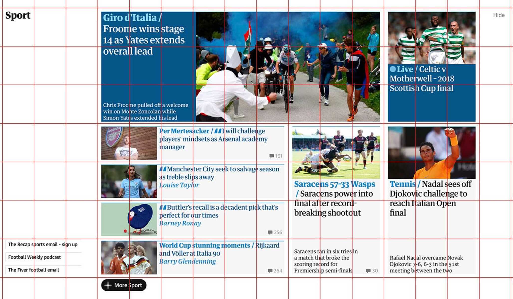
1. The New York Times: The New York Times website utilizes a well-structured grid system that perfectly balances content and whitespace. The grid system helps create a clean and organized layout while allowing for flexible and responsive design. The use of horizontal grids, modular sections, and consistent alignment of elements contributes to an engaging user experience.
2. Apple Product Pages: Apple’s product pages are known for their visually appealing and user-friendly designs. The grid system used in these pages provides a structured layout that showcases product images, descriptions, and specifications. The use of consistent alignment, whitespace, and carefully structured grids enables users to easily navigate and absorb information about the products.
3. National Geographic Magazine: National Geographic magazine consistently demonstrates the power of grid-based layouts. The magazine’s clean and organized design relies on vertical and modular grids to arrange captivating images, informative captions, and compelling articles. The use of grids ensures a cohesive and visually pleasing reading experience, even with diverse content.
4. Pinterest: Pinterest’s grid-based layout is a prime example of how grids can accommodate user-generated content. The platform’s pinboard interface relies on a flexible grid system that dynamically adjusts to accommodate images of different sizes and proportions. This grid-based design allows for easy exploration and discovery of content while maintaining a visually balanced composition.
5. Material Design: Google’s Material Design system incorporates a grid-based layout that offers consistency across various Google apps and platforms. The responsive grid system allows for the seamless adaptation of designs to different screen sizes and orientations. The grid’s inherent flexibility, combined with proper alignment and hierarchy, ensures a cohesive and intuitive user experience.
6. Trello: Trello, a popular project management tool, relies on a grid system to organize task cards in a visually appealing manner. The vertical and horizontal grids align and stack cards in a neat and structured layout. The use of consistent spacing, alignment, and modular subdivisions provides users with a clear overview of their projects and tasks.
7. Nike Online Store: The Nike online store effectively uses a grid system to showcase its products. The grid-based layout allows for consistent alignment of product images and relevant information, ensuring a seamless browsing experience. The grid also accommodates dynamic content such as filtering options, product variants, and interactive elements, providing a visually engaging and user-friendly interface.
These examples demonstrate how designers leverage grid systems to create visually stunning, organized, and user-friendly designs across various industries and mediums. The effective implementation of grids helps to establish hierarchy, maintain balance, and optimize content presentation, ultimately enhancing the overall user experience.