
Understanding Monitor Settings
When it comes to achieving accurate and consistent color representation on your monitor, understanding the different settings is crucial. By familiarizing yourself with these settings, you can ensure that the colors you see on your screen are true to life and match the original content.
One important setting to be aware of is brightness. This refers to the overall intensity of the display’s backlight. Adjusting the brightness can significantly impact the perceived contrast and overall visual experience. It’s crucial to find the right balance to avoid either washed-out or overly dark images.
Contrast is another critical setting that affects the differentiation between light and dark areas on the screen. It’s essential to adjust the contrast to prevent details from being lost in shadows or highlights, ensuring a more realistic and detailed viewing experience.
White balance refers to the color temperature of the display and impacts how accurately whites and neutrals are displayed. Ideally, you want the whites to appear pure white without any color cast. Adjusting the white balance setting ensures that the colors displayed on your monitor are balanced and natural-looking.
Gamma defines the overall brightness distribution curve on the display. It affects how the screen transitions from dark to light shades. A properly calibrated gamma setting helps maintain accurate tonal representation, resulting in more accurate color reproduction.
Color temperature is another setting worth considering. It determines the overall color balance of the screen, with cooler temperatures producing bluer tones and warmer temperatures creating a more orange or reddish tone. Adjusting the color temperature allows you to achieve the desired color tone for your specific needs.
Calibrating the target color space ensures that the monitor displays colors accurately based on commonly accepted industry standards. By selecting the appropriate color space, you can ensure consistency across different devices.
In addition to the primary settings mentioned above, many monitors offer advanced options to fine-tune color settings. These include adjusting individual color channels (red, green, and blue), saturation, and hue. These additional settings can be useful for users who require more precise control over color accuracy.
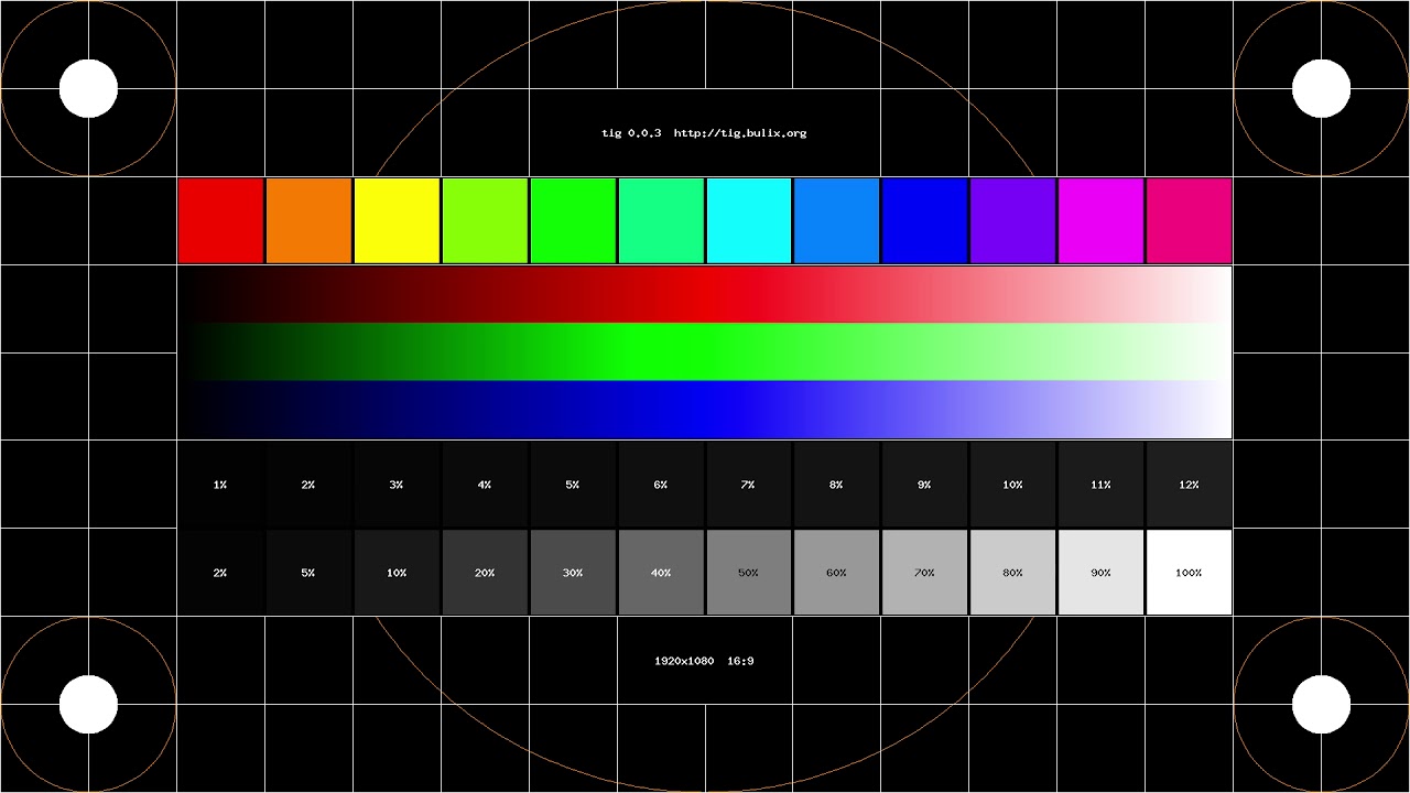
To verify the accuracy of your monitor’s settings, viewing test images is essential. These images are specifically designed to evaluate various aspects of the display, such as color accuracy, contrast, and sharpness. By comparing the test images to their reference versions, you can identify any discrepancies and make further adjustments if necessary.
Finally, it’s essential to ensure that your monitor’s settings are consistent across multiple displays if you’re working on multiple devices. This is particularly important if you’re involved in tasks that require color-critical work, such as graphic design or photo editing. By achieving consistency, you can avoid discrepancies and ensure that your work appears as intended on different screens.
Finding the Calibration Tool
Once you understand the importance of monitor calibration, the next step is to find the right calibration tool for your needs. Fortunately, there are various options available that cater to different budgets and requirements.
Many professional-grade calibration tools are available in the market, designed specifically for photographers, graphic designers, and other professionals who require precise color accuracy. These tools often come with advanced features and capabilities, providing more comprehensive calibration options.
If you’re on a tighter budget, there are also more affordable consumer-grade calibration tools available. While they may not offer the same level of accuracy and advanced settings as professional tools, they can still significantly improve color representation compared to relying solely on your monitor’s factory settings.
Some calibrated displays also come with built-in calibration tools. These monitors often have an on-screen display menu that allows you to access various calibration settings and make adjustments directly. While these built-in tools may not match the precision of dedicated calibration devices, they can still be useful for basic adjustments.
Another option is calibration software. There are both free and paid software options available that utilize your computer’s graphics card to calibrate the display. These software solutions typically provide step-by-step instructions and offer a more flexible and accessible approach to calibration.
When choosing a calibration tool or software, consider factors such as your specific needs, budget, and level of expertise. Professional users or those working in color-critical industries may benefit more from investing in dedicated calibration hardware. Alternatively, casual users or those on a budget can opt for software solutions or more affordable consumer-grade tools.
Before purchasing any calibration tool, it’s also essential to check whether it’s compatible with your operating system and monitor. Most tools and software typically provide compatibility information, ensuring a seamless calibration process.
Additionally, it’s worth considering the support and resources available for the calibration tool. Look for products that offer regular updates, customer support, and comprehensive documentation or video tutorials to assist you throughout the calibration process.
By finding the right calibration tool or software, you can take control over your monitor’s settings and ensure accurate color representation. Remember that calibration is not a one-time process and should be performed periodically to account for any changes in display performance over time.
Adjusting Brightness and Contrast
When calibrating your monitor, one of the essential settings to adjust is brightness. Brightness refers to the intensity of the backlight on your screen, impacting the overall luminance and perceived contrast. Finding the optimal brightness level is crucial for achieving accurate and comfortable visual representation.
Start by accessing the brightness setting in your monitor’s menu, usually found in the on-screen display (OSD) options. Adjust the brightness slider or numerical value to increase or decrease the backlight intensity. It is recommended to set the brightness to a level that provides sufficient visibility without causing eye strain or discomfort.
Keep in mind that the ideal brightness level may vary depending on your environment’s lighting conditions. If you typically work in a dimly lit room, you may prefer a lower brightness level to reduce eye strain. On the other hand, in a well-lit environment, a slightly higher brightness level may be necessary to compensate for ambient light.
Contrast is another critical setting that impacts the differentiation between light and dark areas on your screen. Adjusting contrast ensures that details are visible and accurately represented. Similar to brightness, the contrast setting can usually be found in the monitor’s OSD menu.
Calibrating contrast involves finding the right balance to prevent details from being lost in shadows or highlights. Move the contrast slider or adjust the numerical value to increase or decrease the level of contrast. An ideal contrast setting provides a visually appealing image with clear distinctions between different shades and highlights.
While calibrating brightness and contrast, it’s important to avoid extreme settings. Excessively high brightness can lead to washed-out images and loss of detail, while low brightness can result in overly dark and muddy visuals. Similarly, extreme contrast settings can cause artificial-looking images with crushed blacks or blown-out highlights.
To ensure accuracy, you may utilize various calibration tools and test images to guide you in adjusting the brightness and contrast settings. These tools provide visual references and patterns to help you achieve the desired balance and verify the accuracy of your adjustments.
Remember that calibrating brightness and contrast is not a one-time task. It’s recommended to periodically re-evaluate and readjust these settings, as they can gradually change over time due to factors such as aging displays or environmental conditions.
By carefully adjusting the brightness and contrast settings on your monitor, you can enhance visibility, improve detail representation, and achieve a more accurate and comfortable viewing experience.
Setting the White Balance
White balance is a crucial setting that determines the color temperature of your monitor’s display. It ensures that whites and neutrals appear as pure white without any unwanted color casts, creating a balanced and natural-looking image.
To adjust the white balance, access the monitor’s OSD menu and look for the white balance or color temperature setting. Different monitors may use different terminology, but the concept remains the same. Typically, you’ll have the option to choose between predefined color temperature settings, such as “Cool”, “Normal”, or “Warm”.
The color temperature scales used in monitors often range from cooler blue tones to warmer red or orange tones. Cooler temperatures produce a bluish appearance, while warmer temperatures create a reddish or orange hue.
Generally, the recommended setting is to set the white balance to a temperature that matches the lighting conditions of your environment. If you are working in a room with cool or daylight lighting, choosing a cooler color temperature setting may be more appropriate. On the other hand, for warmer indoor lighting, selecting a warmer color temperature can help counterbalance the effects of the lighting.
It’s important to note that the exact color temperature may vary depending on personal preference and the type of content being displayed. For example, warmer temperatures can enhance the vibrant, cozy feeling of certain images, while cooler temperatures can provide a more modern and crisp appearance.
To ensure accuracy in setting the white balance, some calibration tools or software may offer additional features that allow for more precise adjustment. These tools might include options to fine-tune the RGB (red, green, blue) channels or to manually input specific color temperature values.
It’s worth mentioning that the specific white balance setting may also depend on the color space or color profile being used. If you work in a specific industry that follows standardized color spaces, make sure to choose the appropriate white balance setting for that color space to ensure consistent color reproduction.
Regularly checking and adjusting the white balance is essential, as the lighting conditions in your environment can change over time. Environmental factors such as daylight or artificial light sources can have a significant impact on the overall color temperature.
By setting the white balance appropriately, you can ensure that the colors displayed on your monitor are accurate, neutral, and visually pleasing, contributing to a more realistic and immersive viewing experience.
Adjusting Gamma and Color Temperature
Gamma and color temperature are two important settings that influence the color accuracy and overall visual experience on your monitor. By adjusting these settings, you can achieve more accurate color representation and ensure that your images and content appear as intended.
Gamma refers to the overall brightness distribution curve on the display. It affects how shades of gray transition from dark to light. The correct gamma setting ensures that the tonal representation remains accurate and consistent across different shades.
To adjust the gamma setting, access the monitor’s OSD menu and locate the gamma controls. Many monitors provide preset gamma options, such as 1.8, 2.2, or 2.4. These values represent the power function used to adjust the brightness curve. Lower gamma values like 1.8 result in less contrast between dark and light shades, while higher values like 2.4 produce a more pronounced contrast.
The ideal gamma setting depends on various factors, including personal preference, the specific task at hand, and the color space used. The most commonly recommended setting is 2.2, which generally provides a balanced and accurate representation for general computer use and multimedia content.
Color temperature, on the other hand, determines the overall color balance of your monitor’s display. It quantifies how “warm” or “cool” the colors appear on the screen. Color temperature is measured in Kelvin (K).
In the OSD menu, you’ll typically find options to choose between predefined color temperature settings, such as “Cool”, “Normal”, or “Warm”, which correspond to specific color temperature values. Cooler color temperatures have a bluish tint, while warmer temperatures have a reddish or orange hue.
For most users, a color temperature of around 6500K is considered a standard or “neutral” setting, similar to daylight. However, the optimal color temperature may vary based on personal preference and environmental factors. For example, warm color temperatures can create a cozy and inviting atmosphere, while cooler temperatures can provide a more modern and crisp look.
Some monitors or calibration tools also offer the option to manually adjust the RGB (red, green, blue) channels to fine-tune color temperature. This allows for more precise control over the white point and color balance.
Remember that both gamma and color temperature settings can interact with each other. Adjusting one may impact the perception of the other. Therefore, it’s important to find the right balance when calibrating these settings to achieve accurate color representation.
Regularly evaluating and adjusting the gamma and color temperature settings is advised, as lighting conditions and personal preferences may change over time. By fine-tuning these settings, you can enhance color accuracy, achieve consistent color reproduction, and ensure that your images and content look their best on your monitor.
Calibrating the Target Color Space
Calibrating your monitor to match the target color space is essential for achieving accurate and consistent color representation across various devices and platforms. Different industries and applications often adhere to specific color spaces or color profiles, ensuring that colors appear consistent and predictable across different devices.
To calibrate your monitor to the target color space, you need to determine which color space is most appropriate for your specific needs. Color spaces such as sRGB, Adobe RGB, and DCI-P3 are commonly used in various industries and are supported by most modern monitors.
Access the monitor’s OSD menu and look for color space or color profile settings. Choose the appropriate color space that matches the requirements of your workflow or the output medium you are targeting. Ensure that your monitor supports the selected color space. For example, if you work in photography or graphic design, Adobe RGB may be the preferred color space due to its wider gamut and ability to display more vibrant colors.
Calibrating to the target color space involves adjusting various monitor settings, such as gamma, white balance, and color temperature, to align with the specific color gamut and tonal range defined by that color space. Calibration tools or software can help guide you through this process and ensure accurate adjustments.
It’s important to note that calibrating to a target color space does not change the monitor’s physical capabilities. Instead, it optimizes the monitor’s settings to mimic the color attributes defined by that color space as closely as possible. This ensures that the colors you see on the monitor are consistent with the expected color reproduction on other calibrated devices.
Once you have calibrated to the target color space, it’s advisable to periodically re-evaluate and readjust the monitor settings as environmental factors and display performance may change over time. Regular calibration helps to maintain accurate color representation and ensure consistency in your work.
Additionally, keep in mind that the target color space is not the same as the color profile used for specific files or applications. A color profile is a separate metadata embedded within a file that defines the color characteristics of that specific file. While calibrating to the target color space provides a good foundation, applying appropriate color profiles to individual files ensures accurate color reproduction in different software applications and viewing platforms.
By calibrating your monitor to the target color space, you can ensure that your colors are accurate, predictable, and consistent across different devices, minimizing surprises and ensuring that your work appears as intended.
Fine-Tuning the Color Settings
While adjusting the basic color settings like brightness, contrast, gamma, and color temperature is crucial, some monitors offer additional options to fine-tune the color accuracy and overall visual performance further. Fine-tuning the color settings can help you achieve more precise and customized color representation on your monitor.
One common option for fine-tuning color settings is adjusting the individual color channels, namely red, green, and blue (RGB). This allows you to make minor adjustments to the intensity and balance of each color channel, ensuring accurate color reproduction and eliminating any color biases or inconsistencies.
Access the monitor’s OSD menu and look for options related to RGB or color balance. Some monitors provide sliders or numerical values to adjust the intensity of each channel independently. Experimenting with these settings can help you achieve an optimal balance and accurate color representation.
Another fine-tuning option is saturation, which controls the intensity or richness of colors on the screen. By adjusting the saturation setting, you can make colors appear more vibrant or subdued, depending on your preference or the requirements of your specific workflow.
In some cases, monitors also offer hue adjustment, which allows you to shift the hue of colors slightly. This can be useful for compensating for any color imbalances or correcting specific color tones in certain applications or content.
Keep in mind that when fine-tuning the color settings, it’s important to use reference images or color charts as a guide. These visual aids can help you evaluate the accuracy of your adjustments and ensure that the colors on your monitor match the intended colors as closely as possible.
Additionally, calibration software or colorimeter devices can provide more advanced options for fine-tuning color settings. These tools often come with additional features like advanced color profiling, color matching, and more precise adjustment capabilities.
Remember that fine-tuning the color settings requires a balance between achieving accurate color representation and personal preference. It’s essential to consider the industry or application requirements of your work and the desired visual aesthetic when making these adjustments. Regularly evaluating and fine-tuning the color settings helps ensure that your monitor provides the best possible color accuracy for your specific needs.
Finally, when working with fine-tuned color settings, it’s crucial to ensure consistency across devices. Make sure to compare your monitor’s colors with other calibrated displays or devices to ensure that your work appears consistent regardless of where it is displayed.
By fine-tuning the color settings on your monitor, you can achieve more accurate and customized color representation, enhancing the visual quality and ensuring that your work is displayed as intended.
Verifying Calibration with Test Images
Once you have adjusted and fine-tuned the settings of your monitor, it’s essential to verify the accuracy of the calibration. Test images are specifically designed to assess various aspects of the display, including color accuracy, contrast, sharpness, and other visual parameters.
There are several types of test images available to evaluate the performance of your monitor. One common example is the grayscale test image, which consists of a range of gray shades from pure black to pure white. By examining this image, you can ensure that your monitor displays a smooth transition between different gray levels, without any noticeable banding or abrupt changes in brightness.
Color accuracy can be evaluated using test images that feature a range of colors, gradients, and patterns. These images allow you to assess how well your monitor reproduces different hues, saturation levels, and color transitions. Look for variations in color tones, accurate rendering of skin tones, and the absence of any color casts or unnatural color shifts.
Similarly, image sharpness can be assessed using test images that contain fine lines, text, or intricate patterns. Pay attention to the clarity and crispness of these elements and make sure that the monitor’s settings do not introduce any noticeable blurring or artifacts.
Some common issues to watch out for while verifying calibration include over-sharpening, which can lead to exaggerated textures or halos, or undersaturation, where colors appear dull and muted. On the other hand, oversaturation can result in unrealistic and overly vivid colors.
During the verification process, it’s crucial to view the test images under proper lighting conditions. Ambient lighting can affect your perception of the displayed colors, so ideally, the viewing environment should be well-lit with neutral lighting to provide an accurate assessment.
When comparing the test images to their reference versions, carefully analyze any discrepancies you notice. If you identify any issues, make further adjustments to the monitor’s settings to improve color accuracy, contrast, or sharpness.
Additionally, it’s helpful to periodically re-verify the calibration of your monitor using test images. Over time, display performance can change due to factors such as aging backlights or changes in color temperature. Regular verification helps maintain accurate and consistent color representation.
Remember that accurate calibration is not just limited to the monitor itself. It’s also important to ensure color management and accurate color profiles are applied within your software applications and the operating system, to guarantee consistent color reproduction across devices and platforms.
By verifying the calibration with test images, you can assess the accuracy of your monitor’s settings, identify any potential issues, and make further adjustments if necessary. This ensures that the colors, contrast, and sharpness displayed on your monitor are as accurate and faithful to the original content as possible.
Checking for Consistency with Multiple Displays
While calibrating a single monitor is important, it’s equally crucial to ensure that the colors and visual characteristics remain consistent across multiple displays. This is especially vital if you work on projects that require color-critical work or if you need to share your work with others who may view it on different devices.
Start by comparing your calibrated monitor with other monitors or devices that you have access to. Connect your computer or laptop to the additional displays and evaluate the color representation and overall visual quality.
For consistent color accuracy, it’s important to ensure that the connected displays are also calibrated or at least adjusted to provide a similar color space. Compare the colors, contrast, and overall appearance of the content on each screen to identify any significant differences.
While slight variations between displays are expected due to differences in technology, age, or color calibration, strive to minimize noticeable differences. Differences that are too significant may indicate calibration discrepancies or display limitations that may need addressing.
One effective method to achieve consistency is to use color management tools and color profiles. These tools help to ensure that the colors displayed on different monitors, operating systems, and software applications remain consistent by applying appropriate color transformations and mappings.
Color management systems often rely on color profiles, which are used to describe the color characteristics of a specific device or color space. Ensuring that the correct color profiles are assigned to each display can help maintain consistent color representation across all connected monitors.
For professional color-critical work, hardware calibration tools that allow for multi-monitor calibration can be beneficial. These tools can adjust the color settings on multiple displays simultaneously, ensuring precise and consistent calibration across all connected screens.
Regularly re-evaluate the consistency of your displays, especially after making changes to the settings or adding new monitors. Environmental factors, software updates, and changes in display technology can all affect color accuracy and overall visual consistency.
Collaboration and communication with colleagues or clients are also important when ensuring consistency across multiple displays. Sharing color-managed files, using standard color profiles, and providing instructions for viewing the work can help maintain consistent visual representation.
Lastly, when sharing your work online or viewing it on different devices, keep in mind that not all devices or platforms support color management or accurate color reproduction. Thus, it’s essential to convert your work to appropriate color spaces or export it in a standardized format to achieve consistent display across different devices.
By checking for consistency with multiple displays and implementing color management practices, you can ensure that your work appears as intended, regardless of the display device and platform it is viewed on.