
Choosing the Right Monitor Calibration Tool
When it comes to achieving accurate and consistent colors on your monitor, choosing the right calibration tool is essential. With the myriad of options available, it can be overwhelming to determine which tool is best suited for your needs. In this section, we will discuss the key factors to consider to ensure you select the right monitor calibration tool.
1. Purpose: Consider the intended use of your monitor. Are you a photographer or graphic designer who requires precise color representation? Or are you simply a casual user who wants to enhance the overall visual experience? The purpose of your monitor usage will dictate the level of accuracy and features you need.
2. Calibration Software: Look for a calibration tool that offers comprehensive software. This software should include advanced settings for gamma, contrast, brightness, and color temperature adjustment. Additionally, it should provide options for creating and saving custom profiles.
3. Compatibility: Ensure that the calibration tool is compatible with your monitor. Check if it supports both LCD and LED monitors, as well as the specific model you own. Some tools may have limitations when it comes to compatibility.
4. Ease of Use: Consider the user-friendliness of the calibration tool. Look for tools that offer step-by-step instructions, intuitive interfaces, and automated calibration processes. This will make the calibration process smoother and more accessible to users of all skill levels.
5. Price: Monitor calibration tools come in various price ranges. Determine your budget and find a tool that offers the right balance between price and performance. Keep in mind that more expensive tools often offer advanced features and higher accuracy.
6. Reviews and Reputation: Before making a purchase, read reviews and seek recommendations from professionals or trusted sources. Pay attention to user feedback regarding accuracy of colors, software functionality, and overall satisfaction with the tool.
By considering these factors, you can make a well-informed decision when choosing the right monitor calibration tool. Remember, the accuracy of your monitor’s colors can greatly impact your work and viewing experience, so investing in a high-quality calibration tool is worth it in the long run.
Adjusting the Display Settings on Your Monitor
Once you have chosen the right monitor calibration tool, it’s time to adjust the display settings on your monitor to achieve optimal color accuracy. In this section, we will guide you through the essential steps to calibrate your monitor effectively.
1. Display Mode: Start by selecting the correct display mode on your monitor. Most monitors offer different modes, such as sRGB, Adobe RGB, or Custom. Choose the mode that best suits your needs or follow the recommendations of your calibration tool.
2. Brightness: Adjust the brightness setting to achieve the appropriate level for your environment. It’s important to strike a balance between a brightness level that is comfortable for your eyes and the ability to accurately see shades of dark and light color.
3. Contrast: Set the contrast level to ensure that your monitor can accurately display the difference between light and dark areas. This setting can help enhance the depth and detail of your images or videos.
4. Color Temperature: Adjust the color temperature to achieve the desired warmth or coolness of the display. The standard color temperature is 6500K, which is equivalent to natural daylight. However, you can adjust it according to your personal preferences or the requirements of your work.
5. Color Balance: Use your calibration tool to adjust the color balance or RGB levels. This allows you to fine-tune the red, green, and blue color intensities, ensuring accurate representation of colors on your monitor.
6. Gamma Settings: Gamma refers to the brightness levels of different shades of gray. Adjusting the gamma settings ensures that the variations in brightness are displayed correctly. Most calibration tools offer a target or recommended gamma value to achieve accurate results.
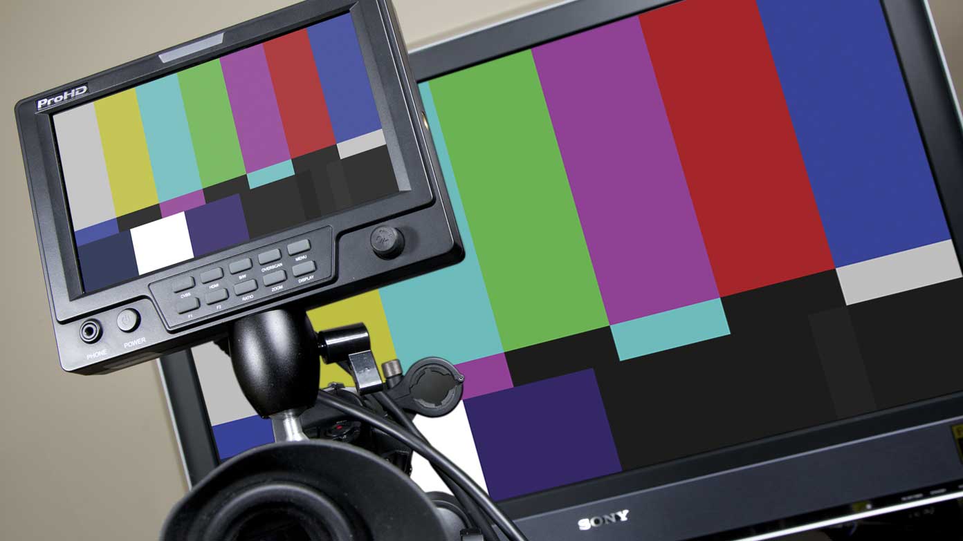
7. Test Patterns: Use the test patterns provided by your calibration tool to verify the changes you have made. These patterns help you identify any discrepancies and make further adjustments if necessary.
Remember to refer to the instructions provided by your calibration tool for specific guidance during the adjustment process. Taking the time to adjust the display settings on your monitor properly will greatly enhance the accuracy and quality of the colors you see on your screen.
Evaluating Your Ambient Lighting
When calibrating your monitor for accurate color representation, it’s crucial to assess and adjust your ambient lighting conditions. The lighting in your environment can greatly impact the perception of colors on your monitor. In this section, we will explore the importance of evaluating your ambient lighting and provide tips for achieving optimal conditions.
1. Natural Light: If possible, position your monitor in a way that minimizes direct exposure to natural light. Sunlight can introduce varying color temperatures and create uneven lighting conditions, affecting the consistency of color representation on your monitor.
2. Room Lighting: Assess the lighting in your workspace and adjust it to a level that is comfortable for your eyes. Avoid harsh or overly bright lighting, as this can create glare and affect your perception of colors. Consider using soft, diffused lighting sources to achieve a more balanced and uniform illumination.
3. Color Temperature: Evaluate the color temperature of your ambient lighting. Ideally, aim for a neutral white light with a color temperature of around 5000K to 6500K, which closely resembles natural daylight. Any extreme color temperature, such as overly warm or cool lighting, can distort your perception of colors.
4. Color Accuracy: Use color reference materials, such as color swatches or prints, to compare the colors on your monitor to real-world objects under the ambient lighting conditions. This will help you identify any color shifts or discrepancies and make necessary adjustments during the calibration process.
5. Lighting Control: If feasible, consider implementing lighting control measures in your workspace to minimize the influence of external lighting sources. This can include the use of curtains or blinds to block out excessive natural light or the installation of adjustable task lighting to provide adequate illumination without causing glare.
6. Monitor Hood or Shield: To further reduce the impact of ambient lighting, consider using a monitor hood or shield. These accessories help prevent stray light from falling directly onto the screen, enhancing the overall color accuracy and reducing the influence of surrounding lighting conditions.
By carefully evaluating your ambient lighting and making necessary adjustments, you can create a controlled environment for accurate color calibration of your monitor. Remember to regularly re-evaluate and adapt your lighting conditions as the external factors, such as the time of day or season, can affect the ambient lighting in your workspace.
Setting the Color Temperature
The color temperature of your monitor plays a significant role in the overall color accuracy and appearance of your display. The color temperature refers to the warmth or coolness of the white light emitted by your monitor. In this section, we will discuss the importance of setting the color temperature correctly and provide guidance on how to achieve the desired result.
Understanding Color Temperature: Color temperature is measured in Kelvin (K). Lower color temperatures, such as 3000K, result in warm, yellowish-tinged light, while higher color temperatures, like 6500K, produce cooler, bluish-white light. It’s important to note that the color temperature can have a significant impact on how colors are perceived on your monitor.
Consider Your Intended Use: The appropriate color temperature for your monitor depends on the nature of your work and personal preferences. For tasks that require accurate color representation, such as photo editing or graphic design, a color temperature of around 6500K (also known as D65) is often recommended as it closely resembles natural daylight. However, for tasks where warmer or cooler tones enhance the visual experience, such as watching movies or gaming, you may prefer adjusting the color temperature accordingly.
Adjusting the Color Temperature: Most monitors offer built-in settings to adjust the color temperature. You can typically access these settings in the on-screen display (OSD) menu of your monitor. Look for options like “Color Temperature” or “White Point” and experiment with different presets, such as “Warm,” “Normal,” or “Cold,” to find the desired color temperature.
Calibration Tools: If you have a monitor calibration tool, it often includes the ability to set and adjust the color temperature. This allows for more precise control and customization of the color temperature to suit your needs. Follow the instructions provided by your calibration tool to fine-tune the color temperature to your preference.
Consider Ambient Lighting: Take into account the ambient lighting conditions in your workspace when setting the color temperature. While a color temperature of 6500K is recommended for accurate color representation, you may need to make slight adjustments based on the lighting conditions. For instance, if you have warmer ambient lighting, you might prefer a slightly cooler color temperature to maintain color balance.
Verifying Color Accuracy: After adjusting the color temperature, use color reference materials or images with known color accuracy to verify the results. Compare the colors on your monitor to these references under the intended lighting conditions to ensure accurate representation.
By setting the color temperature correctly, you can enhance the overall viewing experience and ensure more accurate color representation on your monitor. Experiment with different color temperatures to find the one that best suits your needs and provides the desired aesthetic and color accuracy.
Adjusting the Brightness and Contrast
Properly adjusting the brightness and contrast settings on your monitor is crucial for achieving optimal visual clarity and enhancing the overall viewing experience. In this section, we will delve into the significance of adjusting these settings correctly and provide guidance on how to achieve the desired results.
Understanding Brightness: The brightness setting determines the intensity of the backlight on your monitor. Finding the right balance is essential, as an excessively high brightness can cause eye strain, while a low brightness can result in a dull and difficult-to-read display.
Adjusting Brightness: Start by setting your monitor’s brightness to a level that is comfortable for your eyes in your current ambient lighting. Avoid brightness levels that are too high, as they can lead to eye fatigue. Similarly, avoid levels that are too low, as they may affect the visibility of details and colors in your content. Fine-tune the brightness based on your preferences and lighting conditions.
Understanding Contrast: Contrast refers to the difference between the brightest and darkest areas on your monitor. A higher contrast ratio can enhance image depth and detail, while a lower contrast ratio can lead to a flatter and less vibrant display.
Adjusting Contrast: Find the optimal contrast level that suits your visual preferences and the type of content you’re viewing. Most monitors have a preset contrast setting, often labeled as “standard” or “default.” However, you may also have the option to manually adjust the contrast according to your liking. Experiment with different settings to achieve the desired balance between vibrant colors and visibility of details.
Fine-Tuning: After adjusting the brightness and contrast settings, refer to visual test patterns, images, or videos with known color accuracy and various levels of brightness and contrast. This enables you to verify that the adjustments you made result in accurate representation and retain the visual integrity of the content.
Ambient Lighting Considerations: Keep in mind that the ambient lighting conditions in your workspace can affect your perception of brightness and contrast. For example, brighter ambient lighting may require adjusting your monitor’s brightness slightly higher, while dimmer lighting might necessitate lower brightness settings.
Regular Reassessment: Over time, the lighting conditions in your environment may change, and your eyes may become more sensitive to bright or dim displays. It’s advisable to periodically reevaluate and readjust the brightness and contrast settings on your monitor to maintain optimal visual comfort and quality.
By carefully adjusting the brightness and contrast settings on your monitor, you can enhance visual clarity, detail, and color accuracy, thus enriching your viewing experience across various types of content.
Calibrating the Gamma Settings
Calibrating the gamma settings on your monitor is an important step in achieving accurate and consistent color representation. Gamma refers to the relationship between the luminance levels of different shades of gray. In this section, we will discuss the significance of calibrating the gamma settings and provide guidance on how to accomplish this effectively.
Understanding Gamma: Gamma is a measure of the brightness levels at which colors are displayed on your monitor. The gamma value determines how shades of gray are distributed across the luminance spectrum. The standard gamma value for most monitors is 2.2, which provides a balanced representation of colors.
Calibration Tools: Utilize a calibration tool or software that includes the option to adjust gamma settings. This will provide more accurate and precise control over the gamma value you desire. Follow the instructions provided by your calibration tool to perform the calibration process effectively.
Gamma Target: Determine the target gamma value that best suits your needs and preferences. While the standard gamma value of 2.2 is widely used and recommended, certain tasks or personal preferences may require adjustments. For example, photo editing or graphic design work may benefit from a gamma value closer to 2.4 for more accurate shadow details.
Test Patterns: Use the test patterns provided by your calibration tool to evaluate the gamma settings on your monitor. These patterns consist of gray squares that gradually transition from black to white. They allow you to assess the smoothness and accuracy of the gamma curve on your display.
Adjusting Gamma: Based on the test patterns and recommended gamma value, adjust the gamma settings in your monitor’s OSD menu or calibration software. Some monitors only provide gamma presets, such as 1.8, 2.0, and 2.2, while others allow custom gamma adjustments. Experiment with different settings until you achieve a gamma curve that aligns with your target value.
Validation: After making adjustments, reassess the test patterns and compare them to the desired gamma curve. Look for smooth transitions between shades of gray without noticeable jumps or inconsistencies. Additionally, preview your own images or graphics to verify that the calibrated gamma settings accurately represent the intended colors and details.
Ambient Lighting: Consider the ambient lighting conditions in your workspace when adjusting the gamma settings. Lighting can impact the perception of brightness and contrast, which can affect the appearance of gamma as well. It may be necessary to make slight adjustments to compensate for different lighting conditions.
By calibrating the gamma settings on your monitor, you ensure that the luminance levels and color representation are accurately displayed. This leads to more consistent and predictable results when working with images, videos, and other visual content.
Adjusting the RGB Levels
Adjusting the RGB levels on your monitor is an essential step in achieving accurate color representation and ensuring proper color balance. RGB refers to the primary colors – red, green, and blue – that combine to create a wide spectrum of colors. In this section, we will explore the significance of adjusting the RGB levels and provide guidance on how to accomplish this effectively.
Understanding RGB Levels: Each color channel in your monitor, represented by red, green, and blue, has its own intensity level. By adjusting these levels, you can precisely control the amount of each color displayed on your screen.
Color Balance: The RGB levels determine the color balance on your monitor. An improper balance can result in skewed colors and inaccurate representation. It is crucial to adjust the RGB levels to achieve a neutral and balanced color output.
Calibration Tools: Use a calibration tool or software that allows you to adjust the individual RGB levels. This will provide you with more control and precision in achieving the desired color balance. Follow the instructions provided by your calibration tool to perform the calibration process effectively.
White Point: Start by adjusting the RGB levels to achieve a neutral white point. Display a white image or use the white balance feature of your calibration tool to guide you in adjusting each color channel. Aim to eliminate any visible color tints and achieve a pure white appearance.
Color Accuracy: Utilize color reference materials, such as color swatches or reference images, to verify the accuracy of the adjusted RGB levels. Compare the colors on your monitor to these references under the intended lighting conditions to ensure proper color reproduction and balance.
Fine-Tuning: After adjusting the white point and color balance, assess different types of content, including images, graphics, and videos, to evaluate the overall color accuracy. Pay attention to skin tones, saturated colors, and subtle color details to ensure they are rendered correctly.
Validation: Use a variety of test images or graphics that cover a wide range of hues and shades. Look for smooth transitions, accurate color reproduction, and a balanced representation of colors. Make additional adjustments as necessary to achieve the desired results.
Ambient Lighting: Take into account the ambient lighting conditions in your workspace when adjusting the RGB levels. Lighting can influence the perception of color, so it may be necessary to make slight adjustments to compensate for different lighting conditions.
By adjusting the RGB levels on your monitor, you can achieve accurate color representation and ensure a properly balanced output. This enhances the overall visual experience and provides more reliable results when working with images, graphics, and other color-critical content.
Verifying the Calibration Results
After calibrating your monitor, it is essential to verify the results to ensure that you have achieved accurate and consistent color representation. Verifying the calibration helps confirm that the adjustments made have effectively improved the color accuracy on your monitor. In this section, we will explore the significance of verifying calibration results and provide guidance on how to conduct this process effectively.
Test Images: Utilize test images specifically designed to assess color accuracy and calibration results. These images often consist of various color patches, gradients, and fine details that allow you to evaluate how well your monitor represents different shades, hues, and details.
Color Accuracy Check: Examine the test images for accurate color reproduction. Compare the colors on your monitor to known reference colors or color samples to ensure that they appear as intended. Look for any noticeable color shifts, inaccuracies, or inconsistencies that may indicate calibration issues.
Gray Scale Check: Evaluate the gray scale in the test images to assess the smoothness and consistency of the tonal range on your monitor. Ensure that the shades of gray transition smoothly without any noticeable banding or abrupt changes in brightness levels.
Black Level and Shadow Detail: Pay attention to the black level and shadow detail representation. Dark areas should exhibit depth and detail without appearing crushed or lacking definition. Check for any loss of detail or excessive noise in the shadow regions.
White Level and Highlight Detail: Evaluate the white level and highlight detail representation. Whites should appear pure and clean without any visible color tints or overexposure. Ensure that there is an appropriate amount of detail in the brightest areas without any loss of information.
Consistency Across Applications: Test your monitor’s calibration across different applications, such as image editing software, video players, and web browsers. Check if the calibrated colors and settings remain consistent across these applications. Inconsistencies may indicate color management issues or conflicts with color profiles.
Regular Reassessment: Regularly verify and reassess the calibration results to ensure continued accuracy. Monitor characteristics may change over time, and external factors such as lighting conditions may affect the perception of colors. It is advisable to periodically recalibrate and verify to maintain consistent color representation.
Professional Tools: Consider using professional calibration and validation tools to obtain more precise and comprehensive results. These tools offer advanced features and extensive test patterns that can help you evaluate the accuracy of your monitor’s calibration in detail.
By verifying the calibration results, you can have confidence in the accuracy and consistency of color representation on your monitor. This ensures reliable and predictable results when working with images, videos, and other visual content.
Creating a Color Profile
Creating a color profile for your monitor is an important step in achieving accurate and consistent color representation across different platforms and devices. A color profile provides a standardized description of how your monitor displays colors. In this section, we will explore the significance of creating a color profile and guide you through the process effectively.
Calibration Tool Software: Use a calibration tool software that includes the option to create a color profile. This feature allows you to generate a custom profile that accurately describes the color characteristics and behavior of your monitor.
Target Gamma and White Point: Set your desired target gamma value, white point, and other calibration settings before creating the color profile. These settings form the foundation of your color profile and ensure that the colors are calibrated to your specific requirements.
Profile Creation Process: Follow the instructions provided by your calibration tool to create the color profile. The software will typically guide you through a series of test patterns and measurements to collect data about your monitor’s color behavior.
Display Colorimeter: Use a display colorimeter, a hardware device that accurately measures the color output of your monitor, during the profile creation process. The colorimeter captures and analyzes the spectral data to create an accurate profile specific to your monitor.
Verification and Validation: After creating the color profile, verify its accuracy by comparing it to known color standards or reference materials. Test the profile across various applications, images, and graphics to ensure that colors are accurately displayed according to your calibration settings.
Embedding and Activating the Profile: Once the color profile is created and verified, embed it into your computer’s color management system. Activate the color profile to ensure that it is applied to your monitor whenever it is used. This allows the system and applications to apply the correct color adjustments based on the profile.
Profile Portability: If you work with multiple monitors or use different devices, it is crucial to have consistent color profiles across all screens. Save and export your custom color profile to easily transfer it between devices and maintain color consistency across your workflow.
Regular Profile Updates: Periodically reassess and update your color profile to accommodate changes in your monitor’s behavior, environmental conditions, or personal preferences. Regularly calibrating and updating your profile ensures ongoing accurate color representation.
Professional Calibration Services: If you require precise and highly accurate color profiles, consider employing professional calibration services that use advanced equipment and techniques to create custom profiles tailored to your specific needs.
Creating a color profile is crucial for obtaining accurate and consistent color representation on your monitor. By following the proper process and periodically updating your profile, you can ensure reliable and predictable results when working with various visual content.