
Benefits of Using a Typographic Ruler in Desktop Publishing
A typographic ruler is an essential tool for anyone involved in the world of desktop publishing. It offers a multitude of benefits that can greatly enhance your design process and overall output. Let’s explore some of the key advantages:
- Precision and Accuracy: One of the main benefits of using a typographic ruler is the ability to achieve precise and accurate measurements. Whether you need to determine font sizes, line heights, or spacing between elements, a typographic ruler allows you to make exact measurements, ensuring consistent and professional-looking designs.
- Improved Typography: Typography plays a crucial role in design, and a typographic ruler can greatly assist in achieving optimal typography. By using the ruler, you can easily measure and align text elements, ensuring proper spacing, line breaks, and alignment. This not only enhances readability but also creates a cohesive and visually appealing layout.
- Efficient Workflow: When working on desktop publishing projects, time is of the essence. A typographic ruler enables you to work more efficiently by providing quick reference points and measurement indicators. You can easily align and position elements on the page, eliminating the need for guesswork and manual adjustments.
- Consistency: Consistency is key in any design project. A typographic ruler helps to maintain consistency in font sizes, line heights, and overall layout. With precise measurements at your disposal, you can ensure that all elements are proportionally aligned and properly spaced, resulting in a cohesive and polished final product.
- Enhanced Visual Hierarchy: Visual hierarchy is instrumental in guiding the viewer’s attention and conveying information effectively. A typographic ruler aids in creating a clear visual hierarchy by allowing you to determine the appropriate font sizes for headings, subheadings, and body text. This ensures that important information stands out while maintaining a harmonious visual flow.
These are just a few of the benefits that come with using a typographic ruler in desktop publishing. It empowers you to create designs with precision, efficiency, and consistency. By incorporating this tool into your workflow, you can elevate the quality of your designs and make a lasting impression.
Understanding the Basics of Typographic Ruler
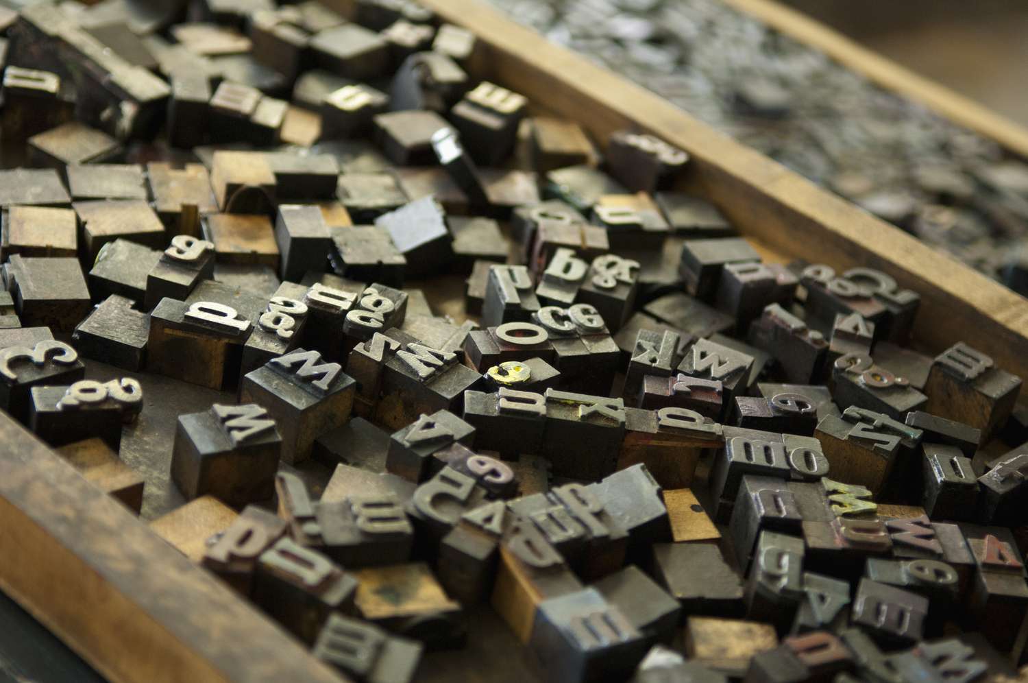
A typographic ruler is a specialized tool used in desktop publishing to measure, align, and design typography with precision. It is a versatile instrument that helps designers create aesthetically appealing and well-balanced layouts. Here is a closer look at the basics of a typographic ruler:
- Measurement Units: Typographic rulers usually come with both inches and picas as the primary measurement units. Inches are commonly used for overall page layout, while picas are ideal for measuring typographic elements such as font size and line heights.
- Scale and Incremental Markings: A typographic ruler typically features a scale, indicating different increments ranging from 1 to 6 picas. Each increment is further divided into smaller units, allowing for precise measurements. These markings provide a visual reference and aid in aligning elements accurately.
- Baseline and X-Height Guide: The baseline is the imaginary line upon which most characters in a text rest. A typographic ruler may include a baseline guide to help you align the text elements consistently. Additionally, there may be an X-height guide, indicating the height of lowercase letters without ascenders or descenders.
- Leading Indicator: Leading refers to the vertical spacing between lines of text. Some typographic rulers feature a leading indicator, allowing you to measure and adjust the line height accurately. This helps in achieving proper spacing and preventing text from appearing cramped or too widely spaced.
- Paragraph Width Guide: A paragraph width guide is a useful feature found on certain typographic rulers. It helps you determine the optimal line length for readability by indicating the ideal width range for a block of text. This guide assists in creating balanced and visually appealing paragraphs.
Understanding the basics of a typographic ruler is essential for harnessing its full potential in desktop publishing. By familiarizing yourself with its measurement units, scale and markings, baseline and X-height guides, leading indicator, and paragraph width guide, you can utilize the ruler effectively to create visually captivating and well-structured typography in your designs.
How to Choose the Right Typographic Ruler for Your Needs
Choosing the right typographic ruler is crucial for achieving accurate measurements and precise typography in your desktop publishing projects. Consider the following factors to ensure you select the ruler that best suits your needs:
- Measurement Units: Decide whether you prefer a ruler that primarily uses inches or picas. Consider the conventions of your industry and the software you are using to determine the most suitable measurement unit for your projects.
- Material and Durability: Typographic rulers are available in various materials such as plastic, aluminum, or stainless steel. Plastic rulers are lightweight but may be less durable. Meanwhile, metal rulers offer sturdiness and longevity. Choose a material that balances portability and durability according to your requirements.
- Length and Size: Typographic rulers come in different lengths, ranging from 6 inches to 18 inches or more. Consider the size of the projects you typically work on and choose a ruler length that allows you to measure and align elements comfortably.
- Clear and Accurate Markings: Ensure that the ruler you choose has clear and legible markings. Look for rulers with precise incremental divisions and well-defined scale indicators. The markings should be visible and easy to read, even in different lighting conditions.
- Additional Features: Some typographic rulers offer extra features like baseline guides, X-height indicators, and paragraph width guides. Assess your specific needs and determine whether these additional features would be beneficial for your typography and design workflow.
- Brand and Reputation: Consider reputable brands that have a track record of producing high-quality typographic rulers. Read customer reviews and ratings to get insights into the ruler’s performance, durability, and accuracy.
- Price: Keep your budget in mind when choosing a typographic ruler. While quality is important, there are options available at various price points. Assess the features and durability in relation to the cost to make an informed decision.
By considering factors such as measurement units, material and durability, length and size, clear and accurate markings, additional features, brand reputation, and price, you can confidently select the right typographic ruler that will enhance your desktop publishing workflow and help you achieve professional, precise, and visually appealing typography in your designs.
Getting Familiar with the Functions and Markings on a Typographic Ruler
A typographic ruler is a versatile tool that offers various functions and markings to aid in accurate measurement, alignment, and typography. Familiarizing yourself with these functions and markings is essential for effectively utilizing a typographic ruler in your desktop publishing projects:
- Measurement Units: Typographic rulers typically have measurement units in both inches and picas. Familiarize yourself with the values and increments of each unit to ensure accurate measurements and consistency throughout your design.
- Scale and Incremental Markings: The ruler usually has a scale indicating the size of the increments. Depending on the ruler, the scale may have divisions ranging from 1 to 6 picas. These incremental markings allow you to measure precisely and align elements with accuracy.
- Baseline Guide: The baseline is the imaginary line upon which most characters rest. Some typographic rulers have a baseline guide, providing a reference line to align the base of your text consistently. This ensures balanced and visually appealing typography.
- Leading Indicator: Leading refers to the vertical spacing between lines of text. Certain typographic rulers include a leading indicator, allowing you to measure and adjust the line height accurately. This feature ensures proper spacing and avoids text appearing cramped or too widely spaced.
- X-Height Guide: The x-height is the height of lowercase letters without ascenders or descenders. Some rulers have an x-height guide, indicating this measurement as a reference. Utilize this guide to maintain consistent x-heights in your typography.
- Paragraph Width Guide: Certain typographic rulers provide a paragraph width guide, indicating the optimal line length for readability. This guide helps you determine the appropriate width range for paragraphs, ensuring an aesthetically pleasing layout.
- X-Axis and Y-Axis Alignment: A typographic ruler often features alignment lines along the X-axis and Y-axis. These lines assist in positioning and aligning elements accurately, ensuring a cohesive and well-structured design.
- Other Miscellaneous Markings: Some rulers may have additional markings to aid in specific design tasks, such as spacing indicators, kerning guides, or vertical alignment markers. Explore these markings and understand their purpose for greater design precision.
By getting familiar with the functions and markings on a typographic ruler, you can take full advantage of this tool’s capabilities. Utilize the measurement units, scale, baseline guide, leading indicator, x-height guide, paragraph width guide, alignment lines, and other markings to achieve accurate typography, consistent alignment, and visually pleasing designs in your desktop publishing projects.
Using a Typographic Ruler for Accurate Font Sizes and Line Heights
A typographic ruler is an invaluable tool for achieving precise font sizes and line heights in your desktop publishing projects. By utilizing this tool effectively, you can ensure consistent and visually appealing typography. Here’s how to use a typographic ruler for accurate font sizes and line heights:
- Font Size Measurement: Use the ruler to measure the font size of your text accurately. Align the ruler with the baseline of the text and read the measurement in picas or inches. This allows you to maintain consistency in font sizes throughout your design.
- Baseline Alignment: Align the ruler’s baseline guide with the baseline of your text to establish a consistent baseline in your design. This ensures that the text is aligned properly and prevents it from appearing slanted or disjointed.
- Line Height Measurement: Determining the appropriate line height is crucial for readability. With the ruler’s leading indicator, measure the distance between baselines to achieve consistent and balanced line heights. This helps to avoid text that is too tightly packed or overly spaced out.
- Vertical Spacing: Utilize the ruler to establish equal spacing between lines of text or paragraphs. This can be achieved by using the leading indicator or by measuring the distance between baselines to ensure uniformity and readability in your design.
- Text Alignment: A typographic ruler can help you align text horizontally on the page. By using the ruler’s X-axis alignment lines, you can ensure that the left or right edges of the text align correctly with other elements in the layout.
- Consistent Hierarchy: When working with headings, subheadings, and body text, a typographic ruler enables you to establish consistent font sizes and line heights. This creates a clear and visually pleasing hierarchy within your typography, enhancing readability and overall design cohesion.
- Adjusting Typography: If you need to make adjustments to font sizes or line heights, the ruler allows you to measure and modify them accurately. By referencing the ruler, you can make precise adjustments to achieve the desired typography and ensure uniformity in your design.
By utilizing a typographic ruler for accurate font sizes and line heights, you can maintain consistency, readability, and visual harmony in your desktop publishing projects. Take advantage of the ruler’s font size measurement, baseline alignment, line height measurement, vertical spacing, text alignment, consistent hierarchy, and adjustment capabilities to elevate your typography and create polished and professional designs.
Aligning Text and Elements Easily with a Typographic Ruler
A typographic ruler serves as an essential tool for aligning text and elements accurately in your desktop publishing projects. With its precise measurements and alignment features, the ruler simplifies the process of achieving a visually balanced and harmonious design. Here’s how to use a typographic ruler to align text and elements seamlessly:
- Baseline Alignment: Align the baseline of your text with the ruler’s baseline guide. This ensures that the text is consistently aligned horizontally, creating a cohesive and professional look.
- Vertical Alignment: The typographic ruler can assist in aligning text vertically. Use the ruler’s leading indicator or measure the distance between baselines to achieve consistent vertical spacing and alignment between lines of text or elements in your design.
- Text Blocks and Columns: When working with multiple columns or text blocks, the ruler aids in aligning them evenly. Use the ruler to measure the width of each column or text block, ensuring they are of equal size and aligned properly.
- Alignment with Grid Systems: If you are working with a grid system in your design, the ruler becomes even more useful. Align elements, including text and images, to the grid using the ruler’s incremental markings. This creates a structured and balanced layout.
- Image Placement: The ruler can help you align images with text or other visual elements. Measure the distance between the image and surrounding elements to achieve consistent margins and spacing within your design.
- Text-to-Element Alignment: When aligning text with other elements, such as graphics or shapes, utilize the ruler for precise alignment. Measure the distance between the edge of the text and the adjacent element to ensure even spacing and alignment throughout your design.
- Consistent Margins and Padding: Achieve uniform margins and padding by using the ruler to measure and align elements accordingly. This creates a visually balanced composition and enhances the overall aesthetics of your design.
By utilizing a typographic ruler for aligning text and elements, you can achieve a well-organized and visually pleasing layout in your desktop publishing projects. The ruler’s alignment features, such as baseline alignment, vertical alignment, grid system alignment, image placement, text-to-element alignment, and consistent margins and padding, allow you to create designs with precision and balance.
Enhancing Typography Hierarchy and Grid Systems with a Typographic Ruler
A typographic ruler is an invaluable tool for enhancing the typography hierarchy and grid systems in your desktop publishing projects. It helps you establish a visually appealing and structured layout that guides the reader’s attention. Here’s how you can use a typographic ruler to enhance typography hierarchy and grid systems:
- Determining Font Sizes: Use the ruler to measure the font sizes of different text elements, such as headings, subheadings, and body text. This ensures consistency and hierarchy in the typography, allowing you to create a clear visual distinction between different levels of information.
- Vertical Spacing: Measure and adjust the line heights using the ruler’s leading indicator to establish appropriate vertical spacing. This enhances the readability and hierarchy of your typography, ensuring that the different text elements are visually separated and easy to follow.
- Aligning with Grid Systems: The ruler’s incremental markings and scale make it an ideal tool for working with grid systems. Use the ruler to align text, columns, images, and other elements to the grid, creating a structured and balanced layout.
- Column Width and Gutters: The ruler assists in determining the width of columns and the space between them (gutters) within a grid system. Measure and adjust the widths and gutters using the ruler to maintain consistency and balance in your design.
- Baseline Alignment: Align the baselines of different text elements to create a cohesive and visually pleasing hierarchy. The ruler’s baseline guide allows you to easily align the text elements, ensuring they are consistently positioned and visually connected.
- Margin and Padding Alignment: Utilize the ruler to measure and align margins and padding within your grid system. This ensures consistent spacing and alignment throughout your design, contributing to an organized and professional appearance.
- Vertical Alignment of Elements: Use the ruler to align elements such as images, icons, or graphics with the baseline or x-height of the adjacent text. This enhances the vertical consistency and hierarchy of your design, keeping the elements visually connected.
- Consistent Text-to-Element Spacing: When incorporating text with other visual elements, such as images or shapes, utilize the ruler to measure and maintain consistent spacing. This ensures a balanced composition and prevents text from appearing cramped or too far apart from the associated elements.
By incorporating a typographic ruler into your workflow, you can enhance typography hierarchy and grid systems in your desktop publishing projects. The ruler’s functions, including determining font sizes, vertical spacing adjustments, alignment with grid systems, baseline alignment, margin and padding alignment, vertical alignment of elements, and consistent text-to-element spacing, empower you to create visually appealing designs with a well-structured hierarchy and layout.
Tips and Tricks for Efficiently Using a Typographic Ruler in Desktop Publishing
Using a typographic ruler effectively can greatly enhance your efficiency and accuracy in desktop publishing. Here are some valuable tips and tricks to help you make the most of this essential tool:
- Practice Consistency: Develop a consistent approach when using the ruler throughout your design process. This includes consistent units of measurement, alignment techniques, and application of spacing. Consistency will streamline your workflow and create harmonious designs.
- Exploring Grid-based Layouts: Familiarize yourself with grid-based layouts and how a typographic ruler can help align elements to the grid system. Utilizing grids can save time and effort in positioning and maintaining consistency within your design.
- Combine with Other Design Tools: Utilize the typographic ruler in conjunction with other design tools such as grid systems, layout templates, and style guides. These complementary tools will further enhance your efficiency and improve the overall consistency of your designs.
- Master Shortcuts: Learn keyboard shortcuts to quickly access measurement tools, alignment options, and other design functions. This will allow you to work more efficiently and reduce the reliance on manual measurements with the ruler.
- Experiment with Different Markings and Features: Take the time to explore and understand the various markings and features on your typographic ruler. Experiment with utilizing additional features such as baseline guides, x-height indicators, or paragraph width guides to elevate your typographic precision.
- Use Proper Lighting: Ensure adequate lighting conditions when using the ruler. Proper lighting will enhance the visibility of the ruler’s markings and help you make more accurate measurements and alignments.
- Leverage Optical Alignment: Train your eye to align elements based on visual cues rather than relying solely on the ruler. This will allow you to quickly assess and make adjustments based on visual balance and proportions.
- Save Templates and Presets: Create templates or presets for common typographic styles and layouts. This will enable you to quickly apply consistent typographic settings, saving time and effort when working on similar projects in the future.
- Seek Inspiration and Learning: Continuously learn and seek inspiration from other designers. Explore typography books, online resources, and design communities to enhance your knowledge and discover new techniques for using a typographic ruler efficiently.
- Regular Maintenance: Keep your typographic ruler clean and in good condition. Regularly check for any damage or wear that may affect its accuracy. Proper maintenance ensures reliable measurements and consistent results.
By implementing these tips and tricks, you can maximize the efficiency and effectiveness of using a typographic ruler in your desktop publishing workflow. These strategies will not only save you time but also help you create polished and visually appealing designs that communicate your message effectively.
Common Mistakes to Avoid When Using a Typographic Ruler
While a typographic ruler is a valuable tool in desktop publishing, it’s important to be aware of common mistakes that can hinder its effectiveness. By avoiding these mistakes, you can ensure accurate measurements and alignments, resulting in professional-looking designs. Here are some common mistakes to avoid when using a typographic ruler:
- Inconsistent Measurement Units: Using different measurement units within a project can lead to inconsistencies. Be mindful of using either inches or picas consistently throughout your design to maintain accuracy and cohesion.
- Ignoring Baseline Alignment: Neglecting to align your text with the ruler’s baseline guide can result in inconsistent and visually disjointed typography. Ensure that the baselines of your text elements are consistently aligned to create a harmonious layout.
- Inaccurate Font Size Measurements: Failing to measure font sizes accurately can lead to inconsistencies in your typography hierarchy. Make sure to align the ruler properly and measure font sizes precisely for a well-balanced and visually appealing design.
- Disregarding Line Height: Neglecting to adjust line heights can result in cramped or overly spaced-out text, impacting readability. Use the leading indicator on the ruler to measure and adjust line heights consistently throughout your design.
- Forgetting to Reference the Grid System: If you are working with a grid system, it’s essential to reference it regularly. Failing to align elements to the grid can result in a layout that lacks structure and visual clarity.
- Overlooking Visual Imbalance: Relying solely on numerical measurements from the ruler without considering visual balance can lead to an unappealing design. Train your eye to assess the visual harmony of your layout, making adjustments based on what looks right rather than just relying on measurements.
- Not Utilizing Additional Ruler Features: Some rulers come with additional features such as baseline guides or x-height indicators. Failing to utilize these features can result in missed opportunities for precise alignment and inconsistency in your design.
- Overcomplicating with Excessive Measurements: While precision is important, overcomplicating your design process with excessive measurements can hinder your workflow. Use measurements where necessary, but also trust your intuition and rely on visual balance for the best results.
- Neglecting Regular Maintenance: A typographic ruler needs proper care to maintain its accuracy. Neglecting regular cleaning and maintenance can lead to wear and tear, affecting the ruler’s markings and ultimately impacting the precision of your measurements.
- Not Seeking Feedback: Avoid the mistake of not seeking feedback from others. Show your work to colleagues or peers and ask for their input. Fresh perspectives can help identify any alignment or typographic issues that may have gone unnoticed.
By avoiding these common mistakes, you can make the most out of your typographic ruler and produce designs that are accurate, visually balanced, and engaging. Stay mindful of these pitfalls to ensure your typography and layout meet professional standards and effectively communicate your message.
Exploring Advanced Techniques with a Typographic Ruler
Once you have mastered the basic functions of a typographic ruler, you can begin to explore advanced techniques to elevate your typography and design skills in desktop publishing. These techniques can help you push the boundaries of creativity and achieve more sophisticated and visually compelling results. Here are some advanced techniques to explore with a typographic ruler:
- Creating Complex Grid Systems: Use the ruler to establish more complex grid systems that go beyond basic column layouts. Experiment with diagonal grids or asymmetric grid structures to add visual interest and unique compositions to your designs.
- Exploring Modular Typography: Combine the ruler with modular typography techniques to create visually striking and modular designs. Utilize the ruler to align and space modular elements, creating dynamic and flexible typography layouts.
- Integrating Non-Linear Typography: Break away from traditional linear typographic layouts and experiment with non-linear typography. Use the ruler to measure and align text along curved or irregular paths, creating innovative and attention-grabbing designs.
- Implementing Distorted Typography: Challenge the conventional rules of typography by intentionally distorting or altering letterforms. The ruler can aid in maintaining consistency and alignment even in distorted typography, allowing you to create unconventional and visually captivating designs.
- Playing with Contrast and Scale: Experiment with contrast and scale in your typographic designs to create visual impact. Use the ruler to measure and adjust font sizes, line heights, and spacing, allowing you to emphasize certain elements and create a more dramatic typographic hierarchy.
- Mixing Typefaces and Styles: Use the ruler to achieve precise alignment and spacing when combining different typefaces and styles. Measure the distance between contrasting fonts to ensure harmonious and visually balanced typography.
- Creating Optical Illusions: Utilize the ruler’s measurements and alignment to create optical illusions in your typographic designs. Experiment with shape layouts and alignments to create visually intriguing illusions that captivate and engage the viewer.
- Designing Customized Typography: With the ruler’s precise measurements, create custom typography by hand-drawing or digitally manipulating letterforms. Use the ruler to establish consistent proportions and alignment, resulting in unique and personalized typographic designs.
- Pushing Typographic Hierarchy: Use the ruler to experiment with unconventional typographic hierarchies, such as playing with disproportionate font sizes, spacing, and alignments. Push the boundaries of traditional hierarchy to create unexpected and visually arresting designs.
- Exploring 3D Typography: Combine the ruler with 3D design techniques to create three-dimensional typographic designs. Use the ruler to align text in space, measure depth, and create precise visual relationships between different elements in your 3D typography.
By exploring these advanced techniques with a typographic ruler, you can unlock your creative potential and push the boundaries of typographic design in desktop publishing. Remember to experiment, take risks, and enjoy the process of discovering new possibilities for the use of a typographic ruler in your design projects.