
Why Use a Secondary Axis
A secondary axis is a feature in Microsoft Excel that allows you to display two different sets of data on the same chart with different scales. This can be incredibly useful when comparing data that has different units of measurement or varying ranges.
There are several scenarios where using a secondary axis can be advantageous:
-
Comparing data with different units: If you have two sets of data that are measured in different units, such as sales revenue and customer satisfaction scores, it can be difficult to visualize them on the same chart. By using a secondary axis, you can display both sets of data side by side, without distorting the scale of either.
-
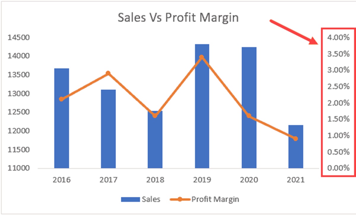
Showing data with different scales: When you have data that has significantly different ranges, it can be challenging to display them effectively on the same chart. For example, if you want to compare the number of website visitors and the average time spent on the site, the scales of these two data sets will be vastly different. A secondary axis allows you to clearly represent both sets of data without losing important details.
-
Highlighting trends and patterns: Sometimes, you may have data that follow different trends or patterns, and displaying them on separate charts may not effectively convey the relationship between them. By using a secondary axis, you can showcase the correlation or divergence between two sets of data, enabling you to identify meaningful insights and make more informed decisions.
By utilizing a secondary axis, you can avoid the pitfalls of misinterpreting data and present a clear, accurate representation of multiple data sets on a single chart. This not only enhances the visual appeal of your charts but also facilitates better data analysis and decision-making.
How to Add a Secondary Axis in Excel
Adding a secondary axis in Excel is a straightforward process that allows you to display two sets of data on the same chart. Here is a step-by-step guide on how to do it:
-
Select the chart: Begin by selecting the chart that you want to add a secondary axis to. You can do this by clicking on the chart.
-
Open the Format Axis pane: With the chart selected, go to the “Format” tab in the Excel ribbon and click on the “Format Selection” button. This will open the Format Axis pane on the right side of the screen.
-
Choose the axis to add: In the Format Axis pane, you will see options for the primary and secondary axes. Choose the axis that you want to add, either the secondary horizontal axis (top) or the secondary vertical axis (right).
-
Adjust the scale of the secondary axis: By default, Excel may automatically adjust the scale of the secondary axis. However, you can manually adjust the scale to best fit the data by right-clicking on the secondary axis and selecting “Format Axis.” From there, you can adjust the minimum and maximum values and other formatting options.
-
Format the secondary axis: To further customize the appearance of the secondary axis, you can modify its title, labels, line styles, and other formatting options. These settings can be accessed by right-clicking on the secondary axis and selecting “Format Axis.”
-
Add data to the secondary axis: Once you have added the secondary axis, you can add data to it by selecting the data series that you want to associate with the secondary axis. Right-click on the series, choose “Change Series Chart Type,” and select a chart type that matches the secondary axis.
-
Adjust the formatting of the chart: Finally, you can adjust the overall formatting of the chart, including colors, fonts, titles, and legends, to ensure it is visually appealing and effectively presents your data.
By following these steps, you can easily add a secondary axis to your Excel charts, allowing you to visualize and compare multiple sets of data with different scales or units of measurement. This feature enhances the clarity and accuracy of your charts, enabling you to communicate your data effectively.
Step 1: Select the Chart
The first step in adding a secondary axis in Excel is to select the chart that you want to work with. This can be any chart type, such as a column chart, line chart, or scatter plot. Selecting the chart will ensure that any changes or adjustments you make will apply to the specific chart you intend to modify.
To select the chart, simply click on it with your mouse. You will notice that the chart is highlighted or has a bounding box around it, indicating that it’s selected. If you have multiple charts on the same worksheet, make sure to choose the correct one by clicking directly on it.
It’s important to note that you cannot add a secondary axis unless you have already created a chart with at least two data sets. The secondary axis is used to display the second data set alongside the primary axis, allowing for comparison between the two sets of data.
If you haven’t yet created a chart, you can do so by selecting the data you want to include in the chart and then choosing a chart type from the “Insert” tab in the Excel ribbon. Once you have created the chart, you can proceed to add the secondary axis by following the subsequent steps.
Remember to double-check that the selected chart is the one you want to modify, as any changes made will directly affect that particular chart. Once you have successfully selected the chart, you can proceed to the next step in adding a secondary axis in Excel.
Step 2: Open the Format Axis Pane
After selecting the chart, the next step in adding a secondary axis in Excel is to open the Format Axis pane. The Format Axis pane is where you can make various adjustments and customizations to the chart axes and other elements.
To open the Format Axis pane, follow these steps:
- Right-click on any part of the chart area. A context menu will appear.
- In the context menu, click on the “Format Chart Area” option. This will open the Format Axis pane on the right side of the Excel window.
Alternatively, you can also access the Format Axis pane by selecting the chart and navigating to the “Format” tab in the Excel ribbon. In the “Current Selection” group, click on the “Format Selection” button. This will also open the Format Axis pane for the selected chart.
Once the Format Axis pane is open, you will see a range of options and settings related to the selected chart. These options allow you to modify the appearance, layout, and other properties of the chart and its elements, including the axes.
It’s important to note that the Format Axis pane may look slightly different depending on the version of Excel you are using. However, the basic functionality and options remain the same.
The Format Axis pane will be an essential tool throughout the process of adding a secondary axis. It allows you to make precise adjustments to the primary and secondary axes, customize their labels, scales, and formatting, and ensure that the chart accurately represents your data.
Once you have successfully opened the Format Axis pane, you can proceed to the next step and choose the axis to which you want to add the secondary axis.
Step 3: Choose the Axis to Add
After opening the Format Axis pane, the next step in adding a secondary axis in Excel is to choose the axis to which you want to add the secondary axis. Depending on your chart type, you can select either the secondary horizontal axis (top) or the secondary vertical axis (right).
To choose the axis to add the secondary axis, follow these steps:
-
In the Format Axis pane, you will see options for both the primary and secondary axes. Look for the section titled “Axis Options” or something similar, depending on your Excel version.
-
Under the “Axis Options” section, you will find checkboxes labeled “Secondary Axis,” “Secondary Horizontal Axis,” or “Secondary Vertical Axis.” Click on the checkbox corresponding to the axis you want to use as the secondary axis.
By selecting the appropriate checkbox, you indicate to Excel that you want to add a secondary axis to the chosen axis. This will result in the secondary axis being added to your chart, allowing you to plot two different sets of data with different scales on the same chart.
It’s important to note that the choice of which axis to add as the secondary axis depends on the specific chart type and your data. If you are working with a column or bar chart, you will typically add the secondary axis to the vertical axis. If you are working with a line or scatter chart, you will typically add the secondary axis to the horizontal axis.
By selecting the appropriate axis to add the secondary axis, you ensure that your chart accurately represents both sets of data and allows for easy comparison and analysis. Once you have made your selection, you can proceed to the next step and adjust the scale of the secondary axis.
Step 4: Adjust the Scale of the Secondary Axis
After choosing the axis to add the secondary axis in Excel, the next step is to adjust the scale of the secondary axis. By default, Excel may automatically adjust the scale of the secondary axis based on the data provided. However, you have the flexibility to manually adjust the scale to best fit the data and ensure accurate representation.
To adjust the scale of the secondary axis, follow these steps:
-
Right-click on the secondary axis. A context menu will appear.
-
In the context menu, click on the “Format Axis” option. This will open the Format Axis pane specifically for the secondary axis.
-
In the Format Axis pane, adjust the minimum and maximum values for the secondary axis. You can either enter specific values or choose automatic scaling options.
-
Further customize the formatting of the secondary axis, such as axis labels, tick marks, line styles, and other options that enhance the visual representation of your data.
By adjusting the scale of the secondary axis, you ensure that the data plotted on the secondary axis is appropriately displayed and accurately compared to the primary axis. Manual adjustment allows you to control the range or interval of the secondary axis, making it easier to interpret and analyze the data.
Additionally, the formatting options in the Format Axis pane for the secondary axis allow you to customize its appearance to match your chart and presentation preferences. You can change the axis title, font size, color, and other visual elements to create a cohesive and visually appealing chart.
Once you have adjusted the scale and formatting of the secondary axis, you can proceed to the next step and format the chart further to enhance its overall appearance and clarity.
Step 5: Format the Secondary Axis
After adjusting the scale of the secondary axis in Excel, the next step is to format the secondary axis to enhance its appearance and ensure clear communication of the data. Formatting the secondary axis allows you to customize various aspects such as the axis title, labels, line styles, and more.
To format the secondary axis, follow these steps:
-
Right-click on the secondary axis. A context menu will appear.
-
In the context menu, click on the “Format Axis” option to open the Format Axis pane for the secondary axis.
-
In the Format Axis pane, you will find various formatting options. Customize the axis title by entering a descriptive title that accurately represents the data it represents.
-
Adjust the labels of the secondary axis by modifying the font size, color, and orientation to improve readability.
-
Customize the line style, thickness, and color of the secondary axis to distinguish it from the primary axis and make it visually appealing.
-
Explore other available formatting options in the Format Axis pane, such as axis tick marks, gridlines, and axis scale settings, to further customize the secondary axis to your preferences.
By formatting the secondary axis, you can make it visually distinct from the primary axis, ensuring that both axes are easily identifiable and distinguishable. This clarity allows viewers to understand the data displayed on each axis and interpret the chart accurately.
Additionally, formatting the secondary axis improves the overall aesthetic appeal of the chart, making it visually engaging and professional. You have the freedom to align the formatting of the secondary axis with your chart’s theme, color scheme, and presentation requirements.
Once you have finished formatting the secondary axis, you can move on to the next step and add data to the secondary axis, making your chart complete and comprehensive.
Step 6: Add Data to the Secondary Axis
After formatting the secondary axis in Excel, the next step is to add data to the secondary axis. This enables you to plot the additional data set on the secondary axis, alongside the existing data plotted on the primary axis. Adding data to the secondary axis ensures that both sets of data are accurately represented and compared on the same chart.
To add data to the secondary axis, follow the steps below:
-
Select the data series that you want to associate with the secondary axis. You can do this by clicking on one of the data points of the series to activate it.
-
Right-click on the selected data series. A context menu will appear.
-
In the context menu, click on the “Change Series Chart Type” or similar option.
-
In the Change Chart Type dialog box, choose a chart type that matches the secondary axis. For example, if you have a line chart, select a line chart type. This ensures that the data series is plotted on the secondary axis.
-
Click the “OK” button to confirm the chart type change and add the data series to the secondary axis.
By adding data to the secondary axis, you can effectively visualize and analyze two different sets of data with different scales or units of measurement. This allows for easy comparison and identification of any relationships or trends between the two sets of data.
It’s important to note that not all data series may be suitable for the secondary axis. Choose the data series that aligns with the purpose of incorporating a secondary axis and enhances the understanding and interpretation of the chart. You can repeat the process to add multiple data series to the secondary axis if needed.
Once you have added the data to the secondary axis, you can proceed to the final step and make any necessary adjustments or formatting to the overall chart to ensure clarity and visual appeal.
Step 7: Adjust the Formatting of the Chart
The final step in adding a secondary axis in Excel is to adjust the formatting of the chart to enhance its overall appearance and make it more visually appealing. Formatting the chart allows you to customize various aspects such as colors, fonts, titles, legends, and other elements to create a professional and polished final product.
To adjust the formatting of the chart, follow these steps:
-
Select the chart by clicking on any part of it.
-
Navigate to the “Format” tab in the Excel ribbon, which appears when the chart is selected.
-
Explore the various formatting options available, such as chart styles, colors, fonts, and effects, to modify the visual appearance of the chart.
-
Customize the chart title by giving it a descriptive and concise name that accurately represents the overall content of the chart.
-
Make adjustments to the legend, axis labels, gridlines, and other chart elements to enhance clarity and readability.
-
Consider applying additional formatting options such as data labels, trendlines, or specific chart elements that help convey the desired information effectively.
By adjusting the formatting of the chart, you can create a visually appealing and professional representation of your data. Pay attention to the overall design and ensure that the formatting choices align with the purpose of the chart and the intended audience.
Experiment with different formatting options to find a style that suits your needs and efficiently conveys the information. The formatting adjustments you make will help highlight important data points, trends, and relationships to enable better insights and understanding.
Once you have completed the formatting adjustments, your chart is now ready to be shared, presented, or included in your reports, providing a clear and impactful visualization of your data.