
What is Responsive Design Mode?
Responsive Design Mode is a feature in the Safari browser that allows web developers and designers to easily test and optimize the appearance of their websites on different screen sizes and resolutions. With the growing popularity of mobile devices and the diverse range of screen sizes available today, it has become crucial for websites to be adaptive and responsive to provide an optimal user experience.
Responsive Design Mode enables developers to simulate different screen sizes, from smartphones and tablets to laptops and desktops, without the need for physical devices. This feature provides a convenient and efficient way to ensure that a website is accessible and visually pleasing on various devices, allowing developers to identify and fix any layout or design issues that may arise.
By activating Responsive Design Mode, web professionals can put themselves in the shoes of their target audience and gain valuable insights into how their websites perform across different platforms. It enables them to see exactly how their content is displayed and how the website reacts to changes in screen size, allowing for quick adjustments and optimizations.
This feature is particularly beneficial for businesses and individuals who aim to reach a wider audience and improve user engagement. It helps ensure that the website content is easily readable, the images are appropriately sized, and the overall user experience is consistent and seamless across different devices.
Responsive Design Mode also aids in keeping up with the ever-evolving digital landscape, where new devices and screen sizes are constantly being introduced. It allows developers to adapt their websites to the latest trends and technologies, offering an enhanced browsing experience to visitors regardless of the device they are using.
Why is Responsive Design Important?
Responsive design is a critical aspect of modern web development that ensures websites are accessible and usable across different devices and screen sizes. Here are some reasons why responsive design is important:
1. Improved User Experience: Responsive design ensures that users can easily navigate and interact with a website regardless of the device they are using. It provides a consistent and seamless experience, allowing visitors to access information and functionalities without any barriers or frustrations.
2. Increased Mobile Traffic: With the significant rise in mobile usage, having a responsive website is crucial to accommodate the growing number of visitors accessing the internet through smartphones and tablets. By optimizing for mobile devices, businesses can tap into the ever-expanding mobile market and attract more potential customers.
3. Better SEO Performance: Search engines prioritize responsive websites when ranking search results. Having a mobile-friendly and responsive design improves the website’s visibility and increases the chances of appearing higher in search engine rankings. This, in turn, drives more organic traffic to the site and boosts its overall online presence.
4. Cost-Effectiveness: Instead of maintaining separate websites for desktop and mobile devices, responsive design allows for a single website that adapts seamlessly to different screen sizes. This reduces the development and maintenance costs associated with managing multiple versions of a website, making it a more cost-effective solution.
5. Future-Proofing: Responsive design ensures that your website is prepared for future technological advancements and changes in user behavior. As new devices with varying screen sizes and resolutions emerge, a responsive website can easily adapt and provide an optimal experience, without the need for major redesigns or updates.
6. Competitive Advantage: With more businesses recognizing the importance of responsive design, it has become a standard expectation for users. Having a responsive website sets you apart from your competitors and showcases your commitment to providing a user-friendly experience, potentially influencing customer perception and driving more conversions.
In a digital landscape that is constantly evolving, responsive design has become a necessity rather than a luxury. It ensures that websites remain functional, accessible, and visually appealing across a wide range of devices, leading to improved user engagement, increased traffic, and enhanced business success.
How to Activate Responsive Design Mode in Safari
If you’re using Safari as your preferred web browser for testing and optimizing your website’s responsiveness, activating Responsive Design Mode is a simple process. Here’s a step-by-step guide:
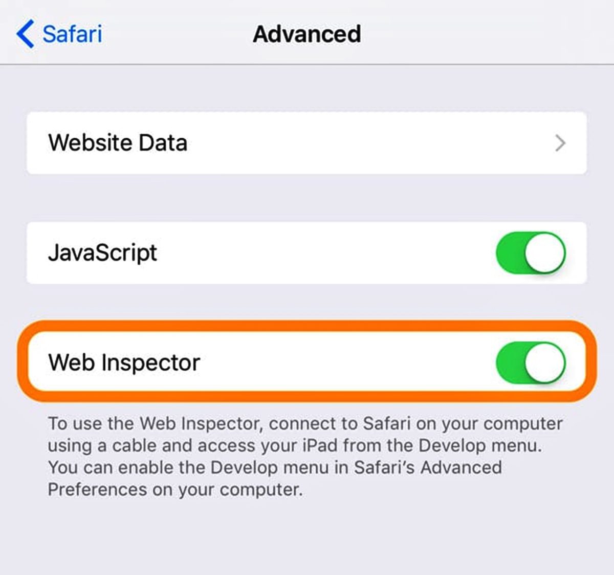
1. Open Safari Developer Tools: To access the developer tools, go to the Safari menu (located in the top-left corner of your screen) and click on “Preferences.” In the Preferences window, select the “Advanced” tab, and check the box next to “Show Develop menu in menu bar.”
2. Enable Developer Tools: In the Safari menu, you will now see a new option called “Develop.” Click on it to expand the dropdown menu.
3. Activate Responsive Design Mode: In the Develop menu, click on “Enter Responsive Design Mode” or use the keyboard shortcut “Command + Option + R” (for Mac) or “Ctrl + Shift + R” (for Windows).
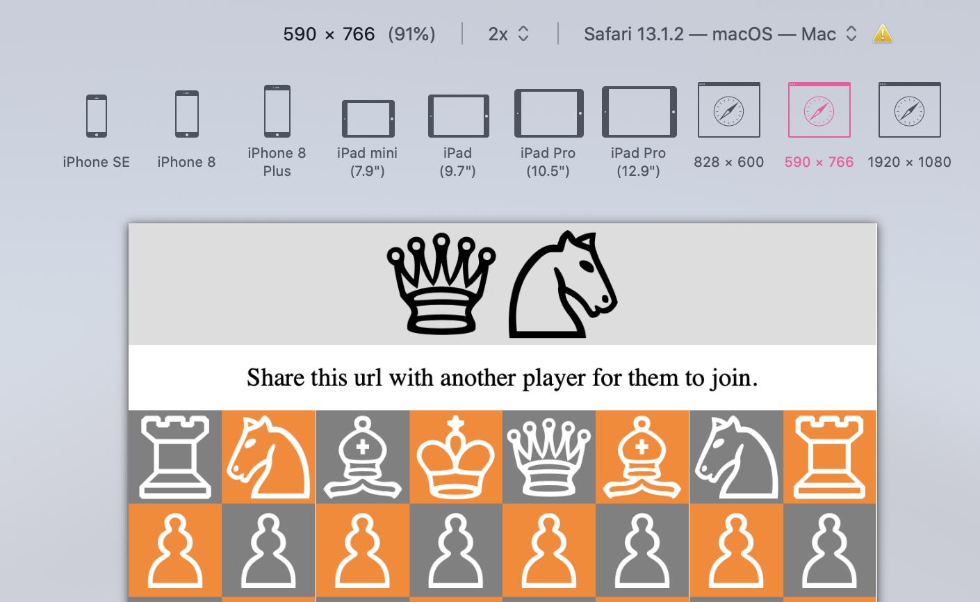
4. Select a Device: Once you have activated Responsive Design Mode, you will see a toolbar at the top of the screen with various device options. Click on the menu to choose the screen size and device you want to simulate. Safari offers a range of predefined options, including popular iPhone and iPad models, as well as other common screen sizes.
5. View Your Website: After selecting the desired device, Safari will display your website in Responsive Design Mode, simulating the chosen screen size. You can now observe how your website appears on different devices and make necessary adjustments to optimize its responsiveness.
6. Customize Screen Size: If the predefined options do not match the specific screen size you wish to test, you can enter custom dimensions in the toolbar. Simply click on the width and height fields and input the desired measurements. This allows you to test your website on unique screen sizes and resolutions.
7. Toggle Device Orientation: Responsive Design Mode also enables you to test how your website adapts to changes in device orientation. To switch between portrait and landscape modes, click on the corresponding button in the toolbar.
8. Exit Responsive Design Mode: To exit Responsive Design Mode and return to the regular browsing mode, go back to the Develop menu and click on “Exit Responsive Design Mode.” Alternatively, you can use the keyboard shortcut “Command + Option + R” (for Mac) or “Ctrl + Shift + R” (for Windows) again.
Activating Responsive Design Mode in Safari empowers web designers and developers to evaluate and optimize their websites for various devices and screen sizes. By using this feature, you can ensure a seamless and visually appealing user experience across different platforms.
Using the Device Toolbar in Responsive Design Mode
Once you have activated Responsive Design Mode in Safari, you can take advantage of the powerful Device Toolbar to further enhance the testing and optimization of your website’s responsiveness. Here’s how you can make the most out of this feature:
1. Viewport Dimensions: At the top of the Device Toolbar, you will find the viewport dimensions. This displays the width and height of the simulated device screen. You can adjust these dimensions by clicking on the input fields and entering custom values. Experimenting with different viewport sizes allows you to see how your website adapts to various screen resolutions.
2. Device Selection: The Device Toolbar offers a wide range of popular device options to simulate. From iPhones and iPads to Android devices and desktop screens, you can choose the device that closely matches your target audience’s preferences. This helps you accurately test how your website looks and functions on different devices.
3. Device Orientation: The Device Toolbar also allows you to switch between portrait and landscape modes. By clicking on the device orientation icons (such as a portrait or landscape icon), you can assess how your website responds to changes in screen orientation, ensuring a seamless user experience in both modes.
4. Touch Navigation: To simulate touch interactions on mobile devices, the Device Toolbar provides intuitive touch gestures. You can use the virtual touchscreen to scroll, pinch-to-zoom, swipe, and perform other common touch actions. This allows you to assess the usability and functionality of your website on touch-enabled devices.
5. Network Conditions: In addition to device simulations, Safari’s Device Toolbar helps you evaluate how your website performs under different network conditions. By selecting various network presets, such as 3G, 4G, or a specific connection speed, you can observe how your website loads and functions in different network environments.
6. Debugging Options: The Device Toolbar also provides access to additional debugging features. By enabling options like continuous repainting, color profiling, and GPU rendering, you can identify potential performance issues and optimize your website for improved speed and efficiency.
7. Device Metrics: As you adjust the viewport dimensions and test your website on different devices, the Device Toolbar provides real-time feedback on various metrics. This includes details such as device pixel ratio, CSS pixels, and scale factors. These metrics offer valuable insights into how your website is rendered on different screens and help ensure accurate rendering and crisp graphics.
The Device Toolbar in Responsive Design Mode is a valuable tool for web developers and designers. It allows for comprehensive testing and optimization of your website’s responsiveness, ensuring a seamless user experience across a variety of devices and network conditions. By utilizing the Device Toolbar, you can confidently create websites that are user-friendly, visually appealing, and optimized for maximum engagement.
Testing Different Screen Sizes in Responsive Design Mode
Responsive Design Mode in Safari provides an excellent platform for testing your website’s responsiveness across various screen sizes. By simulating different devices and resolutions, you can ensure that your website looks and functions optimally on any screen. Here’s how you can effectively test different screen sizes:
1. Device Emulation: In Responsive Design Mode, select different devices from the Device Toolbar to emulate their specific screen sizes. This allows you to evaluate how your website appears on popular devices such as iPhones, iPads, Android phones, and desktop screens. By testing on a range of devices, you can identify potential issues and make necessary adjustments to optimize the user experience.
2. Custom Viewport Sizes: Besides predefined device options, you can also enter custom viewport sizes in the Device Toolbar. This flexibility enables you to test your website on unique screen dimensions and resolutions. It is particularly useful when targeting specific devices or catering to niche audiences with non-standard screen sizes.
3. Responsive Layout: While testing different screen sizes, pay close attention to your website’s layout. Check how the elements reposition or adapt to fit smaller or larger screens. Ensure that important content remains easily accessible, text remains readable, and images are appropriately scaled. Make any necessary adjustments to maintain a consistent and intuitive user experience across all screen sizes.
4. Navigation and Interactivity: Test the navigation and interactive elements of your website on different screen sizes. Evaluate whether menus, buttons, and links are easily clickable and accessible. Verify that dropdown menus function properly and expand or collapse as intended. Aim for a seamless user experience across all devices, minimizing the need for excessive scrolling or zooming.
5. Media Queries and Responsive Images: Ensure that your website is utilizing media queries effectively. Media queries allow you to apply specific CSS styles based on screen size, enabling a tailored display for different devices. Test how your website responds to changes in screen size, and verify that responsive images load appropriately to enhance the visual experience without slowing down page load times.
6. Performance and Loading Times: Test the performance of your website on different screen sizes. Monitor loading times and performance indicators, such as page speed and resource usage. Optimize your website’s code, minimize HTTP requests, and consider using techniques like lazy loading to ensure efficient resource loading and a smooth user experience across devices.
7. User Testing: Don’t rely solely on Responsive Design Mode for testing. Involve real users on different devices to provide feedback on their experience. Conduct user tests and gather valuable insights on how your website functions in real-world scenarios. Their feedback can help you further refine the responsiveness of your website.
By thoroughly testing your website on different screen sizes, you can identify any issues or inconsistencies and address them promptly. This ensures a seamless and enjoyable user experience for visitors, regardless of the device they are using to access your website.
Modifying CSS in Responsive Design Mode
In Responsive Design Mode, Safari offers the ability to modify the CSS (Cascading Style Sheets) of your website on the fly. This feature allows you to make real-time adjustments to the appearance and layout of your site, enabling you to fine-tune its responsiveness. Here’s how you can effectively modify CSS in Responsive Design Mode:
1. Inspect Elements: Use the Inspect Element feature to identify the HTML elements that you wish to modify. Right-click on the element and select “Inspect Element” from the context menu. This will open the Developer Tools panel, showing the HTML and CSS associated with the selected element.
2. Experiment with CSS Properties: In the Styles tab of the Developer Tools panel, you can modify CSS properties to change the appearance of elements on your website. Try adjusting properties such as font size, color, padding, margin, and width. As you make changes, observe how they affect the layout and responsiveness of the page.
3. Responsive Media Queries: Modify media queries to optimize your website’s responsiveness for different screen sizes. Experiment with breakpoints and viewport widths to see how your website adapts to different devices. Adjust styles within media queries to ensure that content is displayed appropriately and that the user experience remains seamless across a range of screen sizes.
4. Test Different Device Orientations: Use the Device Toolbar to switch between portrait and landscape orientations. Modify CSS properties accordingly to ensure that your website adjusts and displays properly in each orientation. It is essential to verify that text, images, and other elements are positioned correctly and remain readable regardless of the device orientation.
5. Live Preview: Safari’s Responsive Design Mode allows you to see your CSS modifications in real-time. As you make changes to the CSS properties, the website preview updates instantly, providing immediate feedback on how your modifications affect the layout. This live preview feature speeds up the process of fine-tuning your website’s design and responsiveness.
6. Take Notes: Keep track of the CSS modifications you make, especially if you are testing multiple scenarios or experimenting with different breakpoints. Taking notes allows you to remember the changes you have made and revert them if needed. It also helps you track the modifications that work well and contribute to improved responsiveness.
7. Debugging CSS: In addition to modification, Responsive Design Mode helps you identify and debug CSS issues. If you encounter layout problems or inconsistencies, use the Developer Tools panel to inspect the CSS properties, identify conflicting styles, and make necessary adjustments to rectify the issues.
Modifying CSS in Responsive Design Mode provides a valuable opportunity to fine-tune your website’s responsiveness and visual presentation. By experimenting with different CSS properties and media queries, you can ensure that your website looks and performs optimally across various devices and screen sizes.
Inspecting Elements in Responsive Design Mode
In Responsive Design Mode, one of the powerful features available is the ability to inspect elements on your website. This capability allows you to dive into the structure and styling of individual elements, aiding in the debugging and optimization of your website’s responsiveness. Here’s how you can effectively inspect elements in Responsive Design Mode:
1. Accessing the Inspector: To inspect elements, right-click on the page and select “Inspect Element” from the context menu. Alternatively, you can use the keyboard shortcut “Command + Option + I” (for Mac) or “Ctrl + Shift + I” (for Windows).
2. Element Highlighting: As soon as you open the Inspector, the element under your cursor will be highlighted in the page’s HTML structure. This highlighting helps you identify the specific element you want to inspect and modify.
3. View and Modify CSS: Within the Inspector, you can view and modify the CSS properties associated with the selected element. By exploring and modifying the CSS rules, you can experiment with different styles and test their impact on the element’s appearance and layout.
4. Box Model Visualization: The Inspector provides a visual representation of the box model for elements, illustrating the size, padding, margin, and border properties. Understanding and adjusting these properties helps control the space and positioning of elements, making them more responsive and aesthetically pleasing.
5. Style Inheritance: In Responsive Design Mode, you can observe how styles are inherited from parent elements and adjust them accordingly. By inspecting elements and their parent hierarchies, you can identify and modify inherited styles to ensure consistency and responsiveness across your website.
6. DOM Tree Navigation: The Inspector displays the DOM tree, representing the hierarchical structure of elements on the page. This feature allows you to navigate through the elements and inspect their properties and styling. Understanding the relationship between elements aids in identifying and solving responsiveness issues.
7. Event Listeners: Use the Inspector to analyze event listeners attached to elements, such as click or hover events. Examining the event listeners helps in understanding the interactivity and functionality of your website. You can also simulate events to test how elements behave in different scenarios.
8. Accessibility Evaluation: In Responsive Design Mode, the Inspector provides insights into the accessibility properties of elements. You can review and enhance the accessibility of your website by inspecting ARIA attributes, labels, and other accessibility-related properties.
By inspecting elements in Responsive Design Mode, you gain a deeper understanding of your website’s structure, layout, and styling. This knowledge helps you identify and address responsiveness issues, optimize the user experience, and ensure that your website appears and functions flawlessly across various devices and screen sizes.
Best Practices for Using Responsive Design Mode in Safari
When utilizing Responsive Design Mode in Safari to test and optimize the responsiveness of your website, following these best practices can help ensure a smooth and efficient process:
1. Start with a Mobile-First Approach: Design and develop your website with a mobile-first mindset. Begin by optimizing your site for smaller screen sizes and gradually enhance the layout and elements for larger screens. This approach ensures a solid foundation for responsiveness.
2. Test on Real Devices: While Responsive Design Mode provides a convenient way to simulate different screen sizes, it is important to also test your website on actual devices. Emulators and simulators cannot perfectly replicate the behavior and performance of physical devices, so testing on real devices is essential for accurate evaluation.
3. Embrace User-Centric Design: Consider the needs and expectations of your target audience when optimizing for responsive design. Ensure that the user experience is intuitive, with easily accessible menus, clear navigation, and readable content across different screen sizes and orientations.
4. Prioritize Performance: Pay attention to the performance of your website, particularly on mobile devices. Optimize images, minimize code and resource sizes, and use caching techniques to enhance loading speeds. Responsive design should not sacrifice performance, so monitor and improve website performance regularly.
5. Validate and Optimize HTML and CSS: Use HTML and CSS validators to identify and fix any errors or warnings. Ensure that your code adheres to best practices and follows web standards. Optimizing and maintaining clean code helps prevent rendering issues and improves the overall responsiveness of your website.
6. Test Different Content: Test your website with a variety of content, including different image sizes, text lengths, and media types. This allows you to optimize the responsiveness of your website to accommodate various content scenarios without sacrificing user experience or visual appeal.
7. Accessibility Considerations: Ensure that your website is accessible to all users, regardless of their abilities. Adopt accessible design practices, such as providing alternative text for images, using proper semantic markup, and leveraging ARIA (Accessible Rich Internet Applications) attributes. Test your website’s accessibility in Responsive Design Mode to ensure it meets WCAG (Web Content Accessibility Guidelines) standards.
8. Monitor Analytics: Use analytics tools to track user behavior and engagement on your responsive website. Analyze data on device usage, screen sizes, and conversions. This helps you identify potential improvements and make data-driven decisions for further optimization.
By following these best practices, you can leverage Responsive Design Mode in Safari effectively to test and improve the responsiveness of your website. Ensuring an optimal user experience across devices will contribute to increased user engagement, improved search engine rankings, and overall business success.