
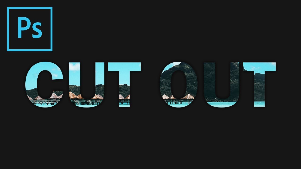
What is a Cutout or Punched Out Text Effect?
One popular graphic design technique that adds visual interest to text is the cutout or punched out text effect. This effect involves creating text that appears to be cut out or punched through a background, giving it a three-dimensional and dynamic look. It gives the impression that the text is interacting with the background, creating depth and adding a captivating visual element to the design.
The cutout or punched out text effect can be used in a variety of design projects, such as posters, flyers, social media graphics, and website banners. It is an effective way to make the text stand out and grab viewers’ attention. By applying this effect, you can add a sense of creativity and uniqueness to your designs, making them visually appealing and memorable.
This technique allows you to explore endless possibilities in terms of font styles, backgrounds, and color combinations. You can choose bold, eye-catching fonts that have the potential to make a statement, or opt for sleek, elegant fonts to create a more refined look. The background can range from solid colors to intricate patterns, or even photographic images. The combination of different fonts, backgrounds, and effects can result in diverse and visually stunning designs.
The cutout or punched out text effect can also be used to convey a specific message or theme. For instance, if you are creating a design for a Halloween event, you can use a spooky font and a background featuring bats or spider webs to add a touch of mystery and intrigue. Similarly, for a summer-themed design, you can use vibrant, beach-inspired fonts and backgrounds adorned with sunsets or palm trees.
Overall, the cutout or punched out text effect is a versatile and impactful technique that allows you to elevate the visual appeal of your designs. By playing with different font styles, backgrounds, and effects, you can create bold, unique, and visually stunning designs that leave a lasting impression on your audience.
Creating a New Document
To begin creating a cutout or punched out text effect, you will first need to create a new document in your preferred graphic design software, such as Adobe Photoshop Elements. Open the software and navigate to the “File” menu, then select “New” to open the New Document dialog box.
In the New Document dialog box, you can specify the dimensions and resolution for your document. The dimensions will depend on the intended use of your design. For example, if you are creating a social media graphic, you can choose a preset size that matches the platform’s requirements, such as 1080 x 1080 pixels for Instagram posts.
Next, set the resolution for your document. Typically, a resolution of 300 pixels per inch (PPI) is recommended for print projects, while a resolution of 72 PPI is suitable for web graphics. Ensure that the color mode is set to RGB for online use or CMYK for print projects.
Once you have entered the desired dimensions and resolution, click “OK” to create your new document. You will now have a blank canvas where you can begin designing your cutout or punched out text effect.
Remember to save your document with a descriptive filename and in a location where you can easily access it for future editing or exporting.
Now that you have created a new document, it’s time to move on to the next step in the process: choosing a suitable background for your design.
Choosing a Background
When creating a cutout or punched out text effect, the background you choose plays a crucial role in enhancing the overall visual impact of your design. It sets the stage for the text to appear as if it has been cut out or punched through the surface. Here are some considerations and approaches to help you choose an appropriate background:
1. Solid Colors: Using a solid color background can create a clean and minimalist look, allowing the cutout text to become the focal point of the design. Opt for colors that complement the overall theme or mood you want to convey.
2. Gradients: Gradients can add depth and dimension to the background, creating a more dynamic visual effect. Experiment with different color combinations to achieve the desired effect.
3. Textures: Applying textured backgrounds such as paper, canvas, or wood can give your design a tactile and organic feel. This technique can work well for designs with a more vintage or handmade aesthetic.
4. Patterns: Incorporating patterns into the background can add visual interest and complexity to your design. Stripes, polka dots, or geometric shapes can serve as engaging backdrops for the cutout text.
5. Images: Photographs or illustrations can provide a visually captivating background for your cutout text effect. Choose images that align with the theme or message of your design, ensuring that they do not overpower the text.
6. Contrast: Consider the contrast between the background and the text to ensure optimal readability. A high contrast between the text and the background color or pattern will make the cutout effect more prominent.
Remember, the background should complement the cutout or punched out text effect rather than compete with it. Experiment with different background options and styles to find the one that best enhances your design concept.
Once you have selected a suitable background, it’s time to add the text to your design.
Adding Text
Now that you have determined the background for your cutout or punched out text effect, it’s time to add the text itself. The text you choose will be the focal point of your design, so it’s important to carefully consider the font style, size, and placement. Here’s how you can add the text:
1. Select the Text Tool: In your chosen graphic design software, locate the Text Tool from the toolbar. It is usually represented by a “T” icon. Click on this tool to activate it.
2. Choose the Font and Size: In the top toolbar or the options panel, you’ll find options to select the font and adjust the size. Experiment with different fonts that align with the style and mood you want to convey. Make sure the font is legible and visually appealing.
3. Type Your Text: Click and drag on the canvas to create a text box. Type or paste your desired text into the box. Resize the text box as needed to fit your design.
4. Adjust Alignment and Spacing: Use the alignment options to position your text within the design. You can also adjust the spacing between characters or lines if necessary. This ensures that the text is visually balanced and aesthetically pleasing.
5. Apply Text Effects: Depending on your design concept, you may want to apply additional effects to the text. These can include shadows, outlines, gradients, or even textured fills. Experiment with different effects to achieve the desired look.
Remember to consider the contrast between the text and the background to ensure legibility. You may need to adjust the color of the text or the background to achieve optimal contrast. Keep in mind that the purpose of the cutout or punched out effect is to create an illusion of the text interacting with the background, so ensure that the font style and placement enhance this effect.
Once you are satisfied with the look of your text, you’re ready to move on to the next step of selecting the background to cut out or punch out the text.
Selecting the Background
Now that you have added the text to your design, it’s time to select the background that you will cut out or punch out the text from. This step is crucial for creating the desired visual effect and making the text appear as if it is interacting with the background. Here’s how to select the background:
1. Assess the Design Concept: Consider the overall theme or message of your design and how the background will complement it. Choose a background that enhances the impact and communicates the desired visual aesthetic.
2. Compatibility with the Text: Ensure that the background and the text have a good contrast ratio. If the text is light-colored, choose a darker background, and vice versa. This contrast will help the cutout or punched out effect stand out and make the text more legible.
3. Visual Interest: Look for backgrounds that have interesting textures, patterns, or gradients. These elements can enhance the depth and visual appeal of the cutout or punched out text effect.
4. Composition: Consider the positioning and placement of the text within the background. Make sure that the background elements align with the flow and composition of your design. This will ensure a visually pleasing final result.
5. Experimentation: Don’t be afraid to try different backgrounds and see how they interact with the text. It’s all about finding the perfect balance between a background that compliments the text and creates an engaging visual effect.
Remember, the goal is to create a seamless integration between the text and the background, as if the text has been cut out or punched out of the surface. Take your time to explore different options and choose a background that enhances the overall impact and aesthetic of your design.
Once you have selected the background, you’re ready to move on to the next step of cutting out or punching out the text from the background.
Cutting Out or Punching Out the Text
Now comes the exciting step of cutting out or punching out the text from the background. This process will further enhance the illusion that the text is interacting with the background. Here are a few methods you can use to achieve this effect:
1. Selection Tools: Most graphic design software comes with various selection tools, such as the Magic Wand, Polygonal Lasso, or Pen Tool. Use these tools to carefully trace around the edges of the text and create a selection. Make sure to include any inner cutouts or holes within the text. Once you’ve made the selection, you can proceed with removing the background.
2. Layer Masks: Another technique is to use layer masks. Duplicate the text layer, then apply a layer mask to the duplicated layer. Use a brush tool with black color to hide the unwanted parts of the background, revealing the underlying background layer. This method allows for non-destructive editing, as you can always adjust the mask later if needed.
3. Blending Modes: Experiment with blending modes to create a seamless integration between the text and the background. Try overlay, multiply, or screen blending modes to achieve different effects. Play around with opacity settings for more control over the visibility of the background through the text.
4. Text Effects: Apply additional effects to the text to enhance the cutout or punched out effect. Add drop shadows, inner shadows, or outer glows to make the text appear three-dimensional and interact with the background. These effects can further elevate the visual impact of your design.
Remember, precision is key when cutting out or punching out the text. Take your time to ensure clean and crisp edges, allowing the text to seamlessly blend with the background. Don’t be afraid to make adjustments as you go along to achieve the desired effect.
Once you have successfully cut out or punched out the text, you can proceed to the next step of adjusting the fill or opacity of the text to enhance the visual impact of your design.
Adjusting the Fill or Opacity of the Text
After cutting out or punching out the text from the background, it’s time to fine-tune the visual impact of your design by adjusting the fill or opacity of the text. This step allows for further customization and enhances the overall look of the cutout or punched out text effect. Consider the following techniques:
1. Fill Color: Experiment with different fill colors for the text to achieve the desired visual effect. You can match the fill color with the background color for a subtle and integrated look. Alternatively, choose a contrasting color to make the text pop and stand out from the background.
2. Gradient Fill: Apply a gradient fill to the text to create a more dynamic and multi-dimensional effect. Play around with different gradient styles, such as linear, radial, or angular gradients, to find the one that best enhances your design.
3. Opacity Adjustment: Adjusting the opacity of the text allows you to control its transparency and how it interacts with the background. Decrease the opacity to create a more translucent and subtle effect, or increase the opacity to maintain a solid and prominent appearance.
4. Layer Blending Modes: Utilize the layer blending modes to further enhance the interaction between the text and the background. Experiment with different blending modes like soft light, overlay, or screen to achieve unique and captivating effects.
5. Texture and Pattern Overlay: Consider applying texture or pattern overlays to the text to add depth and visual interest. This technique can enhance the cutout or punched out effect and make the text appear more tactile and realistic.
Remember, the goal is to find the right balance between the visibility of the text and its integration with the background. Adjust the fill color, opacity, and blending modes to achieve a visually appealing result. Take the time to experiment and fine-tune these settings until you are satisfied with the overall look of your design.
Once you have completed these adjustments, you can move on to the next step of adding additional effects to the text to further enhance the impact of your cutout or punched out text effect.
Adding Effects to the Text
To take your cutout or punched out text effect to the next level, you can add additional effects to enhance its visual impact. These effects can add depth, dimension, and uniqueness to your design. Explore the following techniques to elevate your design:
1. Drop Shadows: Apply a subtle drop shadow effect to the text to make it appear lifted from the background. Adjust the distance, size, and opacity of the shadow to achieve the desired result. This effect adds depth and realism to the cutout or punched out text.
2. Outer Glows: Create an outer glow effect around the text to make it stand out and create a glowing edge. Adjust the color, size, and opacity of the glow to match the intention of your design. This effect can give your text a dreamy or ethereal appearance.
3. Inner Shadows: Add an inner shadow effect to give the text a recessed or engraved look. Adjust the distance, size, and opacity of the shadow to achieve the desired depth and intensity. This effect can make the cutout or punched out text appear more realistic.
4. Bevel and Emboss: Apply a bevel and emboss effect to give the text a raised or carved effect. Adjust the settings such as depth, size, and highlight/shadow intensity to create the desired visual impact. This effect can make your text appear more three-dimensional.
5. Texture and Pattern Overlays: Experiment with applying texture or pattern overlays to the text to add visual interest and depth. This technique can give the text a tactile quality and enhance the cutout or punched out effect. Select textures or patterns that enhance the overall theme or mood of your design.
6. Color Adjustments: Play with color adjustments like hue, saturation, and brightness to further enhance the visual appeal of your cutout or punched out text. Adjusting the color can create different moods or harmonize the text with the overall design concept.
Remember to observe the visual unity of the effects with the overall design. Experiment with different combinations and settings to find the perfect balance between enhancing the cutout or punched out effect and maintaining a visually appealing design.
Once you are satisfied with the effects applied to the text, it’s time to save and export your finished design.
Saving and Exporting the Finished Design
After putting in the effort to create a stunning cutout or punched out text effect, it’s essential to properly save and export your finished design. Here are some steps to follow:
1. Saving the File: Save your work in the native format of your graphic design software (e.g., PSD for Adobe Photoshop Elements). This will preserve all the layers and effects, allowing you to make future edits if needed. Use a descriptive file name that reflects the content and purpose of your design.
2. Exporting for Web: If you plan to use the design for web purposes, such as sharing on social media or posting on a website, you’ll need to export it in a web-friendly format. Choose a suitable format like JPEG or PNG, ensuring a balance between image quality and file size. Optimize the file size for faster loading times without compromising the visual quality.
3. Exporting for Print: If you intend to print your design, it’s important to export it in a high-resolution format. Use the appropriate color mode (CMYK) and choose a file format like PDF or TIFF. Check the print requirements and guidelines from your printing service to ensure accurate color reproduction and image quality.
4. File Compression: If the file size is too large for sharing or uploading, consider compressing it using a compression tool or online service. This reduces the file size without significant loss in quality, making it easier to transfer or store.
5. Organizing Files: Keep your design files organized by creating a folder or directory dedicated to the project. Include all the relevant assets, such as fonts, images, or textures, within this folder for easy access and future reference.
By following these steps, you can ensure that your cutout or punched out text design is saved and exported correctly, ready to be shared, printed, or incorporated into your desired platform.
Congratulations on creating an eye-catching and visually appealing cutout or punched out text effect! With the right background, text adjustments, and effects, you have transformed your design into an engaging and unique piece of art.