
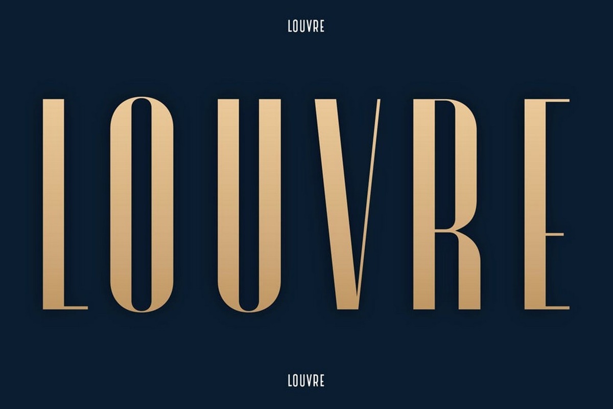
What are condensed fonts?
Condensed fonts are a type of typography variant characterized by narrow letterforms that occupy less horizontal space than standard fonts. They are designed to maximize the use of available space without compromising legibility. Condensed fonts achieve this by squeezing the letterforms closer together and reducing the width of each character.
These fonts are commonly used in various design projects, such as branding, posters, headlines, and website headers. They are especially useful when you have limited horizontal space and need to fit a large amount of text or information within a smaller area.
Condensed fonts offer a distinctive visual appeal, conveying a sense of elegance, sophistication, and efficiency. They can add a touch of modernity to your designs and help emphasize important information. By compressing the letterforms, condensed fonts can create a more compact and impactful layout without compromising legibility.
Using condensed fonts can also help create a sense of hierarchy within your text. By pairing a condensed font for headlines or titles with a more standard font for body text, you can establish a clear visual distinction between different sections of your content.
One important consideration when using condensed fonts is the overall readability. Due to the narrower letterforms, condensed fonts may be less legible at smaller sizes or when used for large blocks of text. Therefore, it is advisable to use them primarily for headlines, subheadings, or shorter snippets of text.
Overall, condensed fonts offer a versatile typographic tool for designers to effectively utilize limited horizontal space and create visually impactful designs. They can add a touch of style and professionalism to your projects while ensuring that your message is effectively communicated to your audience.
The benefits of using condensed fonts
Using condensed fonts in your design projects can offer several advantages that enhance the visual appeal and effectiveness of your typography. Here are some key benefits of incorporating condensed fonts into your designs:
Space-saving: One of the primary benefits of condensed fonts is their ability to save space horizontally. These fonts are designed to compress the letterforms, allowing you to fit more text or information into a limited area. This can be particularly useful when working with narrow columns, posters with limited space, or in responsive web design where screen real estate is at a premium.
Visual impact: Condensed fonts have a unique aesthetic that can make your designs stand out. The narrow letterforms create a sleek and stylish look that adds a touch of modernity to your typography. This visual impact can be particularly effective in headlines, titles, or branding elements where you want to grab the viewer’s attention and make a lasting impression.
Hierarchy and emphasis: By using condensed fonts for headlines or titles and pairing them with a more standard font for body text, you can establish a visual hierarchy within your design. The contrasting styles help differentiate between different levels of information and draw the viewer’s attention to key elements. This enhances the readability and guides the viewer through your content.
Readability in limited space: Despite their narrower width, condensed fonts can still maintain good legibility when used appropriately. They are well-suited for shorter snippets of text, subheadings, or captions. However, for longer passages of text, it is advisable to select a more standard font with sufficient letter spacing and readability to ensure optimal legibility.
Flexibility in design: Condensed fonts come in a wide range of styles, allowing you to find the perfect fit for your design concept. Whether you need a bold and impactful font for a powerful headline or a subtle and elegant font for a sophisticated branding project, you can find a condensed font that suits your needs.
Incorporating condensed fonts into your design projects can greatly enhance the visual impact and effectiveness of your typography. However, it is important to strike a balance between aesthetics and readability. By using them judiciously and in appropriate contexts, you can make the most of their space-saving capabilities while ensuring optimal legibility and a visually pleasing design.
Examples of popular condensed fonts
When it comes to choosing a condensed font for your design project, there are numerous options available. Here are some examples of popular condensed fonts that are widely used and favored by designers:
- Roboto Condensed: This sans-serif typeface, derived from the popular Roboto font family, offers a clean and modern design. With its balanced proportions and versatility, Roboto Condensed is suitable for a wide range of applications, from digital interfaces to print materials.
- Gotham Condensed: Known for its clean and geometric shapes, Gotham Condensed is a highly legible font that exudes a sense of sophistication and professionalism. It is popular for corporate branding and editorial design, providing a modern and stylish touch.
- Avenir Next Condensed: Avenir Next Condensed is a versatile and elegant font that offers a refined and timeless look. Its condensed variants maintain excellent legibility, making it a popular choice for both print and web design projects.
- Montserrat: Montserrat is a geometric sans-serif font with a unique personality. Its condensed variants offer a distinctive and impactful look, making it a favorite choice for posters, headlines, and branding projects.
- Proxima Nova Condensed: Proxima Nova Condensed is a highly readable and versatile font that blends a contemporary aesthetic with classic proportions. Its condensed variants provide a compact and efficient design, suitable for a variety of design applications.
These are just a few examples of the many popular condensed fonts available. Each font has its own characteristics and style, suitable for different design purposes. When selecting a condensed font, consider factors such as the project’s tone, target audience, and overall design concept to ensure a harmonious and visually appealing result.
How to choose the right condensed font for your design
Choosing the right condensed font for your design project is crucial for creating a visually appealing and effective composition. Here are some considerations to keep in mind when selecting a condensed font:
1. Purpose and context: Consider the purpose of your design and the context in which it will be used. Is it for a bold headline, a sleek logo, or a clean interface? Understanding the purpose and context will help guide your font selection process.
2. Readability: Ensure that the condensed font you choose remains legible, even in smaller sizes or when used for longer passages of text. Avoid fonts with excessively tight letter spacing or overly intricate details that could impact readability.
3. Visual compatibility: Consider how the condensed font will visually align with other elements in your design. It should complement the overall aesthetic and enhance the visual hierarchy. A font that clashes with other design elements can create confusion and detract from the message.
4. Tone and personality: Different condensed fonts convey distinct tones and personalities. Some fonts exude professionalism and formality, while others embody a playful or edgy vibe. Align the font’s style with the intended tone of your design to ensure consistency and coherence.
5. Versatility: Choose a condensed font that offers a range of weights or styles to provide flexibility in your designs. Having different variations of the font can help create visual interest and accommodate various design requirements.
6. Brand alignment: If you are working on a branding project, consider how the condensed font aligns with the brand’s identity. It should resonate with the brand’s values and personality, reinforcing a cohesive visual identity.
7. Test and compare: Before finalizing a condensed font, test it out in your design mock-ups. Compare it against other potential options to see which one works best for your specific project. Consider gathering feedback from colleagues or clients to ensure you are making an informed decision.
8. License and availability: Check the licensing and availability of the condensed font you are considering. Ensure that you have the necessary rights and permissions to use it for your project, whether it is a free font or requires a commercial license.
By considering these factors, you can choose a condensed font that aligns with your design goals, enhances the visual impact, and effectively communicates your message to your target audience. Remember that finding the right font may require some experimentation and exploration, so don’t be afraid to try different options until you find the perfect match.
Tips for using condensed fonts effectively
Using condensed fonts in your design projects can bring a stylish and space-saving element to your typography. To ensure that you use condensed fonts effectively, consider the following tips:
1. Pair with complementary fonts: To enhance readability and create visual contrast, consider pairing a condensed font with a complementary font for body text or supporting elements. The combination of a condensed font for headlines and a more standard font for longer passages of text helps maintain readability while adding visual interest.
2. Use for limited text: Condensed fonts are best suited for shorter snippets of text, subheadings, or captions. Avoid using them for long paragraphs or extensive body text, as the narrow letterforms can make the text appear cramped and difficult to read.
3. Optimize letter spacing: Adjust the letter spacing, also known as tracking, to ensure optimal legibility and spacing with condensed fonts. Experiment with different spacing options to find the right balance between compactness and readability.
4. Balance the hierarchy: When using condensed fonts in conjunction with other typography elements, ensure a clear visual hierarchy. Make your headlines or titles stand out by using a bolder or larger weight of the condensed font, while using a lighter weight or more standard font for supporting text.
5. Mind the line length: Ensure that the condensed font does not result in excessively long lines of text. Long lines can strain readability, especially with condensed letterforms. Consider adjusting the layout or incorporating line breaks to maintain optimal legibility.
6. Consider contrast and background: Pay attention to the contrast between the condensed font and the background. Ensure adequate contrast to maintain legibility, especially when using condensed fonts in smaller sizes or on textured or busy backgrounds.
7. Limit to a few variations: While condensed fonts offer versatility in terms of weight and style options, using too many variations in a single design can lead to visual clutter. Limit yourself to a few variations that work harmoniously together to maintain a cohesive design.
8. Test on different devices and platforms: Ensure that your chosen condensed font remains legible and visually appealing across different devices and platforms. Test your design on various screens and contexts to anticipate any potential readability or rendering issues.
By keeping these tips in mind, you can effectively use condensed fonts to enhance your design projects. Remember, finding the right balance between aesthetics and readability is crucial for creating visually appealing and engaging typography.
Using condensed fonts in different design styles
Condensed fonts can be a versatile addition to various design styles, adding a touch of elegance, efficiency, and visual impact to your projects. Here are some ways to incorporate condensed fonts in different design styles:
1. Minimalist design: Condensed fonts work well in minimalist designs, where simplicity and clean lines are emphasized. Choose a condensed font with minimalistic details and a sleek, modern look to complement the overall minimalist aesthetic.
2. Bold and industrial design: Condensed fonts can enhance the bold and industrial vibe in your design projects. Look for condensed fonts with strong, geometric shapes and sharp edges to amplify the edgy and rugged feel of the design.
3. Vintage and retro design: To evoke a vintage or retro vibe, consider using condensed fonts that are reminiscent of classic typography from the past. Seek out condensed fonts with decorative elements, reminiscent of art deco or retro signage styles.
4. Corporate and professional design: Condensed fonts can bring a sense of professionalism and formality to corporate design projects. Opt for condensed fonts with a classic and refined appearance to convey a sophisticated and trustworthy image.
5. Geometric and futuristic design: Condensed fonts perfectly complement geometric and futuristic design styles. Look for fonts with sharp, angular shapes, and sleek, streamlined letterforms to enhance the futuristic look and feel of the design.
6. Playful and creative design: Condensed fonts can also be used in playful and creative design approaches. Seek out condensed fonts with unique character shapes or decorative elements to infuse a sense of whimsy and creativity into your design.
7. Elegant and luxury design: If you are working on a project that exudes elegance and luxury, consider using condensed fonts with a sophisticated and refined appearance. Look for fonts that convey a sense of glamour and exclusivity.
By choosing the right condensed font that aligns with your design style, you can enhance the overall aesthetic and effectively convey the desired mood and message. Experiment with different styles and variations of condensed fonts to find the perfect fit for your specific design project.
How to adjust letter spacing with condensed fonts
Adjusting the letter spacing, also known as tracking, is an important aspect of using condensed fonts effectively in your design. Proper adjustment allows for optimal legibility and readability while maintaining a visually pleasing composition. Here are some tips for adjusting letter spacing with condensed fonts:
1. Consider the font’s default spacing: Start by assessing the default letter spacing of the chosen condensed font. Some fonts may already have an appropriate letter spacing for their condensed design, while others may require slight adjustments.
2. Increase or decrease spacing: Depending on the overall design and the level of compactness desired, you can adjust the letter spacing to be slightly looser or tighter. Increasing the spacing will open up the letters, while decreasing the spacing will bring them closer together.
3. Maintain legibility: Avoid making the letter spacing too tight, as it can negatively impact legibility, especially with condensed fonts. Maintain enough space between letters to ensure that each character remains distinct and readable.
4. Test readability at different sizes: It’s important to test the readability of the adjusted letter spacing at different sizes. What works well for larger headlines may not be suitable for smaller text. Make sure the adjusted letter spacing maintains legibility across various sizes.
5. Consider the context: Take into account the context in which the condensed font will be used. If the text will be placed on a busy background or a visually complex design element, you may need to increase the letter spacing to maintain legibility.
6. Use kerning for individual letter pairs: Along with adjusting the overall letter spacing, pay attention to individual letter pairs that may require specific kerning adjustments. Kerning allows for fine-tuning the space between specific pairs of letters to ensure a visually pleasing result.
7. Test and iterate: Adjusting letter spacing is a subjective process, and different fonts and design contexts may require different approaches. Test and iterate, making small adjustments and comparing the results until you achieve the desired balance of compactness and legibility.
By carefully adjusting the letter spacing of condensed fonts, you can create visually appealing and legible typography in your design. Remember to maintain legibility, test at different sizes, and consider the specific context in which the font will be used. With practice and experimentation, you’ll develop a good sense of how to adjust letter spacing effectively with condensed fonts to achieve the desired visual impact.
Best practices for legibility when using condensed fonts
While condensed fonts can offer visual impact and space-saving benefits, maintaining legibility is crucial for effective typography. To ensure optimal legibility when using condensed fonts, follow these best practices:
1. Use appropriate font sizes: Ensure that the font size of condensed text is not too small, especially for longer passages. Smaller sizes can make condensed text more challenging to read. Consider increasing the font size slightly to maintain legibility.
2. Avoid excessive letter compression: While the whole point of condensed fonts is to save horizontal space, be cautious not to overcompress the letters. Excessive compression can lead to legibility issues, particularly when the font size is smaller. Strike a balance between compactness and legibility.
3. Choose fonts with sufficient x-height: Look for condensed fonts with an adequate x-height—the height of lowercase letters—particularly for text that requires extended reading. Fonts with a larger x-height tend to be more readable, even in condensed forms.
4. Select fonts with clear letterforms: Opt for condensed fonts with distinct and well-defined letterforms. Fonts with clear, easily distinguishable characters will enhance legibility, especially when used in smaller sizes or in situations that require quick reading comprehension.
5. Adjust letter spacing carefully: Pay attention to the letter spacing and ensure that it is adjusted appropriately. Avoid overly tight spacing that can lead to letter merging or make the text appear crowded. Likewise, avoid excessive spacing that can disrupt the visual flow and affect legibility.
6. Consider line length: Be mindful of the line length when using condensed fonts. Longer lines can strain readability, especially with the narrower character width. Optimize line breaks or adjust the layout to maintain a comfortable line length that avoids excessive eye movement.
7. Contrast with background: Ensure sufficient contrast between the condensed font and the background color or texture. High contrast will improve legibility, ensuring that the condensed text stands out clearly and is easily readable.
8. Test readability: Always test the readability of condensed text, especially when it involves longer passages or smaller font sizes. Ask for feedback and conduct usability tests to verify that the text remains legible and easily comprehensible for your target audience.
By following these best practices, you can maintain legibility and ensure that your condensed fonts are both visually impactful and easy to read. Remember that legibility should always take precedence over aesthetic concerns when it comes to typography, especially when using condensed fonts in design projects.
How condensed fonts can impact your website’s performance
While condensed fonts offer visual benefits, it’s important to consider their potential impact on your website’s performance. Here are some ways condensed fonts can affect your website’s performance:
1. File size: Condensed fonts can have larger file sizes compared to standard fonts. This can result in slower loading times for your web pages, especially if multiple condensed font files are used. Optimize and compress font files to minimize their impact on page load speed.
2. Network requests: Each additional font file requires a separate network request when a webpage is loaded. Using multiple condensed fonts can increase the number of network requests, which can impact loading times, particularly on slower connections or mobile devices.
3. Render-blocking: Custom fonts, including condensed fonts, may cause render-blocking, where the web browser delays rendering the page until the font files are loaded. This can lead to slower perceived page load times. Consider using techniques like asynchronous loading or font preloading to mitigate this issue.
4. Compatibility: Not all devices or browsers may support condensed fonts. Ensure that the condensed fonts you select are compatible with all major browsers and devices to provide a consistent experience for users.
5. Performance trade-offs: Using condensed fonts can involve trade-offs between aesthetics and performance. Evaluate the value of using condensed fonts on each web page and consider whether the potential performance impact is justified.
6. Font file caching: Since custom fonts are usually downloaded by visitors’ browsers, caching the font files can help improve subsequent page loads. Configure your server to set appropriate caching headers for font files to reduce the need for repeated font downloads.
7. Loading fallback fonts: To mitigate performance impact, consider specifying fallback fonts in your CSS while the custom condensed fonts are being loaded. This ensures that the content remains readable while waiting for the condensed fonts to load.
8. Minimize font variations: Each variation of a condensed font, such as different weights or styles, requires an additional font file and adds to the overall performance impact. Minimize the number of font variations used to reduce the performance impact on your website.
When using condensed fonts on your website, it’s essential to strike a balance between visual appeal and performance. Optimize font files, consider performance-enhancing techniques, and ensure compatibility across devices and browsers. Regularly test the performance of your web pages and make necessary optimizations to provide a fast and seamless user experience.
Common misconceptions about condensed fonts
When it comes to condensed fonts, there are several misconceptions that can lead to misunderstandings about their usage and effectiveness. Let’s debunk some common misconceptions about condensed fonts:
1. Condensed fonts are difficult to read: While it’s true that condensed fonts can be challenging to read when used improperly, with appropriate size, spacing, and context, they can be just as legible as standard fonts. It’s important to choose the right condensed font and use it in appropriate situations to maintain readability.
2. Condensed fonts should be used for all text: Condensed fonts are best suited for headlines, titles, subheadings, and shorter snippets of text. Using them extensively for body text or in large blocks of text can make the content appear cramped and difficult to read. Reserve condensed fonts for where they can have the most impact.
3. Condensed fonts should be used to fit more text in less space: While condensed fonts can save horizontal space, using them solely to fit more text into a limited area is not always the best approach. It’s important to strike a balance between content density, legibility, and visual appeal. Avoid overcrowding the design by using appropriate font sizes and proper spacing.
4. All condensed fonts look the same: Condensed fonts come in a wide variety of styles, weights, and characteristics. Each font has its own unique design and personality. It’s important to explore different condensed fonts to find the one that best suits the specific design requirements and desired visual impact.
5. Condensed fonts are suitable for any design style: While condensed fonts can be versatile, they may not be suitable for every design style. Consider the overall aesthetics and tone of your design project to determine whether a condensed font aligns with your vision. Some design styles may benefit from other font choices.
6. Condensed fonts are always modern and sleek: While many condensed fonts have a modern and sleek appearance, not all of them fit this style. There are condensed fonts that evoke a vintage or classic vibe, making them suitable for retro or elegant design themes. Always choose a condensed font that aligns with the specific design intent and style.
7. Condensed fonts are detrimental to website performance: While condensed fonts can impact website performance, proper optimization techniques, including file compression, caching, and minimizing font variations, can help mitigate their impact. By following best practices and considering performance optimizations, condensed fonts can be used effectively without significantly compromising website performance.
By understanding the truth behind these common misconceptions, you can make informed decisions about using condensed fonts in your design projects. Use them selectively and appropriately, considering factors such as readability, aesthetics, and overall design intent to achieve the best results.