
What is a Plot Area?
A plot area is an important element in both Excel and Google Spreadsheets that allows you to graphically illustrate data through charts and graphs. It is the designated space where all the visual representations of your data will be displayed.
The plot area serves as a canvas for creating charts and graphs, enabling you to effectively communicate information visually. It provides a clear and concise representation of your data, making it easier for you and your audience to understand and interpret the information at a glance.
Whether you’re analyzing sales data, tracking project progress, or studying financial trends, the plot area is where you can transform raw data into meaningful insights and compelling visualizations.
By organizing your data into charts and graphs, you can identify patterns, trends, and correlations more easily. This visual representation not only enhances the presentation of your data but also enables you to make data-driven decisions more effectively.
The plot area acts as a container for various chart elements, such as the chart title, axes, data series, and legends. It allows you to customize and format these elements to create visually appealing and informative charts.
Understanding the plot area in Excel and Google Spreadsheets is crucial for creating impactful visualizations and effectively conveying your message through data. Whether you are a business professional, a student, or a data enthusiast, mastering the plot area will empower you to present your data in a way that leaves a lasting impression and facilitates better decision-making.
How to Access the Plot Area in Excel
Accessing the plot area in Excel is a straightforward process that allows you to customize and manipulate your charts to suit your specific needs. Here are the steps to access the plot area in Excel:
1. Open your Excel spreadsheet and select the chart or graph that contains the plot area you want to access.
2. Once the chart is selected, you will notice that a new tab called “Chart Tools” appears in the Excel ribbon.
3. Click on the “Chart Tools” tab, which consists of three tabs: “Design,” “Layout,” and “Format.”
4. In the “Chart Tools” tab, click on the “Layout” tab. This tab provides you with various options for modifying and customizing your chart layout.
5. Within the “Layout” tab, locate the “Chart Elements” section. Here, you will find a range of chart elements that you can add or remove from your chart.
6. Look for the option labeled “Plot Area.” Click on the checkbox next to it to enable or disable the display of the plot area in your chart. You can also hover over the option to see its description.
7. After enabling the plot area, you may further customize its appearance. Click on the “Format” tab located in the “Chart Tools” section of the Excel ribbon.
8. Within the “Format” tab, you can modify the fill color, border color, size, and other formatting options to create the desired look for your plot area.
9. Experiment with different settings and formatting options until you achieve the desired result.
10. Once you have completed customizing the plot area, click outside the chart to deselect it and view the updated plot area.
By following these simple steps, you can easily access and customize the plot area in Excel, allowing you to create visually appealing and informative charts that effectively convey your data.
Editing the Plot Area in Excel
Once you have accessed the plot area in Excel, you can further customize and edit its appearance to enhance the visual impact of your charts. Here are some editing options available to you:
1. Adjusting the Size: You can resize the plot area to make it larger or smaller, depending on your needs. Click on the plot area to select it, and then click and drag the corner handles to resize it accordingly. This allows you to optimize the space for displaying your data.
2. Formatting the Fill Color: To change the background color of the plot area, select it and go to the “Format” tab in the “Chart Tools” section of the Excel ribbon. From there, you can choose a new fill color or apply a gradient or pattern fill to make the plot area visually appealing.
3. Adjusting the Border: You can modify the border of the plot area to make it stand out or blend in with the rest of the chart. To do this, select the plot area and navigate to the “Format” tab. From there, you can change the border color, style, and thickness to suit your preferences.
4. Applying Effects: Excel allows you to apply various effects to the plot area to add depth and visual interest. Explore the “Format” tab options to try out effects such as shadows, reflections, and 3-D formatting. Remember to use these effects sparingly to avoid overwhelming the chart.
5. Adding Text: If you want to include additional information within the plot area, such as a title or data labels, you can do so using the “Layout” tab in the “Chart Tools” section. Here, you can insert text boxes or data labels that provide context or clarify the information represented in the chart.
6. Aligning the Plot Area: To ensure a clean and organized chart layout, you may need to align the plot area with other chart elements. Excel provides alignment options that help you position the plot area precisely. Select the plot area, go to the “Format” tab, and utilize the alignment tools to align it horizontally or vertically with other chart components.
7. Removing the Plot Area: If you decide that the plot area is unnecessary for your chart or want to create a minimalist design, you can remove it altogether. Access the “Chart Elements” section in the “Layout” tab, uncheck the plot area option, and Excel will remove it from the chart.
By utilizing these editing options, you can make the plot area in your Excel chart visually appealing, customizable, and informative. Experiment with different formatting choices to create charts that effectively convey your data and engage your audience.
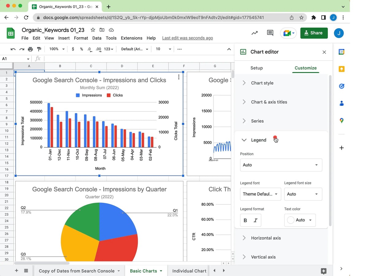
How to Access the Plot Area in Google Spreadsheets
Accessing the plot area in Google Spreadsheets is a simple process that allows you to customize and modify your charts for better data visualization. Here’s how you can access the plot area:
1. Open your Google Spreadsheet containing the chart you want to work with.
2. Click on the chart to select it. You will notice that a small menu icon (three vertical dots) appears in the top-right corner of the chart.
3. Click on the menu icon, and a drop-down menu will appear with various options.
4. From the drop-down menu, select “Edit Chart”. This will open the chart editor on the right-hand side of your spreadsheet.
5. Within the chart editor, you will find several tabs, including “Chart type”, “Customize”, “Series”, and more. Click on the “Customize” tab.
6. Under the “Customize” tab, you will see a list of customization options for your chart, including the plot area.
7. Scroll down or use the scroll bar on the right to find the “Plot Area” section within the “Customize” tab.
8. Within the “Plot Area” section, you can make various modifications to the plot area. For example, you can adjust its size, format the fill color, change the border color and thickness, and apply effects to enhance its appearance.
9. Play around with the different customization options to achieve the desired look and feel for your plot area.
10. Once you have made the necessary modifications to the plot area, you can exit the chart editor by clicking outside the editor or clicking on the “X” icon at the top-right corner of the editor.
By following these steps, you can easily access and customize the plot area in Google Spreadsheets. Through the chart editor, you have a range of options available to modify the plot area and create visually appealing and informative charts to present your data effectively.
Editing the Plot Area in Google Spreadsheets
Once you have accessed the plot area in Google Spreadsheets, you can proceed to edit and customize it to enhance the visual impact of your charts. Here are some editing options available to you:
1. Adjusting the Size: To resize the plot area, click on it to select it, and then click and drag the corner handles to resize it. This allows you to optimize the space for displaying your data and create a balanced chart.
2. Formatting the Fill Color: To change the background color of the plot area, select it, and then use the fill color picker tool in the chart editor. You can choose from a wide range of colors or apply a custom color code to match your desired aesthetic.
3. Modifying the Border: You have the option to adjust the border of the plot area to make it stand out or blend in with the rest of the chart. Select the plot area, and in the chart editor, navigate to the border settings. Here, you can change the border color, style, and thickness to suit your preferences.
4. Applying Effects: Google Spreadsheets provides several effects that you can apply to the plot area, such as shadows, glows, and reflections. Explore the chart editor’s “Effects” tab to experiment with these options and add depth to your plot area.
5. Adding Text: If you want to include additional information within the plot area, such as a title or data labels, use the text options available in the chart editor. You can add labels, captions, or even text boxes to provide context or clarify the information represented in the chart.
6. Aligning the Plot Area: Google Spreadsheets offers alignment tools that help you precisely position the plot area in relation to other chart components. Select the plot area and use the alignment tools to control its horizontal and vertical alignment within the chart.
7. Removing the Plot Area: At times, you may decide that the plot area is unnecessary for your chart or want to create a more minimalist design. To remove the plot area, select it in the chart editor, and then click the delete icon in the toolbar or press the delete key on your keyboard.
Remember, you can experiment with these editing options to achieve the desired visual effect for your plot area. By customizing the plot area in Google Spreadsheets, you can create visually appealing and informative charts that effectively communicate your data.
Common Features of Plot Area in Excel and Google Spreadsheets
The plot area in both Excel and Google Spreadsheets shares common features that allow users to create visually appealing and informative charts. Here are some of the common features of the plot area in both software:
1. Customization Options: Both Excel and Google Spreadsheets provide a wide range of customization options for the plot area. Users can adjust the size, format the fill color, modify the border properties, and apply visual effects to enhance the appearance of the plot area.
2. Resizing Capability: In both applications, users can easily resize the plot area to fit their specific needs. This flexibility enables the user to optimize the chart layout by making the plot area larger or smaller depending on the requirements of the data being presented.
3. Text and Labeling: Both Excel and Google Spreadsheets offer options to add text and labeling within the plot area. Users can include titles, data labels, and other text elements to provide context and improve the understanding of the data presented in the chart.
4. Alignment Tools: Both applications provide alignment tools that assist in precisely positioning the plot area within the chart. Users can align the plot area horizontally or vertically with other chart components for a better overall visual composition.
4. Removal Option: Both Excel and Google Spreadsheets allow users to remove the plot area if it’s not required or if they desire a minimalist design. This feature provides users with the flexibility to eliminate unnecessary elements from their charts.
5. Real-time Editing: Both applications offer real-time editing capabilities, allowing users to make changes to the plot area and see the results instantly. This quick feedback loop enables users to iterate and refine their chart designs efficiently.
Whether you’re using Excel or Google Spreadsheets, the plot area in both software provides powerful features to create visually stunning and informative charts. These shared features allow users to customize and tailor the plot area to effectively visualize their data and present it in a clear and engaging manner.
Tips and Tricks for Working with Plot Area in Excel and Google Spreadsheets
Working with the plot area in Excel and Google Spreadsheets can be made more efficient and impactful with some handy tips and tricks. Here are some tips to help you make the most out of the plot area:
1. Keep it Simple: Remember that less is often more when it comes to design. Avoid cluttering the plot area with unnecessary elements. Focus on presenting the most important information clearly and concisely.
2. Consistency is Key: Maintain a consistent look and feel across your charts. Use the same color palette, font styles, and formatting conventions to create a cohesive visual identity for your data visualization.
3. Use Gridlines and Axis Labels: Gridlines and axis labels provide reference points that aid in understanding the data in the plot area. Ensure that the gridlines are visible and use informative axis labels to help interpret the information accurately.
4. Experiment with Chart Types: Don’t be afraid to explore different chart types to find the one that best represents your data. Both Excel and Google Spreadsheets offer a variety of chart types, such as bar charts, line charts, and pie charts. Choose the chart type that effectively communicates your data story.
5. Highlight Key Data Points: Emphasize important data points or trends by using colors, markers, or data labels. This will draw attention to the crucial information within the plot area and make it easier for viewers to grasp the main insights.
6. Utilize Chart Templates: Save time by using pre-designed chart templates available in Excel and Google Spreadsheets. These templates offer professionally designed layouts and formatting options that can be applied with just a few clicks.
7. Incorporate Interactive Elements: Take advantage of interactive features, such as tooltips or data filtering, to enhance the user experience. This allows viewers to explore the data in a more interactive and engaging way.
8. Regularly Update Data: Keep your charts up to date by regularly updating the underlying data in your spreadsheet. This ensures that the plot area accurately reflects the latest information and maintains its relevance.
9. Consider Accessibility: Make your charts accessible to a wider audience by using color schemes that are easy to distinguish for individuals with color blindness. Additionally, provide alternative text for visually impaired individuals using screen readers.
10. Practice Good Data Visualization Principles: Familiarize yourself with best practices for data visualization, such as using appropriate scales, avoiding misleading representations, and providing proper context for the data. Following these principles will help you create more informative and effective charts.
By applying these tips and tricks, you can enhance the impact and clarity of your charts in Excel and Google Spreadsheets. Experiment with different techniques and continuously refine your data visualization skills to create compelling and informative visual representations of your data.