
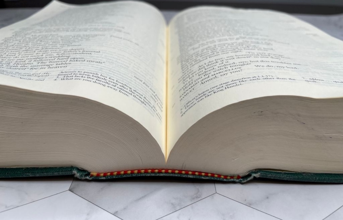
What is the Gutter in Publishing and Layout?
In the world of publishing and layout, the gutter refers to the space between two facing pages in a printed document. It is the area where the pages meet in the middle and is typically located closest to the spine. The gutter ensures that content within a publication remains readable even when the book is opened and the pages are slightly curved or bind together.
The size of the gutter can vary depending on the type of publication and the printing method used. It is crucial to consider the gutter when designing layouts for books, magazines, brochures, and other printed materials to ensure that important elements such as text and images do not get obscured or distorted in the center of the spread.
The gutter plays a significant role in creating visually appealing and functional layouts. It provides a buffer zone between content and the spine, preventing important elements from falling into the binding area. Without an adequate gutter space, text may be difficult to read, and images may be distorted or partially hidden.
Designers need to carefully consider the size of the gutter based on the type of publication and the paper’s thickness. Thicker publications may require a wider gutter to accommodate the additional bulk, ensuring the content remains intact and legible. On the other hand, thinner publications may have a narrower gutter to optimize the space available.
Overall, the gutter is a critical aspect of publishing and layout design. It ensures that the content of a publication is visually pleasing, readable, and functional, even when the pages are bound together. By understanding the importance of the gutter and incorporating it effectively into design layouts, designers can create visually appealing publications that captivate readers and provide an enjoyable reading experience.
Why is the Gutter Important in Publishing and Layout?
The gutter plays a crucial role in publishing and layout design for several reasons. Its importance lies in its ability to enhance the readability, functionality, and visual appeal of a printed document. Here are the key reasons why the gutter is important:
- Readable Content: The gutter ensures that text and other content near the spine of a book or magazine remain readable. Without a gutter, the curvature or binding of the pages can cause text to become obscured or difficult to read. Adequate gutter space ensures the content remains intact and legible, enhancing the overall reading experience.
- Image Placement: The gutter provides a space for images or other visual elements in a layout. By keeping images away from the spine, they can be displayed more prominently and without distortion. This allows for a better visual flow and prevents important parts of the images from being lost in the fold of the page.
- Different Print Sizes: The gutter accommodates different print sizes and binding methods. The width of the gutter can vary depending on the thickness of the publication, ensuring that the content is not compromised by page curvature or the binding process. A well-designed gutter adapts to the printing specifications, making the publication visually appealing and functional.
- Margin Considerations: The gutter complements the margins of a layout. It provides a buffer area between the content and the binding, preventing text or design elements from being too close to the spine, where they may be difficult to read or view. A properly sized gutter ensures a balanced and aesthetically pleasing layout.
The gutter is essential in creating visually appealing and functional publications. It helps maintain readability, optimize image placement, adapt to different print sizes, and balance margins. By considering the importance of the gutter in publishing and layout design, designers can create cohesive and visually pleasing publications that engage readers and leave a lasting impression.
How to Determine the Size of the Gutter in Your Publication?
Determining the appropriate size of the gutter in your publication requires careful consideration of various factors. Here are some key steps to help determine the ideal gutter size:
- Publication Type: Consider the type of publication you are designing. Different types, such as books, magazines, or brochures, may require varying gutter sizes based on factors like thickness and binding method.
- Printing Method: Understand the printing method that will be used for your publication. Traditional offset printing may require a wider gutter due to paper thickness and binding requirements, while digital printing or online publications may be more flexible in terms of gutter size.
- Paper Thickness: Take into account the thickness of the paper you will be using. Thicker paper usually requires a wider gutter to accommodate the bulk and ensure that the content remains intact and readable.
- Page Count: Consider the total number of pages in your publication. The more pages you have, the wider the gutter should be to allow for proper alignment and readability near the spine.
- Design Elements: Evaluate the design elements that will be present in your publication. If you have large images or intricate layouts, you may need a wider gutter to ensure the visual elements do not get distorted or hidden in the center of the spread.
- User Experience: Put yourself in the shoes of the reader and think about their experience. Consider how the gutter affects readability and the overall visual flow of the content. Aim to create a balance between the gutter size and the content, ensuring a comfortable reading experience.
By carefully considering these factors, you can determine the ideal gutter size for your publication. Keep in mind that there is no one-size-fits-all approach, and it may require some trial and error to find the right balance. However, with thoughtful consideration and testing, you can achieve a well-designed publication with an appropriate gutter size that enhances readability and visual appeal.
Tips for Effectively Using the Gutter in Your Designs
The gutter in your designs plays a significant role in creating visually appealing and functional layouts. Here are some tips to help you effectively utilize the gutter:
- Balance the Margins: Maintain a balanced layout by considering the gutter in relation to the outer margins. Avoid having elements too close to the gutter or the outer edges, as it can compromise readability and aesthetics.
- Align Text Away from the Gutter: When placing text in your layout, align it away from the gutter to ensure it remains readable. This helps prevent the text from getting lost or distorted in the binding area.
- Consider Image Placement: Place images strategically in your layout, keeping in mind the gutter. Avoid spanning images across the gutter, as it can disrupt the visual flow and lead to a fragmented viewing experience.
- Use the Gutter for Visual Separation: Utilize the gutter as a visual separator between different elements or sections of your design. This helps create a clear distinction and enhances the overall organization of your layout.
- Pay Attention to Multi-Page Spreads: When designing spreads that span multiple pages, pay special attention to the gutter space where the pages meet. Ensure that important content or design elements are not lost or disrupted by the page fold.
- Test and Adjust: It’s crucial to test your designs by creating physical mock-ups or using design software. This allows you to evaluate the readability and visual balance of your layout and make necessary adjustments to the gutter size or placement of elements.
By following these tips, you can effectively use the gutter in your designs to create visually appealing and functional publications. Remember to strike a balance between design aesthetics and readability, ensuring that the gutter enhances the overall experience for your readers.
Common Mistakes to Avoid When Using the Gutter in Publishing and Layout
While the gutter is an essential element in publishing and layout design, there are some common mistakes that designers should avoid to ensure optimal results. By being aware of these pitfalls, you can create layouts that effectively utilize the gutter. Here are some common mistakes to watch out for:
- Narrow Gutter: Using an excessively narrow gutter can lead to readability issues, especially when dealing with thick publications or materials that do not lie flat. Avoid compromising the gutter size and make sure there is enough space for content near the spine.
- Overlapping Images: Placing images across the gutter can result in visual disruptions and make it challenging to view the image as a whole. Instead, consider utilizing the gutter as a visual separator or aligning images away from the gutter for a more cohesive design.
- Poor Text Alignment: Failing to align text away from the gutter can make it difficult to read. Ensure that text does not fall too close to the gutter and adjust the layout accordingly for optimal readability.
- Neglecting Page Transitions: When designing multi-page spreads, it’s crucial to pay attention to the gutter space where the pages meet. Neglecting this area can result in disruptive page transitions or important content getting lost or distorted.
- Ignoring Print Specifications: Each printing method and paper thickness may require different gutter sizes. Ignoring these specifications can lead to issues during printing, such as content getting cut off near the gutter or improper binding.
- Lack of Testing: Not testing your designs can result in unexpected issues with readability, alignment, or image placement. Regularly create mock-ups or use design software to evaluate the effectiveness of your gutter usage and make adjustments as needed.
By avoiding these common mistakes, you can ensure that the gutter in your publications and layouts is effectively utilized. Taking the time to properly consider the gutter size, alignment, and overall design can significantly enhance the readability, functionality, and visual appeal of your designs.
Examples of Well-Designed Layouts That Effectively Utilize the Gutter
When it comes to designing layouts that effectively utilize the gutter, there are numerous examples that showcase the successful implementation of this important design element. Here are some inspiring examples of well-designed layouts:
- Magazine Spreads: Many magazines utilize the gutter effectively by incorporating captivating images that span across the pages while maintaining sufficient space between content and the spine. This approach creates a visually appealing design that enhances readability and visual flow.
- Book Layouts: Books often employ a wider gutter to account for the thicker spines and ensure that the text remains readable and unobstructed. The gutter is carefully considered to prevent important content from being too close to the binding and to maintain a clean and balanced layout.
- Brochure Design: Brochures typically have a moderate gutter size to accommodate folds and allow for easy readability when the brochure is opened. Effective use of the gutter in brochures ensures that content and images remain intact and aesthetically pleasing.
- Annual Reports: Annual reports often feature multi-page spreads with detailed information. Well-designed annual reports make use of the gutter to separate sections, allowing for clear organization and readability, while maintaining a cohesive and visually appealing layout.
These examples demonstrate how incorporating an appropriate gutter size and strategically placing elements can greatly enhance the overall design and user experience. By studying and drawing inspiration from well-designed layouts, you can learn valuable lessons on how to effectively utilize the gutter in your own projects.
Tools and Resources to Help You Design and Optimize the Gutter in Your Publication
Designing and optimizing the gutter in your publication can be made easier with the help of various tools and resources that are specifically designed for layout design. Here are some helpful tools and resources to consider:
- Design Software: Professional design software such as Adobe InDesign or QuarkXPress provides dedicated features and options for managing the gutter. These programs allow you to set the gutter size, align content, and preview how the design will look when printed or digitally published.
- Templates and Grid Systems: Many design platforms offer pre-designed templates and grid systems that incorporate a well-defined gutter space. These templates provide a starting point for your layout design and ensure that the gutter is properly accounted for.
- Printers and Publishers: Consult with printers and publishers who have experience in producing similar publications. They can provide guidance on recommended gutter sizes based on the printing method, paper type, and binding requirements.
- Online Resources and Communities: Explore online forums, design blogs, and communities where designers share tips and best practices. These platforms can provide valuable insights and recommendations for optimizing the gutter in your publications.
- Mock-Up Tools: Use mock-up tools that allow you to simulate how your design will look in a physical printed format. This enables you to assess the readability and overall visual impact of your design, including the effective use of the gutter.
By utilizing these tools and resources, you can streamline your design process and ensure that the gutter in your publication is effectively designed and optimized. Remember to stay up to date with the latest design trends and techniques to continuously improve your layout designs.