
Finding the Right Font
Choosing the right font is crucial when it comes to creating a visually appealing and effective design in Photoshop. When it comes to simulating bold and italics, selecting a font that has a variety of weights and styles will make the process much easier. Here are a few tips to help you find the perfect font:
- Consider readability: Opt for a font that is easily legible, especially when used in bold or italic styles. Fonts that are too fancy or decorative may be difficult to read in these modified forms.
- Explore font libraries: Take advantage of the vast array of font libraries available online. Websites like Google Fonts, Adobe Fonts, and Font Squirrel offer a wide selection of fonts to choose from, many of which have multiple weights and styles.
- Pay attention to font families: Look for font families that include bold and italic variations. These families often have a consistent design aesthetic, providing a cohesive look throughout your design.
- Check font licensing: Make sure the font you choose is properly licensed for your specific usage. Some fonts may have restrictions on usage for commercial projects or require purchase for full access to all variations.
- Test font combinations: Experiment with different font combinations to find a pairing that works well together and enhances the overall design. Pairing a bold font with a complementary italic font can add visual interest and emphasis.
- Consider the context: Think about the purpose and tone of your design when selecting a font. Different fonts evoke different emotions, so choose one that aligns with the message you want to convey.
Remember, finding the right font is the foundation for effectively simulating bold and italics in Photoshop. Take your time to explore different options and consider how different fonts can enhance your design.
Adding Emphasis with Size and Weight
When it comes to simulating bold and italics in Photoshop, you can also achieve emphasis by adjusting the size and weight of the text. Here are some techniques to consider:
- Increasing font size: One of the simplest ways to add emphasis is by increasing the size of your text. Larger text naturally draws attention and can make certain words or phrases stand out.
- Using font weight: Many fonts come with different weight options, such as light, regular, bold, and extra bold. By selecting a heavier weight, you can add emphasis and make the text appear bolder.
- Combining different font sizes and weights: Experiment with combining different sizes and weights within a text element to create a visually striking effect. For example, you might use a larger, bold font for the main headline and a smaller, regular font for supporting text.
- Applying a hierarchy: Establishing a clear hierarchy in your design is essential for guiding the viewer’s attention. Use larger font sizes and bolder weights for important headings or key points, and use smaller sizes and lighter weights for supporting text.
- Contrasting styles: Another way to create emphasis is by using contrasting font styles. For example, if you have a predominantly serif font, you can use a sans-serif font in bold or italic to make certain elements stand out.
Remember to use these techniques judiciously and avoid overusing bold or large text, as it can overwhelm the design and make it harder to read. The goal is to achieve a balance that adds emphasis without sacrificing readability.
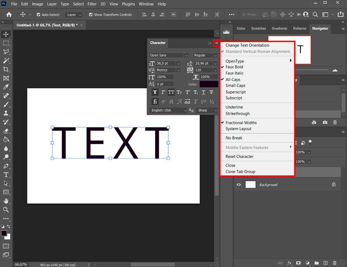
Applying Bold and Italics Using the Character Panel
In Photoshop, one of the simplest ways to simulate bold and italics is by using the Character panel. This panel provides easy access to various formatting options, including bold and italics. Here’s how to apply these styles:
- Select the text: Start by selecting the text that you want to format. You can do this by clicking and dragging your cursor over the desired text.
- Open the Character panel: To open the Character panel, go to the “Window” menu and select “Character” or use the keyboard shortcut Ctrl+T (Windows) or Cmd+T (Mac).
- Toggle bold: In the Character panel, you’ll see a bold button represented by a “B” icon. Click on this button to apply the bold style to the selected text. Alternatively, you can use the keyboard shortcut Ctrl+B (Windows) or Cmd+B (Mac).
- Toggle italics: To apply italics to the text, look for the italics button in the Character panel represented by an “I” icon. Click on this button to activate the italics style. You can also use the keyboard shortcut Ctrl+Shift+I (Windows) or Cmd+Shift+I (Mac).
The Character panel allows you to easily toggle between bold and italics styles, giving you control over the emphasis applied to your text. It is important to note that this method doesn’t actually modify the font itself, but rather applies a style to the selected text.
Additionally, the Character panel offers other typographic options such as adjusting the font size, leading (line spacing), and tracking (letter spacing). Utilizing these options in conjunction with bold and italics can further enhance the visual impact of your text.
Emphasizing with Layer Styles
In Photoshop, you can go beyond basic bold and italics by using layer styles to add more emphasis to your text. Layer styles allow you to apply various effects and enhancements to your text, making it visually compelling. Here are some layer styles you can use to emphasize your text:
- Drop Shadow: Adding a drop shadow to your text creates depth and makes it stand out. You can adjust the size, distance, and opacity of the shadow to achieve the desired effect.
- Stroke: Applying a stroke to your text adds a border around it, making it more prominent. You can customize the color, size, and position of the stroke to match your design.
- Inner Shadow: Similar to a drop shadow, an inner shadow adds depth to your text but inside the characters. It creates a realistic effect and can be adjusted to provide the desired level of emphasis.
- Gradient Overlay: Using a gradient overlay can give your text a vibrant and dynamic appearance. You can choose different color combinations and adjust the angle and opacity of the gradient.
- Bevel and Emboss: Applying bevel and emboss effects to your text adds dimension and makes it look 3D. You can control the depth, size, and angle of the bevel, as well as the highlight and shadow colors.
To apply layer styles to your text, follow these steps:
- Select the text layer: Make sure the layer containing your text is selected in the Layers panel.
- Open the Layer Styles dialog: You can access the Layer Styles dialog by either right-clicking on the text layer and selecting “Blending Options” or by going to the “Layer” menu, choosing “Layer Style,” and then selecting the desired effect.
- Choose the desired layer style: In the Layer Style dialog, select the effect you want to apply. Customize the settings to achieve the desired emphasis effect.
- Preview and apply the layer style: As you adjust the settings, you can preview the effect in real-time. Once you are satisfied, click “OK” to apply the layer style to your text.
Layer styles offer endless possibilities for emphasizing text in Photoshop. Experiment with different combinations and settings to create unique and eye-catching effects that suit your design.
Creating a Custom Bold or Italic Font
If you’re looking to go beyond stock fonts and want a truly custom look, you can create your own bold or italic font in Photoshop. This allows you to have complete control over the style and appearance of your text. Here’s how you can create a custom bold or italic font:
- Choose a base font: Start by selecting a base font that you want to modify. It is recommended to choose a font that already has a regular version as a base for creating the bold or italic variations.
- Create a duplicate: Duplicate the selected font in your operating system’s font folder. This will allow you to make the necessary changes without affecting the original font.
- Modify the font: Now comes the fun part! Use a font editing software or Photoshop’s built-in tools to make the desired modifications to the duplicated font. Increase the weight and add more thickness for a bold effect, or slant the characters for an italic effect. Be sure to maintain the overall look and feel of the original font.
- Save the modified font: Once you are satisfied with the modifications, save the font with a new name to differentiate it from the original font. Ensure that the font is saved in a file format that is supported by Photoshop (.otf or .ttf).
- Install and use the custom font: Install the modified font on your computer by double-clicking the font file and selecting the “Install” option. Once installed, the font will be available in Photoshop’s font list. You can now apply the custom bold or italic style to your text.
Creating a custom bold or italic font allows you to have complete creative control over the text in your design. It adds a unique touch and ensures that your design stands out from the crowd.
Keep in mind that modifying an existing font may have limitations and may not provide the same level of precision and control as professional font creation software. However, this method is a great starting point for creating customized fonts without the need for advanced typography skills or expensive software.
Simulating Bold and Italics Using Photoshop’s Warp Tool
In Photoshop, another technique for simulating bold and italics is by using the Warp tool. This tool allows you to distort and transform the text, giving it a bold or italic appearance without actually modifying the font itself. Here’s how you can use the Warp tool to simulate bold and italics:
- Select the text: Start by selecting the text layer that you want to apply the effect to.
- Access the Warp tool: Go to the “Edit” menu, choose “Transform,” and then select “Warp.”
- Adjust the Warp options: In the toolbar at the top of the screen, you’ll find various warp options. Experiment with different presets like “Arc,” “Flag,” or “Bulge,” or manually adjust the warp handles to achieve the desired effect.
- Apply the Warp: Once you’re happy with the warp adjustments, click the checkmark icon in the toolbar or press Enter/Return to apply the warp transformation to the text.
The Warp tool allows you to manipulate the shape of the text and create custom distortions that can give the illusion of bold or italic styles. However, keep in mind that this method is only a visual simulation and does not change the font properties permanently.
While using the Warp tool can be a quick and effective way to simulate bold and italics, it’s important to use it judiciously. Excessive warping can distort the readability of the text and make it harder to read. It’s recommended to apply subtle transformations that enhance the overall design without sacrificing legibility.
Experiment with different warp options and combinations to achieve the desired bold or italic effect. Remember to keep a backup of the original text layer so that you can easily revert back if needed. The Warp tool provides great flexibility for customizing and stylizing text, allowing you to create unique and eye-catching designs.
Using the Liquify Filter to Create a Bold or Italic Effect
In Photoshop, another powerful tool for simulating bold and italic effects on text is the Liquify filter. This filter allows you to reshape and manipulate the appearance of the text, giving it a bold or italic look. Here’s how you can use the Liquify filter to achieve this effect:
- Select the text layer: Start by selecting the text layer that you want to modify using the Liquify filter.
- Access the Liquify filter: Go to the “Filter” menu, choose “Liquify” or use the keyboard shortcut Ctrl+Shift+X (Windows) or Cmd+Shift+X (Mac).
- Use the Forward Warp Tool: In the Liquify dialog box, select the “Forward Warp Tool” from the toolbar on the left. This tool allows you to push and distort the text.
- Reshape the text: Use the brush cursor to push and warp the characters of the text to achieve a bold or italic effect. You can adjust the brush size and pressure sensitivity for more precise control.
- Apply the changes: Once you’re satisfied with the reshaping, click “OK” to apply the Liquify filter and see the modified text in your document.
The Liquify filter offers a wide range of options to manipulate the shape of the text. You can push, swirl, or squeeze the characters to create the desired bold or italic effect. However, it’s important to use this tool with care and avoid excessive distortion that may impact the legibility of the text.
It’s recommended to keep a backup of the original text layer before applying the Liquify filter. This way, you can easily revert back or make further adjustments if necessary. Additionally, using the Liquify filter on editable text layers is preferable to maintain flexibility and allow for non-destructive editing.
Experiment with different brush sizes, pressure settings, and overall transformations to achieve the desired bold or italic effect. The Liquify filter offers endless possibilities for customization, allowing you to create unique and visually striking text designs.
Adding Depth and Dimension with Shadows and Highlights
One effective way to create a bold or italic effect in Photoshop is by adding depth and dimension to the text using shadows and highlights. By strategically placing light and shadow effects, you can create a more three-dimensional appearance that enhances the overall visual impact of the text. Here’s how you can incorporate shadows and highlights:
- Drop Shadow: Apply a drop shadow to the text to create the illusion of it being raised above the background. Adjust the angle, distance, size, and opacity of the shadow to achieve the desired effect.
- Inner Shadow: Use an inner shadow to add depth and definition to the text. Adjust the angle and distance of the shadow to create the desired appearance of a bold or italic effect.
- Highlight: Add a subtle highlight to certain areas of the text to give it a shiny or raised look. Place the highlight strategically on the edges or thicker parts of the text to create the desired effect.
- Contour: Utilize the contour feature to further enhance the dimension of the text. Experiment with different contour shapes and adjustments to suit your design.
When applying shadows and highlights, it’s important to consider the light source and the overall composition of the design. Consistency in lighting direction and intensity will make the text appear more realistic and coherent.
Play around with different shadow and highlight settings, adjusting their opacity, distance, and size to achieve the desired bold or italic effect. Remember, subtlety is key—overusing shadows and highlights can result in a cluttered and distracting design.
Don’t be afraid to experiment with different blend modes and layer styles to create interesting and unique effects. Using a combination of shadows, highlights, and other layer styles can take your text from plain to visually captivating.
Adding depth and dimension with shadows and highlights allows you to create text that appears bolder or italicized, giving it a more pronounced and visually appealing presence in your design.
Enhancing with Layer Blending Modes
Layer blending modes in Photoshop offer a powerful way to enhance your text and simulate bold and italic effects. By changing the blending mode of a layer, you can interact with the underlying layers and create interesting visual combinations. Here’s how you can use blending modes to enhance your text:
- Overlay: The Overlay blending mode combines the Multiply and Screen blending modes. It adds contrast and saturation to the text, making it more vibrant and bold.
- Soft Light: The Soft Light blending mode adds a subtle lighting effect to the text, enhancing its depth and giving it a softer appearance.
- Multiply: The Multiply blending mode darkens the text by multiplying the colors with the underlying layers. This can create a visually bold effect, especially when combined with lighter backgrounds.
- Color Dodge: The Color Dodge blending mode increases the brightness of the text, creating a glowing and intense effect. This can be particularly useful for creating dramatic or futuristic text styles.
- Color Burn: The Color Burn blending mode increases the darkness and saturation of the text, resulting in a rich and deep appearance. It can be used to add boldness and impact to the text.
To apply a blending mode to a text layer, select the layer and choose the desired blending mode from the mode dropdown in the Layers panel. Experiment with different blending modes and adjust the layer opacity to achieve the desired effect.
Keep in mind that layer blending modes work best when combined with other design elements. Try incorporating gradients, textures, or background effects to enhance the overall visual impact of the text.
Layer blending modes allow you to transform the look and feel of your text, giving it a bold or italic appearance. These modes offer endless possibilities for creative experimentation and can help you achieve unique and eye-catching results in your designs.
Converting to a Smart Object for Non-Destructive Editing
When working with text in Photoshop, it’s important to maintain flexibility and the ability to make changes without permanently altering the original text layer. Converting the text layer to a smart object allows for non-destructive editing, meaning you can make adjustments and modifications while preserving the integrity of the original text. Here’s how you can convert your text to a smart object:
- Select the text layer: Start by selecting the text layer in the Layers panel.
- Convert to a smart object: Right-click on the selected text layer and choose “Convert to Smart Object” from the context menu.
Once the text layer is converted to a smart object, you can apply various transformations, filters, and layer styles to it while maintaining the ability to modify or revert the changes at any time. This is particularly useful when simulating bold and italic effects, as it allows you to fine-tune the appearance without permanently altering the original font or text layer.
To edit the contents of a smart object, simply double-click on the smart object layer in the Layers panel. This will open a new document or tab where you can make the desired changes. Once you save and close this document, the changes will be automatically applied to the smart object layer in your main composition.
Converting text to a smart object also provides other advantages, such as reducing file size and increasing performance. Additionally, it allows for easy replication of the same text style across multiple documents by duplicating the smart object.
By converting your text to a smart object, you have the freedom to experiment and make modifications without the fear of permanently altering the original text. It is a valuable technique for non-destructive editing and maintaining flexibility throughout your design process.