Much like the siren depicted in it, the Starbucks logo is a bit of a mystery even for those who are loyal customers of the popular coffee chain. What does the Starbucks logo mean? There are different theories and interpretations. In order to get to the real answer, however, we must first look at its history and evolution.
Here’s what you need to know about the iconic yet enigmatic Starbucks siren.
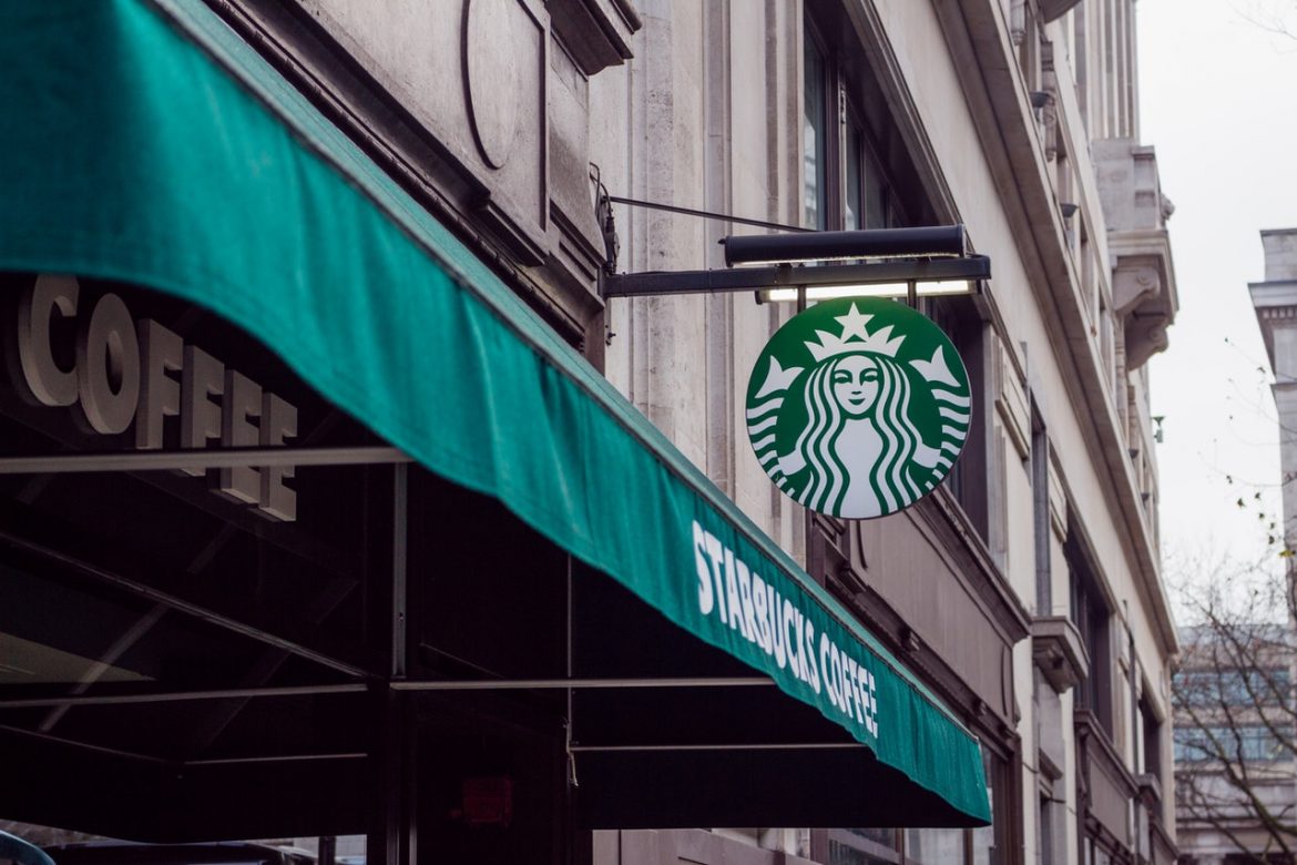
Starbucks Logo History
The coffee giant was first established in 1971 as a coffee bean retailer. It was founded by Zev Siegl, Jerry Baldwin, and Gordon Bowker. The company was originally named Pequod, inspired by the whaling ship from Moby Dick. This was later changed to Starbuck, the chief mate on the Pequod.
Not many people know this, but the Starbucks logo we see today is a simplified version of the original. The surrounding text and its double circles have all been removed. The only detail left of the original is the twin-tailed mermaid—the Siren of Greek mythology.
According to legend, Sirens are mythical creatures who would lure sailors to the coast of a South Pacific Island—leading them to shipwreck. The original Starbucks logo was meant to symbolize the way they would lure coffee lovers from all over, to sample their specialties. Its design first underwent changes in 1987, when the company was bought by Howard Schultz.
The design was cleaned up and given a more corporate look, rather than the artisan-feel it used to have. Aside from the logo, the original company name was also changed. From “Starbucks Coffee, Tea, and Spice,” it was shortened to the more memorable “Starbucks Coffee.” Sounds catchier, doesn’t it?
Starbucks Logo Evolution
1971: The old Starbucks logo featured the Siren and her double tail, with her navel visible. There was also a circular ring surrounding the figure. The design had a coffee-brown palette.
1987: The second version of the logo featured a bare-bodied Siren, with long hair covering her torso. This design featured the name of the company inside the circle, with the addition of two stars on either side. Its color was also changed from an earthy brown to a more refreshing green. This was meant to represent growth, prosperity, and uniqueness.
1992: For its third redesign, everything was cleaned up. The Siren’s navel was no longer visible, but most of her original features were retained. The most significant change was the close-up view of the Siren, instead of the original Starbucks logo which showed her full torso and was far more detailed.
2011: To celebrate the 40th anniversary of the company, the logo underwent another redesign. This time, it was further streamlined. The wordmark and the stars were removed, while the image of the Siren was enlarged. This minimalist take on the Starbucks logo received plenty of criticism and backlash from fans of the coffee chain. Many cited that the simpler design takes away from the Starbucks logo meaning.
What is The Starbucks Logo – The Mysterious Siren
She’s as alluring as the aroma of brewing coffee the moment you step into a Starbucks, but few really know who the Siren really is. While we know that she was inspired by Greek Mythology, it seems that the Starbucks Siren has become a legend of its own. Is she just another representation of the advertising cliché that “sex sells” or is she something far more?
Starbucks Logo Controversies
What do you see whenever you look at your frappe from Starbucks? There are those who believe that the Siren is an Illuminati symbol and in some cases, part of a Zionist plot. Perhaps it’s the association to Greek mythology that really gets minds spinning. But, let’s stick to the facts for this one.
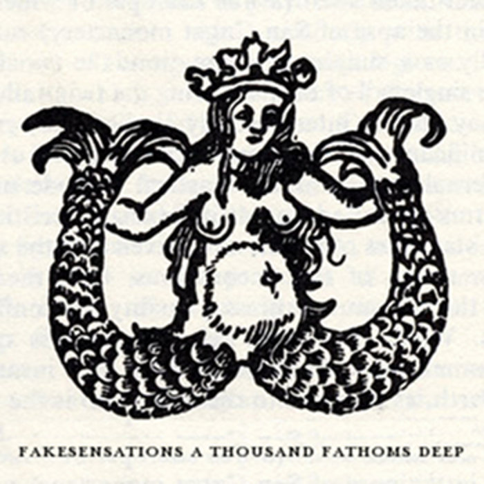
The most popular controversy is the misinformation when it comes to the Starbucks logo history. It seems that when the company said that their logo was derived from a sixteenth-century Norse woodcut of a twin-tailed siren, they actually meant “Nordic.” Furthermore, the original woodcut was said to have been of German origin and not Scandinavian like they first thought.
Starbucks Siren vs. Mélusine
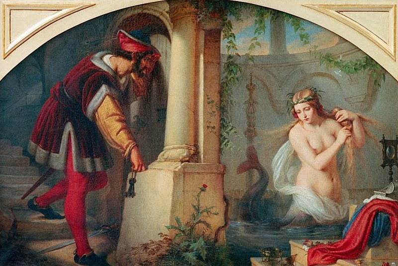
What of the Siren, then? Is she really the same creature from Greek myths? As it turns out, this might not be the case. The image of twin-tailed mermaids is more closely associated with Mélusine, an inland-spring maid and not quite the deadly Siren we all thought. Here’s an interesting read about her legend and the Starbucks connection via Rupert Willoughby.
While Mélusine may not have been the original inspiration, she does fit the narrative better. Seattle is located between Puget Sound and Lake Washington, so a freshwater (mer)maid seems more appropriate for the Starbucks logo.
What Does the Starbucks Logo Mean? A Darker Look
A darker side to Starbucks? Well, you’d be surprised by some of the other associations people have theorized about the company’s “fair lady.” According to The Scott Smith Blog, the figure we’ve come to recognize as a Siren is actually the demon Lilith. If you’re unfamiliar with her, she is known to be Adam’s first wife and is said to be a “child eater.”
She is described as being serpentine in nature, though she has the ability to transform herself into many other forms. Her most common depiction, however, is that of a beautiful woman with serpentine tails instead of legs.
Is this really the Starbucks logo meaning? Well, no one can say so with certainty.
It is for this reason that some groups of people believe the company to be evil. They see it as an organization that promotes atheism and other similar beliefs. Whether these claims are true or not is yet to be seen. It all boils down to what you, as an individual, choose to believe.
In Closing:
Designing a logo is not an easy task and businesses spend a huge amount of money and other resources on their logo design. The Starbucks logo is comparable to the Mona Lisa in terms of the fascination it inspires in people. While we know of its history, there are still many secrets and questions left unanswered. Here’s what we know for certain, though: she has become deeply ingrained in our consciousness. When the Siren beckons, no one can resist her call.