
Understanding Color Theory
When it comes to choosing the right color for your picture frame, understanding color theory is essential. Color theory is the study of how colors interact and the emotions they evoke. By having a basic understanding of color theory, you can make informed decisions that will enhance the visual impact of your artwork or photograph.
Colors can be categorized into various groups, such as warm colors (e.g. red, orange, yellow) and cool colors (e.g. blue, green, purple). Warm colors tend to create a sense of excitement and energy, while cool colors evoke a calm and soothing atmosphere. However, it’s important to note that personal preferences and cultural influences can also play a significant role in color perception.
One important aspect of color theory to consider is the concept of complementary colors. Complementary colors are those that are opposite each other on the color wheel, such as blue and orange, or red and green. When used together, complementary colors create a strong visual impact and can make your artwork or photograph stand out.
Another useful concept in color theory is analogous colors. Analogous colors are those that are adjacent to each other on the color wheel, such as red, orange, and yellow. This color scheme creates a harmonious and cohesive look.
Additionally, understanding color psychology can help you choose a frame color that aligns with the emotions or atmosphere you want to create. For example, if you want to evoke a sense of calmness and tranquility in a room, choosing a cool-toned frame color like light blue or soft green can achieve that effect.
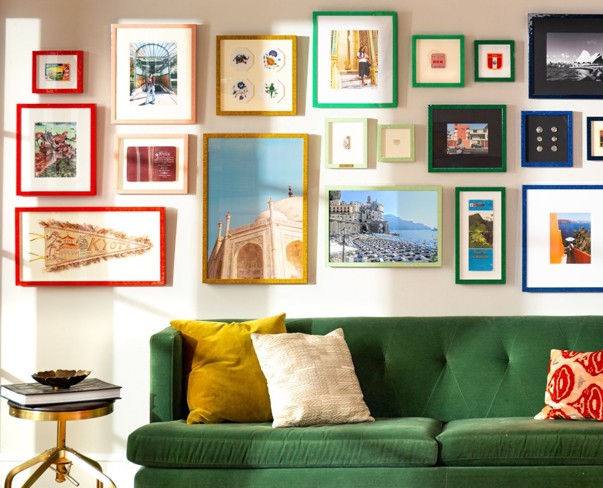
Keep in mind that the size and placement of the artwork or photograph should also be considered when choosing a frame color. A larger or centrally positioned piece may call for a bolder frame color to make a statement, while a smaller or more intricately detailed piece may benefit from a more neutral frame color to let the artwork speak for itself.
Consider the Artwork or Photograph
When selecting a picture frame color, it’s crucial to consider the artwork or photograph itself. The colors, style, and subject matter of the piece will all play a role in determining the most suitable frame color to enhance its overall presentation.
If the artwork or photograph features vibrant and bold colors, a neutral frame color, such as white or black, can provide a clean and timeless look that doesn’t distract from the artwork itself. On the other hand, if the piece is more subdued or monochromatic, a frame color that provides contrast, such as a deep espresso or a vibrant pop of color, can help create visual interest and bring the piece to life.
The style of the artwork or photograph is also important to consider. For contemporary or abstract pieces, a sleek and minimalist frame color, like silver or metallic, can complement the modern aesthetic. For vintage or traditional artwork, a more ornate frame color, such as gold or antique white, can enhance the classic charm of the piece.
Furthermore, it’s crucial to take into account the subject matter of the artwork or photograph. A nature-inspired piece may benefit from a frame color that mimics earthy tones, like a warm brown or a soft green. If the subject matter is more vibrant or whimsical, a frame color that matches the dominant hues in the artwork can help create a cohesive and visually pleasing display.
Remember that the frame color should not overpower the artwork or photograph, but instead complement and enhance its beauty. The frame should act as a visual frame, drawing attention to the piece without overshadowing its content.
By carefully examining the artwork or photograph and considering its colors, style, and subject matter, you can make a more informed decision when selecting the perfect frame color that will showcase the artistic expression to its fullest potential.
Take Color Psychology into Account
Color psychology is the study of how colors can affect human emotions and behavior. When choosing a picture frame color, it’s essential to consider the psychological impact it may have on viewers and the overall atmosphere of the room where the artwork or photograph will be displayed.
Colors have the power to evoke various emotions and moods. For example, warm colors like red, orange, and yellow can evoke feelings of excitement, energy, and passion. These colors can be a great choice for showcasing artwork or photographs that are bold, vibrant, or convey a sense of vitality.
Cool colors, such as blue, green, and purple, have a calming and soothing effect. They can create a sense of tranquility and relaxation, making them suitable for displaying artwork or photographs in spaces where you want to create a serene atmosphere, like bedrooms or meditation rooms.
Neutral colors, like white, black, and gray, have a timeless and versatile appeal. They can provide a clean and minimalist look that allows the artwork or photograph to take center stage. Neutral frames are a safe choice that can work well with various styles and color schemes.
Color associations can also vary across different cultures and personal experiences. For example, red may symbolize luck and happiness in some cultures, while it might represent danger or caution in others. It’s important to consider the cultural significance and personal associations of colors when selecting a frame color.
Consider the overall mood and theme you want to convey in the room where the artwork or photograph will be displayed. Choose a frame color that aligns with that mood, whether it’s calming, energizing, sophisticated, or playful. The frame color should complement the artwork or photograph and create a harmonious visual experience.
Remember, the goal is to create a cohesive and visually appealing display that not only showcases the artistic piece but also creates a positive and engaging atmosphere for viewers. By considering the principles of color psychology, you can select a frame color that enhances the emotional impact of the artwork or photograph and creates a memorable visual experience for anyone who sees it.
Analyzing the Room Decor and Color Scheme
When selecting a picture frame color, it’s crucial to consider the existing room decor and color scheme. The frame should harmonize with the overall aesthetic of the space, complementing the existing colors and decor elements.
Start by examining the dominant colors in the room. Look at the walls, furniture, and accessories to identify the primary hues. If the room features a neutral color scheme, such as whites, grays, or beiges, you have the freedom to choose a frame color that either blends in seamlessly or adds a pop of contrasting color.
If the room has a specific color scheme, such as a coastal theme with blues and whites, or a bohemian style with earth tones and pops of vibrant hues, consider selecting a frame color that aligns with these existing colors. This can help create a cohesive look and tie the artwork or photograph into the overall design scheme.
Another factor to consider is the overall style and ambiance of the room. Is it modern and minimalist, rustic and cozy, or luxurious and elegant? The frame color should complement the style and contribute to the desired ambiance of the space. For example, a sleek black frame can enhance the modern look, while a distressed wood frame can add warmth and rustic charm.
Consider the overall balance and contrast in the room. If the space already has a lot of visual elements and colors, a simpler and more understated frame color might be the best choice to avoid overwhelming the space. On the other hand, if the room feels a bit dull or lacks visual interest, a bold and vibrant frame color can inject personality and create a focal point.
Ultimately, the goal is to create a cohesive and visually pleasing display where the artwork or photograph, along with its frame, seamlessly integrates into the room’s decor. By analyzing the room’s color scheme, style, and overall ambiance, you can make an informed decision about the most suitable frame color that will enhance the space and create a harmonious visual experience.
Deciding between Neutral or Bold Colors
When choosing a picture frame color, one important consideration is whether to opt for a neutral or bold color. Both options have their own advantages and can create different visual effects, so it’s essential to consider the overall aesthetic you want to achieve and how the frame color will interact with the artwork or photograph.
Neutral colors, such as white, black, gray, or beige, are timeless and versatile choices. They provide a clean and minimalist look that allows the artwork or photograph to take center stage. Neutral frames blend seamlessly with any room decor and color scheme, making them a safe and practical option. They can also help create a sense of balance and tranquility, especially in spaces with vibrant or busy surroundings.
On the other hand, bold colors can add a vibrant and eye-catching element to your artwork or photograph. They can make a statement and become a focal point in the room. Bold frame colors, such as deep red, vibrant yellow, or electric blue, can inject energy and personality into the space. They work exceptionally well with artwork or photographs that have bold color palettes, abstract designs, or contemporary themes.
Consider the overall ambiance and style of the room when deciding between neutral or bold frame colors. If the room already has a lot of visual elements and colors, a neutral frame color may help create a sense of balance and prevent overwhelming the space. However, if the room feels lackluster or needs a pop of excitement, a bold frame color can instantly elevate the room’s vibrancy.
Another factor to consider is the size and prominence of the artwork or photograph. A larger and more centrally positioned piece may call for a bolder frame color to create a focal point and make a statement. Conversely, a smaller or more delicately detailed piece may benefit from a more neutral frame color to let the artwork or photograph speak for itself.
Ultimately, the decision between neutral or bold frame colors depends on your personal style, the type of artwork or photograph, and the overall aesthetic you want to create in the room. You can even consider a combination of both by opting for a neutral frame with a bold accent color or incorporating pops of bold colors in other decor elements to create a cohesive and visually appealing display.
Choosing a Complementary Frame Color
When selecting a picture frame color, one effective approach is to choose a complementary color that enhances the artwork or photograph. Complementary colors are those that are opposite each other on the color wheel, creating a visually striking contrast when used together.
By selecting a complementary frame color, you can create a sense of harmony and balance while also making the artwork or photograph stand out. This technique can add depth and visual interest to the overall presentation.
To determine the complementary frame color, start by identifying the dominant hues or color palette in the artwork or photograph. Refer to the color wheel and look for the color directly opposite the dominant hue. For example, if the artwork features a lot of blues and cool tones, its complementary color would be orange or warm tones.
Choosing a complementary frame color can be a bold move that adds a vibrant and dynamic element to the display. However, it’s important to ensure that the chosen frame color does not overpower the artwork or photograph itself. You want the frame color to enhance the piece, not distract from it.
If you prefer a more subtle approach, you can opt for a frame color that is a shade or tint of the complementary color. For example, instead of using a bright orange frame, you could choose a more muted or pastel orange tone. This will create a softer and more harmonious effect while still maintaining the complementary contrast.
Keep in mind that the complementary frame color should also work well with the overall room decor and color scheme. Consider how the frame color will interact with the wall color, furniture, and other accessories in the room. The goal is to create a cohesive and visually pleasing display that seamlessly integrates the artwork or photograph into the space.
Before making a final decision, it can be helpful to test out different frame colors and observe how they interact with the artwork or photograph. You can use digital editing tools or physically place color swatches next to the piece to get a better sense of how they complement each other.
Choosing a complementary frame color can add an extra dimension to your display, creating a visually stunning presentation that grabs attention and highlights the unique qualities of the artwork or photograph.
Exploring Different Framing Materials
When choosing a picture frame, the material you select plays a significant role in the overall aesthetic and durability of the frame. Different framing materials offer unique characteristics and can greatly impact the visual presentation of your artwork or photograph.
Wood is a popular and classic choice for picture frames. It exudes warmth and elegance and has a natural beauty that complements a wide range of artwork styles. Woods like oak, walnut, and maple offer rich tones and grain patterns that add depth and texture to the frame. They can be left natural or stained in various shades to match your decor preferences. Wood frames are durable and timeless, with the ability to withstand the test of time.
Metal frames, such as aluminum or steel, are known for their sleek and contemporary appearance. They offer a minimalist and modern aesthetic, often with a thin profile that lets the artwork or photograph take center stage. Metal frames are lightweight and highly durable, making them a practical choice for large or heavy pieces. They come in a variety of finishes, including brushed, polished, or matte, allowing you to create the desired look and feel.
Another option to consider is acrylic or plexiglass frames. These frames offer a sleek and transparent look, giving the illusion that the artwork or photograph is floating within the frame. Acrylic frames are lightweight and shatter-resistant, making them ideal for spaces where safety is a concern. They also provide UV protection, preserving the color and quality of the artwork over time.
For a more unconventional and unique look, you can explore alternative framing materials like bamboo, reclaimed wood, or even unconventional materials like fabric or cork. These materials can bring a distinctive and creative touch to the framing, adding an extra layer of character and personality to the display.
When selecting a framing material, consider the style and theme of the artwork or photograph, as well as the overall decor of the room. Think about how the material will interact with the colors, textures, and elements in the space. The goal is to find a framing material that enhances and complements the artwork or photograph while blending seamlessly with the overall aesthetic of the room.
Ultimately, exploring different framing materials allows you to create a customized and visually appealing display that showcases your artwork or photograph in the best possible way. Each material offers unique characteristics that can enhance the overall presentation and contribute to the longevity of your framed piece.
Testing Out Different Frame Colors
Choosing the right frame color for your artwork or photograph can be a subjective decision, as it largely depends on personal taste and the desired aesthetic. To make an informed choice, it’s crucial to test out different frame colors and see how they interact with the piece.
One of the easiest ways to test frame colors is by using digital editing tools. Take a high-quality photograph of the artwork or use a digital rendering and overlay different frame colors on it. This allows you to visualize how each color will look without physically committing to a specific frame.
Another option is to use physical frame color samples or swatches. Visit a local framing store or order frame samples online to get a tangible sense of how different colors will complement or contrast with your artwork or photograph. Hold the samples against the piece and observe how each color affects the overall presentation.
When testing out different frame colors, consider the mood and ambiance you want to create in the room. Do you want a frame color that blends seamlessly with the surroundings, or one that creates a bold and eye-catching contrast? Take into account the existing color scheme, the style of the room, and the overall aesthetic you want to achieve.
It’s also important to observe how different frame colors enhance or diminish certain elements in the artwork or photograph. Some colors may accentuate specific colors in the piece, while others may detract attention or create a mismatch. Pay attention to how the frame color interacts with the subject matter, composition, and overall mood of the artwork.
Additionally, take lighting conditions into consideration. Natural light, ambient lighting, and artificial lighting can all influence how colors appear. Test the frame colors in different lighting situations to ensure that they still produce the desired effect and harmonize with the space.
Don’t be afraid to experiment and step out of your comfort zone when testing frame colors. Sometimes, unexpected combinations can create surprising and visually stunning results. Trust your instincts and choose a frame color that speaks to you and enhances the beauty and impact of the artwork or photograph.
By taking the time to test out different frame colors, you can make an informed decision that will result in a visually pleasing and harmonious display. Whether you opt for a color that complements or contrasts with the artwork, the goal is to create a frame that enhances and showcases the piece in the best possible way.
Seeking Professional Advice
Choosing the right frame color for your artwork or photograph can be a daunting task, especially if you’re unsure about color theory or design principles. In such cases, seeking professional advice can alleviate any confusion and help you make a well-informed decision.
Art framers and interior designers are experts in their respective fields and can provide valuable insights and guidance when it comes to selecting the perfect frame color. They have an eye for detail and can consider factors such as the style of the artwork, the surrounding decor, and the desired ambiance of the room.
Art framers, in particular, specialize in the art of framing and have extensive knowledge of different frame styles, colors, and materials. They can offer suggestions based on their experience and expertise, taking into account the specific needs and preferences of your artwork or photograph.
When seeking professional advice, it’s important to articulate your vision, share any specific requirements or constraints, and convey the emotions or messages you want the artwork or photograph to convey. This will help the professionals understand your intentions and guide you in choosing a frame color that aligns with your goals.
Consulting an interior designer can also be beneficial, especially if you’re looking for a cohesive and well-integrated design scheme. They can consider the overall color palette, style, and decor of the room, and recommend a frame color that complements and enhances the existing space.
Keep in mind that professionals have a wealth of knowledge and experience, but ultimately, the final decision is yours. Their advice should serve as a guide, but you should always trust your instincts and choose a frame color that resonates with you and reflects your personal taste and style.
Lastly, don’t be afraid to ask for multiple opinions or seek advice from different professionals. Each individual may offer a unique perspective, and hearing various suggestions can help you gain a better understanding of the possibilities and make a more informed decision.
Seeking professional advice can provide the assurance and guidance needed to choose a frame color that enhances the visual impact of your artwork or photograph. Their expertise and insights can save you time and ensure that your framed piece is presented in the best possible way, leaving you with a beautiful and visually appealing display.
Finalizing Your Picture Frame Color
After considering various factors, such as color theory, artwork analysis, room decor, and professional advice, it’s time to finalize your picture frame color. By following a systematic approach and incorporating your personal preferences, you can confidently select a frame color that perfectly complements your artwork or photograph.
Review all the research and testing you have conducted thus far. Reflect on your initial goals and intentions for the display. Consider the emotions, mood, and ambiance you want to create, as well as the overall aesthetic and style of the space where the artwork or photograph will be displayed.
Take into account the artwork or photograph itself. Pay attention to its colors, style, subject matter, and size. Evaluate how each frame color interacts with these elements and enhances the overall presentation. Consider whether you want the frame to blend in harmoniously or make a bold statement.
Think about the room decor and color scheme. Ensure that the chosen frame color complements the existing hues and elements in the space. Consider the lighting conditions in the room and how they may affect the perception of color.
If you have sought professional advice, take into account the insights and recommendations provided by art framers and interior designers. Reflect on their expertise and consider how their suggestions align with your vision for the display.
Trust your instincts and personal taste. Choose a frame color that resonates with you and brings you joy. Ultimately, you are the one who will be living with the artwork or photograph, so it’s important that you feel a connection to the frame color you select.
Remember that the frame color should enhance and showcase the artwork or photograph, rather than overpower or distract from it. It should contribute to the overall visual appeal and create a cohesive and visually pleasing display.
Once you have made your final decision, take a step back and observe the overall effect. Consider how the chosen frame color transforms the artwork or photograph and enhances its impact. Make any necessary adjustments if something feels off and revisit your selections if new ideas or inspirations arise.
By following this systematic approach and trusting your judgment, you can confidently finalize your picture frame color and create a captivating and visually appealing display that beautifully showcases your artwork or photograph.