
Choosing the Right Colors
When it comes to graphic design, one of the most important factors in creating visually appealing and impactful designs is the use of colors. Choosing the right colors can make or break your design, as they play a crucial role in conveying emotions, setting the tone, and attracting attention. Here are some tips to help you select the perfect colors for your next design project.
Understanding the purpose: Before you begin, it’s essential to consider the purpose of your design. Are you aiming for a bold and vibrant look, or something more subdued and calming? The intended message and audience will greatly influence the color choices.
Considering the brand: If you’re designing for a specific brand or client, it’s important to align the colors with their brand identity. Take into account their existing color palette and incorporate it into your design to maintain consistency and reinforce brand recognition.
Exploring color theory: Familiarize yourself with the basics of color theory to understand how different colors interact and create various effects. Colors can be divided into warm (reds, oranges, yellows) and cool (blues, greens, purples). Understanding the emotional responses associated with these color groups can help you achieve the desired mood in your design.
Using the color wheel: The color wheel can be a great tool for selecting complementary or analogous colors. Complementary colors are directly opposite each other on the wheel and create a striking contrast when used together. Analogous colors are adjacent on the wheel and create a harmonious and cohesive look.
Considering cultural associations: Keep in mind that colors can have different meanings and associations in different cultures. For example, while white represents purity and innocence in many Western countries, it is associated with mourning in some Eastern cultures. Be mindful of these cultural nuances to avoid unintentional misunderstandings.
Testing and experimenting: Don’t be afraid to play around with different color combinations and variations. Use color palettes or online tools to see how colors work together before finalizing your choices. Experimenting will help you discover unique and eye-catching combinations that set your designs apart.
By carefully selecting colors that align with the purpose, brand, and emotional impact you want to achieve, you can create designs that effectively communicate your message and captivate your audience. So, take your time, explore the possibilities, and let the power of color elevate your graphic designs.
Understanding the Principles of Contrast
Contrast is a fundamental principle in graphic design that involves creating visual differences to make elements stand out from one another. It adds depth, interest, and hierarchy to your designs, making them more visually appealing and engaging. To master the art of contrast, it’s crucial to understand its key principles:
Color Contrast: This involves using colors that differ in hue, value, or saturation to create a visual impact. Combining complementary colors, such as blue and orange or red and green, creates a powerful contrast. Alternatively, using a combination of light and dark colors or vibrant and muted hues can also achieve an effective contrast.
Typography Contrast: Varying font styles, sizes, and weights within your typography can create contrast and emphasize important aspects of your design. Utilize bold or italicized fonts for headings and subheadings, while keeping the body text in a regular font. This contrast helps guide the reader’s eye and enhances the readability of your content.
Layout and Composition Contrast: Establishing contrast in the layout and composition of your design helps distinguish various elements and create visual hierarchy. Utilize contrasting sizes, shapes, or alignments to differentiate between primary and secondary elements. For example, placing a large image next to small text creates a clear contrast and draws attention to both elements.
Scale and Size Contrast: By manipulating the scale and size of elements within your design, you can create a prominent contrast. Incorporate small, detailed elements alongside larger, simplified elements to capture the viewer’s attention. This contrast adds visual interest and depth to your designs.
Texture and Pattern Contrast: Contrast in texture and pattern involves juxtaposing different textures or patterns to create visual interest. Combining smooth and rough textures or intricate and simple patterns can create a dynamic contrast that adds depth and uniqueness to your designs.
Line and Shape Contrast: Incorporating contrasting lines and shapes helps to define and differentiate elements in your design. Utilize straight lines and sharp angles alongside curved lines and organic shapes to create a visually striking contrast. This contrast adds a sense of movement and balance to your composition.
Understanding these principles of contrast will allow you to effectively utilize it in your graphic designs. By incorporating contrasting elements thoughtfully and purposefully, you can elevate the visual impact of your designs and create memorable experiences for your audience.
Contrast in Typography
Typography plays a crucial role in graphic design, and utilizing contrast in typography can greatly enhance the visual appeal and readability of your designs. It involves creating differences in font styles, sizes, weights, and spacing to make certain elements stand out and create a hierarchy of information. Here’s how you can effectively apply contrast in typography:
Font Styles: Incorporate contrasting font styles to add interest to your design. Pair a bold and impactful heading font with a more subdued and readable body font. The contrast between the two styles will create a clear distinction and guide the reader’s eyes.
Font Sizes: Varying the sizes of fonts can create visual contrast and hierarchy. Use larger font sizes for headings or important elements that require immediate attention. Contrast the heading size with the body text size to make the hierarchy apparent and enhance the readability of your design.
Font Weights: Utilize variations in font weight to establish contrast between different elements. Combine bold or semi-bold fonts with regular or light fonts to create emphasis and guide the reader’s focus. This contrast helps create visual interest and adds depth to your typography.
Spacing and Tracking: Pay attention to the spacing between letters and words to achieve contrast. Increase the letter spacing or tracking for headings to make them stand out. Conversely, decrease the spacing for body text to ensure legibility. This contrast in spacing enhances the visual impact of your typography.
Color Contrast: Another way to create contrast in typography is through color. Use contrasting colors for headings and body text to add visual interest. However, ensure that the colors chosen are still harmonious and legible. Contrast in color helps to differentiate between different levels of information within your design.
Hierarchy: Establishing a clear hierarchy in your typography is crucial for effective communication. Utilize contrast in font style, size, weight, and spacing to guide the reader’s attention and emphasize important information. This contrast helps create a visual flow and makes your design more engaging.
By applying contrast in typography, you can elevate the visual impact and readability of your designs. Experiment with different font styles, sizes, weights, and spacing to create a harmonious yet visually striking composition. Remember to strike a balance between legibility and aesthetics to ensure that your typography effectively communicates your intended message.
Contrast in Layout and Composition
Contrast in layout and composition is a vital aspect of graphic design that helps create visual interest, hierarchy, and balance. By utilizing contrast in various elements of your design, you can guide the viewer’s eye and make key elements stand out. Here’s how you can effectively apply contrast in layout and composition:
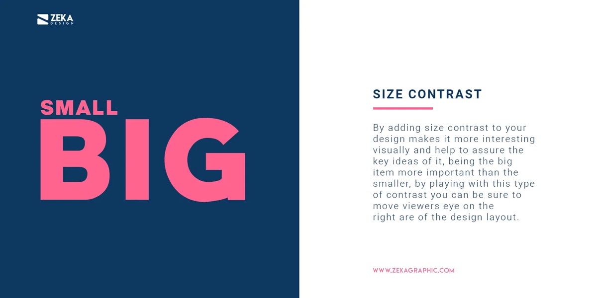
Size Contrast: Vary the sizes of elements to create a clear distinction and hierarchy. Use larger elements for important focal points and smaller elements for secondary or supporting elements. This contrast in size helps establish visual hierarchy and guides the viewer’s attention.
Spacing Contrast: Manipulate the spacing between elements to create contrast and visual impact. Increase the spacing between elements to give them breathing room and draw attention. Conversely, decrease the spacing to create a more dense and visually compact composition. This contrast in spacing adds depth and visual interest to your layout.
Alignment Contrast: Utilize different alignments, such as left, right, center, or justified, to create contrast between elements. This variation breaks the monotony and gives your design a dynamic and engaging look. Contrasting alignments can also help create a visual flow and guide the viewer’s eye through the layout.
Shape Contrast: Incorporate contrasting shapes to add visual interest to your composition. Use a combination of geometric and organic shapes to create a visually dynamic layout. The contrast between sharp, angular shapes and soft, curved shapes adds a sense of balance and dimension to your design.
Color Contrast: Experiment with contrasting colors to make key elements stand out. Utilize a vibrant color against a neutral background or complementary colors to create a striking contrast. This contrast adds depth and visual impact to your composition.
Texture Contrast: Incorporate different textures within your design to create contrast. Use smooth textures alongside rough or textured elements to add visual interest and tactile appeal. The contrast in textures enhances the overall visual appeal of your composition.
Depth Contrast: Establish depth in your design by layering elements or incorporating shadows. A contrast in depth helps create a sense of space and dimension in your layout. It also adds visual interest and draws the viewer’s attention towards specific elements.
By applying contrast in layout and composition, you can create visually engaging designs that capture attention and communicate effectively. Experiment with different combinations of size, spacing, alignment, shape, color, texture, and depth to find the right balance and achieve a captivating composition.
Creating Contrast with Scale and Size
Scale and size are powerful tools in graphic design that can be used to create contrast, draw attention, and establish visual hierarchy. By manipulating the scale and size of elements within your design, you can create a striking contrast that adds depth and visual interest. Here’s how you can effectively create contrast with scale and size:
Varying Element Sizes: Incorporate elements of different sizes within your design to create a noticeable contrast. Use larger elements to grab attention and make a bold statement, while smaller elements can serve as supporting details. This contrast in scale helps create visual hierarchy and guides the viewer’s attention.
Overlapping and Layering: Experiment with overlapping and layering elements of different sizes to create depth and visual interest. By placing smaller elements partially behind larger elements, you can create a sense of depth and three-dimensionality. This contrast in layering adds visual complexity and captures the viewer’s attention.
Using Size to Emphasize: Utilize size to emphasize and draw attention to specific elements. Enlarge key elements, such as headings or important graphics, to make them stand out from the surrounding content. This contrast in size helps communicate hierarchy and importance within your design.
Playing with Proportions: Experiment with the proportions of elements to create a noticeable contrast. Incorporate small, intricate elements alongside larger, more simplified ones. This contrast in proportions adds visual interest and balance to your design.
Contrasting Element Scales: Combine elements of dramatically different scales to create a bold contrast. Pairing a very small element with an oversized one grabs attention and creates an eye-catching design. This contrast in scales adds a sense of drama and intrigue to your composition.
Utilizing Negative Space: Negative space, or the empty space around elements, is an essential component in design. By strategically using negative space around larger elements, you can create contrast and draw attention. This contrast helps create a visually balanced and harmonious composition.
Contrasting Visual Weight: Pay attention to the visual weight of elements when manipulating size and scale. Larger elements tend to have a heavier visual weight, while smaller elements have a lighter visual weight. Creating a contrast in visual weight helps establish balance and hierarchy within your design.
By skillfully using scale and size contrast, you can create visually captivating designs that instantly grab attention and guide the viewer’s gaze. Experiment with different combinations, proportions, and negative space to find the perfect balance that enhances the impact and effectiveness of your design.
Using Contrast in Texture and Pattern
Contrast in texture and pattern is an effective way to add visual interest, depth, and complexity to your designs. By juxtaposing different textures and patterns, you can create a striking contrast that enhances the overall visual impact. Here’s how you can effectively use contrast in texture and pattern:
Combining Smooth and Rough Textures: Incorporate elements with contrasting textures to create interest. Pair smooth textures, such as sleek gradients or polished surfaces, with rough textures like coarse brushstrokes or textured backgrounds. This contrast in textures adds depth and tactile appeal to your design.
Contrasting Detailed and Simple Patterns: Play with patterns of different complexity to create a noticeable contrast. Combine intricate patterns with simple ones to add visual interest and prevent visual overload. This contrast in patterns creates a cohesive yet dynamic look.
Contrasting Organic and Geometric Patterns: Incorporate contrasting geometric and organic patterns to create visual intrigue. Pair the precision of geometric shapes with the fluidity of organic forms. This contrast in patterns adds energy and visual balance to your design.
Varying Scale of Patterns: Experiment with the scale of patterns to create contrast. Utilize large-scale patterns alongside small-scale ones to create a visually striking contrast. This contrast in pattern scale adds depth and uniqueness to your design.
Contrasting Solid Areas with Patterns: Use patterns selectively to create contrast with solid areas. Incorporate patterns in specific elements or regions of your design to draw attention and create a focal point. This contrast between solid areas and patterns adds visual interest and complexity.
Incorporating Texture and Pattern in Backgrounds: Utilize texture and pattern in the background of your design to create contrast with the foreground elements. This contrast helps establish depth and adds visual interest without overpowering the main message or content.
Contrasting Texture and Pattern in Typography: Apply texture and pattern to typography elements to create a striking contrast. Overlay text with textures or patterned backgrounds to make it stand out and add visual intrigue. This contrast in texture and pattern enhances the overall visual impact of your typography.
By skillfully utilizing contrast in texture and pattern, you can create visually captivating designs that engage the viewer and add depth and complexity. Experiment with different combinations and scales of textures and patterns to find the perfect balance that enhances the aesthetic appeal and effectiveness of your designs.
Contrast in Line and Shape
Contrast in line and shape is a powerful technique in graphic design that can create visual interest, movement, and a sense of balance in your compositions. By manipulating lines and shapes, you can add depth, establish focal points, and guide the viewer’s eye. Here’s how you can effectively use contrast in line and shape:
Contrasting Straight and Curved Lines: Combine straight lines, which convey stability and structure, with curved lines, which imply movement and fluidity. This contrast in line style adds visual interest and can create a sense of balance and harmony in your design.
Playing with Line Weight: Vary the weight of lines to create contrast and hierarchy. Use thicker lines to emphasize important elements or create outlines, while thinner lines can be used for finer details or to create a sense of delicacy. This contrast in line weight adds depth and visual impact.
Using Dashed and Solid Lines: Incorporate dashed or dotted lines alongside solid lines to create contrast and visual interest. Dashed lines can be used to highlight boundaries or create a sense of movement, while solid lines provide stability and structure. This contrast in line style adds a dynamic look to your design.
Contrasting Geometric and Organic Shapes: Combine geometric shapes with organic or irregular shapes to create visual contrast. Geometric shapes convey precision and order, while organic shapes imply naturalness and freedom. This contrast adds interest and creates a harmonious balance within your design.
Varying Scale and Proportions: Experiment with different scales and proportions of lines and shapes to create contrast. Incorporate large, bold shapes alongside smaller, intricate ones to establish a visual hierarchy and draw attention to specific elements. This contrast in scale adds visual interest and depth to your design.
Using Negative Space: Utilize negative space, or the empty space around and in between shapes, to create contrast and emphasize form. By cleverly incorporating negative space, you can create shapes that stand out and capture attention. This contrast enhances the visual impact and clarity of your design.
Contrasting Solid Shapes with Patterns: Incorporate patterns within shapes to create a noticeable contrast. Combine solid, filled shapes with patterned ones to add visual interest and complexity. This contrast between solid and patterned shapes creates a dynamic and engaging look.
By skillfully utilizing contrast in line and shape, you can create visually captivating designs that draw the viewer in and provide a harmonious balance. Experiment with different combinations, line weights, shapes, and proportions to find the perfect balance that enhances the impact and effectiveness of your design.
Using Contrast in Photography and Imagery
Contrast in photography and imagery is a powerful tool that can help create visually captivating designs and evoke specific emotions. By utilizing contrast in various elements of your images, you can create depth, interest, and highlight key focal points. Here’s how you can effectively use contrast in photography and imagery:
Light and Dark Contrast: One of the most common forms of contrast in photography is the interplay between light and dark. By incorporating areas of strong light and deep shadows, you can create a dramatic and dynamic effect. This contrast adds depth and creates a sense of mood and intensity.
Color Contrast: Utilizing color contrast in photography can be a powerful way to make your images stand out. Use complementary colors, such as blue and orange or red and green, to create visual impact and make key elements pop. This contrast in color adds vibrancy and draws the viewer’s attention.
Subject and Background Contrast: Contrast your subject against the background to ensure it stands out. This can be achieved by placing a subject with bold colors against a neutral or monochromatic background. The contrast between the subject and the background creates a clear focal point and enhances the visual impact of the image.
Texture Contrast: Incorporate textures with contrasting characteristics to add depth and interest to your images. Combine smooth surfaces with rough textures or soft textures with sharp details. This contrast in texture creates visual complexity and adds tactile appeal to the imagery.
Focus Contrast: Experiment with depth of field to create contrast in focus. Utilize a shallow depth of field to create a sharp subject against a blurred background, or vice versa. This contrast in focus guides the viewer’s attention and adds a sense of depth and dimension to your images.
Point of View Contrast: Contrast different angles and perspectives to create visually interesting compositions. Experiment with high and low angles, close-ups and wide shots, or unusual viewpoints. This contrast in point of view adds a unique and engaging visual element to your images.
Contrasting Emotions: Use contrast to evoke different emotions within your imagery. For example, juxtaposing joy with sadness, or serenity with chaos, can create a powerful emotional impact. This contrast in emotions adds depth and complexity to your photographs or illustrations.
Contrasting Subject Matter: Incorporate diverse subject matter into your imagery to create visual interest. Combine elements that are inherently different, such as nature and technology, or people and landscapes. This contrast in subject matter creates a visually compelling narrative and adds intrigue to your images.
By skillfully utilizing contrast in photography and imagery, you can create visually stunning designs that capture attention and evoke specific emotions. Experiment with different forms of contrast, such as light and dark, color, texture, focus, and perspectives, to create compelling and impactful imagery.
Harmonizing Contrast in Your Designs
While contrast is essential for creating visually appealing and impactful designs, it’s equally important to achieve a sense of harmony and unity. Harmonizing contrast ensures that the contrasting elements work together cohesively, creating a balanced and visually pleasing composition. Here are some techniques to effectively harmonize contrast in your designs:
Color Harmony: When using contrasting colors, it’s crucial to consider their overall harmony. Pair complementary colors or shades within the same color family to maintain a sense of unity. Be mindful of the color temperature and saturation levels to create a visually pleasing balance.
Consistent Typography: While it’s important to vary font styles, sizes, and weights to create contrast, it’s equally important to establish consistency within your typography. Select a set of complementary fonts that work well together and maintain a consistent hierarchy throughout your design.
Repetition of Elements: Repeating certain elements throughout your design helps establish visual harmony. Incorporate consistent shapes, lines, or patterns to connect different sections or elements. This repetition adds a sense of unity and cohesion to your composition.
Balancing Negative Space: Negative space, or the empty space surrounding and between elements, plays a crucial role in achieving balance and harmony. Distribute negative space evenly and intentionally throughout your design to create a sense of equilibrium. This balance helps highlight the contrasting elements and creates a visually pleasing composition.
Contrast in Moderation: While contrast is important, it’s essential to use it in moderation. A design with excessive contrast can become visually overwhelming and distract from the intended message. Find a balance that allows the contrasting elements to stand out while maintaining overall harmony and coherence.
Visual Hierarchy: Establishing a clear visual hierarchy helps guide the viewer’s eye and create a sense of order. Ensure that the contrasting elements are arranged in a way that leads the viewer through the design in a logical and intuitive manner. This hierarchy helps harmonize the contrast and adds structure to your composition.
Attention to Detail: Pay attention to the finer details of your design to ensure overall harmony. Check for consistency in line thickness, color values, spacing, and alignment. These small details contribute to the overall cohesiveness and professionalism of your design.
Receiving Feedback: Seek feedback from peers or design professionals to gain an outside perspective on your design. Another set of eyes can help identify potential areas where the contrast may be too overpowering or lacking harmony. Consider the feedback and make adjustments accordingly to achieve the desired balance and unity.
By harmonizing contrast in your designs, you can create visually appealing compositions that effectively communicate your message. Consider color harmony, consistent typography, repetition of elements, balance of negative space, moderation in contrast, visual hierarchy, attention to detail, and feedback from others. Finding the right balance and harmony will result in designs that are both captivating and visually cohesive.
Applying Contrast in Different Design Mediums
Contrast is a versatile design principle that can be applied to various mediums and platforms to create visually engaging and impactful designs. Whether you’re working on print materials, web design, or motion graphics, understanding how to apply contrast effectively is key. Here’s how you can apply contrast in different design mediums:
Print Design: In print design, contrast can be achieved through various elements such as color, typography, layout, and imagery. Utilize contrasting colors to make your design pop off the page. Experiment with different font sizes, weights, and styles to create a hierarchy in your typography. Play with the arrangement of elements and incorporate contrasting shapes and sizes to create an eye-catching layout.
Web Design: When designing for the web, contrast plays a crucial role in creating a visually appealing and user-friendly experience. Use color contrast to create clear distinctions between different sections and elements of your website. Employ contrasting typography to enhance readability and guide the user’s attention. Ensure a clear contrast between buttons, links, and other interactive elements to provide visual cues for user interactions. Pay attention to contrast in images to create impactful visuals that draw the user’s attention.
Motion Graphics and Animation: Contrast in motion graphics and animation helps create visual interest and guide the viewer’s attention. Utilize changes in scale, timing, and speed to create contrast and emphasis. Incorporate contrasting movement patterns, such as smooth and fluid motions alongside sharp and abrupt transitions. Play with contrasting colors, light and dark, and different types of motion to create a visually captivating and dynamic experience.
Logo Design and Branding: Contrast is vital in logo design and branding as it helps create a memorable and visually distinct identity. Contrast can be achieved through the use of contrasting colors, shapes, and typography. Contrast in these elements ensures that your logo stands out and represents your brand effectively. Consider the desired emotions and values associated with your brand and utilize contrast to reinforce these characteristics in your logo and branding.
Package Design: Contrast in package design helps grab the attention of consumers and create a strong visual impact. Utilize high contrast colors, bold typography, and distinctive shapes to make your product stand out on the shelf. Create contrast between the packaging and the product itself to enhance visibility and create an intriguing presentation.
UI/UX Design: Contrast is crucial in UI/UX design to ensure clarity and ease of use. Utilize color contrast to distinguish interactive elements from non-interactive ones. Create contrast between text and background to enhance readability. Incorporate contrast in button design to make them easily distinguishable and encourage user interaction. Pay attention to contrast in layout and spacing to create a visually balanced and intuitive user interface.
By applying contrast appropriately in different design mediums, you can create visually impactful and engaging designs regardless of the platform. Consider the specific requirements and user expectations of each medium, and use contrast strategically to enhance the overall visual experience.
Experimenting with High and Low Contrast Designs
Contrast is a powerful tool in design, allowing you to create visual impact and guide the viewer’s attention. By experimenting with high and low contrast designs, you can achieve different effects and evoke various emotions within your visual compositions. Here’s how you can explore the possibilities of high and low contrast designs:
High Contrast: High contrast designs are characterized by stark differences between elements, resulting in a bold and dynamic visual impact. Utilize stark color combinations, such as black and white, or complementary colors, to achieve maximum contrast. Incorporate bold typographic choices, with stark differences in size, style, and weight. Create distinct boundaries between elements to enhance the clarity and impact of the design. High contrast designs are often associated with energy, excitement, and a modern aesthetic.
Low Contrast: Low contrast designs rely on subtle differentiations in color, tone, or texture to create a softer and more harmonious visual effect. Incorporate analogous color schemes, using colors that are adjacent on the color wheel, to achieve a gentle and cohesive contrast. Utilize typography with similar weights and styles to create a sense of unity and understated elegance. Balance elements without harsh boundaries, creating a more blended and organic composition. Low contrast designs often evoke a calming, sophisticated, and timeless ambiance.
Striking a Balance: Experimenting with both high and low contrast designs allows you to find the right balance for your specific project and messaging. Consider the purpose and target audience of your design when deciding whether to go for a high or low contrast approach. High contrast designs work well when you want to grab attention immediately and create a bold statement. Low contrast designs are suitable for more subtle and refined aesthetics, where a gentle and harmonious atmosphere is desired.
Leveraging Emotions: Contrast can evoke different emotions depending on its intensity. High contrast designs can create a sense of excitement, intensity, and urgency, making them suitable for bold advertising campaigns or dynamic event promotions. Low contrast designs can instill a sense of tranquility, elegance, and sophistication, making them suitable for luxury brands, mindful products, or serene landscapes.
Considering Context: The context in which your design is displayed can influence the effectiveness of high or low contrast. Factors such as lighting conditions, screen types, or printing quality may affect how the contrast is perceived. Consider the intended medium and environment in which your design will be experienced to ensure that your contrast choices are optimized for the desired impact.
By experimenting with high and low contrast designs, you can create visually captivating and impactful compositions. Consider the messaging, emotions, and target audience of your design, and carefully manipulate color, typography, and element boundaries to achieve the desired contrast effect. Whether it’s a high-contrast design that demands attention or a low-contrast design that exudes elegance, the power of contrast allows your visuals to speak to your audience effectively.
Avoiding Common Contrast Mistakes
While contrast is a vital design principle, it’s important to be mindful of potential pitfalls that can diminish the effectiveness of your designs. Avoiding common contrast mistakes ensures that your visuals are visually appealing, readable, and effectively communicate your message. Here are some key mistakes to watch out for:
Insufficient Contrast: Failing to establish enough contrast hinders readability and makes your design appear flat. Avoid using similar colors or tones that blend together, as this can make it difficult for viewers to distinguish important elements. Ensure that there is enough contrast between text and background, as well as between different design elements, to achieve clarity and visual hierarchy.
Overwhelming Contrast: On the other hand, using excessive contrast can lead to a cluttered and chaotic design. Too many contrasting elements can compete for attention and create visual noise. Maintain balance by selecting a few key areas or elements that require contrast, allowing the rest of the design to support and complement them without overwhelming the viewer.
Inconsistent Contrast: Inconsistency in contrast throughout a design can create confusion and disrupt the visual flow. Elements with different levels of contrast should have a clear intention and purpose. Ensure that the contrast applied is consistent across similar elements or sections to maintain a cohesive and unified design.
Inadequate Font Contrast: Poor contrast between the text and background can lead to legibility issues. Avoid light text on a light background or dark text on a dark background, as this can strain the eyes and make the text difficult to read. Ensure that there is sufficient contrast between the text and its background to improve readability and accessibility.
Ignoring Context: Consider the context in which your design will be displayed. For example, an online design may have different requirements than a printed design. Factor in the viewing conditions, screen or print quality, and lighting conditions to ensure that your chosen contrast levels are suitable for the intended context.
Disregarding Branding and Message: Contrast should support and enhance the intended messaging and branding of your design. Avoid using contrasting elements that clash with the overall brand identity or message. Instead, select contrast choices that align with the desired tone, emotions, and goals of the design.
Not Testing Design Variations: It’s crucial to test your design on different devices, screens, or in printed formats to ensure that the chosen contrast is effective. Conduct user testing or gather feedback from peers to gain insights and make any necessary adjustments to enhance the contrast and overall design experience.
By being mindful of these common contrast mistakes, you can avoid potential pitfalls and create visually appealing designs that effectively communicate your message. Strive for clarity, consistency, and readability, while considering the context and goals of your design. With careful attention to contrast, you can elevate the impact and effectiveness of your visuals.
Using Contrast to Enhance Accessibility
Contrast plays a crucial role in making designs accessible and inclusive for all users. By considering contrast in your designs, you can ensure that the content is easily readable and navigable, regardless of a person’s visual abilities. Here’s how you can use contrast to enhance accessibility:
Color Contrast for Text: Adequate color contrast between text and its background is essential for readability. Ensure that there is enough contrast between the text color and the background color to make it easy for all users to read the content. Consider the Web Content Accessibility Guidelines (WCAG) recommendation of a minimum contrast ratio of 4.5:1 for normal text and 3:1 for large text.
Contrast for User Interface elements: User interface elements, such as buttons or links, should have sufficient contrast to be easily distinguishable from the surrounding content. This allows users to understand their interactive nature and improves the overall navigation experience. Use color contrast, size differentiation, or boundary lines to make interactive elements stand out.
Focus and Hover States: Clearly indicating focus and hover states is crucial for users who navigate with keyboards or assistive technologies. Ensure that interactive elements change appearance or provide a visual indication when they receive focus or are being hovered over. This helps users understand which element they are interacting with and provides feedback on their actions.
Contrasting Visual Elements: In addition to text and interface elements, consider contrast for other visual elements within your designs. Images, icons, graphs, and illustrations should have sufficient contrast to be easily distinguishable. This ensures that users with varying visual abilities can comprehend the information being conveyed.
Consider Contrast in Different Conditions: Keep in mind that users may view designs in various environments and lighting conditions. Optimize contrast to be effective in both well-lit and low-light environments. Test designs on different devices and screens to ensure that contrast remains clear and accessible across various settings.
Accessibility Tools and Testing: Utilize accessibility tools and perform regular testing to assess the effectiveness of contrast in your designs. Use color contrast checking tools to evaluate the contrast ratio between text and background colors. Conduct usability testing with individuals of varying visual abilities to gather feedback and make necessary adjustments.
By prioritizing contrast in your designs, you can create inclusive and accessible experiences for all users. Making content readable, navigable, and understandable enhances the usability and ensures that individuals with diverse visual abilities can effectively access and engage with your designs.
Emphasizing Important Elements with Contrast
Contrast is a valuable tool in ensuring that important elements within your design stand out and capture the viewer’s attention. By strategically applying contrast, you can create visual hierarchy and guide the users’ focus towards key information or calls to action. Here’s how you can effectively emphasize important elements with contrast:
Color Contrast: Utilize color contrast to draw attention to important elements. Choose complementary or contrasting colors to make specific elements pop and stand out from the rest of the design. By using vivid colors against a neutral background or vice versa, you can create a clear contrast that instantly captures the viewer’s attention.
Typography Contrast: Vary font styles, sizes, and weights to emphasize important text elements. Use a larger, bolder font for headings and subheadings, while keeping body text in a more subdued style. This contrast in typography helps establish hierarchy and ensures that vital information is easily distinguishable.
Shape Contrast: Incorporate contrasting shapes to create visual interest and emphasize key elements. Utilize geometrical shapes amongst organic ones or vice versa. This contrast helps guide the viewer’s eye and draws attention to specific elements within your design.
Contrasting Placement and Alignment: Contrast placement and alignment to emphasize important elements. Position significant elements off-center or in unexpected locations to create a visual impact and break the pattern within the design. Contrasting alignment by using centered text for some elements and left-aligned for others can also create visual interest.
Contrast in Size and Scale: Vary the size and scale of elements to highlight important information. Increase the size of important elements, such as call-to-action buttons or key visuals, to make them stand out. This contrast in size and scale draws immediate attention and helps guide the viewer’s focus.
Contrast in Texture and Pattern: Incorporate contrasting textures or patterns in your design to emphasize specific elements. Use a smooth texture or a simple pattern on unimportant areas, while incorporating a more elaborate or textured pattern on the important elements. This contrast helps create visual interest and draws attention.
Contrast through Negative Space: Leverage negative space, also known as white space, to create contrast and highlight important elements. By giving important elements more space and surrounding them with ample negative space, you enhance their prominence and draw the viewer’s attention directly towards them.
Animation or Motion Contrast: Utilize contrast in motion or animation to emphasize important elements. Incorporate subtle or dynamic movements for key elements to create visual interest. This contrast in motion captures attention and guides the viewer’s focus in a purposeful manner.
By strategically applying contrast in color, typography, shape, placement, size, texture, pattern, negative space, and motion, you can effectively emphasize important elements within your design. The use of contrast ensures that crucial information or calls to action are noticed and understood, enhancing the overall impact and effectiveness of your design.
Creating Visual Hierarchy with Contrast
Visual hierarchy is crucial in design to guide the viewer’s attention and effectively communicate your message. Contrast plays a significant role in establishing visual hierarchy by creating differences in elements and emphasizing their importance. Here’s how you can use contrast to create a clear visual hierarchy:
Color Contrast: Utilize color contrast to establish a visual hierarchy. Use bold, vibrant colors for important elements and more subdued or neutral colors for secondary or background elements. This contrast in color draws attention and guides the viewer’s eye to key information.
Typography Contrast: Vary the typography to create a hierarchy of information. Utilize different font sizes, styles, and weights to distinguish between headings, subheadings, and body text. Incorporate bolder or italicized fonts for important headings, while keeping the body text in a more regular font. This contrast in typography guides the reader’s eye and organizes the content effectively.
Contrast in Size and Scale: Manipulate the size and scale of elements to establish a clear hierarchy. Enlarge essential elements or make them visually dominant, while reducing the size of less important elements. This contrast in size and scale makes it evident which elements are the most significant and helps the viewer navigate through the content smoothly.
Shape Contrast: Incorporate contrasting shapes to create visual interest and establish hierarchy. Utilize bold, distinct shapes for important elements, while using simpler or more common shapes for secondary elements. This contrast in shape guides the viewer’s eye and adds visual appeal to the design.
Contrasting Placement and Alignment: Contrast placement and alignment to create visual hierarchy. Position important elements strategically in key focal points or prime reading zones. Break alignment patterns to draw attention to specific elements. This contrast in placement and alignment ensures that essential information stands out and is easily found.
Contrast in Texture and Pattern: Utilize contrasting textures or patterns to establish visual hierarchy. Incorporate intricate textures or patterns for important elements, while using simpler or smoother textures for secondary areas. This contrast in texture or pattern adds depth and makes essential elements more visually prominent.
Contrast through Negative Space: Leverage negative space, or white space, to create contrast and establish visual hierarchy. Give important elements more breathing room by surrounding them with ample negative space. This contrast draws attention to crucial information and adds a sense of elegance and clarity to the design.
Animation or Motion Contrast: Use contrast in motion or animation to create visual hierarchy. Incorporate subtle or dynamic movements for important elements to set them apart from the rest of the design. This contrast in motion guides the viewer’s attention and adds a level of interactivity to the design.
By utilizing contrast in color, typography, size, scale, shape, placement, alignment, texture, pattern, negative space, and motion, you can establish a clear visual hierarchy. Creating a hierarchy ensures that the viewer can easily navigate through the design, understand the information flow, and focus on the most important elements within your composition.
Enhancing Emotional Impact with Contrast
Contrast is a powerful tool that not only adds visual interest to your designs but also aids in conveying emotions and evoking specific feelings. By skillfully employing contrast, you can enhance the emotional impact of your designs and create a more impactful and memorable experience for viewers. Here’s how you can use contrast to enhance emotional impact:
Color Contrast: Color contrast can evoke a range of emotions. Utilize contrasting colors to create a dramatic and energetic impact, evoking feelings such as excitement or enthusiasm. Alternatively, use contrasting colors to create a calm and soothing atmosphere, evoking emotions like tranquility or serenity. The choice of contrasting colors can greatly influence the emotional response of the viewer.
Contrasting Light and Shadow: Contrast between light and shadow can add depth and dimension to your designs and evoke a sense of drama. By emphasizing areas of bright light against deep shadows, you can create a moody or mysterious atmosphere. Contrast in light and shadow can intensify emotions and add a sense of intrigue or suspense to your designs.
Contrast in Typography: Varying typography can enhance the emotional impact of your design. Use contrasting font styles, weights, or sizes to evoke different emotions. Bold and dynamic typography can create a sense of excitement, while delicate and cursive typography can evoke feelings of elegance or romance. Contrast in typography adds personality to your design and enhances its emotional resonance.
Textures and Patterns: Contrasting textures or patterns can add tactile appeal and enhance emotional impact. Pairing rough and smooth textures can create a visual contrast that elicits contrasting emotions. Similarly, using contrasting patterns, such as soft and organic versus geometric and structured, can evoke different moods and feelings within your designs.
Contrasting Visual Elements: Contrast in visual elements can add emotional impact by juxtaposing opposing concepts or symbols. For example, contrasting images of happiness with sadness or urban with nature can create a sense of tension, evoke complex emotions, or tell a compelling visual story. By contrasting visual elements, you can create a more profound emotional impact on the viewer.
Dynamic Contrast: Contrast in motion or animation can enhance the emotional experience of a design. Incorporating contrasting motion, speed, or timing creates a dynamic contrast that can evoke different feelings. Fast and energetic movements can generate excitement, while slow and gentle animations can create a sense of calm or introspection.
By strategically applying contrast in color, light and shadow, typography, textures and patterns, visual elements, and motion, you can enhance the emotional impact of your designs. Consider the feelings you want to evoke and experiment with contrasting elements to create a more engaging and emotionally resonant experience for your viewers.