
What is a Box and Whisker Plot
A box and whisker plot, also known as a box plot, is a visual representation of a dataset that displays the distribution of values. It is commonly used in statistics to analyze and compare sets of data. This plot provides a clear and concise summary of the dataset by depicting various statistical measures such as the median, quartiles, and potential outliers.
The plot consists of a rectangular box that represents the interquartile range (IQR), which encompasses the middle 50% of the data. A vertical line inside the box indicates the median, which represents the middle value of the dataset. The “whiskers” or lines extending from the box display the minimum and maximum values, excluding any outliers. Outliers, if present, are plotted as individual points outside the whiskers.
A box and whisker plot allows you to visually compare multiple datasets, identify any potential outliers, and gain insights into the spread and skewness of the data. It provides a concise summary of the data distribution and allows for quick and easy interpretation.
This type of plot is particularly useful when dealing with large datasets or multiple variables, enabling you to identify patterns, trends, and potential anomalies that may not be readily apparent from numerical or tabular representations. Box and whisker plots are commonly used in various fields, including finance, healthcare, education, and market research.
By using a box and whisker plot, you can effectively communicate complex data in a simple yet informative manner. Its visual representation allows viewers to grasp the distribution and characteristics of the dataset quickly. Whether you are conducting statistical analysis, making business decisions, or presenting findings, the box and whisker plot is a powerful tool to enhance your understanding and communication of data.
Setting Up the Data
Before creating a box and whisker plot in Excel, it is essential to format your data correctly. The data should be organized in columns or rows, with one column or row per dataset you wish to compare. Each dataset should contain numerical values.
Here’s a step-by-step guide to setting up your data for a box and whisker plot:
- Open Excel: Launch Microsoft Excel and create a new workbook.
- Enter the Data: Enter your dataset in columns or rows. Make sure your data is complete, without any empty cells. For example, if you are comparing the test scores of three classes, you can have one column for each class and enter the respective values in the rows below.
- Label your Data: Assign labels to each dataset to make it easier to identify them in the plot. For example, you can use the column or row headings as labels.
- Sort the Data (Optional): If you want the box and whisker plot to display the data in ascending or descending order, sort the values accordingly. This step is beneficial when comparing multiple datasets.
After setting up your data, you are now ready to create the box and whisker plot in Excel.
It is worth noting that Excel does not have a built-in box and whisker plot chart type. However, you can use Excel’s built-in features and functions to create a box and whisker plot. There are also several third-party add-ins and online tools available that can generate box and whisker plots directly from your data with ease.
Now that you have successfully set up your data, let’s move on to creating the box and whisker plot in Excel.
Creating the Chart
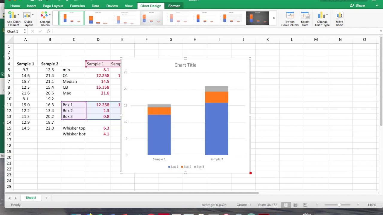
While Excel does not have a dedicated box and whisker plot chart type, you can still create a box and whisker plot using the available chart types. One popular method is to use a combination of stacked bar charts or column charts to represent the different statistical measures.
To create a box and whisker plot in Excel, follow these steps:
- Select your Data: Highlight the data you want to include in the box and whisker plot.
- Insert a Stacked Bar Chart: Go to the “Insert” tab in the Excel ribbon and select the stacked bar chart or stacked column chart option. A basic chart will appear on your worksheet.
- Add the Median: Right-click on one of the bars in the chart and choose “Format Data Series.” In the formatting options, adjust the gap width to separate the bars and make them appear as individual boxes. Then, change the fill color of the middle bar to represent the median.
- Add the Quartiles: Right-click on the chart again and choose “Select Data.” In the “Select Data Source” dialog box, click on the “Add” button to add a new data series. Enter the quartile values for each dataset, making sure to label them accordingly. This will create additional bars inside each box, representing the quartiles.
- Add the Whiskers: Similarly, add the minimum and maximum values as separate data series, creating vertical lines that extend beyond the boxes. Again, make sure to label them appropriately.
By following these steps, you can create a basic box and whisker plot in Excel. However, keep in mind that this method may require manual adjustments and formatting to achieve the desired appearance and accuracy.
If you prefer a more streamlined and automated approach, you can also explore the use of third-party Excel add-ins or online tools specifically designed for creating box and whisker plots. These tools often offer a range of customization options and can generate professional-looking plots with minimal effort.
Once you have created the chart, you can further customize it to enhance its visual appeal and clarity. Let’s explore some of the ways you can customize your box and whisker plot in the next section.
Customizing the Chart
Customizing your box and whisker plot in Excel allows you to improve its visual representation and make it more effective in conveying the information you want to share. Here are some ways you can customize your chart:
- Adjust Axis Titles: Rename the x-axis and y-axis titles to provide a clear indication of the data being represented in the plot. This will help viewers understand the context of the chart.
- Modify Colors: Choose colors that are visually appealing and easily distinguishable for the boxes, whiskers, and outliers. Consider using a consistent color scheme or different shades of the same color for each dataset to maintain clarity and coherence.
- Formatting and Styling: Experiment with different formatting options to enhance the overall appearance of your chart. This includes adjusting the font style, size, and color of the text, as well as modifying the aesthetics of the chart elements such as gridlines, legends, and data labels.
- Data Labels: Add data labels to the chart to display the values of the statistical measures directly on the plot. This will make it easier for viewers to interpret the data without referring to a separate table or legend.
- Chart Title: Include a descriptive and concise title for your chart to provide an overview of the data being presented. This will help viewers understand the purpose and significance of the plot at a glance.
- Legend: If you are comparing multiple datasets in your box and whisker plot, include a legend to clarify which dataset each color or pattern represents. This will eliminate any confusion and ensure accurate interpretation of the plot.
Remember, the goal of customizing your box and whisker plot is to make it visually appealing, informative, and easy to understand. However, be cautious not to overcrowd the chart with unnecessary elements or excessive visual effects, as this can distract viewers from the main message you are trying to convey.
By customizing your box and whisker plot, you can create a visually striking and tailored representation of your data, ensuring that it effectively communicates the insights and trends you want to communicate.
Interpreting the Plot
Interpreting a box and whisker plot involves understanding the key components and identifying the insights it provides. Here’s a step-by-step guide to interpreting the plot:
- Median: The line inside the box represents the median, which indicates the middle value of the dataset. It divides the data into two equal halves. The position of the median in the box gives you an idea of the skewness of the data. If the median is closer to the bottom of the box, the data may be skewed towards lower values, and vice versa.
- Interquartile Range (IQR): The box in the plot represents the interquartile range, which is the range between the first quartile (the bottom of the box) and the third quartile (the top of the box). It contains the middle 50% of the data. The width of the box depicts the spread of the data. A wider box indicates a higher variability.
- Whiskers: The whiskers or lines extend from the box and represent the minimum and maximum values of the dataset, excluding any outliers. They give you an understanding of the range of values within the dataset.
- Outliers: Outliers are data points that fall outside the whiskers. They are represented as individual points on the plot. Outliers can indicate data points that are significantly different or unusual compared to the rest of the dataset. They may be the result of measurement errors, extreme values, or true anomalies in the data.
- Comparison: When comparing multiple datasets in the same plot, you can interpret the chart by examining the relative positions of the boxes and whiskers. Look for differences in the medians, box widths, and whisker lengths. These differences can indicate variations in central tendency, spread, and data range between the datasets.
By analyzing these components, you can draw various insights from the box and whisker plot. For example, you can identify if the data is skewed, determine the variability of the data, compare the median values, and detect any outliers or exceptional data points.
Remember that interpreting a box and whisker plot should be done in conjunction with other statistical analyses and a thorough understanding of the dataset. The plot provides a visual summary of the data distribution, but additional context and analysis are essential for a comprehensive interpretation.
Now that you are familiar with the interpretation of a box and whisker plot, let’s explore some additional tips and tricks to enhance your box and whisker plot creations in Excel.
Additional Tips and Tricks
Creating a box and whisker plot in Excel can be made even more effective with the following tips and tricks:
- Data Validation: Before creating the plot, ensure that your dataset is accurate and free from errors. Perform data validation to check for any inconsistencies or missing values.
- Use Descriptive Labels: Instead of using generic labels for your datasets, consider using descriptive labels that provide more context. This will make it easier for readers to understand the meaning of each dataset being compared.
- Plot Multiple Box and Whisker Plots: If you have several related datasets to compare, consider creating individual box and whisker plots side by side. This allows for a clearer comparison and avoids cluttering the chart with too much information.
- Include a Title and Axis Labels: Always provide a clear and informative title for your plot, along with axis labels that properly describe the data being represented. This helps viewers understand the purpose and context of the chart.
- Experiment with Different Chart Types: While Excel does not have a dedicated box and whisker plot chart type, you can explore different chart types and combinations to achieve a similar visual representation. Stacked bar charts, stacked column charts, or even line charts can be used creatively to represent the key elements of a box and whisker plot.
- Use Formatting for Emphasis: Apply formatting techniques such as bold text, italicized text, or different color schemes to draw attention to important parts of the plot. This can make certain elements, such as the outliers or quartiles, more visually distinct.
- Consider Data Scaling: If your datasets have significantly different scales or ranges, consider scaling the data to make the plot more visually balanced and comparable. Scaling allows for a fair representation and avoids misleading interpretations based solely on the appearance of the boxes and whiskers.
- Test Different Chart Layouts: Experiment with different chart layouts and orientations to find the most effective way to present your data. You can try horizontal or vertical layouts and arrange the plots in a way that provides the clearest comparison.
By implementing these tips and tricks, you can enhance the clarity, visual appeal, and interpretability of your box and whisker plots in Excel. Remember to consider the specific requirements of your dataset and adjust the customization options accordingly for the best results.