
The Psychology of Blue and Complementary Colors
Colors have a powerful impact on human psychology, influencing our mood, emotions, and overall perception. Blue, in particular, is known to evoke feelings of calmness, serenity, and stability. It is often associated with trust, reliability, and confidence. Incorporating blue into your design can create a sense of tranquility and reliability, making it an ideal choice for websites, logos, and branding.
Complementary colors, on the other hand, are pairs of colors that are opposite each other on the color wheel. When used together, they create a sense of harmony and balance. By combining blue with its complementary colors, you can enhance the visual impact of your design and create a dynamic and eye-catching composition.
For example, blue’s complementary color is orange. When they are used together, the vibrant contrast between the two creates a visually appealing and attention-grabbing effect. This combination can be used in various design elements, such as call-to-action buttons, headings, or accent colors, to draw the viewer’s attention and create a sense of excitement.
Furthermore, the psychology behind colors extends beyond the visual realm. Studies have shown that blue can have physiological effects on the human body, such as slowing down heart rate, reducing blood pressure, and promoting feelings of relaxation. This makes blue an excellent choice for spaces where tranquility and calmness are desired, such as bedrooms, spas, or meditation rooms.
When incorporating complementary colors into your design, it is essential to consider the message you want to convey. Different combinations can evoke different emotions and feelings. For instance, combining blue with its complementary color, yellow, creates a playful and energetic atmosphere. On the other hand, pairing blue with its complementary color, purple, can create a sense of luxury and sophistication.
Understanding the psychology behind blue and complementary colors allows you to strategically use them in your designs to create the desired impact. Whether you want to create a calming website, an eye-catching logo, or a harmonious interior space, incorporating blue and complementary colors can help you achieve your design goals.
Understanding the Color Wheel and Color Relationships
When it comes to designing with colors, understanding the color wheel and color relationships is crucial. The color wheel is a visual representation of the spectrum of colors, organized in a circular format to demonstrate their relationships and harmonies. By understanding the color wheel, you can effectively choose and combine colors that work well together in your design.
The color wheel is divided into primary, secondary, and tertiary colors. The primary colors are red, blue, and yellow, and they cannot be created by mixing other colors. Secondary colors are created by mixing two primary colors: orange (red and yellow), green (yellow and blue), and purple (red and blue). Tertiary colors are created by mixing a primary color with a neighboring secondary color on the color wheel.
In addition to primary, secondary, and tertiary colors, the color wheel also illustrates different color relationships. One of the most common relationships is the complementary colors relationship. Complementary colors are located opposite each other on the color wheel and provide a high level of contrast when used together. Examples of complementary pairs include blue and orange, green and red, and purple and yellow. This contrast creates visual interest and can be used to highlight specific elements in your design.
Another common relationship is the analogous colors relationship. Analogous colors are located side by side on the color wheel and share similar hues. For example, blue, green, and cyan are analogous colors. This color scheme creates a harmonious and cohesive look in your design, as the colors flow seamlessly from one to another.
Additionally, the color wheel also includes split-complementary and triadic relationships. Split-complementary colors involve a base color and two colors adjacent to its complementary color. Triadic colors consist of three colors that are equidistant from each other on the color wheel. These relationships offer a balanced and visually interesting color scheme for your design.
Understanding color relationships can help you choose colors that work harmoniously together and create the desired visual impact. By using the color wheel as a guide, you can select complementary colors for a bold and striking design, or choose analogous colors for a more soothing and cohesive look.
Experimenting with different color relationships can add depth and visual interest to your designs. Whether you’re creating a website, designing a logo, or decorating a space, understanding the color wheel and color relationships will enable you to make informed decisions and create visually appealing and impactful designs.
Exploring Different Shades and Hues of Blue
Blue is a versatile color that comes in a wide range of shades and hues, each with its own unique characteristics and mood. From light and airy pastels to deep and rich navy blues, exploring the diverse spectrum of blue can provide endless possibilities for your design.
Lighter shades of blue, such as baby blue or sky blue, evoke a sense of tranquility and calmness. These softer hues are often associated with serenity and can create a soothing and peaceful atmosphere in your design. Light blues are commonly used in healthcare or wellness-related websites or logos to convey a sense of comfort and relaxation.
On the other end of the spectrum, darker shades of blue like navy or midnight blue exude sophistication and elegance. These deep blues are often used in designs that aim to convey a sense of authority and professionalism. Dark blues can be employed in corporate branding, luxurious product packaging, or formal event invitations to create a sense of trust and reliability.
Moving beyond the basic shades, exploring different color variations within the blue family, such as teal, turquoise, or aqua, can add a vibrant and refreshing touch to your design. These shades incorporate elements of green, offering a balance between the serenity of blue and the invigorating energy of green. These colors work well in designs that aim to evoke feelings of freshness, innovation, or a connection with nature.
When choosing shades of blue, it’s important to consider the context and purpose of your design. Lighter shades are often favored for designs that require a soft and delicate touch, while deeper hues can create a bold and impactful presence. Additionally, pairing different shades of blue can create a layered effect and add depth to your design.
Furthermore, blue can also be combined with other colors to create unique and visually appealing color palettes. For example, combining blue with white creates a classic and timeless look, reminiscent of clear blue skies and white clouds. Adding touches of gold or silver to blue can create a sense of luxury and opulence. The possibilities are endless when it comes to experimenting with different color combinations using blue as the foundation.
Exploring the different shades and hues of blue gives you the opportunity to play with the emotional impact of color and create designs that convey the desired mood and message. Whether you want to create a calming and serene design or a bold and captivating one, the extensive range of blues allows for endless creativity and possibilities in your designs.
Choosing Complementary Colors for Blue
When selecting complementary colors for blue, it’s essential to consider the desired effect and mood you want to create in your design. Complementary colors are those that are directly opposite blue on the color wheel and can create a visually striking and harmonious color combination.
One classic complementary color pairing with blue is orange. The contrast between these two colors creates a vibrant and energetic combination. Orange adds warmth and enthusiasm to blue, making it an ideal choice for designs that aim to convey a sense of excitement or playfulness. For example, using orange as an accent color in a blue dominant website or incorporating it in a logo design can create a visually engaging and attention-grabbing composition.
Another complementary color for blue can be found by looking at its position on the color wheel. As blue is situated between green and purple, both of these colors can create a harmonious combination when used with blue. Green, a color associated with nature and freshness, adds a refreshing and calming effect to blue. This combination is often used in designs related to environmental or health-focused themes.
Purple, on the other hand, offers a sense of luxury and mystery when combined with blue. The rich and royal characteristics of purple can enhance the depth and elegance of blue, resulting in a sophisticated color scheme. This combination is often seen in designs associated with beauty, artistic expression, or high-end products or services.
While these are just a few examples of complementary colors for blue, it’s important to remember that the choice ultimately depends on the desired emotional impact and the context of your design. Experimenting with different complementary color combinations can help you find the perfect balance and create a visually appealing composition.
When using complementary colors, it’s essential to strike a balance between the dominant color (in this case, blue) and its complementary counterpart. The proportion and intensity of each color play a role in determining the overall visual impact. You can use the 60-30-10 rule as a guideline, allocating 60% to the dominant color, 30% to the complementary color, and 10% to an accent color to add visual interest.
By carefully selecting complementary colors for blue, you can create a visually pleasing and impactful design. The contrast and harmony between these colors will help you achieve the desired mood and message, making your design stand out and capture the attention of your audience.
Creating Balance with Blue and Complementary Colors
When designing with blue and its complementary colors, achieving balance is essential for creating visually appealing and harmonious compositions. By understanding how to balance the use of these colors, you can create designs that captivate your audience and effectively convey your intended message.
One way to create balance is through the strategic use of color dominance. Start by determining which color, blue or its complementary color, you want to take the lead in your design. This dominant color will have a stronger presence and occupy a larger portion of your design. The complementary color can then be used as an accent to add visual interest and create a sense of harmony. By establishing a clear hierarchy between the two colors, you maintain balance and prevent the design from feeling overwhelming or chaotic.
Another important aspect to consider is the tonal balance between blue and its complementary colors. Tonal balance refers to the distribution of light and dark values within your design. Pay attention to the intensity and saturation of the colors you are using. For example, if you have a deep, rich blue as your dominant color, choose a complementary color that is equally saturated or opt for a lighter tint of the complement. This ensures that the colors are balanced in terms of visual weight and prevents one color from overpowering the other.
Furthermore, consider the spatial placement of blue and its complementary colors within your design. Creating a sense of equilibrium and symmetry can enhance the overall balance. For instance, if you use blue predominantly on one side of a design element, consider incorporating complementary colors on the opposite side to create visual harmony. This technique helps distribute the colors evenly and ensures that the design feels cohesive and well-balanced.
It’s also important to consider the context and purpose of your design. The balance between blue and complementary colors may differ depending on the industry or target audience. For example, a design for a children’s clothing brand may utilize a more playful and vibrant balance, while a design for a financial institution may opt for a more professional and subtle balance. Understanding the expectations and preferences of your audience will help guide your decision-making process.
Lastly, always strive for a balanced visual weight across your design elements. This includes using appropriate font sizes, line weights, and graphic elements to ensure that no single element overpowers the rest. By balancing the visual weight of different design elements, you create a cohesive and harmonious design overall.
Creating balance with blue and complementary colors is key to achieving a visually appealing and well-executed design. Through strategic color dominance, tonal balance, spatial placement, and consideration of the context, you can create harmonious compositions that effectively communicate your message and capture the attention of your audience.
Tips for Using Blue and Complementary Colors in Web Design
When it comes to web design, incorporating blue and its complementary colors can create visually appealing and engaging websites. Here are some tips to help you effectively use these colors in your web design projects:
- Start with a clear color hierarchy: Determine the dominant color between blue and its complementary color and establish a clear hierarchy. Use the dominant color for important elements such as headers, buttons, or call-to-action sections, while the complementary color can be used for accents or secondary elements.
- Use color psychology to your advantage: Consider the emotional impact of blue and its complementary color and use them strategically. For example, for a calming or trustworthy website, use a dominant blue with accents of its complementary color. For a more energetic or playful vibe, use a dominant complementary color with touches of blue.
- Pay attention to contrast: Ensure there is sufficient contrast between the text and background colors. Blue and its complementary colors can have varying levels of contrast, so make sure the text is easily readable. Consider using lighter shades of complementary colors for text on a blue background and vice versa.
- Create a balanced color palette: Experiment with different shades and hues within blue and its complementary color to create an aesthetically pleasing color palette. Use tools like color palettes generators to find complementary colors that work well together and maintain visual harmony.
- Consider accessibility: Keep in mind the accessibility guidelines and ensure that your color choices meet the contrast requirements. This is particularly important for users with visual impairments who may rely on high contrast to access and navigate your website.
- Utilize color-blocking techniques: Use blue and its complementary colors to create distinct sections or blocks within your web design. This can help organize the content, guide the viewer’s eye, and provide visual interest.
- Test your color choices: Before finalizing your design, test how your chosen color palette appears across different devices and screens. Colors can appear differently on various displays, so ensure your design maintains its intended look and feel regardless of the device it is viewed on.
- Keep it simple: Avoid using too many colors in your web design. Stick to a limited color palette that includes blue and its complementary color, along with neutrals like white or grey. A clean and simple color scheme will help your design appear cohesive and professional.
- Seek inspiration: Look for inspiration from other websites that effectively use blue and its complementary colors. Analyze their color choices, layouts, and use of white space. This can spark ideas and guide you in creating a visually appealing and well-balanced design.
By following these tips, you can effectively incorporate blue and its complementary colors in your web design projects and create visually stunning and cohesive websites that leave a lasting impression on your visitors.
Using Blue and Complementary Colors in Print Design
Blue and its complementary colors can be effectively used in print design to create visually striking and memorable designs. Whether you are designing a brochure, flyer, poster, or business card, incorporating these colors can make your print materials stand out. Here are some tips for using blue and complementary colors in print design:
- Consider the printing process: Keep in mind that colors may appear differently on printed materials compared to what you see on screen. Undertake color calibration and work with a print professional to ensure the colors in your design translate accurately onto the final printed piece.
- Use blue and its complementary color for emphasis: Selecting blue as the dominant color in your print design can evoke a sense of trust, reliability, and professionalism. Use complementary colors as accents to draw attention to important information or to create visual interest.
- Experiment with different shades and tones: Blue offers a wide range of shades and tones. Explore the various hues within the blue spectrum and consider using lighter shades for a softer and more delicate look, or darker shades for a bolder and more impactful design. Pairing complementary colors in different tones with blue can add depth and dimension to your print design.
- Pay attention to typography: Choose font colors that harmonize with your blue and complementary color scheme. Ensure there is sufficient contrast between the text and background for readability. You can experiment with using complementary colors for headings or key elements of your design to make them more eye-catching.
- Create visual hierarchy: Use the colors strategically to guide the viewer’s attention. Use blue for dominant elements such as headlines or key visuals, and complementary colors for secondary information or supporting graphics. This creates a clear visual hierarchy and ensures important information stands out.
- Incorporate color psychology: Consider the emotional impact of blue and its complementary colors and how they align with the message and purpose of your print design. Blue may create a sense of calm or reliability, while complementary colors can add energy or excitement. Use these colors to evoke the desired emotions and response from your audience.
- Keep the design balanced: Balance is key in print design. Avoid overwhelming your design with too many colors. Stick to a cohesive color palette comprising blue and its complementary colors, along with a neutral background or accent color for balance.
- Consider the audience and purpose: Your color choices should align with the target audience and the message you want to convey. Different color combinations can evoke different emotions and perceptions. Ensure your color choices resonate with the intended audience and align with the overall purpose of your print design.
- Seek inspiration: Look for inspiration from print designs that effectively use blue and complementary colors. Pay attention to how the colors are balanced, how the focal points are highlighted, and how the overall design communicates the intended message. This can serve as a springboard for your own creative ideas.
By following these tips, you can effectively leverage blue and complementary colors in your print design, creating visually appealing and impactful materials that leave a lasting impression on your audience.
Designing with Blue and Complementary Colors in Branding
Branding is a crucial aspect of any business, and color plays a significant role in brand recognition and perception. When designing with blue and its complementary colors for branding purposes, it is essential to create a cohesive and memorable visual identity that aligns with your brand values. Here are some tips for designing with blue and complementary colors in branding:
- Understand your brand personality: Consider the personality and values of your brand. Blue is often associated with trust, reliability, and professionalism, making it an ideal color for brands that want to convey these qualities. Complementary colors can add energy, playfulness, or sophistication, depending on your brand identity.
- Choose a dominant color: Decide whether blue or its complementary color will be the dominant color in your brand’s color palette. This primary color will represent your brand’s core values and should be used consistently across all brand materials.
- Experiment with shades and tones: Explore different shades and tones within the blue spectrum to find the one that resonates with your brand identity. Lighter shades can create a softer and more approachable image, while darker shades can convey authority and sophistication.
- Use complementary colors strategically: Complementary colors can be used as accents to add visual interest and create a dynamic brand identity. Choose complementary colors that align with your brand’s personality and convey the desired emotions or energy.
- Create a harmonious color palette: Establish a well-balanced color palette that includes blue and its complementary colors. Ensure that the colors work harmoniously together and reflect the overall brand image you want to portray. The colors should complement each other and create a cohesive visual experience for your audience.
- Consider the context of color usage: Understand how different colors are perceived in different cultures and industries. Blue, for example, may symbolize trust and reliability in one culture, but have different connotations in another. Ensure that your chosen color palette aligns with your target audience and industry.
- Maintain consistency: Consistency is key in branding. Use your chosen color palette consistently across all brand materials, including logos, website design, packaging, and promotional materials. This consistency builds recognition and reinforces your brand identity.
- Think beyond color: While color is an important element, remember that branding extends beyond color choices. Consider how typography, imagery, and other design elements can complement your color palette and reinforce your brand identity.
- Test and iterate: Continually evaluate the effectiveness of your branding and make adjustments as needed. Test your brand materials with your target audience to gauge their perception and make modifications accordingly.
- Stay true to your brand: Ultimately, the colors and design choices should align with your brand’s identity and values. Be thoughtful in your decisions and ensure that the visual elements accurately represent your brand’s essence.
By designing with blue and complementary colors in branding, you can create a visually appealing and cohesive brand identity that resonates with your target audience and communicates your brand’s values effectively.
Examples of Successful Designs using Blue and Complementary Colors
Blue and its complementary colors have been used in countless successful designs across various industries. These designs demonstrate the power of color and how effectively incorporating blue and its complementary colors can create visually stunning and impactful compositions. Here are a few examples:
- Facebook: Facebook’s branding prominently features blue as its dominant color. The combination of blue and white creates a clean and trustworthy aesthetic, reflecting the platform’s mission of connectivity and communication. The use of a complementary color, often seen in call-to-action buttons or notifications, adds vibrancy and visual interest to the design.
- Volvo: The automotive brand Volvo uses blue as its primary color in branding, symbolizing trust, reliability, and safety. The use of a complementary color, such as orange or yellow, in their logo and marketing materials creates a dynamic visual appeal and attracts attention to key information. This combination effectively conveys the brand’s commitment to safety and innovation.
- Samsung: Samsung’s branding incorporates blue as a dominant color, representing trust, reliability, and technology. The use of complementary colors, like orange or yellow, as accents in their promotional materials or product packaging, adds excitement and energy to the design. This color combination successfully communicates the brand’s cutting-edge and innovative image.
- United Nations: The United Nations uses blue as its primary color in their logo and branding. Blue symbolizes trust, reliability, and unity, aligning with the organization’s mission of global collaboration. Complementary colors, such as orange or green, are often used in their infographics and promotional materials to signify energy, sustainability, and inclusivity.
- Red Bull: Red Bull incorporates blue as an essential color in its branding, signifying trust, reliability, and refreshment. Complementary colors like yellow or orange are used to evoke energy and excitement. The combination of blue and its complementary colors creates a dynamic and captivating design that aligns with the brand’s high-energy image.
- HubSpot: HubSpot, a marketing and sales software company, effectively uses blue as its dominant color, representing reliability, dependability, and professionalism. Complementary colors, such as orange or green, are used strategically in their website’s call-to-action buttons, creating a visually appealing and engaging design. This combination helps draw attention and drive user interactions.
- Tiffany & Co.: Tiffany & Co. has become synonymous with its signature color, known as “Tiffany Blue.” The use of this distinct blue hue in their branding creates a sense of luxury, sophistication, and exclusivity. Complementary colors are often used sparingly or in neutral tones to maintain a refined and elegant aesthetic.
These examples showcase the successful use of blue and complementary colors in branding across diverse industries. While blue represents trust and reliability, the inclusion of complementary colors adds energy, excitement, and visual interest to the designs. By strategically incorporating these colors, these brands have effectively communicated their values, created a strong visual identity, and captured the attention of their target audience.
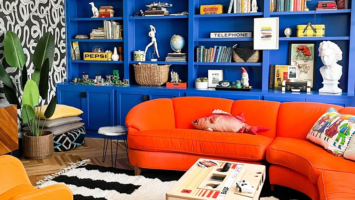
How to Implement Blue and Complementary Colors in Interior Design
Implementing blue and its complementary colors in interior design can create beautiful and harmonious living spaces. Whether you’re designing a bedroom, living room, or kitchen, incorporating these colors can evoke desired emotions and create visually appealing environments. Here are some tips on how to implement blue and complementary colors in interior design:
- Choose the right shade of blue: Blue comes in a spectrum of shades, each with its own mood and energy. Lighter shades of blue, like baby blue or sky blue, can create a serene and calming ambiance, while deeper shades, such as navy or royal blue, can add richness and sophistication. Consider the mood you want to create and select the appropriate shade of blue accordingly.
- Add complementary colors as accents: Use complementary colors to add pops of contrast and visual interest. For a warm and energetic feel, incorporate accents in shades of orange or yellow. For a more harmonious and soothing atmosphere, consider using accents in shades of green or purple.
- Consider the color proportions: Determine the proportion of blue and complementary colors you want to use in your design. The dominant color should typically be blue, while complementary colors can be used sparingly as accents. Strive for a balanced distribution of colors throughout the space to achieve visual harmony.
- Focus on accent pieces: Use complementary colors in accent pieces such as throw pillows, artwork, rugs, or curtains. These items can easily be changed or updated, allowing you to experiment with different color combinations and refresh the look of your space as desired.
- Create color harmony: Select complementary colors that are in harmony with each other and with the overall theme or style of your space. Consider the undertones of the colors, ensuring they complement each other and create a cohesive aesthetic.
- Pay attention to lighting: Lighting can significantly impact how colors appear in a space. Consider the natural and artificial lighting in your room when choosing blue and complementary colors. Natural light can enhance the vibrancy and depth of colors, while artificial lighting can influence how colors are perceived.
- Use neutrals as a backdrop: Incorporate neutral colors such as white, beige, or gray as a background to balance the vibrancy of blue and its complementary colors. Neutrals can help create a sense of stability and prevent the design from feeling overwhelming.
- Consider the room function: Different colors evoke different emotions and energies. Consider the function of the room and the desired atmosphere you want to create. For example, in a bedroom, using calming shades of blue with complementary colors like soft greens or lavender can promote relaxation and restful sleep.
- Experiment with textures and patterns: Combine different textures and patterns to add depth and visual interest to your design. Incorporate complementary colors in textured fabrics, patterned wallpapers, or decorative elements to create a dynamic and visually appealing space.
- Seek inspiration: Look for interior design inspiration that effectively uses blue and complementary colors. Explore magazines, online platforms, or consult with a professional interior designer to gather ideas and see how these colors are implemented in various spaces.
By implementing blue and complementary colors in your interior design, you can create inviting and visually appealing spaces. Carefully choosing the right shades, considering the proportions and harmonizing the colors, will help you achieve the desired atmosphere and create a visually stunning environment.
Adding Blue and Complementary Colors to Fashion and Accessories
Blue and its complementary colors can be used effectively in fashion and accessories to create stylish and eye-catching looks. Whether you’re designing clothing, jewelry, handbags, or shoes, incorporating these colors can elevate your designs and make a fashion statement. Here are some tips on adding blue and complementary colors to fashion and accessories:
- Choose the right shade of blue: Consider the mood and style you want to convey with your fashion or accessory design. Lighter shades of blue, like pastels, can create a soft and feminine look, while darker shades like navy or royal blue can add sophistication and elegance to your designs.
- Use complementary colors as accents: Complementary colors can add pops of contrast and create visual interest in your designs. Incorporate accents of complementary colors in small details such as buttons, trims, or stitching to add a dynamic element to your fashion pieces or accessories.
- Experiment with color blocking: Color blocking is a technique where different areas of a garment or accessory are filled with contrasting colors. Incorporate blue and its complementary colors in color blocking to create bold and visually striking designs. For example, you can combine a blue blouse with a complementary color skirt for a fashionable and trendy look.
- Consider the color proportions: Determine the balance between blue and its complementary colors in your design. Blue can be the dominant color, with complementary colors used as accents, or vice versa. Experiment with different proportions to achieve the desired visual impact.
- Pay attention to color harmony: Select complementary colors that harmonize well with the overall color palette of your design. Consider the undertones of the colors and ensure they complement each other to create a cohesive and aesthetically pleasing look.
- Experiment with fabrics and textures: Combine different fabrics and textures to add visual interest to your fashion pieces or accessories. Consider using fabrics with different textures or patterns that incorporate blue and complementary colors to create a unique and dynamic look.
- Accessorize with complementary colors: Add accessories in complementary colors to enhance your overall look. This can include jewelry, belts, scarves, or footwear. Accessories can serve as statement pieces that add a burst of color and complete your fashion ensemble.
- Consider the target audience and occasion: Think about the preferences of your target audience and the occasion for which the fashion or accessory is intended. Different combinations of blue and complementary colors can evoke various emotions and cater to different fashion tastes and style preferences.
- Seek inspiration: Look for fashion inspiration that effectively uses blue and complementary colors. Explore fashion magazines, runway shows, or fashion blogs to gather ideas and see how these colors are used in different fashion and accessory designs.
- Test and iterate: Continually evaluate the success of your designs by testing them with your target audience and receiving feedback. This will help you refine your use of blue and complementary colors and make any necessary adjustments to enhance the overall design.
By incorporating blue and complementary colors in fashion and accessories, you can create fashionable and visually appealing designs that make a statement. Experiment with different shades, textures, and proportions to create stylish looks that captivate attention and showcase your unique sense of style.
Incorporating Blue and Complementary Colors in Visual Arts and Illustrations
Blue and its complementary colors can be incredibly impactful when used in visual arts and illustrations. These colors have the power to evoke specific emotions, set the tone, and create dynamic compositions. Whether you’re working with traditional or digital mediums, incorporating blue and complementary colors can enhance your artistic expression. Here are some tips for incorporating blue and complementary colors in visual arts and illustrations:
- Understand color theory: Familiarize yourself with the principles of color theory, including the color wheel, complementary colors, and color harmonies. This knowledge will help you make informed decisions and successfully incorporate blue and complementary colors in your artwork.
- Use blue as a dominant color: Consider using blue as the dominant color in your artwork. Blue can be used to establish the mood, convey emotions such as calmness or sadness, or depict natural elements like water and sky. Experiment with different shades of blue to convey the desired atmosphere.
- Integrate complementary colors for contrast: Complementary colors create a strong contrast that can make your artwork visually dynamic. Use these colors strategically to draw attention to focal points or add visual interest to your composition. For example, use touches of orange or yellow to create vibrant highlights against a predominantly blue background.
- Consider color values and tones: Pay attention to the lightness or darkness of the colors you use. Varying the values and tones of blue and its complementary colors can create depth and dimension in your artwork. Experiment with different color combinations to find the most visually impactful results.
- Highlight with complementary color accents: Use complementary colors sparingly as accents or strategic focal points in your artwork. These accents will create contrast and draw attention to important details or elements in your composition. For example, use complementary colors to highlight a specific object or create a sense of movement.
- Experiment with color temperature: Explore the temperature of blue and complementary colors. Blue is typically considered a cool color, while complementary colors like orange or yellow are warm. Playing with these temperature variations can evoke different emotions and add complexity to your artwork.
- Consider the emotional impact: Different color combinations can evoke specific emotions. Blue can convey tranquility, stability, or even melancholy, while complementary colors can add energy, excitement, or tension. Use these color combinations consciously to enhance the emotional impact of your artwork.
- Work with color harmony: Harmonize blue and complementary colors to create a visually pleasing and balanced composition. Explore color harmonies such as analogous or triadic color schemes to find combinations that complement each other and create visual unity in your artwork.
- Experiment and embrace creativity: Allow yourself to experiment with different color combinations and techniques. There are no strict rules in art, and every artist has their own unique style. Embrace your creativity, take risks, and use blue and complementary colors to create artwork that reflects your artistic vision.
- Seek inspiration: Look for inspiration from other artists who effectively use blue and complementary colors in their artwork. Explore various art forms, including paintings, illustrations, and digital art, to gather ideas and see how these colors are incorporated to enhance visual impact.
By incorporating blue and complementary colors in your visual arts and illustrations, you can create captivating and emotionally engaging artwork. Experiment with different combinations, values, and tones to develop your own unique artistic style and create visually stunning compositions.
The Impact of Blue and Complementary Colors on Human Emotion and Mood
Colors have a profound impact on human emotion and mood, and blue and its complementary colors are no exception. Understanding the psychological effects of these colors can help us harness their power in various aspects of our lives. Here’s a closer look at the impact of blue and complementary colors on human emotion and mood:
Blue: Blue is often associated with feelings of calmness, tranquility, and serenity. This cool color has the power to lower blood pressure, slow down heart rate, and reduce feelings of anxiety and stress. It stimulates a sense of trust, stability, and reliability. Blue is especially effective in creating a peaceful and soothing atmosphere. However, too much blue can evoke a sense of coldness or detachment, so it’s important to balance it with warmer tones or complementary colors.
Orange: As the complementary color of blue, orange offers a vibrant and energetic contrast. It is often associated with warmth, enthusiasm, and optimism. Orange can evoke feelings of excitement and creativity. It is commonly used to grab attention and create a sense of playfulness or adventure. However, excessive use of orange can be overwhelming, so it’s essential to use it strategically and in moderation.
Green: Green is created by combining blue and yellow, and it often represents growth, harmony, and balance. This color is associated with nature and has a calming effect on the human mind. Green can evoke feelings of freshness, renewal, and relaxation. It promotes a sense of peace and tranquility and is often used in spaces intended for rest or healing. Darker shades can symbolize wealth, stability, and prestige.
Purple: Purple, the complementary color of yellow, is often associated with royalty, luxury, and spirituality. It represents power, creativity, and ambition. Purple has a calming effect, similar to blue, and can promote introspection and a sense of mystery. It is often used to create a sense of elegance and sophistication. Lighter shades of purple can create a soft and romantic atmosphere, while darker shades can convey a sense of depth and richness.
Yellow: Yellow is a warm and energetic color associated with happiness, joy, and positivity. It evokes feelings of optimism, warmth, and cheerfulness. Yellow can stimulate mental activity and encourage creativity. It is often used to evoke a sense of happiness and playfulness. However, an excessive amount of yellow can cause feelings of restlessness or anxiety, so it’s important to balance it with other colors.
When combined, blue and its complementary colors can create dynamic and visually striking compositions. The contrast between these colors can evoke a range of emotions and moods. The proper use of these colors, considering the desired atmosphere and the context in which they are used, can elicit specific emotional responses and enhance the overall experience.
It’s important to note that individual perceptions and cultural backgrounds can influence the impact of colors on human emotion and mood. Personal preferences and experiences can also play a role in how colors are interpreted and experienced. Therefore, it’s crucial to consider the target audience and the message being conveyed to create the desired emotional impact.
By understanding the impact of blue and complementary colors on human emotion and mood, we can leverage their power to create visually appealing designs, set the tone in spaces, and evoke specific emotional responses in various aspects of our lives.