
Choosing the Data for Your Timeline
When creating a timeline in Excel, the first step is to carefully choose the data you want to include. The data you select will determine the events and milestones that will be represented on the timeline. Here are the key considerations for choosing the data for your timeline:
1. Define Your Timeline: Determine the specific time period or duration that you want to display on your timeline. It could be a project timeline, historical timeline, or any other timeline that suits your purpose.
2. Identify Key Events: Identify the important events that you want to showcase on your timeline. These events could be significant milestones, key dates, or major developments related to your project or subject matter.
3. Gather Relevant Information: Collect all the necessary information for each event or milestone, such as the event name, date, description, and any additional details that you want to include. Ensure that the information is accurate and well-documented.
4. Sort and Organize: Arrange your events and milestones chronologically to maintain a proper sequence on the timeline. Depending on your data, you may need to sort them in ascending or descending order of dates.
5. Consider Data Density: Consider the amount of data you have for each time period. If there are too many events close together, it might clutter the timeline. In such cases, you may need to consider grouping similar events or selecting key events to highlight.
6. Validate Data Sources: Ensure that the data sources you are using for your timeline are reliable and credible. It’s important to verify the accuracy of the information before presenting it on your timeline.
By carefully choosing the data for your timeline, you can create a clear and visually appealing representation of events and milestones. Remember to keep the focus on the most relevant and significant information to effectively communicate your message.
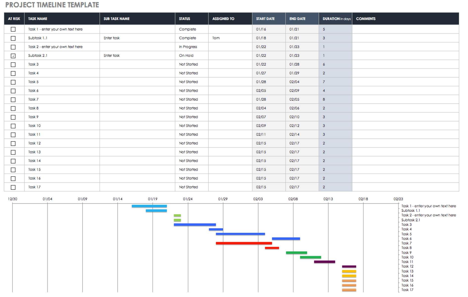
Creating a Basic Timeline
Once you have chosen the data for your timeline, it’s time to create the basic structure of your timeline in Excel. Follow these steps to create a basic timeline:
1. Open Excel and Create a New Worksheet: Open Excel and start a new worksheet where you will build your timeline.
2. Set Up the Timeline Layout: Determine the size and layout of your timeline. Decide whether you want a horizontal or vertical timeline and adjust the row height or column width accordingly.
3. Create a Time Scale: Determine the time scale for your timeline, such as days, months, or years. Enter the starting date and ending date or time period on your timeline spreadsheet.
4. Add Event Markers: Mark the dates or time periods on your timeline where events or milestones occur. You can do this by inserting shapes or symbols at the appropriate points on your timeline.
5. Label Event Markers: Add labels to your event markers to identify each event or milestone. Include the event name or description for clarity and easy understanding.
6. Add Connecting Lines: Draw lines or arrows to connect the event markers on your timeline. This visually connects the events and makes it easier to follow the chronological order.
7. Format Your Timeline: Customize the appearance of your timeline to align with your preferences and project requirements. Format the colors, fonts, and styles to make your timeline visually appealing.
8. Add Descriptive Text: Include descriptive text or captions below each event marker to provide additional context or details. This allows viewers to understand the significance of each event.
9. Review and Adjust: Take a step back and review your basic timeline. Make any necessary adjustments to ensure that it accurately reflects your data and presents the information in a clear and organized manner.
By following these steps, you can create a basic timeline in Excel that outlines the sequence of events or milestones. It provides a visual representation of the data you have chosen, making it easier for viewers to comprehend and engage with the information you are presenting.
Customizing the Timeline Appearance
Once you have created a basic timeline in Excel, you can take it a step further by customizing its appearance to make it visually appealing and engaging. Here are some ways to customize the appearance of your timeline:
1. Formatting: Apply formatting to the timeline elements, such as the event markers, connecting lines, and axis labels. Use different colors, fonts, and styles to highlight important events or create a cohesive visual theme.
2. Themes and Styles: Excel offers a range of predefined themes and styles that you can apply to your timeline. These themes provide consistent formatting and give your timeline a professional look with just a few clicks.
3. Shapes and Symbols: Customize event markers by using different shapes or symbols to represent specific types of events. This can help differentiate between different categories of events or add visual interest to the timeline.
4. Background: Change the background color or add an image to the timeline to enhance its visual appeal. Consider the context of your timeline and choose a background that complements the overall theme or subject matter.
5. Font and Text Formatting: Experiment with different font styles, sizes, and colors to make your timeline text visually appealing and easy to read. Use bold or italicized text to highlight important information or emphasize key events.
6. Gridlines and Axes: Adjust the gridlines and axes of your timeline to align with your desired look. You can customize the intervals, tick marks, and labels to provide clear visual cues and improve readability.
7. Data Labels: Customize the data labels on your timeline by changing their position, orientation, or font style. This helps viewers easily identify and understand the events or milestones represented on the timeline.
8. Legends and Key: If your timeline includes different categories of events, consider adding a legend or key to explain the significance of each category. This helps viewers interpret the information accurately.
9. Animation and Transitions: If you plan to present your timeline in a slide show or interactive format, consider adding animations and transitions to enhance the visual impact and engage your audience.
By taking the time to customize the appearance of your timeline, you can create a visually attractive and informative representation of your data. Remember to strike a balance between aesthetics and clarity to ensure that your customized timeline effectively communicates the intended information to viewers.
Adding Milestones to Your Timeline
Milestones are significant events or achievements that mark key points in your timeline. They provide important markers for viewers to understand the progress or significance of your project or subject matter. Incorporating milestones into your timeline allows you to highlight specific moments in time. Here’s how you can add milestones to your timeline in Excel:
1. Identify Milestone Events: Review your chosen data and identify the events that you want to designate as milestones. These can include significant achievements, project deadlines, major product releases, or any other noteworthy events.
2. Determine Milestone Position: Decide where each milestone should be placed on the timeline. This can be done by aligning the milestone with the corresponding date or by positioning it on a specific point along the timeline to create visual interest.
3. Insert Milestone Markers: Add visual indicators or markers that represent milestones on your timeline. You can use symbols, shapes, or customized images to differentiate milestones from other events.
4. Label Milestone Markers: Provide clear labels or captions for each milestone marker to identify the specific event or achievement. Ensure that the labels are easy to read and positioned near the corresponding milestone marker.
5. Add Descriptions: Include additional descriptions or details about each milestone to provide viewers with more context and understanding. This can be done by inserting text boxes or annotations near the corresponding milestone.
6. Customize Milestone Appearance: Customize the appearance of the milestone markers to make them stand out visually. Consider using unique colors, larger sizes, or different shapes to make the milestones more noticeable amidst the other events on the timeline.
7. Group Milestones: If you have multiple milestones that are related or fall within the same timeframe, consider grouping them together on the timeline. This can be done by using brackets, lines, or other visuals to indicate a specific milestone cluster.
8. Adjust Milestone Positions: As you refine your timeline, you may need to adjust the positions of the milestone markers to ensure they are accurately represented in relation to other events. This can be done by simply dragging the milestone marker to the desired location.
By adding milestones to your timeline, you can highlight and emphasize key events or achievements. This provides viewers with a clear understanding of the timeline’s significant moments and helps them grasp the progression or impact of your project or subject matter.
Adjusting the Timeline Layout
When creating a timeline in Excel, you may need to make adjustments to the layout to ensure a clear and organized representation of your data. Here are some ways to adjust the timeline layout to suit your needs:
1. Resize Rows or Columns: To accommodate the timeline elements, you might need to resize the rows or columns of your spreadsheet. Adjust the height of rows or the width of columns to create enough space for the timeline.
2. Modify Axis Scale: Depending on the time scale of your timeline, you may need to adjust the axis scale to properly display the time intervals. This can be done by changing the minimum and maximum values or altering the interval units.
3. Change Orientation: By default, timelines are typically laid out horizontally. However, you can also consider a vertical orientation to better fit the available space or achieve a different visual effect. Adjust the layout to suit your preferences.
4. Adjust Event Marker Positions: If the event markers on your timeline appear too crowded or overlap with each other, you may need to reposition them. Move the event markers along the timeline to enhance readability and ensure that they are easily distinguishable.
5. Add Legends or Key: If your timeline includes different categories of events or milestones, consider adding a legend or key to provide clarity and assist viewers in interpreting the timeline accurately. This helps them understand the significance of each category.
6. Remove Clutter: Review your timeline and remove any unnecessary clutter, such as excessive gridlines or labels. Keep the layout clean and uncluttered to prevent visual distractions and maintain a clear focus on the timeline’s important elements.
7. Group Related Events: If you have multiple events that are closely related or occur within the same timeframe, consider grouping them together. Use specific visuals, such as brackets or lines, to indicate the relationship between the events.
8. Test Different Layouts: Don’t be afraid to experiment with different layout options. Test out different arrangements, orientations, and scales to find the layout that best suits your data and provides the clearest representation of your timeline.
By adjusting the timeline layout, you can enhance the readability and visual appeal of your timeline in Excel. Creating a well-structured and organized layout ensures that viewers can easily comprehend the flow and progression of events or milestones represented on your timeline.
Adding Descriptions and Notes to Your Timeline
To provide additional context and details for the events or milestones on your timeline, it’s helpful to include descriptions and notes. These descriptions and notes help viewers understand the significance, outcomes, or any pertinent information related to each event. Here’s how you can add descriptions and notes to your timeline in Excel:
1. Insert Text Boxes: Use text boxes to add descriptions directly onto the timeline. Position the text boxes near the corresponding event or milestone, ensuring they don’t obstruct the overall layout or readability of the timeline.
2. Provide Relevant Information: Write clear and concise descriptions that capture the key details of each event. Include important information such as the event name, date, location, people involved, and any relevant statistics or outcomes.
3. Utilize Conditional Formatting: Use conditional formatting to highlight specific events or milestones that require additional attention or have special significance. This can be achieved by applying different colors or font styles to the descriptions or notes of those specific events.
4. Include Links or References: If there are external resources or documents related to an event or milestone, consider including hyperlinks in the descriptions or notes. This allows viewers to access additional information or references conveniently.
5. Add Annotations: Use annotations or callouts to draw attention to specific details within the timeline. These can include explanations, clarifications, or noteworthy facts that further enhance the understanding of the events or milestones.
6. Use Symbols or Icons: Incorporate symbols or icons to represent key points within the descriptions or notes. These visual cues can help emphasize important information or provide a quick overview of the event or milestone.
7. Format Text: Enhance the readability and aesthetics of the descriptions by formatting the text. Use font styles, sizes, and colors to differentiate the descriptions from other elements on the timeline and make them visually appealing.
8. Review and Edit: Proofread and edit the descriptions and notes to ensure clarity, accuracy, and concise wording. Avoid excessive details or unnecessary jargon that may confuse viewers.
By adding descriptions and notes to your timeline, you enrich the viewer’s understanding of the events or milestones. These additional details provide valuable context and insights, making your timeline more informative and comprehensive.
Grouping and Filtering Data in Your Timeline
Grouping and filtering data in your timeline can help organize and present the information in a more structured and meaningful way. Excel provides powerful features that allow you to group and filter data based on specific criteria. Here’s how you can utilize grouping and filtering in your timeline:
1. Grouping Events: If you have a large number of events or milestones on your timeline, you can group them based on categories, themes, or projects. Grouping events helps viewers focus on specific subsets of data and facilitates a clearer understanding of the overall timeline.
2. Creating Group Headers: When grouping events, it’s useful to create group headers to provide a quick overview of the events contained within each group. These headers can include the group name or category and act as visual markers to separate different sections of the timeline.
3. Collapsing and Expanding Grouped Events: Excel allows you to collapse and expand groups, which is helpful when dealing with large datasets. Collapsing groups hides the individual events within a group, making the timeline less cluttered and enabling viewers to focus on specific groups of interest. Expanding groups reveals the events within each group.
4. Filtering by Time Period: Excel’s filtering functionality allows you to filter events based on a specific time period. This feature is particularly useful when dealing with extensive timelines, allowing viewers to focus on events that fall within a particular timeframe of interest.
5. Filtering by Categories or Labels: If your timeline includes categorization or labels for events, you can use Excel’s filtering capabilities to display events based on specific categories or labels. This allows viewers to easily identify and analyze events that are relevant to their specific interests or criteria.
6. Adding Interactive Controls: Excel provides interactive controls such as checkboxes or drop-down lists, which you can use to create user-friendly filtering options. This enables viewers to dynamically filter the events on the timeline based on their preferences or specific criteria.
7. Utilizing Slicers: Slicers are graphic representations of filtering options and can be used to provide a more visual and intuitive way for viewers to filter the data in your timeline. Slicers can be added to display and select specific categories, labels, or time periods.
8. Updating and Clearing Filters: Excel allows you to update or clear filters easily. This functionality is beneficial when you need to modify the filtering criteria or revert to the original unfiltered view, ensuring flexibility and adaptability in presenting the data in your timeline.
By utilizing the grouping and filtering capabilities of Excel, you can effectively organize and present data in your timeline. These features enhance the flexibility and readability of your timeline, enabling viewers to focus on specific subsets of data or analyze events based on their own interests or criteria.
Formatting the Timeline Axis
The timeline axis is a crucial element in effectively conveying the time scale and chronological order of events on your timeline. By formatting the timeline axis in Excel, you can enhance the readability and clarity of your timeline. Here are some key considerations for formatting the timeline axis:
1. Display Format: Choose a display format that best suits the time period you are representing. Excel offers various formats, such as date formats (e.g., day/month/year) or elapsed time formats (e.g., hours:minutes:seconds). Select the format that provides the most accurate and understandable representation of your timeline data.
2. Interval Units: Determine the interval units or increments on the timeline axis based on the duration of your timeline. Determine whether you want to display intervals in days, weeks, months, or years. Adjust the interval units to ensure that the timeline is not too cluttered or too sparse with events.
3. Tick Marks: Add tick marks to the timeline axis to visually indicate the intervals. Tick marks can enhance the readability and understanding of the timeline. Choose the appropriate length and style of tick marks that align with the overall aesthetic of your timeline.
4. Axis Labels: Label the timeline axis with clear and descriptive labels that accurately portray the time scale. Use clear fonts and appropriate font sizes to ensure legibility. Orient the labels vertically or horizontally depending on the orientation of your timeline layout.
5. Axes Titles: Consider adding a title to your timeline axis that provides a clear indication of the timeframe or subject matter of your timeline. The axes title can be positioned at the top or bottom of the axis, depending on your preference and available space.
6. Gridlines: Gridlines can aid in visually organizing the events on the timeline. Customize the appearance of gridlines to provide clear visual cues and improve readability. Choose the appropriate style, color, and weight of gridlines that complement the overall design of your timeline.
7. Axis Scale: Adjust the scale of the timeline axis to ensure that it accurately represents the duration of your timeline. Excel provides the flexibility to set the minimum and maximum values on the axis scale, allowing you to accurately reflect the time period being presented.
8. Axis Formatting: Customize the formatting of the timeline axis to align with the overall theme or design of your timeline. Choose appropriate font styles, sizes, and colors that enhance the readability and aesthetics of the timeline without overshadowing the events or milestones.
By carefully formatting the timeline axis in Excel, you can create a visually appealing and informative representation of your data. The formatting choices you make contribute to the clarity and overall presentation of your timeline, enabling viewers to easily grasp the chronological order and time scale of the events.
Adding Labels to Your Timeline
Labels play a crucial role in providing clear identification, context, and information about the events or milestones on your timeline. By adding labels to your timeline in Excel, you can enhance the understanding and comprehension of the data presented. Here’s how you can effectively add labels to your timeline:
1. Event Labels: Each event or milestone on your timeline should have a clear and concise label that identifies the event or milestone. The label can be the name of the event, a brief description, or any relevant information that provides context for viewers.
2. Formatting Labels: Format the labels to ensure they stand out and are easily readable. Adjust the font size, style, and color to differentiate the labels from other text on the timeline. Consider using bold or italicized formatting to emphasize important events or milestones.
3. Label Placement: Position the labels near the corresponding event or milestone on the timeline. Place them close enough for viewers to easily associate the label with the event, but make sure they don’t obstruct the overall layout or readability of the timeline.
4. Line Connections: Use lines or arrows to visually connect the event labels with the corresponding events on the timeline. This helps viewers easily identify which event each label refers to, especially when dealing with multiple events close together on the timeline.
5. Label Alignment: Align the labels consistently for a professional and organized look. Consider aligning the labels to the right, left, or center of the corresponding event or milestone. Consistency in label alignment throughout the timeline ensures a cohesive visual presentation.
6. Label Hierarchy: If your timeline has multiple layers or subcategories of events, consider using different font sizes or styles to indicate a hierarchy of importance or significance. This can visually highlight key events or milestones on the timeline.
7. Wrap Text: If your event labels are long or contain multiple lines of text, wrap the text to prevent it from overflowing and disrupting the overall aesthetics of the timeline. Wrapping the text ensures that the labels are displayed in a neat and organized manner.
8. Data Point Labels: In addition to event labels, consider adding data point labels to provide additional information or context. Data point labels can be used to display numeric values, percentages, or any other relevant data associated with each event or milestone.
By adding clear and well-formatted labels to your timeline, you enhance the clarity and understanding of the events or milestones being portrayed. The labels serve as key markers, helping viewers navigate and interpret the timeline effectively.
Applying Conditional Formatting to Your Timeline
Conditional formatting is a powerful feature in Excel that allows you to visually enhance your timeline based on specific conditions or rules. By applying conditional formatting to your timeline, you can draw attention to important events, highlight specific trends, or emphasize significant milestones. Here’s how you can effectively utilize conditional formatting in your timeline:
1. Highlighting Significant Events: Use conditional formatting to highlight events or milestones that are of particular importance. For example, you can apply bold font or a different color to events that signify critical project deadlines or major achievements.
2. Color-Coding Categories: If your timeline includes events from different categories or themes, use conditional formatting to color-code each category. This helps viewers quickly identify and differentiate events based on their category or subject matter.
3. Applying Data-Based Formatting: Apply conditional formatting based on the values in specific cells or columns associated with the events on the timeline. For example, you can display events with higher values in a larger font size or with a different background color to highlight their significance.
4. Progress or Status Indicators: If your timeline represents project timelines or progress, use conditional formatting to display progress indicators. For instance, color-code events based on their completion status or utilize visual icons to show the current stage of each event.
5. Conditional Icon Sets: Excel provides a range of pre-defined icon sets that can be applied using conditional formatting. Utilize these icon sets to represent different states or conditions related to events on the timeline. For instance, use green checkmarks for completed events and yellow or red exclamation marks for pending or delayed events.
6. Data Bars or Color Scales: Apply data bars or color scales to visualize the comparative values or durations of events on the timeline. This technique allows viewers to quickly grasp the differences and trends represented by the data.
7. Dynamic Formatting: Use dynamic formatting with formulas to apply conditional formatting that adjusts based on changing data. For example, you can highlight events that are overdue, approaching deadlines, or have exceeded certain thresholds.
8. Test and Refine: Experiment with different conditional formatting options to find the visual representations that best suit your timeline and effectively communicate the intended message. Test the formatting and make adjustments as necessary to ensure a cohesive and visually appealing timeline.
By applying conditional formatting to your timeline, you can visually enhance the presentation and highlight important aspects of the data. Conditional formatting not only makes the timeline visually appealing, but also facilitates a more intuitive understanding of the events, trends, and status represented on the timeline.
Adding Links and Actions to Your Timeline
Adding links and actions to your timeline can greatly enhance the functionality and interactivity of your Excel timeline. By incorporating links and actions, you can provide additional information, facilitate navigation, or enable users to interact with the timeline elements. Here are some ways to effectively add links and actions to your timeline:
1. Hyperlinking: Excel allows you to easily hyperlink events or milestones on your timeline to external documents, websites, or additional resources. By adding hyperlinks, you can provide viewers with direct access to more detailed information or relevant sources.
2. Document Attachments: If your timeline requires more extensive documentation or supplementary materials, consider attaching relevant documents directly to specific events. This feature allows users to access related files, such as project plans, presentations, or reports, without leaving the timeline workbook.
3. Tooltips: Utilize Excel’s tooltip feature to display additional information when users hover over an event or milestone on the timeline. Tooltips provide a convenient way to offer brief descriptions, dates, or other relevant details without cluttering the main view of the timeline.
4. Action Buttons and Macros: Excel enables you to incorporate custom action buttons or macros into your timeline. You can create buttons that trigger specific actions, such as opening related worksheets, running calculations, or executing customized operations on the timeline data.
5. Form Controls: Implementing form controls, such as dropdown lists or checkboxes, allows users to filter or manipulate data within the timeline dynamically. This feature enhances interaction by enabling users to modify the view or focus on specific events based on their preferences or criteria.
6. Navigation Buttons: Include navigation buttons within your timeline to facilitate easy navigation between different time periods or sections of the timeline. Users can traverse the timeline swiftly without manually scrolling or searching for specific events.
7. Visual Cues and Icons: Add visual cues or icons to indicate events or milestones that have associated links or actions. For instance, you can place a small icon next to an event to signify the presence of a hyperlink or action. This prompts users to interact with those specific events or milestones.
8. User-Friendly Design: Ensure that your timeline design intuitively guides users to the interactive elements. Use clear labels, tooltips, or visual indicators to communicate the presence of links or actions, ensuring a seamless user experience and enhancing the overall usability of the timeline.
By adding links and interactive actions to your timeline, you create a more dynamic and engaging experience for viewers. Incorporating these features not only enhances the functionality of your timeline but also allows users to interact with the data and explore the timeline in a more customized manner.
Sharing and Collaborating on Your Timeline
Sharing and collaborating on your timeline in Excel can improve communication and allow multiple stakeholders to contribute to the project. By leveraging the collaborative features of Excel, you can streamline the workflow, gather feedback, and ensure everyone involved stays informed. Here are some ways to effectively share and collaborate on your timeline:
1. Share Online: Use Excel’s sharing functionality to upload your timeline to a cloud storage service or online collaboration platform. This allows you to share a link with collaborators, granting them access to the timeline from anywhere, anytime, and facilitating real-time collaboration.
2. Set Permissions: Choose the appropriate permission levels for collaborators to control their level of access and editing capabilities. Determine whether they should have view-only access or be able to make alterations to the timeline.
3. Commenting and Feedback: Encourage collaborators to provide comments and feedback directly on the timeline. Excel’s comment feature allows users to leave notes, suggestions, or questions, facilitating a collaborative discussion and ensuring everyone’s input is captured.
4. Version Control: If multiple collaborators are working on the timeline, consider enabling version control to keep track of changes. This ensures that you can revert to previous versions if needed and allows for clear documentation of the timeline’s evolution.
5. Assigning Responsibilities: Use Excel’s collaboration tools, such as shared task lists or assignments, to assign responsibilities to specific collaborators. This helps streamline the workflow, ensuring that each stakeholder knows their role and can update their respective sections of the timeline.
6. Avoiding Data Conflicts: To prevent data conflicts, establish clear guidelines for collaborators to avoid overwriting or duplicating entries. Encourage communication and awareness among team members to ensure that changes are properly coordinated and consolidated.
7. Regular Updates and Notifications: Keep collaborators informed about changes to the timeline by providing regular updates or sending notifications when significant updates are made. This helps maintain transparency and ensures that everyone has access to the most up-to-date version of the timeline.
8. Offline Collaboration: If collaborators prefer working in Excel on their local machines, consider utilizing file-sharing services to exchange the timeline workbook. This allows collaborators to work on their local copies and merge the changes periodically to maintain a centralized version of the timeline.
By leveraging the sharing and collaboration features of Excel, you can streamline teamwork, improve communication, and enhance the quality of your timeline. Sharing and collaborating on the timeline ensures that all stakeholders have access to the necessary information and can actively contribute to its development and accuracy.
Tips and Tricks for Creating an Effective Timeline
Creating an effective timeline in Excel requires careful planning and attention to detail. By following these tips and tricks, you can ensure that your timeline is clear, visually appealing, and communicates the intended information effectively:
1. Define the Purpose: Clearly define the purpose and objective of your timeline. Understand the key information you want to convey and the target audience to tailor your timeline accordingly.
2. Choose the Right Time Scale: Select the appropriate time scale for your timeline based on the duration and granularity of your events. Consider whether you need to display events in minutes, hours, days, weeks, months, or years.
3. Keep it Simple: Avoid overcrowding your timeline with excessive events or cluttered visuals. Focus on the most important events and provide sufficient spacing and clarity for easy comprehension.
4. Consistent Styling: Maintain consistency in font styles, colors, and shapes throughout your timeline. This helps create a cohesive and visually appealing look, making it easier for viewers to follow the timeline.
5. Use Visual Cues: Utilize visual cues, such as icons, symbols, or color-coding, to enhance the understanding and interpretation of events. Visual cues make it easier for viewers to identify important milestones or distinguish between different categories or stages.
6. Narrate the Story: Arrange events in a logical sequence to tell a coherent story. Consider using introductory or concluding sections to provide context or summarize the timeline’s significance.
7. Balance Text and Visuals: Find the right balance between textual information and visual elements on your timeline. Use concise labels and descriptions, complemented by visual cues, to make the timeline informative and visually appealing.
8. Test for Readability: Test the readability of your timeline by having others review it. Ensure that the font sizes, colors, and layouts are easily readable, and adjust them if necessary to optimize clarity.
9. Update and Maintain: Regularly update and maintain your timeline as new events occur or changes arise. Keep it accurate and relevant by reviewing and revising it periodically.
10. Solicit Feedback: Seek feedback from colleagues or stakeholders to gather different perspectives and improve the effectiveness of your timeline. Incorporate constructive feedback into your revisions to enhance its overall quality.
11. Consider Interactive Elements: Explore interactive elements, such as hyperlinks, tooltips, or filtering options, to allow viewers to explore the timeline in more depth or interact with specific events based on their interests.
12. Use Visualizations: Enhance your timeline by including visualizations, such as charts or graphs, to represent data trends or analyses related to the events. Visualizations can provide additional insights and make the timeline more engaging.
By implementing these tips and tricks, you can create an effective and visually appealing timeline in Excel. Remember to customize your approach based on the specific requirements of your project or subject matter to ensure that your timeline meets its intended purpose and effectively communicates the desired information.