` element. Make sure to give it a unique id or class for styling purposes.
Add the Options: Within the drop-down container, add your individual options as list items `
`. These can be links, buttons, or any other interactive elements. Customize each option with appropriate text, attributes, and styles.
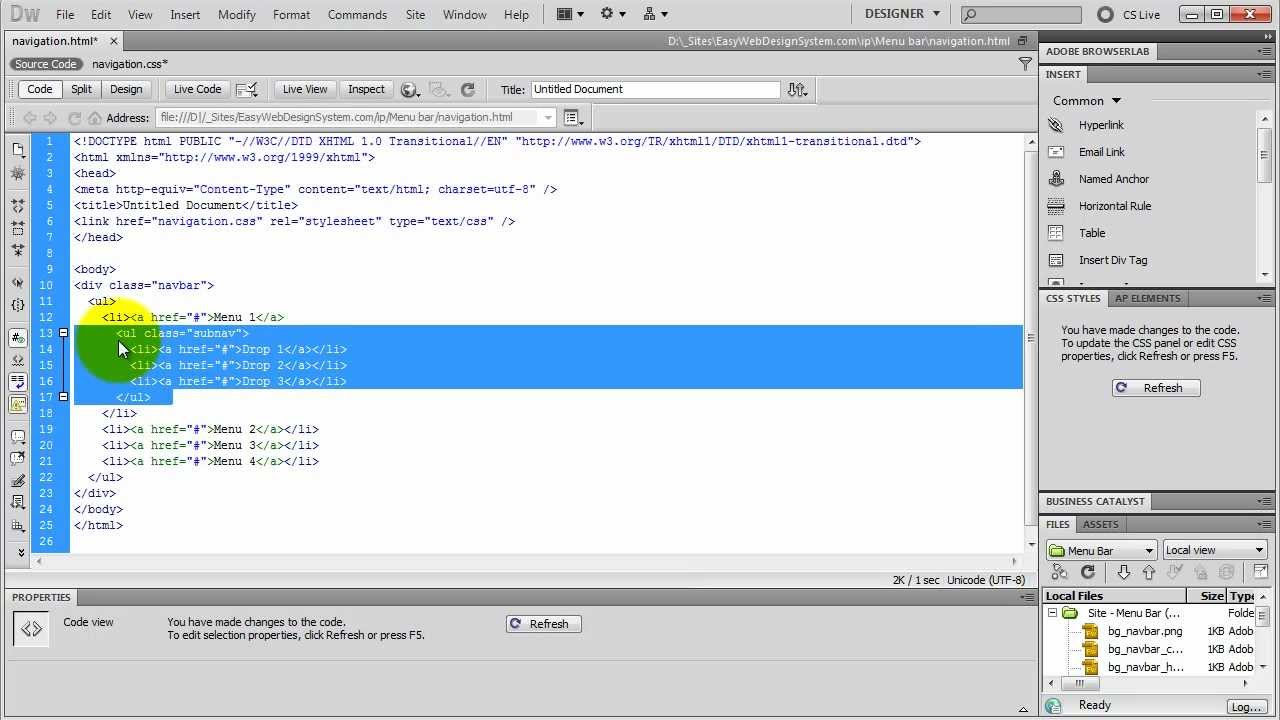
Here’s an example of the HTML structure for a basic drop-down menu:
Remember to replace the class and id names with your own customized names. The parent element’s id (“dropdown-trigger” in the example) will be necessary to associate it with the JavaScript functionality later on.
With the HTML structure in place, you have successfully set up the foundation for your drop-down menu. The next step is to style the menu using CSS to match the design of your website.
Styling the Menu with CSS
Now that you have set up the HTML structure for your drop-down menu, it’s time to style it using CSS. The CSS styles will define the appearance, layout, and behavior of your menu. Here are the steps to style your menu:
- Select the Parent Element: Use the class or id name of the parent element to select it in CSS. Apply desired styles such as background color, text color, padding, and border, to make it visually appealing.
- Hide the Drop-Down Container: Set the display property of the drop-down container to “none” initially, using the class or id name of the container in CSS. This will ensure that the options are hidden until the parent element is clicked or hovered over.
- Style the Options: Target the list items within the drop-down container to apply styles. Customize the font style, background color, hover effects, and any other styling properties to create a visually consistent menu.
- Add Animation and Effects: If desired, you can enhance the drop-down menu with CSS transitions or animations. For example, you can add a smooth fade-in effect when the options appear, or animate the menu expanding and collapsing. This adds a touch of refinement and interactivity to the menu.
Here’s an example of CSS styles for a drop-down menu:
css
.parent-element {
background-color: #eeeeee;
color: #333333;
padding: 10px 20px;
border: 1px solid #cccccc;
cursor: pointer;
}
.dropdown-container {
display: none;
background-color: #ffffff;
padding: 10px;
border: 1px solid #cccccc;
}
.dropdown-container li {
list-style: none;
margin-bottom: 5px;
}
.dropdown-container li a {
color: #333333;
text-decoration: none;
}
.dropdown-container li a:hover {
background-color: #cccccc;
color: #ffffff;
}
Feel free to customize these styles based on your design preferences. Experiment with different colors, fonts, and effects to create a menu that aligns with your website’s overall visual theme.
By following these CSS styling guidelines, you can transform the basic HTML structure into a visually appealing drop-down menu. However, the menu won’t have any functionality yet. In the next section, we will cover the JavaScript code needed to make the menu display and hide the options upon user interaction.
Writing the JavaScript for the Drop-Down Functionality
Now that you have styled your drop-down menu using CSS, it’s time to add the JavaScript code to make it functional. The JavaScript code will handle the display and hiding of the drop-down menu options based on user interaction. Here’s how you can write the JavaScript code for drop-down functionality:
- Access the Parent Element: Use JavaScript to select the parent element. This can be done by targeting the class or id of the parent element. Assign it to a variable for easier manipulation later on.
- Create Event Listeners: Add event listeners to the parent element to detect user interaction. For example, you can use “click” or “mouseover” events to display the drop-down options.
- Toggle the Drop-Down Container: Inside the event listener function, toggle the display property of the drop-down container between “none” and “block” to show or hide the options. This can be achieved using the “style” property of the drop-down container element.
Here’s an example of the JavaScript code for the drop-down functionality:
javascript
// Select the parent element
const parentElement = document.getElementById(“dropdown-trigger”);
// Add event listener for mouseover event
parentElement.addEventListener(“mouseover”, function() {
// Toggle the display property of the drop-down container
const dropdownContainer = document.getElementsByClassName(“dropdown-container”)[0];
dropdownContainer.style.display = dropdownContainer.style.display === “none” ? “block” : “none”;
});
Replace the id and class names in the code snippet with the corresponding ones from your HTML structure. Make sure the JavaScript code is placed after the HTML structure in your web page for proper functionality.
By adding this JavaScript code, your drop-down menu will now show or hide the options when the mouse hovers over the parent element. You can further customize this code to include functionality for clicks or other user interactions.
With the JavaScript code implemented, your drop-down menu is now fully functional. In the next section, we will explore how to add the menu to your Dreamweaver project seamlessly.
Adding the Menu to Your Dreamweaver Project
Once you have created and styled your drop-down menu, it’s time to integrate it into your Dreamweaver project. Dreamweaver provides an intuitive interface and tools that make it easy to add and manage your menu. Follow these steps to add the menu to your Dreamweaver project:
- Open Your Dreamweaver Project: Launch Dreamweaver and open the HTML file or project where you want to add the drop-down menu. Alternatively, you can create a new HTML file by going to File > New.
- Add the HTML Structure: Copy and paste the HTML structure for your drop-down menu into the appropriate location within your Dreamweaver project. Ensure that you place it in the desired location, such as the header section or navigation area.
- Link the CSS File: If you have defined your drop-down menu’s CSS styles in an external CSS file, link this file to your Dreamweaver project. Place the link tag within the head section of your HTML file to ensure that the styles are applied correctly.
- Save and Preview: Save your changes in Dreamweaver and preview your web page in a browser to see how the drop-down menu looks and functions within your project. Make any necessary adjustments to the HTML or CSS code, repeating the process until you are satisfied with the result.
By following these steps, you can seamlessly integrate your drop-down menu into your Dreamweaver project. Dreamweaver provides a visual editor that allows you to see real-time previews of your changes, making it easier to fine-tune the appearance and functionality of your menu.
Remember to save your Dreamweaver project regularly to avoid losing any modifications. Additionally, consider testing your menu on different devices and browsers to ensure that it is responsive and functions correctly across various platforms.
Now that you have successfully added the drop-down menu to your Dreamweaver project, the next step is to test and troubleshoot any issues that may arise.
Testing and Troubleshooting the Drop-Down Menu
After implementing the drop-down menu in your Dreamweaver project, it is crucial to thoroughly test and troubleshoot the menu to ensure its smooth functionality. Here are some steps to follow when testing and troubleshooting your drop-down menu:
- Test Different Browsers: Check how the drop-down menu functions in different web browsers such as Chrome, Firefox, Safari, and Edge. Cross-browser compatibility is essential for a consistent user experience.
- Test on Different Devices: Test the responsiveness of your menu on various devices, including desktop computers, laptops, tablets, and mobile devices. Ensure that the menu adapts and displays correctly across different screen sizes.
- Inspect the Console: Use the browser’s developer tools to inspect the console for any JavaScript errors or warnings that may occur. Fix any issues to ensure proper functionality.
- Ensure Proper Navigation: Test the navigation flow of the drop-down menu. Check that the options lead to the correct pages or perform the intended actions.
- Check for Accessibility: Verify that your drop-down menu is accessible to users with disabilities. Use tools like screen readers or keyboard navigation to ensure that all users can access and interact with the menu effectively.
- Optimize Performance: Evaluate the performance of your drop-down menu, especially if you have included animations or transitions. Optimize the code and assets to ensure smooth and fast loading times.
- Address Common Issues: Troubleshoot common issues like overlapping content, misaligned elements, or unexpected behavior. Check your CSS to ensure there are no conflicting styles that might affect the functionality of the menu.
By thoroughly testing and addressing any issues that arise, you can ensure that your drop-down menu provides a seamless and user-friendly experience for your website visitors.
Remember to revisit the testing phase whenever you make significant changes or updates to your drop-down menu. Regularly testing and troubleshooting will help you maintain a high-quality menu that enhances your website’s functionality.
Once you have thoroughly tested and resolved any issues, you can proceed to customize the design of your drop-down menu to align with your website’s branding and aesthetic.
Customizing the Design of Your Drop-Down Menu
After testing and ensuring the functionality of your drop-down menu, the next step is to customize its design to match your website’s branding and aesthetics. Customization allows you to make the menu visually appealing and cohesive with the overall design of your website. Here are some ways to customize the design of your drop-down menu:
- Colors and Typography: Customize the colors of the menu to match your website’s color scheme. Experiment with different font styles, sizes, and weights to find a combination that complements your website’s typography.
- Iconography: Enhance the visual appeal of your menu by incorporating icons or symbols alongside the options. Use CSS or a library like FontAwesome to add scalable vector icons that represent the menu options.
- Hover Effects: Add visual feedback to the menu by implementing hover effects. For example, change the background color or apply a subtle animation when the mouse hovers over the options.
- Transitions and Animations: Make your drop-down menu more engaging by adding smooth transitions or animations. Use CSS transitions or JavaScript libraries like jQuery to create effects such as sliding, fading, or scaling the menu.
- Responsive Design: Ensure that your drop-down menu is responsive and adapts well to different screen sizes. Use media queries to adjust the styling or layout of the menu for mobile devices or smaller screens.
- Visual Hierarchy: Design the drop-down menu with a clear visual hierarchy. Use font weight, size, and positioning to distinguish between parent elements and sub-menu options, making it easy for users to navigate through the menu.
- Subtle Animations: Consider adding subtle animations to the menu to make it feel more interactive. For example, animate the opening and closing of the drop-down container or apply a fade-in effect when the options appear.
Remember to strike a balance between customization and usability. While it’s important to create a visually appealing menu, it should also be easy to navigate and understand for users. Keep the design clean and consistent with the overall style of your website.
By customizing the design of your drop-down menu, you can create a cohesive and visually appealing navigation component that enhances the user experience on your website. Take the time to experiment and refine the design until it aligns with your vision and meets your website’s needs.
Once you have finalized the design, ensure to test the menu again for responsiveness and functionality, especially after making any additional customization. This will ensure that your drop-down menu delivers a seamless and visually appealing experience to your website visitors.
Enhancing the Drop-Down Menu with Transitions and Effects
To further elevate the visual experience of your drop-down menu, you can enhance it with transitions and effects. By adding subtle animations and effects, you can make the menu more engaging and interactive for users. Here are some ways to enhance your drop-down menu:
- Smooth Transitions: Apply smooth transitions to the appearance and disappearance of the drop-down container. Use CSS transitions to animate changes in opacity, height, or width, creating a seamless visual experience.
- Fade-In and Fade-Out Effects: Employ fade-in and fade-out effects to make the drop-down container appear and disappear gradually. Use CSS opacity transitions to create a smooth and elegant effect.
- Slide-In and Slide-Out Effects: Implement slide-in and slide-out effects to animate the movement of the drop-down container. Use CSS transitions or JavaScript libraries to slide the container in and out of view from different directions.
- Scale and Zoom Effects: Add visual interest by incorporating scale or zoom effects to the drop-down menu options. Use CSS transforms to animate the size of the options on hover, giving them a dynamic and interactive feel.
- Dropdown Indicators: Include subtle dropdown indicators, such as arrows or chevrons, to visually convey that the parent element has a drop-down functionality. Use CSS styles or SVG icons to add these indicators.
- Easing Functions: Experiment with different easing functions to control the speed and acceleration of your transitions. Utilize easing functions like ease-in, ease-out, or ease-in-out to make the animations more natural and pleasing to the eye.
- Delay and Staggered Animations: Create a more dynamic effect by adding delays or staggered animations to the menu options. Use CSS delays or JavaScript libraries to sequence the appearance of each option, enhancing user engagement.
- Hover Effects: Apply hover effects to the drop-down menu options to provide visual feedback to users. Use CSS transitions or animations to change background colors, add shadows, or apply other visual transformations on hover.
When applying transitions and effects, it’s important to strike a balance. Use them sparingly and avoid overwhelming the user with excessive animations. Keep the effects subtle and intuitive, ensuring they enhance the overall usability and user experience of your drop-down menu.
Remember to test your enhanced drop-down menu across different browsers and devices to ensure compatibility and smooth performance. Regularly review and refine the effects to ensure they align with your website’s design language and remain visually appealing.
By using transitions and effects, you can transform your drop-down menu into an engaging and interactive component that captivates users and enhances their navigation experience on your website.
