
History and Origins of Chartreuse
Chartreuse, a vibrant and unique color that lies between yellow and green on the color spectrum, has a rich history and fascinating origins. Named after the Chartreuse Mountains in the southeastern region of France, this captivating hue dates back to the early 18th century.
The story of Chartreuse begins with a religious order, the Carthusian monks, who were known for their herbal liqueur production. In 1605, the monks were given a secret recipe for a medicinal elixir that contained a blend of 130 different plants and herbs. The recipe was so complex that it took over a century for the monks to perfect their creation.
It was not until the early 1700s that the distinctive Chartreuse liqueur, infused with the color that would bear its name, was finally produced. This delightful concoction quickly gained popularity not only as a medicinal remedy but also as a flavorful beverage of choice among nobles and the upper class.
The vibrant hue of Chartreuse caught the attention of artists and designers, leading to its adoption in various forms of art and design. It became a favored color for textiles, ceramics, and even interior decorations during the Art Nouveau movement in the late 19th and early 20th centuries.
During the mid-20th century, Chartreuse experienced a decline in popularity due to the changing trends and preferences in design. However, it made a comeback in the 21st century as a bold and adventurous color choice for designers seeking to make a statement.
The beauty of Chartreuse lies in its ability to captivate and evoke various emotions. It is a color that symbolizes growth, freshness, and renewal, embodying the essence of nature and springtime. Its vibrant and energetic nature makes it a perfect choice for attracting attention, making it an ideal color for marketing and advertising campaigns.
Today, Chartreuse continues to be admired and celebrated in various industries, including fashion, interior design, graphic design, and more. Its unique position between yellow and green allows it to effortlessly blend with a multitude of other colors, making it a versatile choice for designers looking to create impactful and visually stunning compositions.
In essence, the history and origins of Chartreuse are deeply intertwined with the rich traditions of the Carthusian monks and their quest for a captivating liqueur. The color has transcended its origins and has become a symbol of creativity and allure in the world of design.
Understanding the Psychology of Chartreuse
Color plays a significant role in our emotions and perceptions, and chartreuse is no exception. As a unique blend of yellow and green, chartreuse holds a distinct psychological impact on our minds and can evoke various feelings and reactions.
One of the key psychological associations of chartreuse is its connection to energy and vibrancy. The color is often seen as highly stimulating and can create a sense of excitement and liveliness. It is a shade that grabs attention and demands to be noticed, making it an excellent choice for highlighting important elements in design.
Chartreuse is also known for its association with growth and renewal. The vibrant green undertones within the color bring to mind images of fresh foliage and lush landscapes. This connection to nature can evoke a sense of revitalization and a positive outlook on life.
Furthermore, chartreuse is often perceived as a color that exudes a sense of confidence and optimism. It can uplift the mood and create a positive atmosphere. In interior design, chartreuse accents can bring a sense of vitality and playfulness to a space, making it an ideal choice for rooms where social interaction occurs.
On the other hand, chartreuse can also elicit mixed reactions from individuals. Some people may find the color too intense or overwhelming, leading to feelings of unease or discomfort. It is essential to consider the context and target audience when using chartreuse in design to ensure it resonates positively with the intended viewers.
In marketing and advertising, chartreuse is often used to captivate attention and create an unforgettable brand impression. Its unique and eye-catching hue can make a brand or product stand out among competitors. However, it is crucial to use it judiciously to avoid overwhelming the viewer and sacrificing legibility.
Understanding the psychology of chartreuse enables designers to harness its power and use it strategically in their creations. By tapping into the color’s energetic and positive associations, they can create designs that evoke specific emotions and resonate with their audience.
Overall, chartreuse is a color that evokes energy, growth, and optimism. Its vibrant and attention-grabbing nature can have a powerful impact on viewers’ emotions and perceptions. Whether used sparingly as an accent or boldly as a dominant color, chartreuse can add a dynamic and invigorating element to any design.
Exploring the Color Chartreuse in Nature
Chartreuse, with its unique blend of yellow and green, is a color that can be found abundantly in the natural world. From lush foliage to vibrant blooms, chartreuse appears in various forms, captivating our senses and inspiring designers and artists alike.
One of the most prominent examples of chartreuse in nature is the vibrant leaves of many deciduous trees during the spring and summer seasons. As new growth emerges, the leaves take on a fresh, bright chartreuse hue, symbolizing life and rejuvenation. It is a color that exudes energy and vitality, evoking feelings of optimism and growth.
Chartreuse can also be observed in a plethora of plant life, such as mosses and ferns. These delicate organisms often showcase shades of chartreuse in their leaves, stems, and fronds, creating a tranquil and enchanting atmosphere in forested areas. The soft, almost luminous qualities of chartreuse in these plants can lend a sense of serenity and harmony to natural landscapes.
Moreover, chartreuse can be seen in beautiful flowers that grace gardens and meadows. The vibrant blooms of tulips, lilies, and many other flowering plants often feature chartreuse accents or petals. This infusion of chartreuse within the floral palette adds an element of intrigue and visual interest, capturing the eye and drawing attention to the intricate details of the flowers.
It is also worth mentioning the presence of chartreuse in various fruits and vegetables. Fruits like kiwi, lime, and certain varieties of apples exhibit shades of chartreuse, showcasing the color’s freshness and zest. Additionally, vegetables like cucumbers and snap peas also possess the vibrant hue, reflecting their crisp and invigorating nature.
Chartreuse not only appears in living organisms but can also be found in minerals and gemstones. Peridot, a gemstone known for its vibrant green color, resembles the hues found in nature. The vivid chartreuse tones found in peridot evoke feelings of abundance and prosperity, further connecting the color to the natural world.
By exploring the color chartreuse in nature, designers can gain inspiration for their creations. Capturing the essence of chartreuse’s energy, vitality, and growth, they can infuse their designs with a natural charm and a sense of freshness.
The Different Shades and Variations of Chartreuse
Chartreuse, a color that lies between yellow and green, encompasses a spectrum of shades and variations that provide designers with a wide range of options for their creations. From subtle and muted tones to bold and vibrant hues, chartreuse offers a diverse palette that can be tailored to suit any design aesthetic or mood.
One of the first distinctions to be made within chartreuse is between warm and cool variations. Warm chartreuse leans more towards the yellow side of the spectrum, giving it a sunnier and brighter appearance. On the other hand, cool chartreuse has stronger green undertones, creating a cooler and more refreshing feel.
In terms of intensity, chartreuse can range from soft and pastel-like shades to bold and neon-like tones. Pastel chartreuse has a delicate and understated quality, making it ideal for creating a subtle pop of color in a design. Neon chartreuse, on the other hand, is highly vibrant and attention-grabbing, often used when a bold statement is desired.
Furthermore, chartreuse can be influenced by its saturation level, resulting in various levels of intensity. Highly saturated chartreuse exhibits a pure and vivid appearance, while desaturated chartreuse has a more muted and subdued quality, lending an air of sophistication and elegance to a design.
Another fascinating aspect of chartreuse is its ability to transform in different lighting conditions. Natural sunlight can bring out the vibrancy and intensity of chartreuse, particularly when used in outdoor spaces or in designs inspired by nature. On the other hand, artificial lighting, such as warm or cool white lights, can alter the perception of chartreuse, creating a different ambiance and mood.
Subtle variations of chartreuse can also be achieved by adjusting the hue or adding hints of other colors. For instance, adding a touch of blue to chartreuse can create a cooler and more tranquil shade, evoking a sense of calmness and serenity. Similarly, combining chartreuse with a hint of red can create a warmer and more energetic variation.
Designers can experiment with different shades and variations of chartreuse to evoke specific emotions and create the desired impact. Light and pastel chartreuse may be suitable for creating a gentle and soothing atmosphere, while bold and vibrant chartreuse can be used to make a bold statement or grab attention.
Chartreuse and Its Associations with Other Colors
Chartreuse, with its unique blend of yellow and green, interacts with other colors in intriguing and visually captivating ways. Whether paired with complementary hues or used within analogous color schemes, chartreuse creates a dynamic and harmonious relationship that can evoke specific moods and convey different design messages.
One of the most striking combinations with chartreuse is its pairing with purple. The intense contrast between these two colors creates a vibrant and energetic visual impact. Chartreuse and purple form a complementary color scheme, with chartreuse representing energy and growth, while purple symbolizes creativity and luxury. This combination is often used in graphic design, fashion, and interior décor to create a bold and captivating statement.
For a more serene and harmonious feel, chartreuse can be paired with shades of blue. Chartreuse and blue create a refreshing and calming atmosphere reminiscent of vibrant foliage against a clear blue sky. This combination is often used in outdoor-themed designs, evoking feelings of nature, tranquility, and serenity.
Chartreuse also meshes well with neutrals, such as grays and beiges. These muted and earthy tones provide a backdrop that allows chartreuse to take center stage. The contrast between the bright chartreuse and neutral tones creates a balance, adding vibrancy and a pop of color to minimalist or modern designs.
Analogous color schemes can also incorporate chartreuse harmoniously. Combining chartreuse with shades of yellow and green creates a cohesive and nature-inspired palette. This combination can evoke a sense of freshness, rejuvenation, and vitality, making it suitable for designs that focus on health, wellness, or sustainability.
When used in combination with other warm colors like orange and red, chartreuse can create a vibrant and energetic composition. The warmth of these hues complements the lively and spirited nature of chartreuse, resulting in a design that exudes confidence, excitement, and passion.
It is essential to consider the desired emotional response and the message of a design when selecting color combinations involving chartreuse. Different color pairings can elicit distinct emotions and send varying messages. The versatility of chartreuse allows designers to create a wide range of visual experiences by exploring its associations with other colors.
Ultimately, the associations between chartreuse and other colors are subjective and can be interpreted differently by individuals. Designers have the opportunity to experiment with various color combinations to create unique and impactful designs that resonate with their target audience.
Chartreuse in Graphic Design: Tips and Examples
Chartreuse, with its vibrant and energetic appeal, can be a powerful color choice in graphic design. When used effectively, it has the ability to grab attention, convey messages, and create visually stunning compositions. Here are some tips and examples of how chartreuse can be utilized in graphic design:
1. Use chartreuse as an accent color: Chartreuse can act as a focal point in a design by using it sparingly to draw attention to specific elements. Incorporating chartreuse as a highlight or in small details can create visual interest and guide the viewer’s gaze.
2. Contrast chartreuse with neutral tones: Pairing chartreuse with neutral colors, such as black, white, or gray, can create a striking contrast. This contrast enhances the vibrancy of chartreuse and makes it stand out more prominently, giving the design a modern and bold look.
3. Combine chartreuse with complementary colors: Chartreuse pairs well with colors that sit opposite on the color wheel, such as purple or magenta. This combination creates a visually dynamic composition and evokes a sense of energy and excitement.
4. Take advantage of chartreuse’s legibility: Chartreuse offers high-contrast against dark backgrounds, making it an excellent choice for typography and text-based designs. Using chartreuse for headlines or important text can improve readability and make the design more engaging.
5. Experiment with different shades of chartreuse: Chartreuse comes in various shades and variations. By exploring different tones, designers can create different moods and evoke specific emotions. Soft pastel chartreuse can evoke a sense of calmness, while neon chartreuse can create a bold and attention-grabbing impact.
Example 1: A magazine cover design for a fitness publication could feature a prominent chartreuse title against a white background. The vibrant chartreuse draws attention and conveys energy and vitality, while the clean white space adds balance and sophistication to the overall design.
Example 2: A poster for an eco-friendly event could use chartreuse as the primary color, symbolizing growth and sustainability. This could be complemented with images of lush green landscapes and other nature-inspired elements, creating a visually cohesive and impactful design.
Example 3: A website design for a technology company could incorporate chartreuse accents in buttons and call-to-action elements. The chartreuse color adds a pop of color and draws attention to essential actions, such as ‘Sign up’ or ‘Learn more,’ enhancing the user experience and guiding visitors through the site.
By implementing these tips and exploring different design examples, chartreuse can be used effectively in graphic design to create visually captivating and engaging compositions. The key is to understand the desired aesthetic, emotional response, and target audience, allowing the vibrant nature of chartreuse to enhance the overall design concept.
The Use of Chartreuse in Fashion and Interior Design
Chartreuse, with its vibrant and eye-catching nature, has found its place in the world of fashion and interior design. This unique color can add a fresh and energetic touch to any space or outfit, making it a popular choice among designers looking to make a statement. Here are some insights into the use of chartreuse in fashion and interior design:
In Fashion:
Chartreuse is a color that effortlessly grabs attention and makes a bold fashion statement. Designers often incorporate chartreuse into garments and accessories to inject vibrancy into outfits. From chartreuse dresses and tops to shoes and bags, this color can add a playful and energetic touch to any wardrobe. It is particularly popular in spring and summer collections, as it embodies the freshness and optimism associated with these seasons.
For those seeking a subtler approach, chartreuse can be used as an accent color through accessories such as scarves, belts, or jewelry. These small pops of chartreuse can instantly elevate an outfit and add a touch of uniqueness. Additionally, chartreuse can be combined with neutrals or other bold colors to create contrast and visual interest.
In Interior Design:
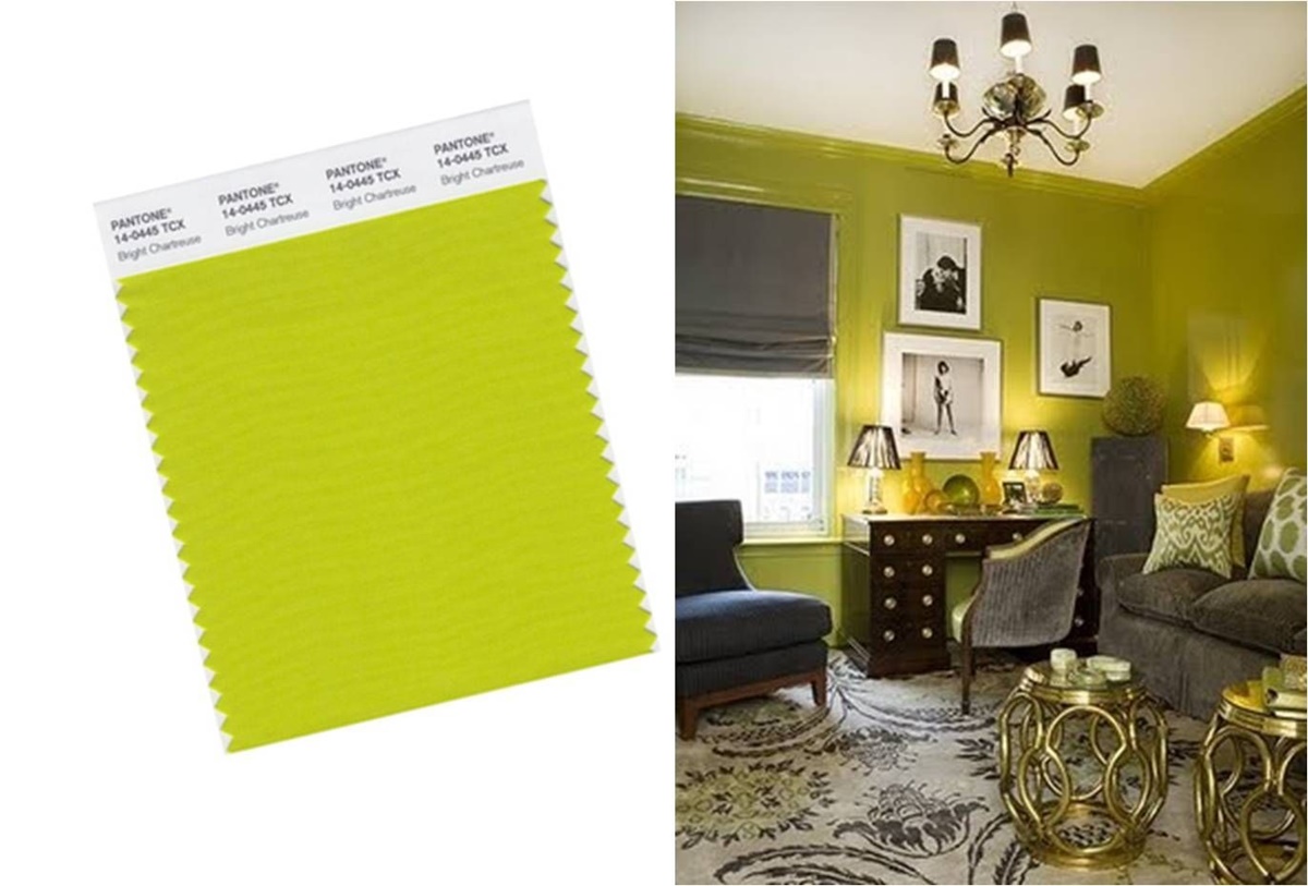
When it comes to interior design, chartreuse can be a powerful color for creating a lively and invigorating atmosphere. In a room filled with neutrals, chartreuse accents can add a burst of energy and playfulness. From chartreuse throw pillows and curtains to accent chairs or wall art, these elements can create a focal point and infuse the space with a sense of vibrancy.
Chartreuse is also commonly used in modern and contemporary designs, where it adds a fresh and unexpected twist. It can be incorporated through furniture pieces like sofas or chairs, as well as through wall paint or wallpaper. The color works well with other neutrals, creating a balance between boldness and sophistication.
Moreover, chartreuse can be used in a more restrained manner by incorporating it into smaller details such as lampshades, rugs, or decorative accessories. This allows for a subtle touch of chartreuse without overwhelming the space. It pairs well with both warm and cool color schemes, complementing a variety of interior design styles.
Whether in fashion or interior design, chartreuse brings a sense of liveliness and originality to the forefront. Its versatile nature allows for a variety of applications, from bold and statement-making pieces to subtle accents that add a unique touch. Designers in both industries continue to explore the use of chartreuse to create visually striking and captivating designs.
Chartreuse as a Highlight Color in Web Design
Web design is a realm where color plays a crucial role in capturing visitors’ attention and creating a visually engaging experience. Chartreuse, with its vibrant and energetic nature, can be an effective highlight color in web design, helping to draw focus and guide users through a website. Here’s how chartreuse can be utilized as a highlight color in web design:
1. Calls to Action: Chartreuse can make calls to action (CTAs) stand out and encourage user interaction. Whether it’s a “Sign Up” button or a “Purchase Now” banner, using chartreuse for CTAs can create a sense of urgency and drive conversions. Its energetic nature makes it hard to ignore, catching the user’s attention and prompting them to take action.
2. Navigation Menu: Incorporating chartreuse into the navigation menu can make it easily distinguishable and user-friendly. By highlighting the current page or the active tab with chartreuse, users can quickly identify their location and navigate through the website seamlessly. It adds a visually appealing element to the menu and enhances the overall user experience.
3. Important Information: When there is important information that needs to be conveyed to website visitors, using chartreuse can make it stand out. Whether it’s a notification, a discount offer, or a deadline, highlighting the text or the relevant section in chartreuse instantly draws attention, ensuring that users don’t miss out on critical updates or promotions.
4. Visual Hierarchy: Chartreuse can be used to establish a visual hierarchy on a web page, guiding users’ attention to specific elements or content. By using chartreuse for headings, subheadings, or important keywords, designers can create a clear flow and structure, making it easier for users to scan and absorb information. This use of chartreuse helps improve readability and aids in website usability.
5. Feedback and Validation: Chartreuse can be utilized to provide feedback and validation to users. When a form is successfully submitted or an action is completed, using chartreuse to display a success message or checkmark symbol can create a positive user experience. It visually reinforces the user’s accomplishment and adds a touch of delight to the interaction.
When incorporating chartreuse as a highlight color in web design, it is essential to ensure that it is used consistently throughout the website. Consistency in the use of color helps establish a visual identity and creates a coherent and unified user experience.
Overall, chartreuse as a highlight color in web design can contribute to a visually engaging and user-friendly website. Its vibrancy, energy, and ability to grab attention make it a powerful tool for guiding users, emphasizing important elements, and ultimately creating a memorable digital experience.
Chartreuse in Branding and Marketing
When it comes to branding and marketing, color plays a vital role in creating a strong and memorable brand identity. Chartreuse, with its vibrant and attention-grabbing nature, can be a powerful color choice for businesses seeking to differentiate themselves in the market. Here’s a look at how chartreuse can be effectively used in branding and marketing:
1. Stand Out: Chartreuse is a color that easily catches the eye and stands out in a sea of traditional colors. By incorporating chartreuse into a brand’s visual identity, businesses can create a distinct and unforgettable presence. Whether it’s a logo, packaging, or marketing materials, chartreuse can help a brand grab attention and make a lasting impression.
2. Evoke Energy and Positivity: Chartreuse is often associated with energy, vitality, and optimism. By using chartreuse in branding and marketing efforts, businesses can evoke these positive emotions in their audience. This vibrant color can create an energetic and upbeat brand personality, making it appealing to customers who are seeking dynamic and engaging experiences.
3. Attract Attention: Chartreuse has a natural ability to draw attention and engage viewers. In advertising campaigns, using chartreuse strategically can help businesses capture the interest of their target audience. Whether it’s a chartreuse accent in an image, chartreuse text, or even a chartreuse background, this color can help advertisements stand out and increase brand visibility.
4. Convey Modernity and Innovation: Chartreuse is a contemporary and cutting-edge color choice that can be associated with innovation and forward-thinking. In industries such as technology, design, or fashion, using chartreuse in branding and marketing materials can communicate a modern and progressive brand image. It gives the impression that a business is at the forefront of trends and is not afraid to push boundaries.
5. Align with a Target Audience: Chartreuse can be used strategically to target specific demographics. Its vibrant and youthful appeal may resonate well with younger audiences or those seeking a more adventurous and bold experience. By incorporating chartreuse into branding, businesses can tailor their visual identity to connect with the desired target market and create a strong brand relationship.
It’s important to note that while chartreuse can be a powerful color choice, its implementation should be based on a thorough understanding of the brand, target audience, and industry. Designers and marketers must consider the overall brand personality and how chartreuse aligns with the values and aspirations of the business.
When used effectively, chartreuse can serve as a visual magnet, attracting attention, conveying positive emotions, and creating a distinctive brand identity. By harnessing the power of chartreuse in branding and marketing, businesses can make a bold statement and leave a lasting impression on their audience.
Chartreuse and Its Use in Art and Photography
Chartreuse, with its vibrant and captivating nature, has made its mark in the world of art and photography. This unique color has been embraced by artists and photographers as a tool to evoke specific emotions, create visual interest, and make a vivid impact. Here’s a look at how chartreuse is utilized in art and photography:
1. Expressive Landscapes: Nature enthusiasts and landscape photographers often incorporate chartreuse into their compositions to capture the energy and freshness of the natural world. Chartreuse foliage and vibrant greenery can add a sense of dynamism and vitality to landscape photographs, creating a captivating visual experience.
2. Abstract Artworks: Chartreuse is a favored choice in abstract art due to its ability to create striking visual effects. Artists may use chartreuse to explore concepts of movement, energy, and emotion. The bright and bold nature of chartreuse can create a sense of intensity and excitement that adds depth and visual interest to abstract art pieces.
3. Portraits and Fashion Photography: Chartreuse can be used effectively in portrait and fashion photography to create a sense of uniqueness and make the subjects stand out. Whether it’s chartreuse clothing, accessories, or backdrops, this vibrant color can add a pop of visual interest and breathe life into the image. It conveys a sense of confidence, creativity, and individuality.
4. Still Life Arrangements: Chartreuse can be incorporated into still life compositions to add a touch of liveliness and energy. By featuring chartreuse-colored objects or elements, artists and photographers can create focal points and draw attention to specific details within the composition. The vibrant chartreuse hue can inject a sense of playfulness and excitement into still life photography and art.
5. Color Field Paintings: Chartreuse plays a significant role in color field paintings, which explore the emotional and sensory impact of color. Chartreuse can be used alone or in combination with other bold colors to create immersive and visually stimulating experiences. The vibrant hue of chartreuse can evoke emotions ranging from joy and happiness to energy and dynamism.
Artists and photographers often experiment with different shades and variations of chartreuse to achieve their desired visual impact. The intensity, saturation, and interaction with other colors can all contribute to the overall mood and message of the artwork or photograph. Whether used subtly or prominently, chartreuse has the power to create memorable and visually engaging art and photography.
Dos and Don’ts when Using Chartreuse in Design
Chartreuse, with its vibrant and eye-catching nature, can be a powerful color choice in design. However, it is essential to use it with careful consideration to ensure a harmonious and effective result. Here are some dos and don’ts when using chartreuse in design:
Do:
- Use chartreuse strategically: Incorporate chartreuse in key elements of your design to draw attention and create impact. Whether it’s a headline, a call to action button, or an accent detail, use chartreuse strategically to guide users’ attention and highlight important information.
- Experiment with contrasting colors: Pair chartreuse with complementary or contrasting colors to create a visually appealing composition. Colors like purple, blue, or gray can provide an excellent contrast to chartreuse, enhancing its vibrancy and making it stand out even more.
- Consider the context and target audience: Understand the context in which the design will be used and the preferences of your target audience. While chartreuse can be bold and attention-grabbing, it may not be suitable for certain industries or demographics. Tailor the use of chartreuse according to the message and the desired emotional response.
- Balance chartreuse with neutrals: To maintain a balanced and visually pleasing design, use chartreuse in combination with neutral colors like white or gray. This helps to prevent the design from becoming overwhelming and allows chartreuse to take center stage without overpowering the overall aesthetic.
- Use chartreuse in a typography hierarchy: Utilize chartreuse as a way to establish a clear typographic hierarchy in your design. Use it for headings, subheadings, or highlighted text to distinguish different levels of importance and guide the reader’s attention.
Don’t:
- Overuse chartreuse: While chartreuse is attention-grabbing, using it excessively can lead to visual fatigue and make the design overwhelming. Use chartreuse strategically as a highlight or as an accent rather than saturating the entire design with it.
- Neglect contrast and legibility: Ensure that the use of chartreuse doesn’t compromise the legibility of text or other essential elements. Make sure there is enough contrast between chartreuse and other elements of the design to maintain readability.
- Ignore color psychology: Understand the psychological associations of chartreuse and consider how it aligns with the message and desired emotional response of your design. Be mindful of the emotions and connotations that chartreuse may evoke in your target audience.
- Forget about accessibility: When using chartreuse, consider its accessibility for individuals with visual impairments. Ensure there is sufficient color contrast to accommodate those who rely on assistive technologies or have difficulty perceiving certain colors.
- Be afraid to experiment: While there are guidelines and recommendations, don’t be afraid to push boundaries and experiment with chartreuse in your designs. Test different variations and combinations to discover new and exciting ways to incorporate it effectively.
By keeping these dos and don’ts in mind, designers can harness the power of chartreuse and create visually striking and engaging designs that leave a lasting impression on their audience.
Chartreuse Combinations and Color Palettes
Chartreuse, with its vibrant and energetic nature, can be effectively paired with a variety of colors to create visually stunning combinations and color palettes. Whether used in complementary or analogous schemes, chartreuse can be combined with different hues to evoke specific moods and create harmonious compositions. Here are some chartreuse combinations and color palettes to consider:
1. Complementary Colors:
Pairing chartreuse with colors that sit opposite on the color wheel creates a vibrant and dynamic contrast. Some complementary combinations include:
- Chartreuse and Purple: The rich and regal nature of purple juxtaposes beautifully against the energetic chartreuse, creating a bold and eye-catching contrast.
- Chartreuse and Magenta: The intensity of magenta complements the vibrancy of chartreuse, resulting in a high-impact combination that conveys energy and excitement.
2. Analogous Colors:
Analogous color combinations involve using colors that are adjacent to chartreuse on the color wheel. These combinations create a harmonious and cohesive feel. Some analogous combinations include:
- Chartreuse, Yellow, and Green: This combination creates a vibrant and fresh palette, symbolizing growth and natural harmony.
- Chartreuse, Lime Green, and Teal: This combination introduces cooler tones and adds depth to the palette, evoking a sense of tranquility and serenity.
3. Neutral Colors:
Using chartreuse with neutrals provides a balanced and sophisticated palette. The neutrality of these colors allows chartreuse to take center stage. Some chartreuse and neutral combinations include:
- Chartreuse and Black: This high-contrast combination exudes sophistication and modernity, allowing chartreuse to stand out boldly against a dark background.
- Chartreuse and Gray: This combination creates a sleek and contemporary look, providing a neutral backdrop that allows chartreuse to shine while maintaining a sense of elegance.
4. Monochromatic Colors:
A monochromatic color scheme revolves around shades and tints of a single color. By using various shades of chartreuse, designers can create depth and dimension. Some monochromatic chartreuse variations include:
- Chartreuse and Lime: This combination uses lighter and brighter shades of chartreuse, creating a lively and fresh palette reminiscent of citrus fruits.
- Chartreuse and Olive: This combination explores deeper and more muted tones of chartreuse, evoking a sense of sophistication and earthiness.
When working with chartreuse combinations, it’s important to consider the mood, message, and target audience of your design. Experiment with different color palettes to find the combination that best suits your design goals and create the desired emotional impact.
By exploring various combinations with chartreuse, designers can create visually captivating and harmonious compositions that effectively communicate their design vision.
Chartreuse in Different Cultures and Traditions
Colors often carry cultural and traditional significance, and chartreuse is no exception. While chartreuse may not have specific symbolic meaning in every culture, its unique blend of yellow and green can evoke different connotations and associations depending on the cultural context. Let’s explore chartreuse in various cultures and traditions:
Western Culture:
In Western cultures, chartreuse is often associated with energy, vibrancy, and playfulness. It is seen as a color that symbolizes growth and renewal, representing the freshness of spring and the optimism of new beginnings. Chartreuse is commonly used in fashion, home decor, and branding to create a bold and eye-catching impact.
Eastern Culture:
In Eastern cultures, chartreuse may be less prevalent, but similar meanings can still be associated with the color. Yellow and green are often seen as auspicious colors, bringing good luck, abundance, and prosperity. The energetic and vibrant nature of chartreuse aligns with these positive associations. In traditional East Asian art and design, chartreuse may be incorporated to represent nature, harmony, and vitality.
Native American Culture:
Native American cultures have their own unique interpretations of colors. While chartreuse may not have a specific meaning in Native American traditions, the colors yellow and green can hold symbolism in their own right. Yellow can represent the sun and energy, while green is often associated with nature and growth. These associations reflect some of the qualities inherent in chartreuse.
Middle Eastern Culture:
In Middle Eastern cultures, chartreuse may not have a recognized traditional meaning, but the colors yellow and green hold significance. Yellow is often associated with wealth and prosperity, while green is seen as the color of paradise and spirituality. Chartreuse can embody these qualities and may be used to represent abundance, growth, and divine beauty in Middle Eastern design and aesthetics.
African Culture:
Different regions and tribes in Africa may have unique interpretations of the color chartreuse. In some African cultures, yellow and green colors can symbolize fertility, prosperity, and the natural world. Chartreuse, with its blend of yellow and green, may hold similar meanings, such as representing the abundance and vibrancy of the land.
It is important to note that interpretations of chartreuse in different cultures are not prescriptive, and colors can have multifaceted meanings. Additionally, the symbolic associations of colors can vary within cultures and change over time. Understanding the cultural context and traditions is crucial when incorporating chartreuse or any color into designs that target specific audiences.
Chartreuse’s vibrant and energetic nature allows it to transcend cultural boundaries and be embraced by various societies. By appreciating the associations and cultural contexts, designers can create more meaningful and inclusive designs that resonate with diverse audiences.
Chartreuse as a Trending Color in Design
Chartreuse, with its vibrant and electrifying nature, has been gaining popularity as a trending color in various design industries. From fashion and interior design to graphic design and branding, chartreuse has emerged as a bold and captivating choice that designers are incorporating into their creations. Here’s a look at why chartreuse has become a trending color in design:
Elevating Energy and Boldness:
Chartreuse embodies energy and boldness, making it a refreshing departure from more traditional and subdued color choices. In a world inundated with visual stimuli, chartreuse grabs attention and evokes excitement. Designers are drawn to chartreuse for its ability to make a statement and add a sense of dynamism to their creations.
Aesthetic Refreshment:
The rise of chartreuse as a trending color is also driven by a desire for aesthetic refreshment. Chartreuse offers a departure from muted or monotonous color palettes, injecting a burst of freshness and vibrancy. Its unique blend of yellow and green creates an unexpected and captivating visual experience that resonates with those seeking novelty and visual interest.
Mood of Optimism:
In a world filled with uncertainties, chartreuse brings a mood of optimism and positivity. Its bright and energetic nature can uplift spirits and create a sense of hope and vitality. As a result, many designers are choosing chartreuse as a color that reflects the resilient and positive attitudes we aspire to embody.
Impactful Visual Contrast:
Chartreuse’s high contrast against neutral or complementary colors creates visually striking compositions. Designers gravitate towards chartreuse for its ability to create impactful visual contrast, making it suitable for highlighting important elements or creating focal points that command attention.
Compatibility with Multiple Styles:
Chartreuse’s versatility allows it to seamlessly integrate into different design styles. It can complement minimalist, contemporary, and even traditional aesthetics, making it a versatile choice for designers with varying creative visions. Chartreuse can add a modern twist to classic designs or enhance the edginess of contemporary styles.
Inspiration from Nature:
Chartreuse draws inspiration from nature’s vibrant landscapes and blossoming flora. The color evokes the vitality, growth, and beauty found in the natural world, resonating with those who seek a connection to nature and its energizing qualities. Designers are inspired by chartreuse to capture the essence of nature and infuse it into their designs.
As a trending color, chartreuse invites designers to push boundaries, challenge conventions, and create visually arresting compositions. Its ability to captivate and energize viewers has made it a favorite choice for those seeking to make a bold and memorable impact in the design world.
Chartreuse and Sustainability in Design
In recent years, sustainability has become a key consideration in design practices, and chartreuse can play a role in promoting sustainable design principles. With its vibrant and refreshing nature, chartreuse aligns with the values of sustainability in several ways:
Symbolizing Growth and Renewal:
Chartreuse, with its blend of yellow and green, symbolizes growth and renewal. This connection highlights the importance of sustainability, which aims to foster growth in harmony with nature while renewing and preserving resources for future generations. Incorporating chartreuse in sustainable design themes sends a visual message of environmental consciousness.
Promoting Attention to Nature:
Chartreuse, reminiscent of fresh foliage and vibrant plant life, encourages an appreciation for the natural world. In sustainable design, this connection can inspire designers and users to consider the environmental impact of their choices and seek out eco-friendly materials, practices, and technologies.
Inspiring Innovation and Adventure:
Chartreuse’s bold and adventurous nature can inspire designers to experiment with sustainable materials, processes, and designs. By using chartreuse as a thematic color, sustainable designs can draw attention to the innovative and exploratory aspects of sustainable practices, encouraging creativity and pushing the boundaries of environmentally-friendly design.
Embracing Versatility and Timelessness:
Chartreuse’s versatility and ability to complement various design styles can support sustainability by promoting longevity and reducing waste. By incorporating chartreuse as an accent color or in timeless designs, sustainable designs become less prone to going out of fashion, encouraging users to cherish and keep their products for extended periods.
Optimizing Visual Contrast and Legibility:
Chartreuse’s high contrast against neutral backgrounds can enhance legibility and visual clarity in sustainable design. By effectively utilizing chartreuse, designers can prioritize the clarity of environmentally-conscious messaging, making it more accessible and engaging for users.
Encouraging Eco-Friendly Decision-Making:
Chartreuse, as a striking and attention-demanding color, can be used strategically to highlight and guide users’ attention toward eco-friendly choices. By incorporating chartreuse in sustainable product packaging or environmental campaigns, designers can draw attention to sustainable options and inspire individuals to make environmentally responsible decisions.
Chartreuse’s visual appeal and symbolism make it a compelling choice for sustainable design. By incorporating chartreuse in environmentally-conscious projects, designers can promote awareness of sustainability, inspire creativity, and encourage individuals to prioritize environmentally-friendly choices.