
What is Asymmetrical Balance?
Asymmetrical balance, also known as informal balance, is a fundamental principle in graphic design that involves arranging elements within a composition in a way that creates a visual equilibrium. Unlike symmetrical balance, where elements are mirrored or evenly distributed, asymmetrical balance achieves harmony through the strategic placement of elements that are different in size, shape, color, or texture.
With asymmetrical balance, designers can create dynamic and visually interesting compositions that capture the viewer’s attention. It allows for more freedom and creativity in design by breaking away from the traditional notions of symmetry.
An asymmetrical balance can be achieved by considering the visual weight of elements rather than their physical size or position. Visual weight is determined by factors such as color intensity, contrast, and texture. By carefully placing heavier or visually dominant elements in one area of the composition and counterbalancing them with lighter or more subtle elements, designers can achieve asymmetrical balance.
One of the key advantages of asymmetrical balance is its ability to create a sense of movement and energy within a design. By introducing elements of different sizes or shapes, designers can lead the viewer’s eye through the composition and create visual interest. This dynamic quality makes asymmetrical balance a popular choice for designs that aim to evoke emotions or communicate a sense of energy and movement.
Asymmetrical balance is widely used in various forms of graphic design, including branding, print advertisements, web design, and packaging. Its versatility allows for endless possibilities in creating unique and visually compelling designs that stand out from the crowd.
Overall, asymmetrical balance is a powerful design principle that adds a sense of dynamism, vibrancy, and interest to compositions. By understanding the fundamentals of asymmetrical balance, designers can create visually striking designs that captivate and engage viewers.
The Importance of Asymmetrical Balance in Graphic Design
Asymmetrical balance plays a crucial role in graphic design, as it helps create visually appealing compositions that effectively communicate the intended message. By understanding the importance of asymmetrical balance, designers can enhance their designs and capture the attention of their target audience.
One of the key advantages of asymmetrical balance is its ability to create visual interest and grab the viewer’s attention. Unlike symmetrical designs that may appear static and predictable, asymmetrical compositions offer a sense of energy, dynamism, and movement. This can be particularly useful in advertising and marketing materials where designers want to capture the viewer’s attention and leave a memorable impression.
Another important aspect of asymmetrical balance is its ability to create a sense of hierarchy and emphasis within a design. By strategically placing visually dominant elements in key areas, designers can guide the viewer’s eye and highlight the most important information or focal points. This helps convey the intended message more effectively and ensures that the viewer comprehends the main idea at a glance.
Asymmetrical balance also allows for more creativity and flexibility in design. It gives designers the freedom to experiment with various elements, sizes, colors, and textures to achieve a harmonious composition. This versatility makes asymmetrical balance a preferred choice for designers who want to create unique, eye-catching, and memorable designs that stand out from the competition.
Furthermore, asymmetrical balance can help establish a visual connection with the viewer and evoke emotional responses. By using asymmetry, designers can create tension, curiosity, or even a feeling of surprise, capturing the viewer’s interest and encouraging further exploration of the design. This emotional engagement can leave a lasting impression and help establish a strong connection between the viewer and the design’s intended message or brand.
Incorporating asymmetrical balance in graphic design also allows for a more organic and natural aesthetic. Instead of relying solely on balanced and uniform designs, asymmetrical compositions can mimic the irregularities and asymmetries found in nature. This can create a sense of authenticity and relatability, making the design more approachable and resonating with the viewer on a deeper level.
Principles of Asymmetrical Balance
When creating a design with asymmetrical balance, there are several principles that designers should keep in mind to achieve a visually pleasing and harmonious composition:
- Visual Weight: Elements within the composition have varying levels of visual weight. Visual weight is determined by the size, color, contrast, or texture of an element. Placing heavier elements closer to the center or bottom of the composition can create balance with lighter elements positioned higher or towards the edges.
- Contrasting Elements: By incorporating contrasting elements, such as dark and light colors, large and small shapes, or rough and smooth textures, designers can create a sense of balance. The contrast between these elements adds visual interest and helps distribute visual weight evenly throughout the composition.
- Direction and Flow: The placement and arrangement of elements can create a sense of movement or flow within the composition. Designers can guide the viewer’s eye by using directional elements, such as lines or shapes, to lead them from one part of the design to another. This creates visual rhythm and balance.
- Negative Space: Negative space, also known as white space, is the empty or blank areas within a design. By carefully considering the amount and placement of negative space, designers can enhance the asymmetrical balance of the composition. Negative space provides breathing room for the design and helps prevent it from appearing cluttered or overwhelming.
- Hierarchy: Establishing a clear hierarchy is essential in any design, including those with asymmetrical balance. Designers can achieve hierarchy by emphasizing certain elements to draw attention. This can be done through size, color, position, or other design techniques. By establishing a hierarchy, designers give the viewer a visual pathway to follow and ensure the most important information stands out.
Adhering to these principles allows designers to create compositions with asymmetrical balance that are visually pleasing and engaging. By carefully considering the visual weight, contrast, direction, negative space, and hierarchy, designers can achieve a harmonious and dynamic design that captures the viewer’s attention and effectively communicates the intended message.
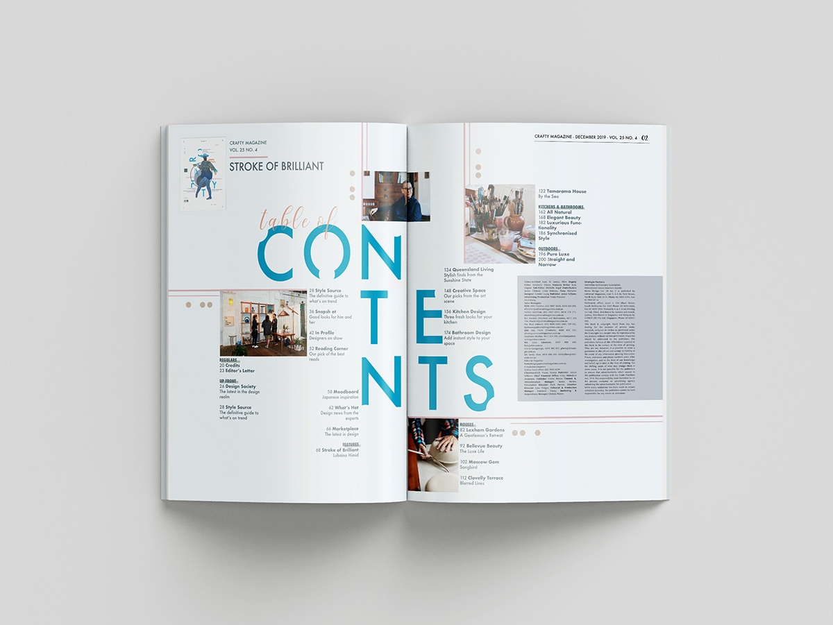
Compositional Techniques for Creating Asymmetrical Balance
Creating asymmetrical balance in graphic design involves applying various compositional techniques that ensure a harmonious and visually appealing composition. By employing these techniques, designers can achieve a sense of balance and cohesion in their designs:
- Use of the Rule of Thirds: The rule of thirds is a common technique used in photography and design. It involves dividing the composition into a 3×3 grid and placing key elements along the gridlines or at their intersections. By adhering to this rule, designers can create visual interest and achieve a balanced composition that avoids a static, centered look.
- Overlap and Layering: Overlapping or layering elements within the design can create depth and add visual interest. By strategically positioning elements on top of each other, designers can create a sense of depth and dimension. This technique helps distribute visual weight and achieve balance by ensuring the elements interact with each other in a cohesive way.
- Diagonal Lines and Dynamic Shapes: Utilizing diagonal lines and dynamic shapes can add a sense of energy and movement to the composition. These lines and shapes can guide the viewer’s eye across the design, creating a visual flow and balance. Incorporating diagonals or non-traditional shapes instead of strict horizontal and vertical lines adds visual interest and breaks away from a symmetrical structure.
- Varying Element Sizes: Playing with different sizes of elements within the composition can help achieve asymmetrical balance. Combining larger elements with smaller elements adds visual interest and helps distribute visual weight. It is important to consider the overall composition and ensure that the larger elements do not overpower the smaller ones, maintaining a sense of balance.
- Color Contrast and Harmony: Contrasting colors can create visual impact and help achieve asymmetrical balance. By juxtaposing colors with varying lightness, darkness, or saturation, designers can establish a dynamic balance. However, it is essential to maintain color harmony within the design by selecting colors that work well together and complement the overall aesthetic.
- Framing and Negative Space: The use of framing and negative space can help create visual balance and focus. Framing elements within the composition can draw attention and create a sense of containment. Open areas of negative space can counterbalance the more visually dominant elements and provide breathing room, preventing the design from feeling cluttered.
By employing these compositional techniques, designers can effectively create asymmetrical balance in their designs. Each technique contributes to the overall visual appeal and ensures that the elements within the composition interact harmoniously, capturing the viewer’s attention and conveying the intended message.
Using Scale and Proportion for Asymmetrical Balance
Scale and proportion are powerful tools that designers can utilize to achieve asymmetrical balance in their compositions. By carefully considering the size and relationship between elements, designers can create visually appealing designs that convey a sense of balance and harmony.
Varying the scale of elements within a composition can help create asymmetrical balance. By including larger and smaller elements, designers can distribute visual weight and prevent the composition from feeling stagnant. Larger elements can serve as focal points or anchor points, while smaller elements can provide counterbalance and add visual interest. The key is to maintain a cohesive and harmonious relationship between the elements, ensuring they work together to create a visually balanced composition.
Proportion is another important consideration when aiming for asymmetrical balance. Balancing proportions involves finding the right ratio between elements within the composition. Designers must consider how the sizes of different elements relate to each other and how they impact the overall composition. For example, a small element with high visual weight can balance out a larger and visually lighter element by creating contrast and harmony.
Playing with scale and proportion also allows designers to create a sense of depth and dimension within the composition. By incorporating foreground and background elements of varying sizes, designers can add layers and create a dynamic visual experience. This technique helps distribute visual weight and avoids a flat or static composition.
While exploring scale and proportion, it’s crucial to maintain a sense of visual hierarchy. Larger elements should hold more importance, drawing the viewer’s attention first. The relationship between elements should create a visual pathway for the viewer’s eye to follow, leading them through the composition in a balanced and engaging manner.
Additionally, designers can use scale and proportion to establish a sense of harmony and balance through repetition. Repeating elements of similar or varied sizes can create a visual rhythm and cohesion within the design. This repetition can help distribute visual weight and create a sense of balance without relying on strict symmetrical arrangements.
Color and Asymmetrical Balance
Color plays a vital role in achieving asymmetrical balance within a design. By strategically selecting and using colors, designers can create visually harmonious compositions that effectively communicate their intended message. Here are some key considerations when it comes to color and asymmetrical balance:
Color Contrast: Contrast is crucial in creating a visually balanced composition. By incorporating colors that are opposite on the color wheel, such as complementary colors, designers can create high contrast and add visual interest. Contrast helps distribute visual weight within the design, ensuring that no single color dominates the composition.
Color Intensity: The intensity or saturation of a color can also contribute to asymmetrical balance. Designers can use highly saturated colors to draw attention to specific elements, creating focal points within the composition. Combining highly saturated colors with more muted or neutral tones balances the visual weight and prevents the composition from feeling overwhelming.
Color Harmony: Creating a harmonious color palette is essential for a visually balanced design. By selecting colors that complement and work well together, designers can create a harmonious and cohesive composition. Utilizing color schemes, such as analogous or monochromatic color schemes, ensures that the colors within the composition interact in a visually pleasing and balanced way.
Color Distribution: Distributing color evenly within the design is key to achieving asymmetrical balance. Designers can strategically place colors of varying intensities or hues throughout the composition to create a sense of balance. By avoiding clustering or overwhelming one area with a single color, designers can maintain a harmonious and visually balanced design.
Color Psychology: Color choices can evoke specific emotions or responses in viewers. Understanding the psychological impact of color can help designers create a composition that effectively communicates their intended message. By considering the emotions and associations linked to different colors, designers can create a balanced design that resonates with the viewer on an emotional level.
When using color for asymmetrical balance, it is important to consider the overall composition and the role each color plays. Each color should complement and enhance the other elements within the design, contributing to a visually balanced and harmonious composition.
Texture and Asymmetrical Balance
Texture is a powerful design element that can greatly contribute to the achievement of asymmetrical balance within a composition. By incorporating different textures, designers can create visual interest, depth, and a sense of equilibrium. Here are some important considerations when it comes to texture and asymmetrical balance:
Variety of Texture: Introducing a variety of textures within a design can add visual interest and contribute to its overall balance. By juxtaposing smooth and rough textures or incorporating tactile elements, designers can create a diverse and engaging composition. This variety of textures helps to distribute visual weight and ensures that the design feels visually balanced throughout.
Contrasting Textures: Combining contrasting textures can create a dynamic interplay of elements within the design. Contrasting textures, such as soft and hard or matte and glossy, add visual interest and contribute to asymmetrical balance. By strategically placing elements with different textures, designers can achieve equilibrium and prevent the composition from feeling visually stagnant.
Texture and Hierarchy: Texture can also play a role in establishing a visual hierarchy within the composition. By utilizing textures with varying levels of intensity or prominence, designers can guide the viewer’s eye and emphasize specific elements or information. The contrasting textures can create a focal point or draw attention to important areas, contributing to the overall sense of asymmetrical balance.
Texture and Depth: Texture can provide a sense of depth to a design, adding dimension and a three-dimensional quality. By integrating textures that convey depth or implying texture through visual techniques, designers can create a more immersive and visually engaging composition. This added depth helps distribute visual weight and contributes to the overall balance of the design.
Texture and Mood: Different textures can evoke specific emotions or moods within a design. By considering the emotional impact of various textures, designers can create a composition that effectively communicates the desired message. For example, rough textures may create a sense of ruggedness or strength, while smooth textures may evoke a feeling of elegance or sophistication. Incorporating textures that align with the intended mood helps create a visually balanced design that resonates with the viewer.
When working with texture in asymmetrical balance, it is crucial to ensure that the textures work harmoniously with the other design elements. The textures should complement and enhance the overall composition, contributing to a visually balanced and cohesive design.
Typography and Asymmetrical Balance
Typography plays a significant role in achieving asymmetrical balance within a design. By carefully selecting and arranging type elements, designers can create visually appealing and balanced compositions. Here are some considerations when it comes to typography and asymmetrical balance:
Type Hierarchy: Establishing a clear typographic hierarchy is crucial in creating asymmetrical balance. By varying the font sizes, weights, and styles, designers can guide the viewer’s eye and emphasize the most important information or focal points in the design. This typographic hierarchy ensures that the composition feels visually balanced and that the main message is effectively communicated.
Placement and Alignment: The placement and alignment of type elements contribute to the overall balance of the composition. By strategically positioning type elements, designers can create a sense of movement and visual flow. Offsetting or aligning type elements asymmetrically can add interest and contribute to the overall asymmetrical balance. Careful consideration should be given to the negative space surrounding the text to ensure a visually pleasing composition.
Mixing Typefaces: Combining different typefaces can add visual interest and contribute to a sense of asymmetrical balance. Designers can experiment with pairing contrasting typefaces, such as a serif font with a sans-serif font, to create a dynamic interplay of visual elements. By carefully selecting and pairing complementary typefaces, designers can create a harmonious composition that feels visually balanced.
Size and Scale: Varying the size and scale of type elements can help achieve asymmetrical balance. By incorporating larger and smaller type elements, designers can create visual interest and distribute visual weight within the composition. Larger type elements can serve as focal points or anchor points, while smaller type elements can provide counterbalance and add visual variety.
Color and Contrast: Color and contrast within typography can create visual impact and contribute to the balance of the composition. By using contrasting colors or combining light and dark text, designers can add visual interest and create a sense of harmony within the design. The contrast between the type elements adds to the overall asymmetrical balance and ensures that the composition feels visually cohesive.
Whitespace: Whitespace, also known as negative space, plays a vital role in achieving asymmetrical balance with typography. By carefully considering the spacing around and between type elements, designers can create breathing room and allow the composition to feel visually balanced. The negative space surrounding the text should be balanced and help guide the viewer’s eye throughout the design.
Overall, typography is a powerful element that can greatly contribute to achieving asymmetrical balance within a design. By carefully considering typographic hierarchy, placement, alignment, typeface pairing, size and scale, color and contrast, and whitespace, designers can create visually appealing and balanced compositions that effectively communicate their intended message.
Negative Space and Asymmetrical Balance
Negative space, also known as white space, is a crucial element in achieving asymmetrical balance within a design. It refers to the empty or blank areas surrounding and between the main elements. By strategically utilizing negative space, designers can create a visually pleasing and harmonious composition. Here are some considerations when it comes to negative space and asymmetrical balance:
Breathing Room: Negative space provides breathing room for the elements within a design. By allowing elements to be surrounded by empty space, designers ensure that the composition feels open and uncluttered. This helps prevent the design from feeling overwhelming and allows the viewer’s eye to navigate the composition easily.
Visual Balance: Negative space plays a significant role in achieving visual balance within a design. By balancing the distribution of negative space around and between elements, designers can create a sense of equilibrium. Placing heavier or visually dominant elements with ample negative space around them helps distribute visual weight and achieve a visually balanced composition.
Focus and Emphasis: Negative space can help draw attention to the main elements within a design. By surrounding a key element with ample negative space, designers can create a natural focal point. This draws the viewer’s attention and emphasizes the importance of the element. Negative space can guide the viewer’s eye and ensure that they focus on the intended message or primary visual elements.
Contrast and Visual Interest: By incorporating negative space, designers can create contrast and visual interest within the composition. By juxtaposing areas of empty space with areas of visual elements, designers can add dynamic tension to the design. This interplay between positive and negative space contributes to the overall asymmetrical balance and ensures that the composition feels visually engaging.
Creating Movement: The use of negative space can create a sense of movement and flow within a design. By having negative space guide the viewer’s eye from one element to another, designers can create a dynamic composition. This visual movement adds interest and contributes to the overall asymmetrical balance of the design.
Enhancing Readability: Negative space helps enhance the readability of a design, particularly in typography and layout. By giving text elements enough space to breathe, designers ensure that the text is legible and easily comprehensible. Ample negative space around text also contributes to the overall balance of the design, avoiding a cluttered or overwhelming appearance.
Overall, negative space is a vital component in achieving asymmetrical balance within a design. By carefully considering its distribution, balance, and relationship with the main elements, designers can create visually appealing compositions that convey a sense of harmony and engage the viewer’s eye effectively.
Case Studies: Examples of Asymmetrical Balance in Graphic Design
Examining real-world examples of asymmetrical balance in graphic design can provide insights into how this design principle is implemented effectively. Here are a few case studies that showcase the application of asymmetrical balance:
Apple Logo: The iconic Apple logo is a prime example of asymmetrical balance. The simple apple silhouette with a bite taken out of it is positioned off-center, creating a visually dynamic and memorable composition. The negative space surrounding the apple balances the visual weight, resulting in a visually harmonious and asymmetrical design.
Vogue Magazine Covers: Vogue magazine is known for its visually striking covers. Many of these covers feature asymmetrical compositions that create a sense of movement and visual interest. By incorporating overlapping images or text, combining various typeface sizes and styles, and using contrasting colors strategically, Vogue achieves asymmetrical balance while capturing the viewer’s attention.
MOMA Identity and Branding: The Museum of Modern Art (MOMA) identity and branding exemplify the use of asymmetrical balance. The logo consists of bold, black, asymmetrically stacked letters, and the overall visual identity follows suit. The use of asymmetrical compositions and arrangements in their marketing materials and exhibition graphics adds a sense of energy and modernity, capturing the essence of contemporary art and design.
Spotify App Interface: The Spotify app features an asymmetrical layout that balances various elements, including album covers, artist names, and song titles. The use of negative space and varying image sizes creates a visually dynamic and engaging interface. By strategically placing elements off-center and utilizing contrasting colors, Spotify achieves asymmetrical balance while providing an intuitive user experience.
Penguin Random House Book Covers: Penguin Random House is known for its visually captivating book covers, many of which employ asymmetrical balance. By combining striking imagery, asymmetrical typography, and creative use of negative space, their book covers stand out on the shelves. These designs demonstrate how asymmetrical balance can create visually compelling compositions that captivate readers and communicate the essence of a book.
These case studies illustrate how asymmetrical balance can be applied effectively in various design contexts. Whether it’s logos, magazine covers, branding, interfaces, or book covers, asymmetrical balance adds visual interest, dynamism, and harmony to the design, leaving a lasting impression on the viewer.
Tips for Achieving Effective Asymmetrical Balance in Your Designs
Integrating asymmetrical balance into your designs requires careful consideration and execution. Here are some tips to help you achieve effective asymmetrical balance:
- Plan and Sketch: Before starting your design, sketch out different compositions and arrangements. Plan the placement of elements and consider the distribution of visual weight to achieve the desired asymmetrical balance.
- Use the Rule of Thirds: Apply the rule of thirds by dividing your composition into a 3×3 grid. Place key elements along the gridlines or intersections to create a visually balanced and engaging design.
- Utilize Scale and Proportion: Experiment with different sizes and proportions of elements to achieve visual balance. Varying the scale of elements can distribute visual weight and add visual interest to the composition.
- Consider Color Contrast: Incorporate contrasting colors to create visual impact and add depth to the composition. Utilize colors with varying intensities or temperatures to achieve a visually balanced and harmonious design.
- Balance Visual Weight: Consider the visual weight of each element within the composition. Distribute visual weight by placing heavier elements strategically and counterbalancing them with lighter elements or negative space.
- Play with Shapes and Lines: Incorporate dynamic shapes and lines to enhance asymmetrical balance in your design. Diagonal lines and non-uniform shapes can create movement and guide the viewer’s eye through the composition.
- Pay Attention to Typography: Establish a clear typographic hierarchy to guide the viewer’s attention. Experiment with different type sizes, weights, and styles to achieve asymmetrical balance and emphasize important information.
- Strategically Use Negative Space: Be mindful of negative space and its relationship with the main elements of the design. Use negative space to create breathing room and balance within the composition.
- Embrace Contrast and Variety: Incorporate contrasting elements such as textures, colors, or shapes to add visual interest and create a sense of asymmetrical balance. Variety adds depth and engages the viewer’s eye in a visually dynamic way.
- Refine and Iterate: Continuous refinement and iteration are vital in achieving effective asymmetrical balance. Evaluate your design, seek feedback, and make adjustments as necessary to create a visually appealing and harmonious composition.
By applying these tips, you can enhance your designs with asymmetrical balance, creating visually engaging compositions that captivate your audience and effectively communicate your message.