
Pantone Color Books: An Essential Tool for Designers
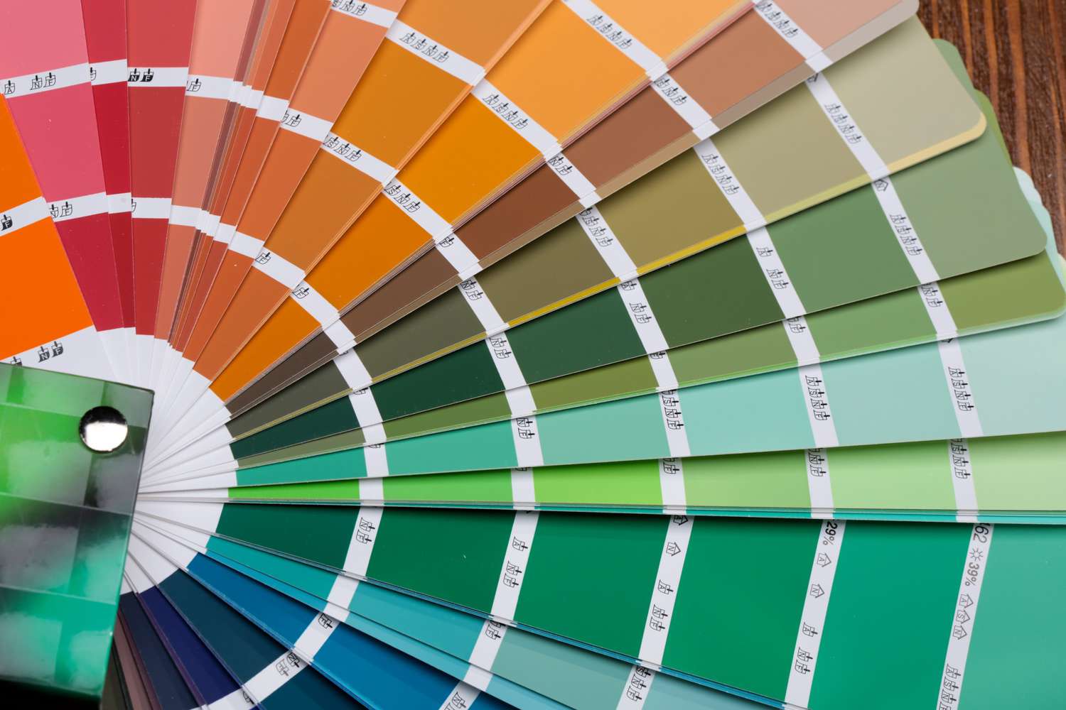
Pantone color books are a vital resource for designers in various industries, providing a standardized system for communicating and selecting colors accurately. These books, also known as color guides, consist of meticulously printed swatches that showcase a wide range of shades across different color families, such as solid colors, metallics, pastels, neons, and more.
Designers rely on Pantone color books to ensure consistency and precision in their projects. Whether you’re working on graphic design, fashion, interior design, or any other creative endeavor, selecting the right Pantone color book is crucial. These books act as a visual reference library, allowing you to match colors accurately and communicate precise color specifications to clients, printers, and manufacturers.
By using Pantone color books, designers eliminate the guesswork involved in color selection. Instead of relying on subjective interpretations or variations across different devices and printers, Pantone offers a standardized system that guarantees color consistency both on and off-screen. This is especially important when working on brand identity projects, where maintaining color accuracy is paramount.
Furthermore, Pantone color books empower designers to expand their creativity by exploring new color possibilities. With the vast array of shades available, designers can experiment with different color combinations and select the perfect hues to evoke the desired emotions and convey intended messages.
Overall, Pantone color books play a pivotal role in the design industry by providing a reliable, standardized color reference system. From inspiration to execution, these color guides ensure accuracy, consistency, and creativity in design projects of all kinds. So, whether you’re a seasoned professional or a budding designer, investing in a high-quality Pantone color book will undoubtedly elevate your work and help you achieve remarkable results.
Factors to Consider When Choosing a Pantone Color Book
When selecting a Pantone color book, there are several important factors to consider. These factors not only impact the accuracy and reliability of your color choices but also align with your specific design needs. Let’s explore the key considerations:
- The Type of Design Projects You Work On: Different Pantone color books cater to various design industries. If you primarily work with print materials, the Pantone Solid Coated and Uncoated books are essential, as they provide a vast range of solid color options suitable for printing. However, if you’re involved in fashion design or product development, you may want to consider specialized options like Pantone Metallics or Pantone Pastels and Neons.
- Budget Constraints: Pantone color books vary in price depending on the number of included colors and the complexity of the swatch design. Consider your budget and choose a color book that offers a sufficient range of colors without exceeding your financial limitations.
- Accuracy and Consistency: Some Pantone color books offer higher accuracy and consistency in color reproduction. If precision is crucial in your work, opt for books known for their meticulous color matching. The Pantone Color Bridge book, for example, is designed to accurately translate Pantone colors into CMYK or RGB values.
- Paper Type and Texture: The texture and paper quality of a Pantone color book can affect how the colors appear. If you frequently work with coated or uncoated paper, choose a book that matches the intended printing substrate to ensure the closest representation of your desired color outcomes.
- Size and Portability: Consider the size and portability of the color book. If you’re often on the go, a compact and lightweight option may be more convenient. On the other hand, if you primarily work in a studio setting, a larger format may provide a better visual reference.
By taking these factors into account, you can make an informed decision when choosing the Pantone color book that best suits your design projects. Remember, selecting the right color book ensures accurate color communication and empowers you to bring your creative visions to life with confidence.
The Type of Design Projects You Work On
When choosing a Pantone color book, it’s important to consider the specific type of design projects you work on. Different design disciplines require different color palettes and options to ensure accurate representation of the intended designs. Here are a few points to consider:
a) Print Design: If you primarily work on print design projects such as brochures, packaging, or marketing materials, the Pantone Solid Coated and Uncoated books are essential. These books provide a wide range of solid colors specifically formulated for printing on coated and uncoated papers. The Pantone matching system in these books ensures accurate color representation for print production.
b) Fashion Design: For fashion designers, color plays a vital role in creating garments and accessories. Pantone offers specialized color books like Pantone Metallics, Pantone Pastels and Neons, and Pantone Fashion, Home + Interiors. These books provide palettes tailored to the fashion industry, featuring colors that are popular in clothing and textile design.
c) Graphic and Web Design: In the digital realm, Pantone color books such as Pantone Color Bridge are useful for graphic and web designers. These books bridge the gap between Pantone spot colors and their representation in CMYK or RGB color spaces. They provide accurate color conversions for designs that will be reproduced digitally or in print.
d) Industrial and Product Design: Industrial and product designers often require specialized color options to match specific materials and applications. Pantone offers books like Pantone Metallics and Pantone Plastics to meet these unique needs. These books provide a wide range of metallic shades and plastic color chips that designers can use for material selection and product development.
By considering the type of design projects you work on, you can choose a Pantone color book that aligns with your specific industry and design requirements. This ensures that the colors you select are accurate and relevant to your work, helping you achieve consistent and visually appealing designs.
Budget Constraints
When choosing a Pantone color book, it’s important to take into account your budget constraints. Pantone color books vary in price depending on factors such as the number of included colors, the complexity of the swatch design, and any additional features they offer. Here are some points to consider:
a) Basic Color Guide: If you’re on a tight budget or just starting out, consider a basic Pantone color guide that offers a limited but essential range of colors. These guides often come at a more affordable price point while still providing a solid foundation of colors for your design needs.
b) Expanded Color Selection: If your budget allows, you may want to consider Pantone color books with a more extensive color range. These books typically offer a wider selection of hues and shades, allowing for more creativity and flexibility in your designs. However, keep in mind that these books may come at a higher price.
c) Specialty Color Books: Some Pantone color books cater to specific industries or design niches, offering specialized color options. These books may be priced differently from the standard Pantone guides. If you work in a particular industry or have specific color requirements, investing in these specialty color books may be worth considering.
d) Online Resources: In addition to printed color books, Pantone also offers online tools and resources that can be more cost-effective. Pantone’s digital color libraries and online color guides provide access to a vast range of colors at a lower cost compared to physical books. This option allows for flexibility and convenience, especially if your work primarily revolves around digital design.
It’s essential to set a budget for your Pantone color book purchase and weigh the value of the included features and color options against your financial limitations. Remember, while a more comprehensive color book may offer more versatility, it’s important to choose a book that meets your immediate design requirements without stretching your budget too far.
Accuracy and Consistency
When selecting a Pantone color book, one of the key factors to consider is the level of accuracy and consistency it offers. These qualities are essential for designers who want to ensure that their chosen colors are faithfully represented in their final designs. Here are some points to keep in mind:
a) Color Matching: Pantone color books are designed to provide precise color matching across various printing and manufacturing processes. Look for books that have a reputation for accurate color reproduction and consistency. This is especially important for branding and identity projects, where maintaining a consistent color palette is crucial.
b) Pantone Color Bridge: The Pantone Color Bridge book is a valuable tool for designers who work with both digital and print media. It offers color conversions between Pantone spot colors and their closest equivalent in CMYK or RGB values. This ensures that the colors selected in a design can be accurately reproduced in both digital and print formats.
c) Proofing Capabilities: Some Pantone color books come with additional features that aid in color proofing. These features include color-matching software or color management tools that enable designers to preview how the colors will look under different lighting conditions or on different materials. This can help ensure that the chosen colors will reproduce accurately in different contexts.
d) Reputed Color Matching Systems: Pantone is a well-established and renowned color matching system used globally. Choosing a Pantone color book ensures that you are utilizing a trusted and widely accepted standard for color communication. This helps maintain consistency when collaborating with clients, printers, and manufacturers, as they will be familiar with the Pantone system and its accuracy.
When accuracy and consistency are vital to your design process, it’s crucial to invest in a reliable Pantone color book. By choosing a book that is known for its color matching capabilities and reputation, you can be confident that the colors you select will be reproduced accurately and consistently across various mediums and production processes.
Paper Type and Texture
When choosing a Pantone color book, it’s important to consider the paper type and texture that your designs will be printed on. The choice of paper can significantly impact how colors appear and how they interact with the surface. Here are some points to keep in mind:
a) Coated vs. Uncoated: Pantone offers color books specifically designed for coated and uncoated papers. Coated papers have a glossy or satin finish, while uncoated papers have a more natural and matte appearance. If your designs will be printed on coated paper, choose a Pantone color book that shows colors as they would appear on this type of paper. Likewise, if uncoated paper is the medium you will be working with, choose a book that showcases colors on uncoated paper.
b) Color Interaction: Different paper textures can affect how colors appear and interact with each other. Smooth surfaces tend to give colors a more vibrant and saturated look, while rough or textured surfaces can create a softer and more muted effect. Consider the characteristics of the paper you will be using for your designs and choose a Pantone color book that reflects those characteristics.
c) Printing Substrates: If you work with specific printing substrates such as fabric, plastic, or specialized materials, look for Pantone color books that offer color chips designed for those substrates. Pantone has books like Pantone Plastics, Pantone Textile Color System, and Pantone Metallics that cater to specific material applications and provide accurate color representations for those mediums.
d) Consider Color Tolerance: Keep in mind that due to limitations in the printing process and the nature of paper, there may be slight variations in color between what you see in the Pantone color book and the final printed result. Understanding the color tolerance of your printing process and paper type will help you set realistic expectations and make adjustments in your color choices, if necessary.
By considering the paper type and texture of your print projects, you can choose a Pantone color book that aligns with your intended printing substrate. This ensures that the colors you select will be accurately represented and give you a realistic preview of how they will interact with the chosen paper or material.
Size and Portability
When selecting a Pantone color book, it’s important to consider the size and portability of the book. Depending on your work environment and design needs, the size and portability of the color book can greatly impact your convenience and ease of use. Here are some points to consider:
a) Studio vs. On-the-Go: Evaluate whether you primarily work in a studio setting or if you frequently find yourself working on design projects on-the-go. If you work in a studio with a dedicated workspace, a larger Pantone color guide may be more suitable as it offers a larger display of colors. However, if you often need to carry the color book with you, a more compact and portable option may be preferred.
b) Convenience: Consider how easy it is to carry and use the Pantone color book. Look for books that have a sturdy and durable construction, as well as a practical design that allows for easy flipping through pages and accessing colors. Some Pantone color books come in a fan-style format, allowing you to quickly browse through the swatches and select the desired colors with ease.
c) Lighting Conditions: Think about where and how you will be using the color book. If you frequently work in different lighting conditions, you may want to choose a color book that offers features like UV light evaluation or color viewing filters. These features can help you assess how colors will appear under specific lighting conditions, ensuring accurate color selection and representation.
d) Digital Alternatives: In today’s digital age, there are also digital alternatives to traditional Pantone color books. Pantone provides digital libraries and online color guides that can be accessed through various devices. These digital options offer the convenience of portability and accessibility, making them a practical choice for designers who work primarily in digital formats.
Consider your specific needs and working style when selecting a Pantone color book. Choose a size and format that aligns with your work environment and offers the level of portability that suits your design workflow. This will ensure that you have easy access to your color options and can make accurate color selections no matter where your design projects take you.
Exploring Different Pantone Color Book Options
When it comes to Pantone color books, there are various options available, each catering to different design requirements and industries. Here are five popular Pantone color book options to consider:
1. Pantone Solid Coated and Uncoated: These color books offer a comprehensive range of solid colors that are widely used in print design. The coated book is designed for glossy and coated papers, while the uncoated book is suited for matte and uncoated papers. These color books are essential for designers working on projects that require precise color matching and print production.
2. Pantone Metallics: This color book is ideal for designers working on projects that require metallic shades. It features a wide range of metallic colors, including gold, silver, bronze, and other metallic finishes. From packaging design to product branding, the Pantone Metallics book allows designers to incorporate the shimmering allure of metallic tones into their creations.
3. Pantone Pastels and Neons: For designs that require soft pastel shades or vibrant neon hues, the Pantone Pastels and Neons color book is a go-to choice. This book offers a curated selection of delicate pastel colors and striking neon shades, providing designers with options to create eye-catching and visually dynamic designs.
4. Pantone Color Bridge: The Pantone Color Bridge book is a versatile tool for designers who work with both print and digital media. It provides color conversions between Pantone spot colors and their closest approximations in CMYK or RGB values. This assists designers in ensuring that the colors they choose will translate accurately across different printing processes and digital displays.
5. Pantone Extended Gamut: The Pantone Extended Gamut book utilizes an extended color gamut printing process that allows for a broader range of colors. This book is particularly useful for designers working with digital and offset printing processes that can reproduce a larger range of colors beyond the traditional CMYK spectrum. It provides additional options to enhance color accuracy and vibrancy in printed designs.
When exploring different Pantone color book options, consider the specific needs of your design projects. Think about the color palettes you require, whether you’re working with metallics or need options for pastels or neons. Additionally, consider the printing processes you typically work with and whether you need color conversions for digital designs. By selecting the right Pantone color book, you can expand your color options and create designs that truly stand out in their vibrant accuracy.
Pantone Solid Coated and Uncoated
The Pantone Solid Coated and Uncoated color books are essential tools for designers working on print projects. These color books offer a comprehensive range of solid colors that are widely used in the design and printing industry.
The Pantone Solid Coated book is designed specifically for coated papers, which have a glossy or satin finish. These papers are commonly used for printing materials such as brochures, business cards, and packaging. The colors in the coated book are formulated to accurately represent how the final printed piece will look on coated paper.
On the other hand, the Pantone Solid Uncoated book is designed for papers with a more natural and matte appearance. Uncoated papers are often used in projects such as stationery, letterheads, and booklets. The colors in the uncoated book are formulated to accurately represent how the final printed piece will look on uncoated paper.
These color books are crucial for designers because they provide a reliable and consistent system for selecting and communicating colors. Each color in the book is assigned a unique Pantone number, which serves as a universal reference that designers, printers, and clients can use to ensure color accuracy across different materials and printing processes.
Using the Pantone Solid Coated and Uncoated books, designers can precisely select colors that match their creative vision. Whether it’s establishing brand identities or creating visually striking designs, these color books provide an extensive range of colors to choose from.
In addition to color selection, these Pantone color books assist in the production process by ensuring that the chosen colors will be accurately reproduced when printing. By using the swatches in the solid coated and uncoated books as a reference, designers can communicate their color choices to printers, manufacturers, and clients, helping to achieve consistent and accurate results.
Ultimately, the Pantone Solid Coated and Uncoated color books are a must-have for designers working on print projects. They offer a standardized and reliable color system that supports accurate color selection, communication, and reproduction. By utilizing these color books, designers can ensure that their designs accurately represent their intended colors and achieve the desired visual impact.
Pantone Metallics
The Pantone Metallics color book is a valuable resource for designers who want to incorporate the captivating allure of metallic shades into their designs. This specialized color book features a wide range of metallic colors, including gold, silver, bronze, and other metallic finishes.
Metallic colors add a touch of elegance, luxury, and visual interest to various design projects. From packaging design to product branding, the Pantone Metallics color book provides designers with a plethora of options to create eye-catching and sophisticated designs.
With the Pantone Metallics color book, designers can accurately select and communicate metallic colors, ensuring their desired effect is achieved during the printing or manufacturing process. The swatches in the book showcase the vibrant and reflective nature of each metallic shade, offering a reliable reference for color accuracy.
Whether it’s designing metallic accents on packaging, adding shimmer to graphic designs, or creating glamorous brand identities, the Pantone Metallics color book empowers designers to explore the richness and versatility of metallic colors.
Furthermore, the Pantone Metallics color book is designed to provide consistency and reproducibility across different printing processes and materials. This enables designers to communicate their chosen metallic colors to printers and manufacturers accurately. This consistency ensures that the final product matches the designer’s vision, whether it’s a luxurious packaging design, a high-quality promotional material, or an attention-grabbing advertisement.
By having access to the Pantone Metallics color book, designers can expand their creative possibilities and elevate their designs with a touch of lustrous elegance. The wide range of metallic shades available allows designers to experiment with different finishes and combinations to achieve the desired visual impact.
Pantone Pastels and Neons
The Pantone Pastels and Neons color book is a valuable tool for designers who want to explore soft pastel shades or vibrant neon hues. This specialized color book offers a curated selection of delicate pastel colors and striking neon shades, providing designers with a wide range of options to create visually dynamic and eye-catching designs.
Pastel colors are known for their subtle, calming, and sophisticated appeal. They are often used in various design projects, such as branding, packaging, and interior design, to evoke a sense of tranquility, elegance, and femininity. The Pantone Pastels color book offers a diverse range of pastel shades, allowing designers to select the perfect hues to complement their creative vision.
On the other hand, neon colors are vibrant, intense, and attention-grabbing. They are commonly used in designs that aim to create a bold and energetic impact. The Pantone Neons color book provides a collection of vivid neon colors that can bring a burst of brightness to designs, making them stand out and capture viewers’ attention.
Both the Pantone Pastels and Neons color books are particularly useful when designers want to create designs that go beyond traditional color palettes. Whether it’s a pastel-inspired brand identity or a neon-infused poster, these color books offer a wide range of options to create unique and visually compelling designs.
These Pantone color books not only aid in color selection but also ensure color consistency and accuracy. Each shade in the book is formulated to ensure reproducibility across different printing processes and materials, allowing designers to communicate their chosen pastel or neon colors with confidence.
Whether you’re working on fashion design, graphic design, or any other creative projects that require the use of pastel or neon colors, the Pantone Pastels and Neons color books offer an extensive palette that inspires creativity and helps designers achieve their desired aesthetic.
By leveraging the diverse shades in these color books, designers can unleash their imagination and create designs that exude a sense of softness, vibrancy, and visual impact.
Pantone Color Bridge
The Pantone Color Bridge color book is a versatile tool that helps designers bridge the gap between Pantone spot colors and their closest approximations in CMYK or RGB values. This essential color book enables designers to accurately translate Pantone colors into the language of digital and print production, ensuring consistent color representation across different mediums.
Designers often face the challenge of accurately reproducing Pantone spot colors in CMYK or RGB formats. The Pantone Color Bridge book addresses this issue by providing side-by-side comparisons of Pantone spot colors and their corresponding CMYK or RGB equivalents. This helps designers select colors that closely match their desired Pantone shades while working within the limitations of digital or print production processes.
The Pantone Color Bridge book is particularly useful for designers who work on projects that require both print and digital outputs. Designers can confidently choose colors from the Pantone Color Bridge book, knowing that they will translate faithfully whether printed or displayed digitally. This ensures the consistency and accuracy of colors across different media channels.
In addition to CMYK and RGB conversions, the Pantone Color Bridge book also includes color-matching software and color conversion guides to assist designers further. These tools help designers simulate how the colors will appear under various lighting conditions or when printed on different substrates. By using these additional features, designers can ensure that their chosen colors will translate accurately in real-world applications.
The Pantone Color Bridge book is an invaluable resource for designers who need to communicate color choices accurately and efficiently. It provides a common language between designers, clients, printers, and manufacturers, ensuring a smooth and consistent color workflow. With the Pantone Color Bridge book, designers can have confidence that their chosen colors will be reproduced faithfully, regardless of the medium or production process.
For designers who work across different printing and production platforms, the Pantone Color Bridge book is an essential tool that simplifies color selection and ensures precise color representation. It enables designers to achieve accurate and consistent colors in both print and digital designs, enhancing the overall quality and integrity of their visual creations.
Pantone Extended Gamut
The Pantone Extended Gamut color book is designed to provide designers with an extended color range beyond traditional CMYK printing. This specialized color book allows designers to access a broader spectrum of colors, enhancing their design possibilities and ensuring vibrant and accurate color reproduction.
Traditionally, printing processes use the CMYK color model to produce a wide range of colors. However, this limited color gamut cannot accurately reproduce certain vibrant and saturated hues that fall outside of the CMYK color space. The Pantone Extended Gamut color book addresses this limitation by expanding the color range to include additional ink options beyond CMYK, such as orange, green, and violet.
By using the Pantone Extended Gamut color book, designers can select colors that are richer and more vibrant, achieving a closer representation of their original designs. This is particularly beneficial for projects that require the use of intense and dynamic colors, such as packaging design, branding, and marketing materials.
The Pantone Extended Gamut color book enables designers to ensure color consistency across different printing processes, providing a reliable guide for printers and manufacturers to accurately reproduce the chosen colors. It eliminates the guesswork involved in color translation, allowing designers to communicate their color vision with precision.
In addition, the Pantone Extended Gamut color book also aids in reducing the need for spot color inks, which can be costly and time-consuming to apply in the printing process. Instead, by leveraging the extended color gamut, designers can achieve a wider range of colors using the process colors alone, saving time, money, and resources.
It’s important to note that the Pantone Extended Gamut color book requires printers equipped with the capability to reproduce the extended color range. Working with printers experienced in the extended gamut process ensures that the chosen colors will be reproduced accurately, with the added vibrancy and saturation that the extended gamut offers.
By incorporating the Pantone Extended Gamut color book into their workflow, designers can push the boundaries of color possibilities, achieving vibrant and striking designs that stand out. The expanded color range of the Pantone Extended Gamut color book empowers designers to unleash their creativity and produce visuals with unparalleled color depth and impact.
Where to Purchase Pantone Color Books
If you’re in the market for a Pantone color book, there are various reputable sources where you can purchase these essential tools for designers. Here are a few options to consider:
1. Pantone Official Website: The official Pantone website is a reliable and convenient source to purchase Pantone color books. The website offers a wide range of color books, including the Solid Coated and Uncoated books, Metallics, Pastels and Neons, Color Bridge, Extended Gamut, and more. Ordering directly from Pantone ensures that you are getting genuine and up-to-date color books.
2. Authorized Pantone Distributors: Pantone has authorized distributors worldwide who carry their products. These distributors can be found through the Pantone website or by conducting a simple internet search. Authorized distributors offer the advantage of local availability and may also provide additional services such as color consulting and support.
3. Local Art Supply Stores and Design Shops: Many local art supply stores and design shops carry Pantone color books. These stores often have a dedicated section for design resources, including Pantone products. Visiting your local art supply store allows you to physically browse through the color books, compare options, and seek advice from knowledgeable staff.
4. Online Retailers: Online retailers such as Amazon, eBay, and specialized design and printing websites often carry a wide selection of Pantone color books. These platforms may offer competitive prices and shipping options, allowing you to conveniently order color books from the comfort of your own home or office. However, it’s important to ensure that you are purchasing from reliable sellers to guarantee the authenticity of the Pantone color books.
5. Design Conferences and Trade Shows: Design conferences and trade shows often feature booths and exhibitions from Pantone and their authorized retailers. Attending these events provides an excellent opportunity to explore the different Pantone color books firsthand, ask questions, and even take advantage of event-specific discounts and promotions.
Regardless of where you choose to purchase your Pantone color book, it’s important to ensure that you are getting genuine and accurate products. Avoid purchasing from unauthorized sellers or suspicious sources to prevent receiving counterfeit or outdated color books. Stick to reputable sources and authorized sellers to guarantee the quality and reliability of your Pantone color book purchase.
Final Thoughts: Choosing the Right Pantone Color Book for Your Design Needs
When it comes to selecting a Pantone color book, it’s essential to consider the specific needs of your design projects and industry. Each Pantone color book offers a distinct range of colors and features, making it crucial to choose the right one for your design needs. Here are some final thoughts to guide you in the selection process:
Consider Your Industry: Assess the type of design projects you primarily work on and the color palettes commonly used in your industry. For print design, the Pantone Solid Coated and Uncoated books are essential, while specialized industries may benefit from books like Pantone Metallics, Pantone Pastels and Neons, or Pantone Extended Gamut.
Evaluate Your Budget: Set a budget for your Pantone color book purchase and consider the value you’ll derive from the included colors and features. Determine whether it’s worth investing in a comprehensive color book or if a more basic option will suffice for your immediate needs.
Weigh Accuracy and Consistency: Consider the level of color accuracy and consistency required for your design projects. If precision is crucial, opt for books known for their meticulous color matching, such as the Pantone Color Bridge, which provides reliable conversions between Pantone spot colors and CMYK or RGB values.
Think About Printing Substrates: Take into account the types of materials or printing substrates you work with. If you frequently design for specific materials such as plastics or textiles, consider books like Pantone Plastics or Pantone Textile Color System, which cater specifically to those substrates.
Consider Size and Portability: Determine whether a larger, more comprehensive Pantone color book or a smaller, more portable option suits your working style and environment. Think about whether you work mainly in a studio setting or if you need a color book that you can easily carry with you for on-the-go projects.
Research and Compare Options: Take the time to research and compare different Pantone color books. Read reviews, seek advice from professionals in your industry, and thoroughly explore the features, color range, and benefits of each book. This will help you make an informed decision that aligns with your specific design needs.
Choosing the right Pantone color book is crucial for designers who strive for color accuracy, consistency, and creative possibilities. By considering your industry, budget, required accuracy, printing substrates, and working style, you can select a Pantone color book that empowers you to confidently communicate and produce visually stunning designs.
Remember, a Pantone color book is not merely a tool for color selection, but a foundational resource that supports accurate color representation and enhances the quality of your designs. Invest in the right Pantone color book, and you’ll have a powerful asset at your fingertips, elevating your design work and making a lasting impression on your audience.